
Seasonal Branding & Digital Art — Creative Projects at Vernier Science Education
Two distinct creative projects from inside Vernier's design team — an annual summer fitness challenge identity that ran for six years, and a set of original digital illustrations and sprites built to teach students about parallax motion in Scratch.
Six years of summer branding and a set of digital illustrations built to teach.
Not every design project comes with an external client, a launch deadline, or a public audience. Some of the most creatively satisfying work happens internally — projects where the brief is loose, the purpose is genuine, and the designer gets real creative latitude. Both projects in this case study came from inside Vernier's design team, and both gave exactly that kind of room to work.
The Summer Fitness Challenge was an annual internal campaign running from 2019 through 2025 — a branding exercise that arrived every year with a new theme and a wide open creative brief. The Parallax Digital Art project was a one-time engagement from 2019 to 2020, creating original illustrations and sprites for students learning about motion and layering in Scratch. Two very different projects, both rooted in the same thing: making something with care for an audience that genuinely needed it.
The Problem — Summer Fitness Challenge
A brand new identity every year — for six years running.
The Summer Fitness Challenge was an annual internal program designed to encourage Vernier employees to move more and explore holistic approaches to staying active. Each year brought a new theme, a new creative direction, and a new set of assets that needed to feel fresh, motivating, and distinctly their own. The challenge wasn't just designing something good once — it was designing something genuinely different six times in a row.
The Problem — Parallax Digital Art
Original illustrations built to teach students how layers create movement.
Parallax is a concept that describes how objects at different distances appear to move at different speeds — a principle used everywhere from film production to web design. Teaching it to students required more than an explanation. It required something they could see, interact with, and build themselves. The brief was to create original digital artwork — scenes and sprites — that students could use inside Scratch to experience parallax motion firsthand, alongside a manual that walked them through the entire process.
The choices that shaped both projects.
Treating each year's fitness challenge as a completely new brand — not a refresh.
The temptation with an annual project is to iterate on what came before — change the colors, update the logo, call it done. The decision was made early to treat each Summer Fitness Challenge as a genuinely new brand identity with its own theme, visual language, and personality. That meant starting from scratch every year, which was more work but produced something employees could engage with as something new rather than something familiar. Six years in, no two iterations looked alike.
Letting the theme drive every visual decision — color, type, illustration style, and tone.
Each year's challenge started with a theme — and that theme became the creative brief. Rather than applying a consistent visual system across all six years, the approach was to let the theme fully dictate the direction. A theme about adventure would look and feel entirely different from one about mindfulness or community. That flexibility is what kept the project genuinely interesting to design every year — and what kept employees looking forward to seeing what the new season would bring.
Choosing Mt. Hood as the anchor for the parallax scene.
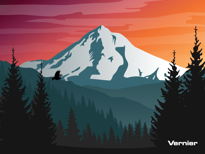
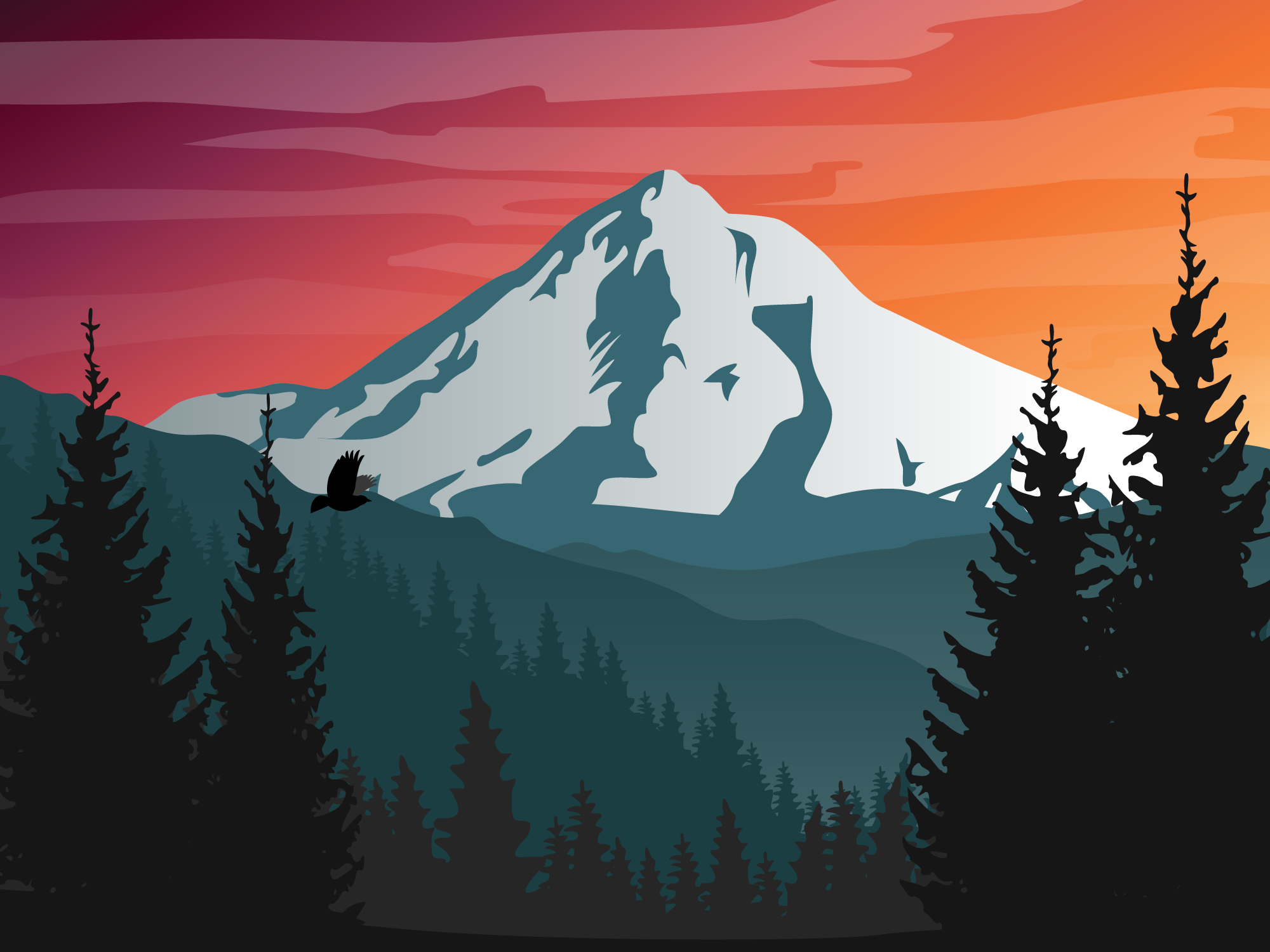
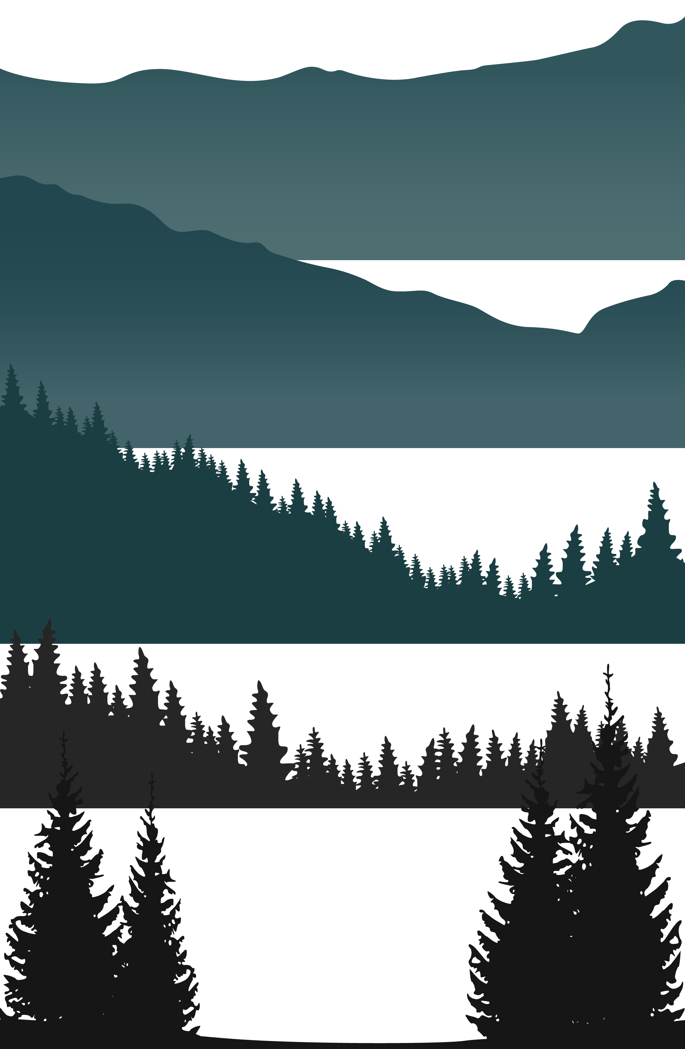
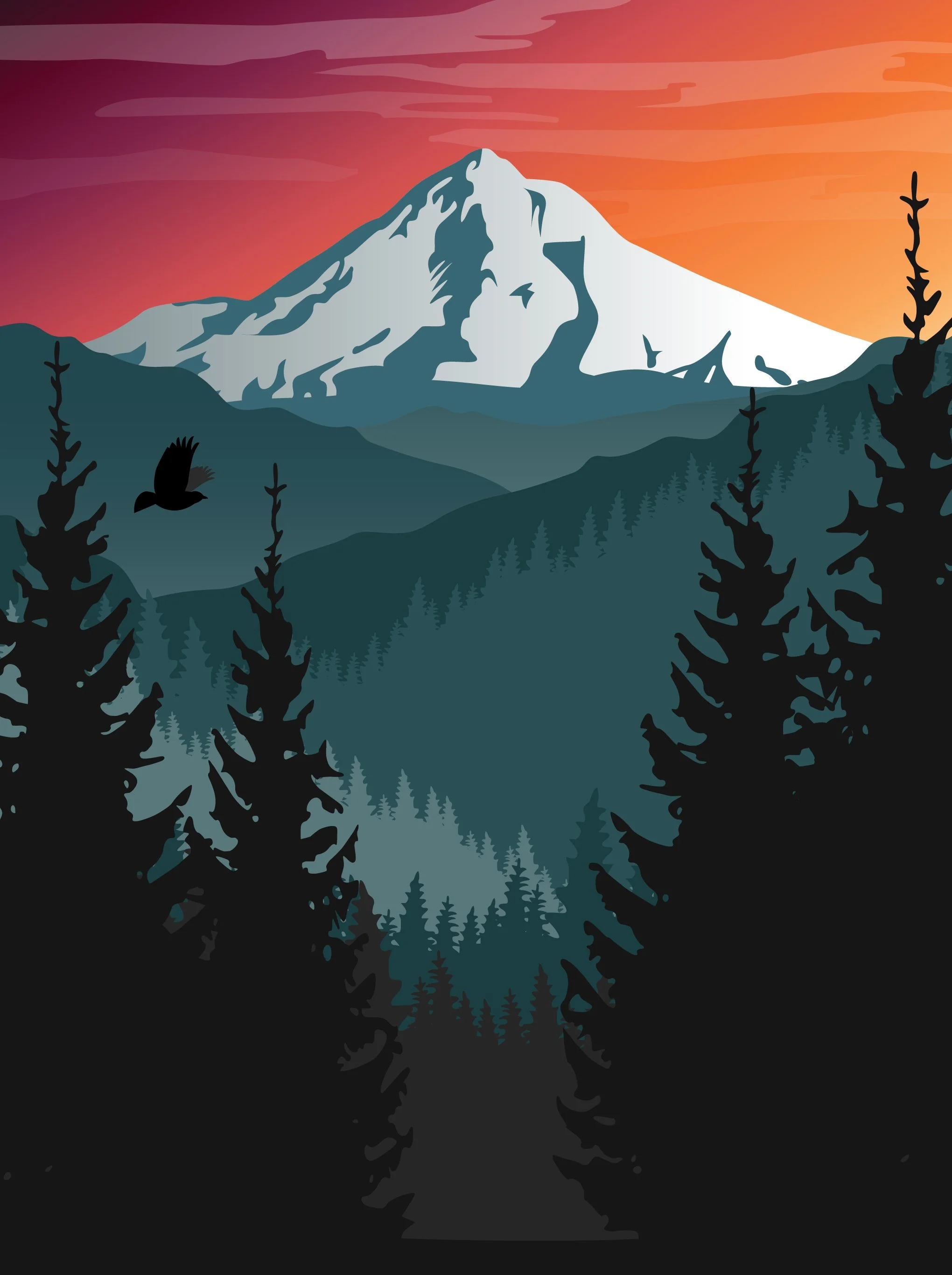
For the Parallax Digital Art project, the choice of subject matter was deliberate. Mt. Hood is a landmark that Vernier's audience — Pacific Northwest students and educators — would immediately recognize and connect with. Grounding an abstract technical concept like parallax in a familiar, local landscape made it more approachable and gave the illustration a sense of place that a generic landscape wouldn't have provided. The mountain in the background, the pine trees in the mid-ground, and the bird in the foreground gave the scene natural depth — exactly what parallax needed to demonstrate.
Designing the manual to match the quality of the illustrations.
A student manual could have been a functional document — clear steps, plain formatting, done. The decision was to treat it with the same care as the artwork itself. If the illustrations were going to inspire students to engage with the project, the manual needed to hold up its end of the experience. Clear, well-designed instruction that felt like part of the same creative package rather than an afterthought attached to it.
A recurring creative process built around a new theme every year.
Each Summer Fitness Challenge followed a similar production rhythm — theme development first, then logo design, then asset expansion into banners, PNGs, and favicons. The theme was usually decided collaboratively, often shaped by what was happening in the world or within the company, and then handed off as a creative brief. From there the design work was largely self-directed — exploring visual directions, refining the logo, and building out the full asset suite for deployment across Vernier's internal web presence.
The Parallax Digital Art project followed a different process entirely — starting with the illustration concept, building each layer independently as a Scratch-compatible sprite, assembling and testing the full scene, and then writing the student manual that would walk participants through recreating it. The wallpaper deliverable was unplanned — a spontaneous extra step taken after overhearing a coworker wish they could use the artwork as a phone background. Small decisions like that are often the ones that stay with people longest.
Summer Fitness Challenge — Annual Brand Identities
Adobe Illustrator Adobe PhotoshopSeven years of summer fitness branding — each one a complete mini identity built around a new theme. Logo, website banners, PNGs, and favicons delivered annually from 2019 through 2025. No two years looked alike.
2020 Wellness Challenge Logo - Flatten the Curve
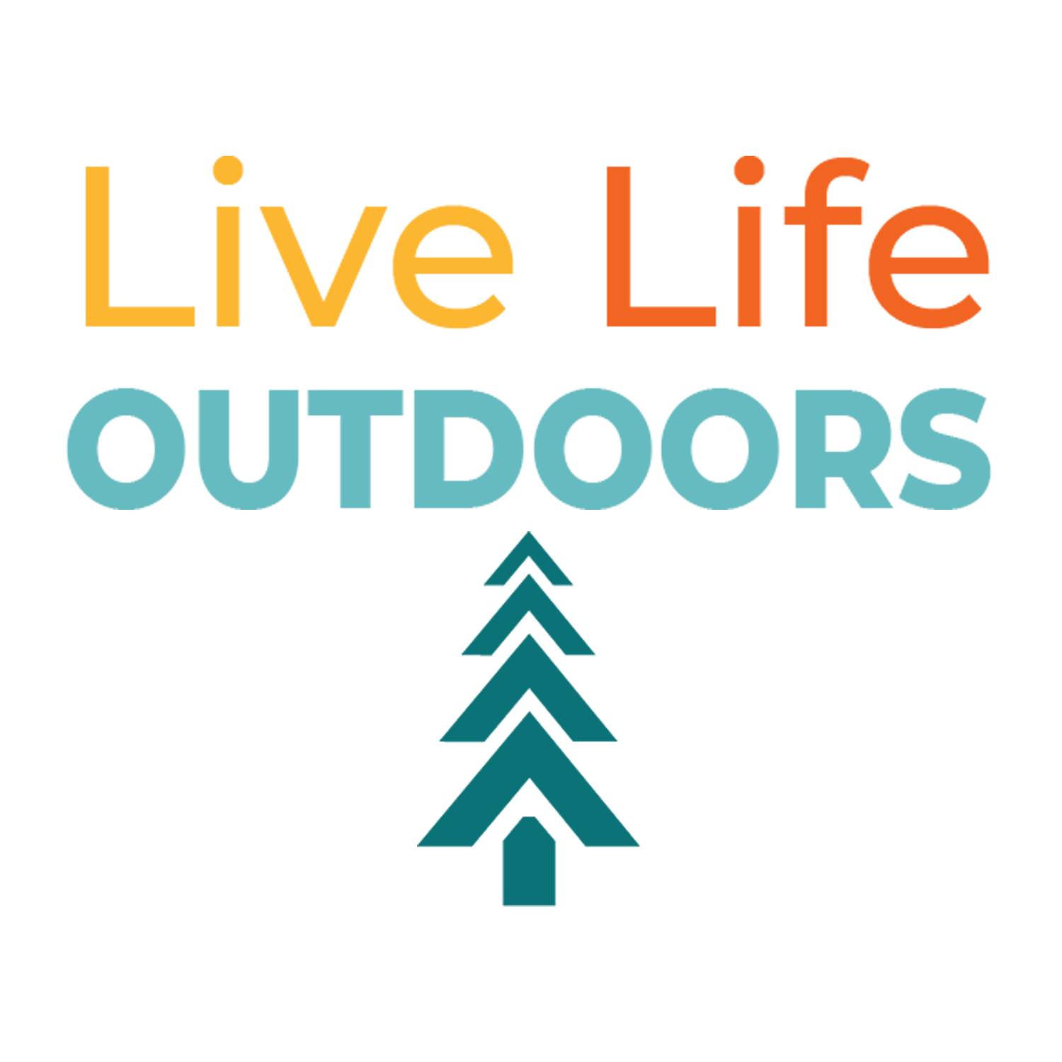
2021 Wellness Challenge Logo - Live Life Outdoors
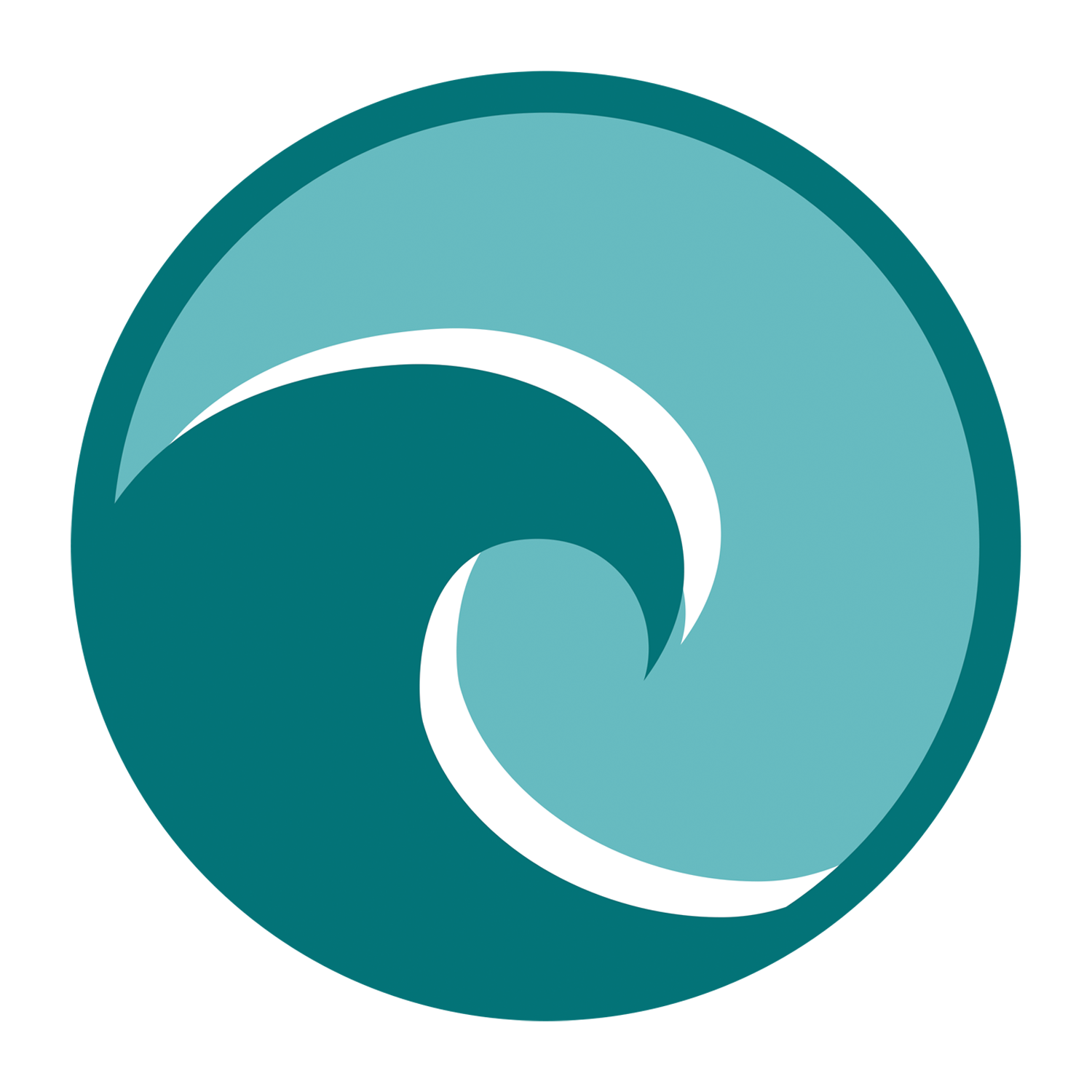
2022 Wellness Challenge Logo - Waves of Wellness
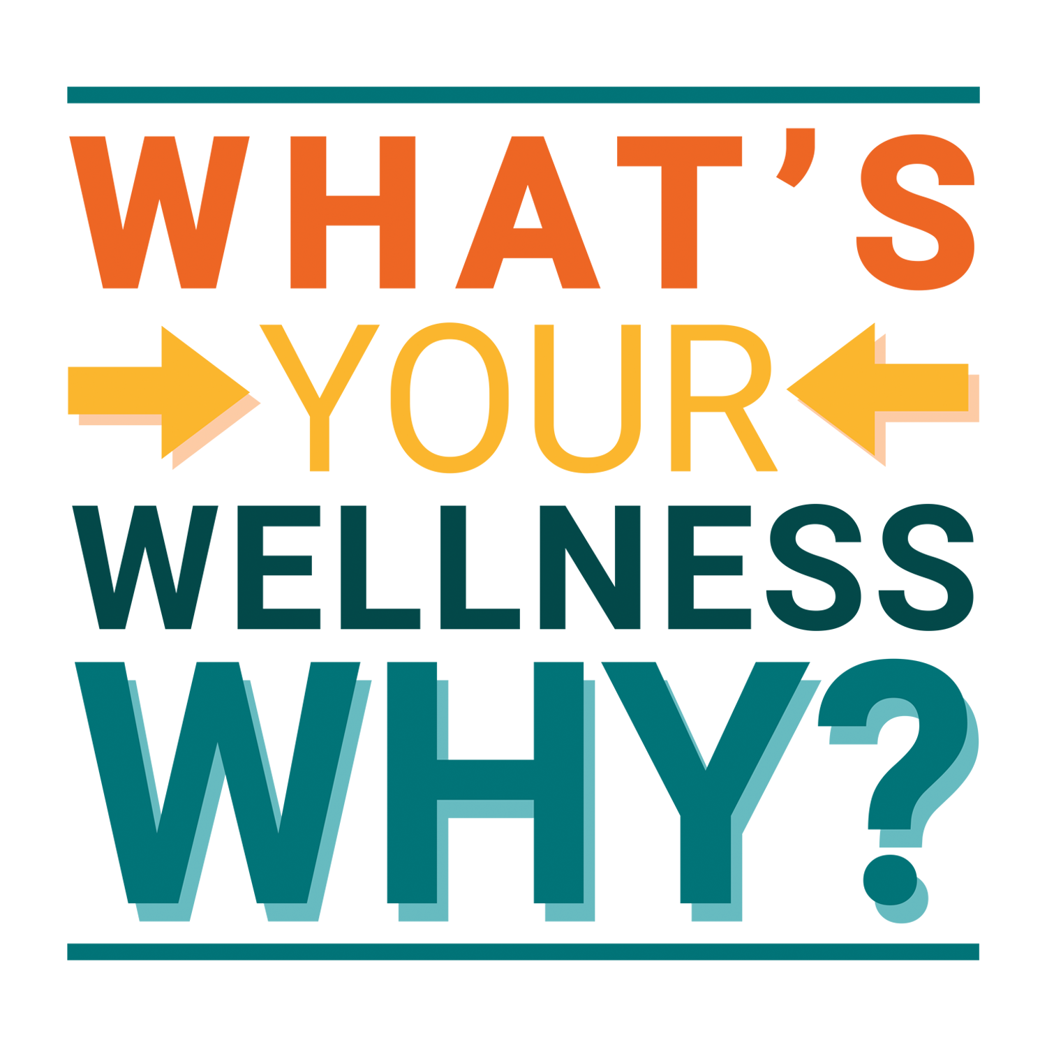
2023 Wellness Challenge Logo - What's Your Wellness Why?
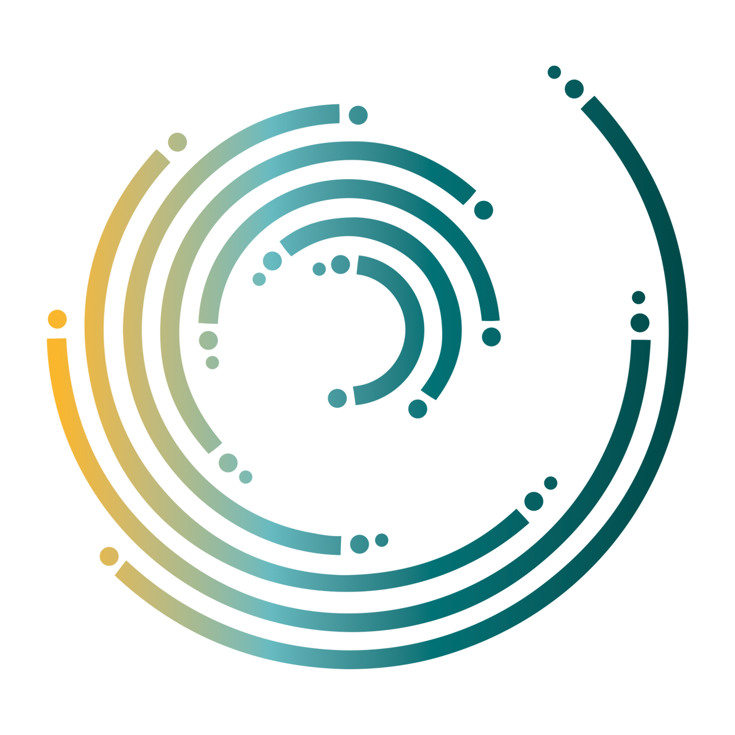
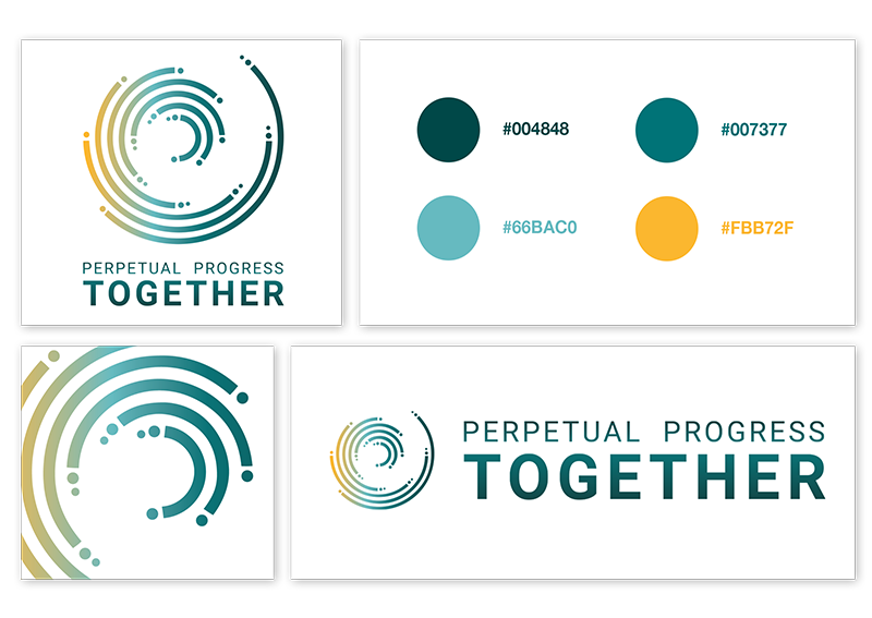
2024 Wellness Challenge Logo - Perpetual Progress Together
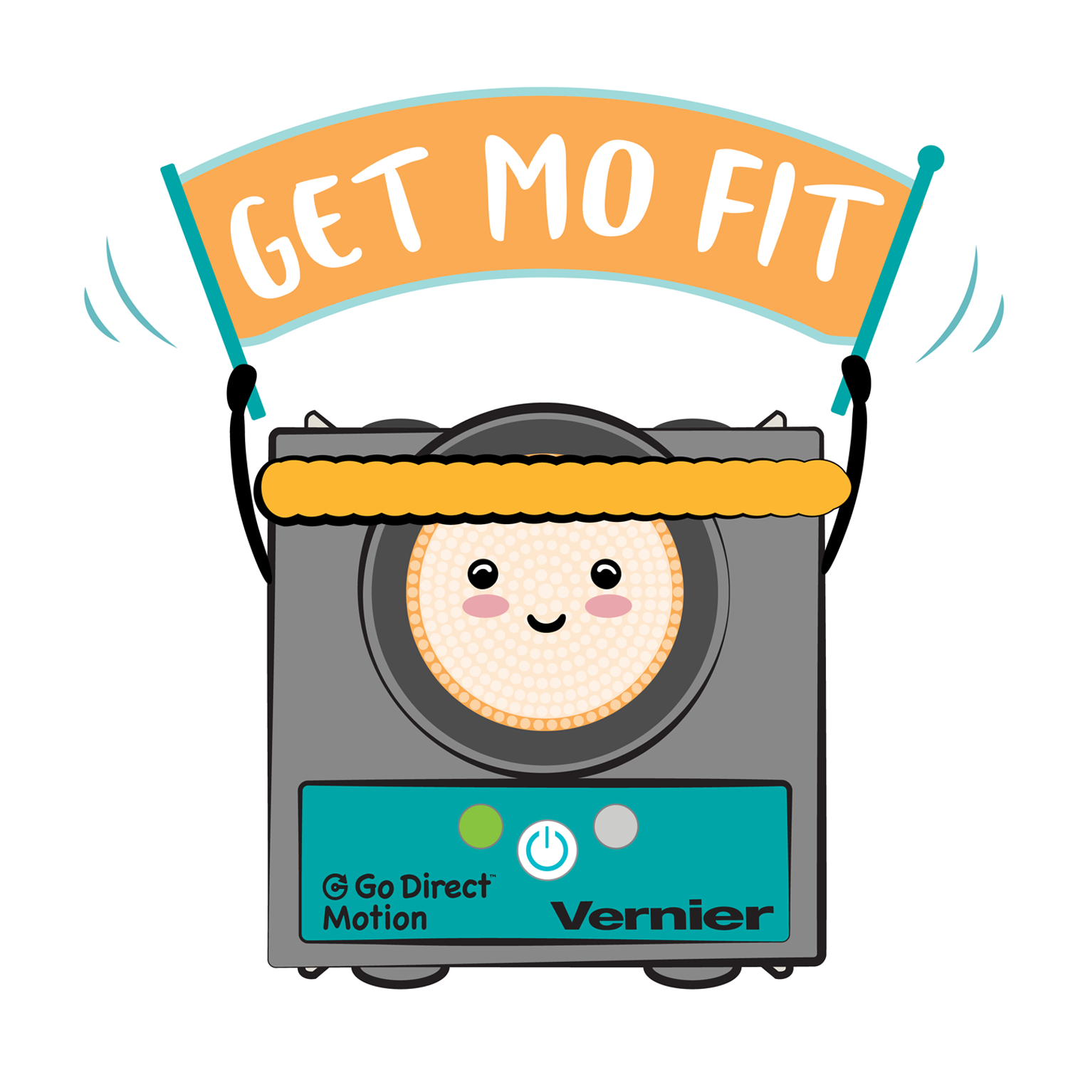
2025 Wellness Challenge Logo - Get Mo Fit
Parallax Digital Art — Mt. Hood Vista & Sprites
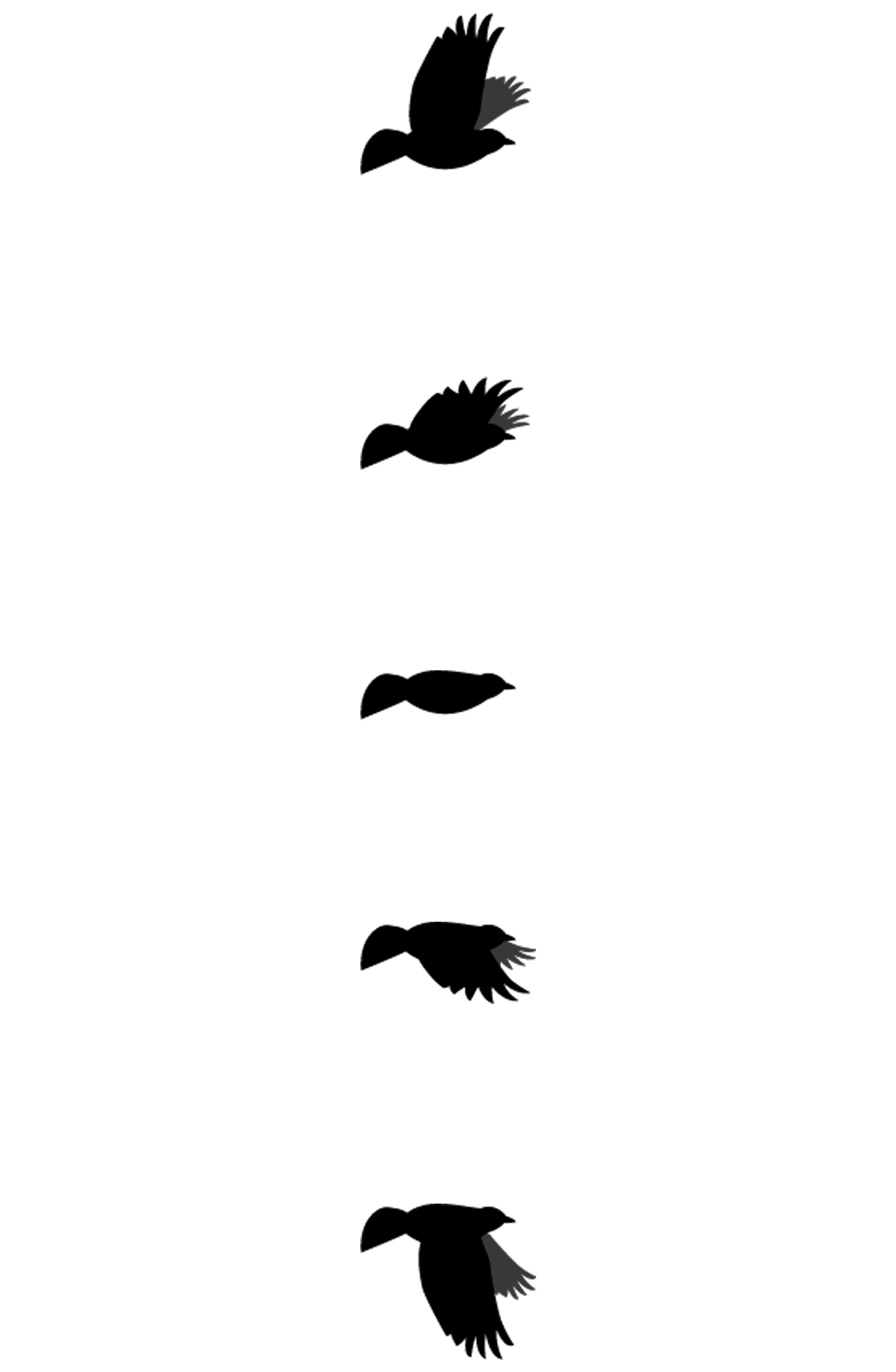
Adobe Illustrator ScratchA layered Pacific Northwest scene built for Scratch — a Mt. Hood vista as the background, pine tree sections as mid-ground sprites moving at medium speed, and a bird sprite flying across the foreground at full speed. Each layer was illustrated and exported independently so students could assemble and animate the complete scene themselves.
“Building difficult scientific concepts into something tangible and beautiful.”
Meghan Lewis, Senior Visual DesignerSeven years, seven themes — each one a complete creative response to its moment.
Every summer brought a new brief, a new theme, and a new design challenge. Each year's identity was shaped not just by aesthetic decisions but by what was happening in the world, in the company, and in the lives of the people the challenge was designed for. Employees tracked steps, activities, and bonus challenges — all converted into a charitable donation at the end of the summer, alongside prizes for participants. The branding had to make people want to show up.
2019 — Elements of Wellness
First YearThe inaugural challenge used a periodic table as its structural concept — each "element" of wellness introduced week by week throughout the challenge. The logo became a periodic table of its own, with individual wellness elements revealed progressively as the summer unfolded. A design system that rewarded participation with new content every week.
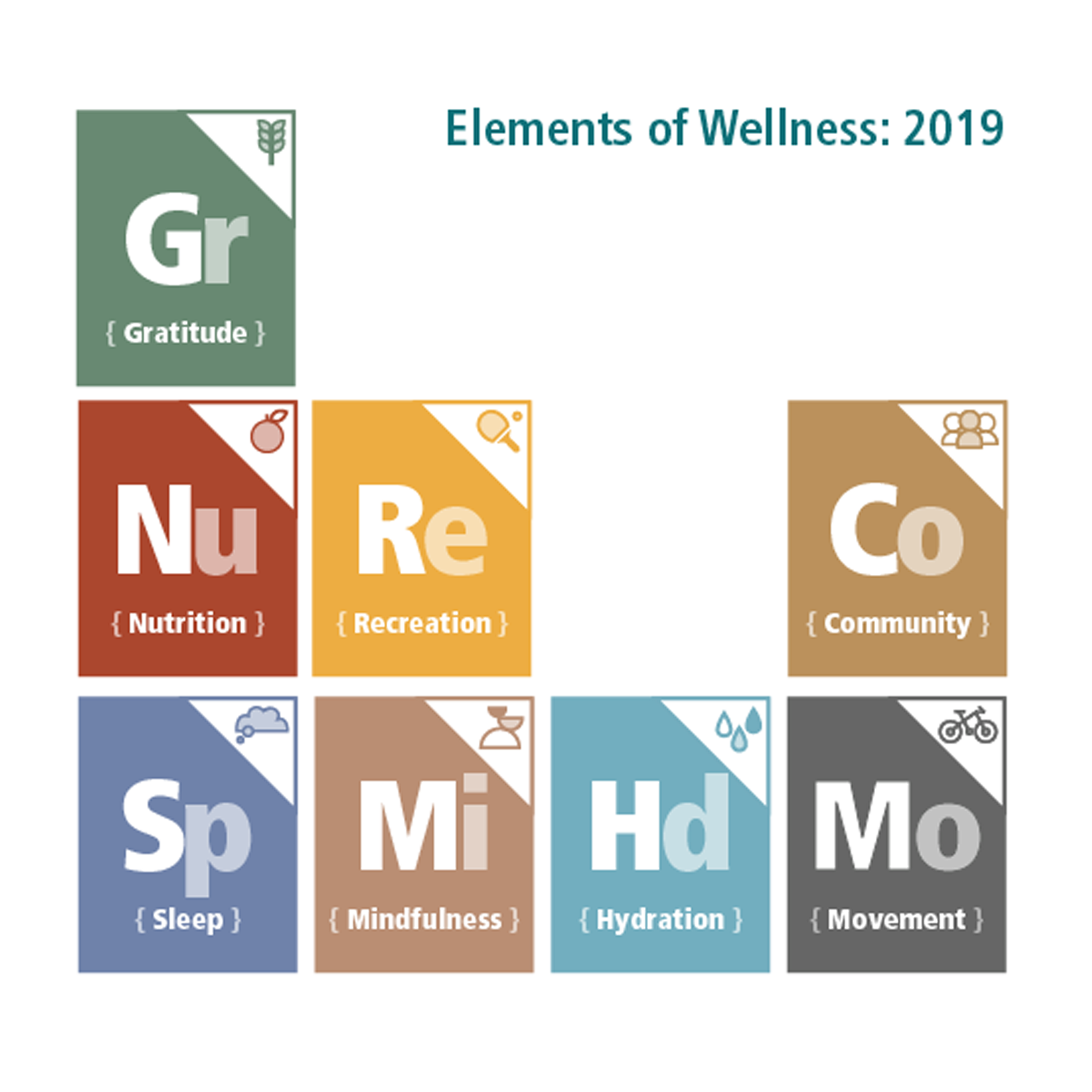
2019 Wellness Challenge - Elements of Wellness - Logo

2019 Wellness Challenge - Elements of Wellness - Favicon
2020 — Flatten the Curve
Pandemic Year OneSecond YearThe 2020 challenge arrived in the middle of the pandemic — and the theme responded directly to that reality. Flatten the Curve encouraged employees to stay active during lockdown, reframing a public health phrase into a personal wellness challenge. The design had to feel urgent and motivating without being heavy-handed about what everyone was already living through.
2020 Wellness Challenge - Flatten the Curve - Logo
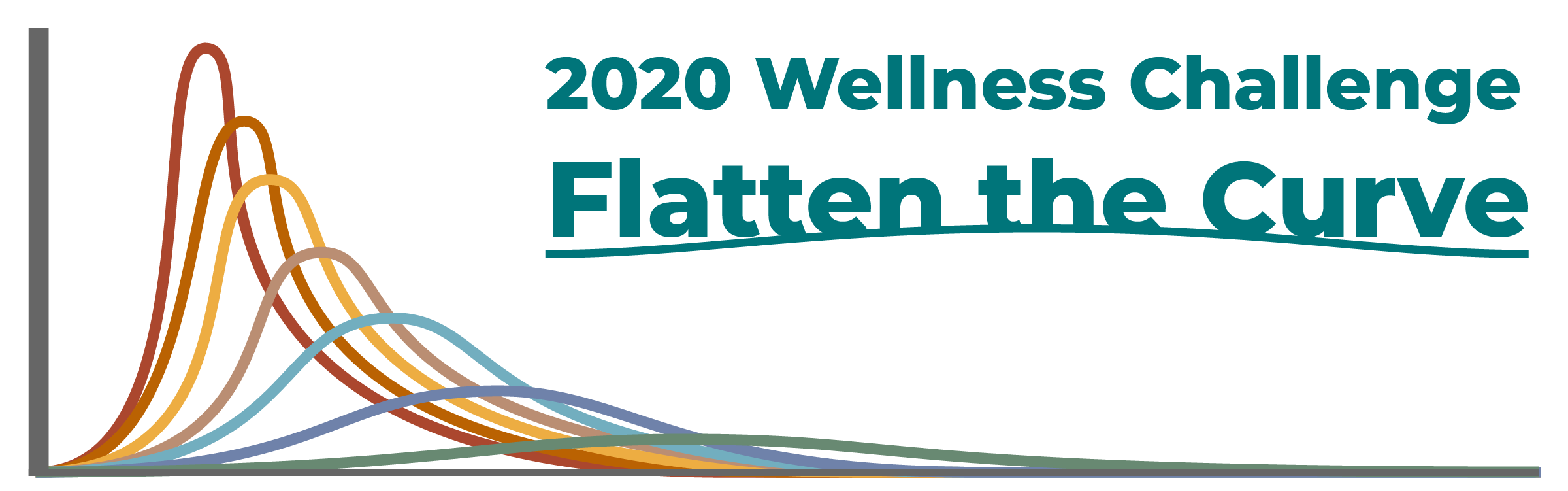
2020 Wellness Challenge - Flatten the Curve - Banner

2020 Wellness Challenge - Flatten the Curve - Favicon
2021 — Live Life Outdoors
Pandemic Year TwoThird YearStill in the pandemic, the 2021 challenge shifted the focus outward — encouraging employees to find motivation in the natural world around them during an ongoing period of isolation and fatigue. Live Life Outdoors was about reframing lockdown as an opportunity to rediscover movement in open spaces. The design needed to feel expansive, energetic, and genuinely hopeful.
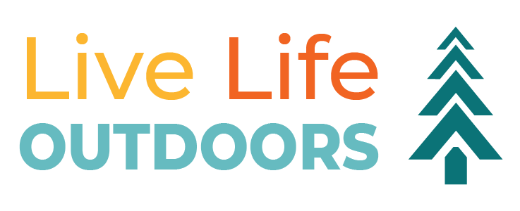
2021 Wellness Challenge - Live Life Outdoors - Logo

2021 Wellness Challenge - Live Life Outdoors - Banner

2021 Wellness Challenge - Live Life Outdoors - Favicon
2022 — Waves of Wellness
Charity-Driven ThemeFourth YearThe 2022 theme was shaped directly by the charity selected for that year's donation — an organization focused on ocean research and the health of coastal environments. Waves of Wellness tied the physical challenge to something larger than individual fitness, connecting personal movement to environmental stewardship. The design drew from ocean imagery, wave forms, and coastal color palettes.
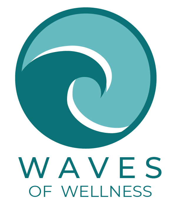
2022 Wellness Challenge - Waves of Wellness - Logo

2022 Wellness Challenge - Waves of Wellness - Banner

2022 Wellness Challenge - Waves of Wellness - Favicon
2023 — What's Your Wellness Why?
Reflective ThemeFifth YearThe 2023 challenge turned the question inward — asking participants to reflect on their personal motivation for staying active. What's Your Wellness Why? acknowledged that different people move for different reasons, and that understanding your own reason is the foundation of sustainable wellness. The design had to feel personal, introspective, and warm without being preachy.
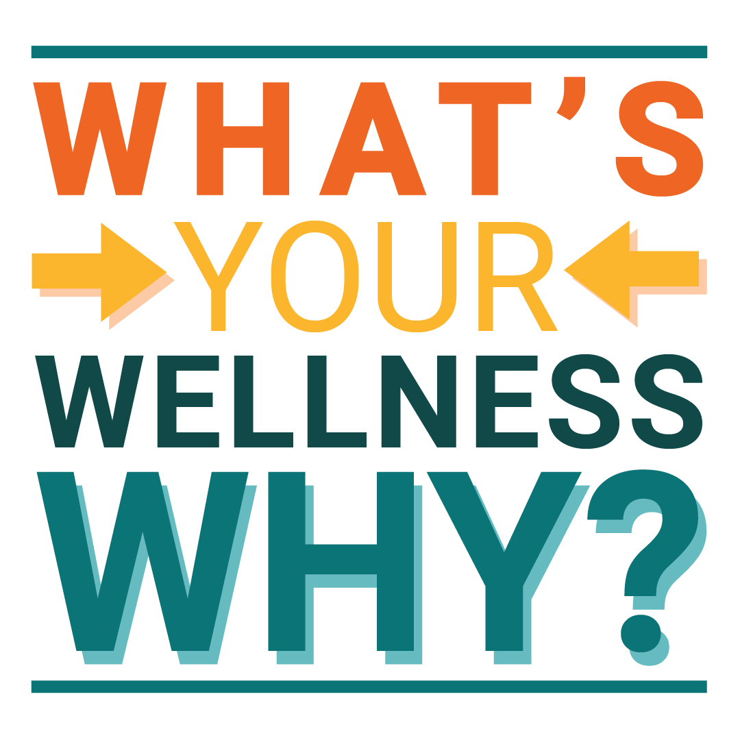
2023 Wellness Challenge - What's Your Wellness Why? - Logo

2023 Wellness Challenge - What's Your Wellness Why? - Banner

2023 Wellness Challenge - What's Your Wellness Why? - Favicon
2024 — Perpetual Progress Together
Personal FavoriteSixth YearThe 2024 challenge responded to Vernier's transition to a Perpetual Business Trust model — a significant shift in how the company thought about its future and its people. Perpetual Progress Together took that language and reframed it as a wellness philosophy: progress that is continuous, collective, and built to last. The logo was a personal favorite — the design that felt most fully realized of all six iterations.
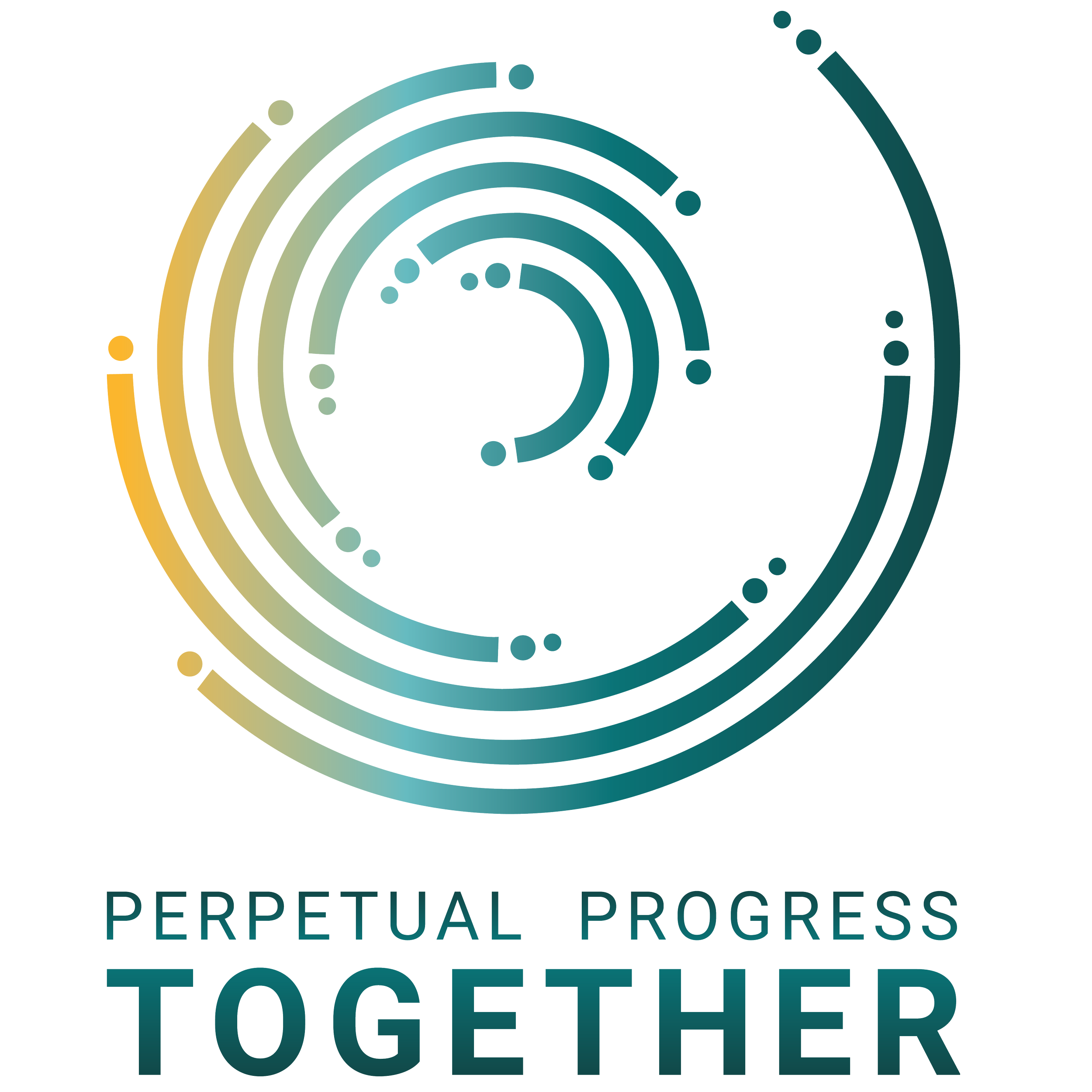
2024 Wellness Challenge - Perpetual Progress Together - Logo

2024 Wellness Challenge - Perpetual Progress Together - Banner
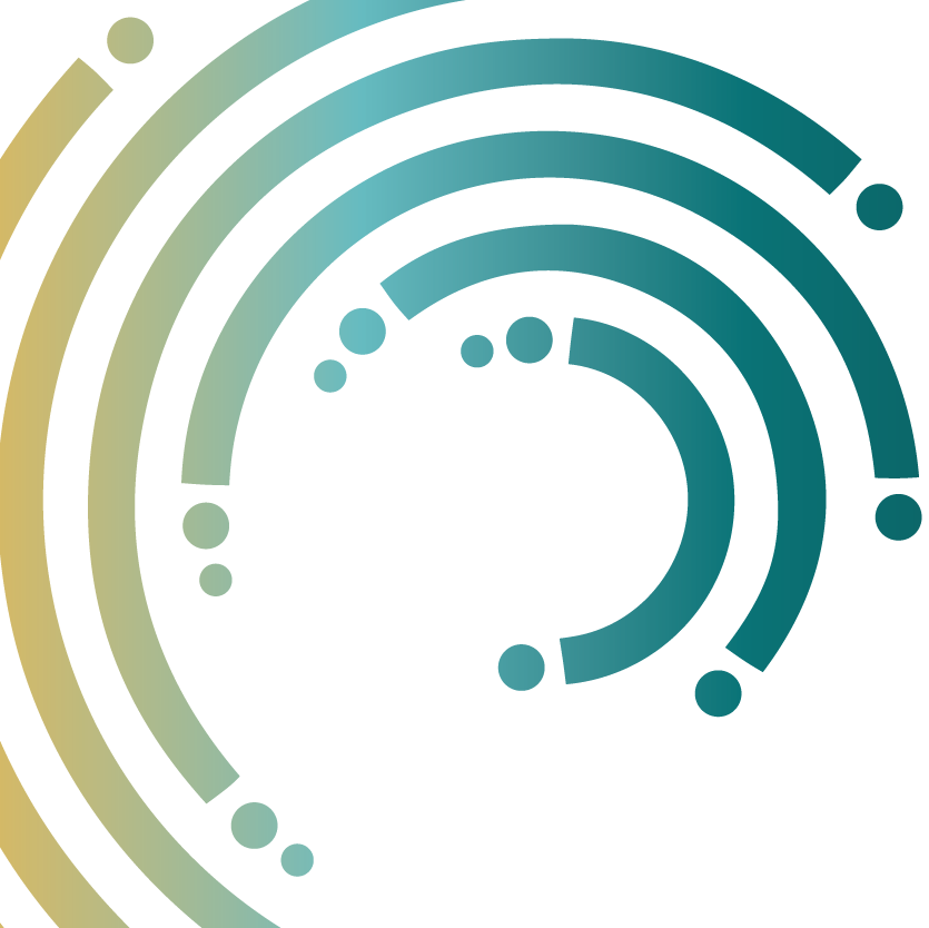
2024 Wellness Challenge - Perpetual Progress Together - Favicon
2025 — Get Mo Fit
Final ChallengeSeventh YearThe 2025 challenge featured Mo — the Go Direct Motion Detector mascot — as its central character, bringing a beloved piece of Vernier's product identity into the wellness program. Designed in May and June, the challenge was scheduled to run in late July and early August. The branding was completed. The challenge was ready. It never ran for me — I was laid off the day after Independence Day vacation, before the first week began.
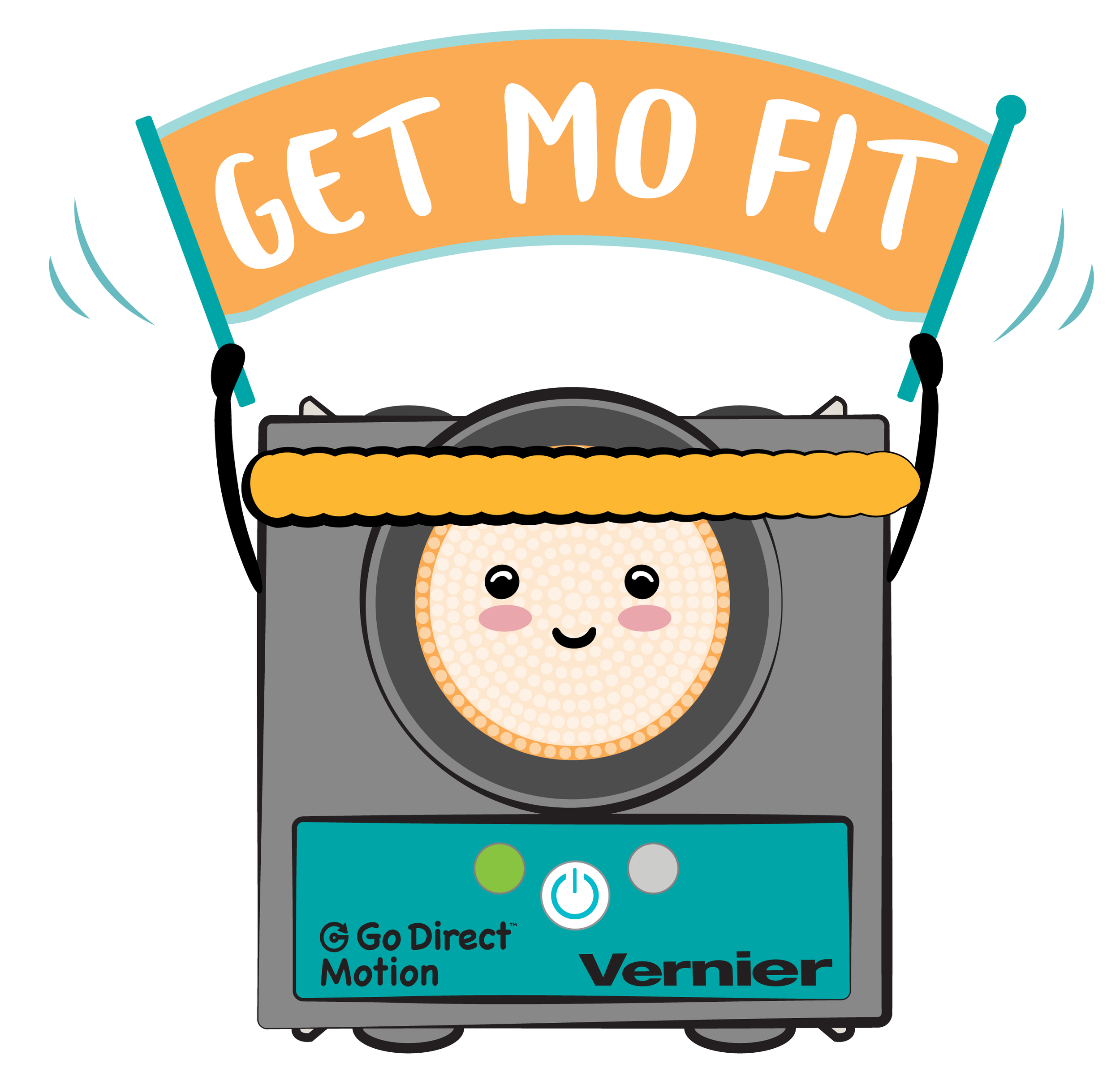
2025 Wellness Challenge - Get Mo Fit! - Logo

2025 Wellness Challenge - Get Mo Fit! - Banner
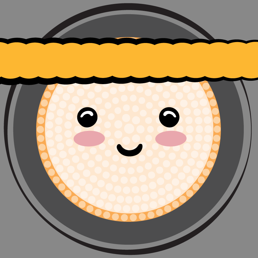
2025 Wellness Challenge - Get Mo Fit! - Favicon
Where the brief ended and the making began.
Some projects generate work that lives beyond their original purpose. The Parallax Digital Art piece started as a teaching tool — a layered Mt. Hood illustration built to demonstrate parallax motion in Scratch. But the process of building it sparked something, and it led directly to a second piece: an iPhone wallpaper series that grew out of the same visual language. These aren't campaign deliverables. They're what happens when a project gives you permission to make something for its own sake.
Parallax Digital Art — The Full Picture
Adobe Illustrator ScratchParallax motion creates the illusion of depth by moving foreground elements faster than background elements — the same principle used in film, animation, and modern web design. To teach it, students needed something they could see and build themselves. The scene was designed in three distinct layers: a Mt. Hood vista as the static background, pine tree sections as mid-ground sprites moving at medium speed, and a bird flying across the foreground at full speed. Each layer was illustrated independently so it could be imported into Scratch as its own sprite and animated separately.
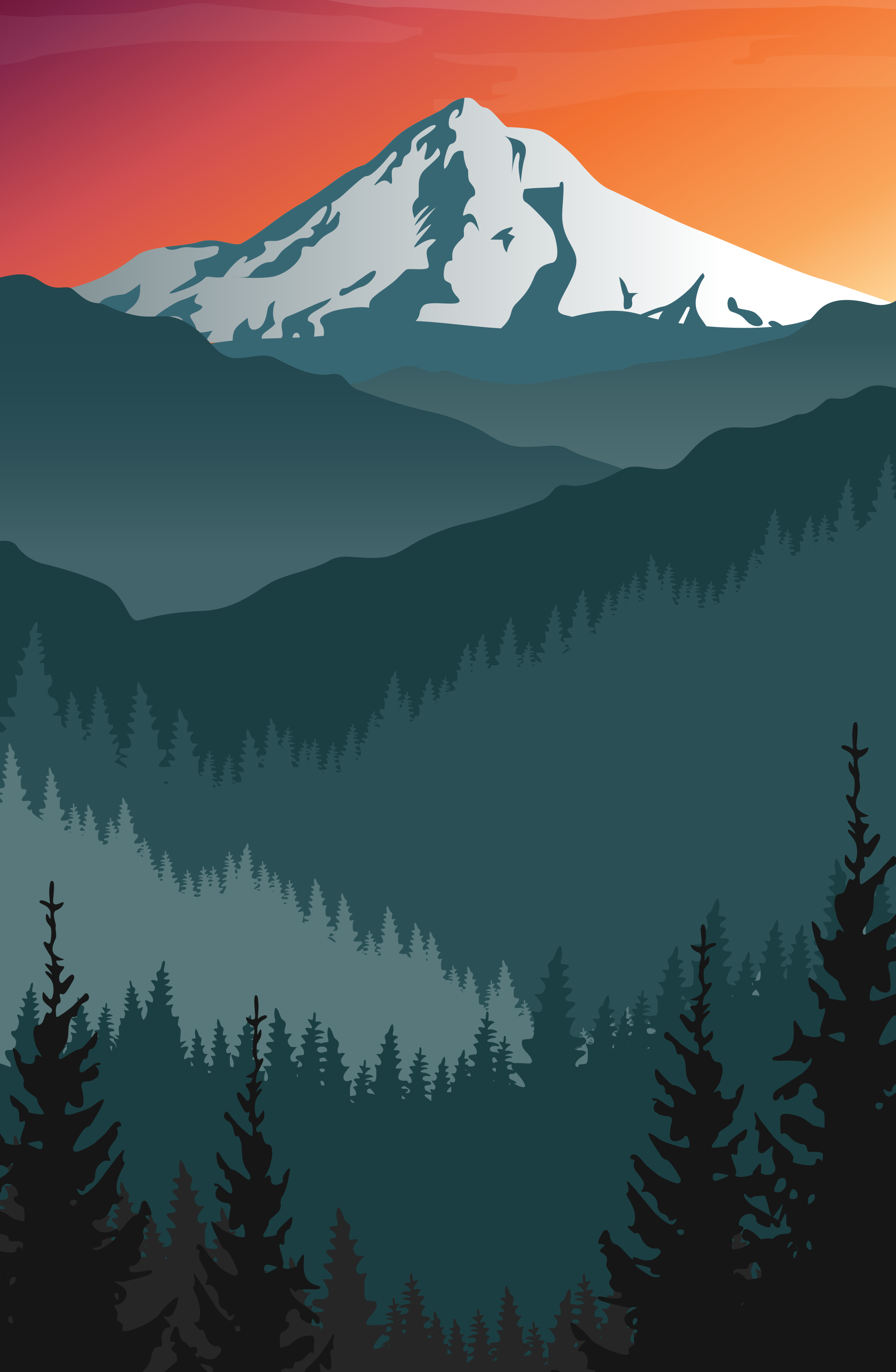
Parallax Digital Art — Teacher's Manual
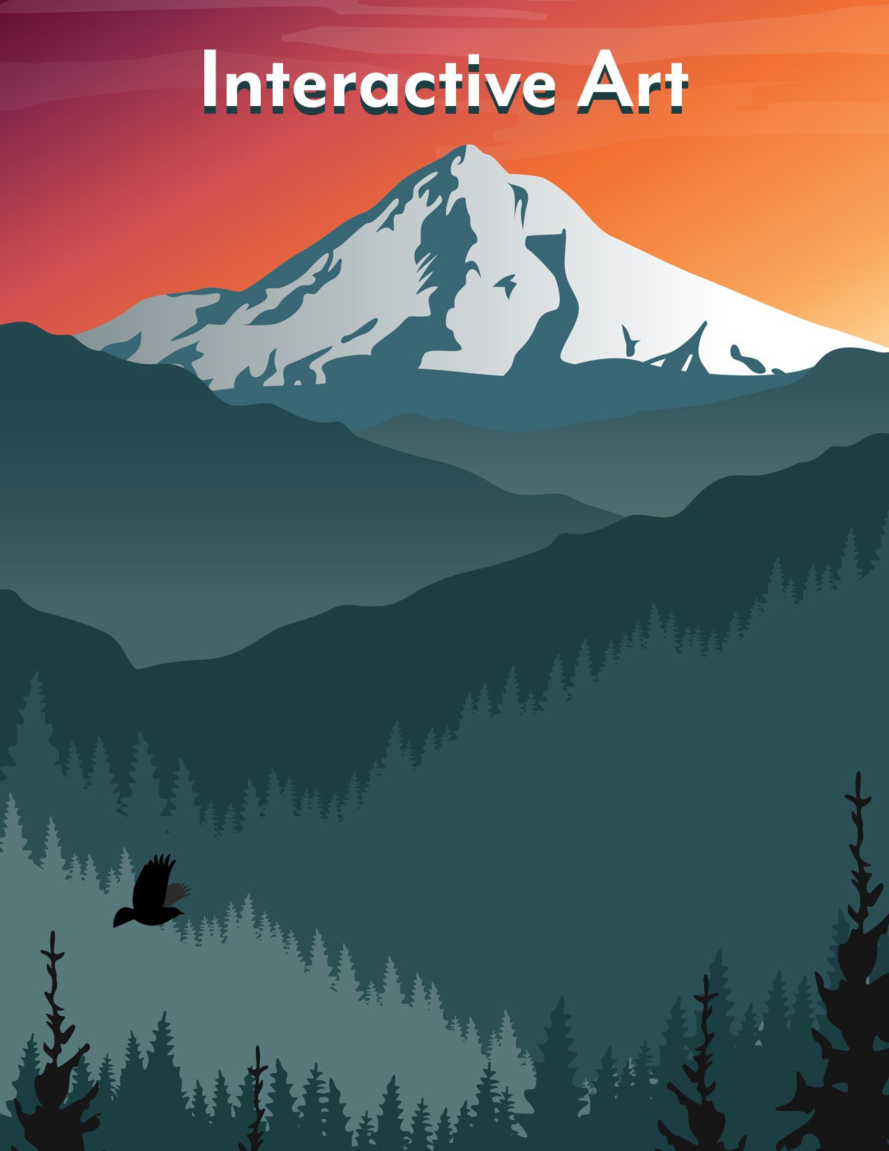
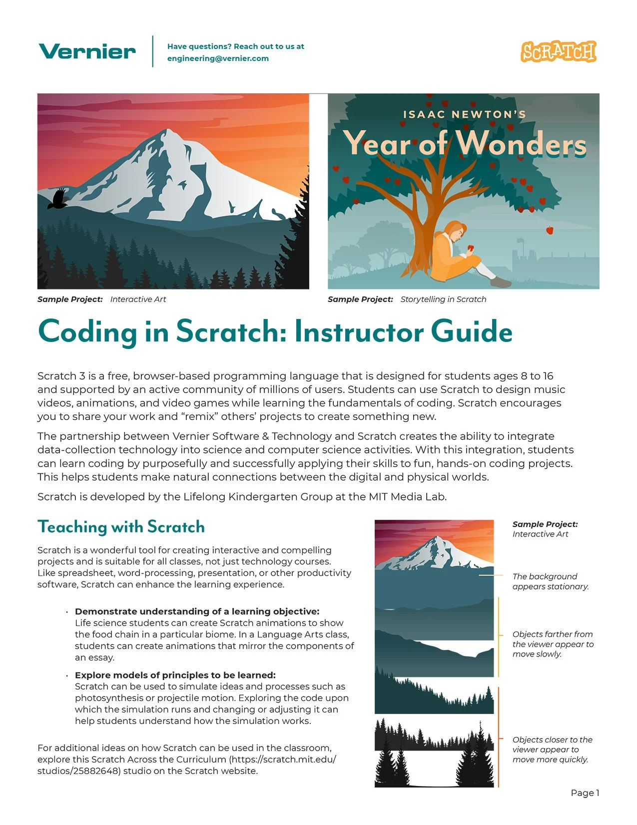
Adobe Illustrator Adobe InDesignThe teacher's manual guided instructors through facilitating the full build — from setting up Scratch environments to walking students through the parallax motion logic. Designed with the same visual care as the illustrations themselves, it was a complete instructional document that could stand alone as a polished deliverable.
Parallax Digital Art — Wallpapers
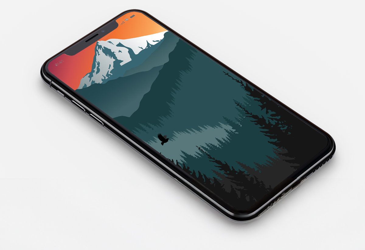
Adobe IllustratorAfter finalizing all the artwork, I overheard a coworker say they'd love it as a phone background. It wasn't in the brief — it wasn't asked for — but it felt like the right thing to do. I sized the illustration for tablet and mobile phone screens and shared it with the team. It was a small extra step that cost very little and meant a lot. My supervisor thanked me with a Bob Ross Funko Pop figurine, which sat proudly on my desk for years — and now lives in my home office, by the TV.
Six years of creative work that people actually used — and loved.
Six complete Summer Fitness Challenge identities from 2019 through 2025 — each one a fresh theme, a new visual language, and a full set of digital assets. No two years looked alike.
Approximately 80% of Vernier employees participated in the Summer Fitness Challenge each year — a reflection of both the program's culture and the role that inviting, well-crafted branding played in making it feel worth joining.
Three original illustration assets — Mt. Hood vista, layered pine tree sprites, and an animated bird — plus a complete student manual, all delivered for classroom use before the pandemic.
The projects I looked forward to most — and miss the most.
The Summer Fitness Challenge was one of the highlights of every year at Vernier. It arrived reliably, it came with genuine creative latitude, and it was for an audience that was genuinely excited to see what the new season would bring. Designing something that people looked forward to — and then participating in the challenge yourself — is a rare and wonderful thing. Six years of that work is something to be proud of.
Each year's theme reflected something real — a global crisis, a company milestone, a charitable cause, a personal question worth asking. The branding wasn't decoration. It was part of how the program communicated its values to the people inside it. Getting to be the person who translated those values into something visual, year after year, was a privilege I didn't take lightly.
The Parallax Digital Art project was a different kind of satisfaction — quieter, more technical, and more self-contained. Drawing a Mt. Hood vista from scratch, breaking it into layers that could move independently, and then writing the instructions that would walk a student through building the whole thing was a genuinely complete creative experience. The illustration had to work as art and as a technical asset simultaneously. Getting both right in the same piece felt like exactly the kind of problem design is made for.
The 2025 challenge — Get Mo Fit — was designed and ready to go. The logo was done, the assets were built, the challenge was scheduled. I was laid off the day after my Independence Day vacation, before it ever launched. Not getting to participate in something I made with care is a particular kind of hard. But the work exists. The logo is real. And six years of Summer Fitness Challenge branding is a body of work that represents some of the most joyful creative time I've had in my career.
I'm proud of all of it — and I miss it.
After sharing the wallpapers with the team, my supervisor surprised me with a Bob Ross Funko Pop figurine as a thank you. He sat on my desk at Vernier for years. He now lives in my home office, by the TV — a small, cheerful reminder that going a little further than the brief asks is almost always worth it.
The Vernier Collection
Explore More Vernier Work
Nine case studies covering six years of in-house design work. You're viewing 9 of 9.
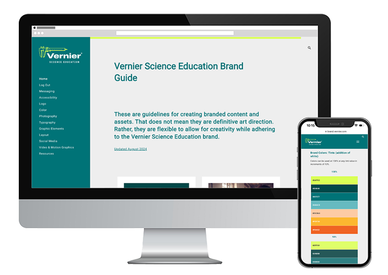
Brand Guide & Refresh
View Case Study →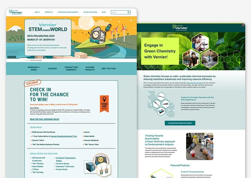
Campaign Websites
View Case Study →
Internal Website Design
View Case Study →
Email Design & Digital Ads
View Case Study →
Digital & Social Media
View Case Study →
Print Brochures, Flyers & Packaging
View Case Study →
Print Catalogs, Books & Papers
View Case Study →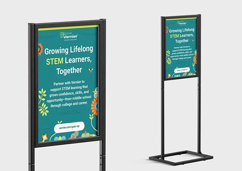
Conference Signage & Swag
View Case Study →