
Building Consistent, Responsive Web Pages for a Science-Focused Brand
Seven years. Two CMS platforms. Dozens of campaign pages. Here's how I shaped Vernier's digital presence end-to-end.

Overview
A science brand with a 40-year legacy — and a digital presence that needed to match it.
Vernier Science Education has spent more than four decades creating hands-on tools that help students learn through exploration. During my seven years on the design team, I saw how deeply the company valued educators and student curiosity — and how much was at stake in translating that into digital campaigns.
I designed and built campaign landing pages supporting product launches and major initiatives including the Green Chemistry HubSpot pages, the 2025 GEAR UP Conference, and the 2025 NSTA Conference site. Working on a small, highly collaborative team, I contributed across illustration, print, web, and email — and over time became the primary designer for web and email projects, shaping Vernier's digital campaigns end-to-end from creative direction through production.
The Problem
Vernier lives in physical spaces. My job was to make the digital ones just as compelling.
Vernier's campaigns come to life at conference booths, in live demos, and through direct conversations with educators. Each campaign page needed to do more than present information — it had to spark curiosity, guide users through a story, and drive meaningful action. The added challenge: two very different CMS platforms, each with its own constraints, and a marketing team that needed to maintain the pages without design support.
Key Decisions
What I decided, and why.
Design with each platform, not against it
WordPress and HubSpot impose very different constraints — components rarely carry over between them. Rather than forcing visual uniformity, I reviewed how previous campaigns were built in each system before designing anything, so layouts could flex within each platform's rules instead of fighting them. Identifying constraints early meant fewer surprises at build time.
Let brand be the connective tissue
With no shared templates across platforms, consistency had to come from visual choices — consistent grids, typography, spacing, and color. This allowed each campaign to feel distinct while still clearly part of the Vernier ecosystem, even when the underlying CMS was completely different.
Build for the team that has to maintain it
Every campaign page eventually needs to be updated by someone who isn't a designer. I structured layouts as repeatable components and documented decisions so the marketing team could update content, adjust messaging, or reuse sections for future campaigns without redesigning from scratch.
The System
Before a single page went live, each campaign had its own visual direction.
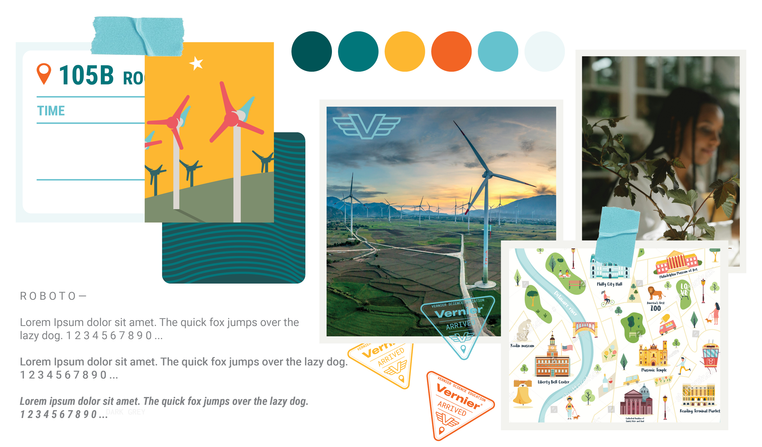
Each campaign started with a moodboard — a visual brief that defined color, imagery tone, typography treatment, and overall mood before any layouts were built. This step was how I translated the energy of a specific event or initiative into a coherent design language, and how I aligned with the marketing team before committing to production.
Campaign Moodboards
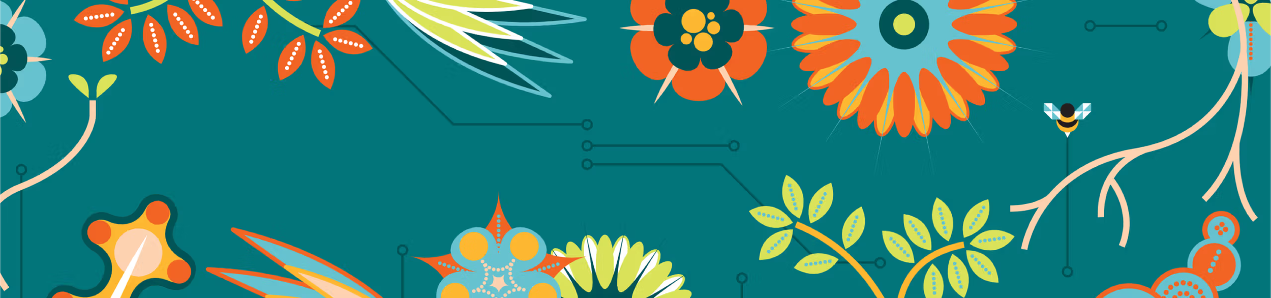
Creative DirectionThree distinct visual directions — one per campaign — each anchored to a specific audience, message, and event context. Green Chemistry called for restraint and natural calm. GEARUP needed bold partnership energy. NSTA required a cohesive multi-page hub that could flex across three distinct sub-pages.
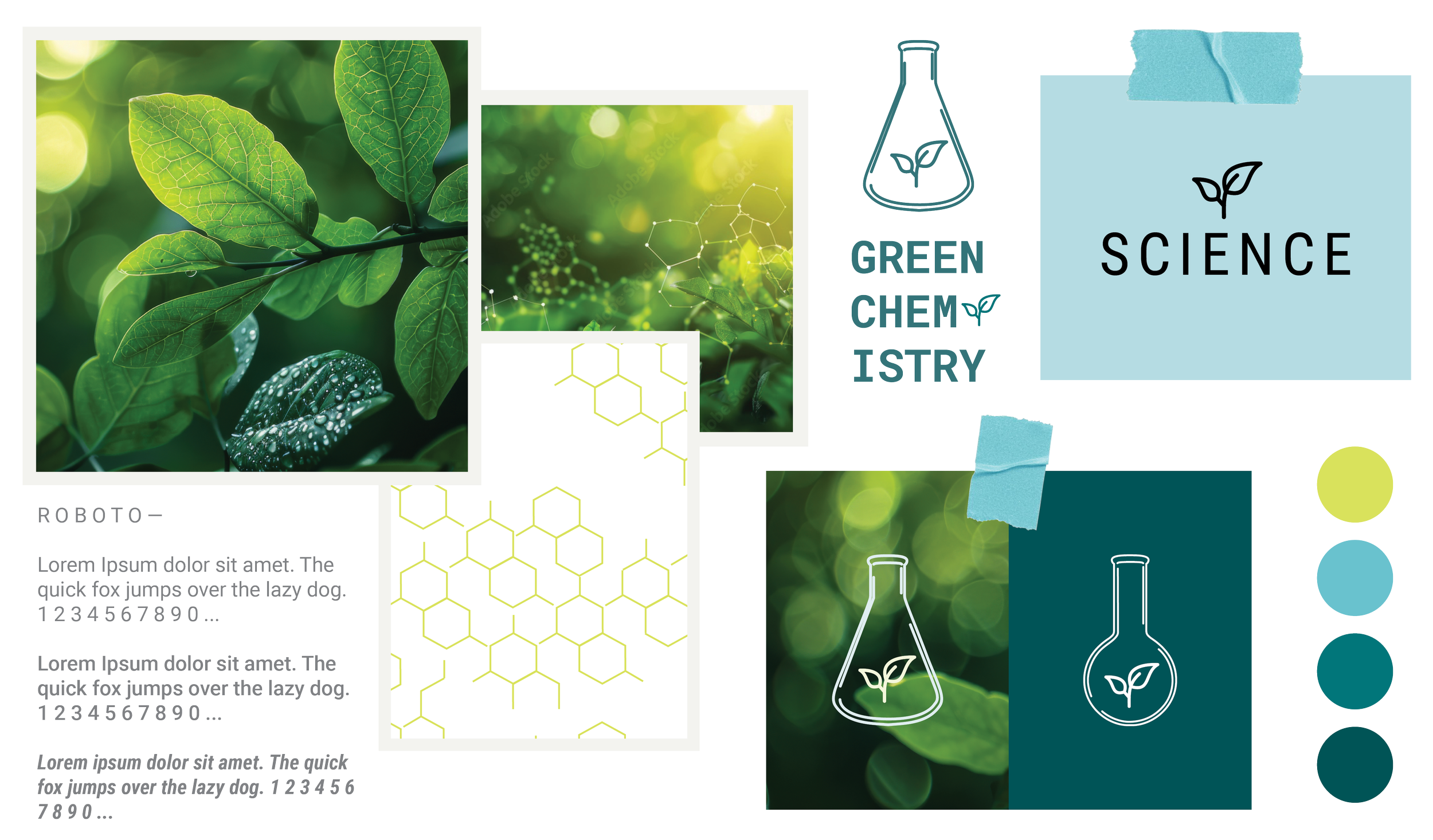
Green Chemistry — natural palette, sustainable tone
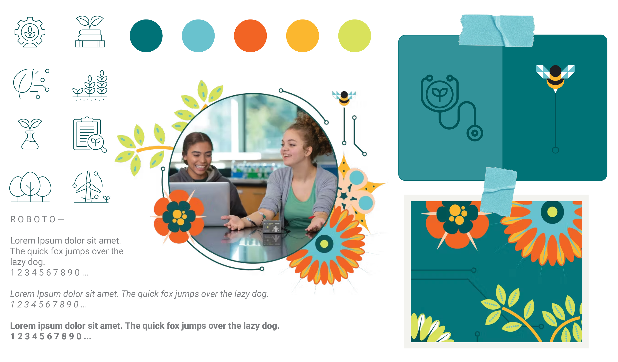
GEARUP — bold, conference-ready energy
NSTA 2025 — cohesive multi-page hub system
“Building difficult scientific concepts into something tangible and beautiful.”
Meghan Lewis, Senior Visual DesignerThe Campaigns
Three campaigns. Two platforms. One visual system.
Each campaign served a different audience and goal — from sustainability education to major national conferences — but all shared a common foundation of clear hierarchy, responsive layouts, and brand consistency.
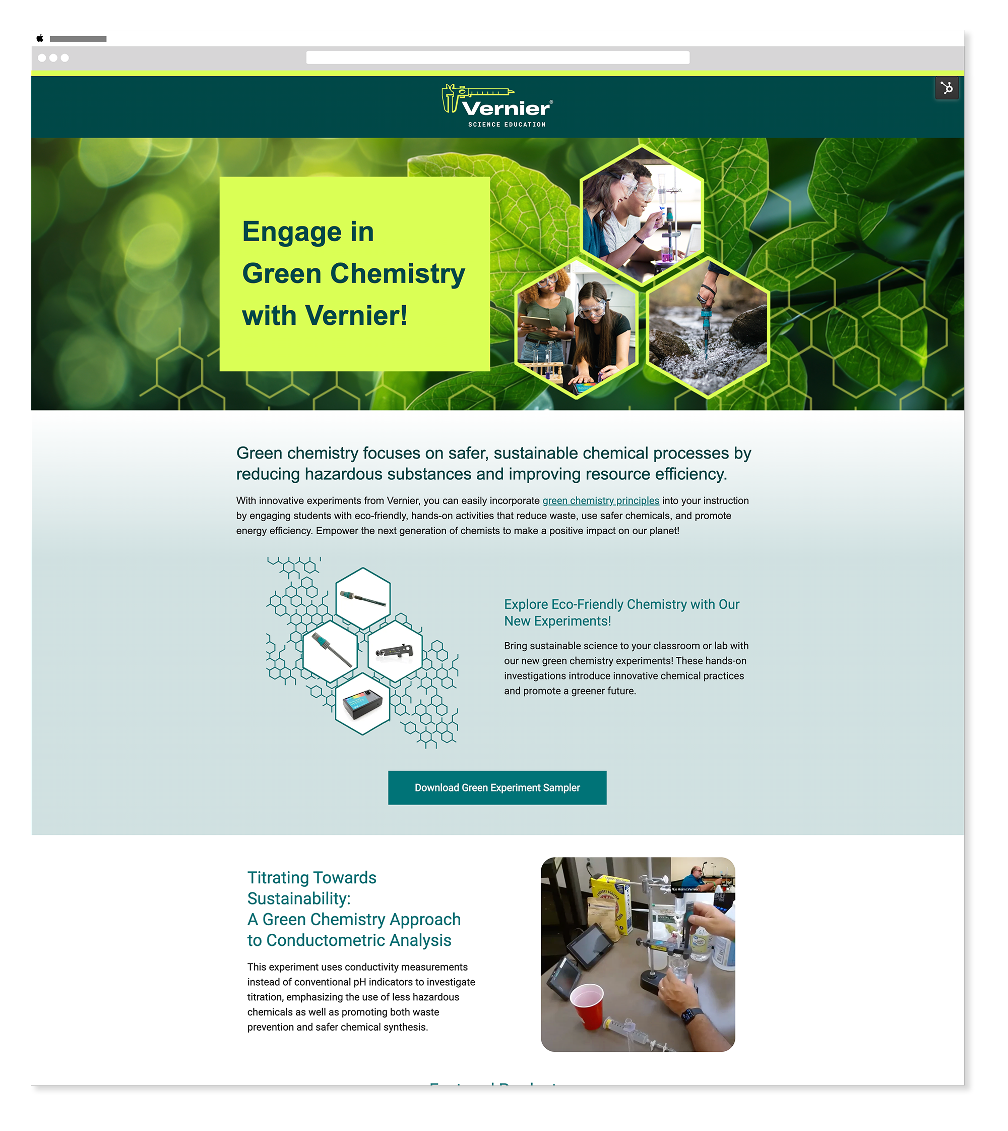
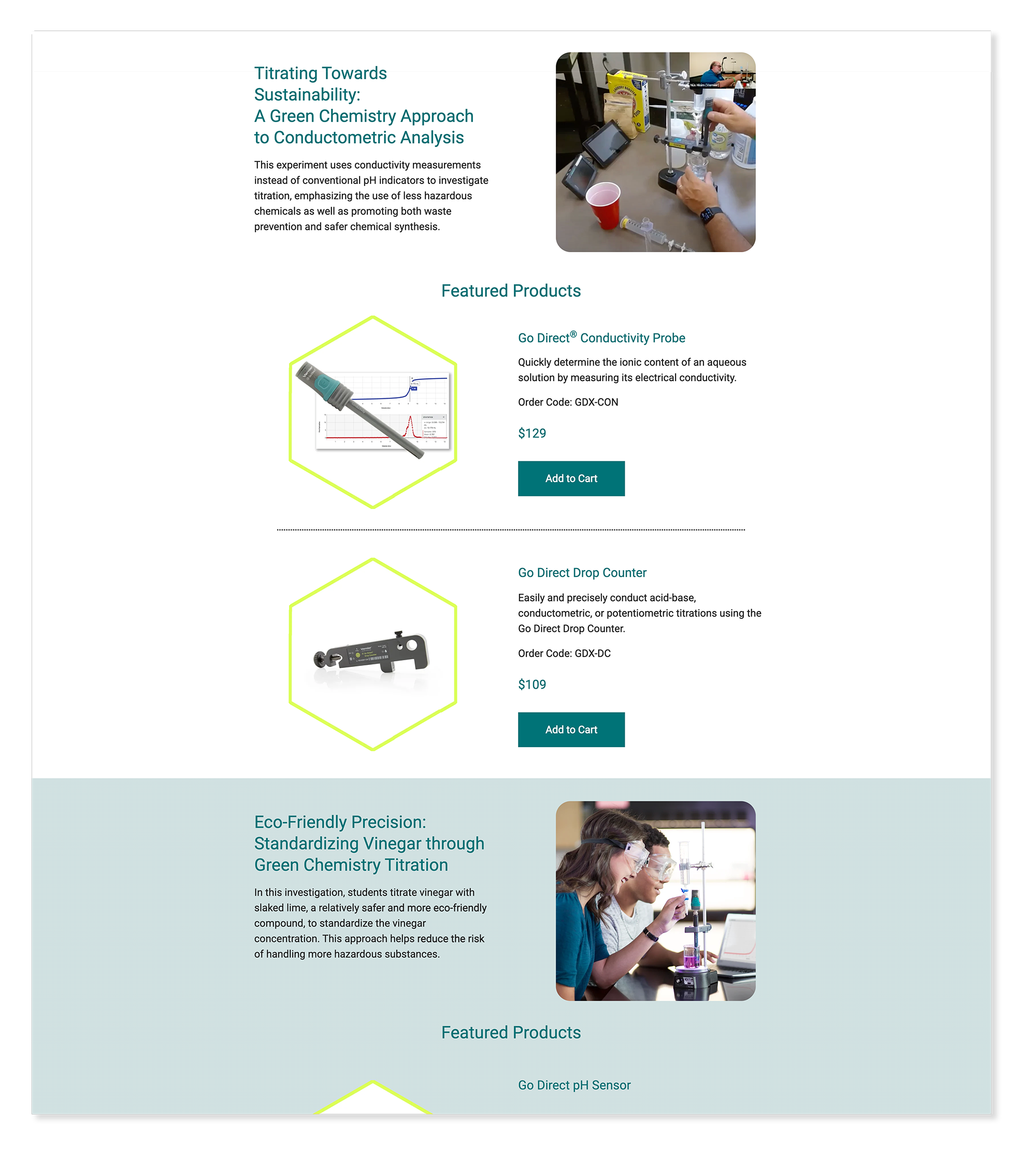
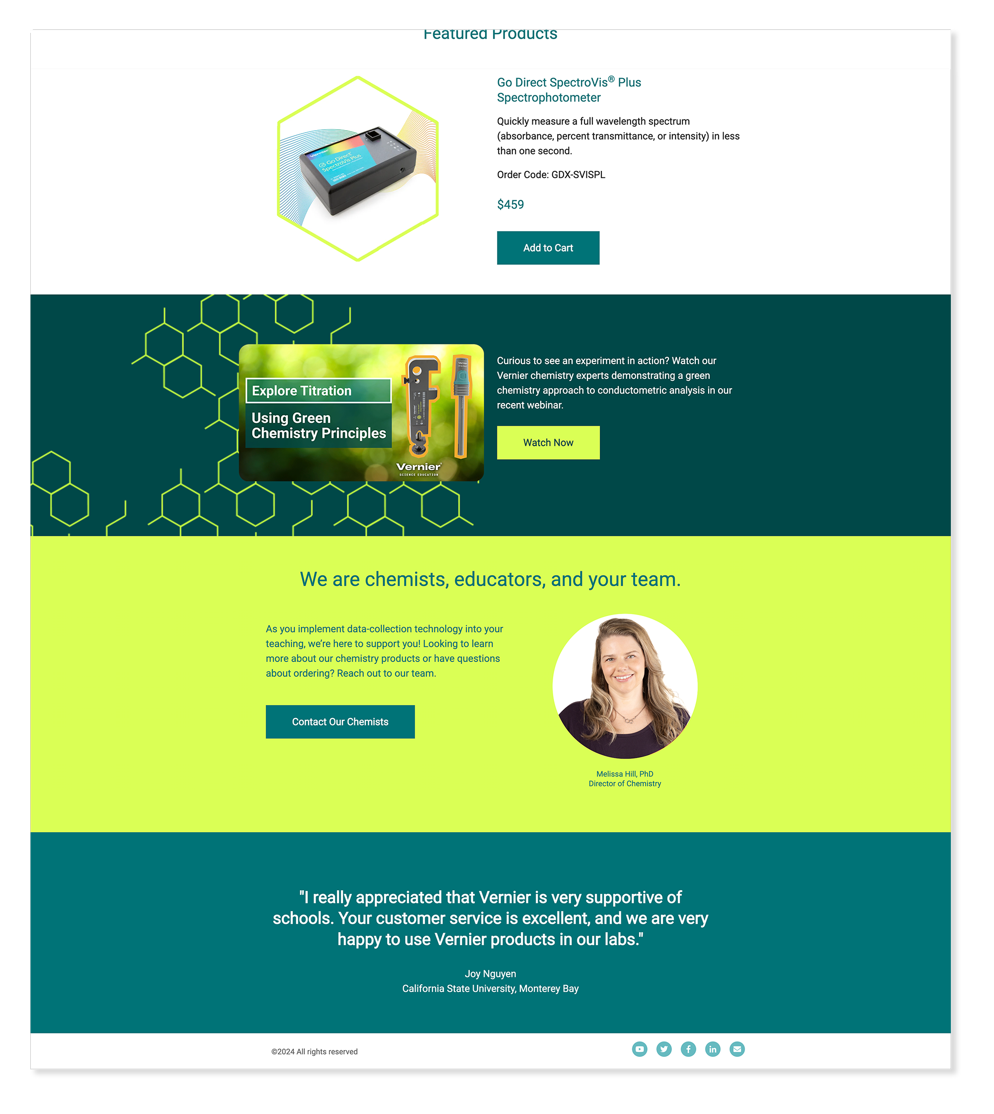
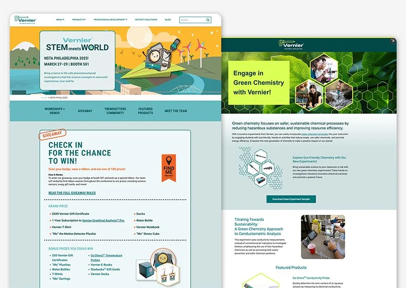
2025 Green Chemistry
HubSpotA campaign highlighting Vernier's commitment to sustainable science education. I leaned on restraint — a natural color palette of greens, chartreuse, teal, and neutral grays — letting the educational message set the tone. Built on a modular HubSpot grid so the marketing team could update content without redesigning the page.
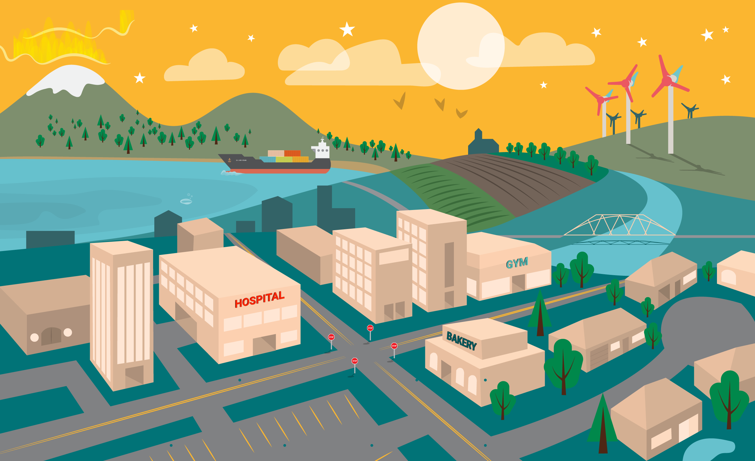
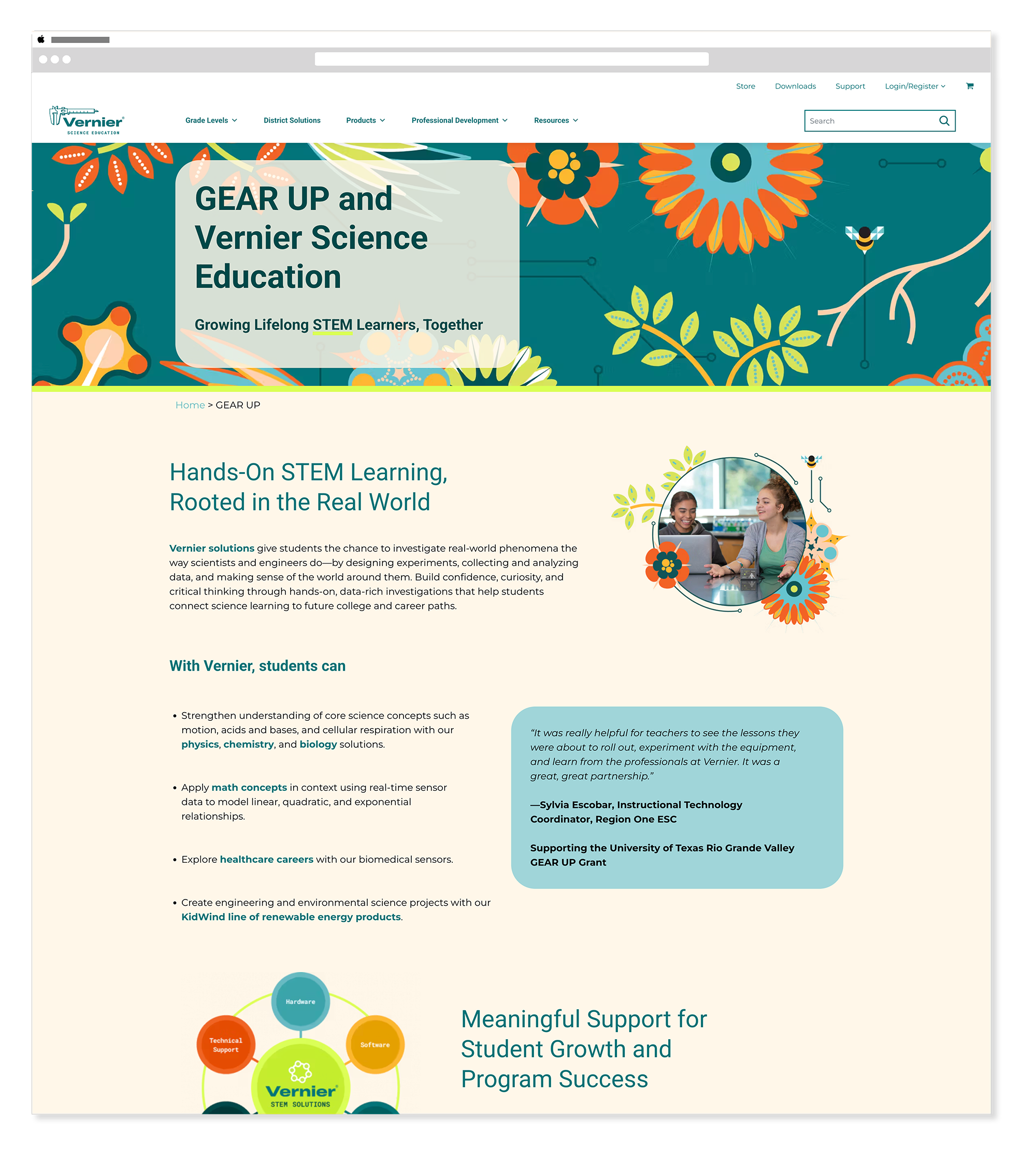
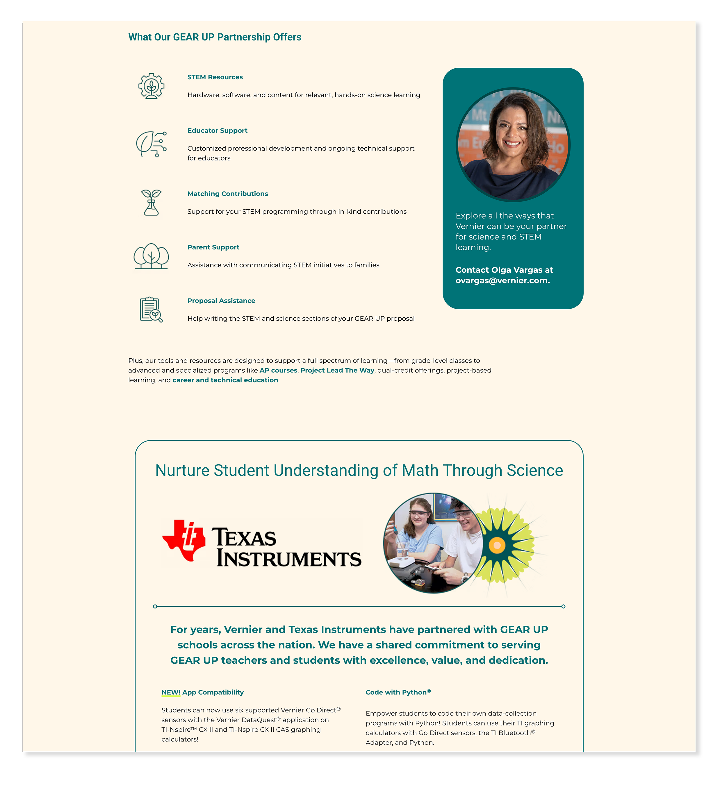
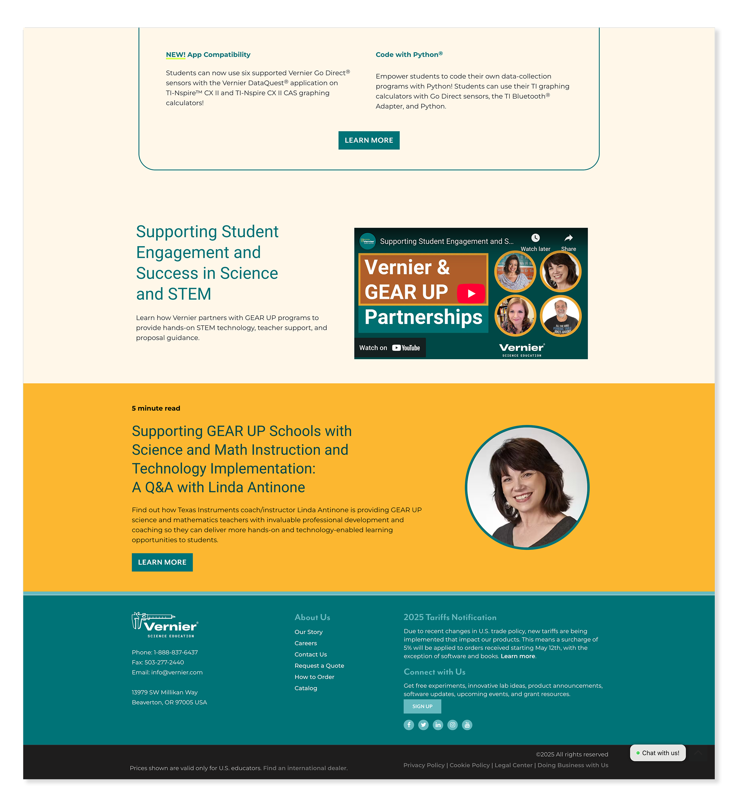
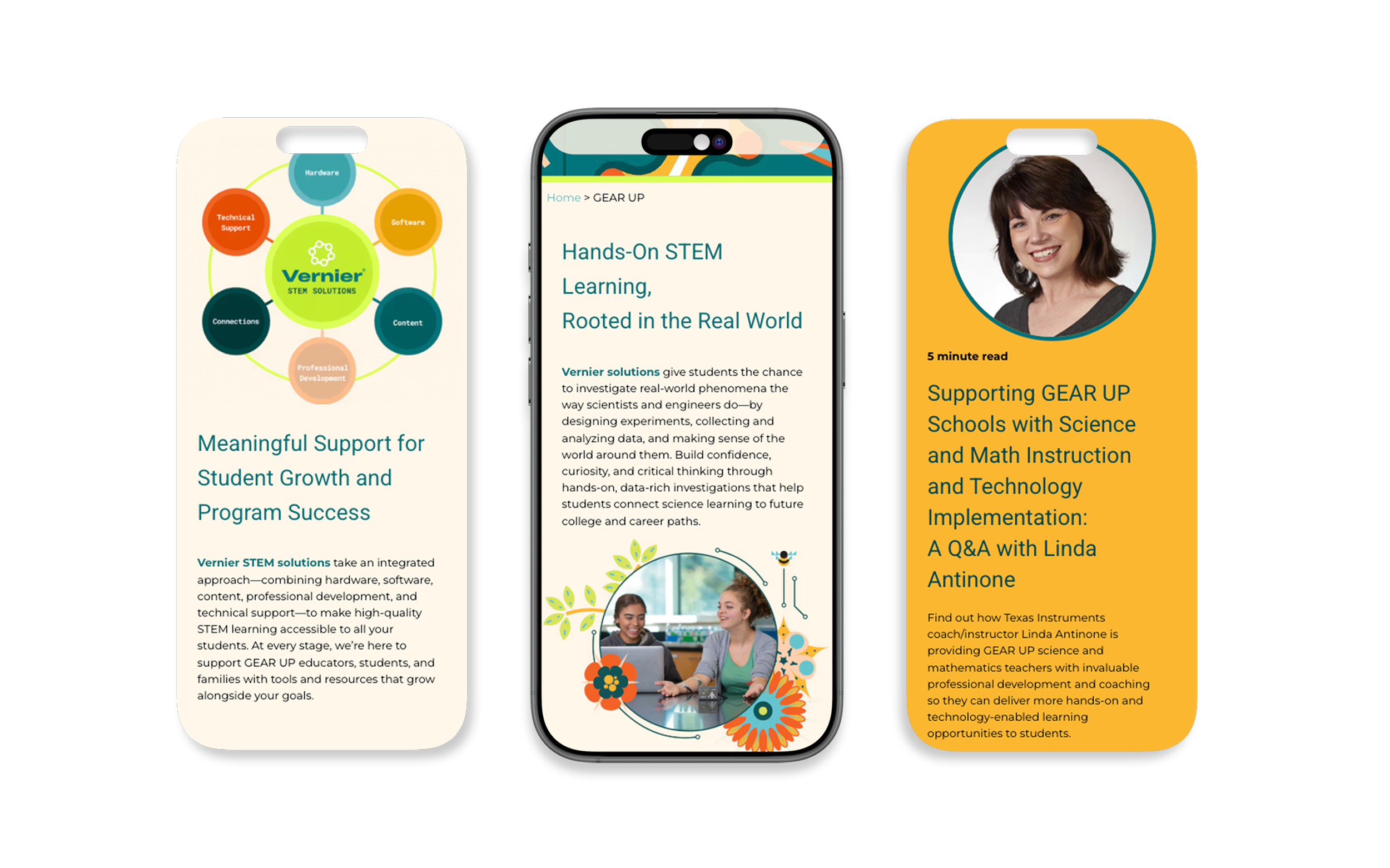
2025 GEARUP Conference
WordPressA landing page presenting Vernier as a trusted long-term partner in STEM education — not just a product vendor. I built on the conference's established event branding to create a digital experience that echoed the in-person presence. Responsive behavior was central: with much of the conference traffic coming from mobile, the layout had to translate cleanly across screen sizes.
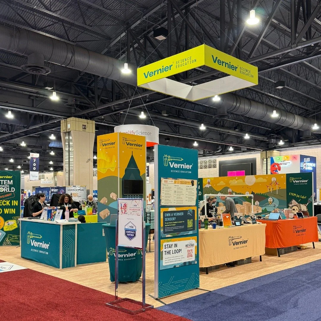
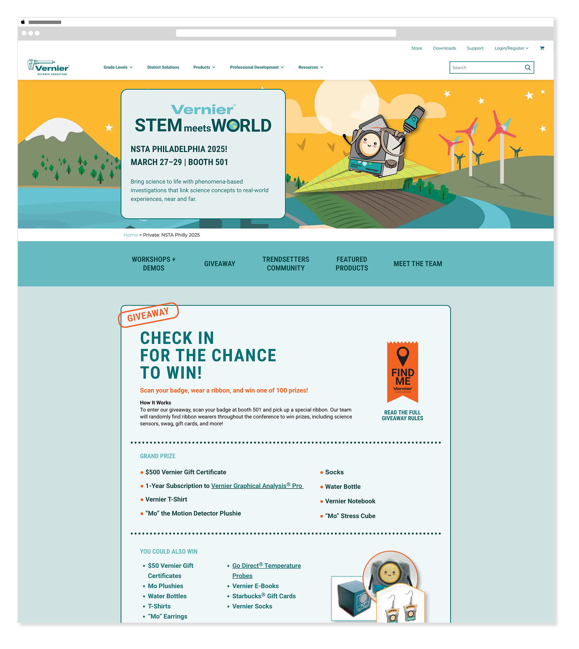
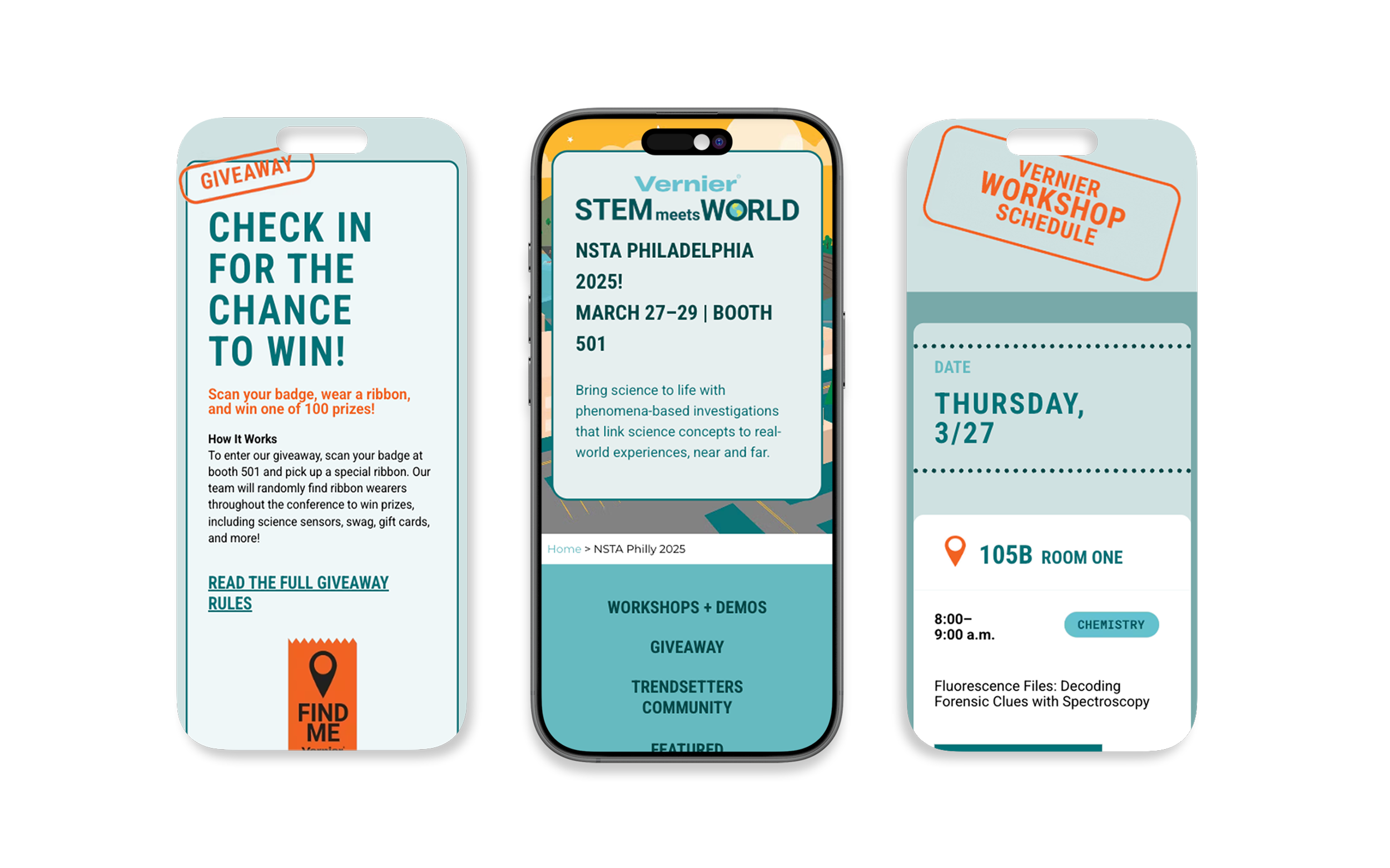
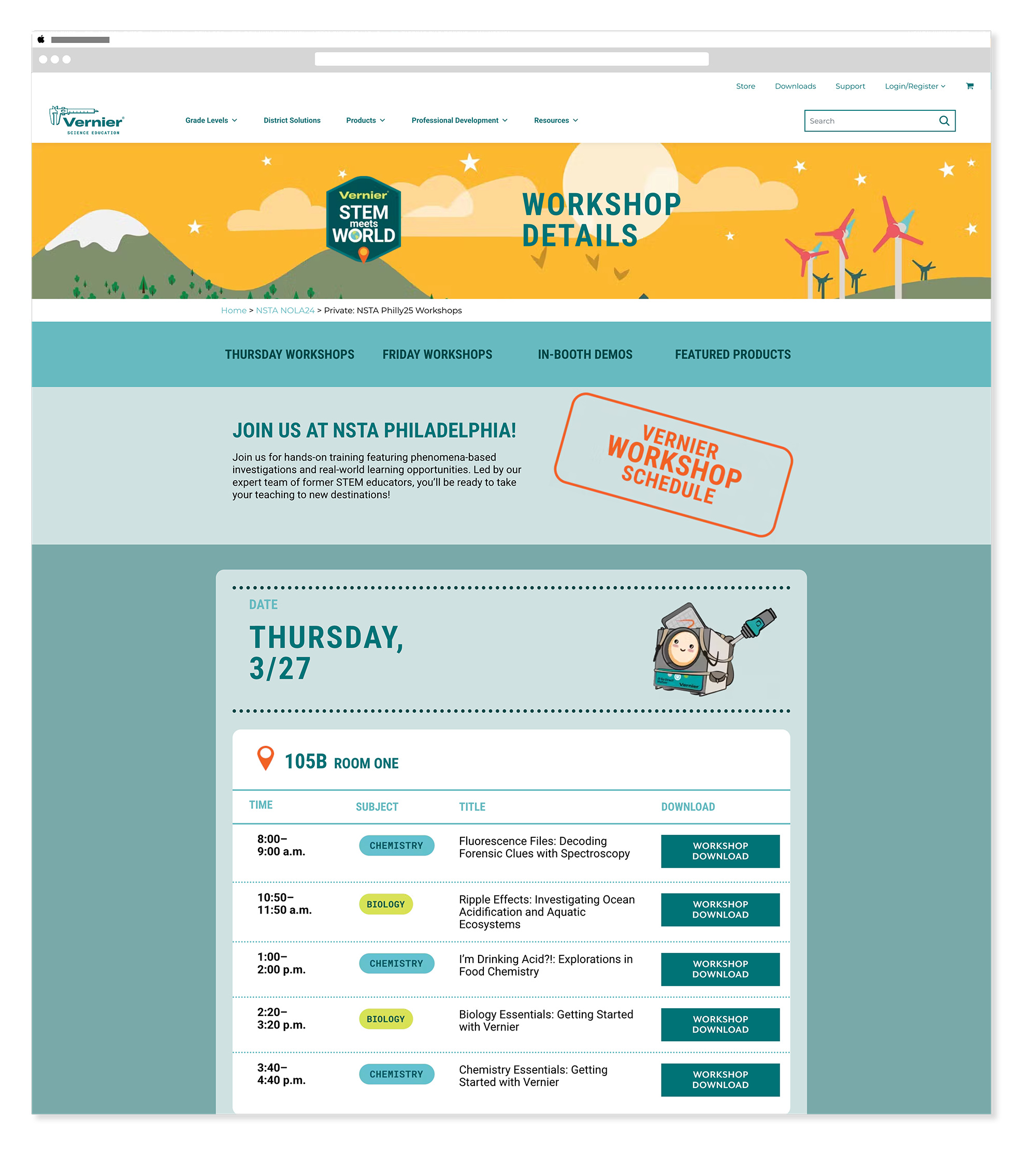
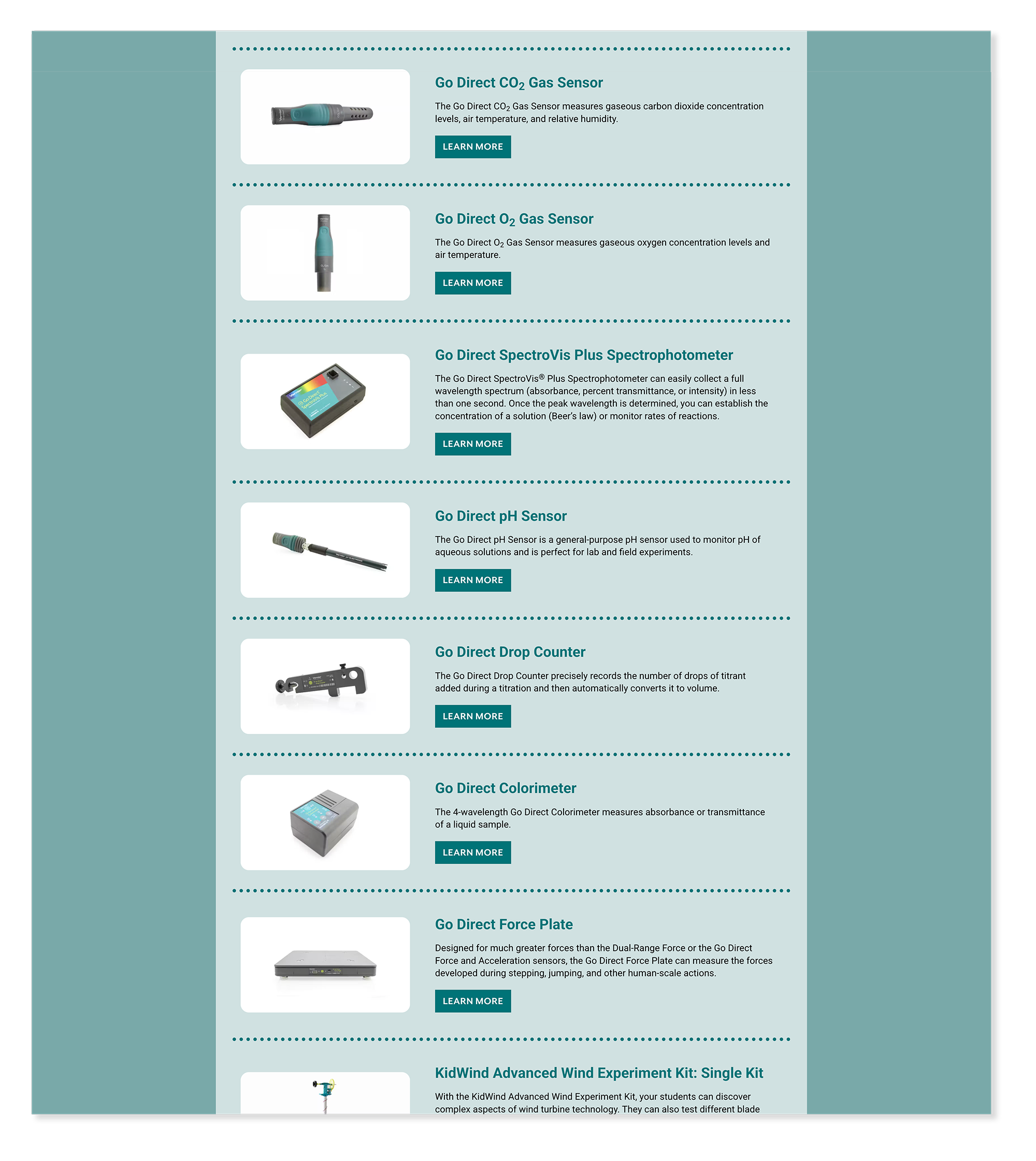
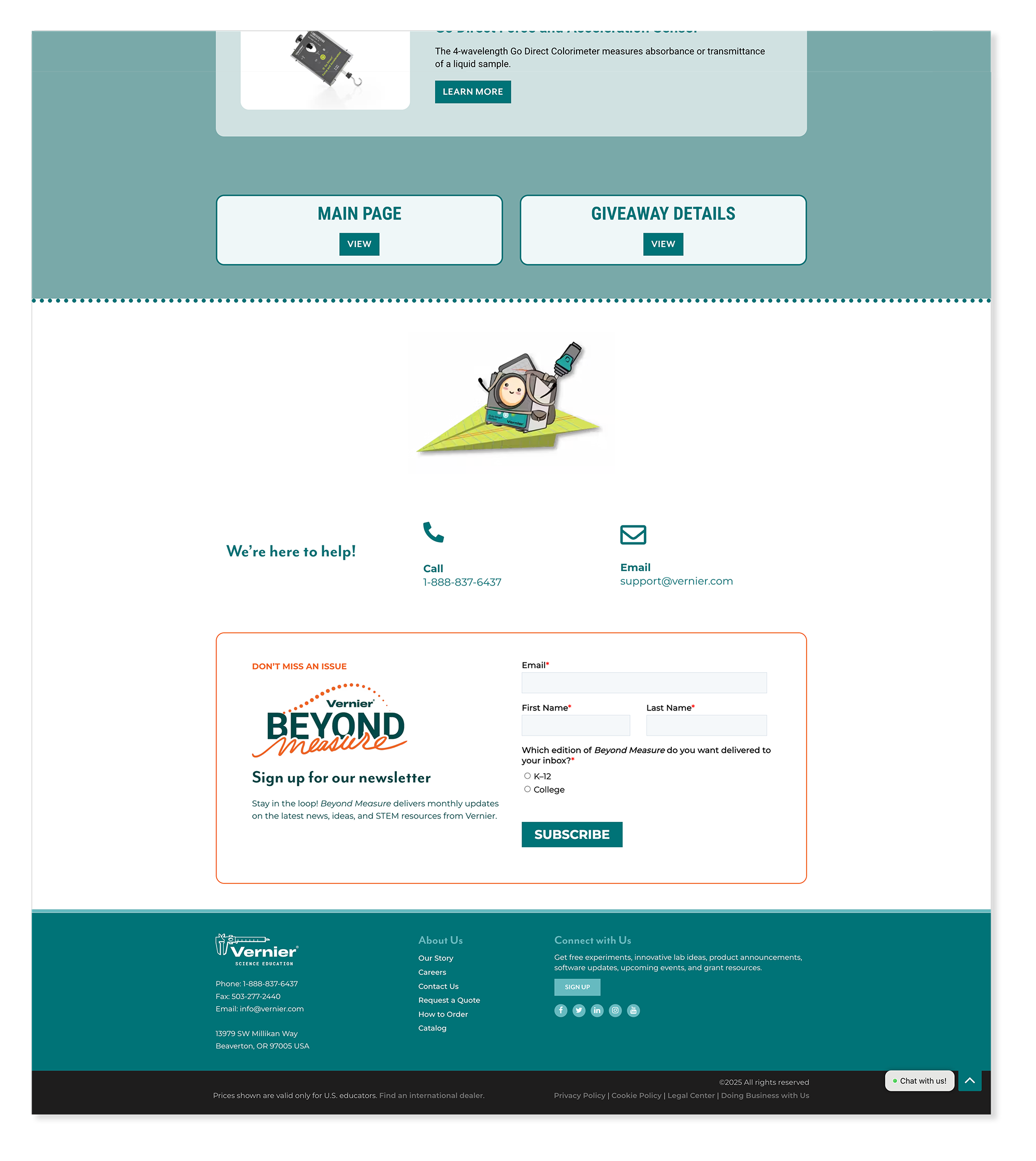
2025 NSTA Conference - Home/Landing Page
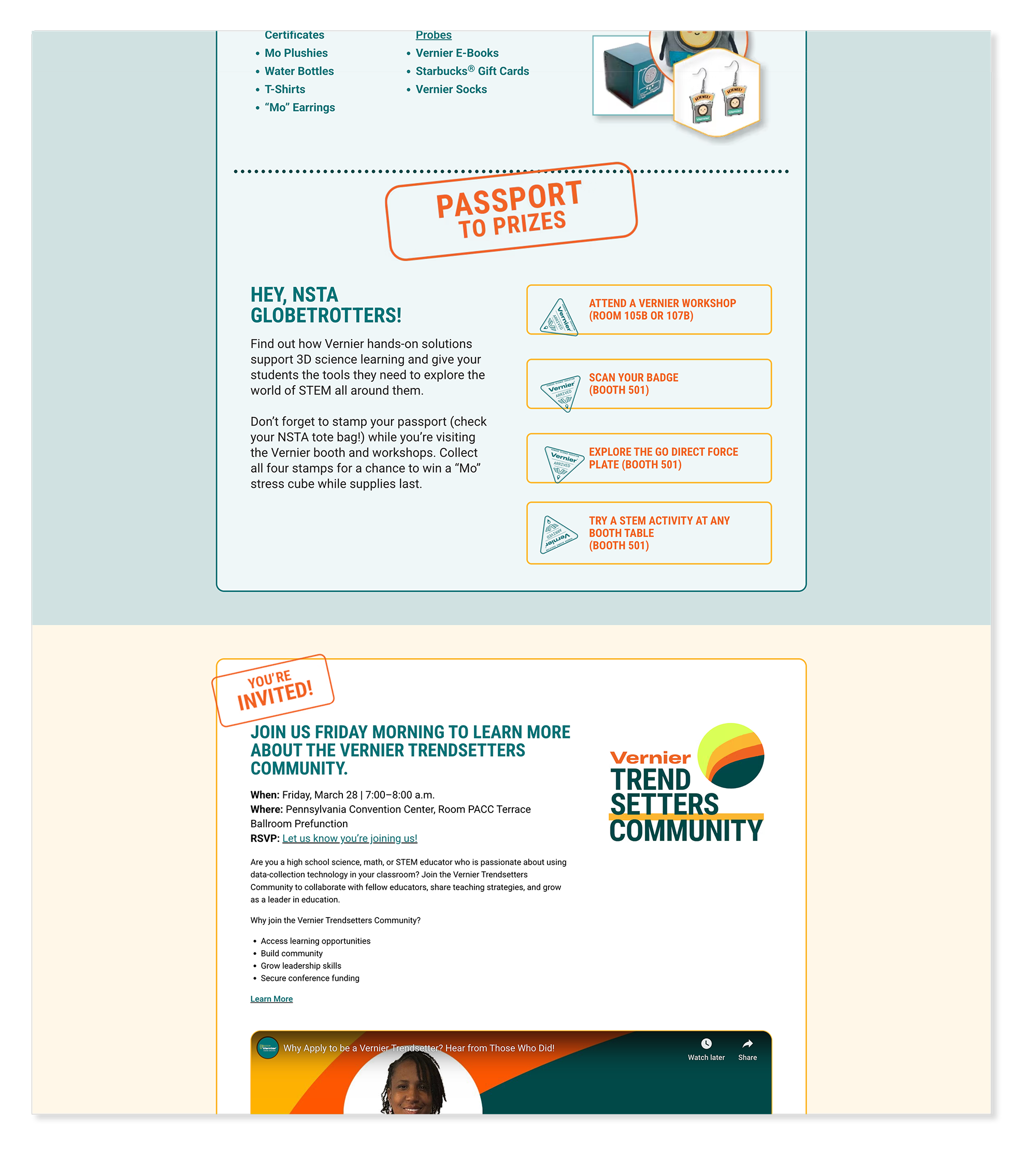
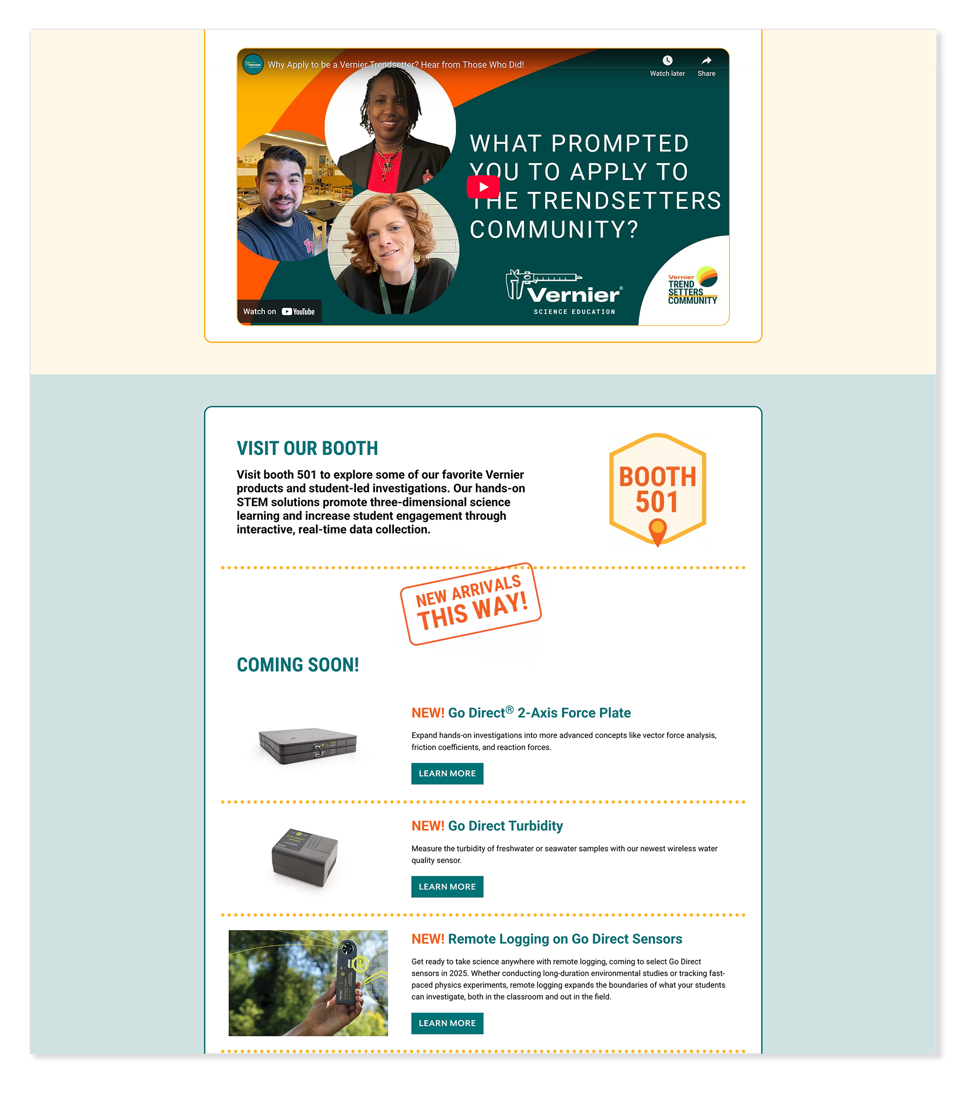
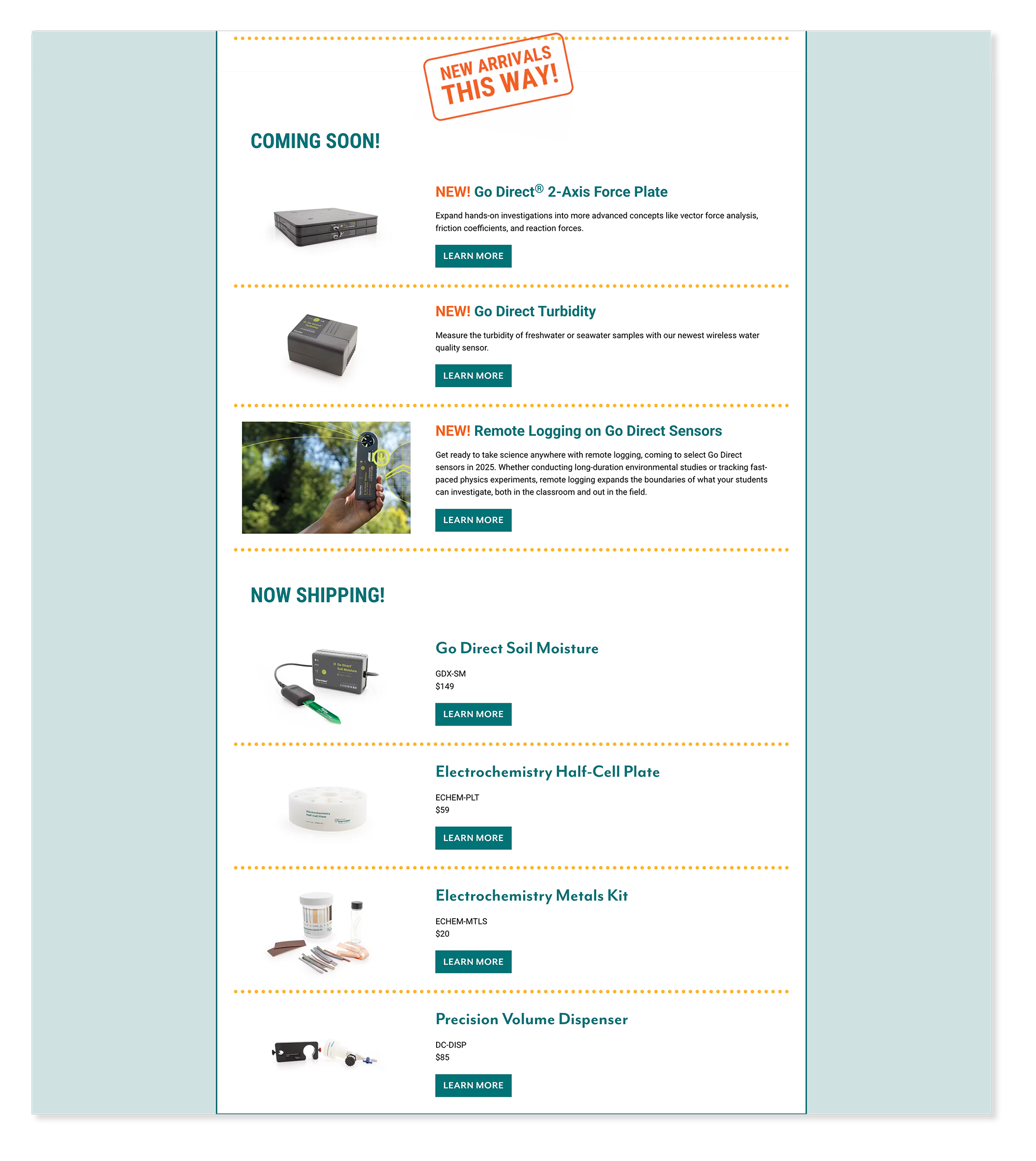
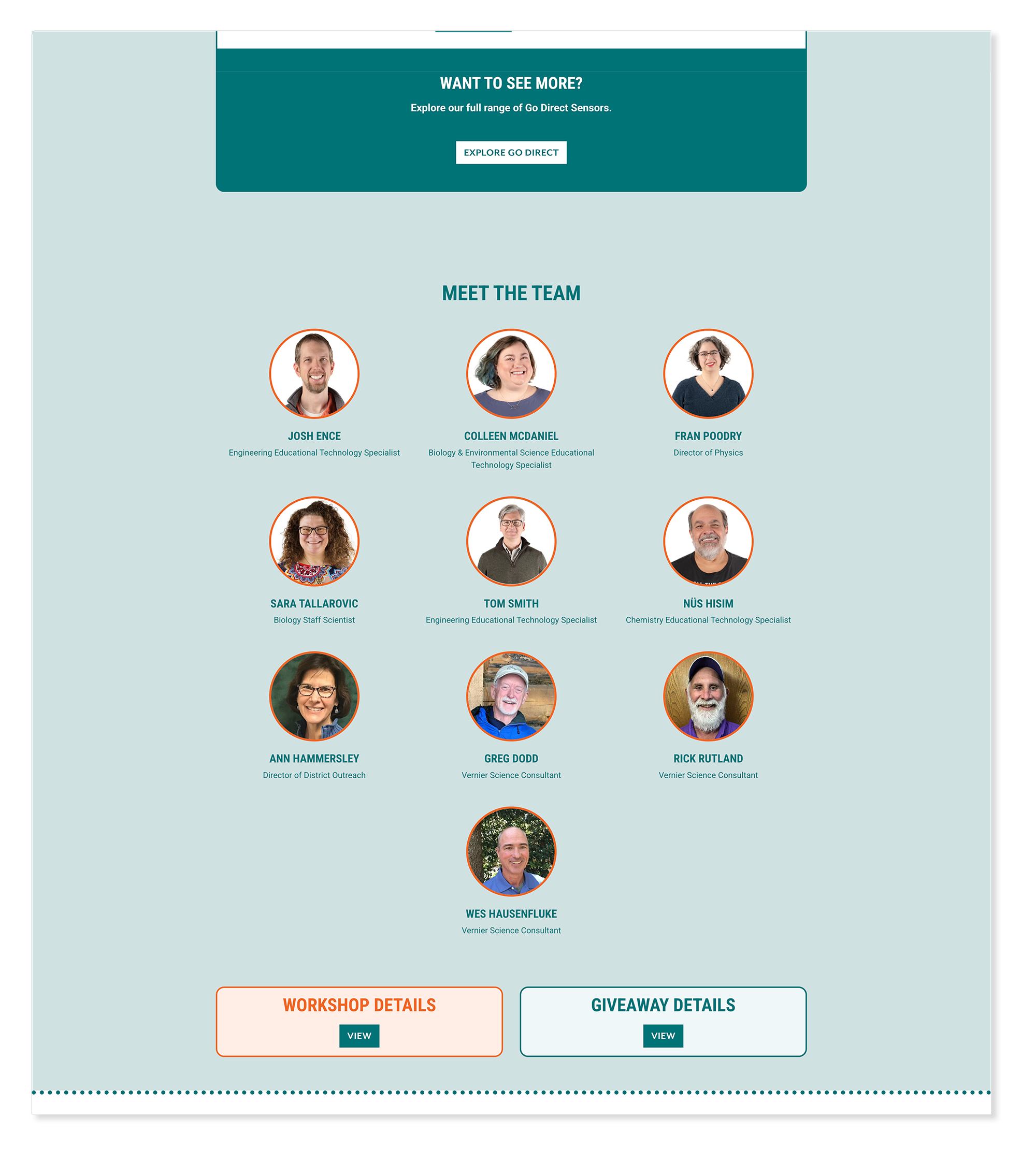
WordPress Multi-PageThe most complex build of the three — a multi-page event hub for the National Science Teaching Association conference. Three interconnected pages (main, workshops, giveaways) each played a specific role while forming a unified experience. I structured pages around a modular system so conference details could be updated without disrupting the overall layout as the event evolved.
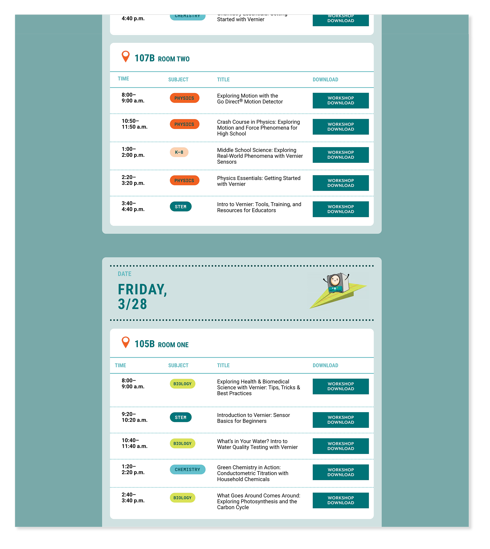
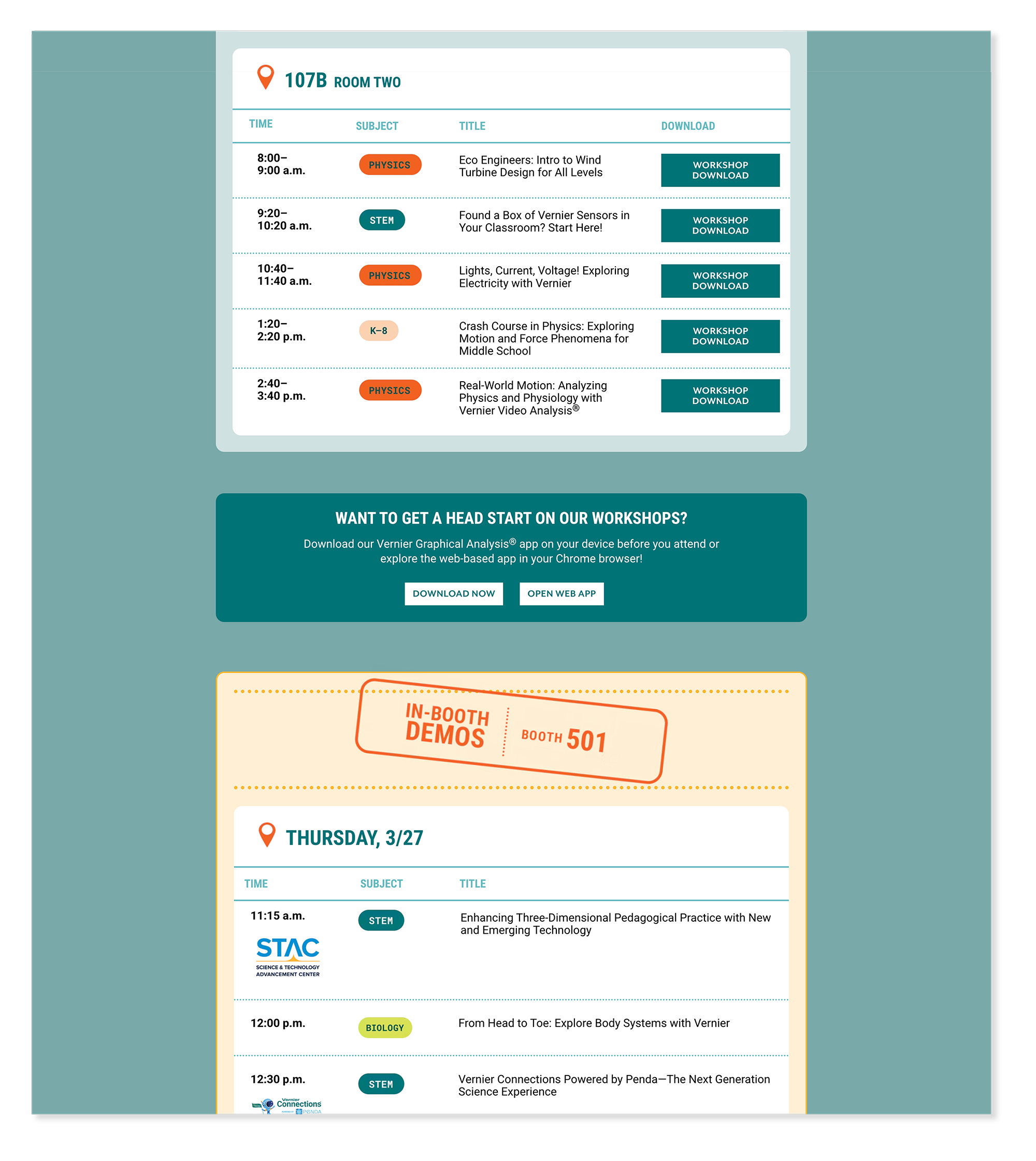
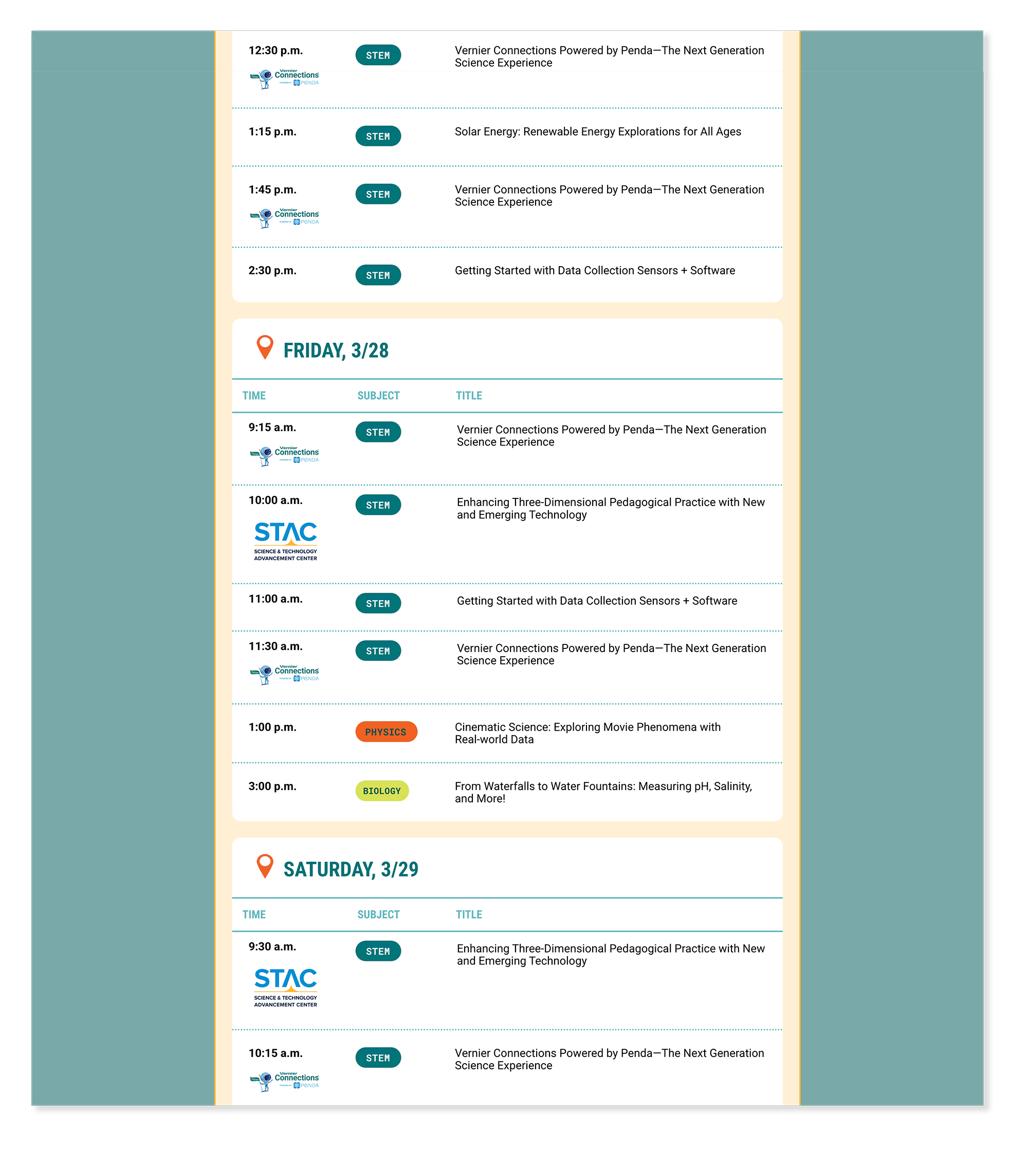
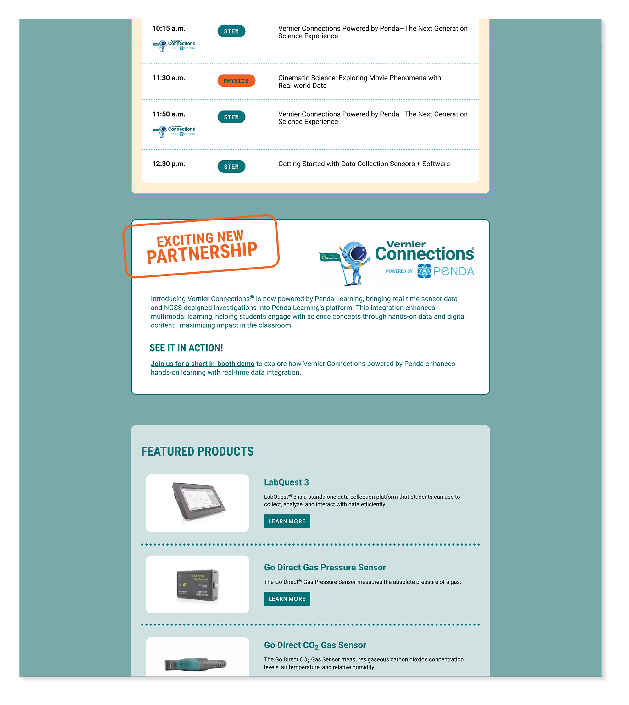
2025 NSTA Conference - Workshop Details Page
WordPress Multi-PageEducators attending NSTA came to learn — and the workshop details page gave them everything they needed to plan their sessions. Each workshop listing included presenter information, session times, room locations, and product connections, structured so educators could scan quickly and build their conference schedule around Vernier's offerings.
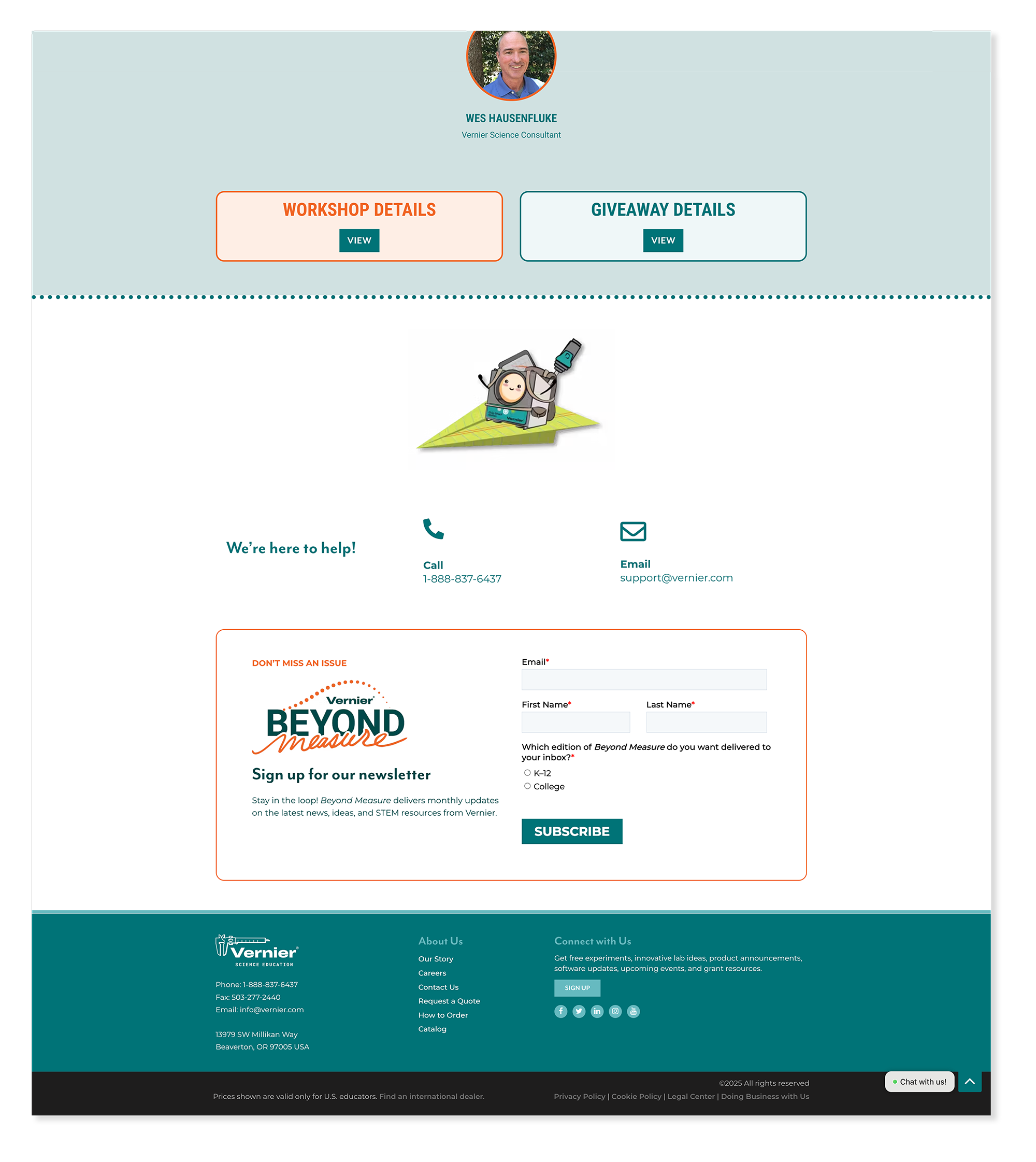
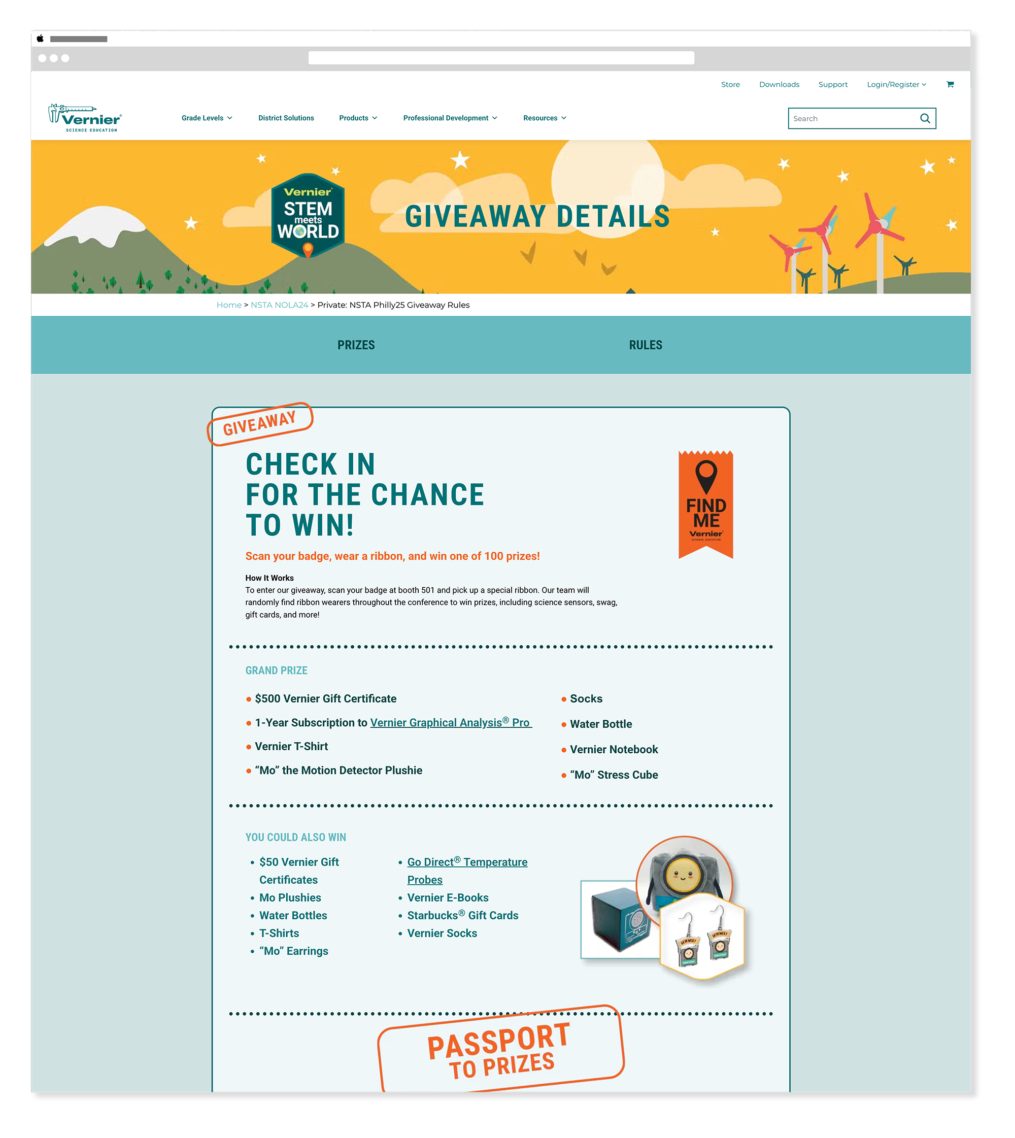
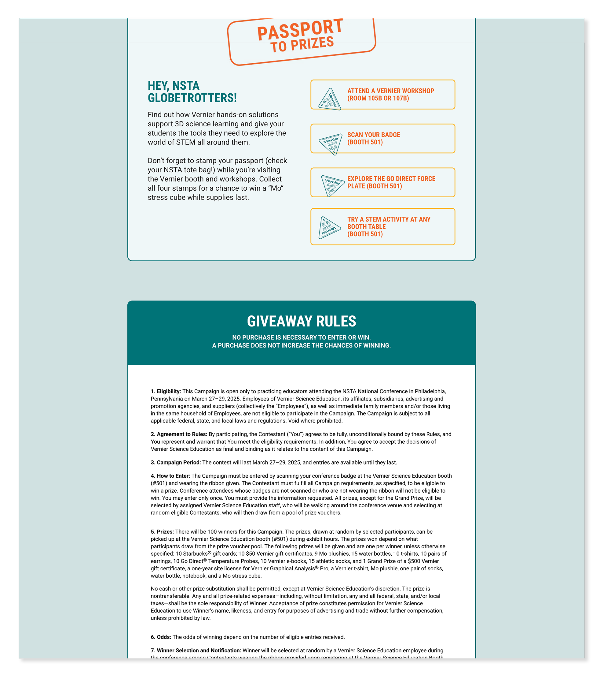
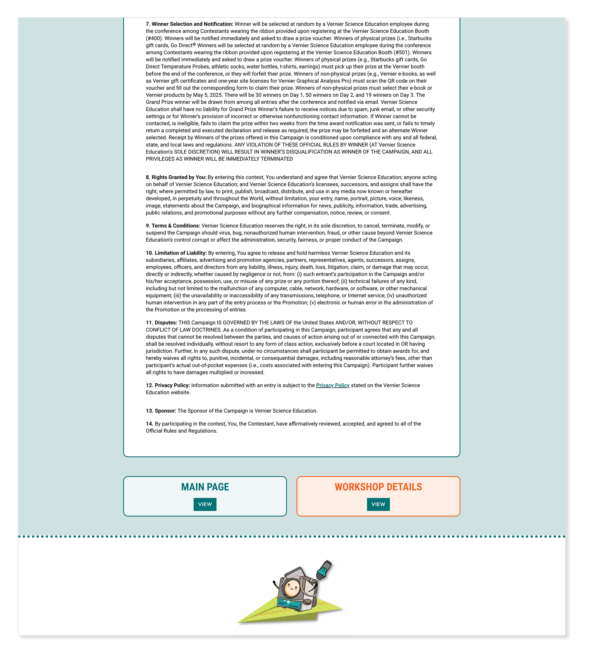
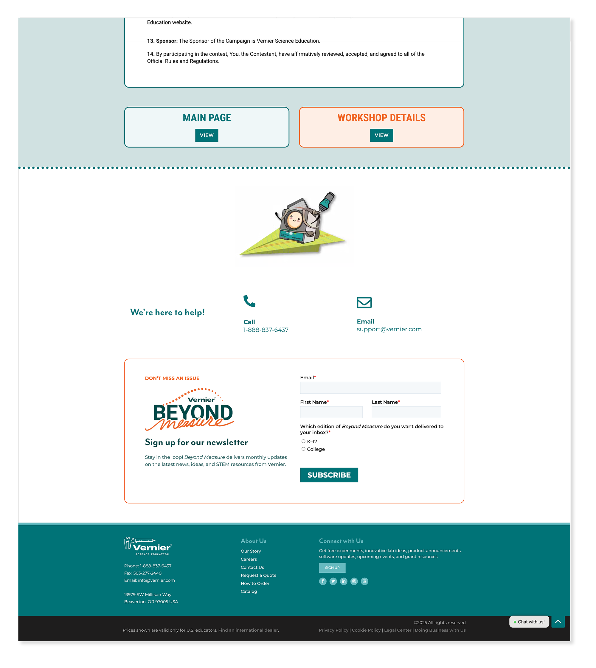
2025 NSTA Conference - Giveaway Details Page
WordPress Multi-PageThe giveaway page drove engagement throughout the conference — giving attendees a clear, simple path to entering and a reason to visit the booth. Entry mechanics, prize details, and rules were all presented clearly within the same visual system as the rest of the NSTA hub, keeping the experience cohesive from landing page to giveaway.
Outcomes
What this work delivered.
End-to-end — from creative direction through front-end build — across two platforms with different constraints and zero shared templates.
Became the primary designer for Vernier's web and email campaigns, shaping the digital presence through two major brand refreshes.
Built repeatable component systems in both WordPress and HubSpot — adaptable enough for the marketing team to maintain and reuse without design support.
Reflection
What this work taught me.
Working across these campaigns pushed me to design with constraints rather than around them. Moving between WordPress and HubSpot sharpened my instinct for building flexible systems — and close collaboration with the marketing team early on meant fewer course corrections later. The biggest shift was learning to see consistency not as a limitation, but as the thing that gave each campaign room to feel distinct.
The Vernier Collection
Explore More Vernier Work
Nine case studies covering six years of in-house design work. You're viewing 1 of 9.
Campaign Websites
View Case Study →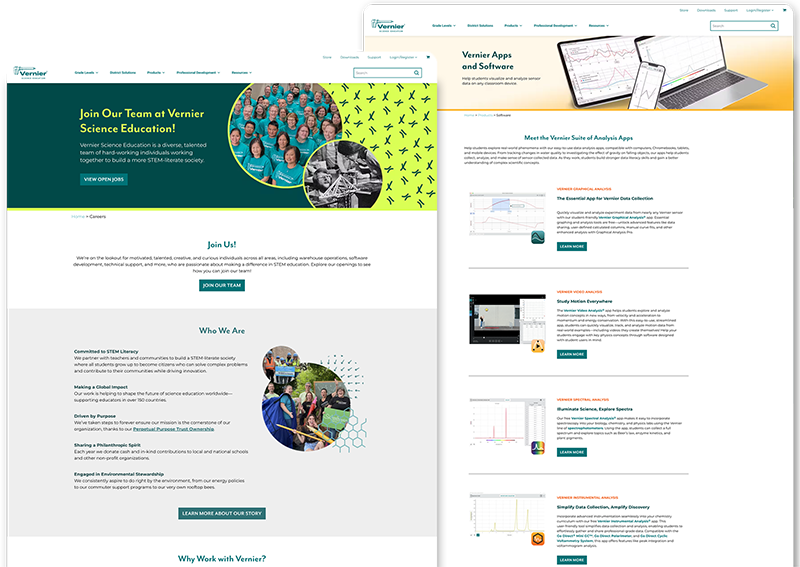
Internal Website Design
View Case Study →
Email Design & Digital Ads
View Case Study →
Digital & Social Media
View Case Study →
Print Brochures, Flyers & Packaging
View Case Study →
Print Catalogs, Books & Papers
View Case Study →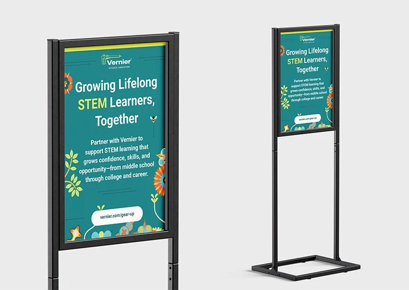
Conference Signage & Swag
View Case Study →
Seasonal Branding & Digital Art
View Case Study →