
Engaging Science, Digitally — Social Campaigns and Graphics that Connect with Educators and Students
Six years of digital design for Vernier Science Education — social graphics, campaign visuals, seasonal moments, animated assets, and a flexible social media system built to meet educators where they already spent their time.
Overview
Six years of digital design — built to meet educators where they already were.
Vernier's digital presence needed to work hard in a crowded space. Science education content competes for attention in the same social feeds as everything else — and educators decide in seconds whether something feels relevant or worth their time. My work focused on making science feel clear, approachable, and engaging across every digital touchpoint, from product launches and seasonal moments to campaign series and animated assets.
Over six years I designed social graphics, digital ads, campaign visuals, and a flexible social media system that supported Vernier's marketing team throughout the school year. Thoughtful typography, strong hierarchy, and consistent brand application helped simplify complex ideas and present them in a way that felt supportive rather than overwhelming — and every piece was built to perform at a glance.
The Problem
Science can feel overwhelming on a screen — and educators decide in seconds.
Vernier's products are sophisticated and technically rich — exactly the kind of content that can easily overwhelm rather than invite. In a social feed, there's no room for complexity. A graphic either earns attention immediately or it doesn't. The challenge was translating Vernier's science education mission into digital content that felt energetic and relevant without losing clarity or credibility.
Key Decisions
What I decided, and why.
Clarity and structure first — energy second
Every digital piece started with hierarchy. Strong typographic structure, readable spacing, and a clear focal point ensured the core message landed before anything else. Color, motion, and visual energy were layered in after the foundation was solid — not used to compensate for a weak layout. This approach kept the work feeling purposeful rather than busy, even on the most visually ambitious pieces.
Build flexible systems, not just individual assets
Rather than designing each graphic in isolation, I looked for opportunities to build scalable systems — series that could flex across color variations, templates that could be updated without starting from scratch, and visual frameworks that maintained consistency while allowing creativity. The 4th of July element series and the social media cover system are both examples of this thinking applied in practice.
Align early, execute confidently, support the launch
Before opening a design file, I reviewed briefs, asked questions, and confirmed goals with marketing and product partners. This upfront alignment meant fewer surprises in production and cleaner handoffs to external vendors. After launch I stayed closely involved — responding to last minute requests, resolving formatting issues, and ensuring the work translated correctly across platforms and screen sizes.

The Work
Six years of digital — built to perform at a glance.
From evergreen campaign graphics to seasonal moments, animated assets, and a full social media system — every piece was designed to deliver Vernier's message clearly and consistently across platforms and audiences.
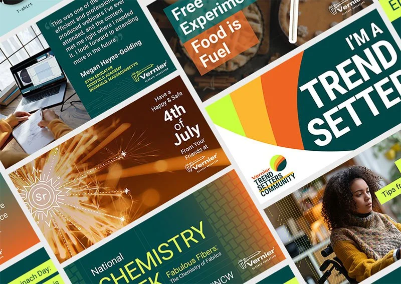
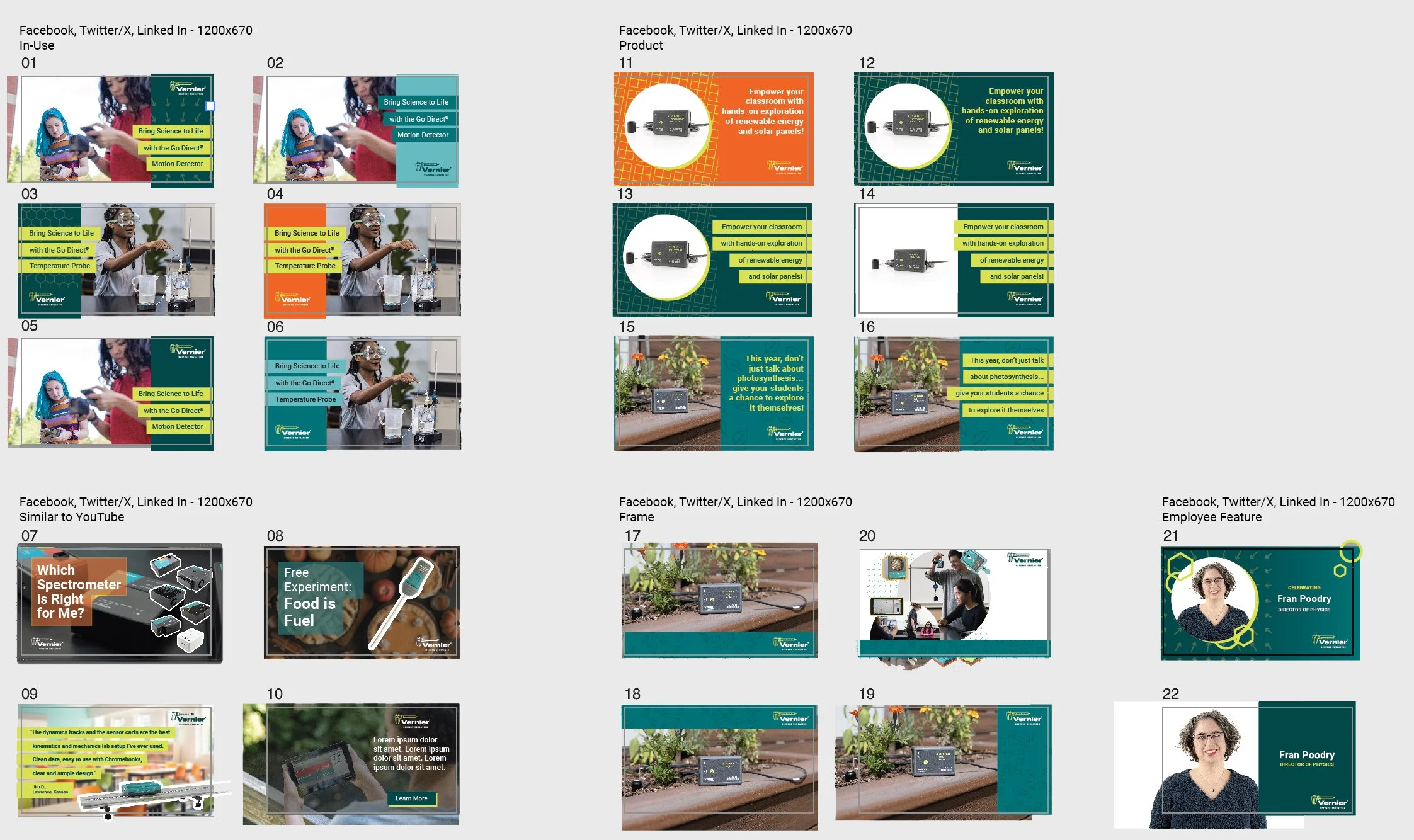
Evergreen & Campaign Graphics
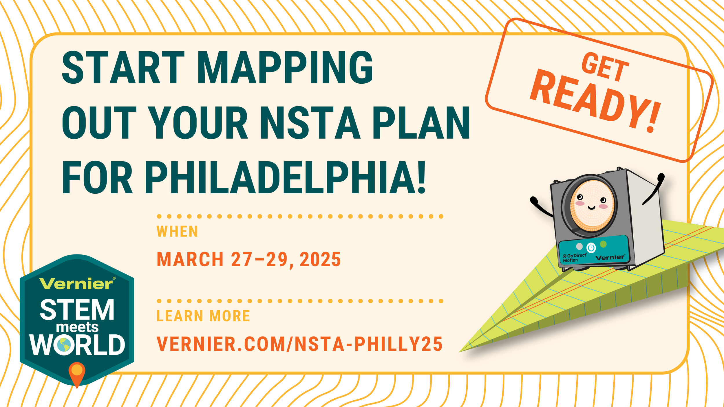
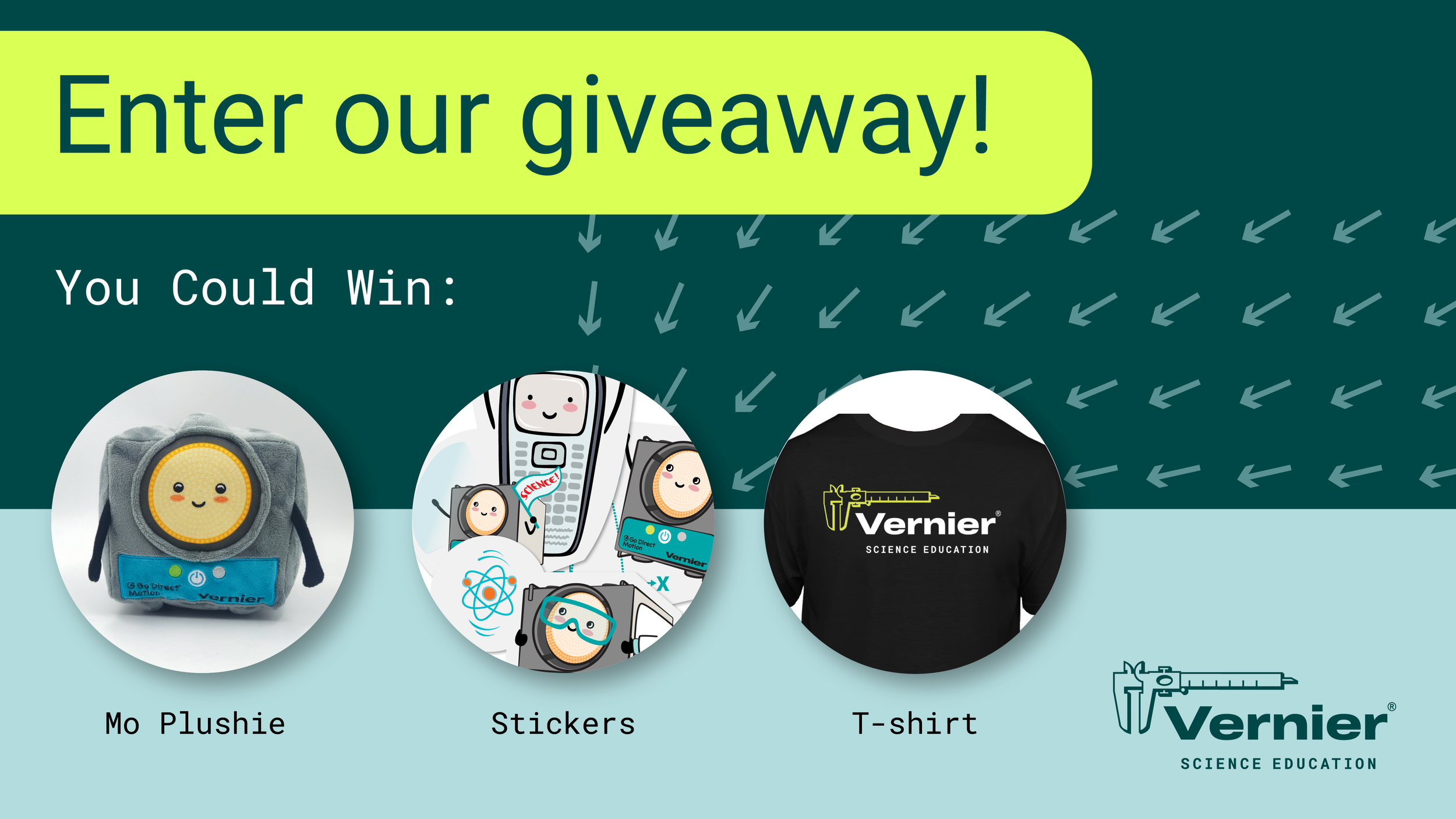
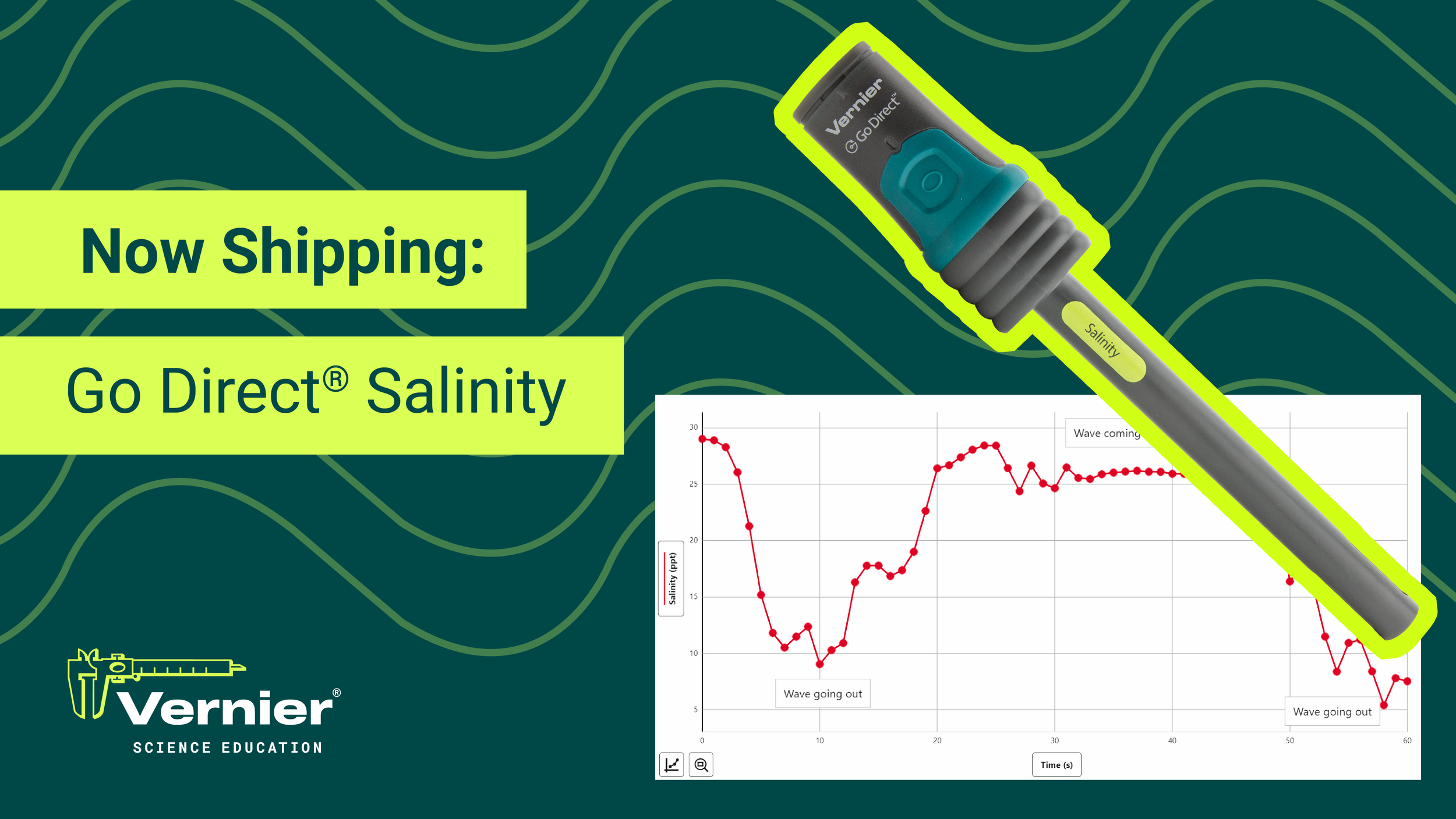
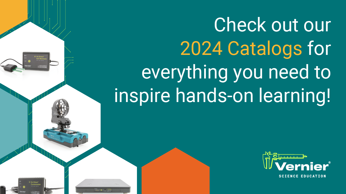
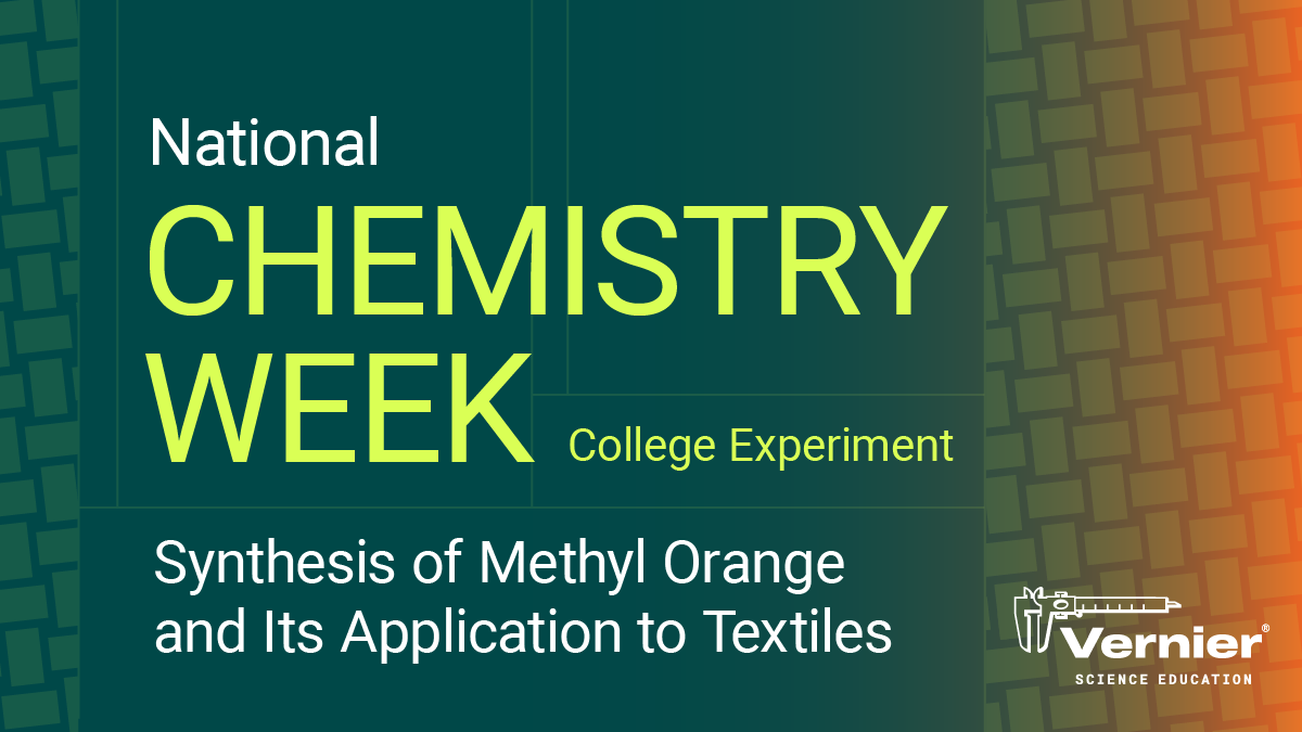
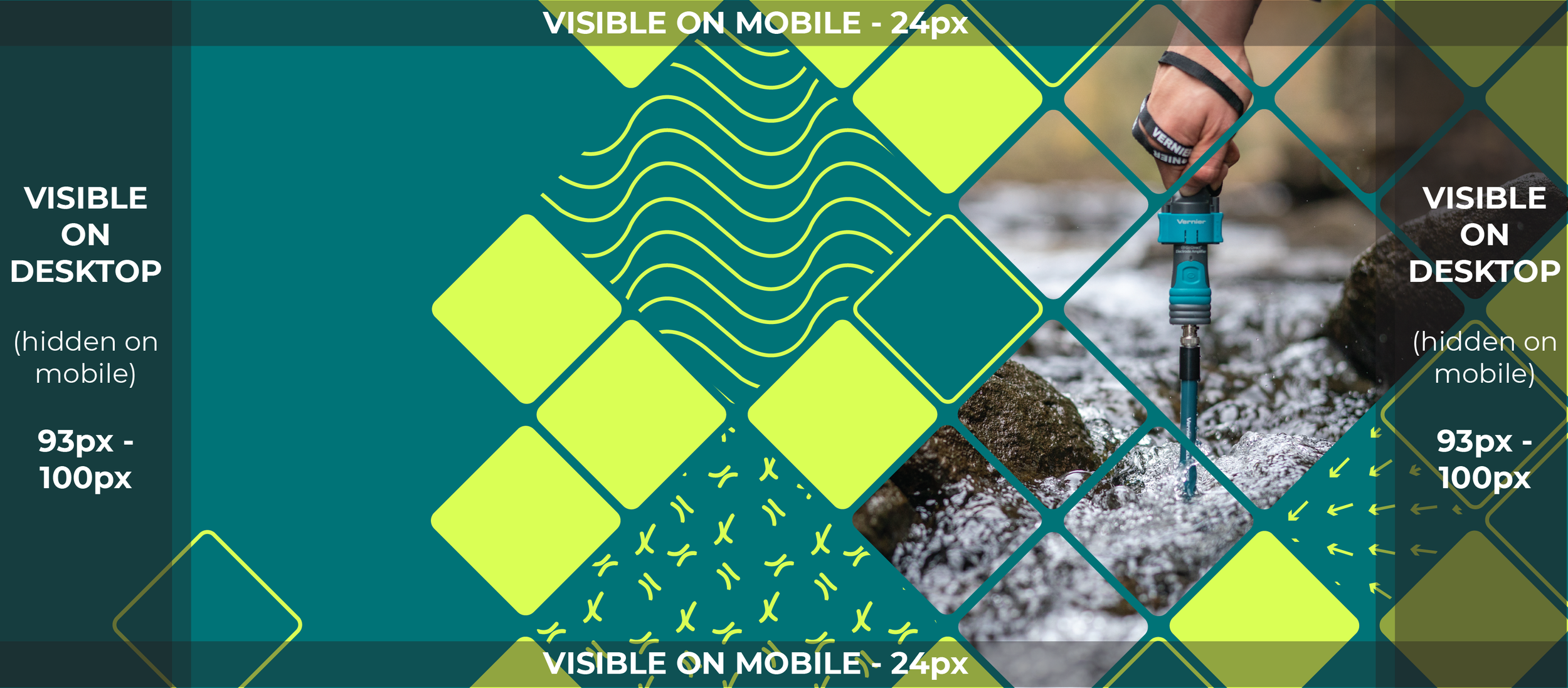
Facebook Twitter LinkedInThese graphics supported Vernier's core marketing moments throughout the school year — NSTA conference promotions, AP exam prep, product launches, end of year campaigns, and catalog announcements. Each piece was built to deliver its message at a glance while staying firmly within Vernier's brand system.

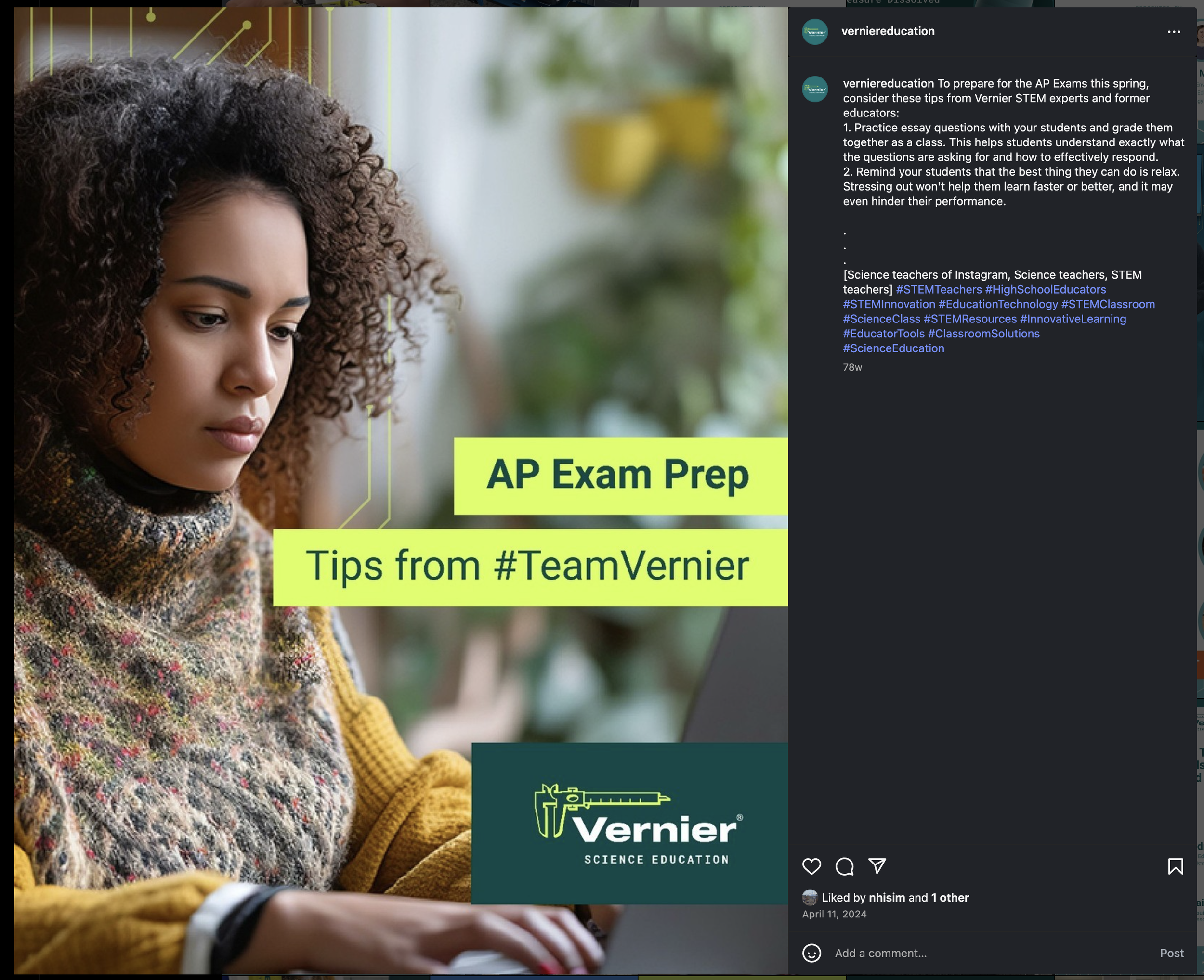
The AP Exam Prep graphic shown in context on Facebook — demonstrating how the design performed in a real social feed alongside other content.
4th of July — Element Series
Campaign Series Scientifically AccurateThis series was designed to celebrate the 4th of July in a way that felt instantly festive while staying rooted in Vernier's science-forward voice. Each color variation corresponds to a real elemental reaction responsible for firework colors — Strontium for red, Barium for green, Potassium for violet, Sodium for yellow, and Copper for blue. The concept worked as both a celebration and a quiet science lesson. The series was designed as a flexible system and typically deployed as the Strontium variation, though the full series demonstrates the scalability of the concept. It was later refreshed to align with the 2022 brand update.


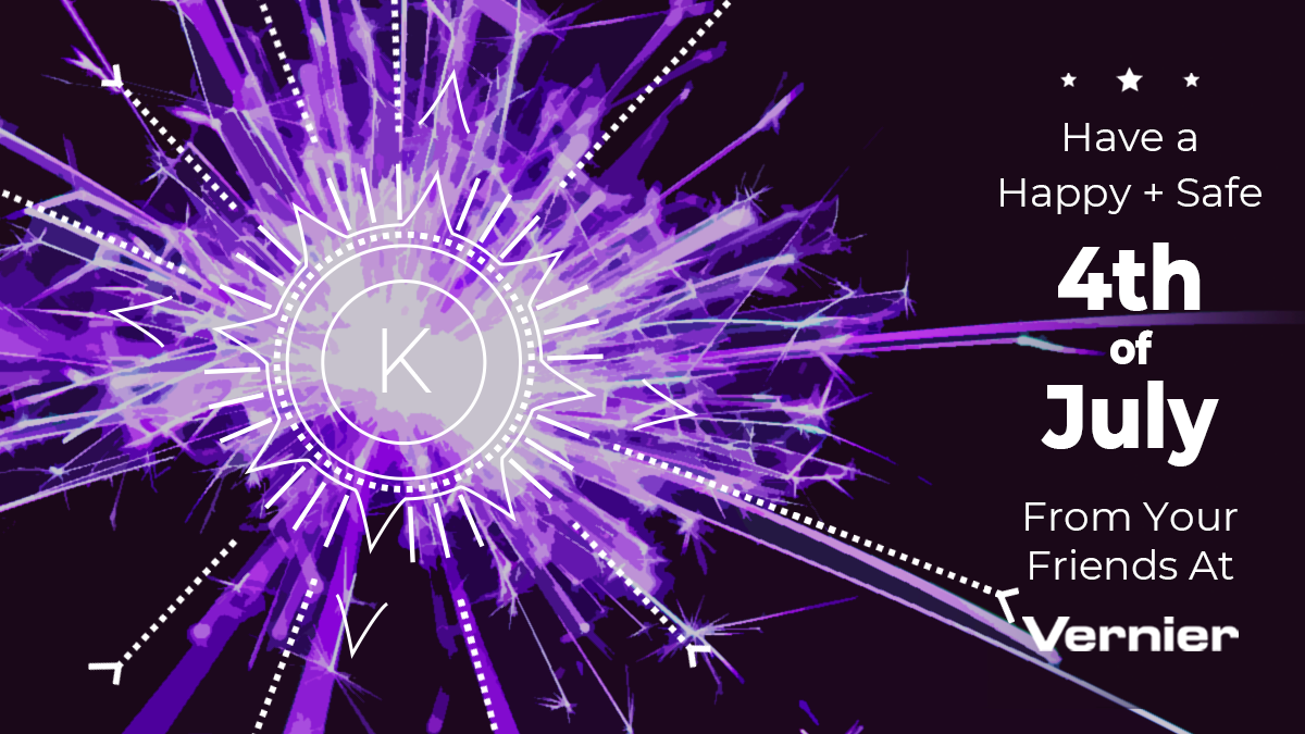

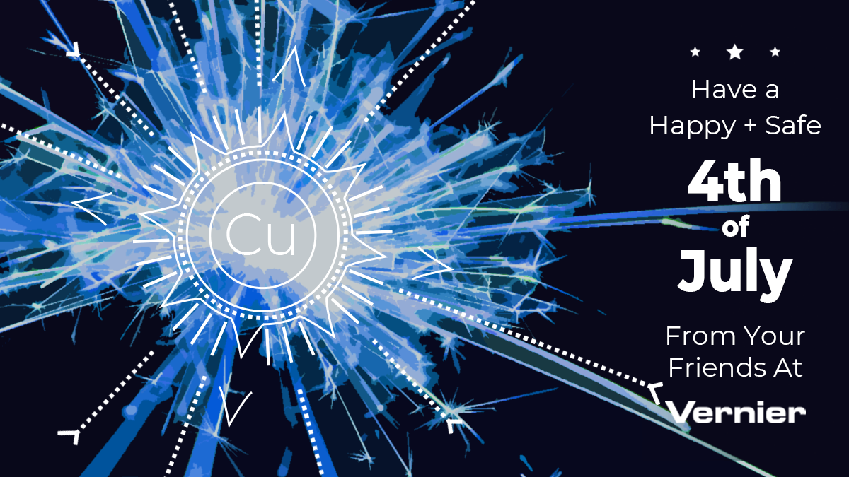

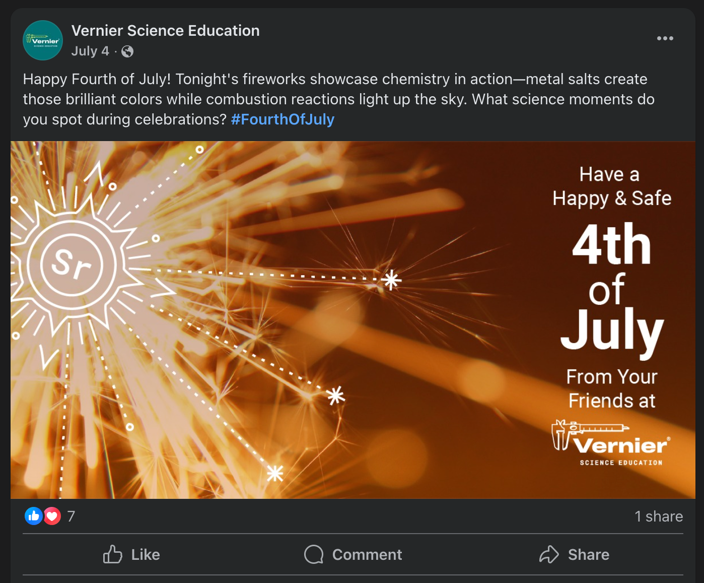
The 4th of July Strontium graphic shown in context on Facebook — demonstrating how the series performed in a real social feed.
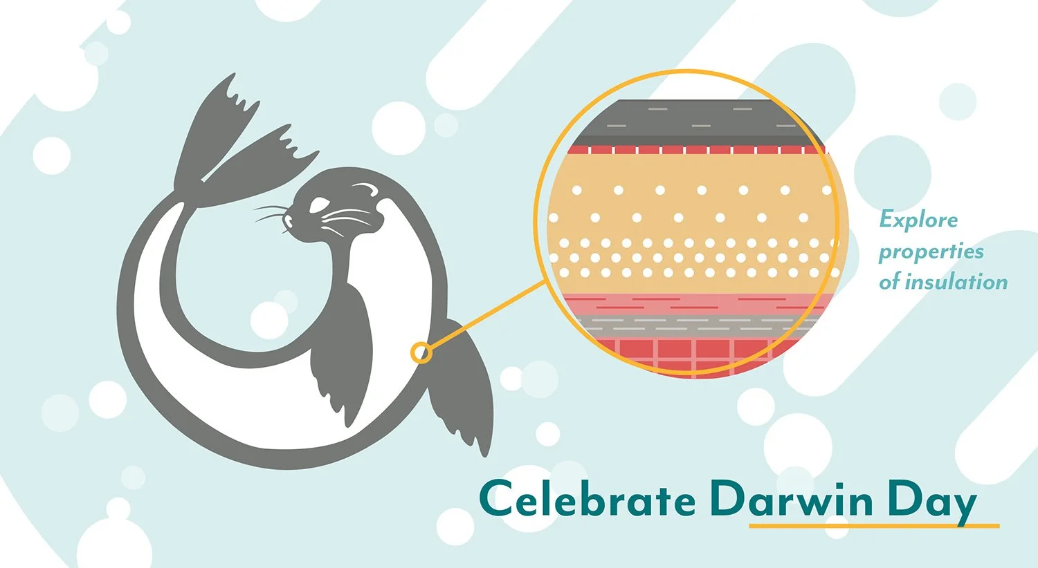
Seasonal & Moment Graphics
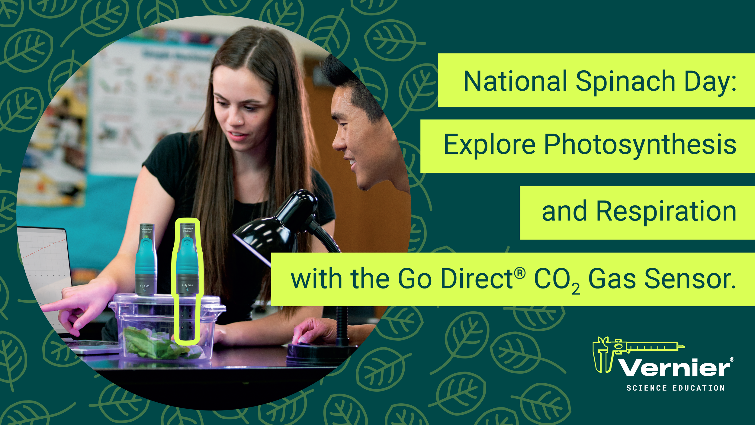
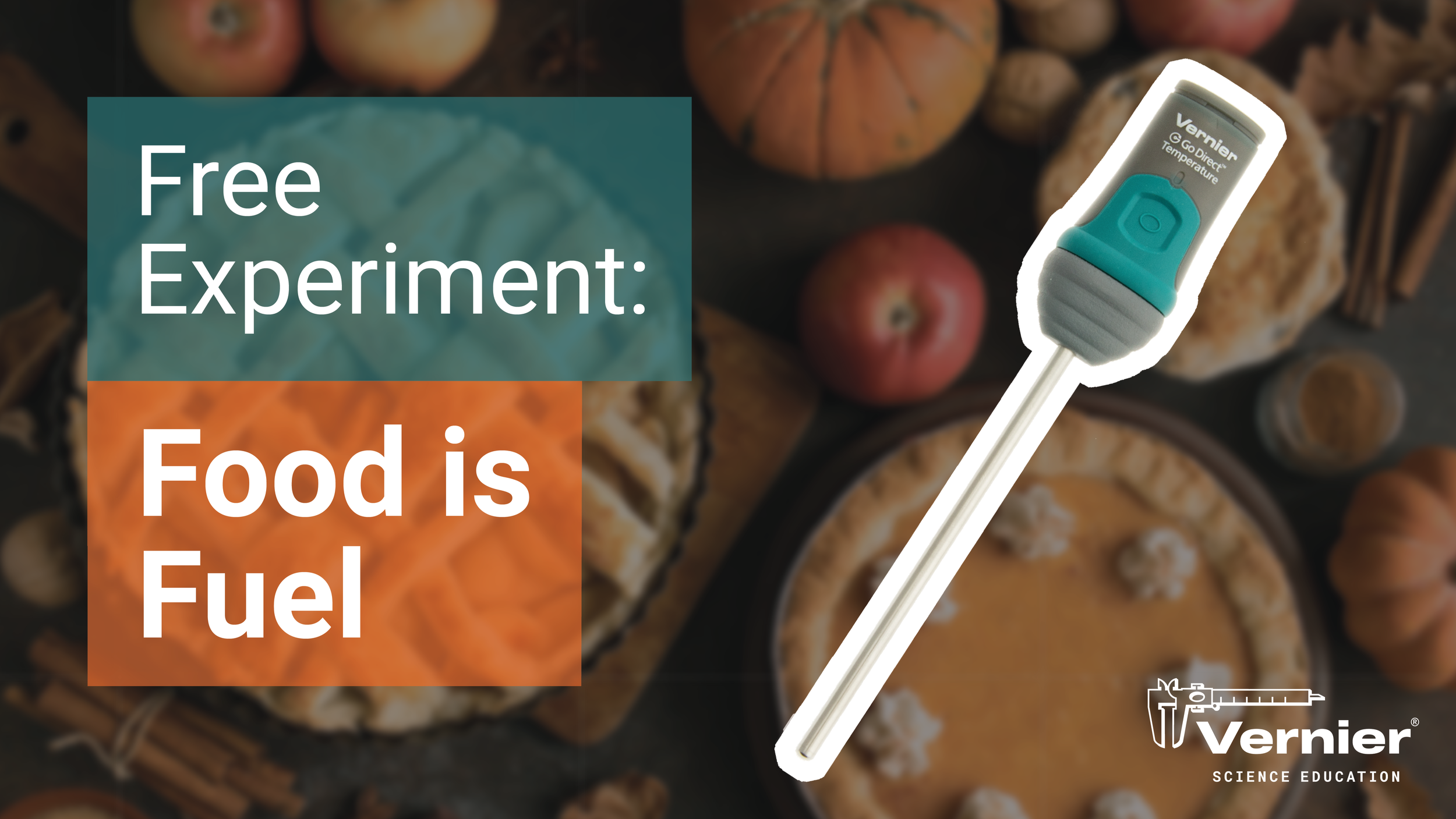
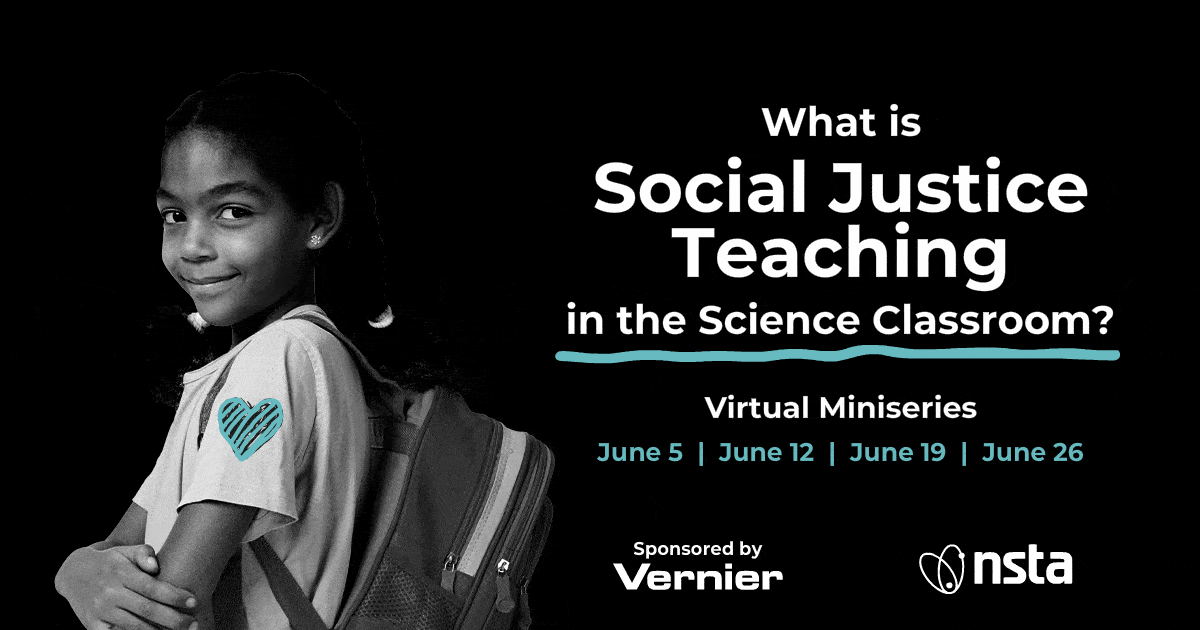
Science Holidays Awareness DaysScience has its own calendar of moments — Darwin Day, National Spinach Day, Food is Fuel, Chemistry Week, Social Justice awareness days — and Vernier showed up for all of them. These graphics balanced celebration with scientific accuracy, giving educators content that felt timely, shareable, and on brand.
I'm a Trendsetter Campaign
Facebook Twitter LinkedIn Instagram StoryThe Trendsetter campaign supported Vernier's NSTA recognition program, celebrating educators who were recognized as innovators in their field. The design needed to feel prestigious and energetic — a moment worth sharing. The campaign was built across multiple formats including standard social and a vertical Instagram Story variation.
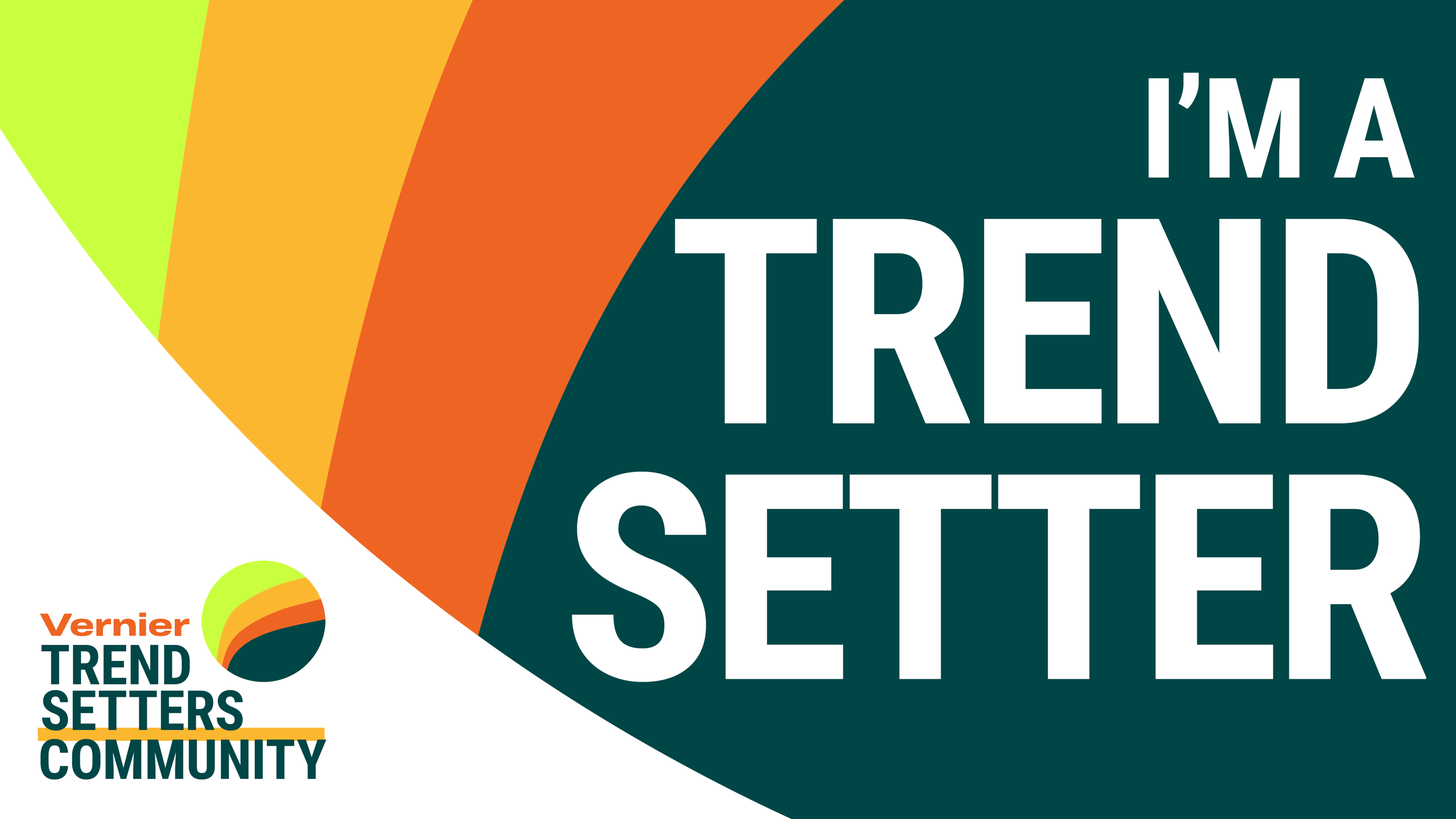
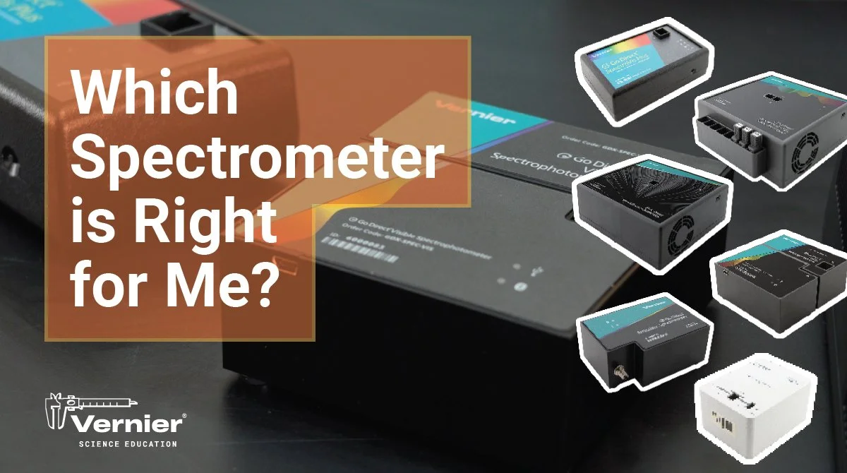
Illustration & Digital Art
Animation GIF Digital IllustrationSome projects called for something beyond a static graphic — animated GIFs, illustrated concepts, and motion-forward assets that added energy and engagement to Vernier's digital presence. These pieces pushed beyond the standard social template and demonstrated the range of digital design possible within the brand system.
Social Media System
Templates Covers YouTubeBeyond individual graphics, I developed an internal social media system — cover templates, post frameworks, and YouTube assets — that gave the marketing team a consistent, updatable foundation to work from. The system reduced production time, maintained visual consistency across platforms, and made it easier for the team to move quickly without sacrificing quality.
Vernier social media system overview — a flexible framework built to maintain consistency across platforms.
Social media cover templates updated for the 2023 summer refresh.
YouTube channel art and social templates.
Outcomes
What this work delivered.
Consistent, on-brand digital content delivered across product launches, seasonal moments, conference campaigns, and ongoing marketing initiatives.
Facebook, Twitter, LinkedIn, Instagram, and YouTube — each with platform-specific sizing, formatting, and visual considerations.
A flexible internal system of cover templates, post frameworks, and YouTube assets that reduced production time and kept the team moving quickly without sacrificing quality.
Reflection
What this work taught me.
Six years of digital design for the same client taught me that consistency is a skill in itself. It's easy to design something great once — the harder challenge is maintaining quality and creativity across hundreds of assets over years of evolving brand standards, shifting priorities, and changing platform requirements. The work that I'm most proud of from this period isn't any single graphic — it's the systems I built that made the whole operation run more smoothly. The 4th of July element series, the social media cover system, the YouTube templates — these weren't just deliverables, they were infrastructure. They gave the team tools to move faster without losing the quality that made Vernier's digital presence worth following.
The Vernier Collection
Explore More Vernier Work
Nine case studies covering six years of in-house design work. You're viewing 4 of 9.
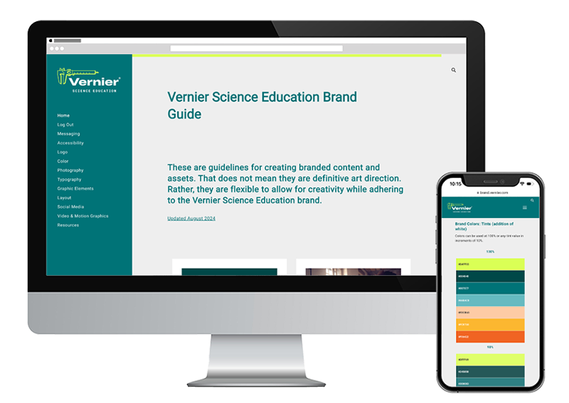
Brand Guide & Refresh
View Case Study →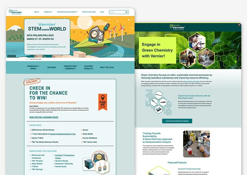
Campaign Websites
View Case Study →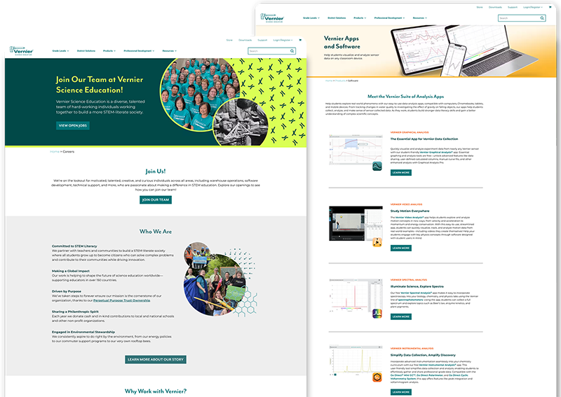
Internal Website Design
View Case Study →
Digital & Social Media
View Case Study →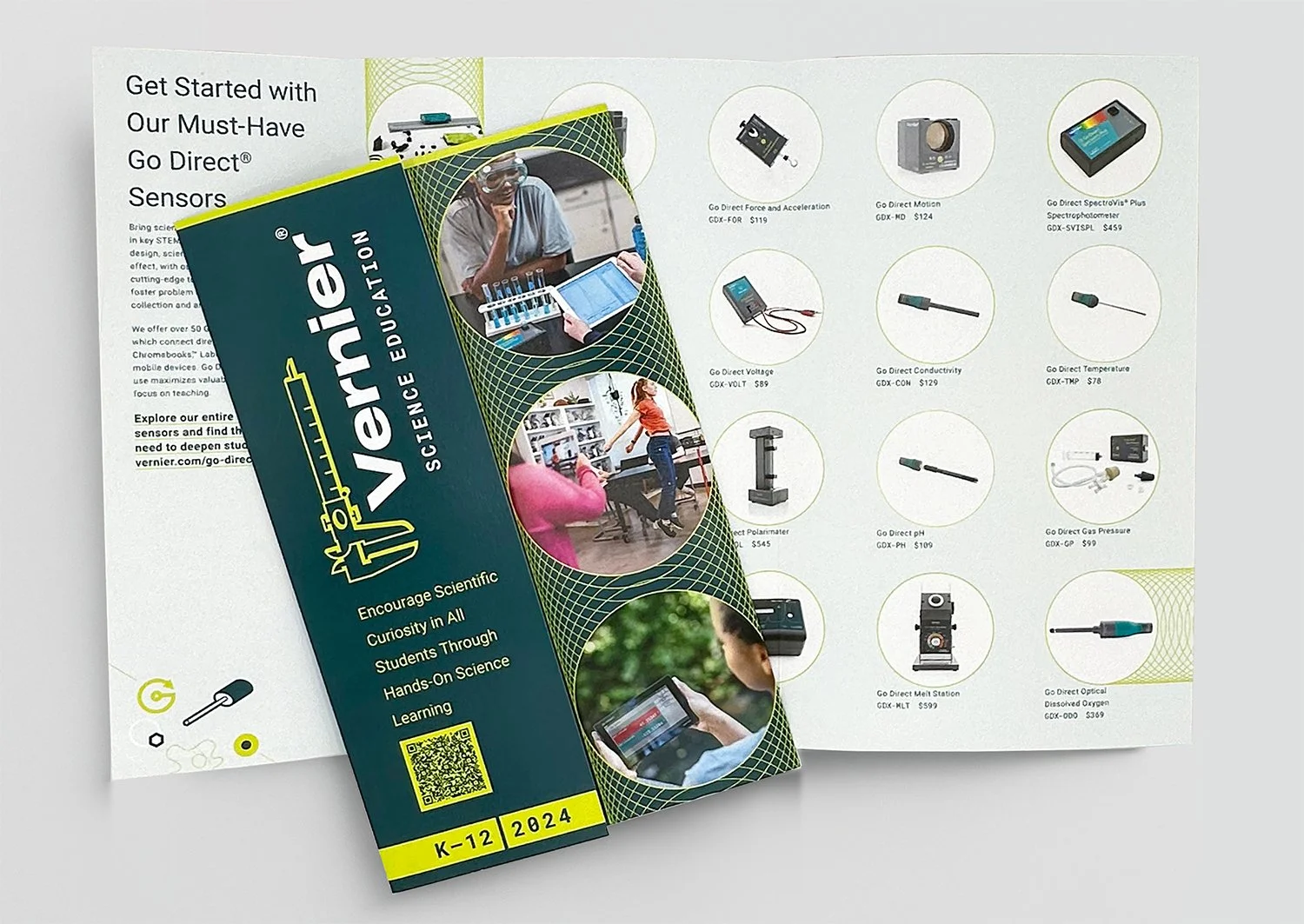
Print Brochures, Flyers & Packaging
View Case Study →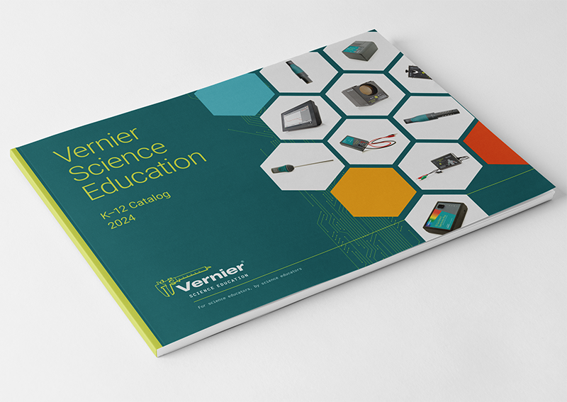
Print Catalogs, Books & Papers
View Case Study →
Conference Signage & Swag
View Case Study →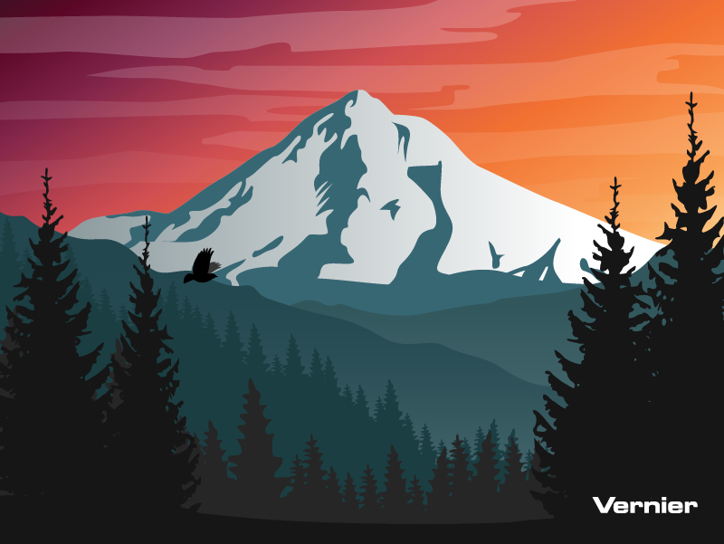
Seasonal Branding & Digital Art
View Case Study →