
Shaping the Digital Storefront — Homepage & Internal Page Design for Vernier Science Education
Six years of web design work within Vernier's WordPress environment — homepage updates, internal page redesigns, new page builds, and conference landing pages — all built to help educators find what they needed quickly and feel confident in what they found.

Overview
Vernier's website was the first stop for millions of educators — and it needed to work.
Vernier's website served as the primary point of contact between the brand and the educators who relied on its products every day. Beyond the homepage, dozens of internal pages carried the weight of communicating everything from product software and support resources to career opportunities and higher education programs. These pages needed to feel consistent, credible, and easy to navigate — whether someone was visiting for the first time or returning to find a specific resource they'd used before.
Working within Vernier's WordPress environment using Elementor, I designed and built homepage updates, redesigned key internal pages, and created new pages from scratch — all built from Art Director and Creative Supervisor wireframes, copywriter content, and the Vernier brand system. I also designed and built conference-specific landing pages for events like NSTA, GEARUP, CAST, and CASE, giving each conference a dedicated digital presence that connected back to the broader brand.
The Problem
A complex product ecosystem — and educators who needed to find the right thing fast.
Vernier's website had grown organically over years — and like many established company sites, some pages had fallen behind the brand, the content had outgrown the layout, or the user flow had become harder to navigate than it needed to be. Educators arriving at the software page, the support page, or the careers page needed to understand quickly what was available, where to go next, and how to get help if they needed it. Pages that created confusion or required extra effort to navigate reflected poorly on a brand built around clarity and precision.
Key Decisions
What I decided, and why.
Every page should feel like it belongs to the same brand
With dozens of pages across a large WordPress site, visual inconsistency was a real risk. Every page I built or redesigned was evaluated against the same brand standards — typography, color, spacing, imagery, and tone all aligned to the Vernier system. This wasn't just aesthetic — it built trust. An educator who landed on the support page after visiting the homepage should feel like they were still in the same hands, not on a different site.
Work from real content, not placeholders
Building pages in Elementor with real copy from the copywriter and real assets from the brand system meant fewer surprises when pages went live. Rather than designing around placeholder text and swapping in real content later — which almost always creates layout problems — I waited for finalized copy before locking in layouts. This added time upfront but produced cleaner, more reliable pages that didn't need significant rework after launch.
Give each conference its own moment while staying on brand
Conference landing pages for NSTA, GEARUP, CAST, CASE, and others needed to feel timely and specific — not just generic Vernier pages with a conference logo dropped in. Each one was designed to reflect the energy and focus of that event while remaining unmistakably Vernier. This required balancing brand standards with enough flexibility to make each page feel like it was built for that conference specifically, not recycled from a template.

The Work
Homepage updates, internal page redesigns, and conference landing pages — built to help educators find what they needed fast.
From the homepage to internal support pages and conference-specific landing pages, every page was built from Art Director or Creative Supervisor wireframes, finalized copywriter content, and the Vernier brand system — all within WordPress using Elementor.
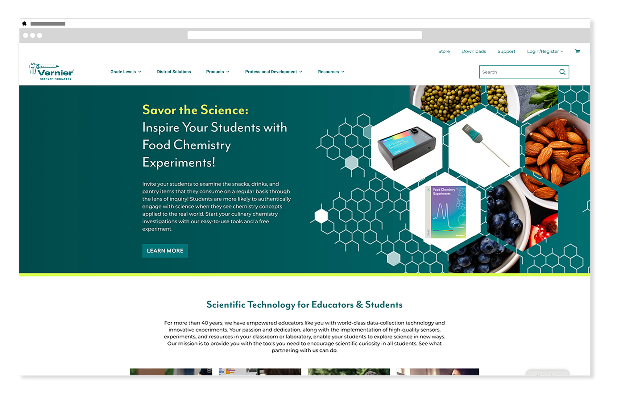
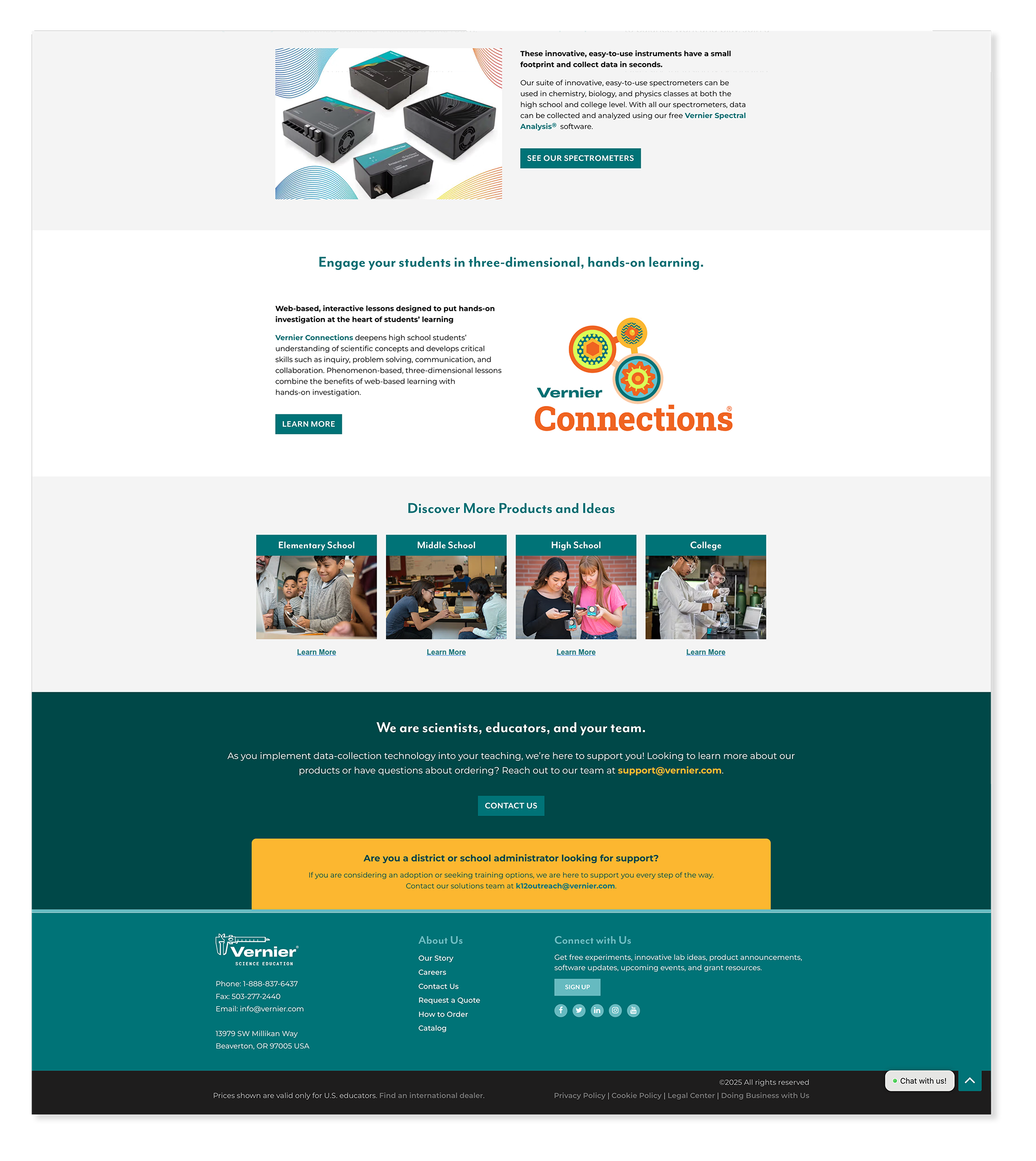
Homepage Updates
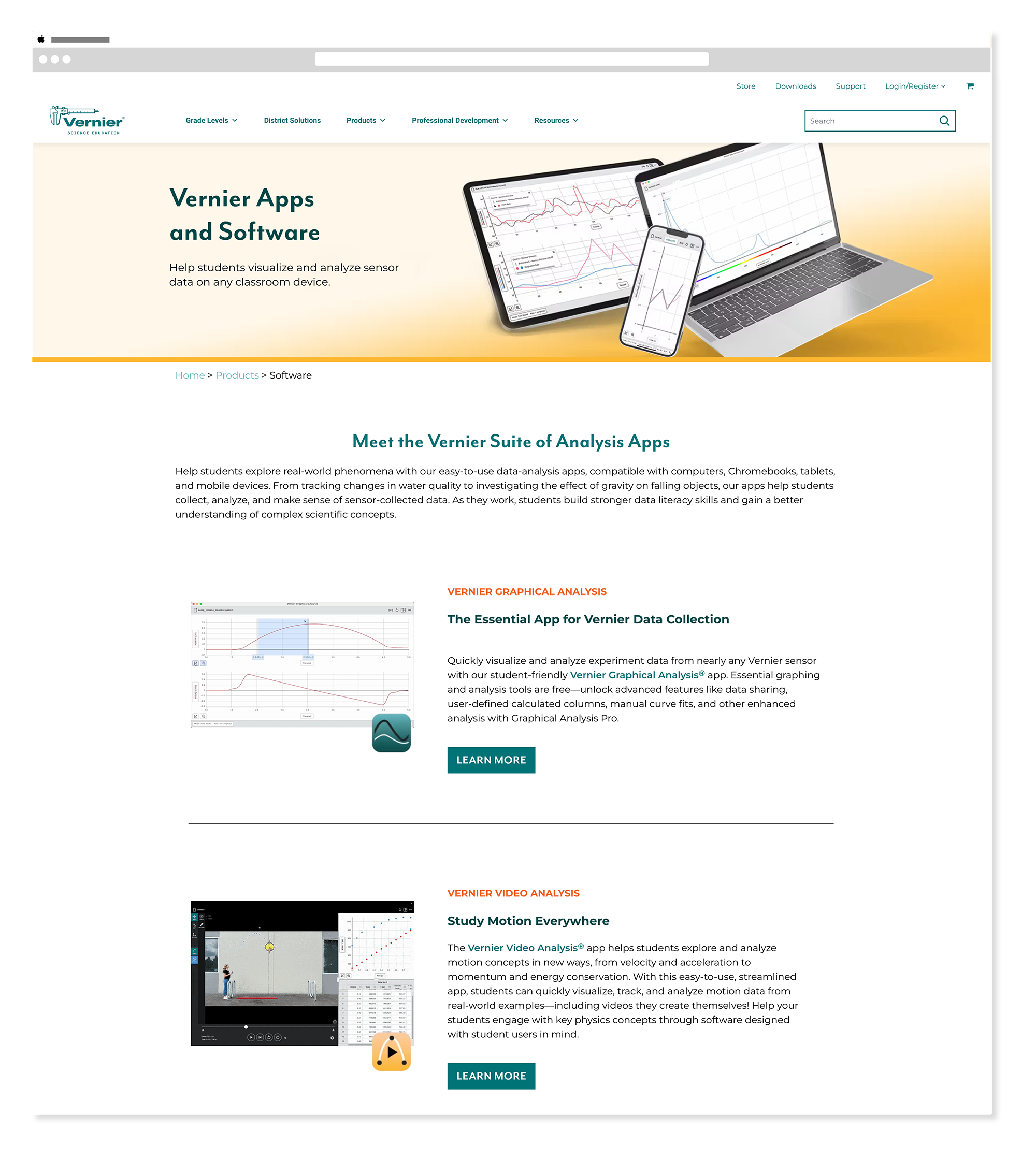
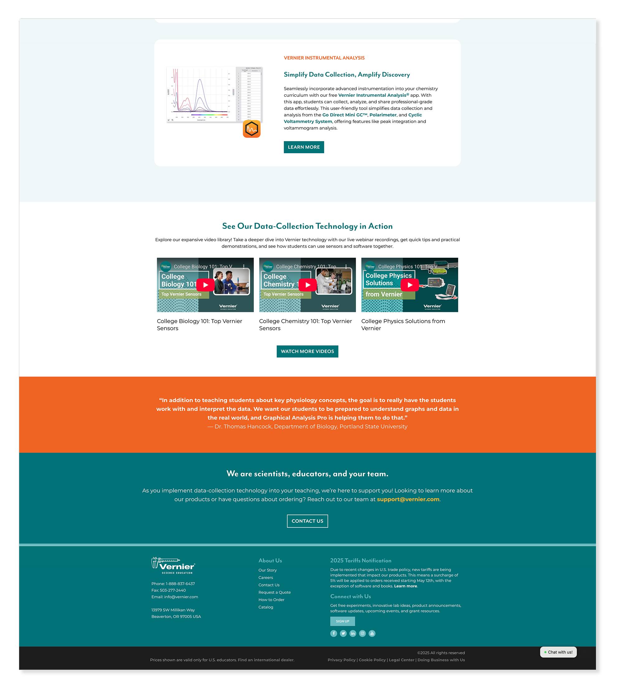
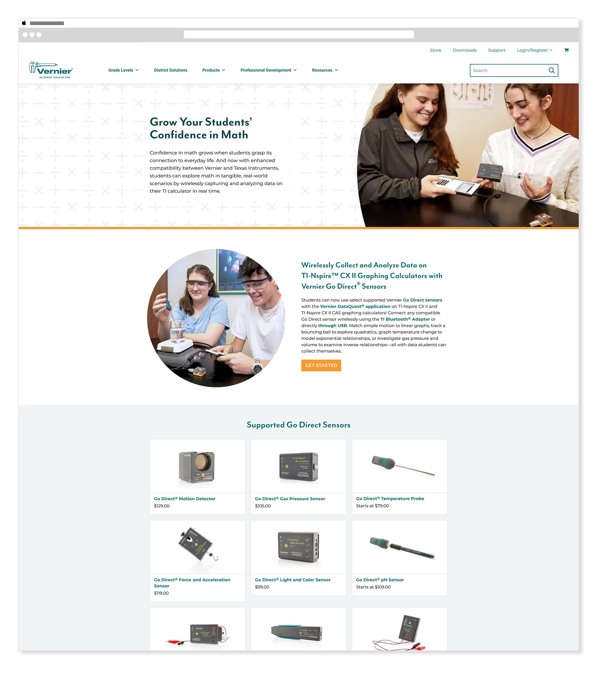
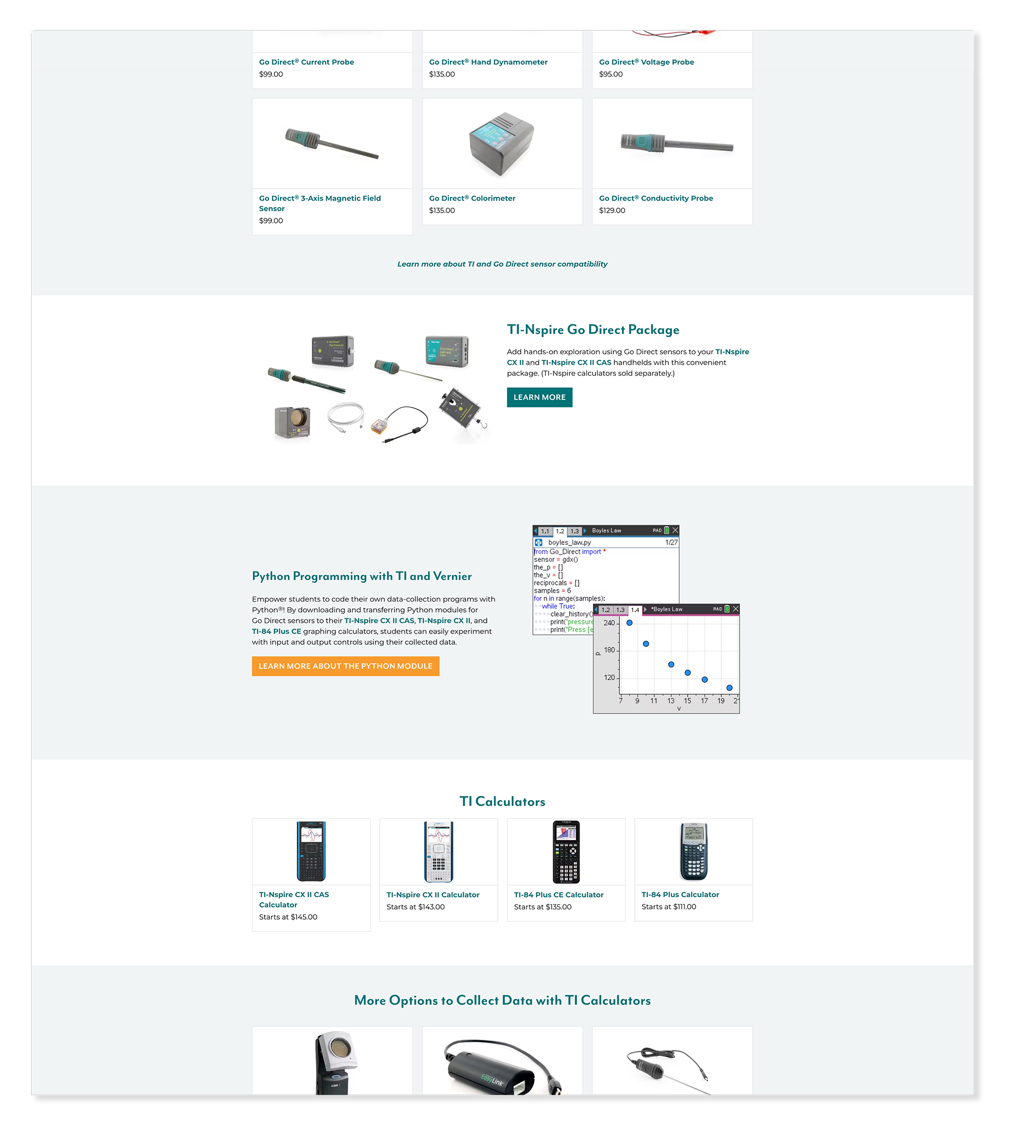
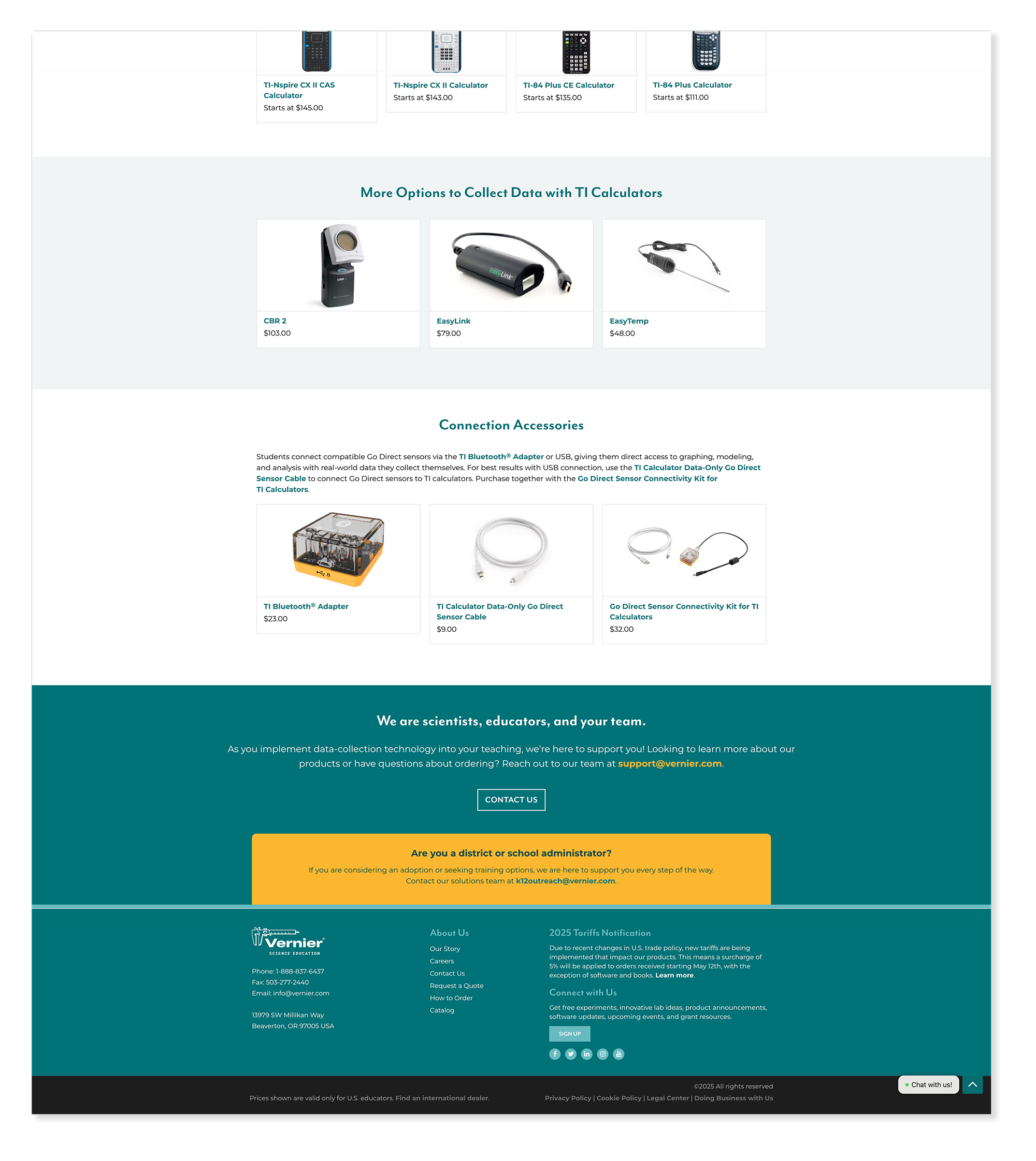
WordPress ElementorThe homepage was Vernier's highest traffic page and the first thing most educators saw when they came looking for answers. Homepage updates required careful attention to hierarchy, messaging, and visual impact — every change needed to feel intentional and consistent with the brand while supporting whatever the current marketing priority was.


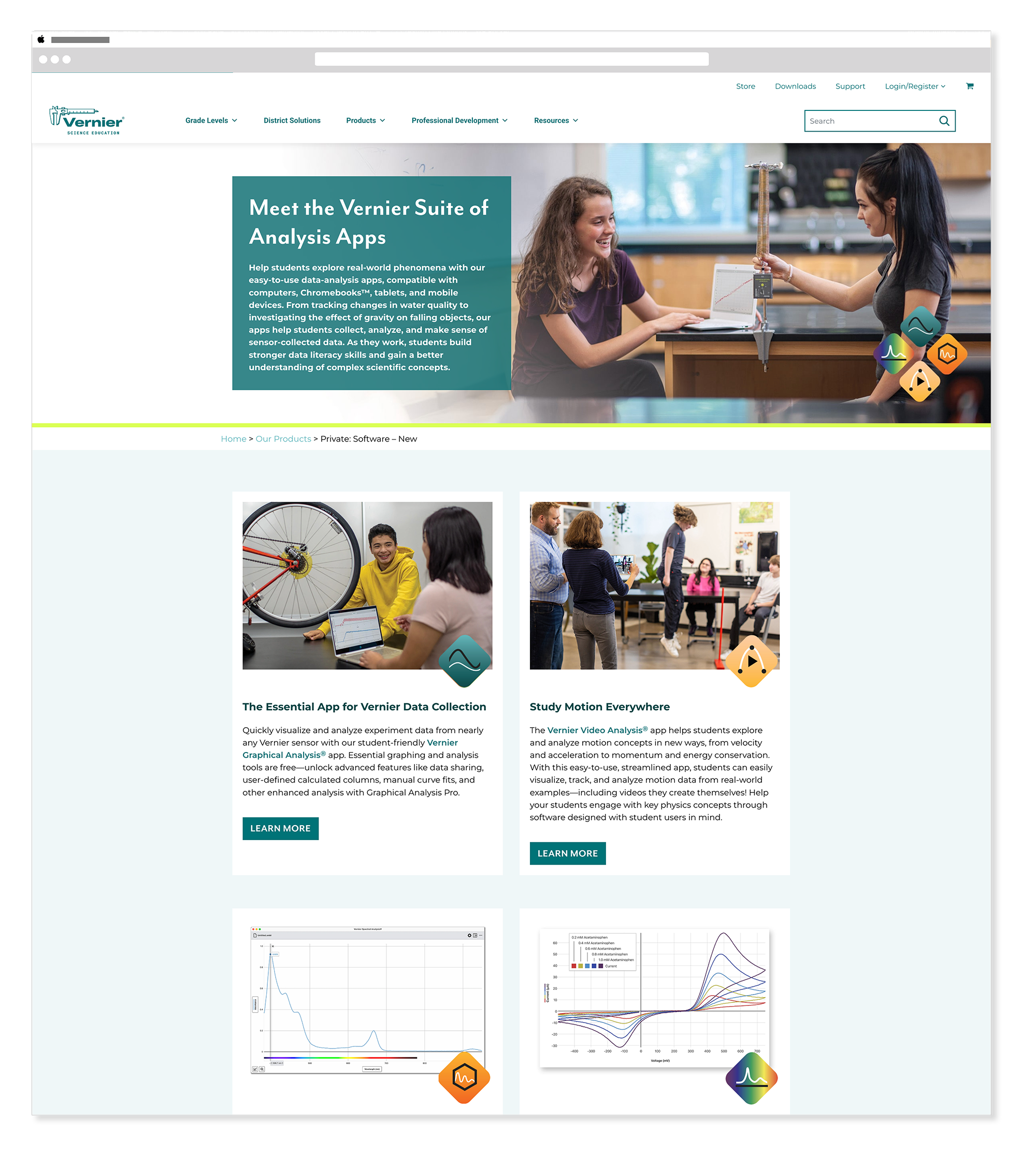
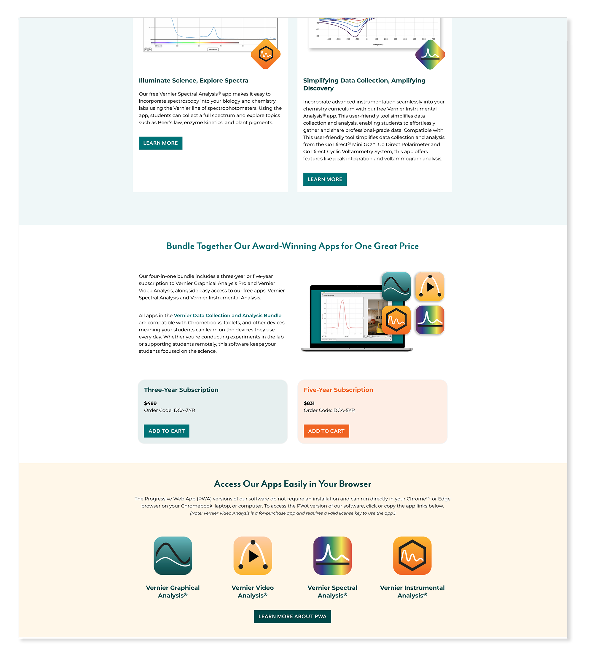
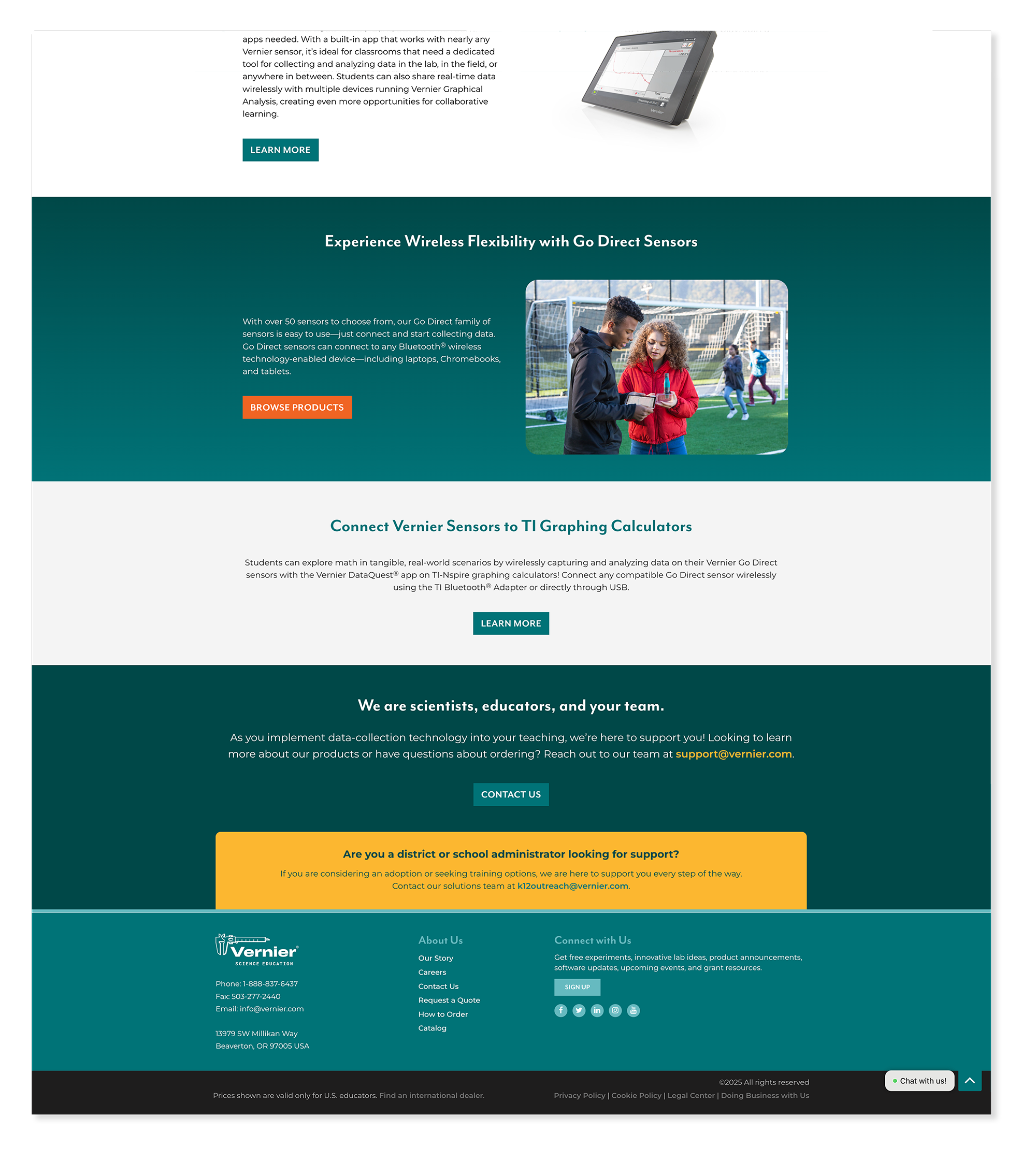
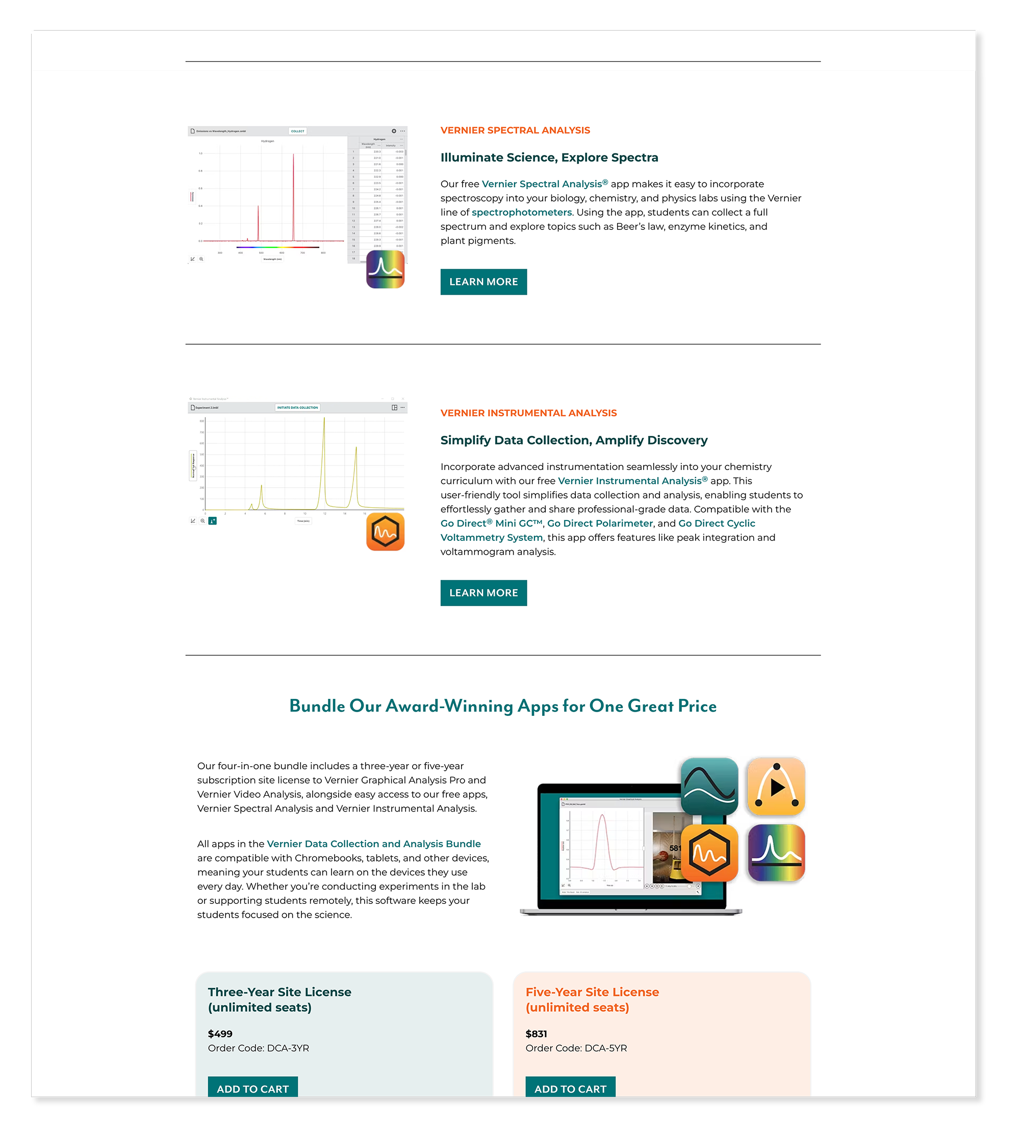
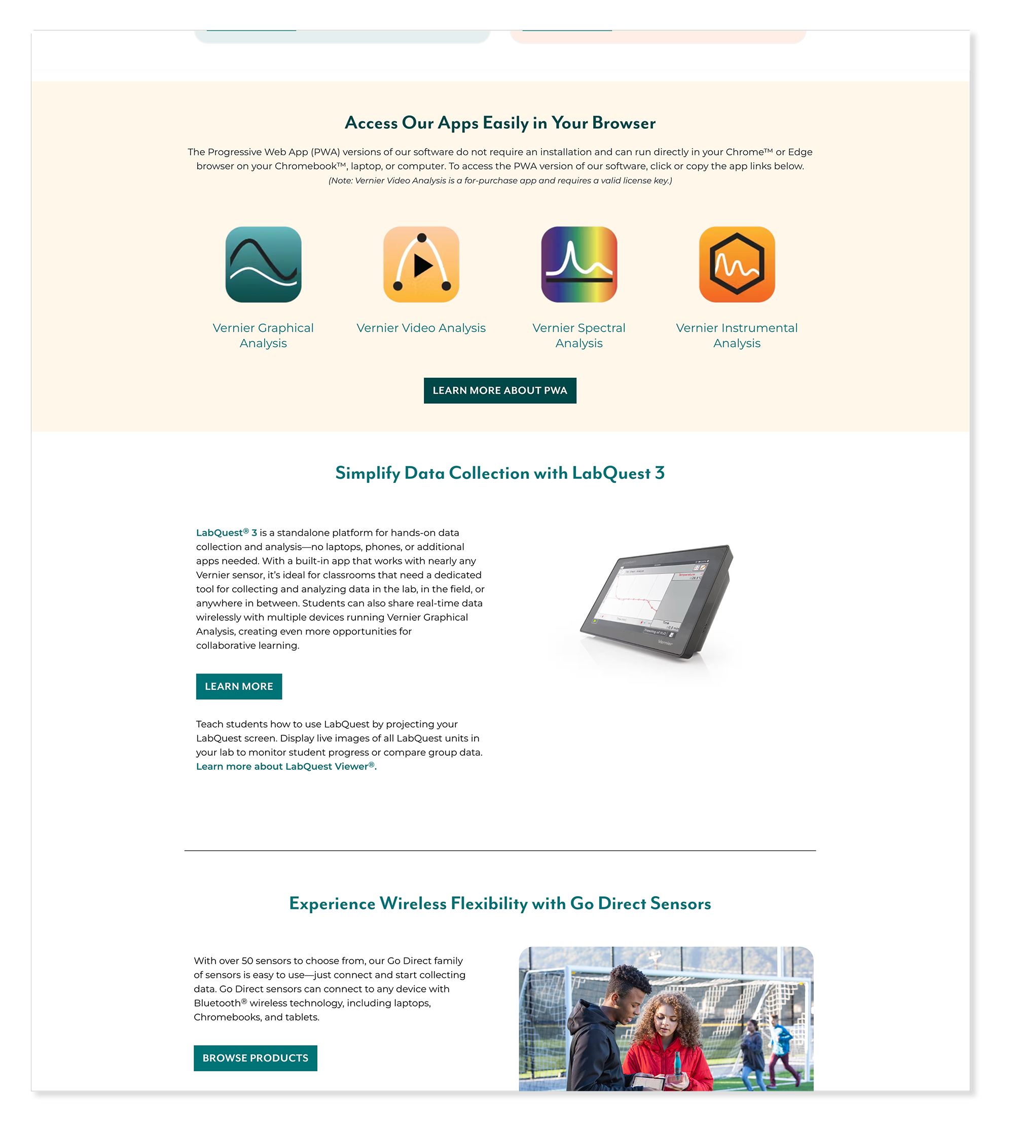
The software umbrella page went through two distinct design phases. The first concept attempted to mirror the energy of the product flyer — bold, visually driven, and campaign-like. In practice, the page needed to be highly informational, guiding educators through a complex software ecosystem. The final design prioritized clarity and navigation over visual drama, making it easier for visitors to find the right tool for their classroom.
Concept Direction
Final — Live Page
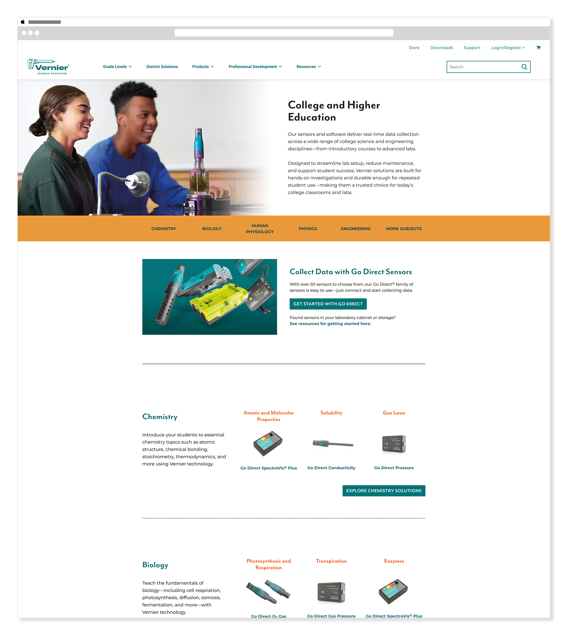
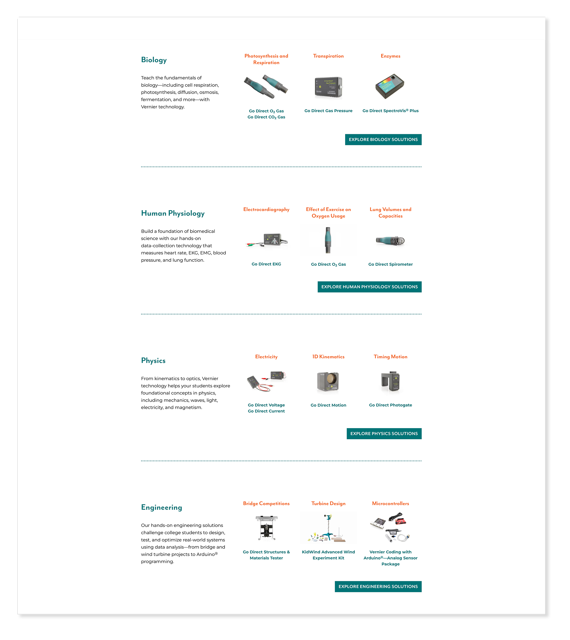
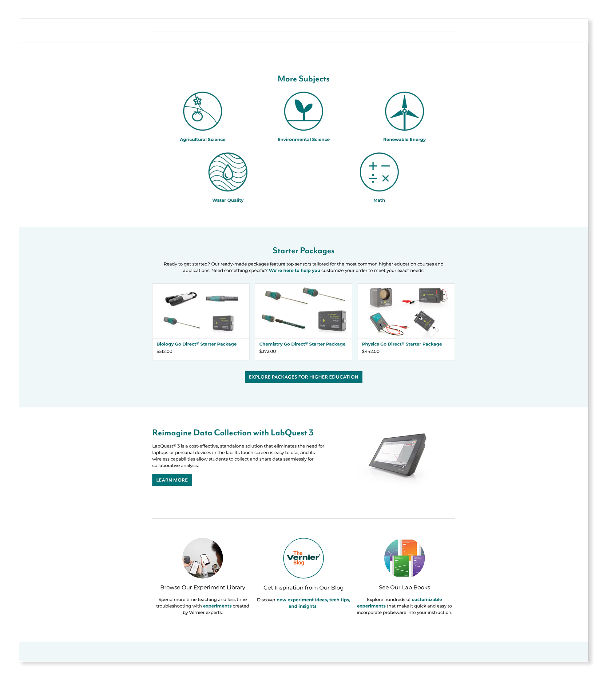
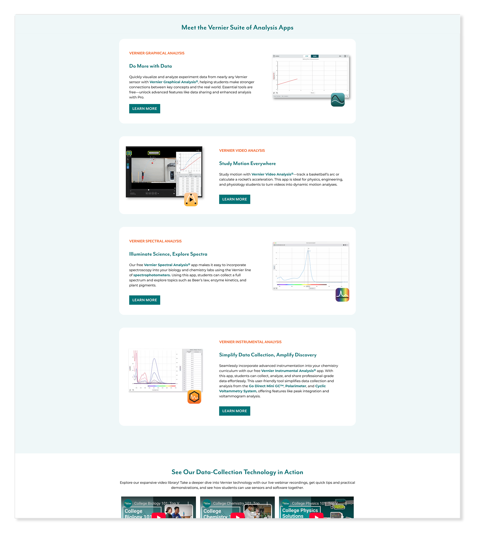
The higher education page gave college and university educators a dedicated entry point into Vernier's products and resources — acknowledging that their needs and context are distinct from K-12 classrooms. The page was built to feel authoritative and relevant to an academic audience while remaining consistent with the broader Vernier brand. The wireframe shows the structural thinking before any visual decisions were made.
Wireframe

Final — Live Page
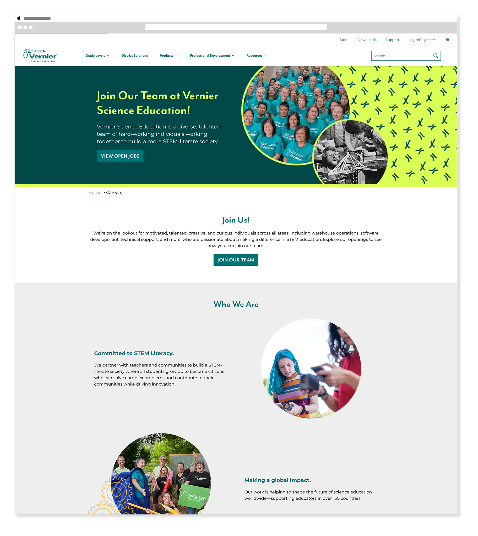
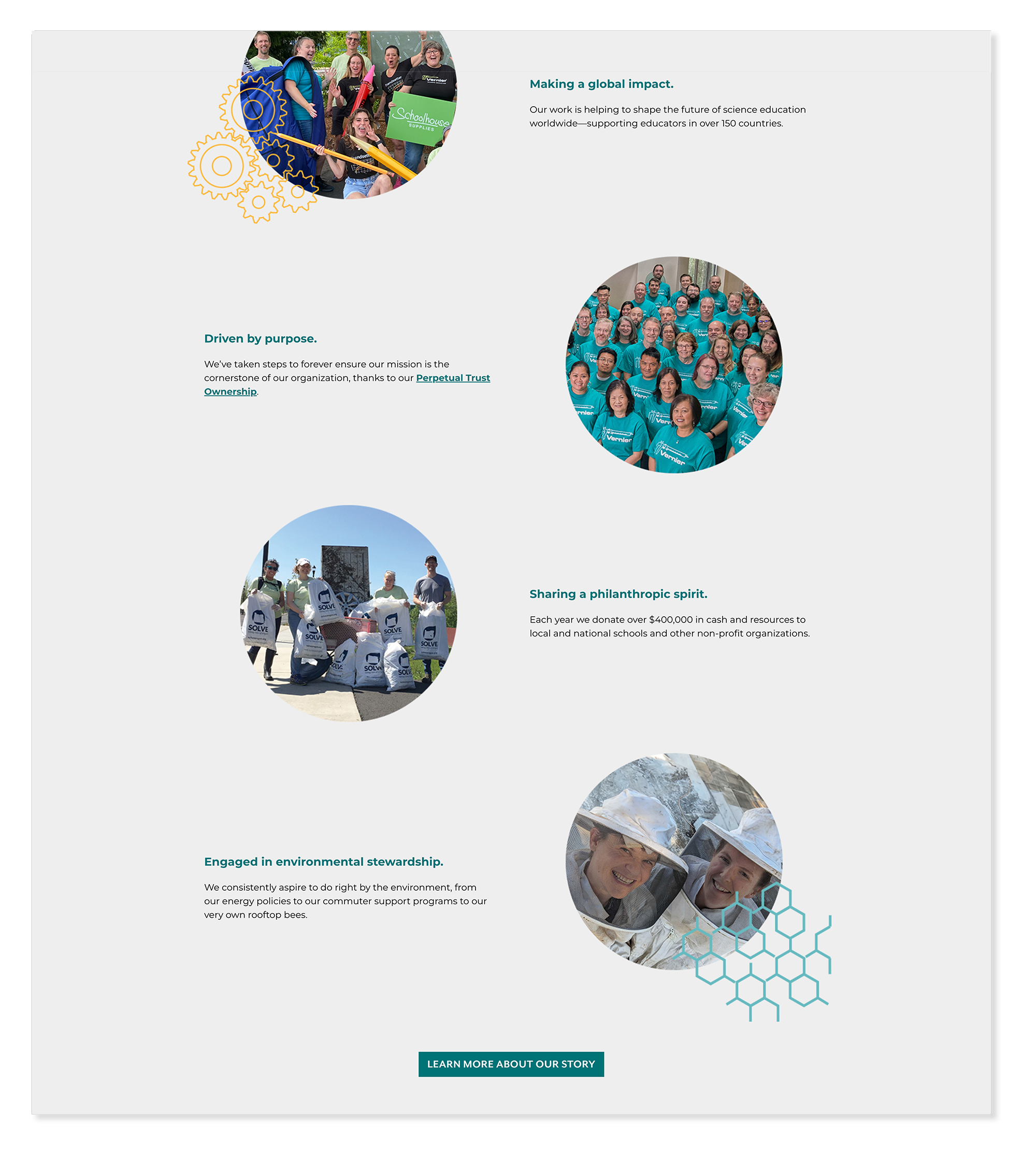
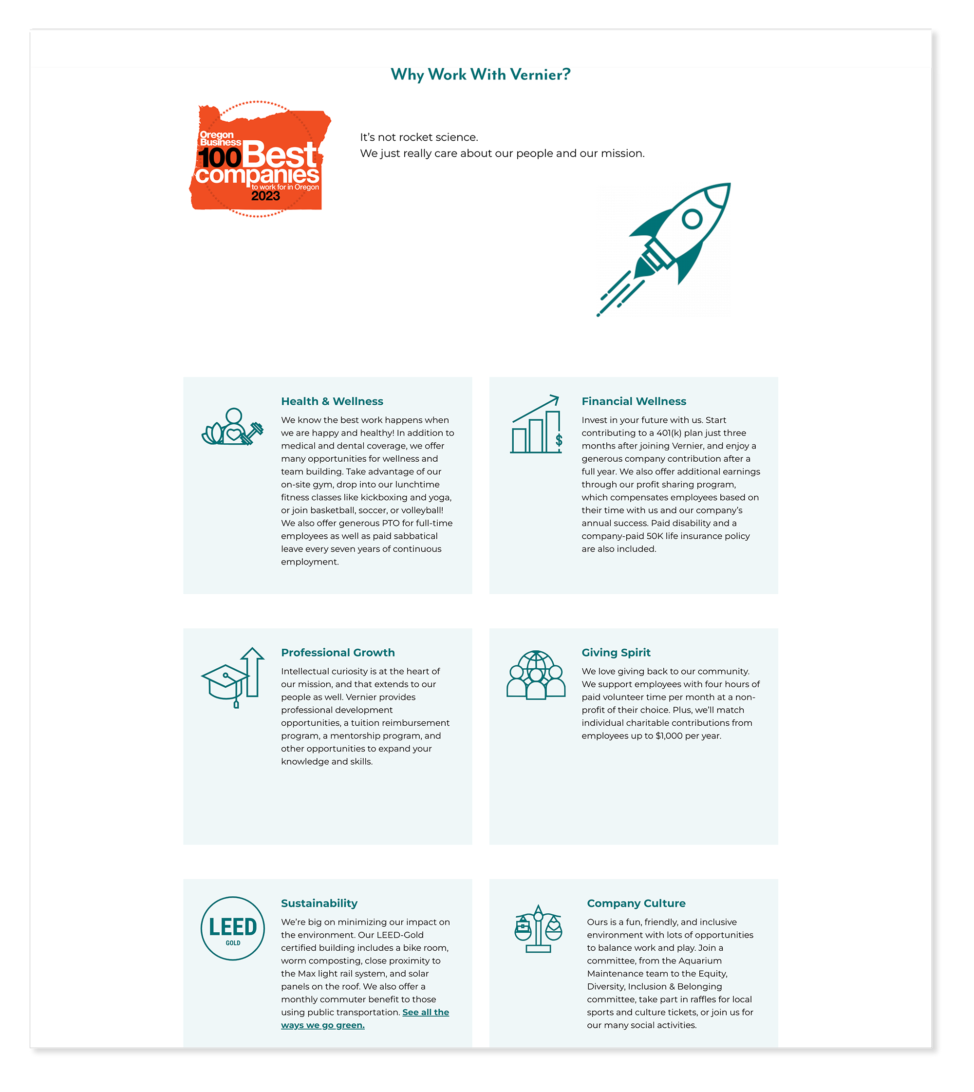
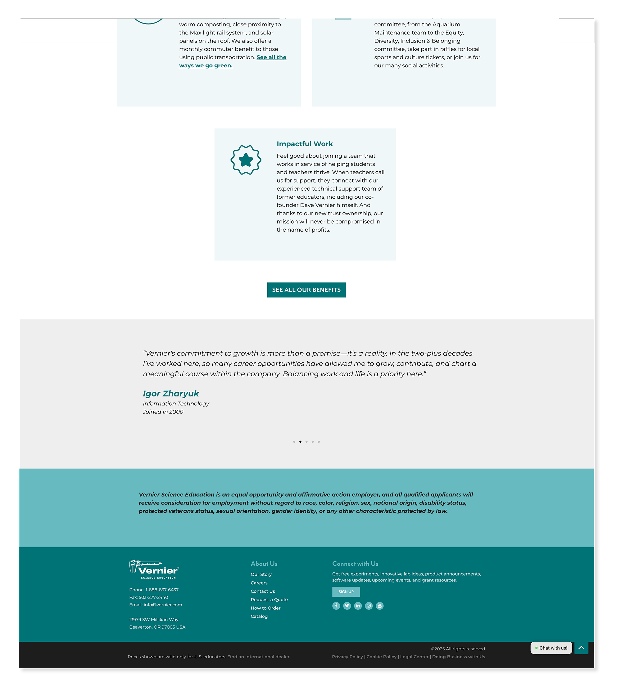
The careers page needed to communicate Vernier's culture and values to prospective employees while making it easy to find and apply for open positions. The redesign balanced warmth and professionalism — giving the page enough personality to feel like a place people would actually want to work, while keeping the path to open roles clear and direct.
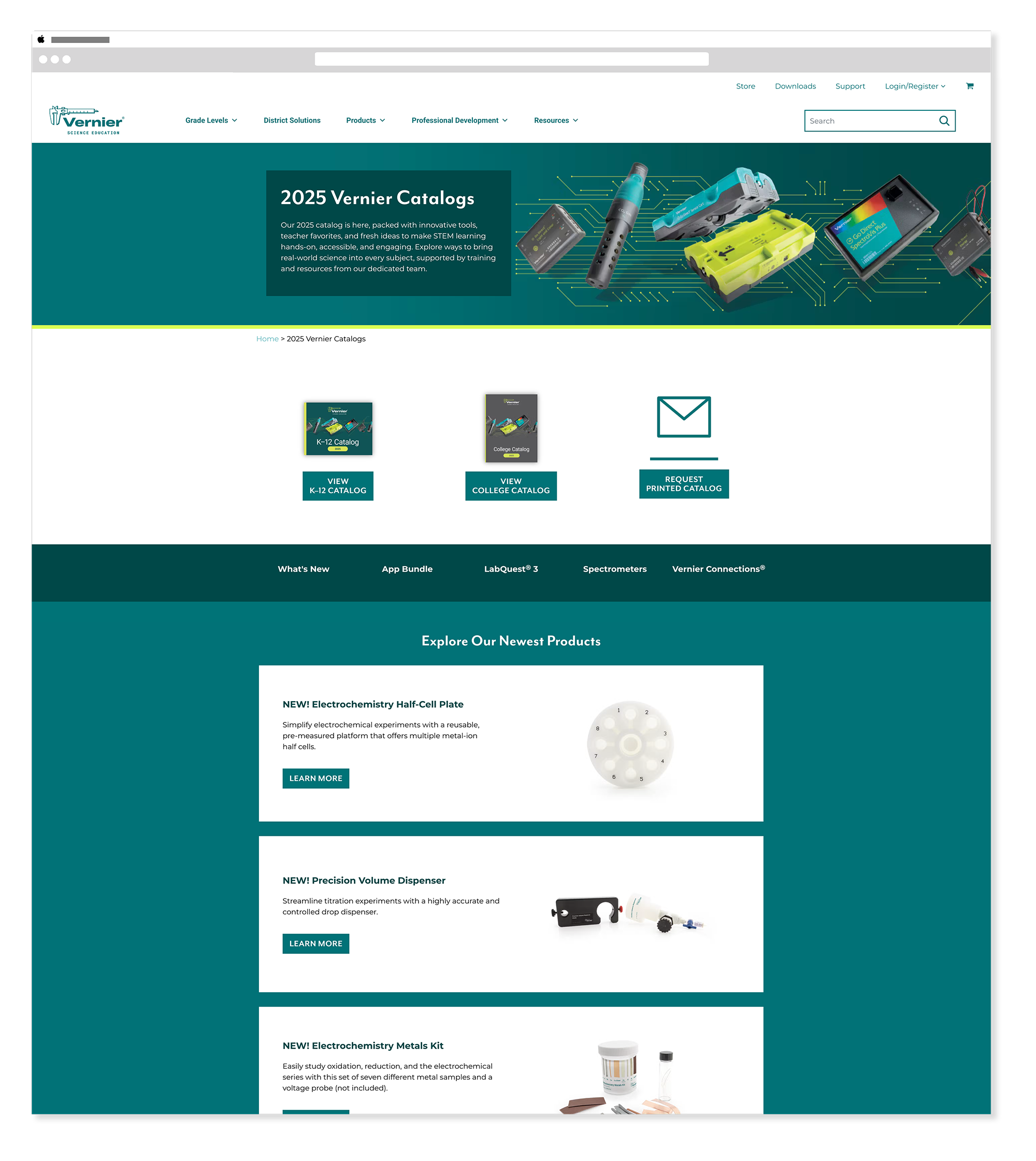
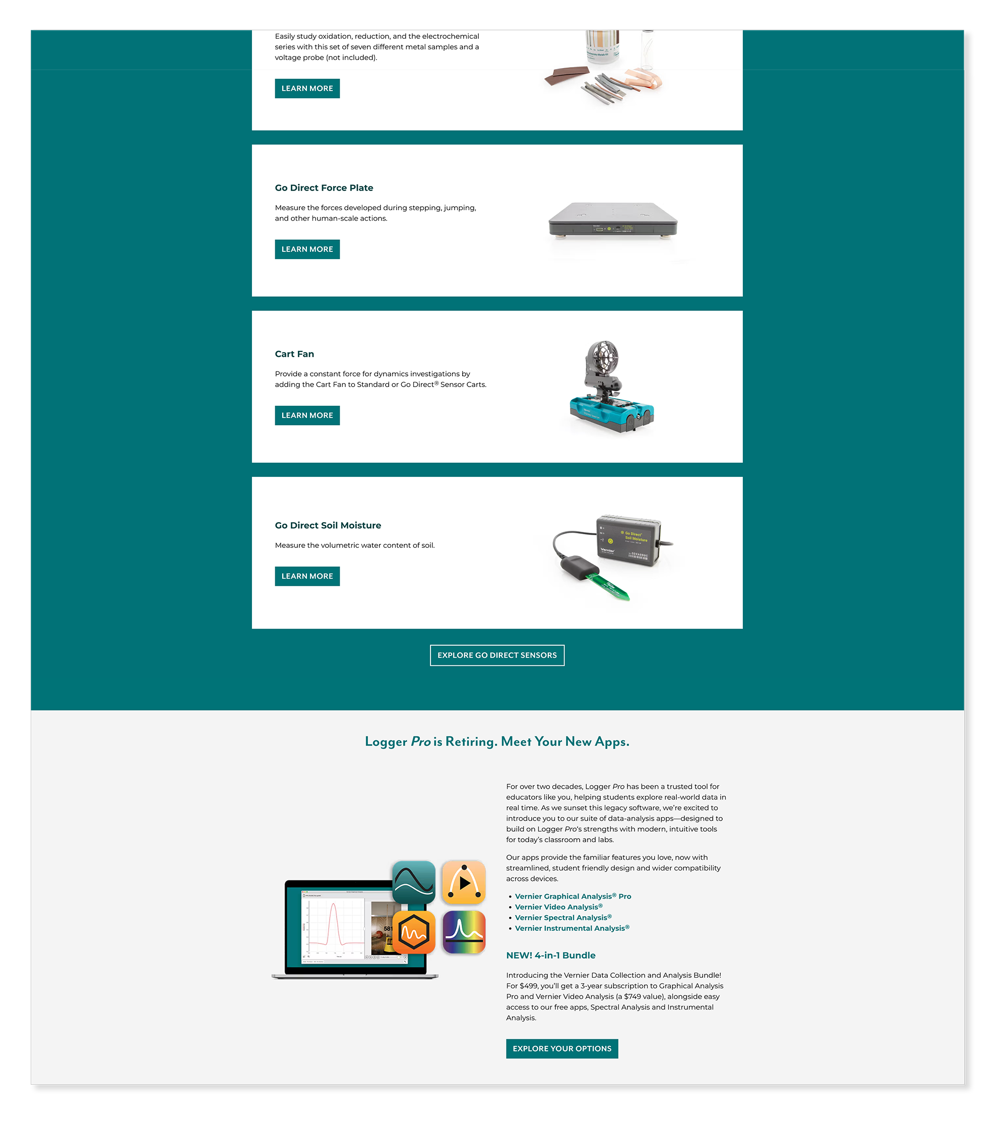
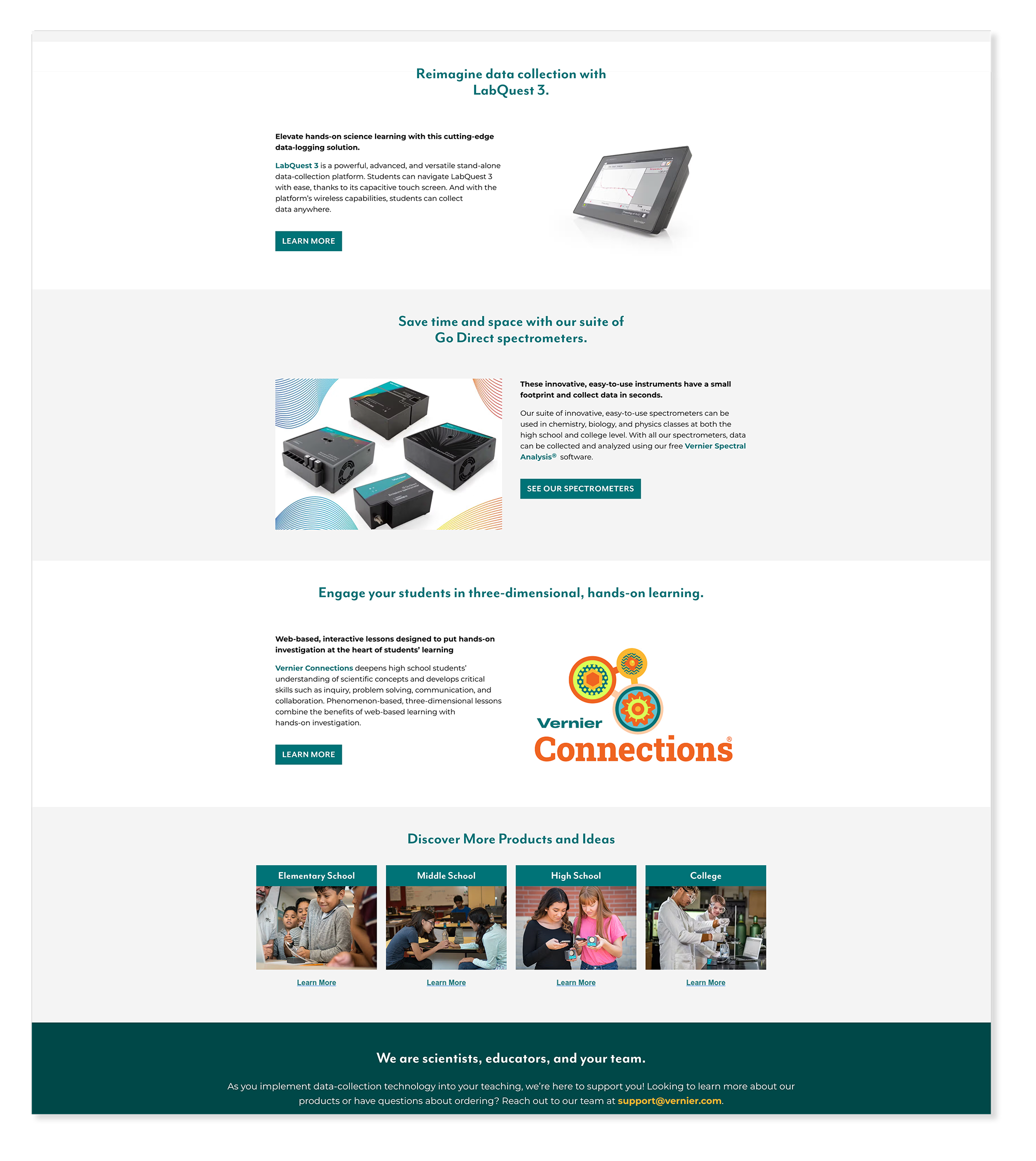
Catalogs Page
WordPress Elementor New Build ⚠︎ Page No Longer LiveThe catalogs page gave educators a centralized home for Vernier's full catalog library — print and digital editions organized clearly so visitors could find the right resource quickly. The page connected directly to the print catalog and long-form publication work covered in the Catalog & Long Form Print case study →
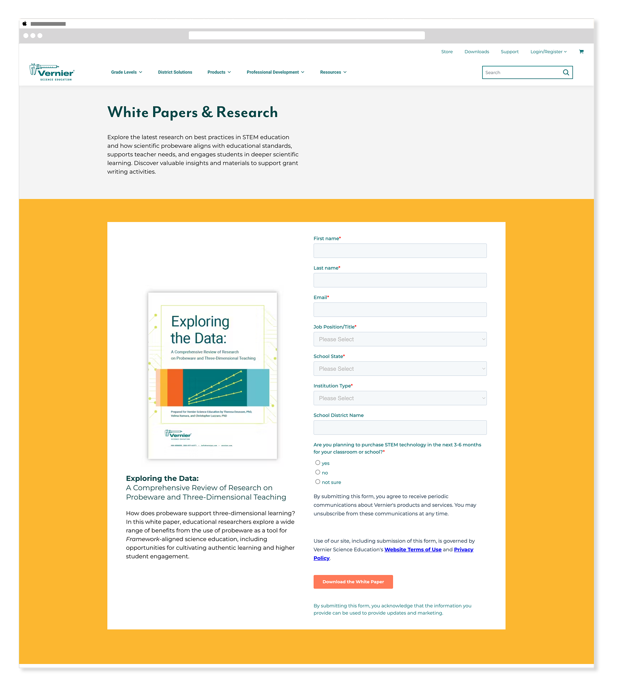
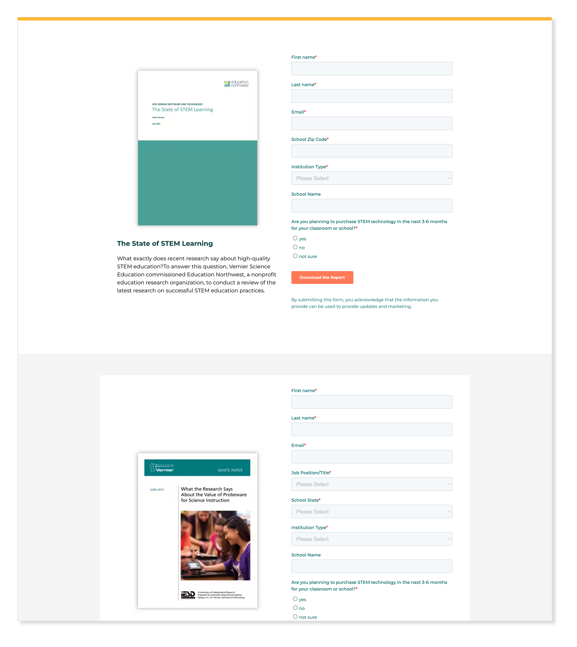
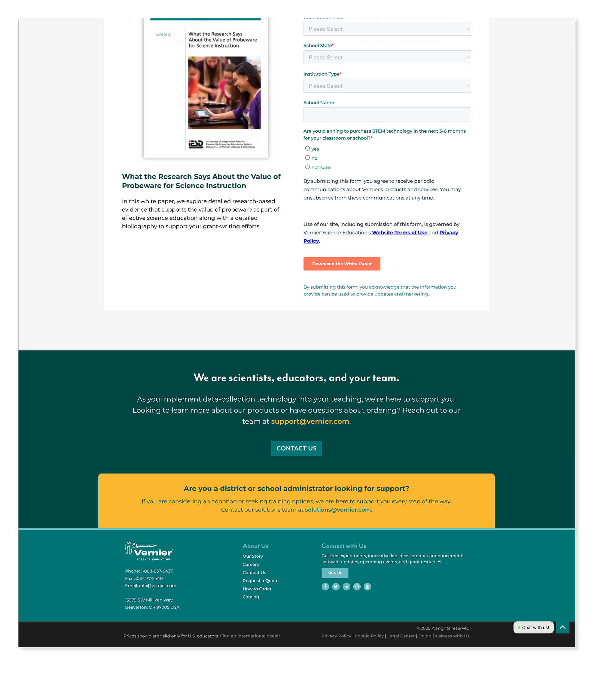
The white papers page gave educators and administrators a clear, organized home for Vernier's research and long form content — making it easy to find relevant publications by topic without having to dig through the broader resources section.
The math page gave educators a dedicated entry point into Vernier's math-specific products and resources — a subject area with its own distinct audience and needs. The page was built to feel focused and relevant to math educators while staying consistent with the broader Vernier brand system.
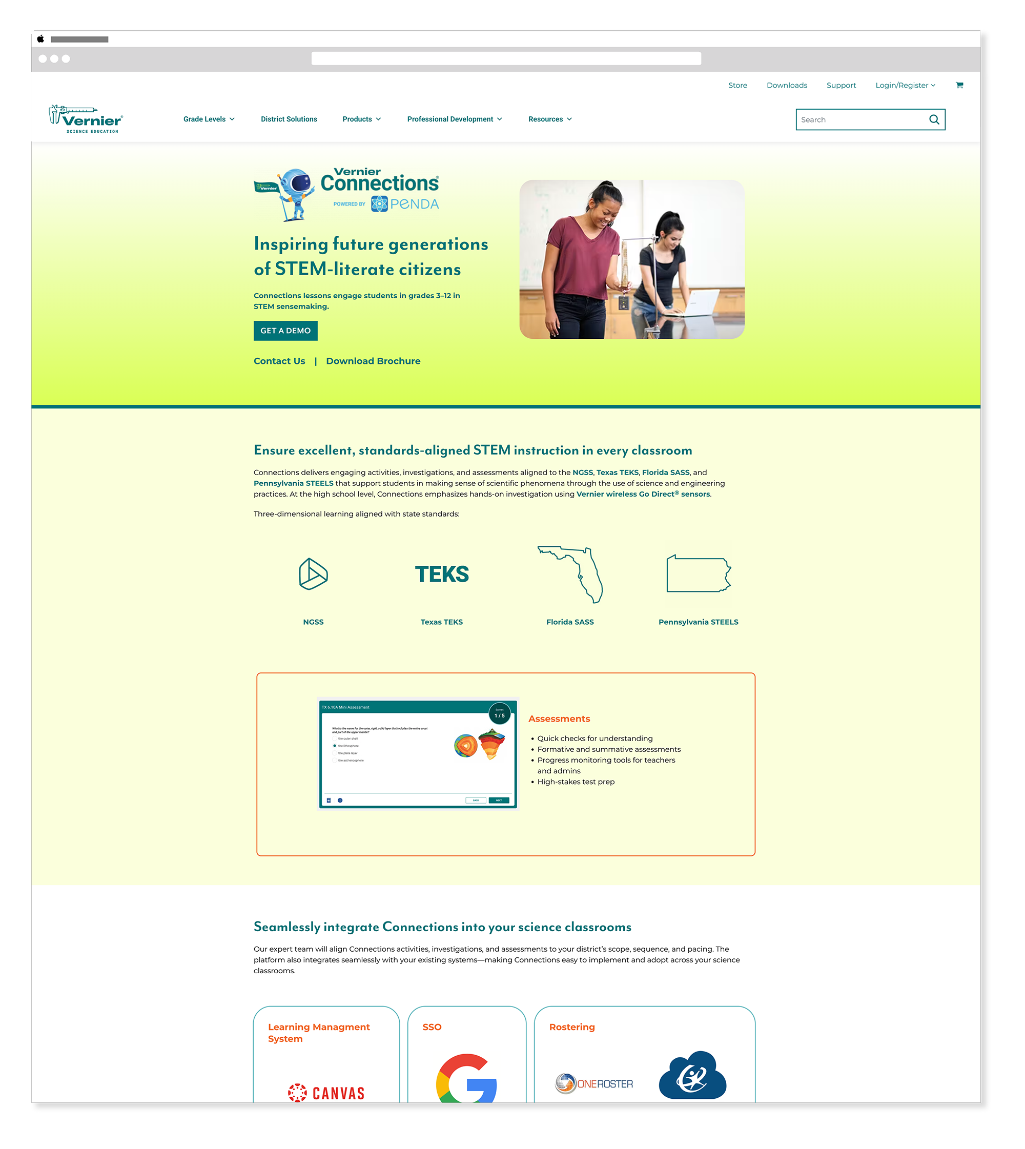
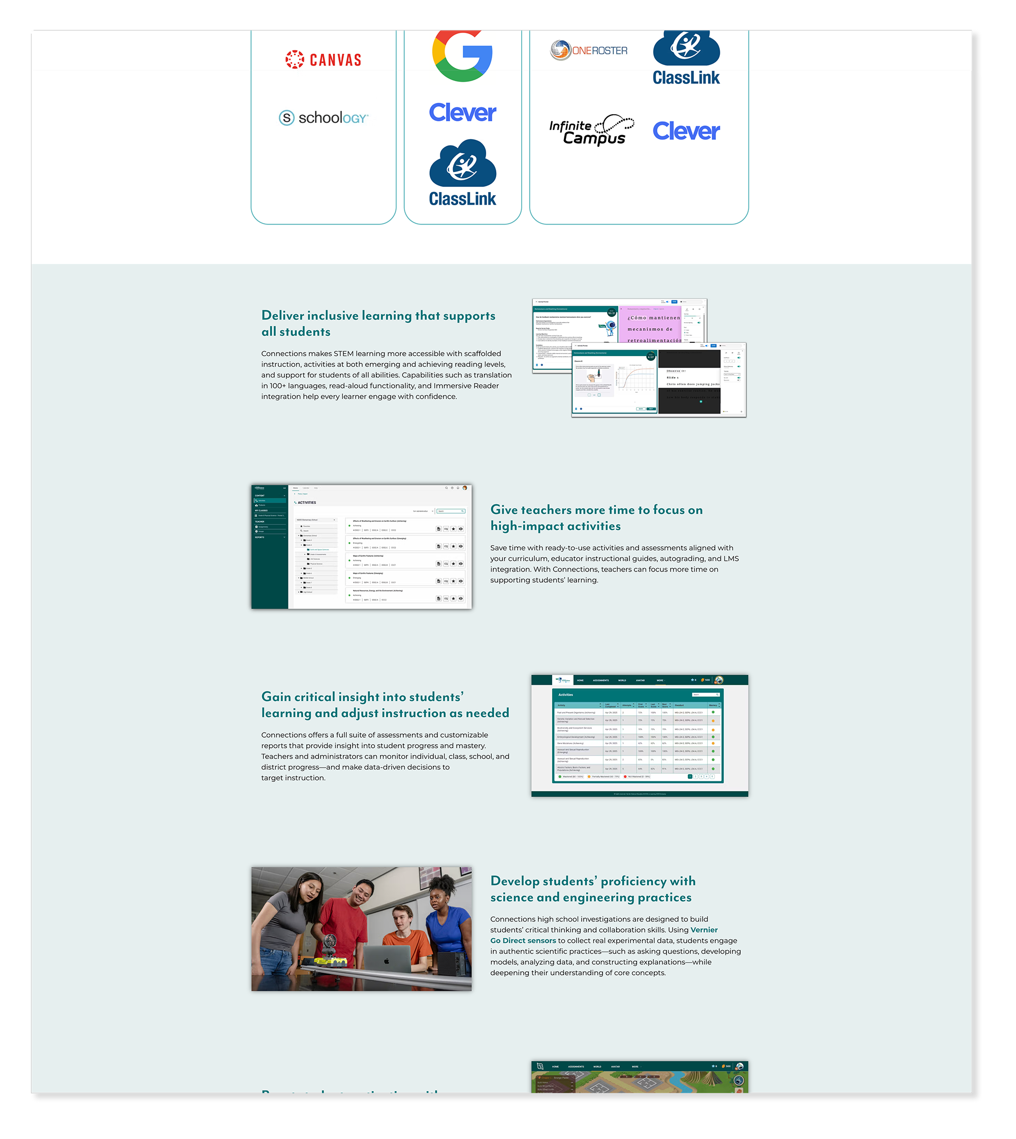
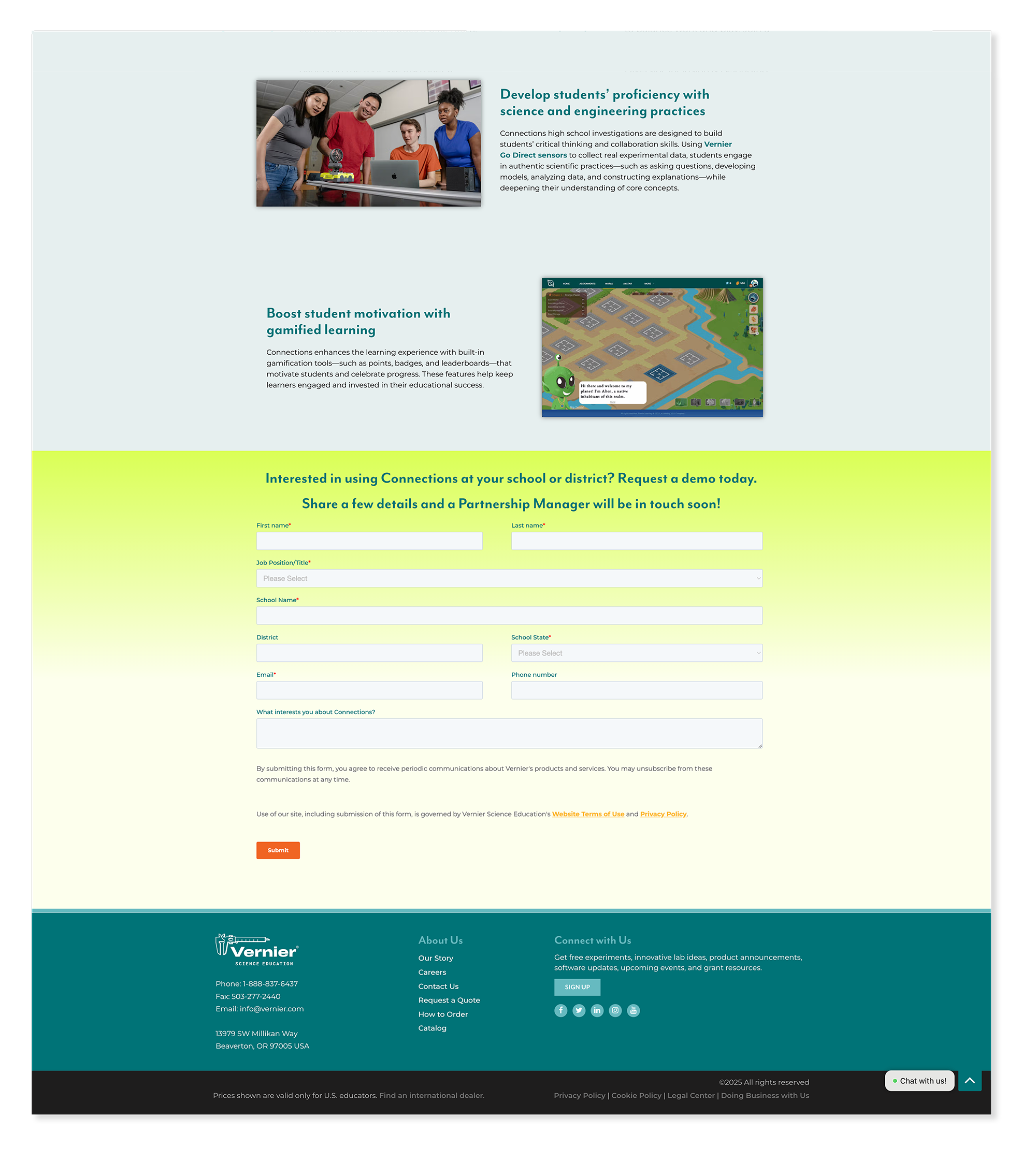
Vernier Connections — Powered by Penda
WordPress Elementor New Build ⚠︎ Page No Longer LiveThe Vernier Connections page was the last page I built before my layoff — a dedicated landing page for Vernier's learning management system powered by Penda, similar in concept to Canvas. The page introduced educators to the platform, communicated its value clearly, and gave visitors a path to learn more or get started. The page is no longer live at its original URL and now redirects to a subdomain.
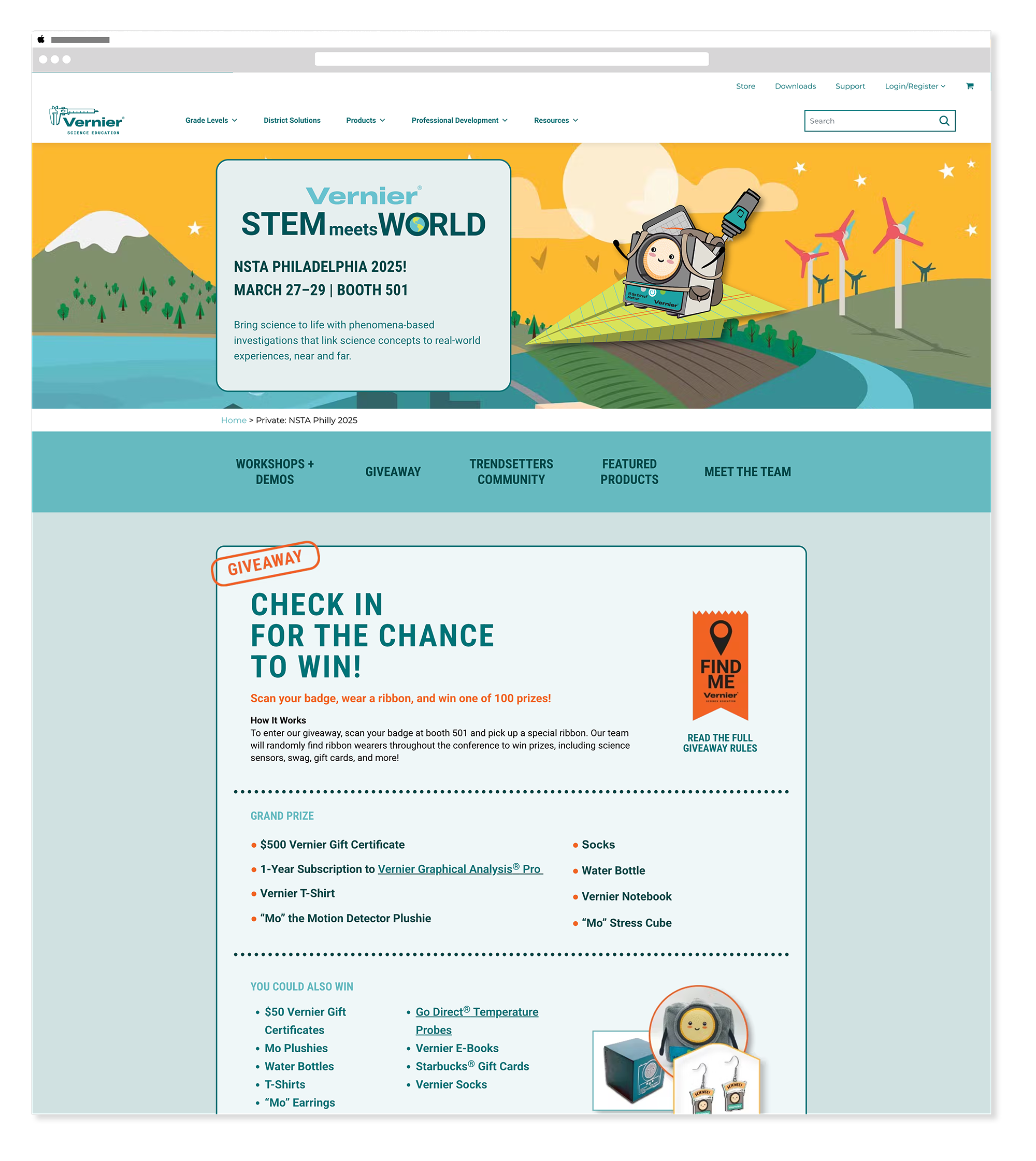
Conference Landing Pages
NSTA GEARUP CAST CASEConference landing pages gave each event a dedicated digital home — timely, specific, and unmistakably Vernier. Each page was built to feel like it was designed for that conference specifically while connecting back to the broader brand system. CAST and CASE pages are no longer available online. For the full story on Vernier's conference landing pages see the Campaign Websites case study →

“Building difficult scientific concepts into something tangible and beautiful.”
Meghan Lewis, Senior Visual DesignerOutcomes
What this work delivered.
Consistent, on-brand web pages designed and built within Vernier's WordPress environment from 2019 through 2025 — homepage updates, internal page redesigns, new builds, and conference landing pages.
Careers, Software, Support, Higher Education, and White Papers pages — each redesigned or built from scratch to help educators navigate Vernier's ecosystem with clarity and confidence.
Dedicated digital presences for NSTA, GEARUP, CAST, CASE, and more — each designed to feel event-specific while staying unmistakably on brand.
Reflection
What this work taught me.
Web design within an established CMS like WordPress taught me that constraints are actually clarifying. Working within Elementor, from Art Director wireframes, with real copy from the start — none of that felt limiting. It felt grounding. The decisions that mattered most were about hierarchy, clarity, and consistency, and those are the same decisions that matter in any design medium. The conference landing pages were some of my favorite work from this period — each one had a clear deadline, a specific audience, and a moment to design toward. That combination of focus and urgency brought out some of the sharpest thinking I did across six years at Vernier. And seeing those pages go live knowing that educators would land on them at a conference booth made the work feel genuinely connected to something real.
The Vernier Collection
Explore More Vernier Work
Nine case studies covering six years of in-house design work. You're viewing 3 of 9.
Brand Guide & Refresh
View Case Study →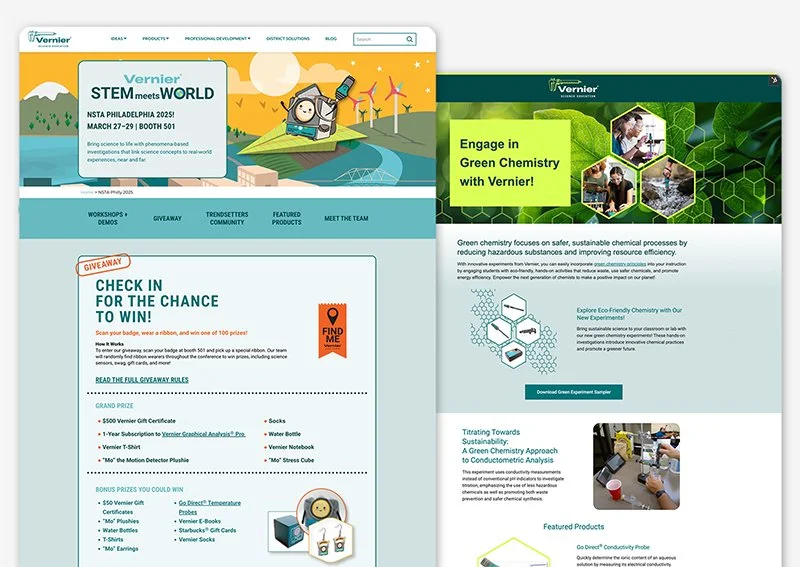
Campaign Websites
View Case Study →
Email Design & Digital Ads
View Case Study →
Digital & Social Media
View Case Study →
Print Brochures, Flyers & Packaging
View Case Study →
Print Catalogs, Books & Papers
View Case Study →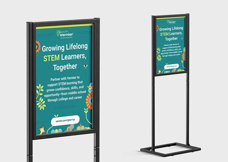
Conference Signage & Swag
View Case Study →
Seasonal Branding & Digital Art
View Case Study →