
Reaching Educators Where They Are — Email & Digital Advertising for Vernier Science Education
Six years of product announcement emails, promotional campaigns, newsletter contributions, and display advertising — designed to reach science educators and researchers on the platforms and publications they trusted most.

Six years of reaching science educators in their inboxes and on the publications they trusted.
Email and digital advertising are two of the most direct channels a brand has — a product announcement lands in an educator's inbox on a Tuesday morning, and a display ad appears on the science publication website they read during their lunch break. Both require the same thing: a design that communicates clearly, reflects the brand accurately, and earns attention in an environment full of competing messages.
At Vernier, email design centered on product announcements and promotions — communicating new tools, resources, and offers to an audience of educators and researchers who had real decisions to make about what they brought into their classrooms and labs. Digital advertising extended that reach into the third-party publications and vendor platforms where Vernier's audience spent time — display and banner ads designed to perform within strict size specifications while still feeling unmistakably Vernier.
The Problem
Designing for inboxes and third-party platforms — where attention is scarce and brand control is limited.
Email and digital advertising are unforgiving design environments. An email has seconds to earn a scroll before it's deleted. A display ad has even less — a fraction of a second to register before a visitor's eye moves on. The challenge was designing within those constraints while still communicating Vernier's warmth, clarity, and educational mission accurately and consistently.
The choices that shaped how Vernier communicated across channels.
Leading with the product — not the brand.
Product announcement emails work best when the product is the hero. The decision to lead with clear, well-composed product photography and a direct headline — rather than brand storytelling or extended copy — respected the audience's time and made the email's purpose immediately clear. Educators opening a Vernier email knew within one scroll what was being announced and why it mattered to them.
Keeping every email and ad unmistakably Vernier — regardless of where it appeared.
Email clients and vendor ad platforms impose their own constraints on what's possible visually. The decision was to maintain Vernier's color palette, typography, and visual language as tightly as each environment allowed — so that whether an educator opened an email in Gmail or spotted a display ad on an NSTA publication, the brand felt consistent and recognizable. Familiarity builds trust, and trust is what moves an educator from awareness to purchase.
Getting every display ad right for every vendor's requirements.
Digital advertising for third-party vendors comes with strict file specifications — pixel dimensions, file size limits, format requirements, and animation constraints that vary by platform and publication. Managing those specifications across multiple simultaneous ad placements while keeping every asset on brand required the same production precision as the conference signage work. A display ad that doesn't meet spec doesn't run. Getting it right the first time was always the goal.
Working within HubSpot's email framework without losing design quality.
HubSpot's email builder has real constraints — templated structures, limited custom CSS, and rendering behavior that doesn't always match what you see in the editor. The decision was to work with those constraints rather than against them — designing emails that used HubSpot's framework intelligently, making the most of the flexibility available while keeping the visual quality consistent with Vernier's broader design standards.

Emails that informed and ads that reached — six years of consistent digital communication.
Email and digital advertising work operates at high volume and high frequency — campaigns overlap, deadlines are tight, and the audience sees a lot of communication from a lot of sources. The work here was about maintaining quality and brand consistency across every touchpoint, every send, and every ad placement over a six-year period.
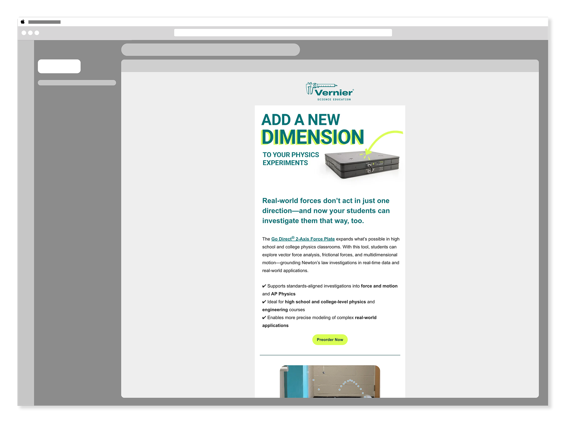
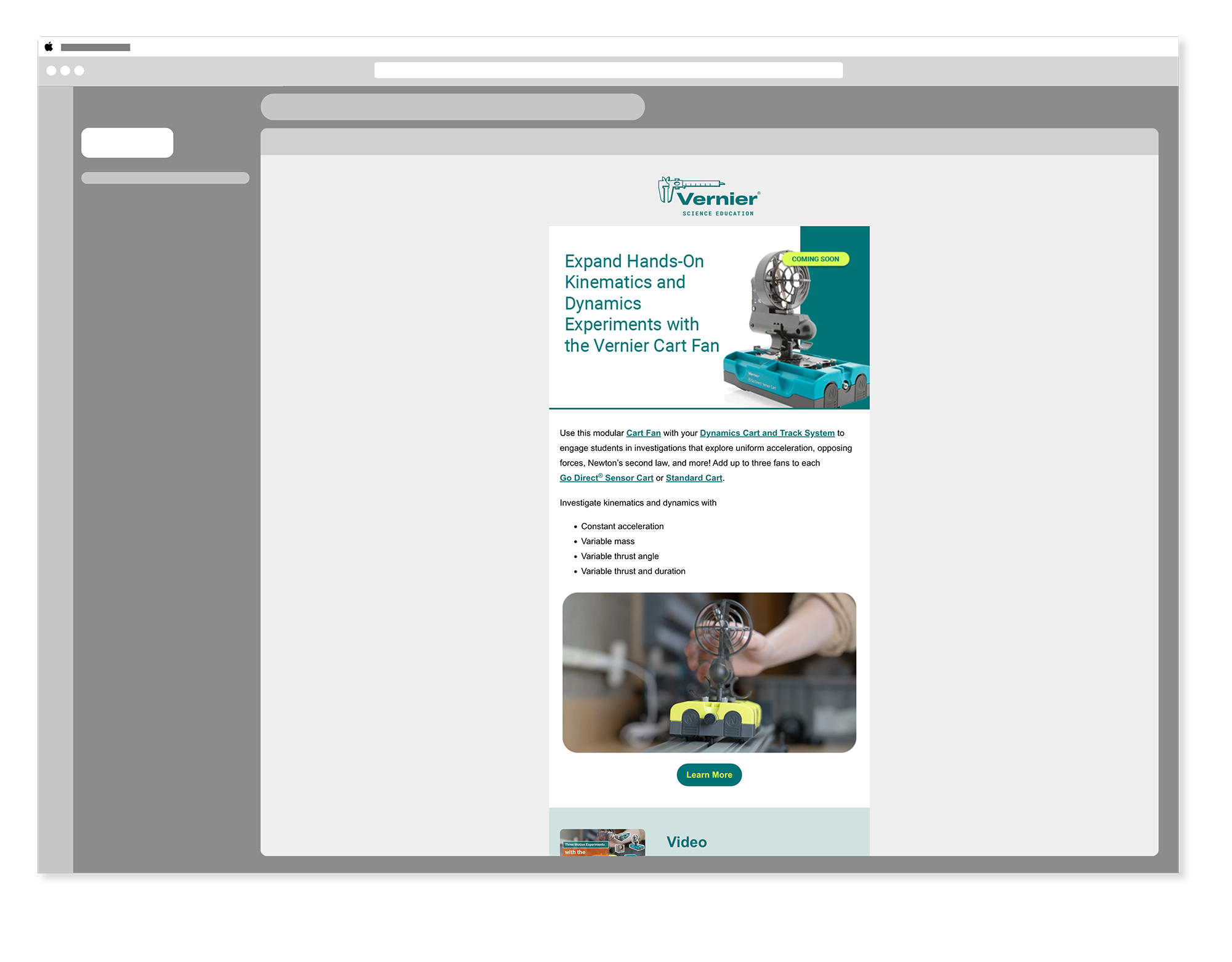
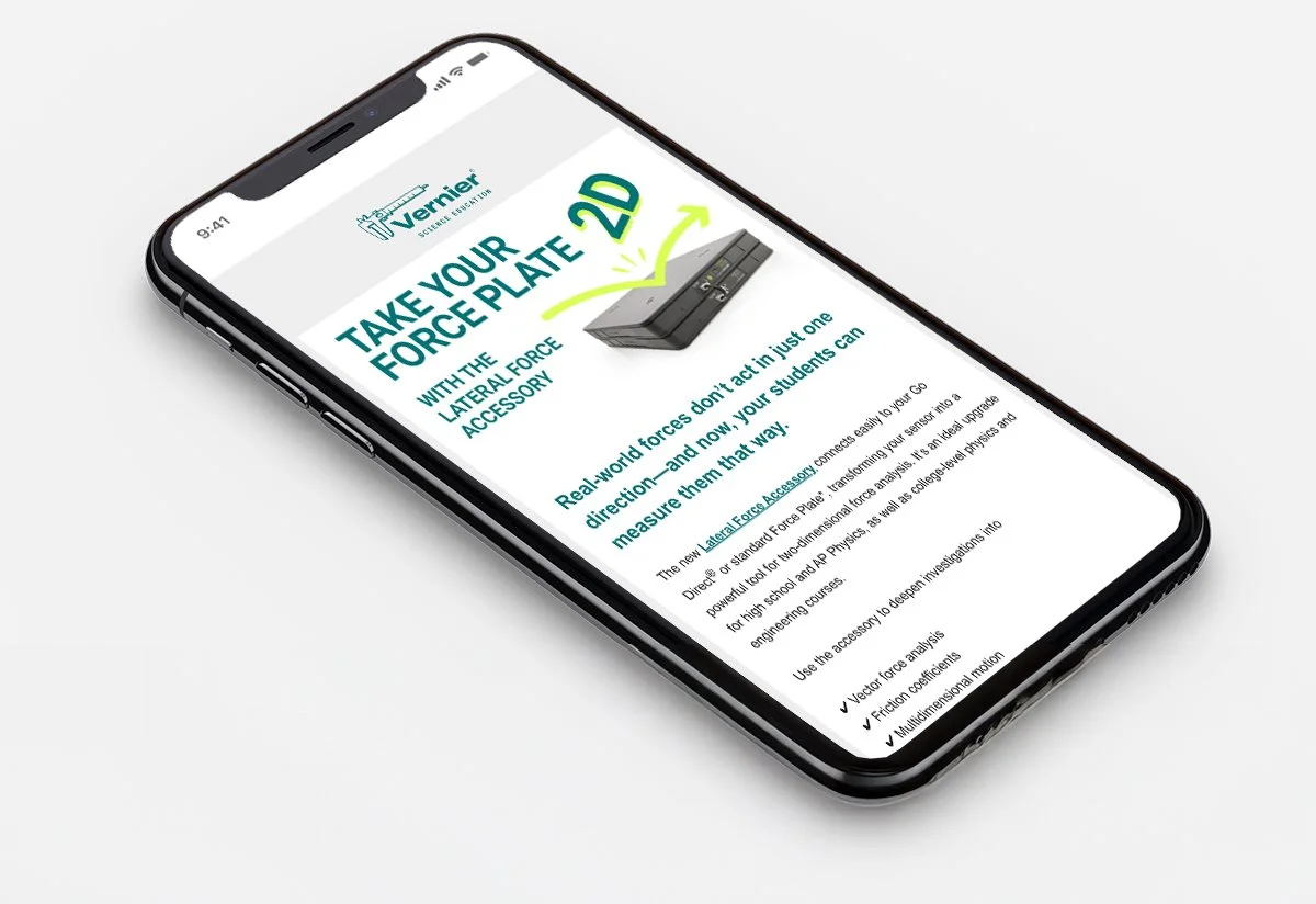
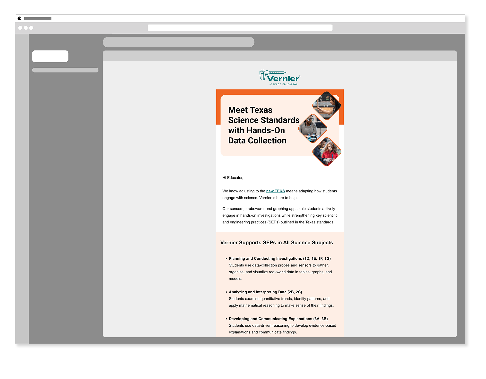
Product Announcement Emails
HubSpot Adobe PhotoshopProduct announcement emails were the primary email deliverable — communicating new tools, sensors, and resources to Vernier's educator audience. Each email led with the product, used clear hierarchy to surface the most important information quickly, and carried a direct call to action that gave educators an easy path to learning more or purchasing.
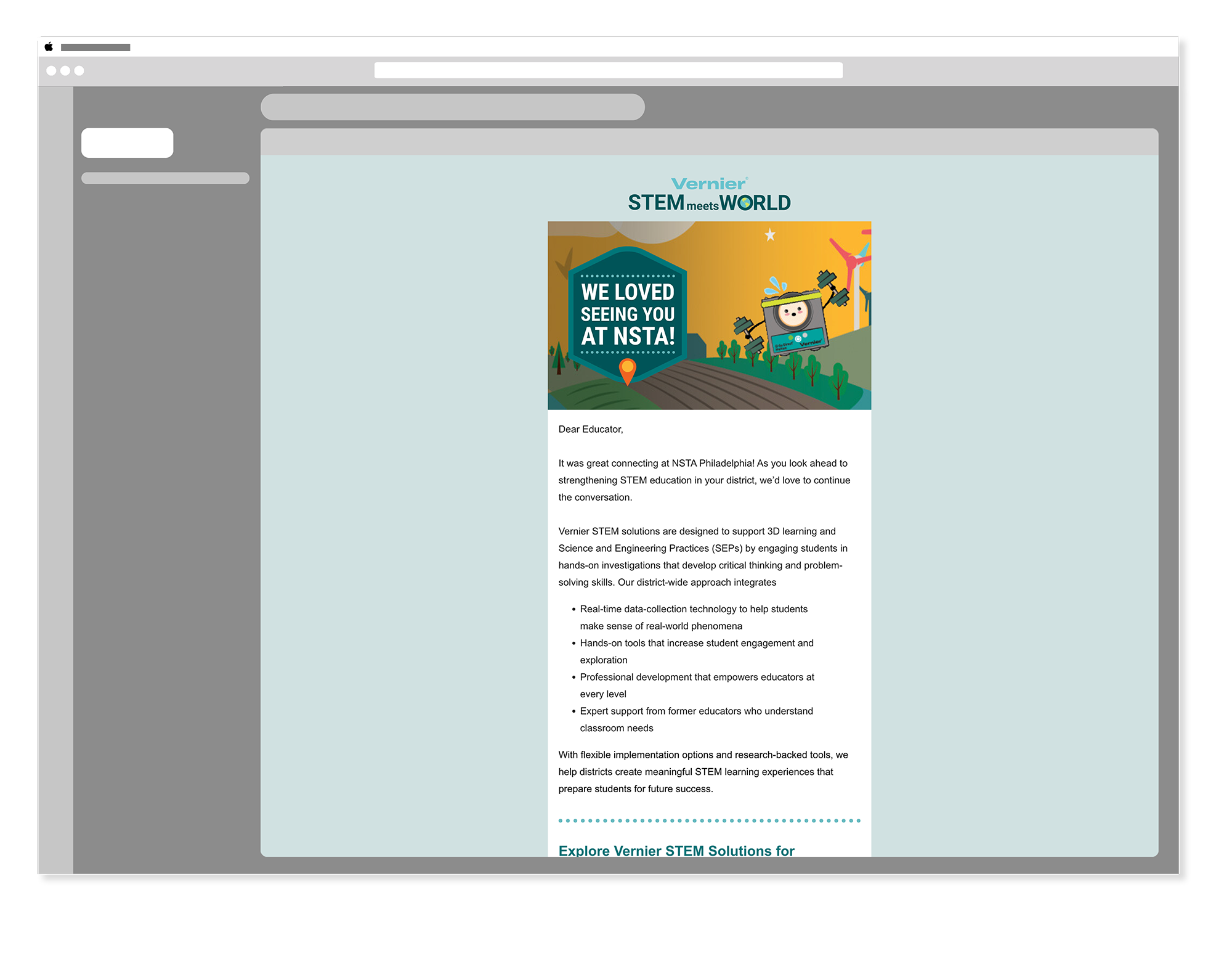
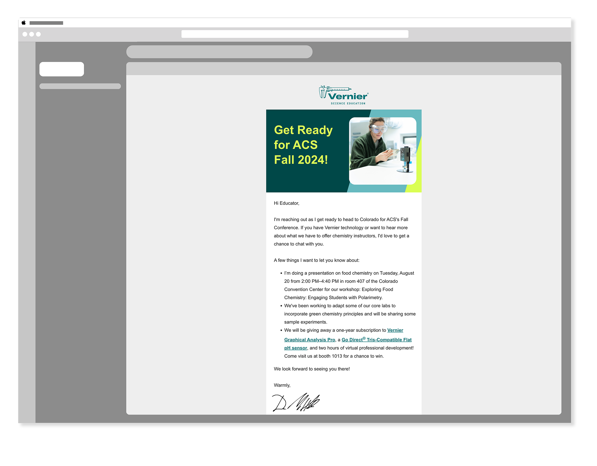
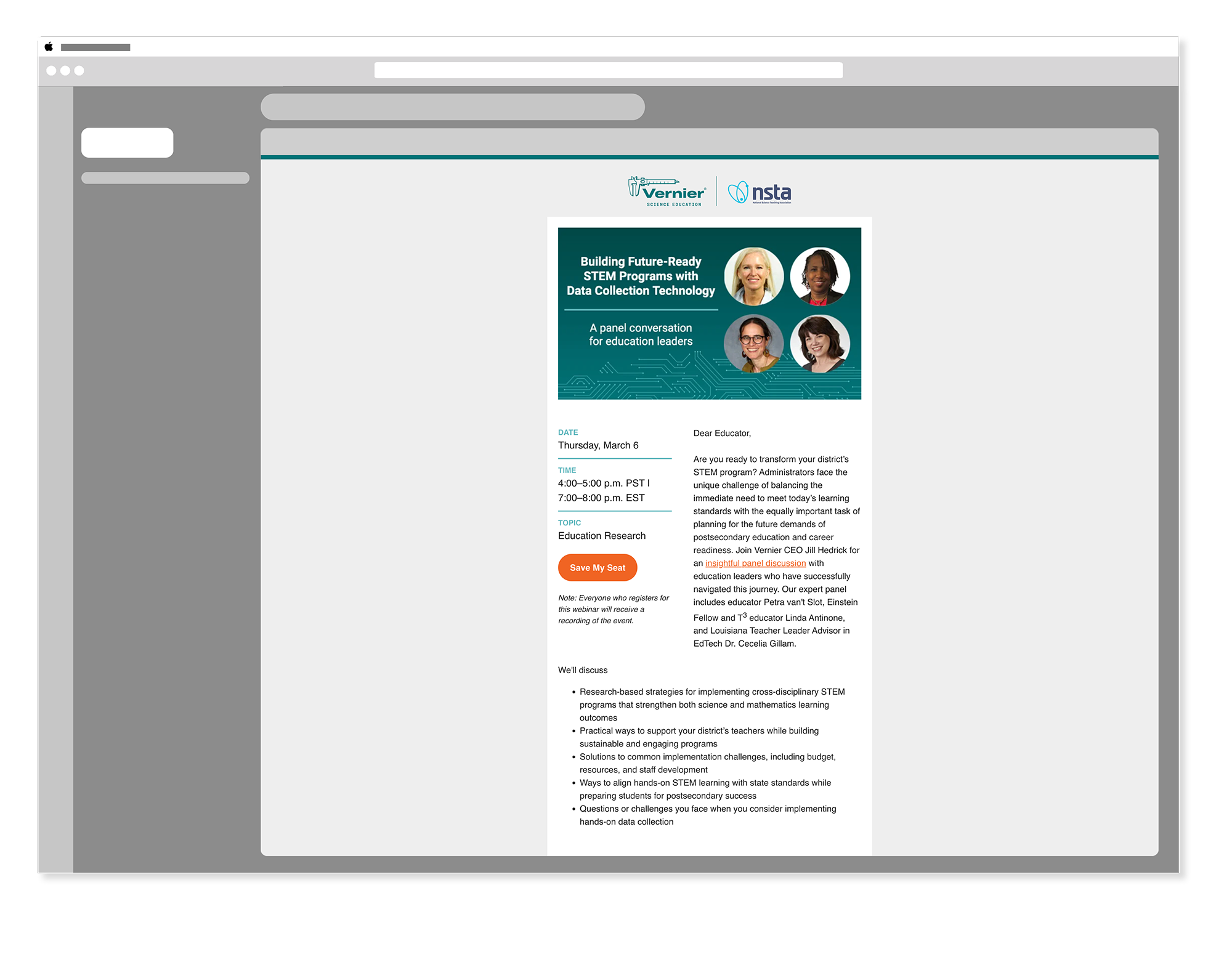
Conference Emails
HubSpot Adobe PhotoshopConference emails supported Vernier's presence at key educator events throughout the year — announcing booth locations, highlighting featured products, and driving registrations for workshops and demos. These emails needed to feel timely and energetic while staying anchored in the Vernier brand system.

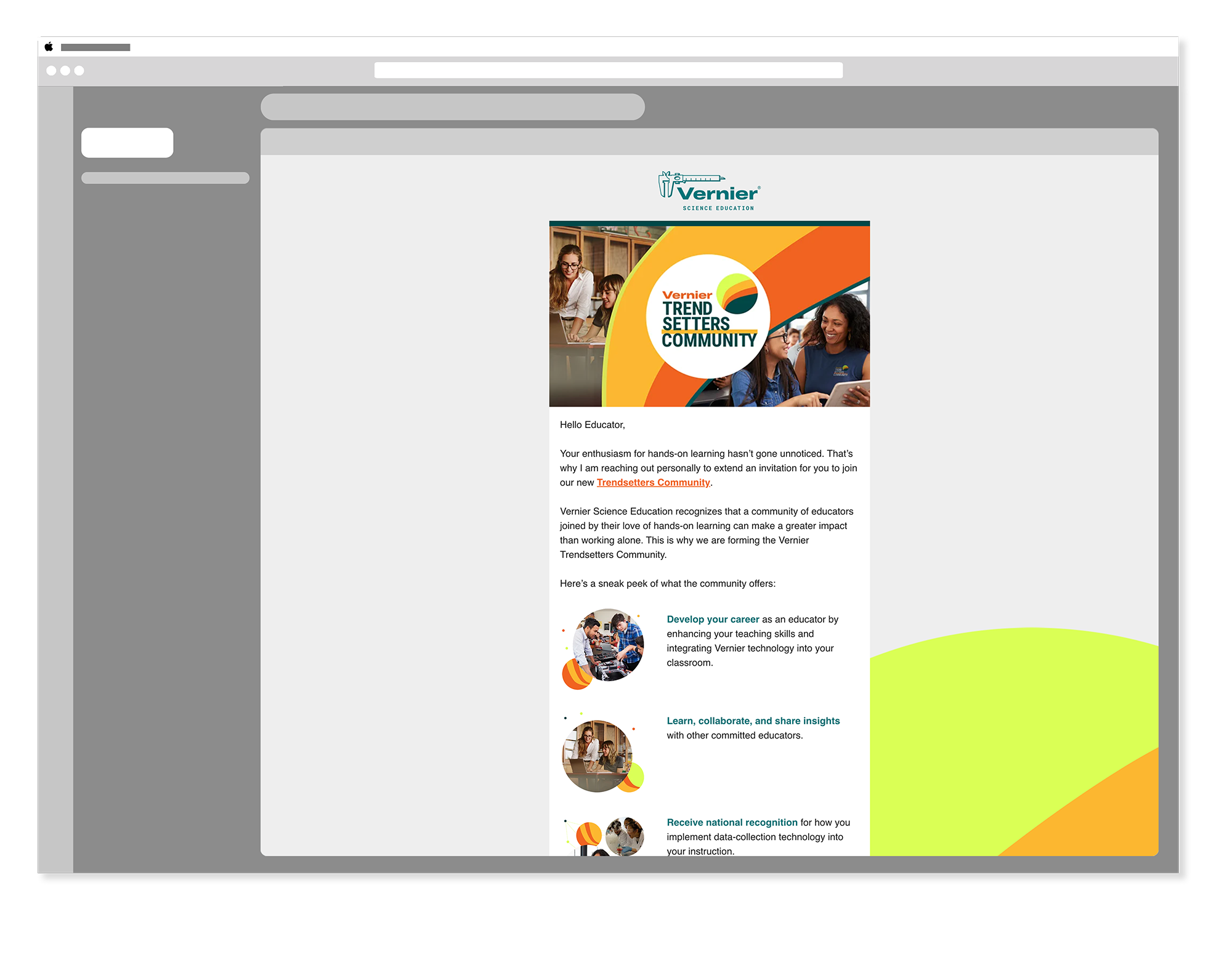
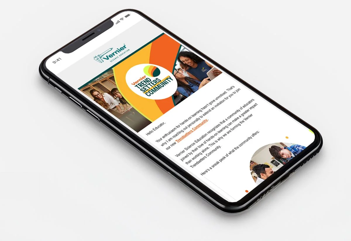
Trendsetter Emails
HubSpot Adobe PhotoshopThe Trendsetter program was Vernier's loyalty program for educators — teachers who had gone beyond simply using Vernier products to actively advocating for the brand in their schools and districts. Trendsetter emails needed to feel exclusive and appreciative, reinforcing that this community was valued and recognized. The tone was warmer and more personal than standard product emails, reflecting the relationship Vernier had built with its most engaged advocates.
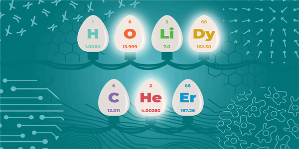
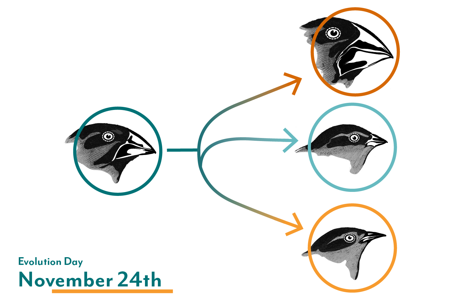
Email Headers & Seasonal Graphics
HubSpot Adobe Photoshop Adobe IllustratorBeyond full email builds, contributions to Vernier's broader email program included designing headers, seasonal graphics, and animated elements that carried the brand into a longer-form communication format — working within existing email structures while raising the overall visual quality of each send.
Display & Banner Ads
Adobe Illustrator Adobe PhotoshopDisplay and banner ads were produced for NSTA and science education publications — placing Vernier's brand in front of educators on the third-party platforms they visited regularly. Each ad was built to vendor specifications, designed to read clearly at small sizes, and produced in multiple dimensions to cover the full range of placements available across each publication's ad inventory.


“Building difficult scientific concepts into something tangible and beautiful.”
Meghan Lewis, Senior Visual DesignerProduct launches, event follow-ups, and everything in between.
Six years of email work produced a wide range of communication types — from product-focused announcements to event-driven campaigns to regional outreach. Each one had its own audience, its own goal, and its own design challenge.
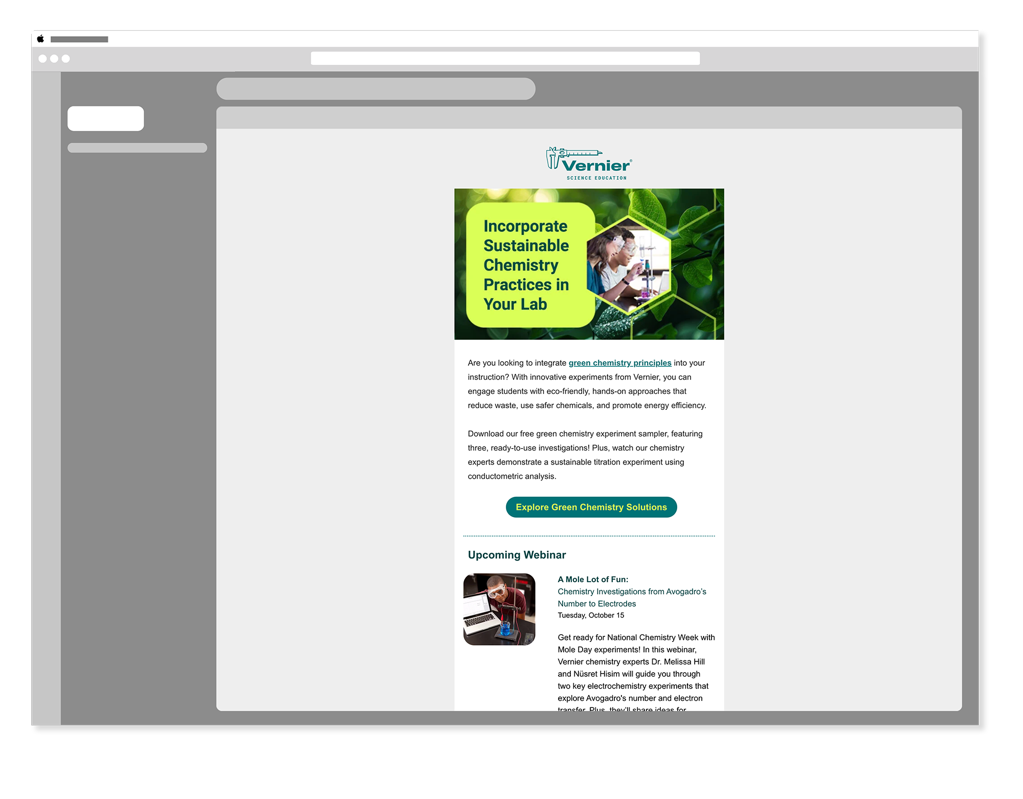
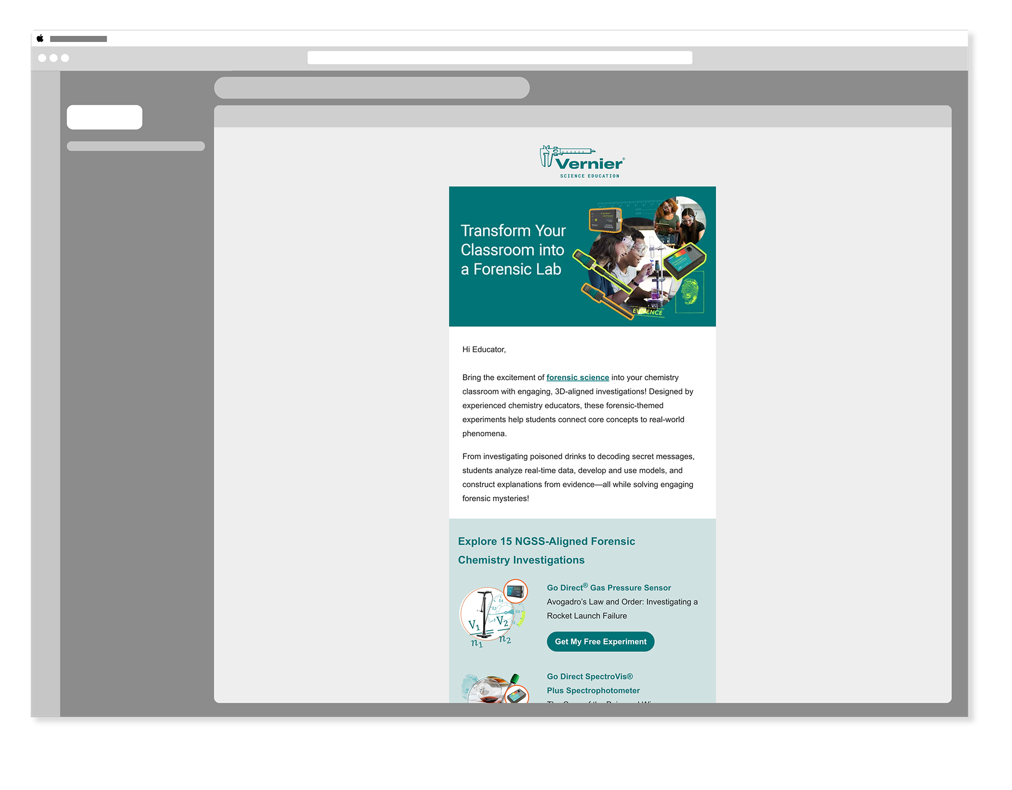
Green Chemistry & Forensic Lab — Campaign Emails
HubSpot Adobe IllustratorTwo campaign-driven email series — Green Chemistry promoting Vernier's commitment to sustainable science education, and Forensic Lab supporting a curriculum-focused product line. Each required a distinct visual tone: Green Chemistry leaning into natural palettes and environmental messaging, Forensic Lab carrying the energy of investigative science.

Regional & Workshop Emails
HubSpotRegional emails targeted specific geographic markets — including a dedicated Texas campaign that addressed the needs and curriculum standards of one of Vernier's largest educator audiences. Workshop emails supported specific training and professional development offerings, giving educators the information they needed to register and prepare.
Six years of consistent digital communication — across every channel, every campaign.
Six years of product announcements, promotional campaigns, conference communications, and newsletter contributions — a reliable, on-brand email presence for Vernier's educator audience.
Display and banner ads placed across NSTA and science education publications extended Vernier's brand beyond its own channels — reaching educators on the platforms they already trusted.
Every email and ad — across six years, multiple campaigns, and two channel types — held to the same visual standards, reinforcing Vernier's identity with every send and every placement.
The work that runs quietly in the background — and keeps the brand moving forward.
Email and digital advertising don't get the same attention as a conference booth or a product launch microsite. They're not the work people point to when they talk about a brand's visual identity. But they're the work that reaches the most people, the most often — landing in inboxes and appearing on publication pages week after week, year after year. Done well, they build familiarity and trust without anyone noticing. Done poorly, they erode both.
Six years of email and advertising work at Vernier taught me a lot about designing for environments you don't control. Email clients render differently. Ad platforms have their own rules. HubSpot's builder has real constraints. Working within those limitations while still producing something that felt like Vernier — warm, clear, and professional — required the same design discipline as any other channel, just applied differently.
The variety of the work was what kept it interesting. A Trendsetter email celebrating customer advocates required a completely different tone from a Force Plate product launch. A regional Texas campaign had different considerations than a conference follow-up. Each one was a small design problem worth solving well — and six years of solving them added up to something I'm genuinely proud of.
The Vernier Collection
Explore More Vernier Work
Nine case studies covering six years of in-house design work. You're viewing 4 of 9.
Brand Guide & Refresh
View Case Study →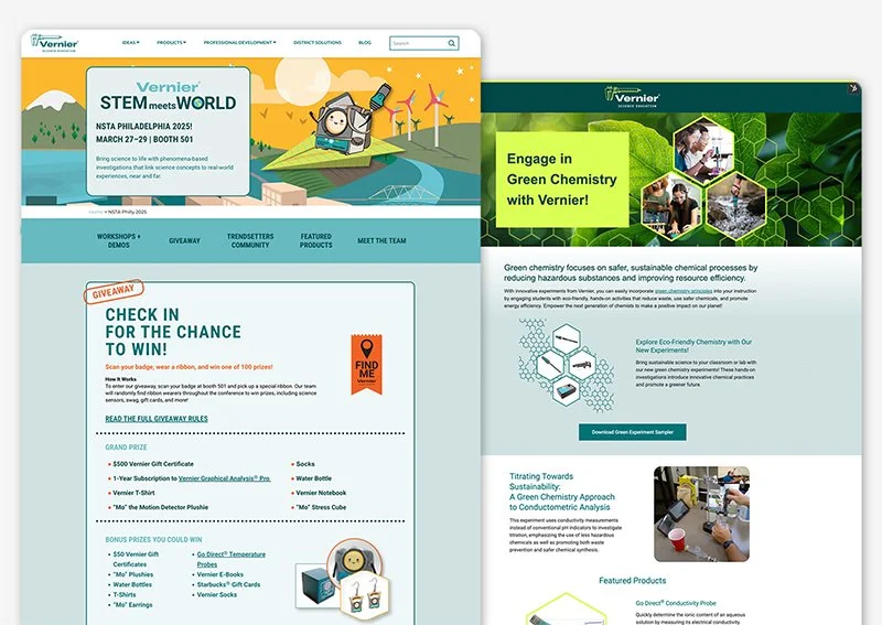
Campaign Websites
View Case Study →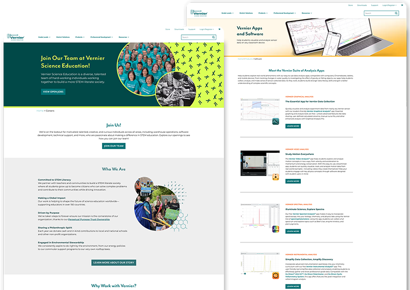
Internal Website Design
View Case Study →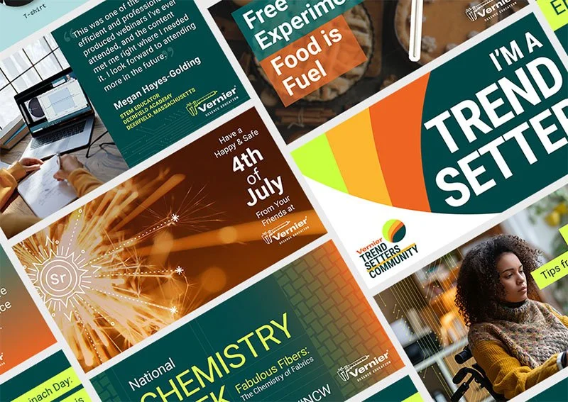
Digital & Social Media
View Case Study →
Print Brochures, Flyers & Packaging
View Case Study →
Print Catalogs, Books & Papers
View Case Study →
Conference Signage & Swag
View Case Study →
Seasonal Branding & Digital Art
View Case Study →