
From Static PDF to Living System — Vernier Science Education Brand Guide & Refresh
A brand evolution and living online guide built to replace an outdated static PDF — modernizing Vernier's visual identity and giving the entire organization a single, maintained source of truth for brand standards.

Overview
Seven years of science education design — anchored by a brand system built to last.
Vernier Science Education has been making science accessible for students and educators since 1981. By 2022, the brand had accumulated years of incremental updates that left it feeling dated, inconsistent, and difficult to apply at scale. The visual identity needed to evolve — and the way the brand was documented and shared needed to evolve with it.
Working alongside Art Director Brent Maynard and Creative Supervisor Kristen Paniagua, I helped shape the brand refresh and built the online brand guide that would become Vernier's single source of truth for visual standards. From logo variations to illustration guidelines, the system was designed to be flexible enough to support creativity while consistent enough to keep a large organization aligned.
The Problem
A dated identity, a static PDF, and a brand that wasn't scaling.
Vernier's existing brand had served the organization for years — but by 2022 it was showing its age. The visual identity felt muted and overly intricate, the logo didn't scale cleanly across digital and print applications, and brand standards lived in a PDF that was difficult to update, easy to ignore, and impossible to keep current. The organization needed a brand that could grow with them — and a system for maintaining it that didn't depend on a single document sitting in a shared drive somewhere.
Creative Supervisor, Art Director, and Visual Designer
Key Decisions
What we decided, and why.
Evolve the brand, don't replace it
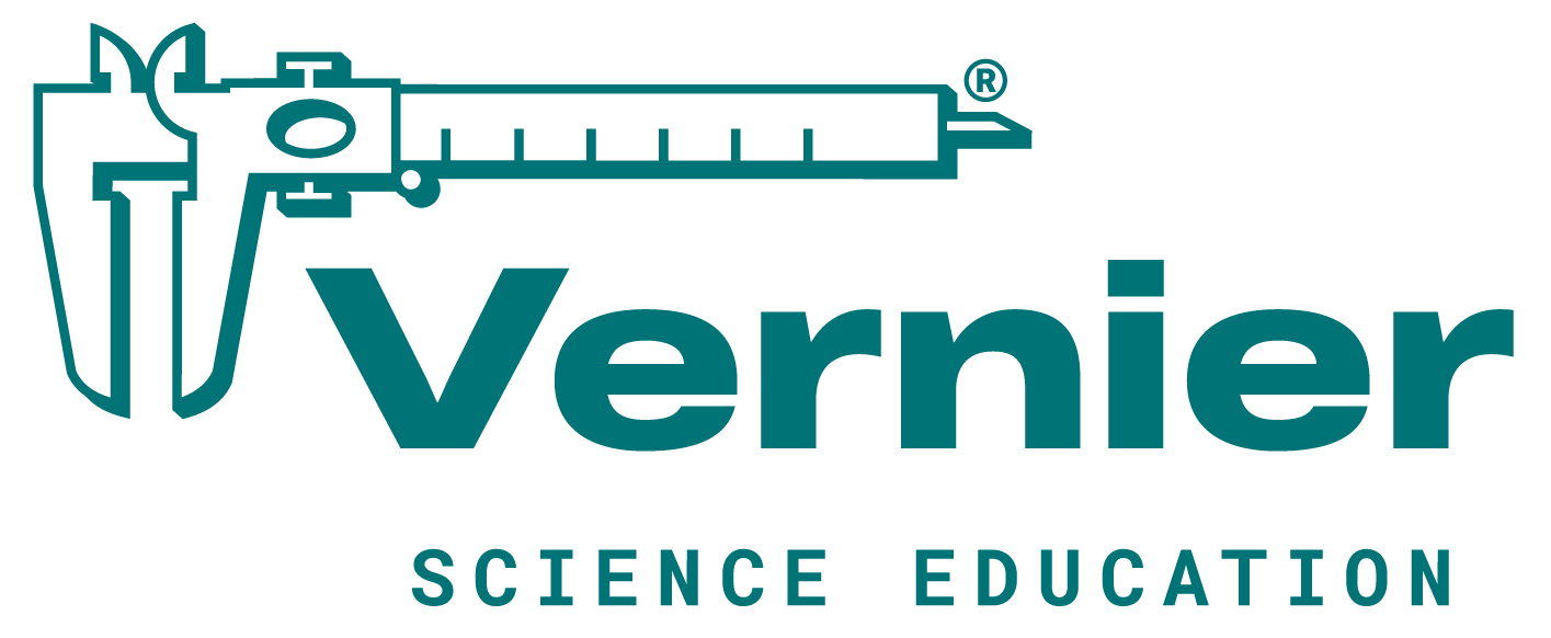
Vernier has been a trusted name in science education since 1981. The founders were protective of that legacy — and rightly so. Rather than a full rebrand, the team made a deliberate choice to modernize what wasn't working while preserving what had equity. The caliper that had always been central to the logo stayed — but was refined and simplified for better scalability and a cleaner, more contemporary feel.
Build a logo system with clear use cases, not just one mark
A single logo can't serve every context — from a trade show banner to a pencil. The refresh established three distinct variations: the full logo for primary use wherever space allowed, a wordmark without the caliper for size-constrained applications, and a simplified Vernier wordmark for small-scale uses like swag and promotional items. Each variation had defined use cases so the brand stayed consistent even at the edges.
Replace the static PDF with a living website
A brand guide that lives in a PDF is a brand guide that gets out of date. The decision to build an online WordPress site — with sections for logo, color, typography, illustration, photography, layout, accessibility, and more — meant brand standards could be updated in real time, accessed by anyone in the organization, and maintained as the brand continued to evolve. It also protected assets from competitors who regularly monitored Vernier's public-facing materials.

The Brand Evolution
Modernizing a trusted identity without losing what made it recognizable.
The refresh touched every layer of the visual system — logo, color, typography, and illustration. Each element was evaluated against the same question: does this still serve the brand, or is it holding it back? The goal was a system that felt fresh and scalable without losing the familiarity that Vernier's audience had built over four decades.
Logo Refinement
3 VariationsThe caliper — a symbol of precision measurement and a nod to Vernier's scientific roots — had always been central to the logo. It stayed, but was refined and simplified for cleaner rendering across all sizes and surfaces. Three variations were established with a clear size hierarchy: the full logo for primary use wherever space allowed, a wordmark without the caliper for size-constrained applications like swag and pencils, and a Vernier-only wordmark for extremely small contexts like product labels.
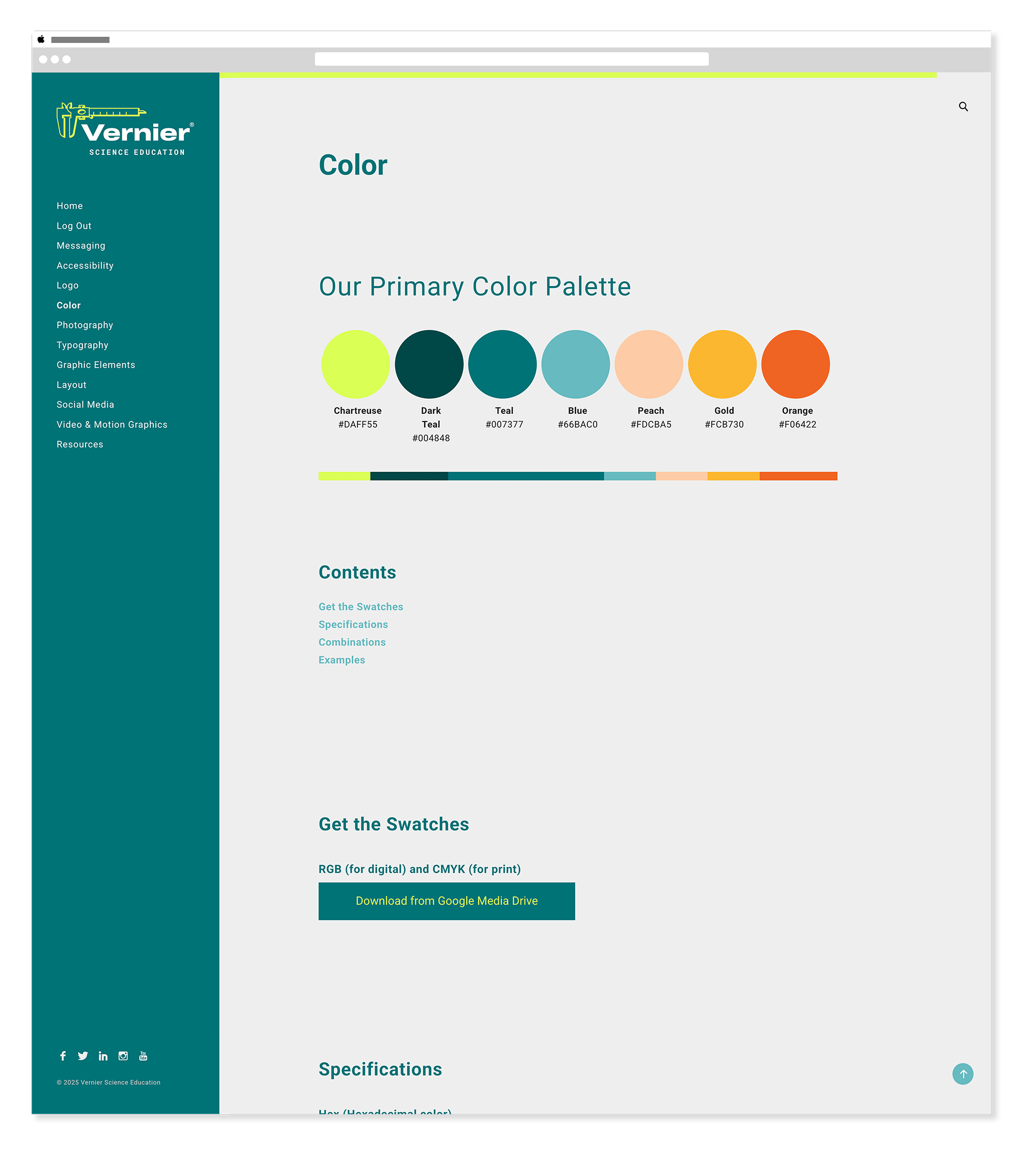
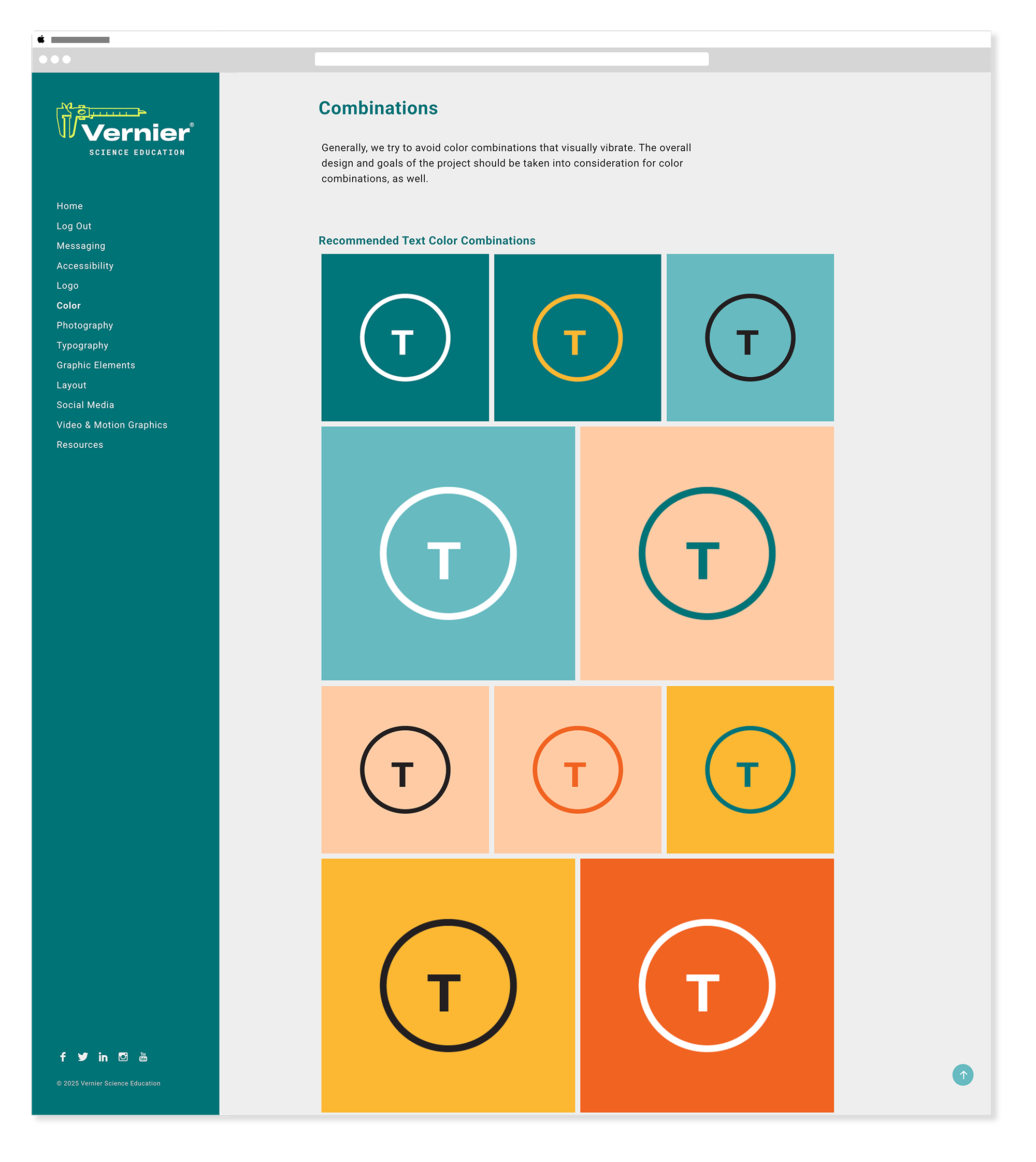
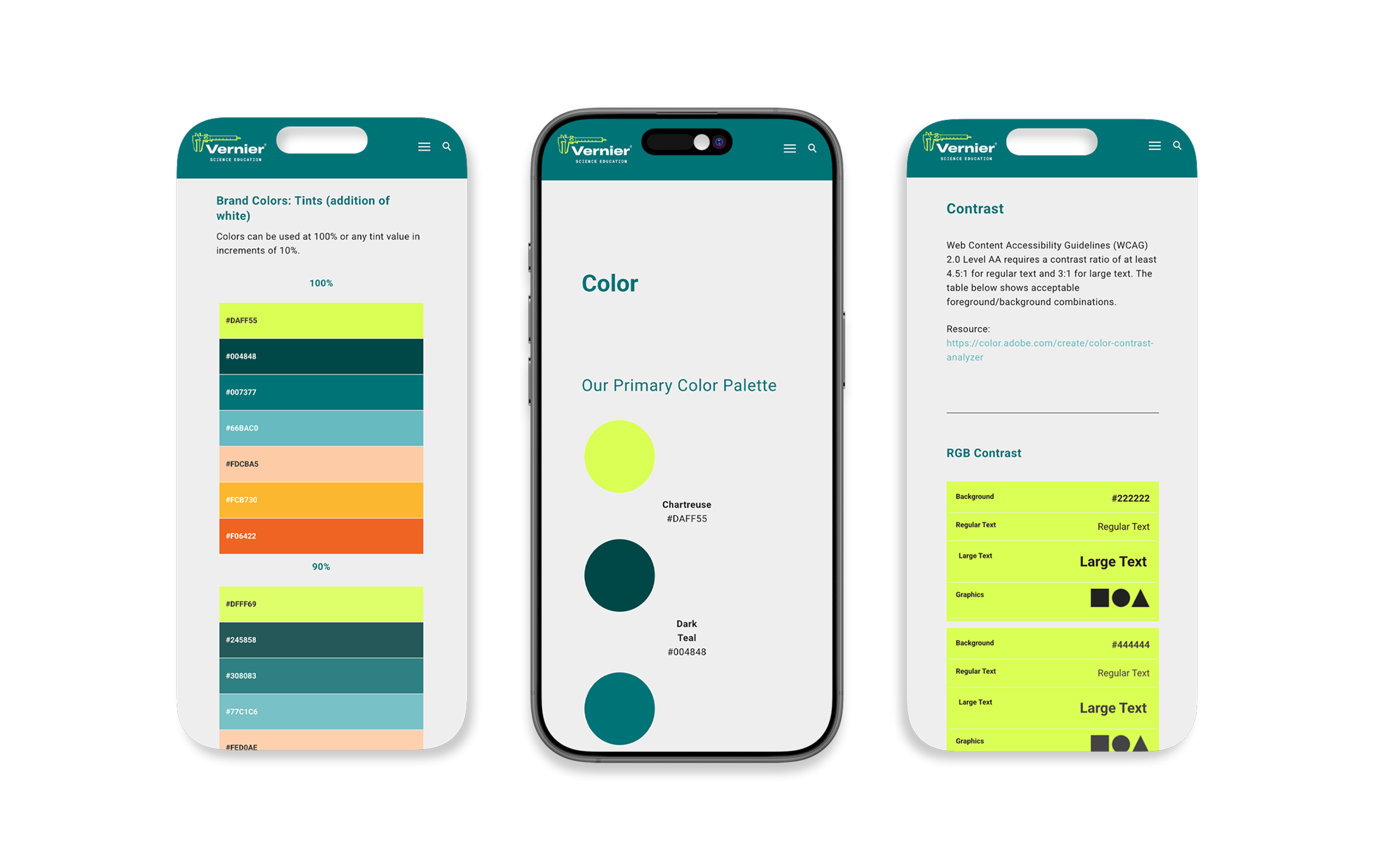
Color System
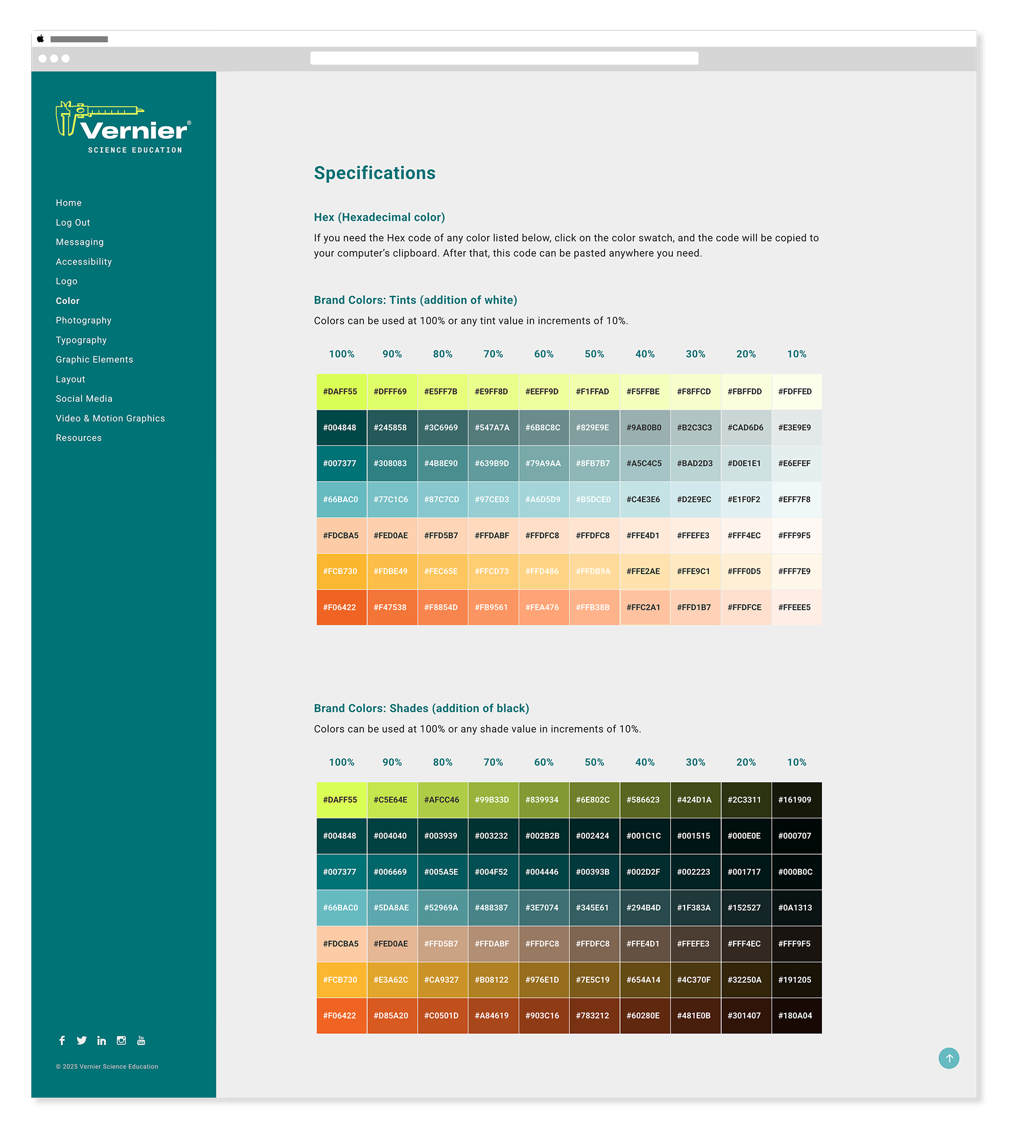
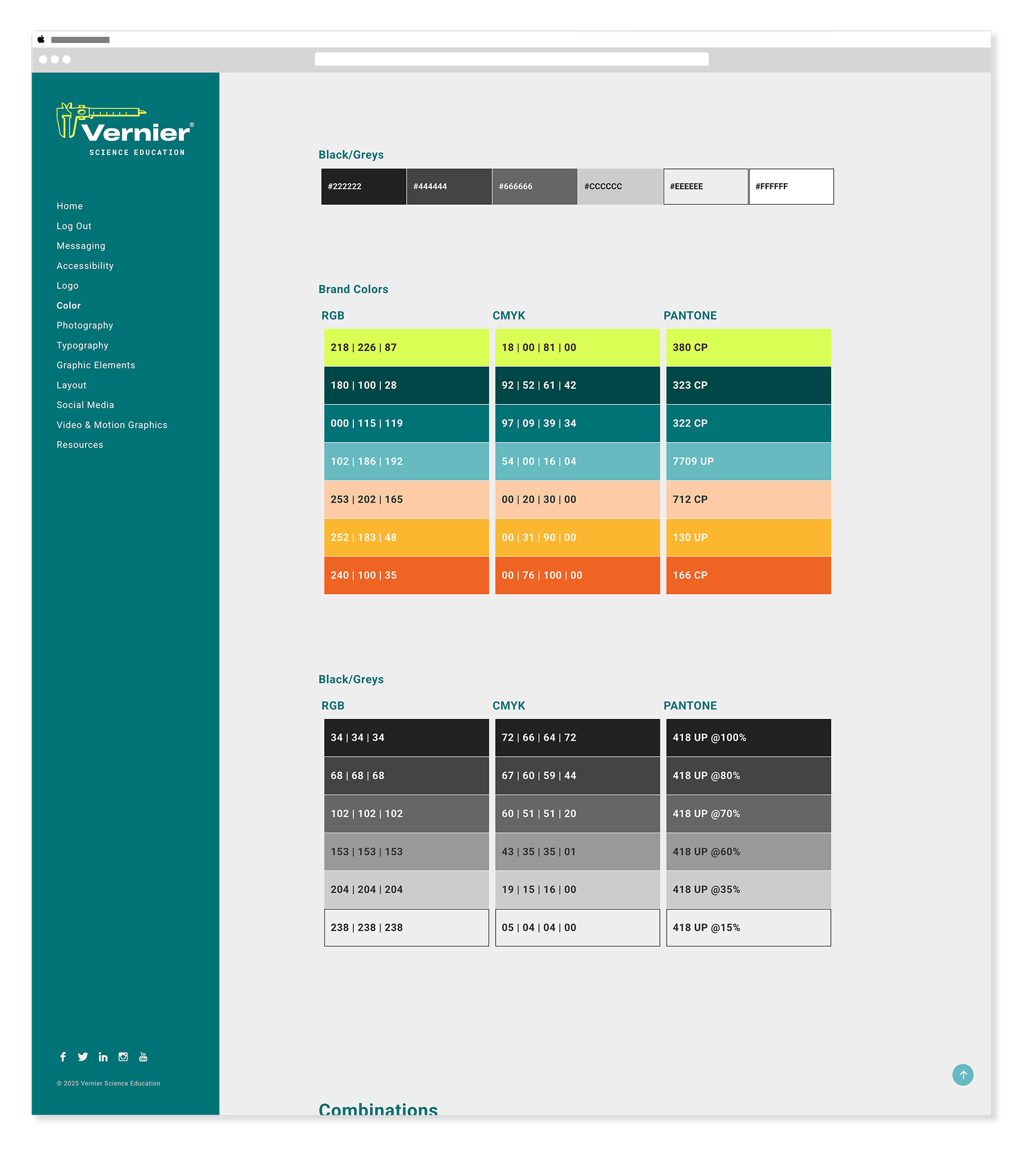
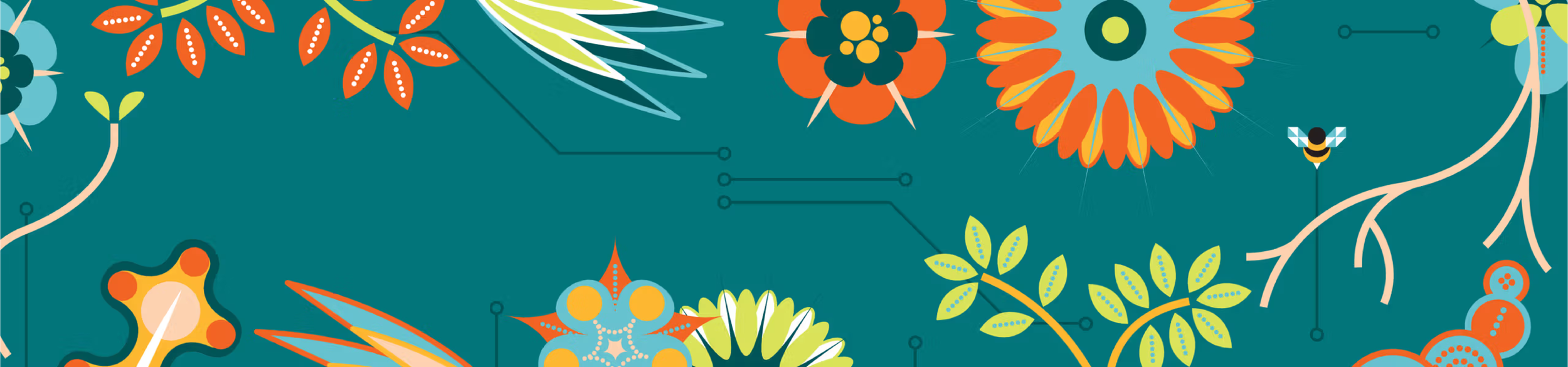
Before & After Digital-SafeThe original palette was cool, muted, and anchored in teal — functional but dated. The refresh moved toward a warmer, more vibrant system anchored by a bold chartreuse and deeper teal tones, with peach, gold, and orange rounding out a palette that felt modern, energetic, and distinctly Vernier. Every color was specified across CMYK, RGB, and Hex to ensure consistency from print production to digital screens.
Before — Pre-2022
Color System — Before & After
Before — Pre-2022
Teal
#007377
Grey
#7A7B75
Orange
#F79B2E
Chartreuse
#D4E458
Red
#D22630
After — 2022 Refresh
Chartreuse
#DAFF55
Dark Teal
#004848
Teal
#007377
Blue
#66BAC0
Peach
#FDCBA5
Gold
#FCB730
Orange
#F06422
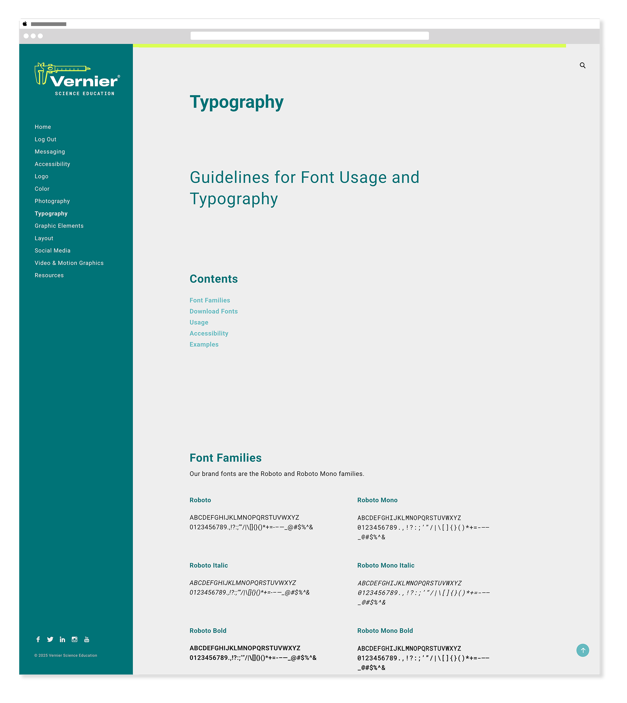
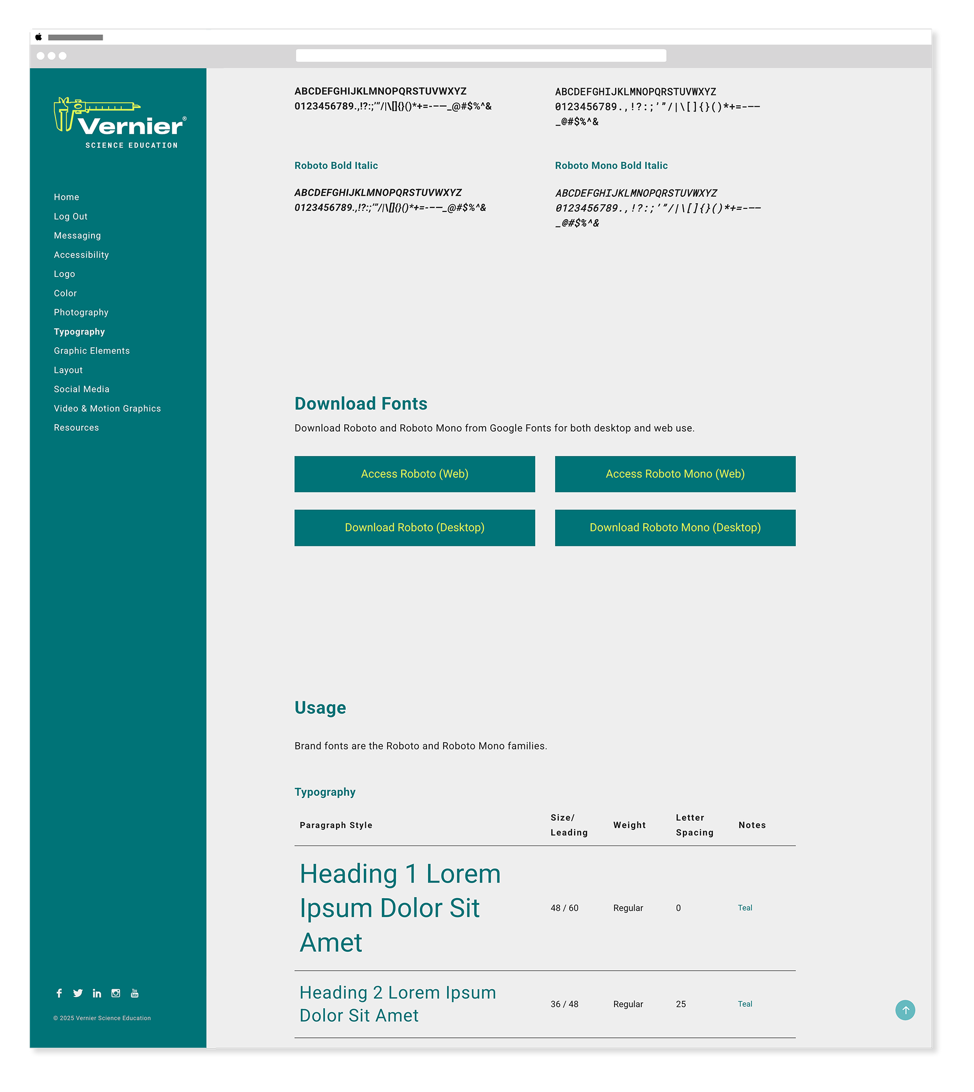
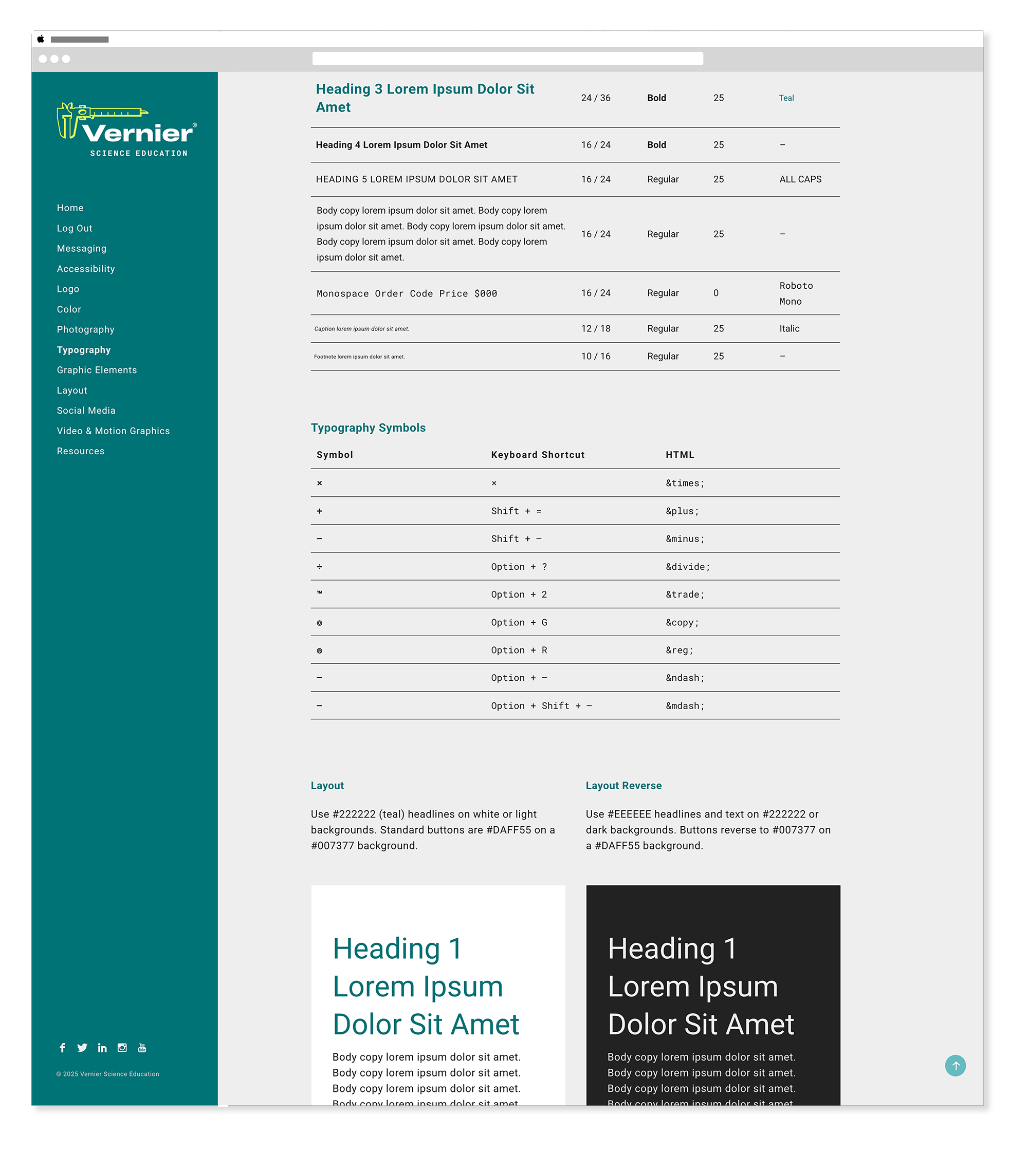
Typography
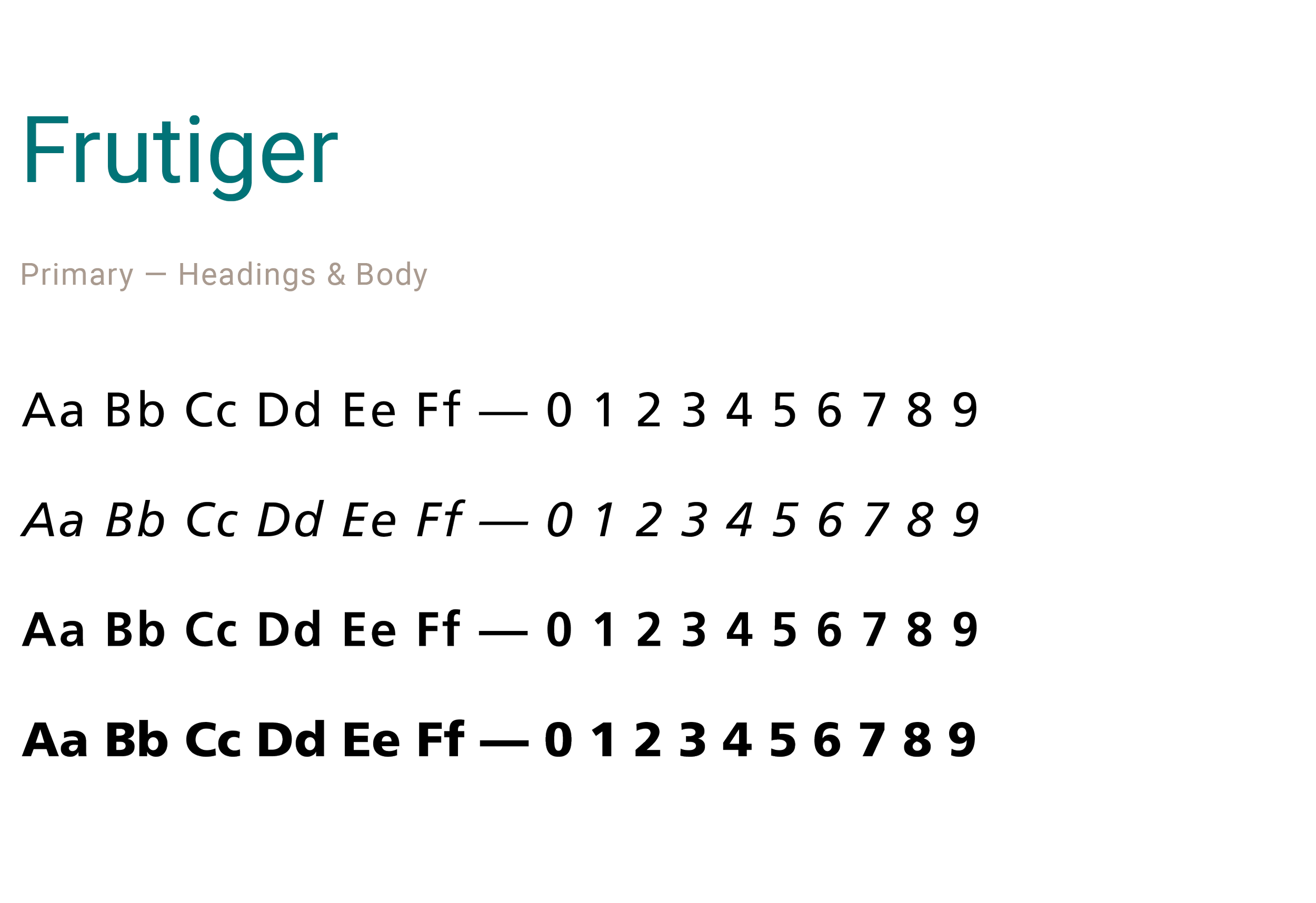
Before & After Print & WebThe type system evolved significantly over the years — from Frutiger's classic corporate feel to the more contemporary Mr Eaves and Montserrat pairing, and finally to the web-first Roboto family. The move to Roboto in 2022 was deliberate — freely available from Google Fonts for both web and desktop, it meant anyone in the organization could access and use the brand typefaces without needing an Adobe Fonts subscription.
typography — pre-2018
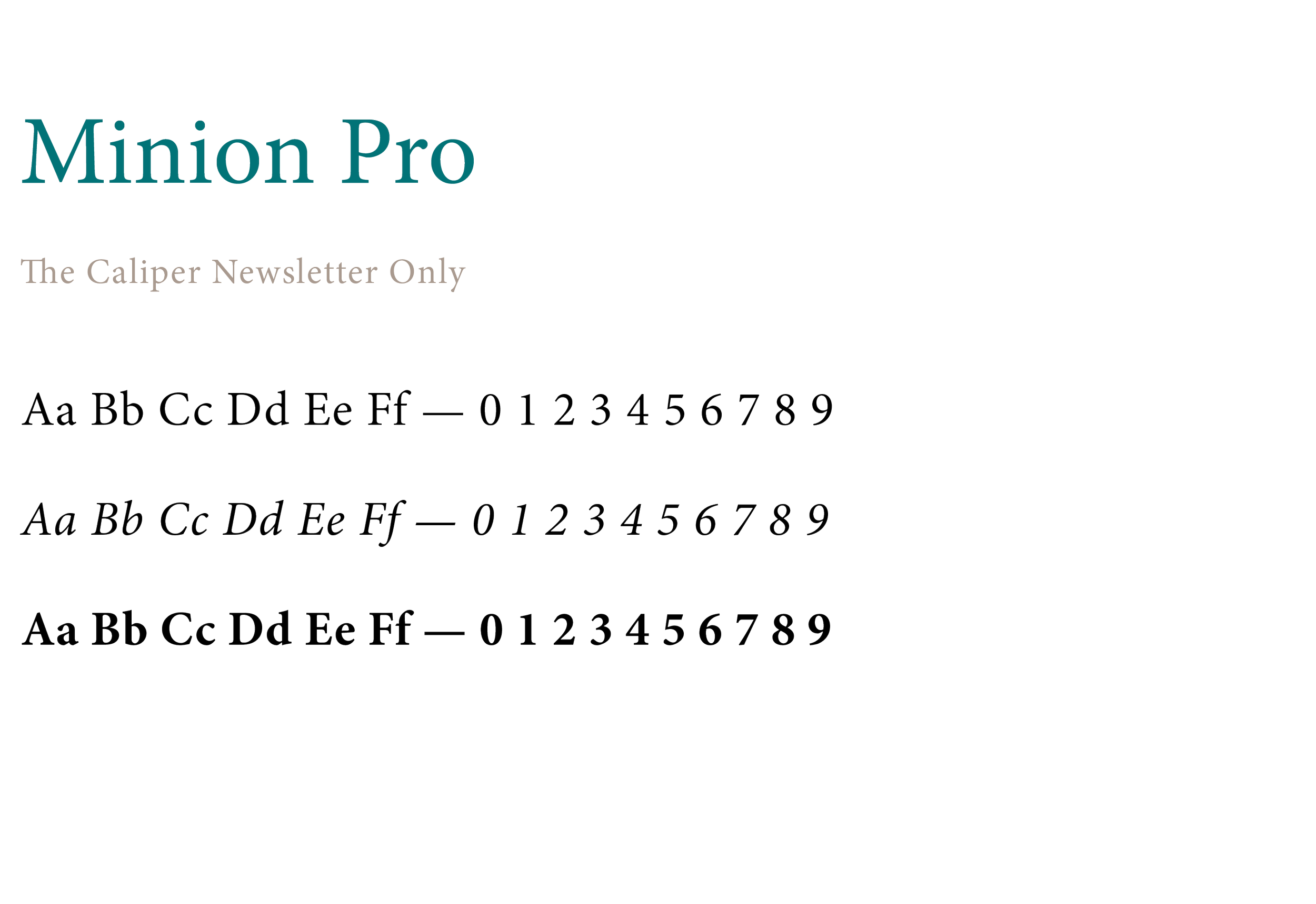
typography — 2020 transition
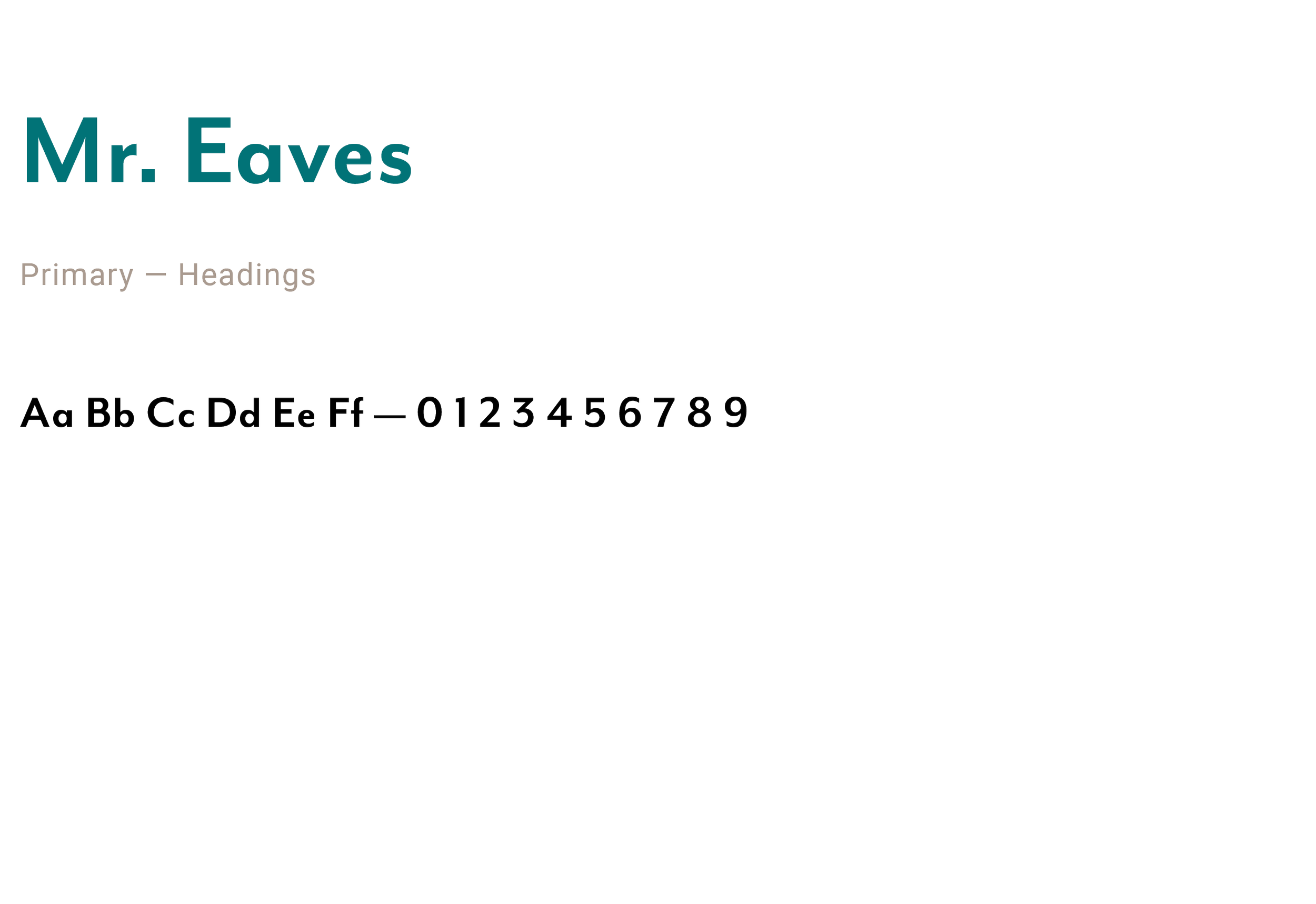
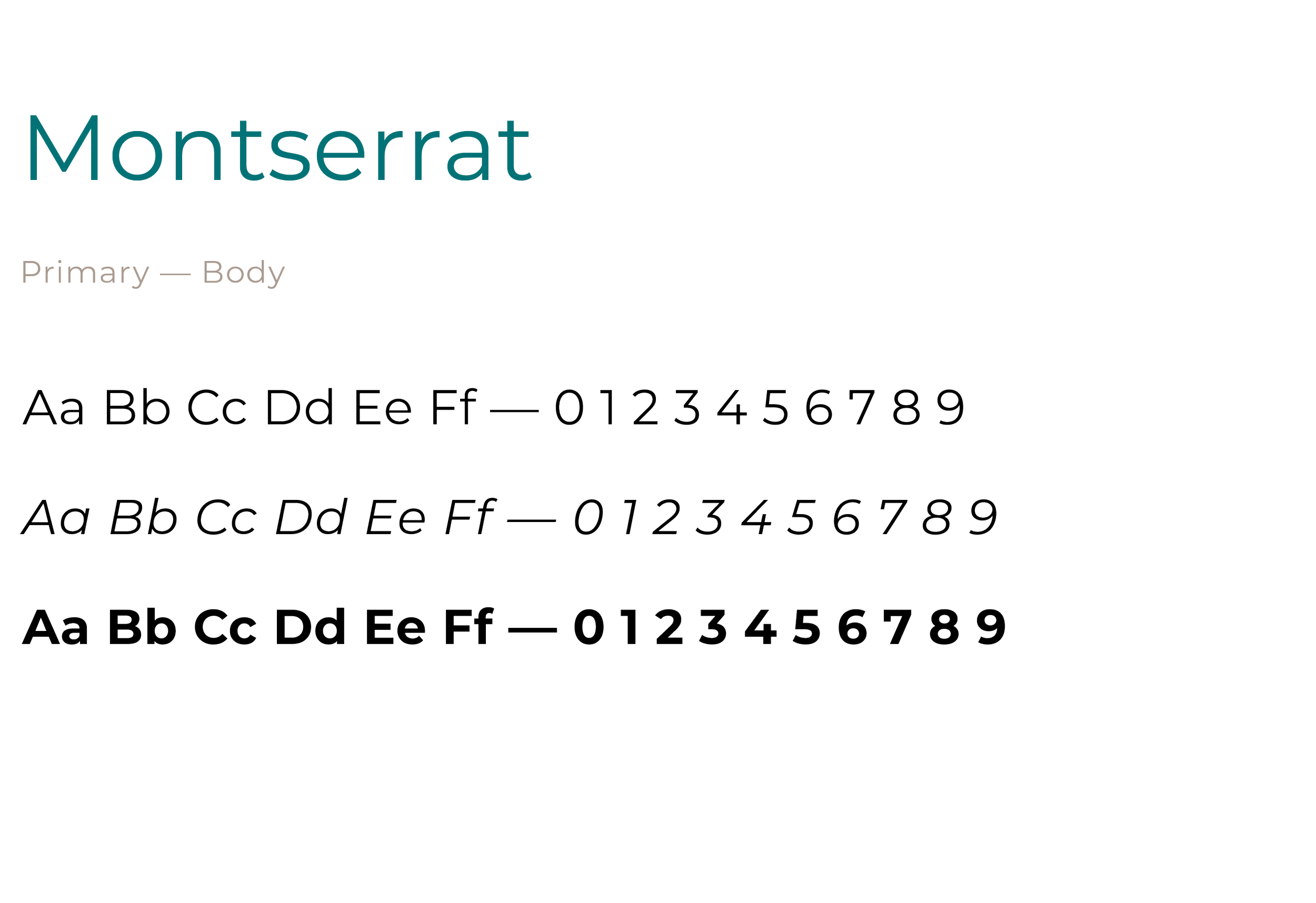
typography — 2022 refresh
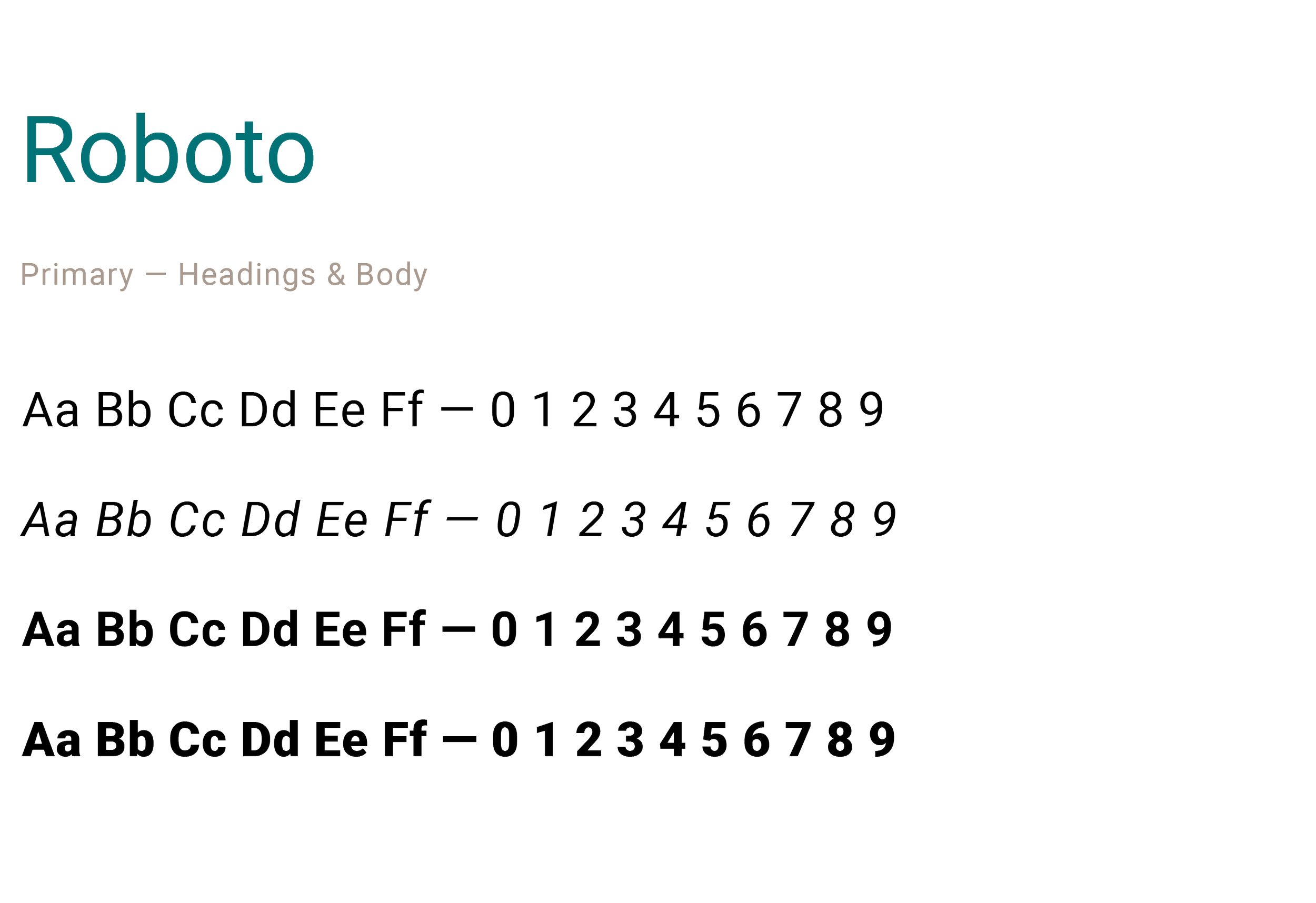
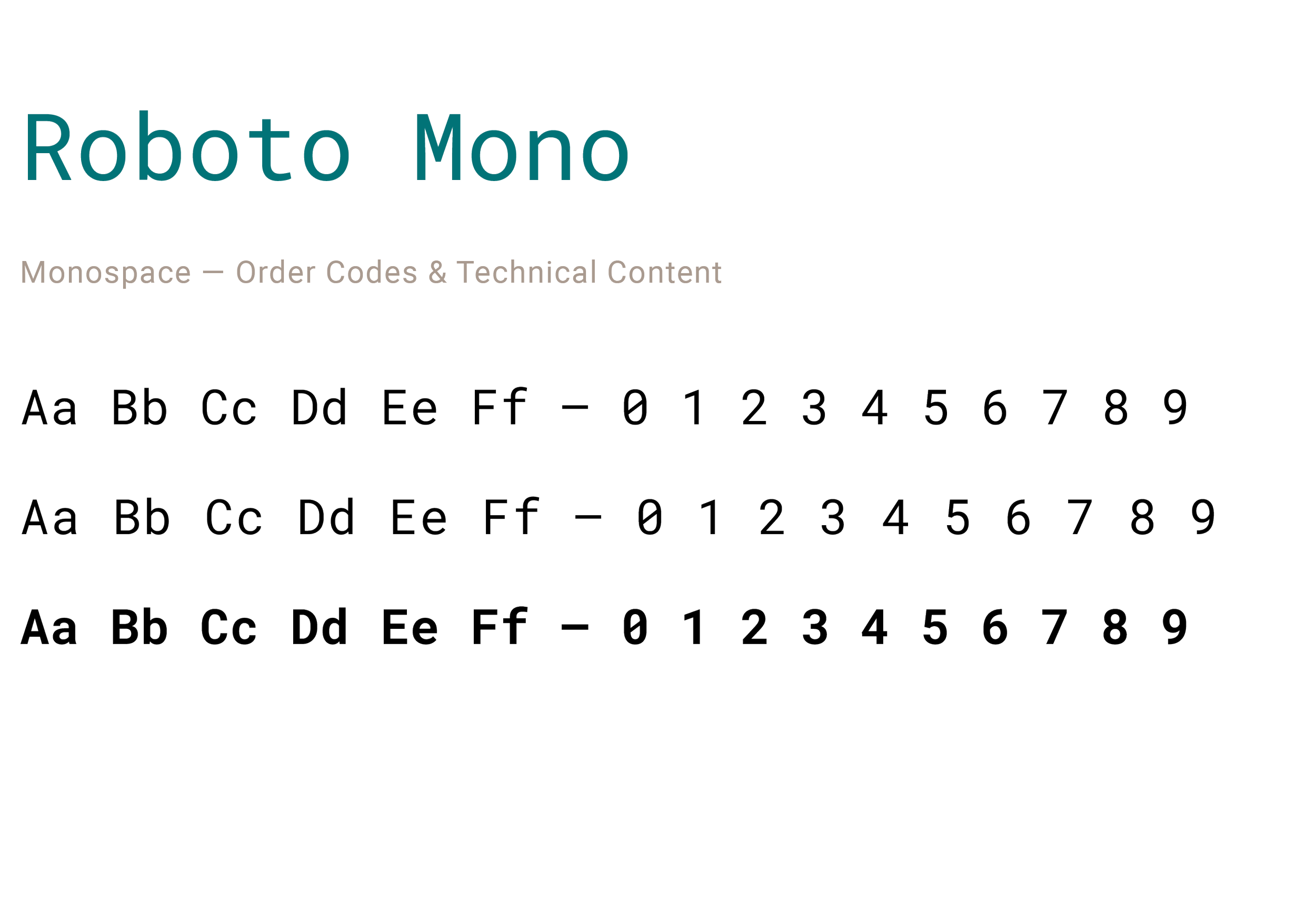
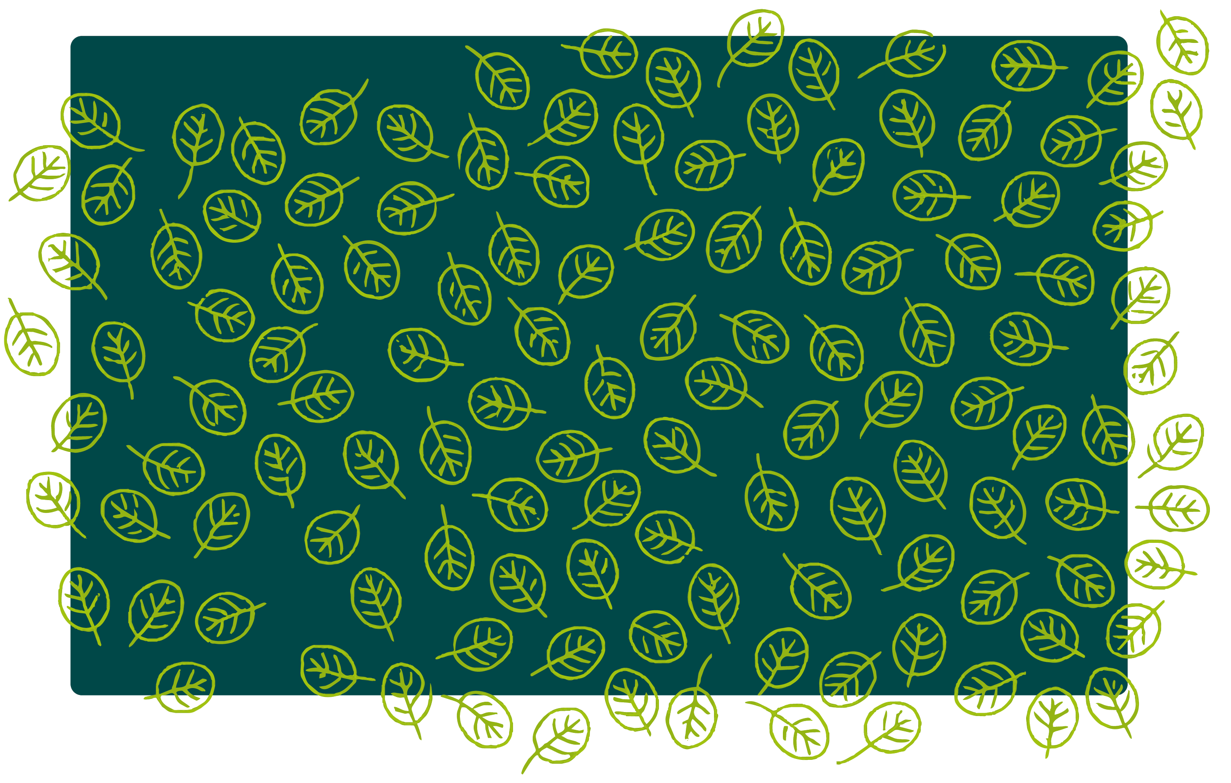
Illustration & Graphic Elements
Line Art Scientific AccuracyIllustration at Vernier served a dual purpose — it had to be visually engaging and scientifically accurate. Patterns and background elements leaned toward clean line art, while more prominent illustrations could be dynamic and realistic depending on the project. Accuracy was non-negotiable — an illustration of lab equipment or a scientific process had to reflect real-world precision, not artistic interpretation.

"A brand guide only works if people can find it, trust it, and actually use it — so we built one they could."
Meghan Lewis — Visual Designer, Vernier Science EducationThe Brand Guide Website
A living system that anyone in the organization could access, trust, and actually use.
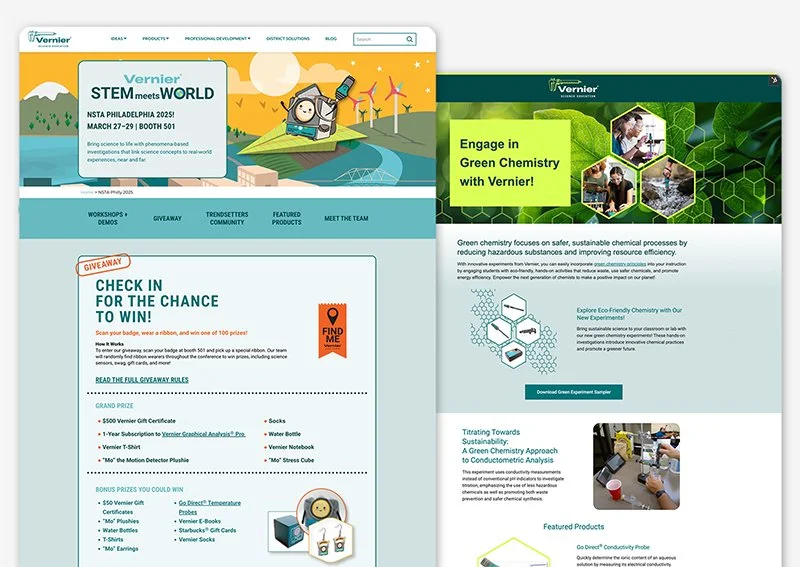
The old static PDF was replaced with a WordPress site built from Brent's wireframes — a structured, searchable, always-current home for every brand standard Vernier needed to maintain. With sections covering everything from logo usage to video and motion graphics, the site gave the entire organization a single source of truth that could be updated in real time as the brand evolved.
To protect proprietary assets from competitors who regularly monitored Vernier's materials, the site was built with member-only access — requiring login to view downloadable resources and detailed guidelines. Managing the authentication system across multiple plugins was one of the more technically complex aspects of the project, requiring ongoing troubleshooting and iteration to keep the login experience smooth for internal users.
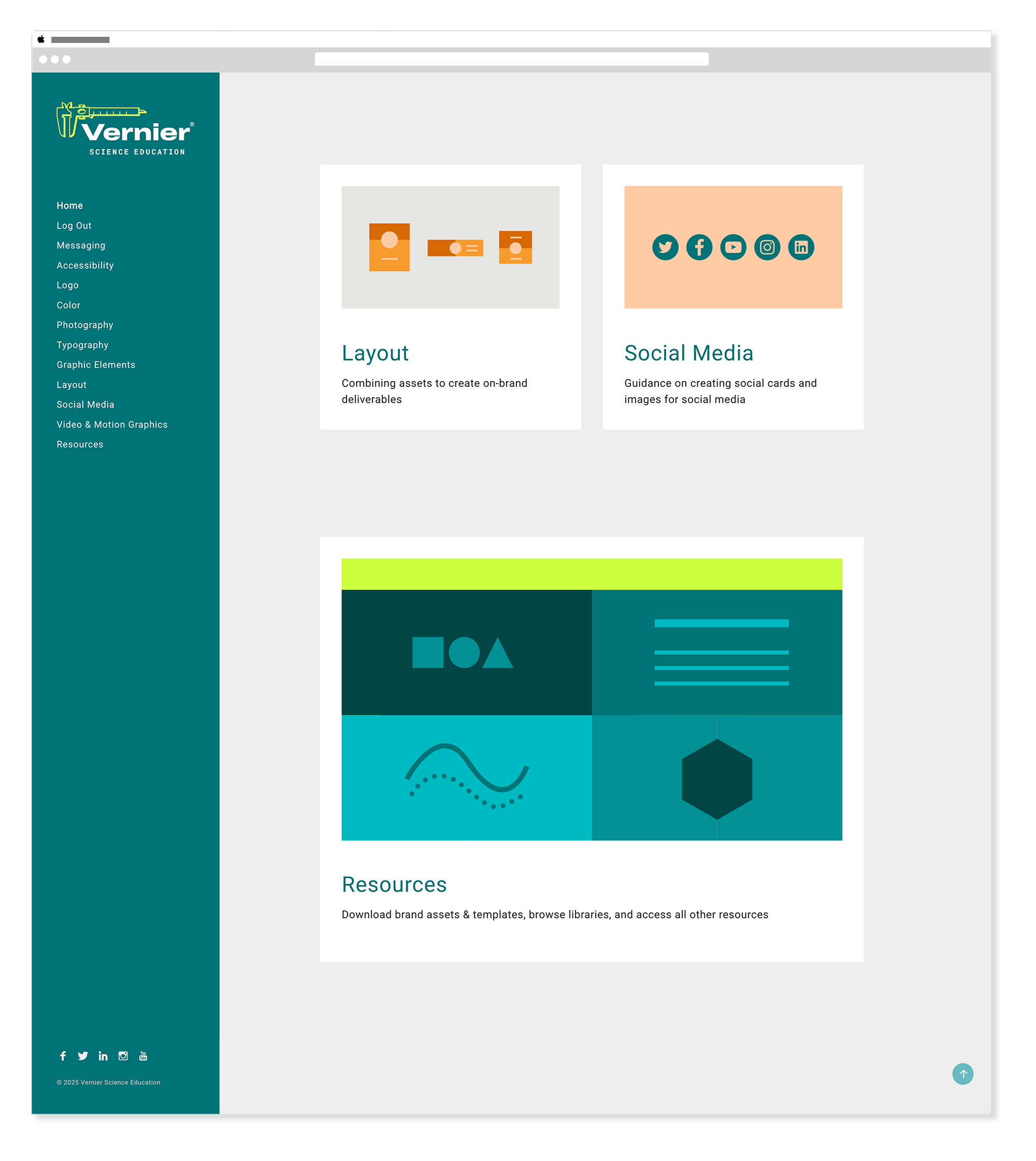
Homepage
WordPress Online Brand GuideThe homepage served as a navigation hub — each section card linking directly to its corresponding brand guideline page. The introductory statement set the tone for the entire guide: these are guidelines for creativity within the brand, not rigid rules that limit it.
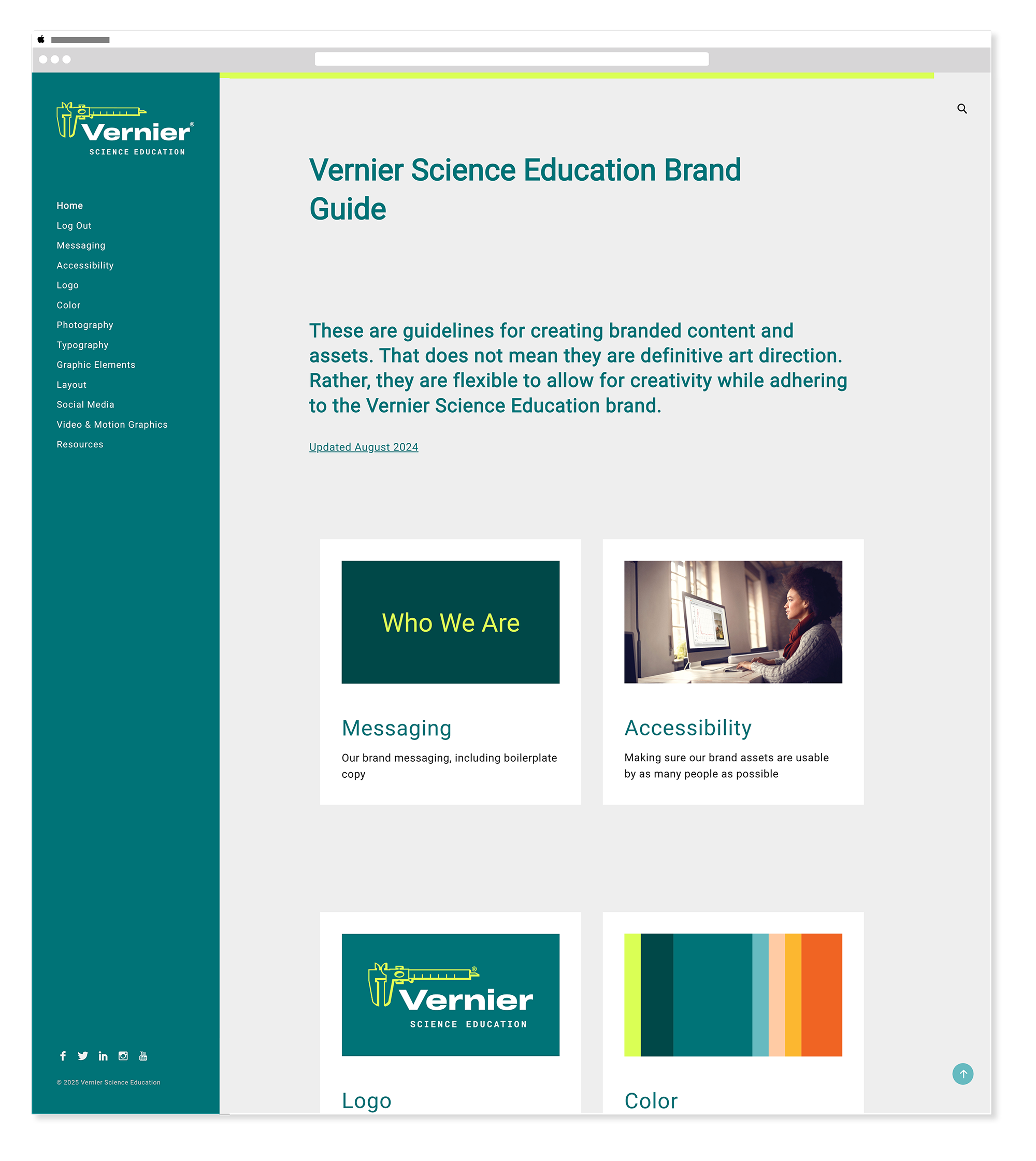
Logo
Downloads SVG · PNG · EPSThe logo section documented every variation, use case, and misuse — with downloadable assets for each context. Every team member, agency partner, and vendor could access the right file format for the right application without having to ask.
Color
CMYK · RGB · HexThe color section specified every palette value across print and digital formats so any team member could apply colors correctly without guessing or approximating.
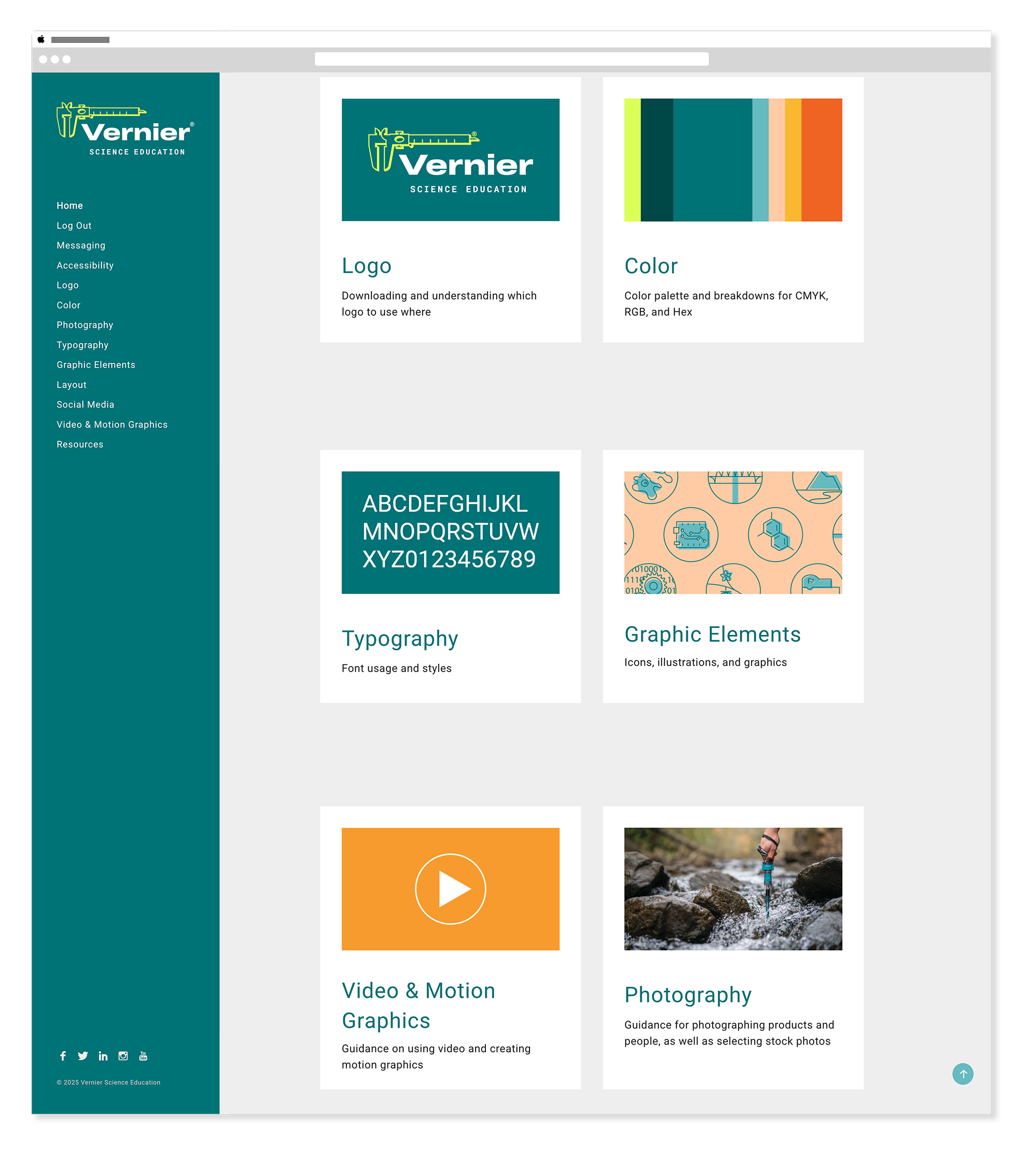
Typography
Web · Print · DisplayThe typography section established the full type system — primary and secondary typefaces, weights, sizing scales, and usage rules for web, print, and display contexts. Clear guidance meant consistent typographic decisions across every team and every deliverable.
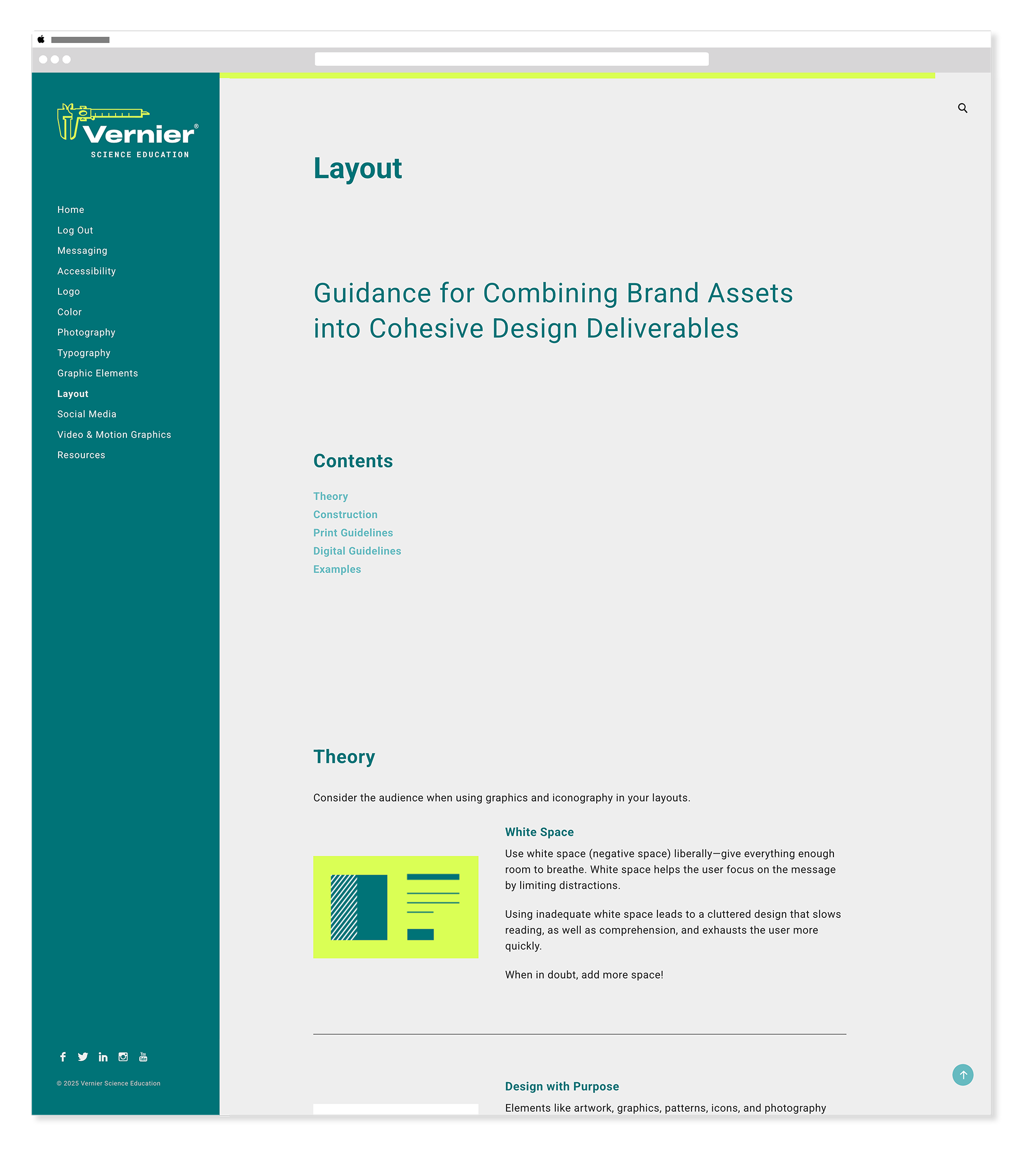
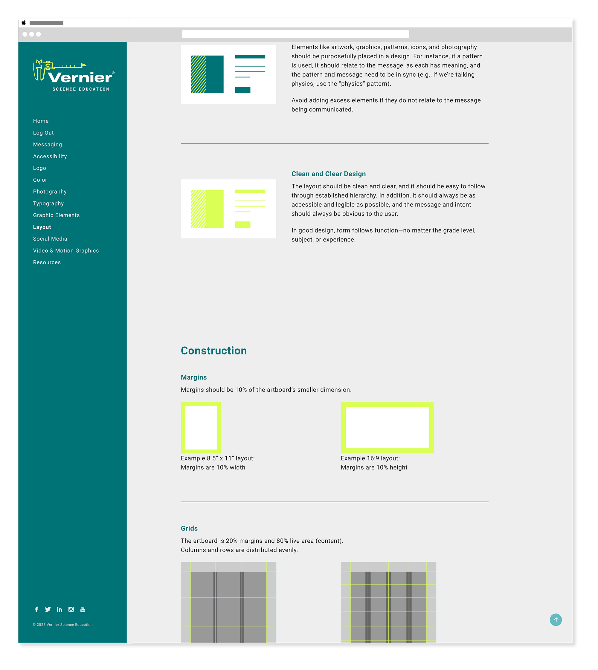
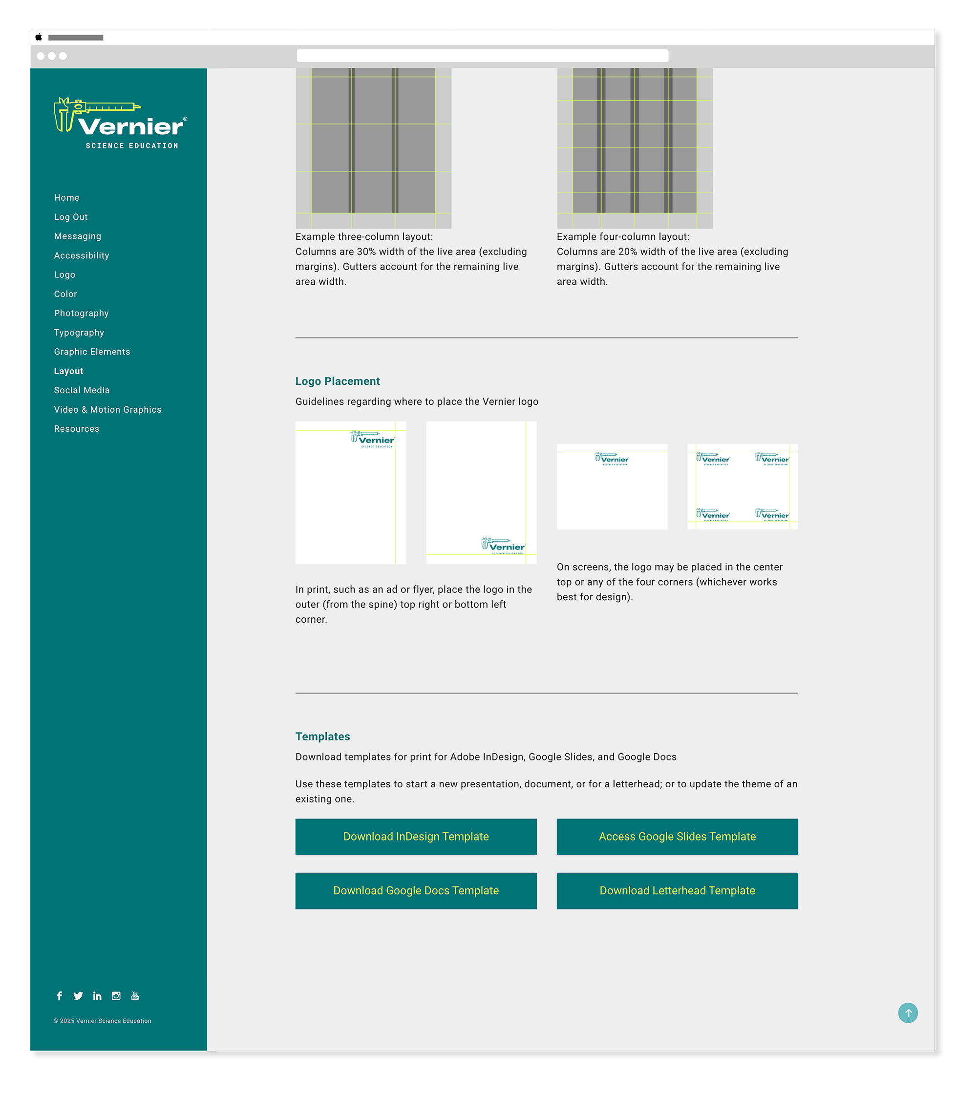
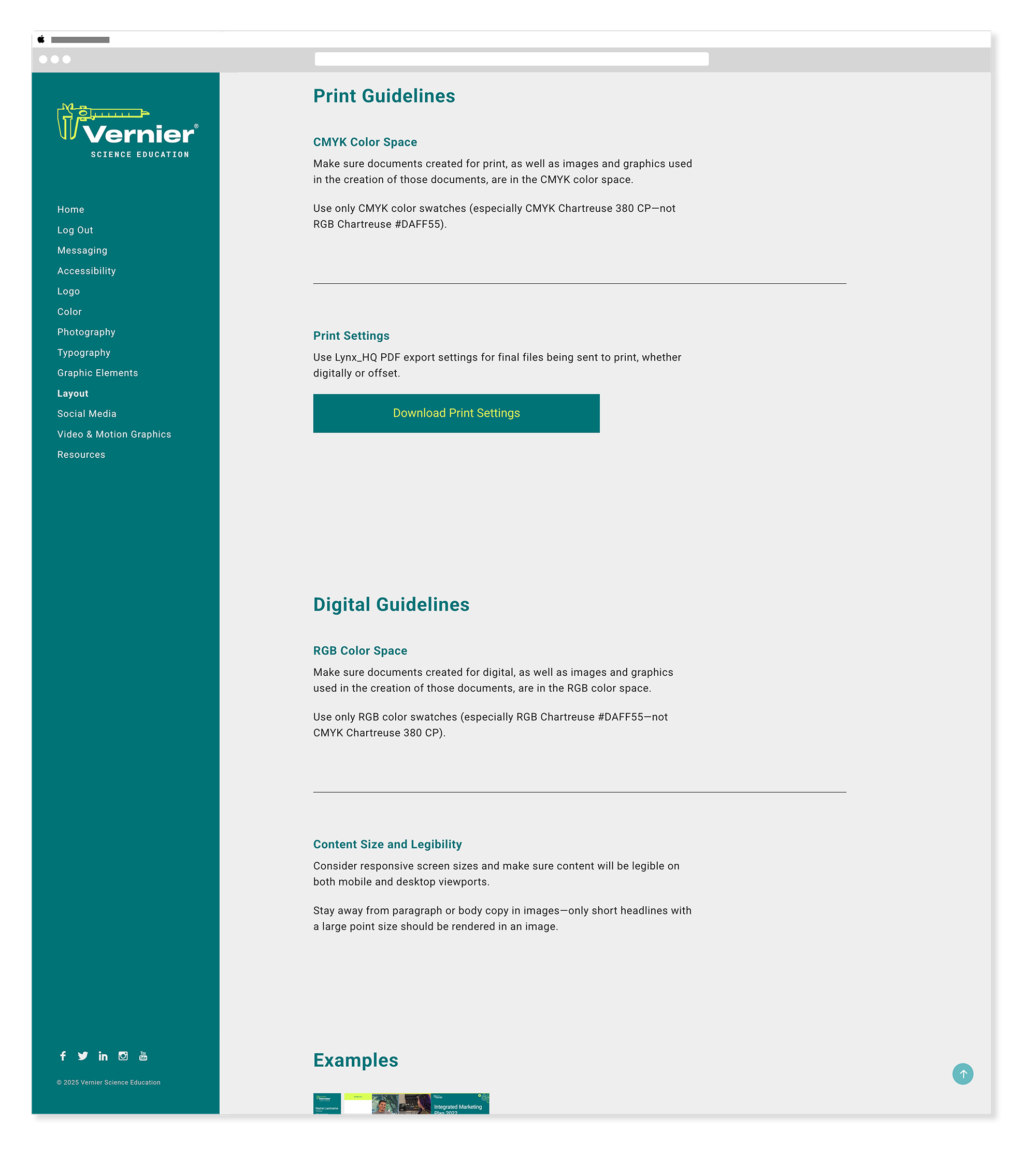
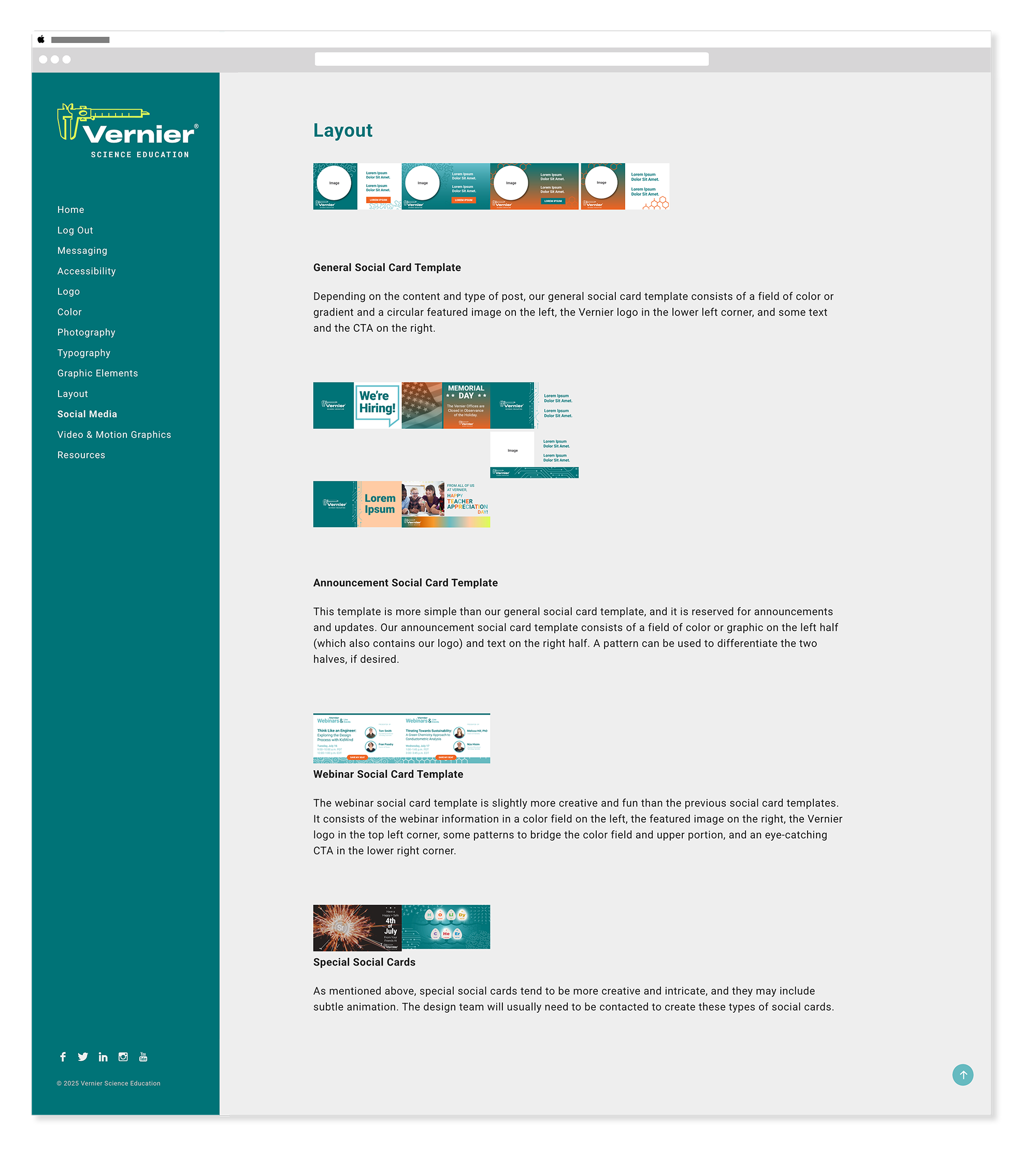
Layout
Grid · Spacing · CompositionThe layout section established grid systems, spacing rules, and compositional principles — giving designers a consistent structural foundation to work from across every format and medium.
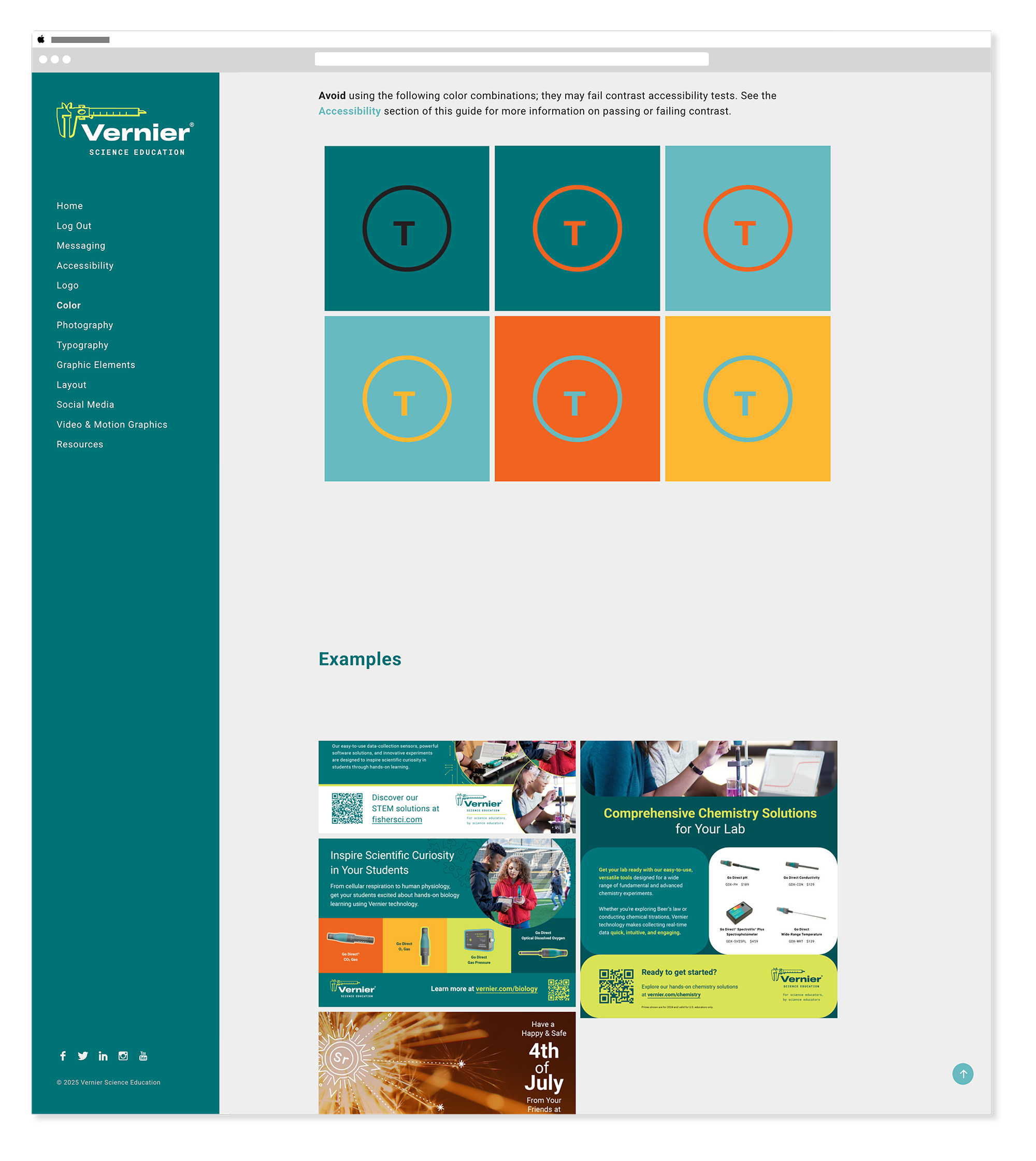
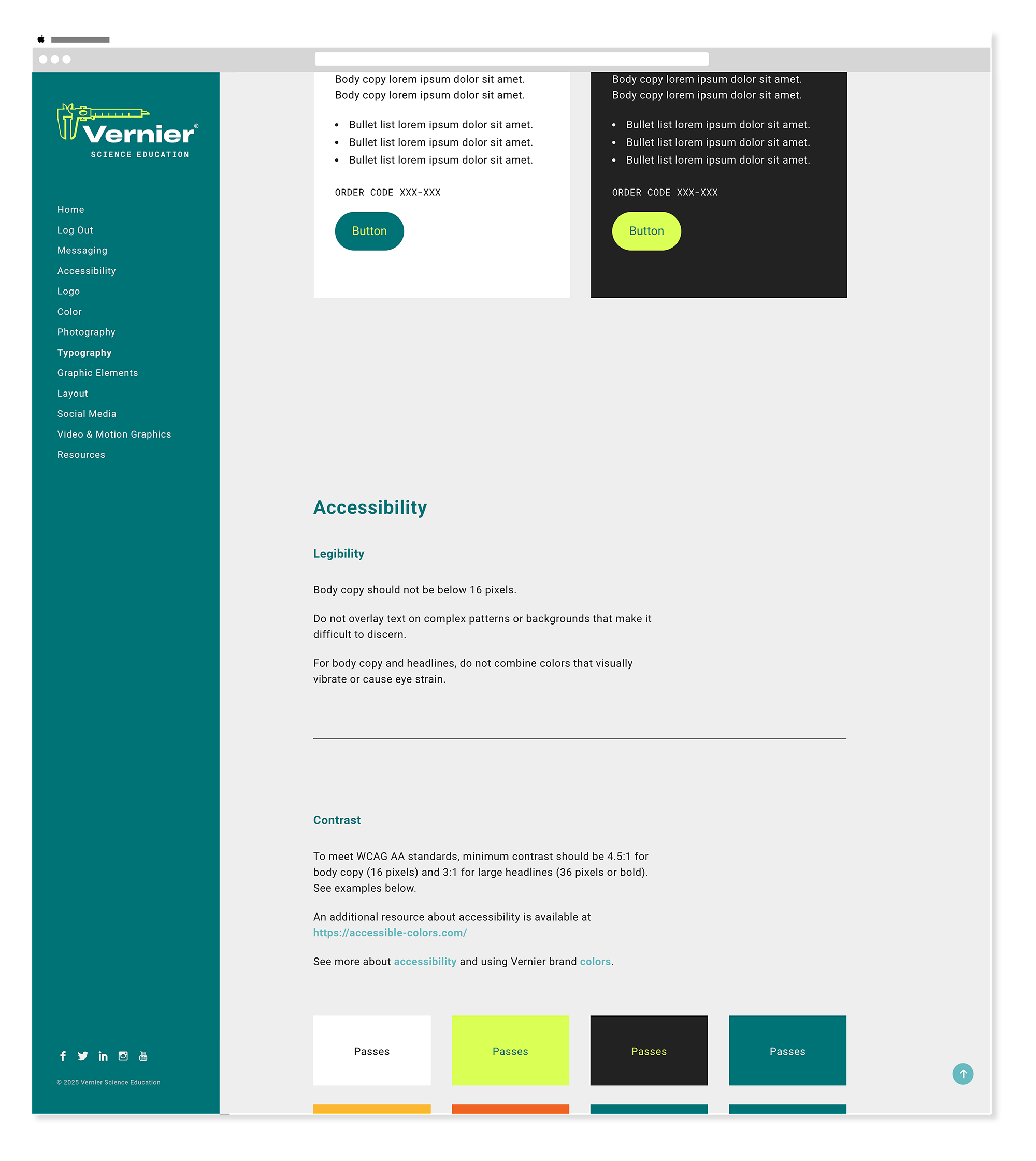
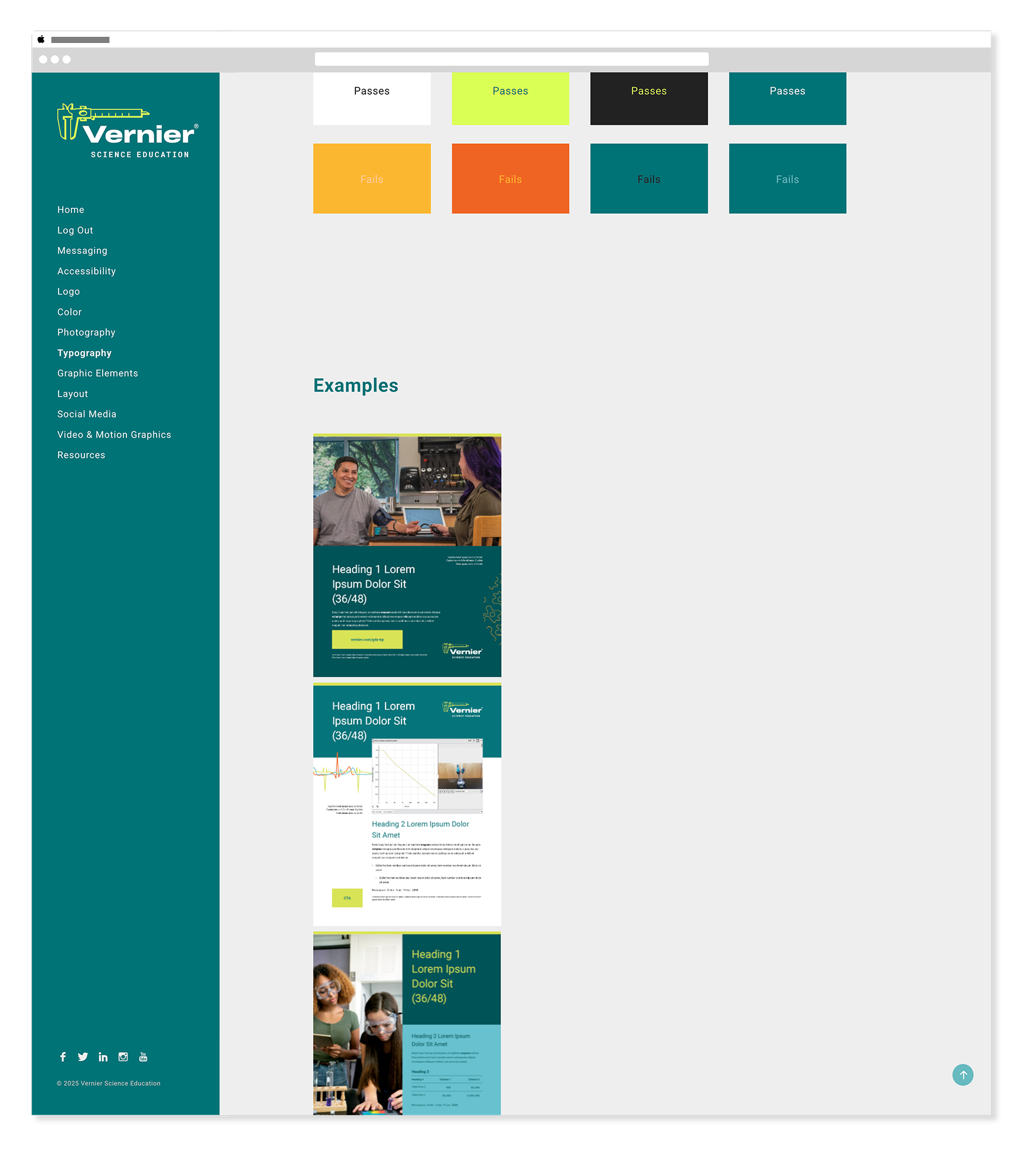
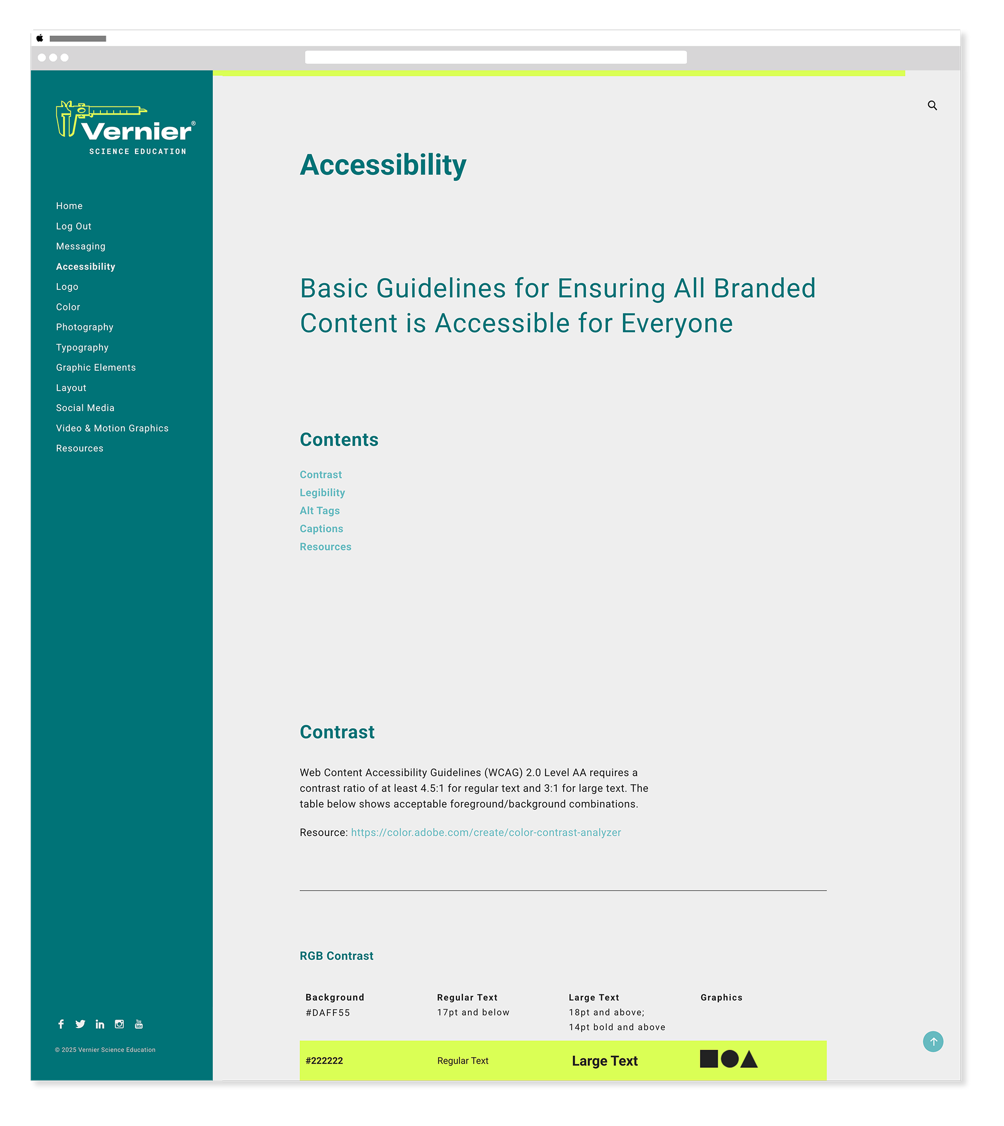
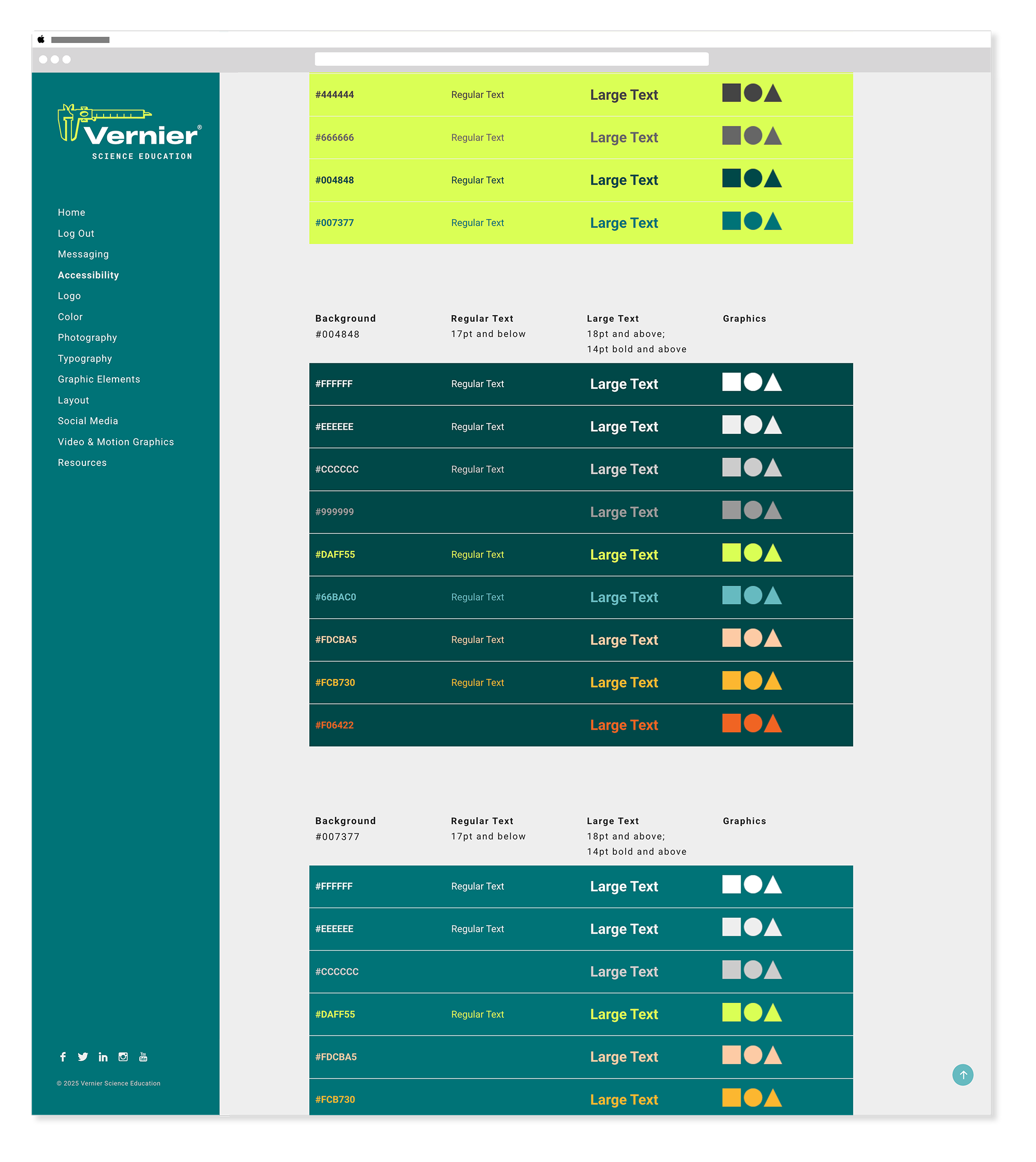
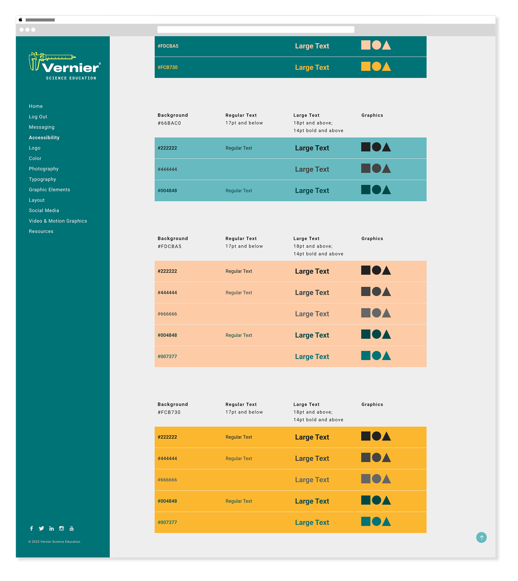
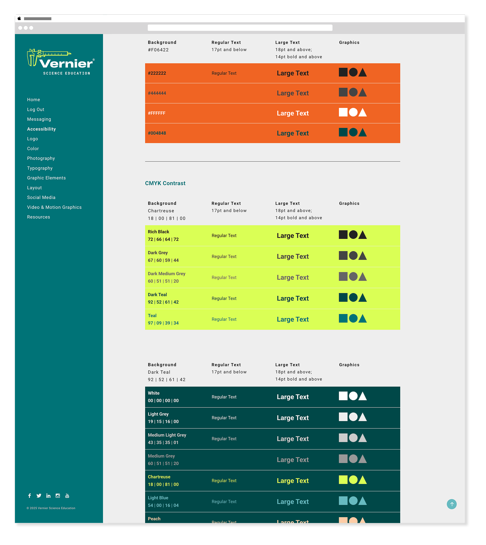
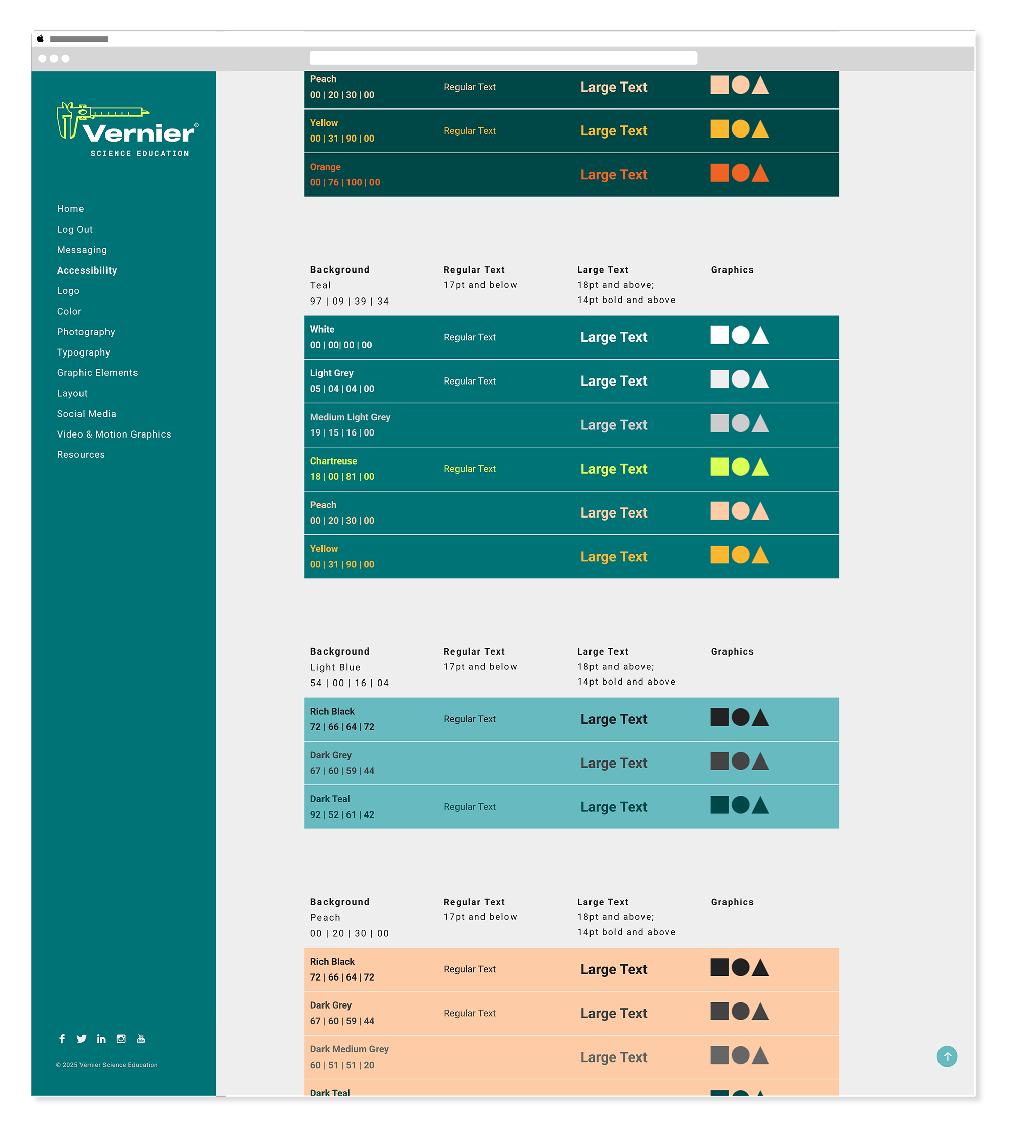
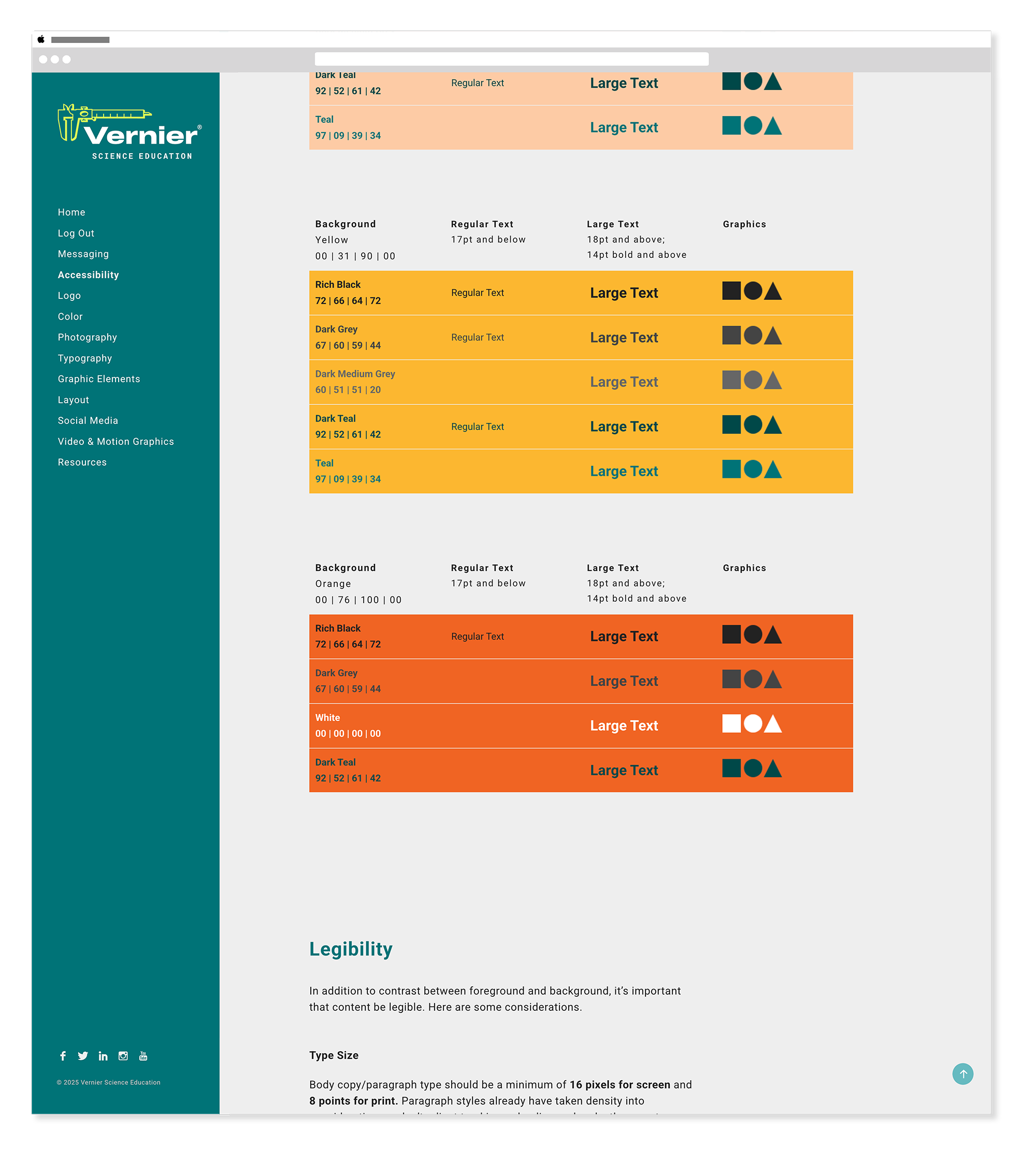
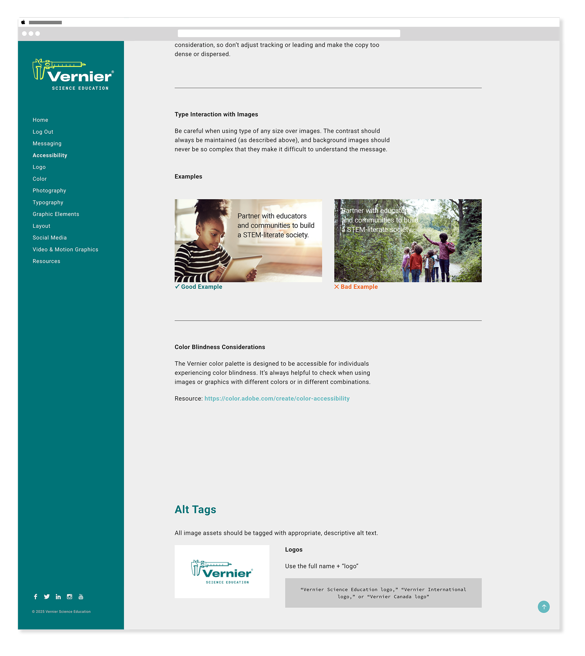
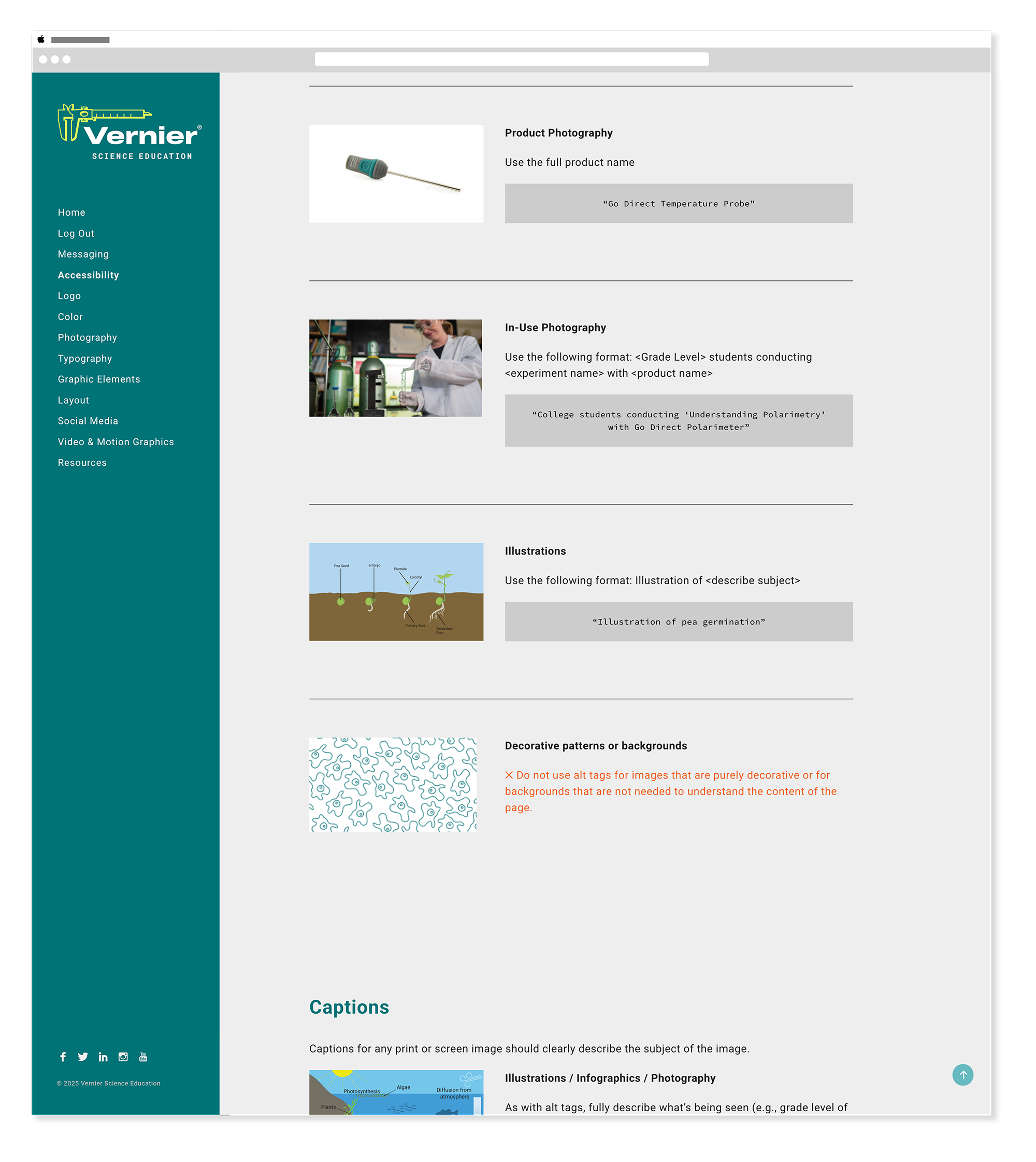
Accessibility
WCAG · Contrast · Color UsageThe accessibility section established color contrast requirements, text legibility standards, and WCAG compliance guidelines — ensuring every design decision made across the organization met the needs of all users, not just the majority.
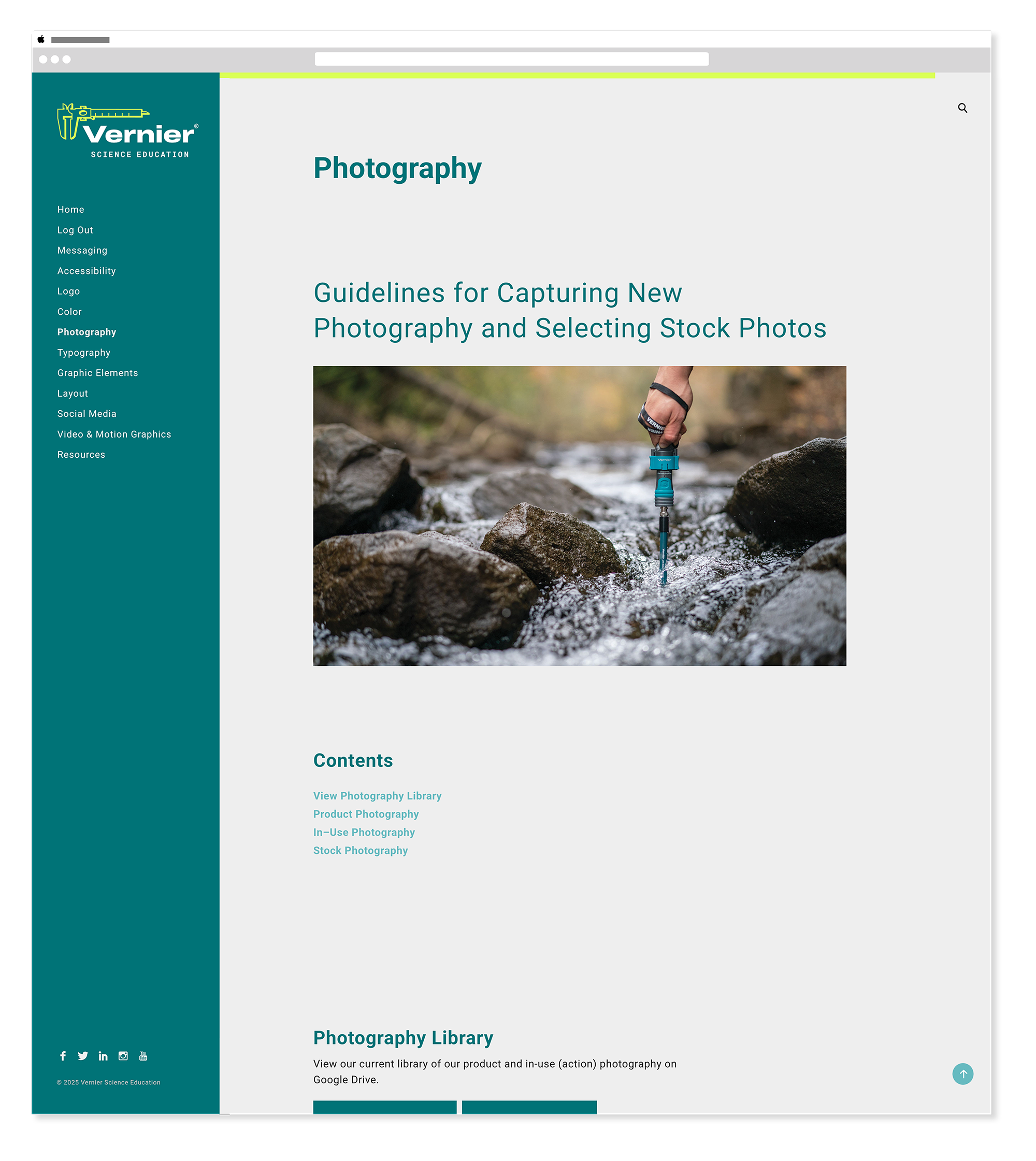
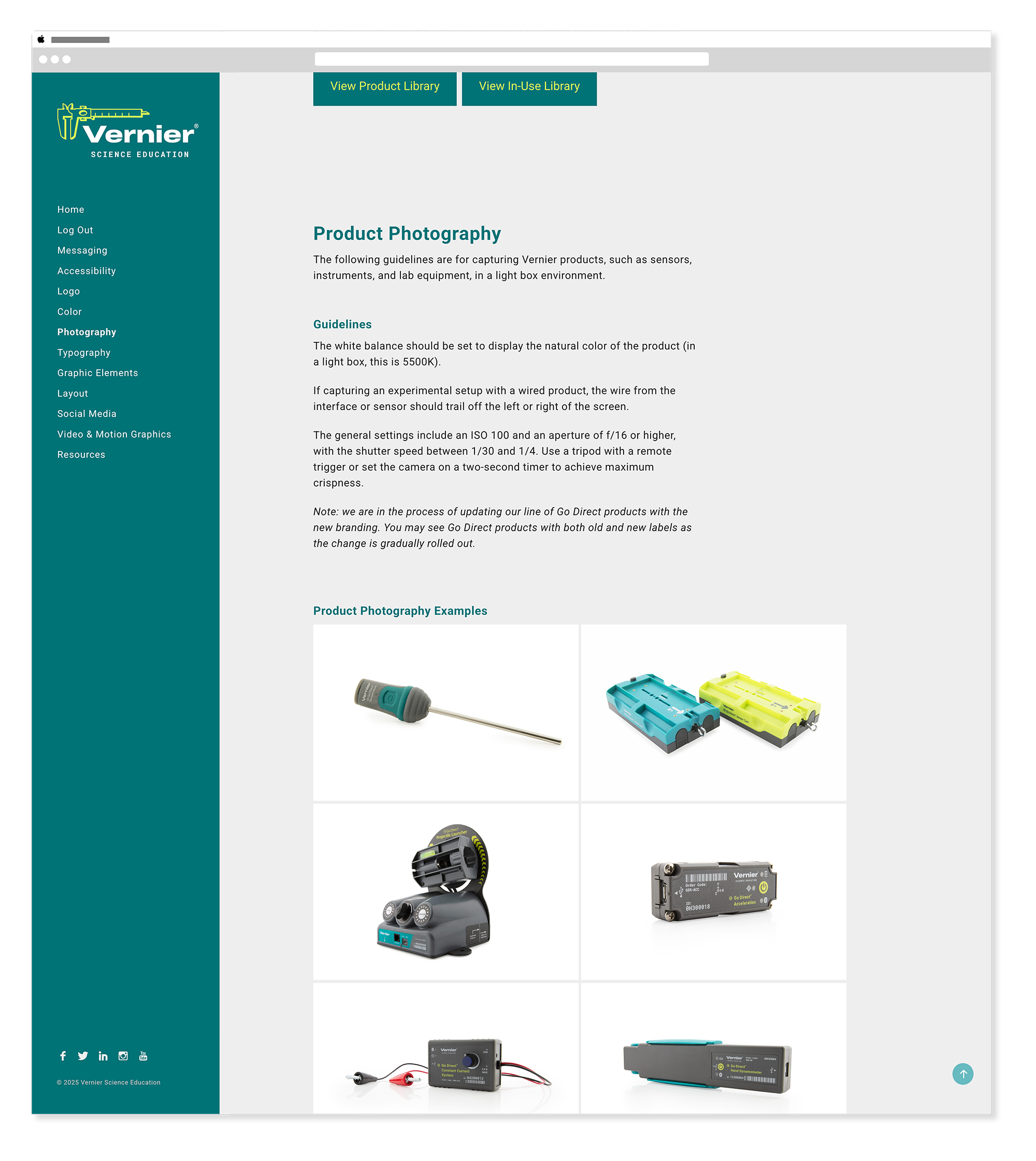
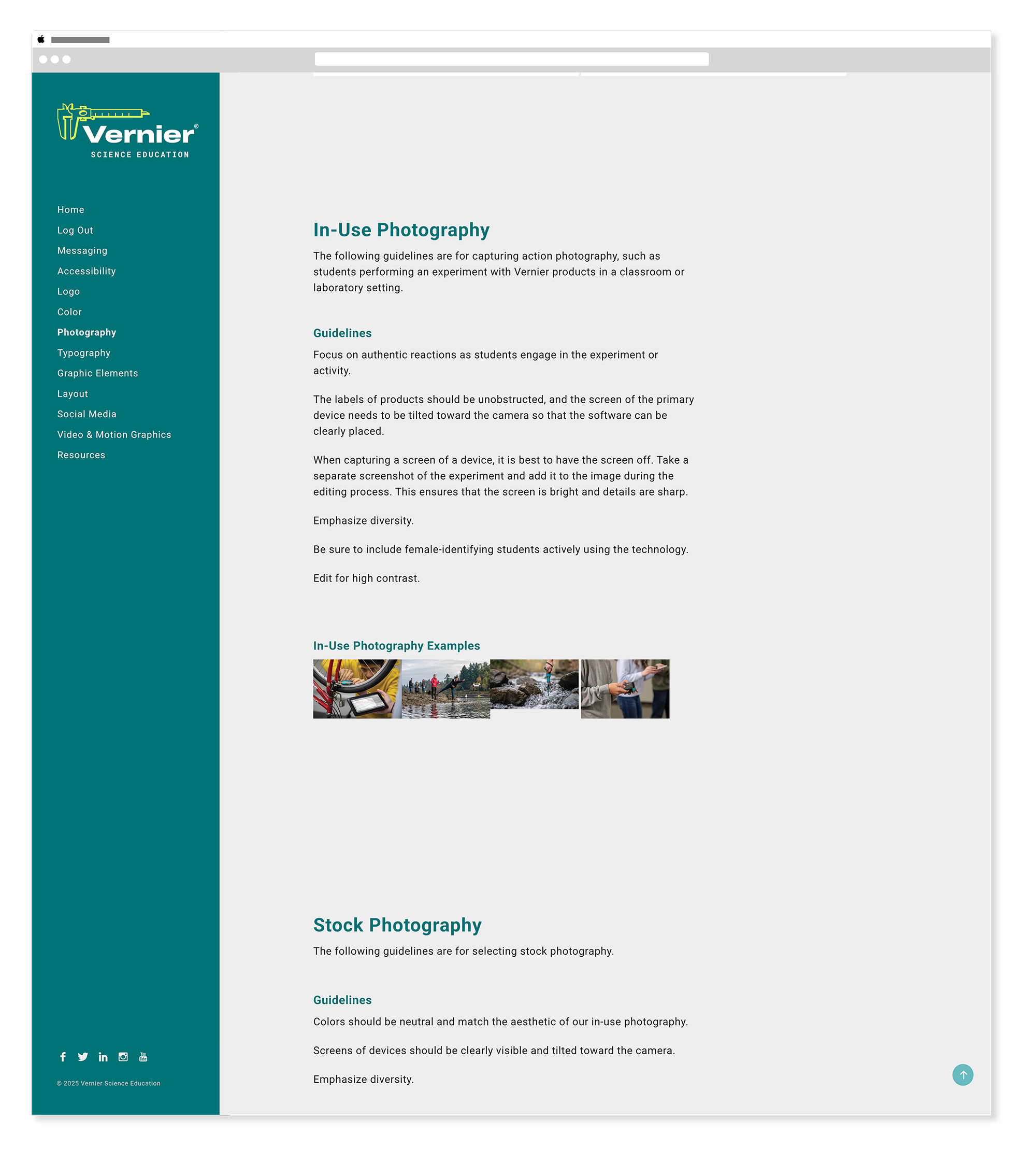
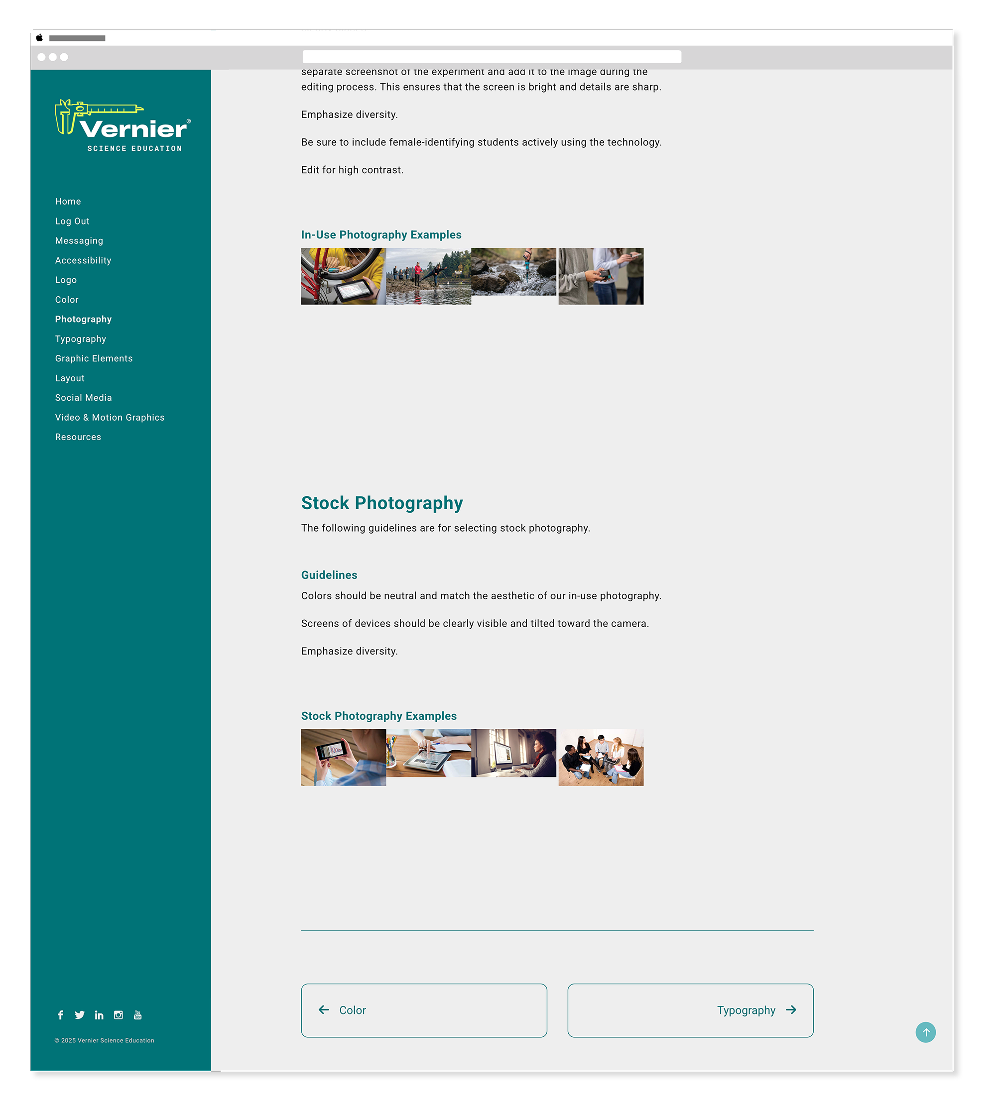
Photography
Style · Usage · DirectionThe photography section established the visual style and tone for all imagery used across Vernier's brand — defining what good photography looked like in this context, how it should be selected, and how it should be used to support the brand's educational mission.
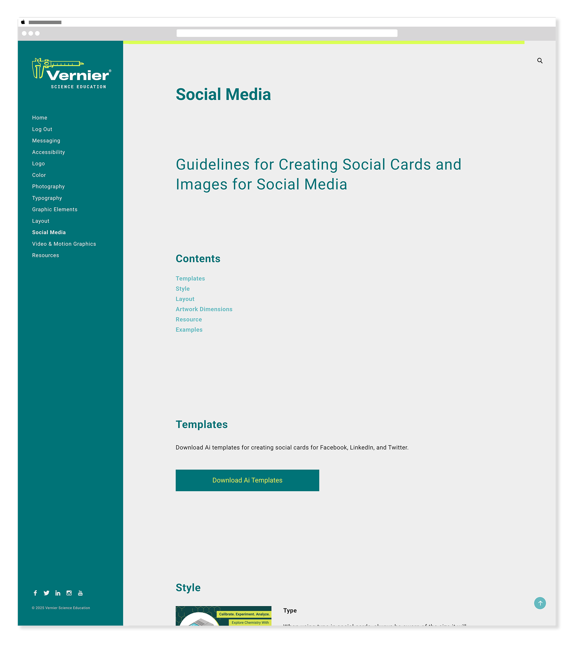
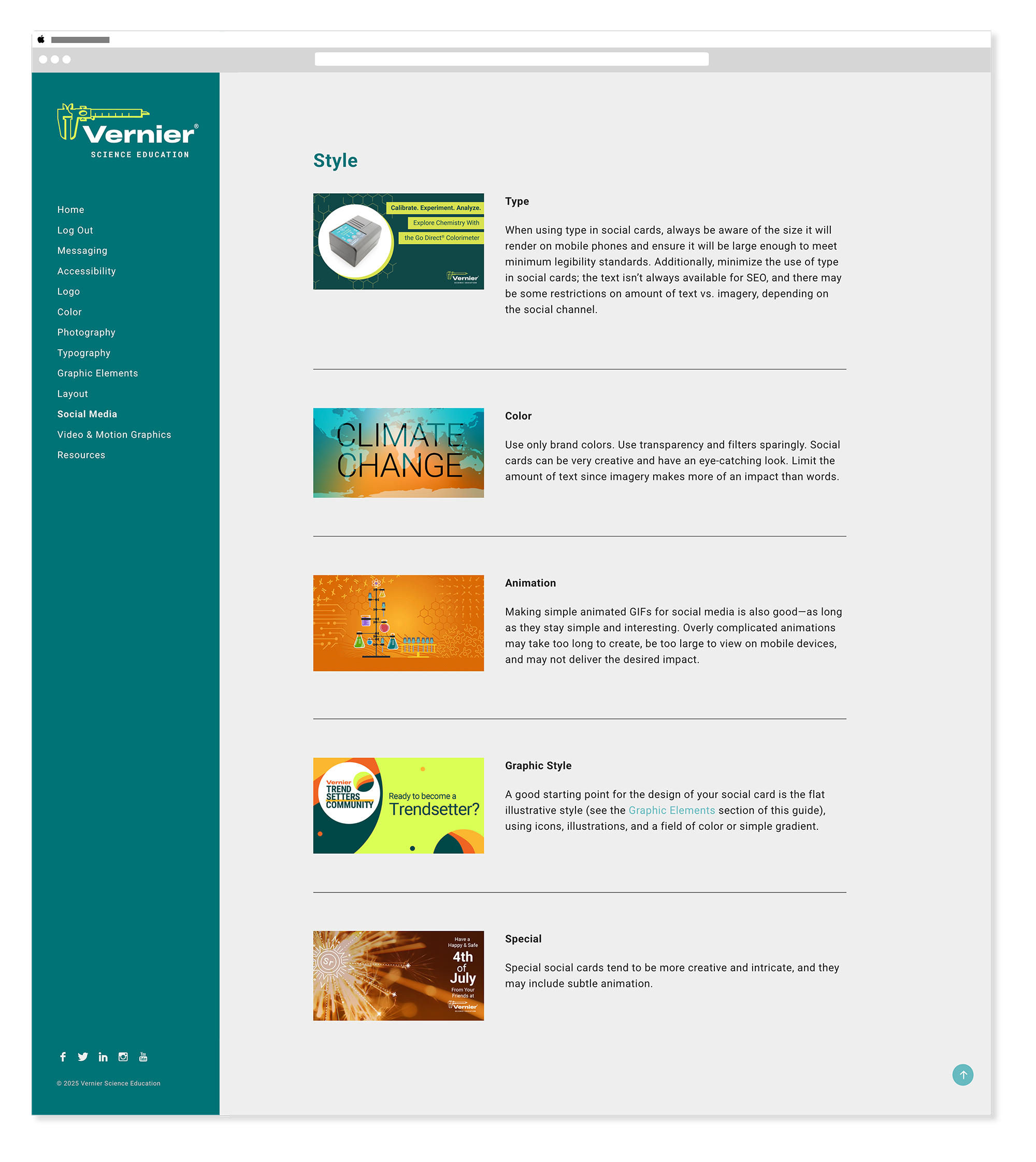
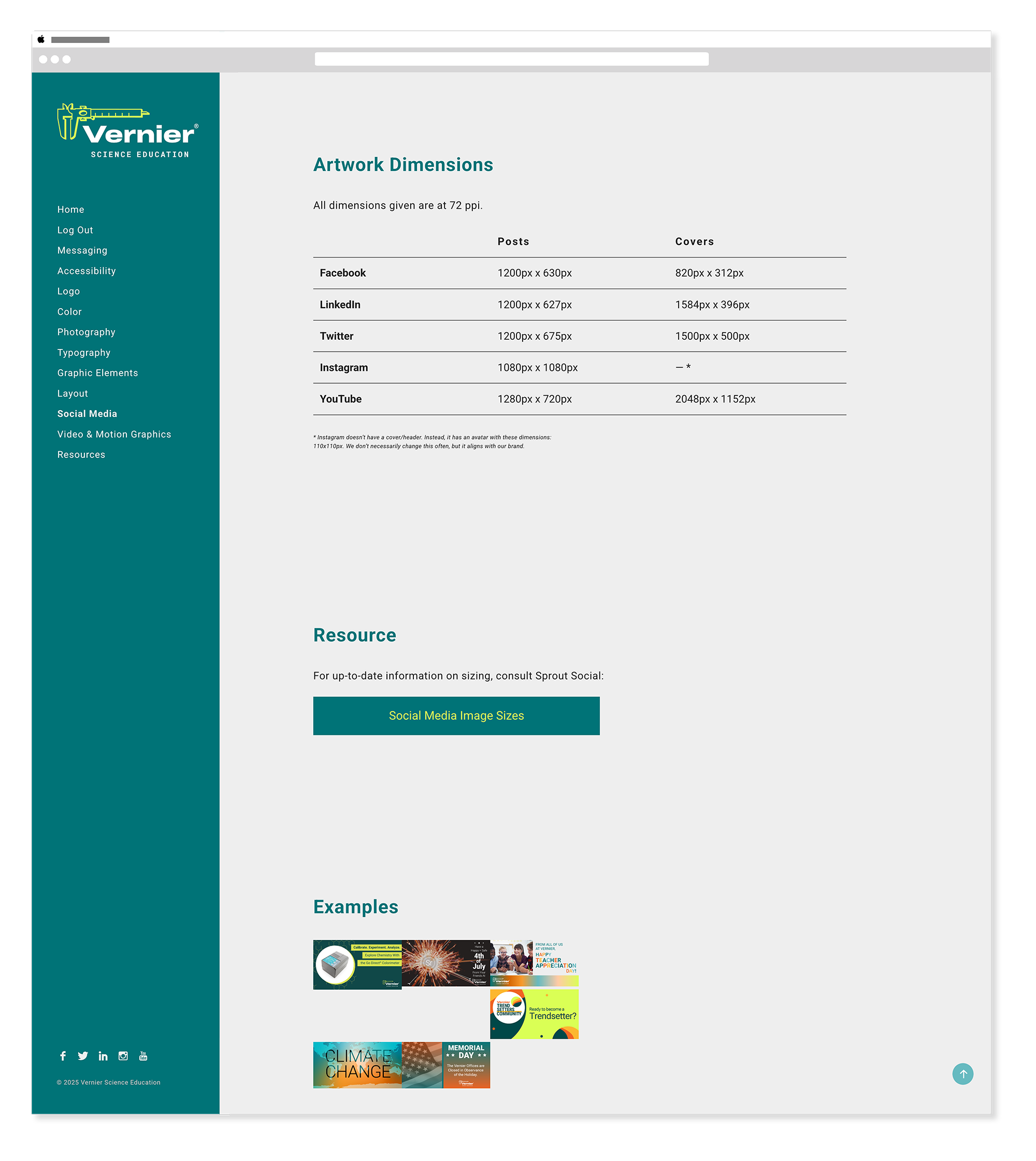
Social Media
Templates · Sizing · UsageThe social media section established templates, sizing specifications, and usage guidelines for every platform Vernier maintained a presence on — ensuring the brand translated consistently from a full-size web page down to a square Instagram post or a Twitter header.
Responsive Design
MobileThe brand guide was built to be fully responsive — accessible on any device, whether team members were referencing standards at their desk or on the go.
Outcomes
What this work delivered.
Logo, color, typography, illustration, photography, layout, social media, video, accessibility, and resources — all in one living system.
Full logo, wordmark, and simplified Vernier wordmark — each with clear guidelines for when and how to apply them.
The brand guide site was continuously updated from 2022 through 2025 — keeping Vernier's standards current as the brand evolved.
Reflection
What this work taught me.
This project taught me that brand systems are never really finished — they're maintained. Building the online guide was the straightforward part. Keeping it accurate, up to date, and technically functional across three years of organizational change, plugin updates, and evolving brand needs was the real work. The authentication bug alone was a months-long puzzle that required patience, research, and a willingness to try unconventional solutions. When I finally resolved it by switching from My Private Site to Members, it felt like a genuine win — not just for me, but for every internal user who had been frustrated by the login experience. I'm proud of what the team built and what I maintained. A brand guide that people actually use is rarer than it should be.
The Vernier Collection
Explore More Vernier Work
Nine case studies covering six years of in-house design work. You're viewing 1 of 9.
Campaign Websites
View Case Study →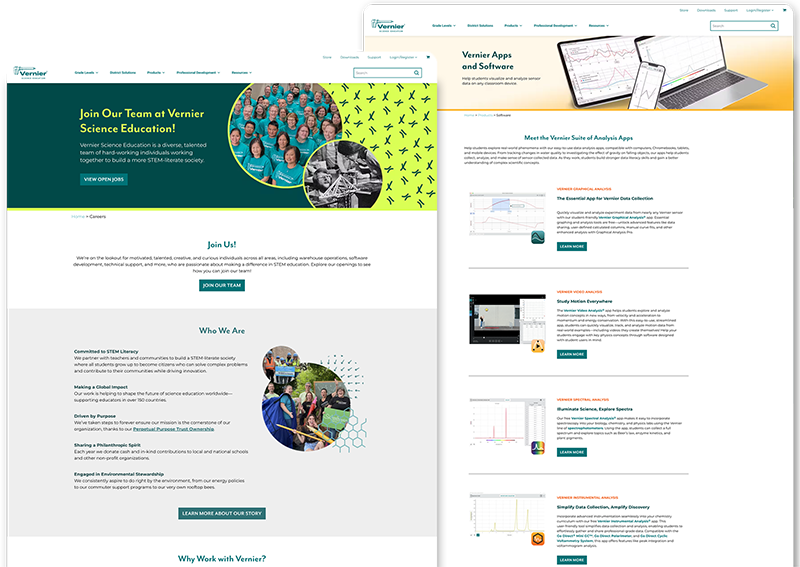
Internal Website Design
View Case Study →
Email Design & Digital Ads
View Case Study →
Digital & Social Media
View Case Study →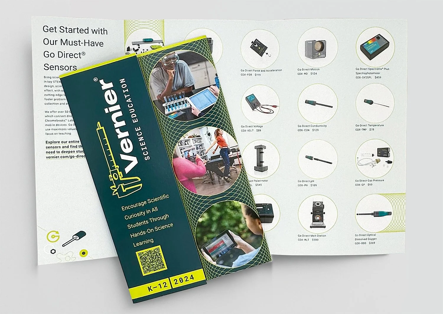
Print Brochures, Flyers & Packaging
View Case Study →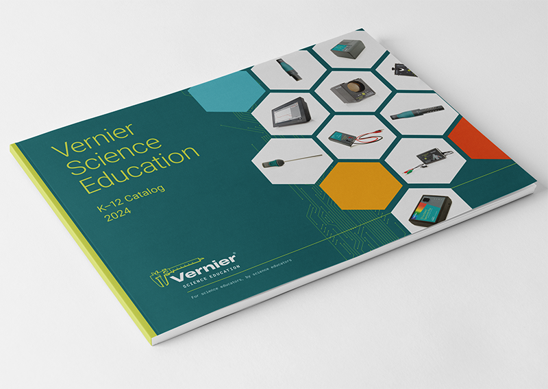
Print Catalogs, Books & Papers
View Case Study →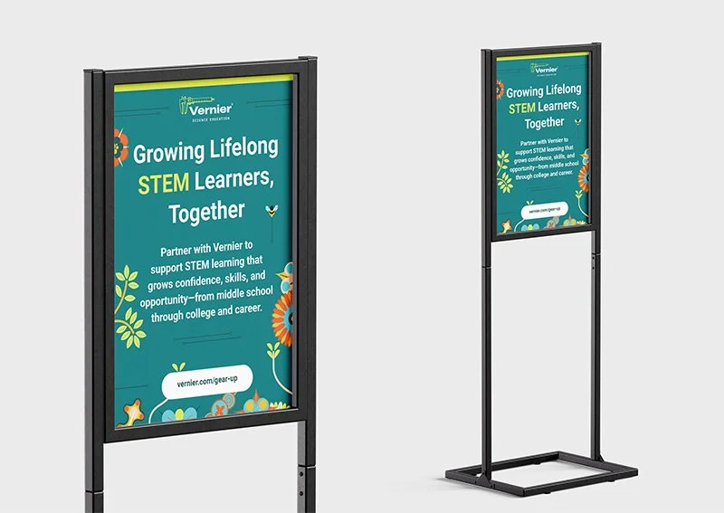
Conference Signage & Swag
View Case Study →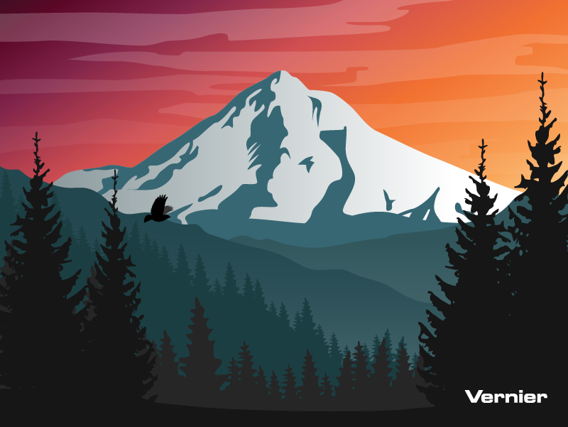
Seasonal Branding & Digital Art
View Case Study →