
Thoughtful Print Design that Communicates and Connects — Vernier Science Education
Six years of print design for a science education brand — flyers, postcards, brochures, sell sheets, event collateral, and packaging — all built to help educators quickly understand complex tools and feel confident bringing them into the classroom.
Overview
Six years of print that helped educators say yes.
Print played a strategic role in how Vernier communicated with educators. Brochures, postcards, flyers, and packaging were often the first point of contact — at a conference booth, in an outreach kit, or on a product shelf. These materials needed to do a lot of work quickly: introduce a product, communicate its classroom value, and make a complex scientific tool feel approachable and worth a closer look.
Working closely with the Art Director, copywriters, project managers, and subject matter experts, I designed and produced a wide range of print collateral across six years — from single-page flyers to multi-panel brochures to product packaging. Every piece was built around the same core challenge: make technical information feel human.
The Problem
Complex science tools. Busy educators. Very little time to make an impression.
Vernier's products are sophisticated — sensors, data collection systems, lab equipment designed for serious scientific inquiry. But the educators who needed them were busy, often overwhelmed, and encountering these tools for the first time at a conference or through a mailer. The design challenge wasn't just visual — it was about reducing friction, building trust quickly, and making the right information easy to find at a glance.
Key Decisions
What I decided, and why.
Lead with what educators need to know first
Every piece started with a single question: what does an educator need to understand in the first three seconds? That answer drove every hierarchy decision — what goes at the top, what gets the largest type, what image leads the layout. Technical details and product specs came after the emotional and practical hook, not before it.
Balance warm photography with technical clarity
Educators responded best to materials that showed real classroom moments alongside clear product diagrams. Photography made the tools feel human and relatable — students using equipment, teachers engaged in the process. Diagrams and callouts answered the technical questions. The balance between the two was calibrated differently for every piece depending on the audience and context.
Design for print, not just screens
Every file was built with production in mind from the start — correct color modes, bleed, resolution, and vendor specs. This meant fewer surprises at press and a final product that matched the design intent. Careful pre-press preparation, proofing, and quality review on printed samples kept the work consistent across runs and ensured Vernier's brand showed up correctly in the world.

The Work
Six years of print — built to move people to action.
Each deliverable type had its own format constraints, audience context, and communication goal. Flyers needed to work at a glance. Postcards had to earn attention in a crowded mailbox. Brochures had to carry more information without feeling overwhelming. Packaging had to communicate product value on a shelf. The common thread across all of it: clarity, hierarchy, and brand consistency.
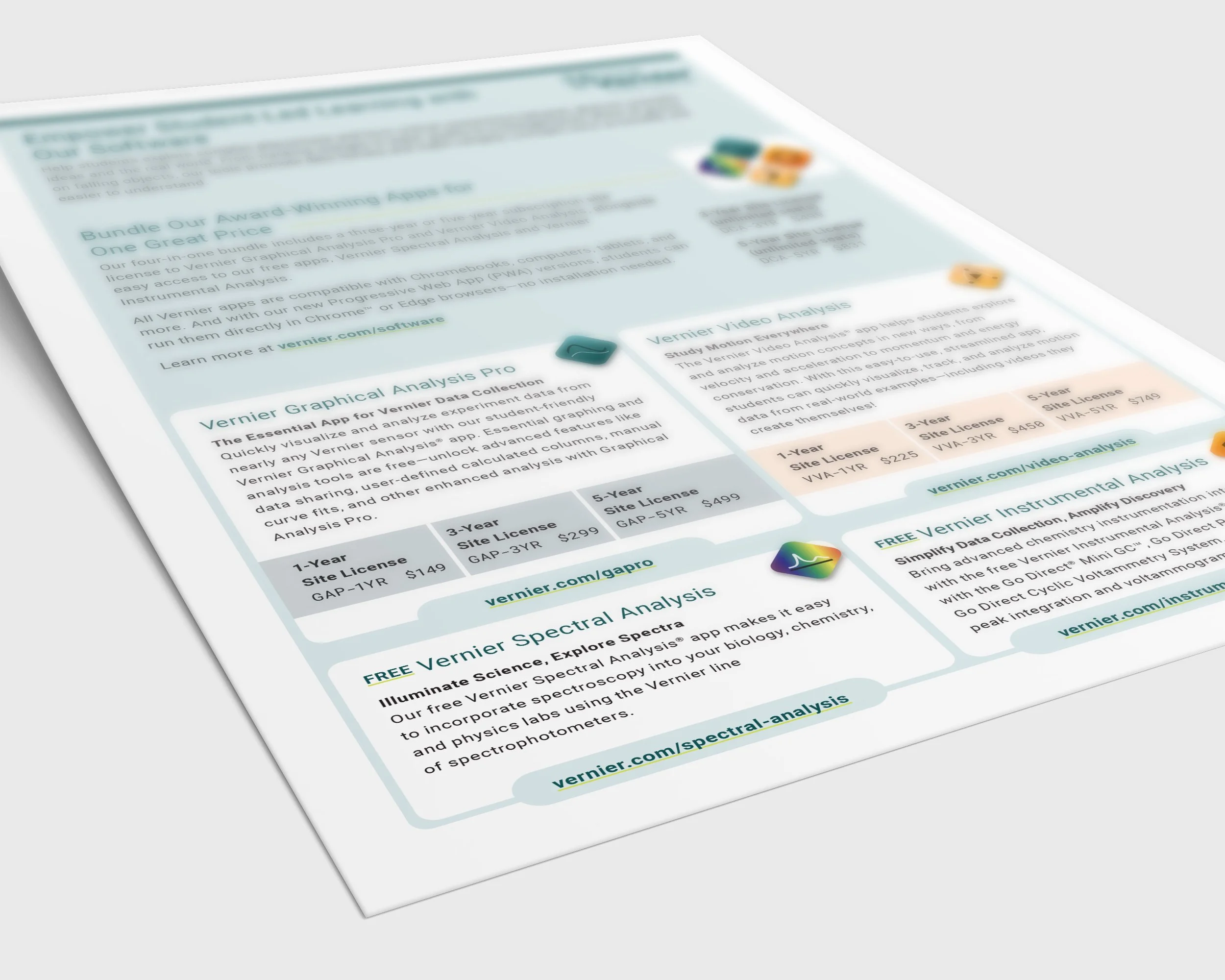
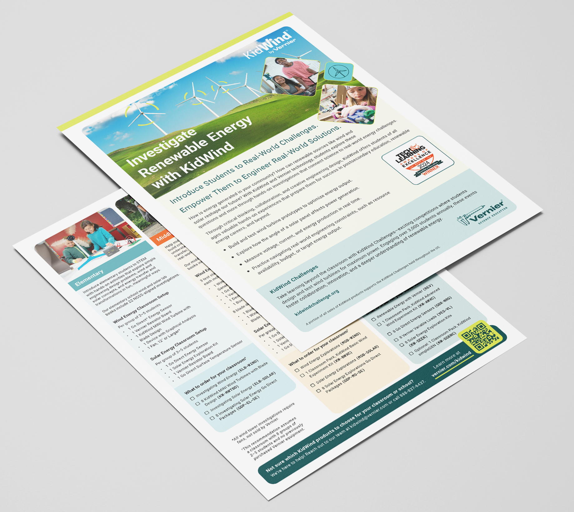
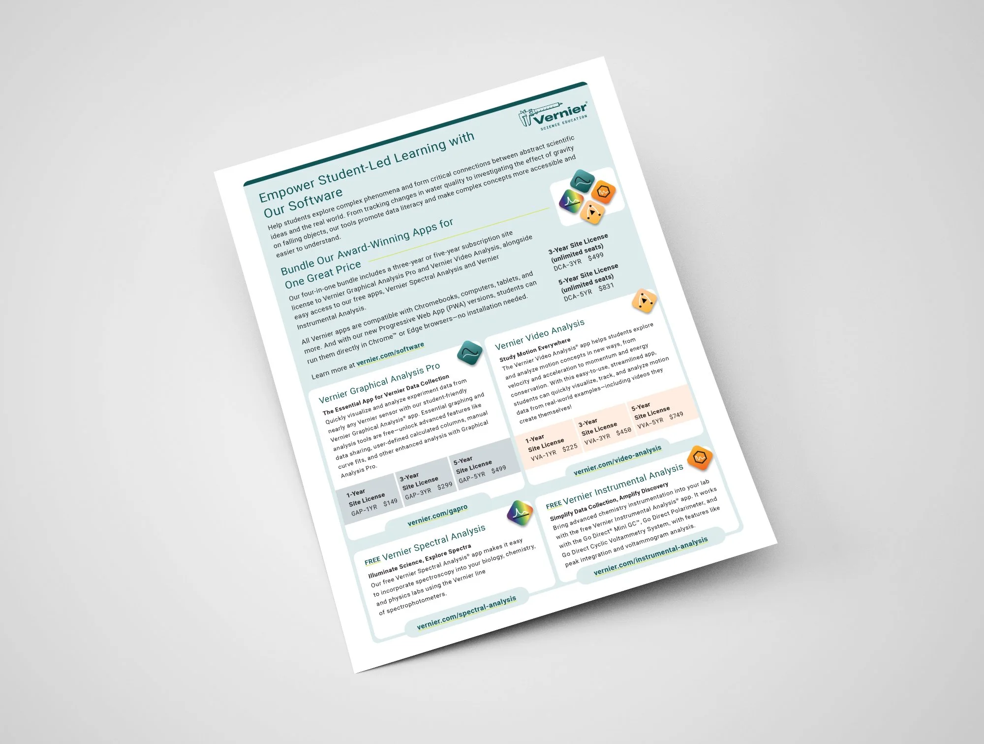
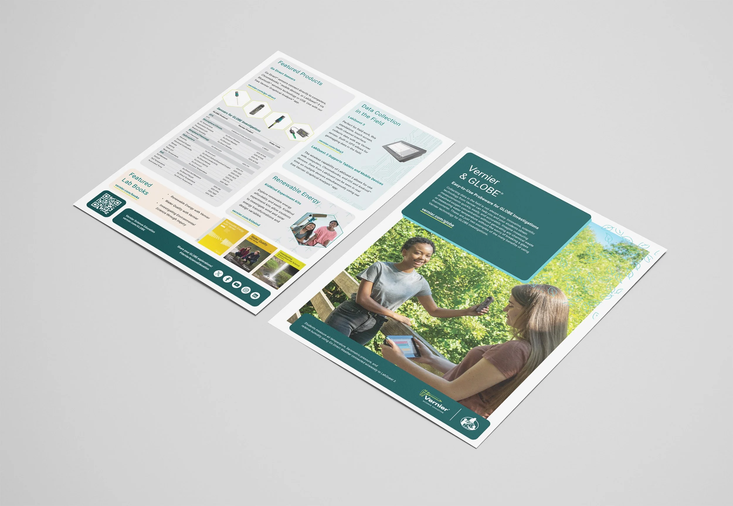
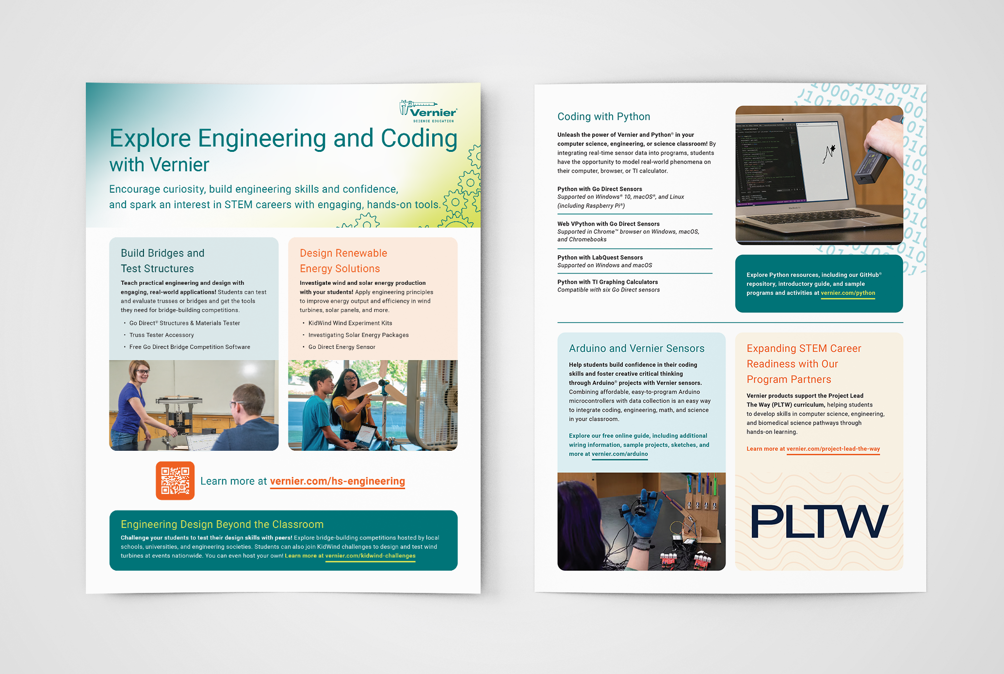
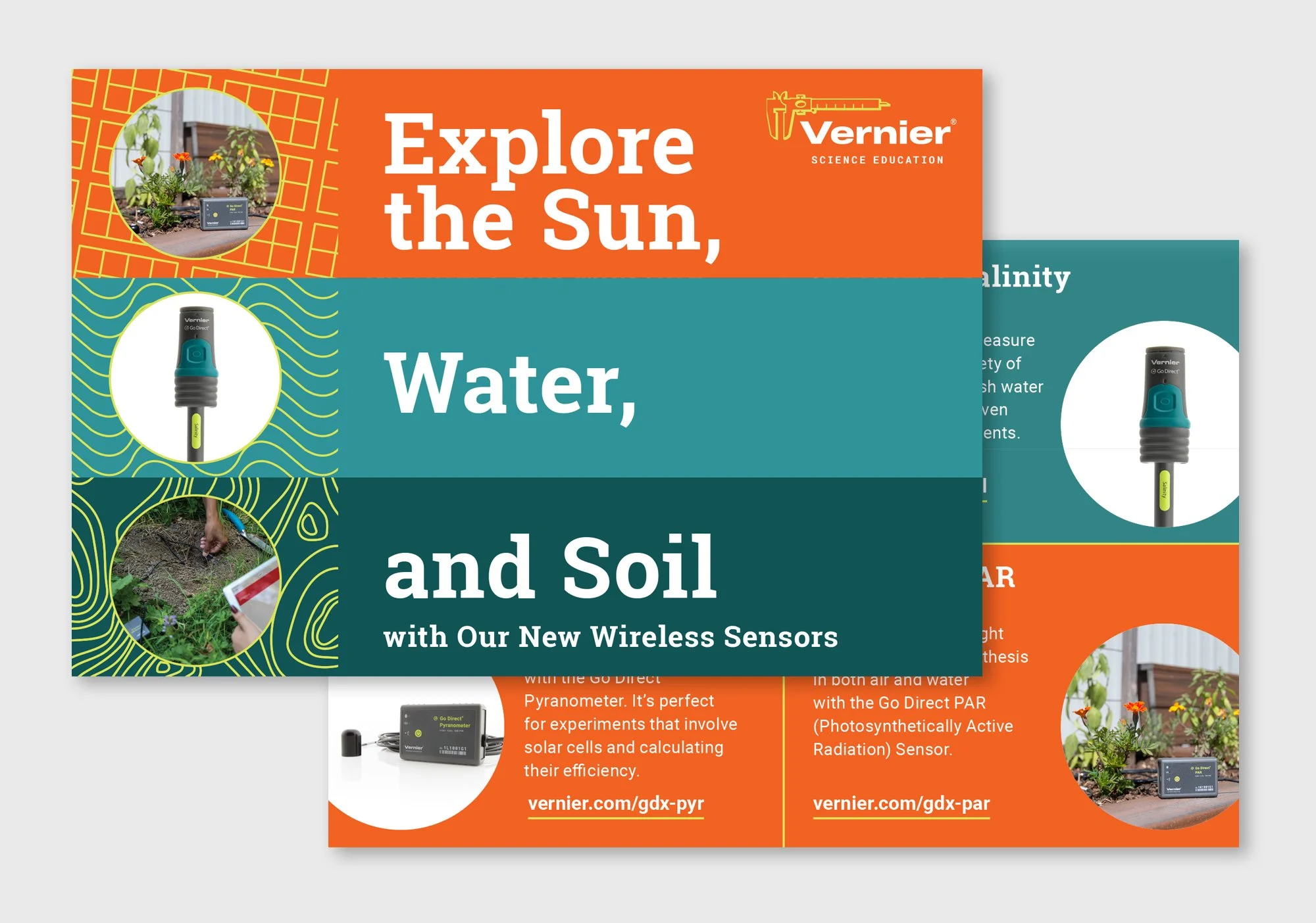
Flyers
Adobe InDesign 2019–2025Flyers supported different parts of Vernier's STEM education story — KidWind renewable energy investigations, engineering kits, software updates, and GLOBE program partnerships. Each needed its own tone and visual structure while staying within the brand system. I worked with the Art Director to confirm direction, then took creative ownership of the layouts, pacing, and hierarchy.
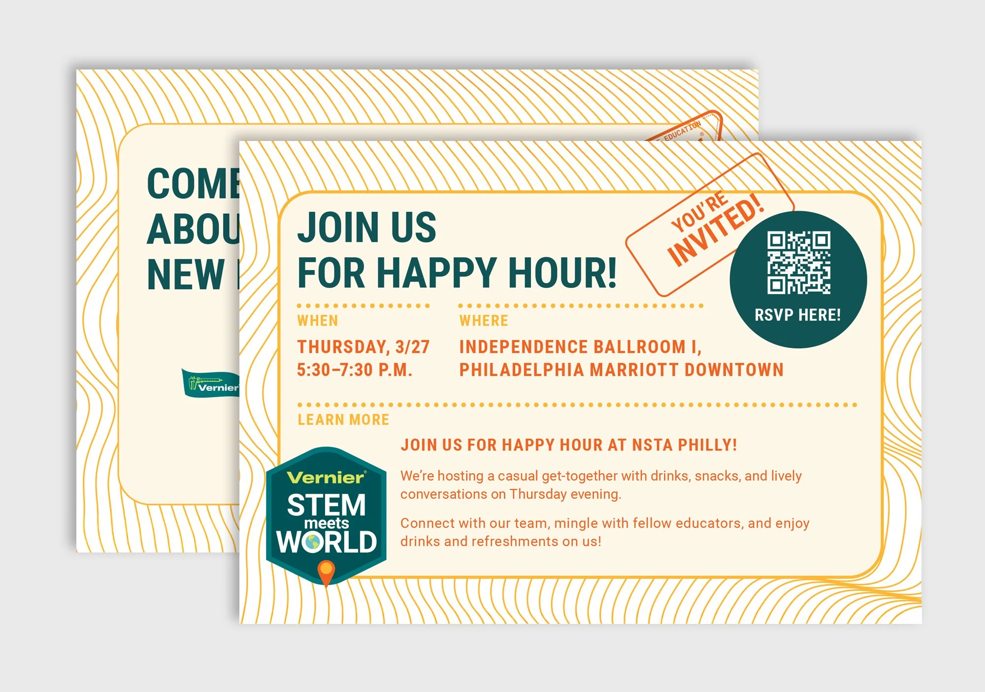
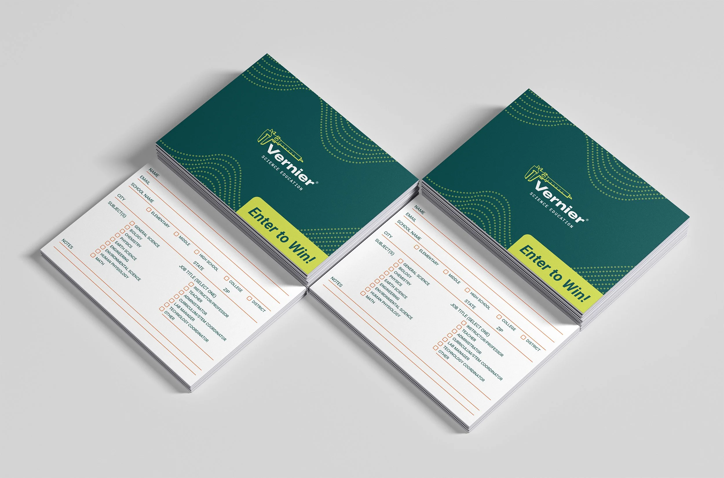
Postcards
Adobe InDesign Direct Mail ConferencePostcards had to earn attention quickly — a small format, a crowded mailbox or conference table, and a busy educator on the other end. The Discovery and Let's Talk cards supported lead capture at conferences, the New Product postcard introduced the upcoming product line, and the NSTA Trendsetter cards highlighted innovation in teaching. Each card had its own goals but all needed to feel complete and engaging in a compact format.
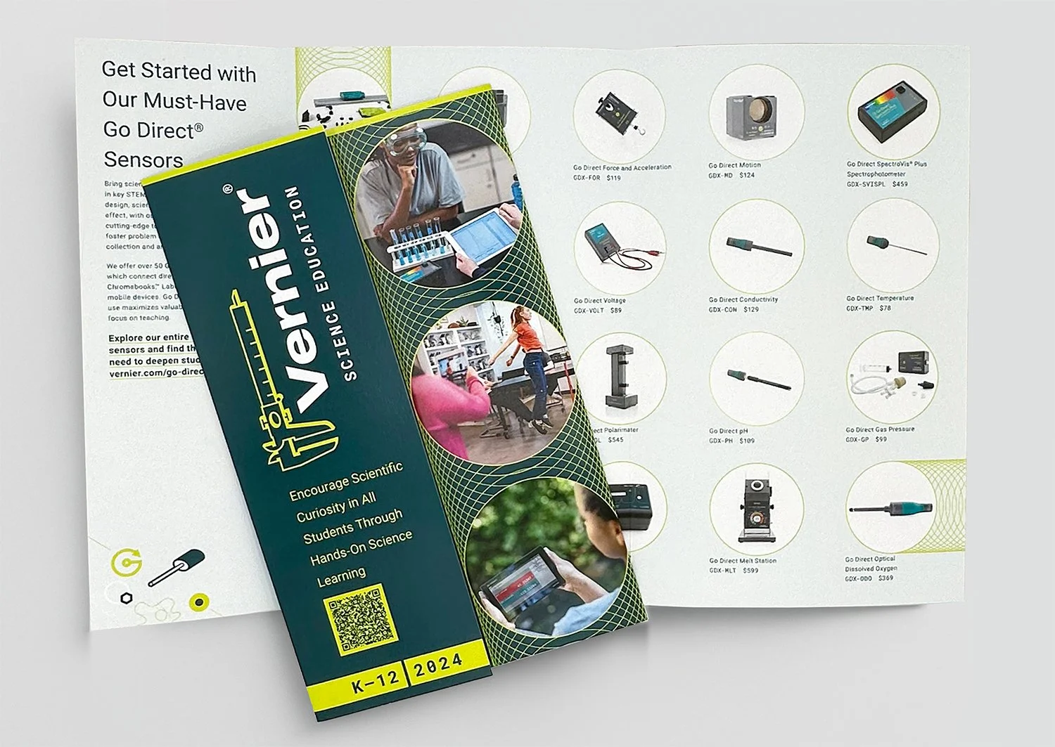
Brochures
Adobe InDesign Multi-PanelBrochures carried more information than any other format — product lines, curriculum benefits, technical specifications, and supporting resources. The challenge was organizing that density without making the piece feel overwhelming. Clear section breaks, strong visual hierarchy, and a consistent use of Vernier's color system kept multi-panel brochures readable and easy to navigate.
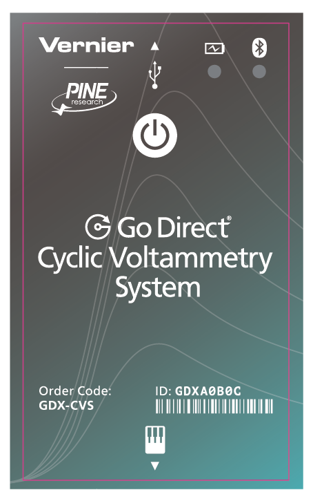
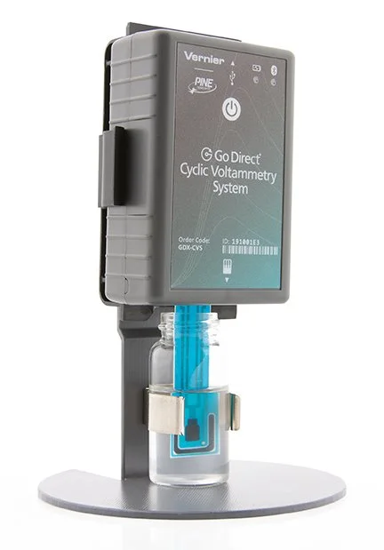
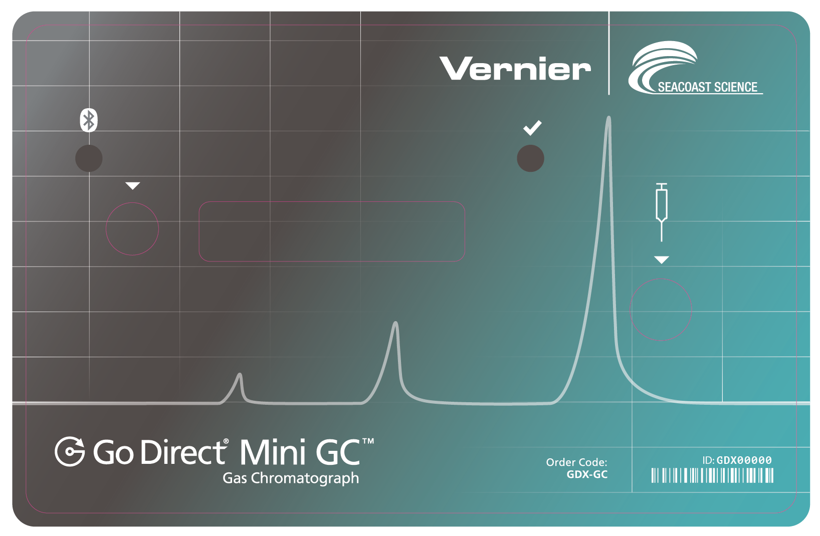
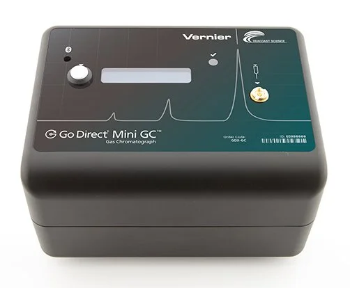
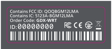
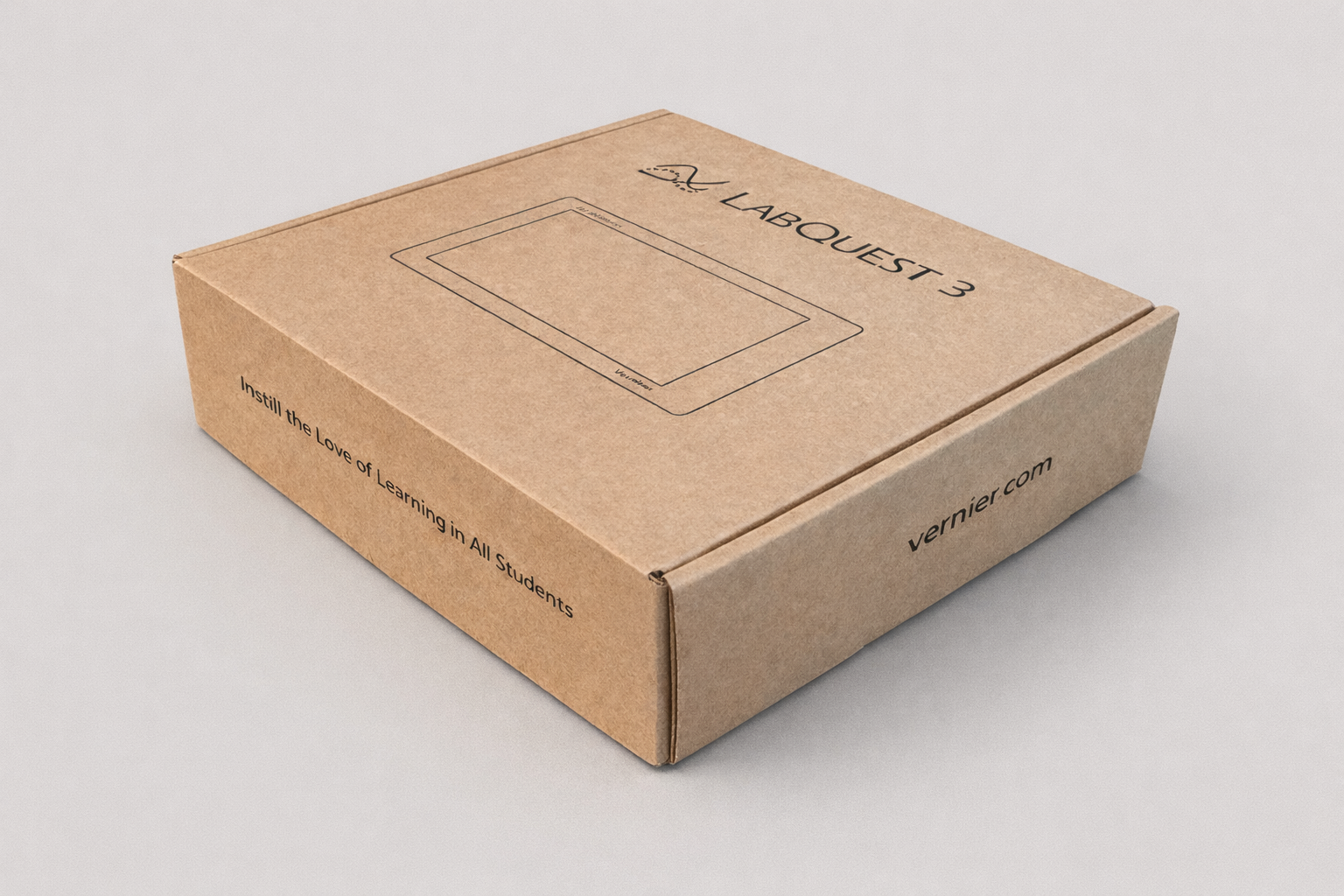
Packaging & Labels
Adobe Illustrator Labels Product DesignProduct packaging and labels brought the Vernier brand into the physical product experience. Labels for Go Direct sensors had to communicate essential information clearly at very small sizes — a different design challenge than large-format print. Each label was built to work within tight production constraints while maintaining visual consistency with the broader brand system.
"Print work has a sense of permanence — and seeing the final pieces reinforced the value of careful planning, collaboration, and attention to detail."
Meghan Lewis — Print Designer, Vernier Science EducationOutcomes
What this work delivered.
Consistent, on-brand print collateral delivered across product launches, seasonal promotions, educator events, and curriculum support initiatives.
Flyers, postcards, brochures, sell sheets, event collateral, and product packaging — each with its own format constraints and audience context.
Print materials distributed at national conferences, through direct mail campaigns, in outreach kits, and on product shelves across the country.
Reflection
What this work taught me.
Six years of print work at Vernier taught me that good design is really good editing. The hardest part was never making something look nice — it was deciding what to leave out. Every flyer, postcard, and brochure had more information than it could carry, and my job was to find the signal in the noise and build a visual path that led educators to it. Working closely with subject matter experts, copywriters, and project managers also deepened my appreciation for collaboration — the best pieces came from teams that trusted each other to do their part well. Print has a permanence that screen work doesn't, and that raised the stakes in a way I found genuinely motivating.
The Vernier Collection
Explore More Vernier Work
Nine case studies covering six years of in-house design work. You're viewing 6 of 9.
Brand Guide & Refresh
View Case Study →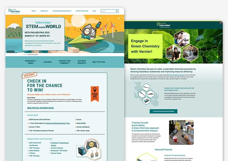
Campaign Websites
View Case Study →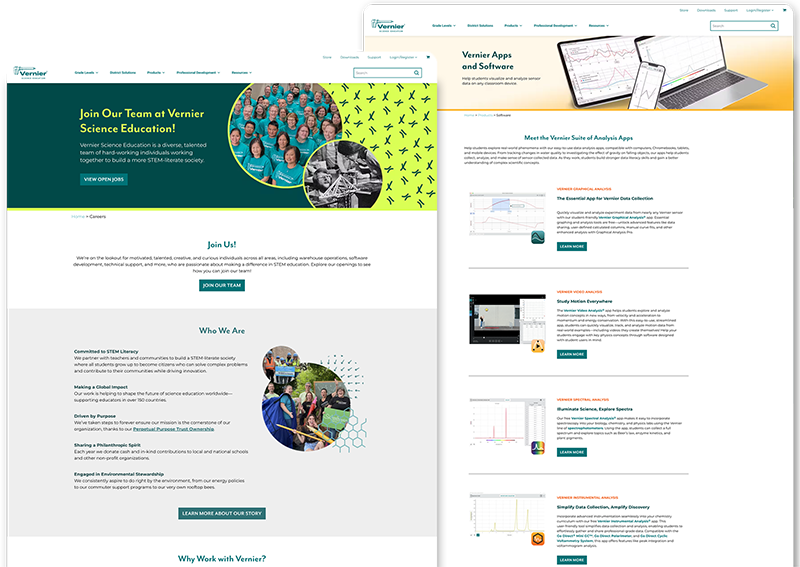
Internal Website Design
View Case Study →
Email Design & Digital Ads
View Case Study →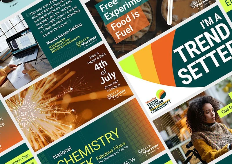
Digital & Social Media
View Case Study →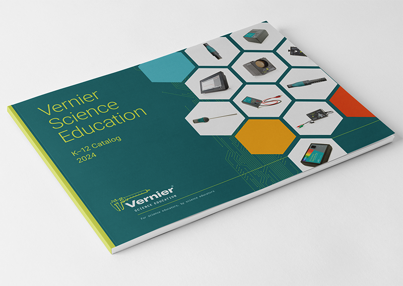
Print Catalogs, Books & Papers
View Case Study →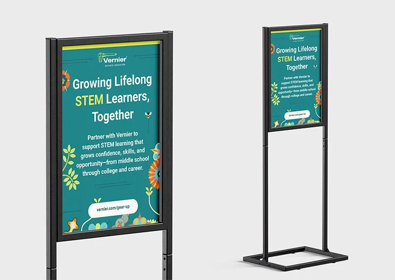
Conference Signage & Swag
View Case Study →
Seasonal Branding & Digital Art
View Case Study →