
Showing Up in the Room — Conference Signage, Swag & Event Design for Vernier Science Education
Three years of conference signage, branded swag, and event collateral for one of STEM education's most active brands — workshop signs, popup displays, floor decals, t-shirts, booth uniforms, and a memorial sign drawn with love for a beloved colleague.

Eight conferences, three years, and a brand that had to show up consistently in every room.
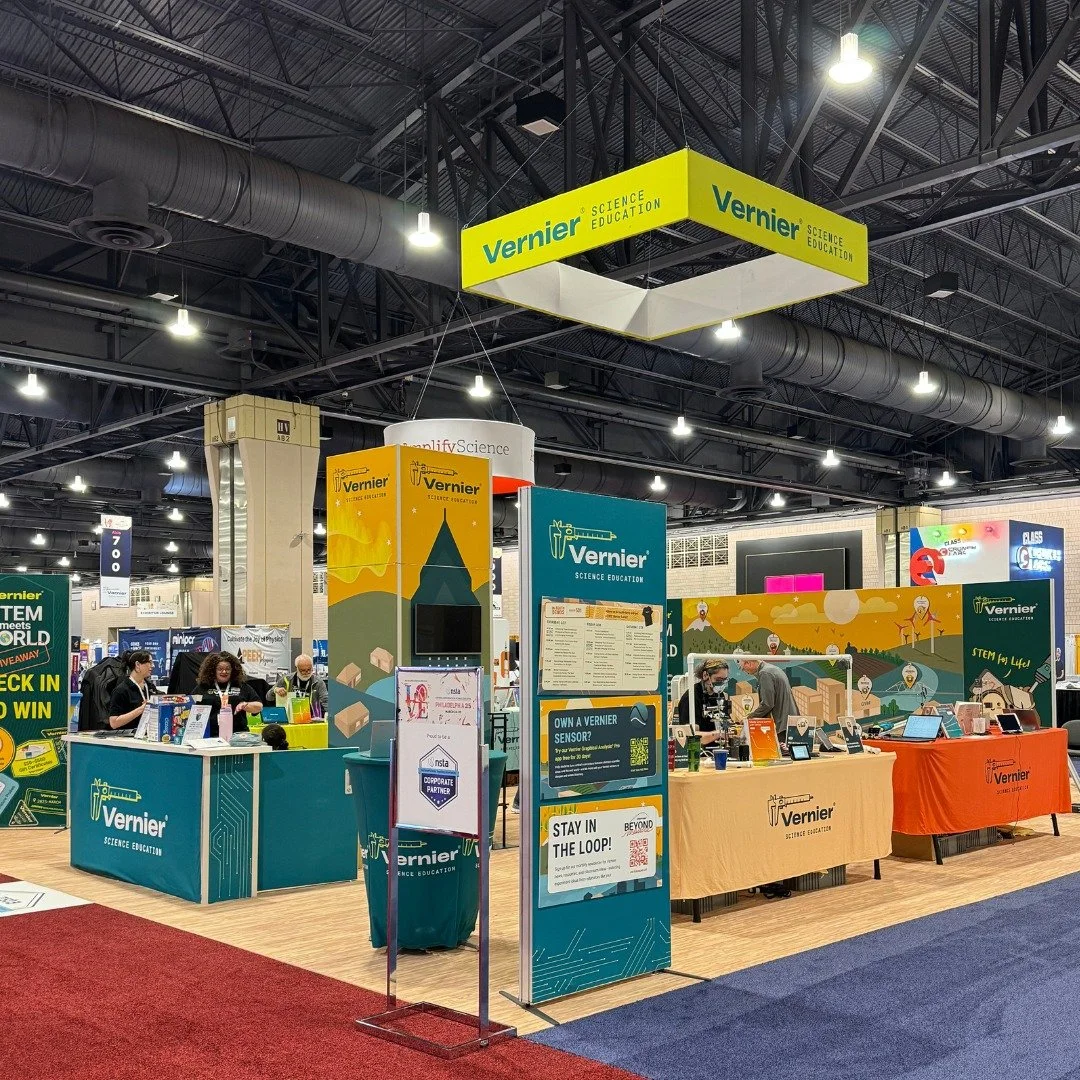
Vernier Science Education attends some of the most significant STEM education conferences in the country — events where educators, researchers, and students gather to learn, connect, and discover new tools for teaching science. At each one, Vernier's physical presence had to communicate the same brand clarity and energy as its digital presence. That meant signage that matched workshop themes, booths that felt polished and professional, and swag that people actually wanted to keep.
The work spanned three years of post-pandemic conference activity — from 2023 through 2025 — and covered everything from large-format popup displays and floor decals to t-shirts, booth uniforms, and sales enablement folders. It also included permanent banner installations at Vernier's headquarters and a deeply personal project: a memorial sign for the dedicated chemistry lab honoring Elaine Nam, a beloved colleague who passed away in 2023.
The Problem
A brand that lived in physical spaces — and had to feel as considered as the digital work.
Conference environments are noisy, crowded, and visually competitive. Every booth, every sign, and every piece of swag is competing for attention from an audience that has seen it all before. The challenge was designing physical touchpoints that felt unmistakably Vernier — cohesive, professional, and warm — while also serving the specific needs of each conference, each workshop, and each audience.
The choices that shaped how Vernier showed up in the room.
Designing workshop signage that matched the campaign — not just the brand.
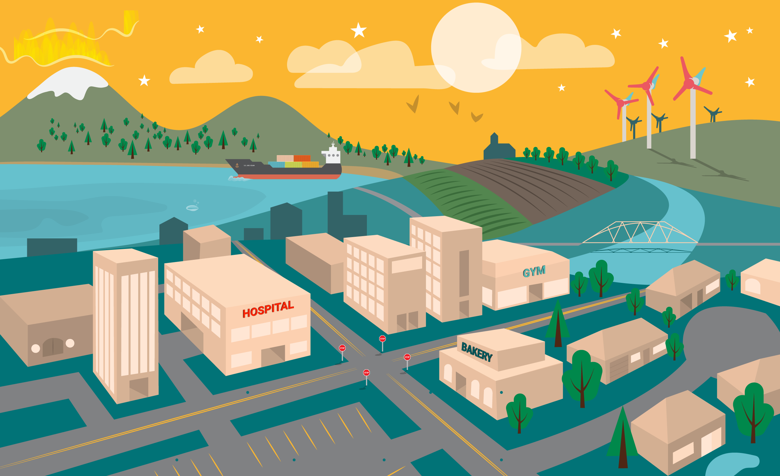
Generic conference signage is forgettable. The decision to design workshop signage that matched each campaign's specific theme — pulling color, typography, and visual language directly from the campaign identity rather than defaulting to a standard Vernier template — gave each workshop its own sense of place. Attendees walking into a workshop could immediately see the connection between the signage around them and the materials in their hands.
Designing swag people would actually use — not just take and forget.
Conference swag has a reputation for ending up in a drawer or a landfill. The approach here was to design items with enough care and quality that people would actually want to keep them — t-shirts with designs worth wearing, bookmarks worth using, pencils worth keeping on a desk. Swag is a small but persistent brand touchpoint. Every time someone uses a Vernier pencil or wears a Vernier shirt, the brand travels with them.
Getting the files right the first time — every time.
Physical production is unforgiving. A color that looks right on screen can look completely different on a floor decal or a t-shirt. Large-format signage has bleed and safe zone requirements that differ from standard print. Apparel decoration has its own file specifications entirely. Managing all of those technical requirements across multiple simultaneous deliverables — while keeping every file production-ready on the first pass — was as much a part of the work as the design itself.
Approaching the Elaine Nam memorial sign as an act of care, not a design task.
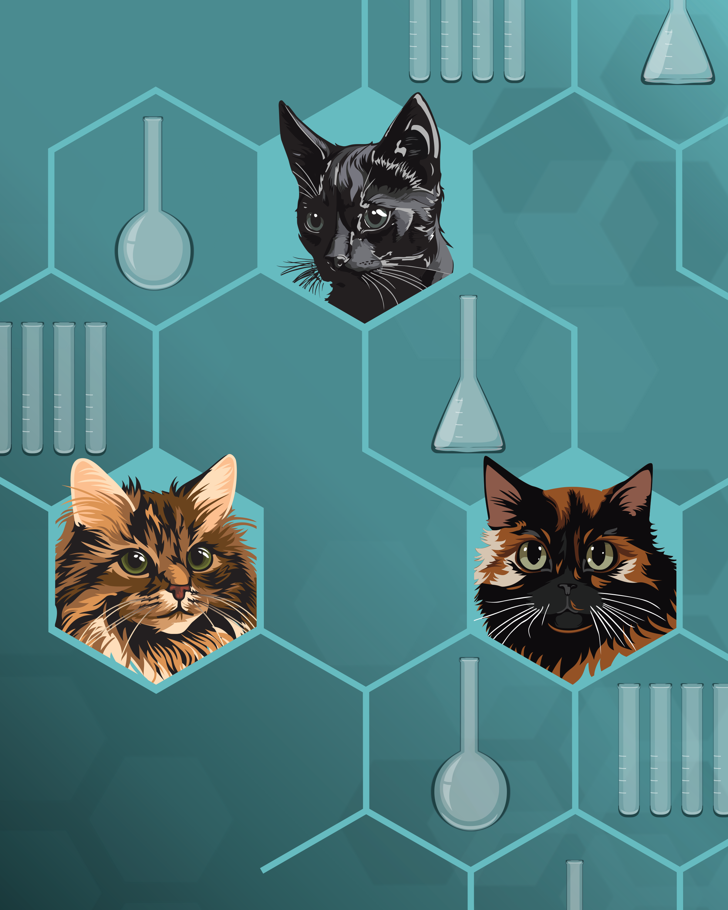
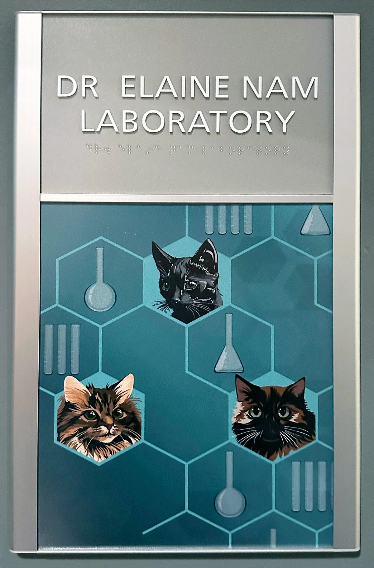
When asked to create a sign for the chemistry lab dedicated to Elaine Nam's memory, the approach had to be different from any other project. This wasn't a brand deliverable. It was a tribute to a person who was loved. The decision to draw her cats — something personal and specific to her — was the right one. A memorial sign that reflected who she actually was, rather than a generic dedication plate, was the only version worth making.
Everything from floor to ceiling — and everything in between.
Three years of conference work produced a significant body of physical design — signage at every scale, apparel that employees and attendees wore proudly, and collateral that supported Vernier's presence at eight national conferences. Every piece had to hold up in a real environment, under real conditions, in front of a real audience.
Conference Signage
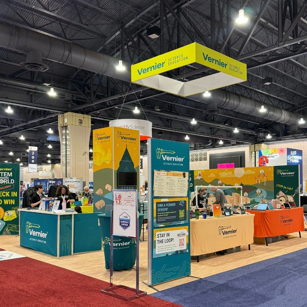
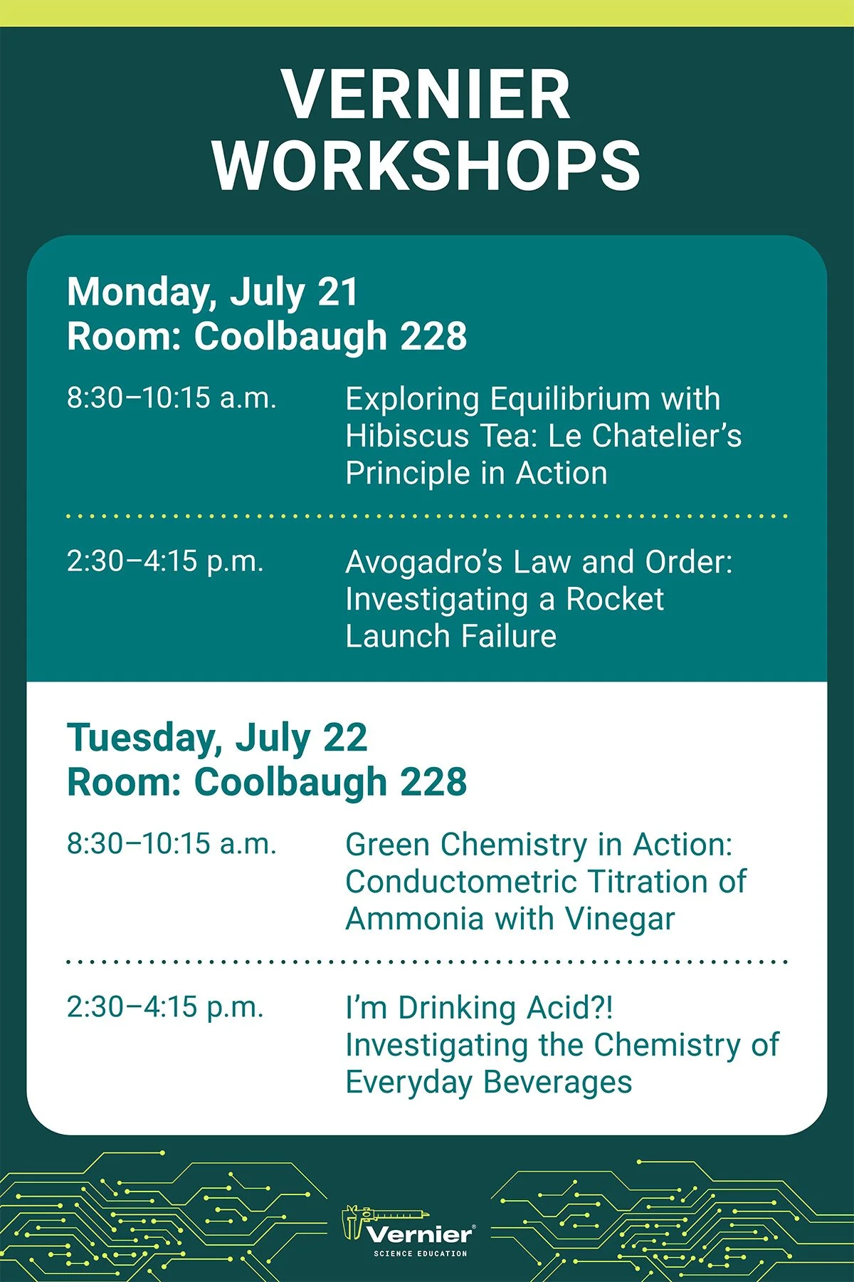
Adobe Illustrator Adobe InDesign Large Format PrintWorkshop signage, popup displays, floor decals, prize signage, and small booth signage — all designed to feel cohesive with the campaign they supported while standing up to the visual noise of a busy conference floor. Workshop signs matched their campaign themes directly, giving each session its own visual identity within the larger Vernier brand.
Swag & Apparel
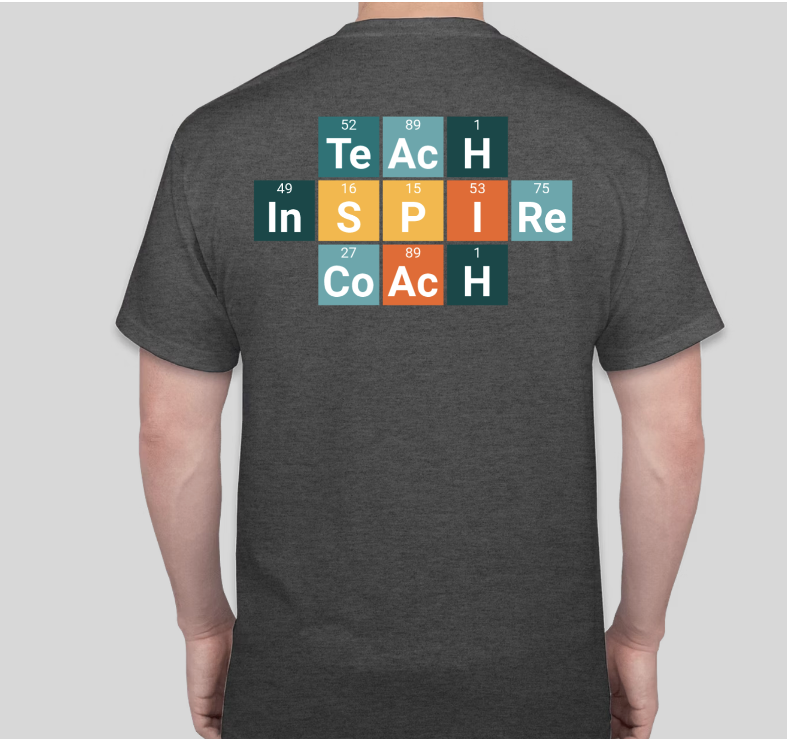
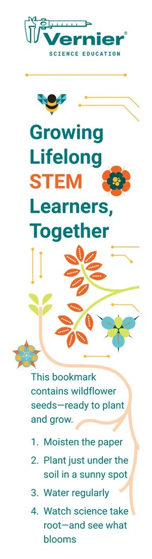
Adobe Illustrator Adobe PhotoshopApparel and swag spanned internal and external audiences — from t-shirts designed for employee committees and booth staff to conference giveaways that attendees would actually use. The GEARUP seed paper bookmark is a good example of the thinking behind the smaller pieces: a functional item with a story built in, designed to feel worth keeping rather than worth tossing. Every piece reflected the campaign or program it supported rather than defaulting to a plain logo treatment.
“Building difficult scientific concepts into something tangible and beautiful.”
Meghan Lewis, Senior Visual DesignerEight conferences, three years — each one a full design deployment.
Every conference had its own set of needs, its own audience, and its own deliverables. Some required a full suite of signage and swag; others needed a single strong piece. All of them required the same thing: showing up looking like Vernier.
NSTA Denver 2024
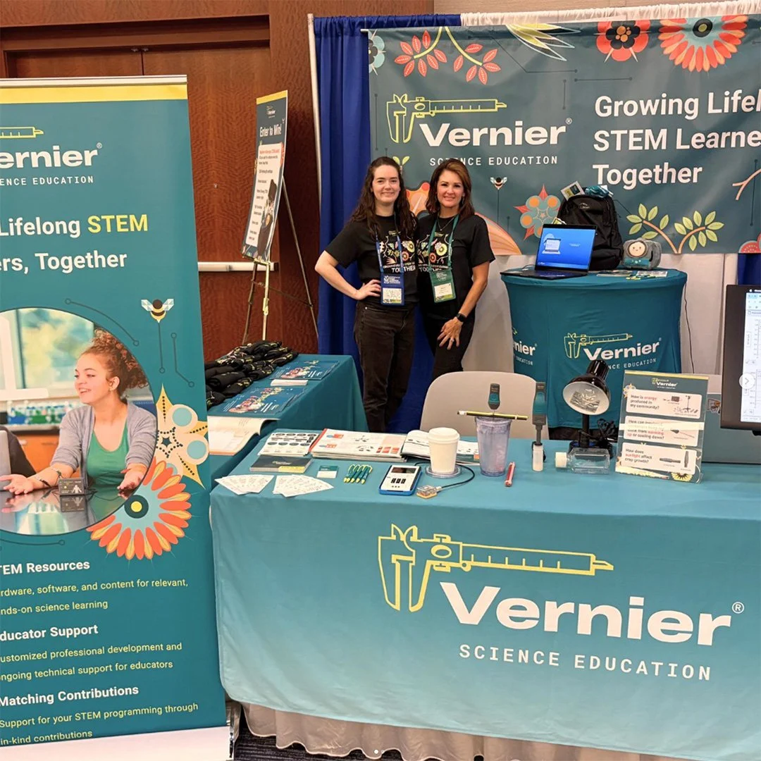
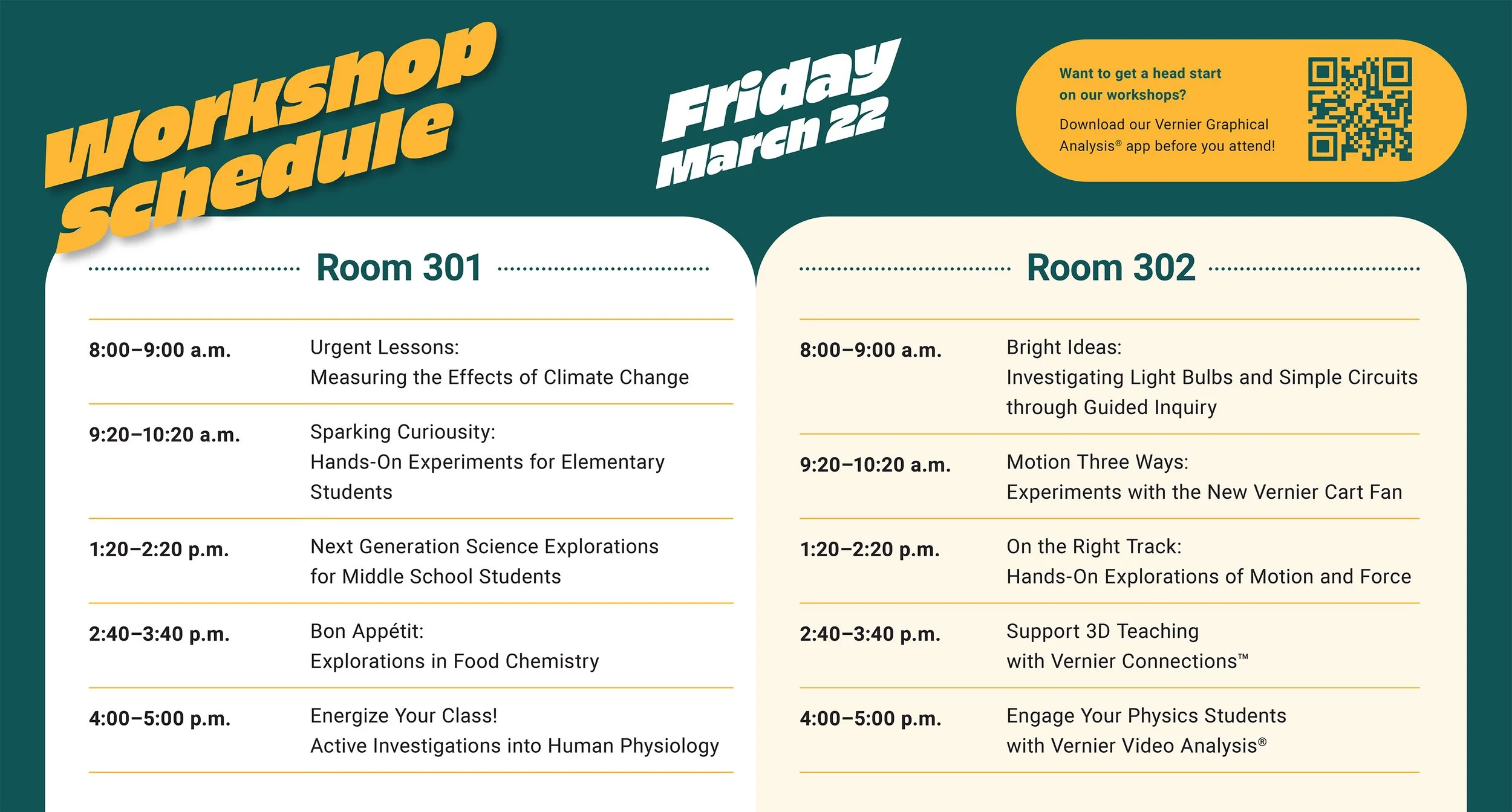
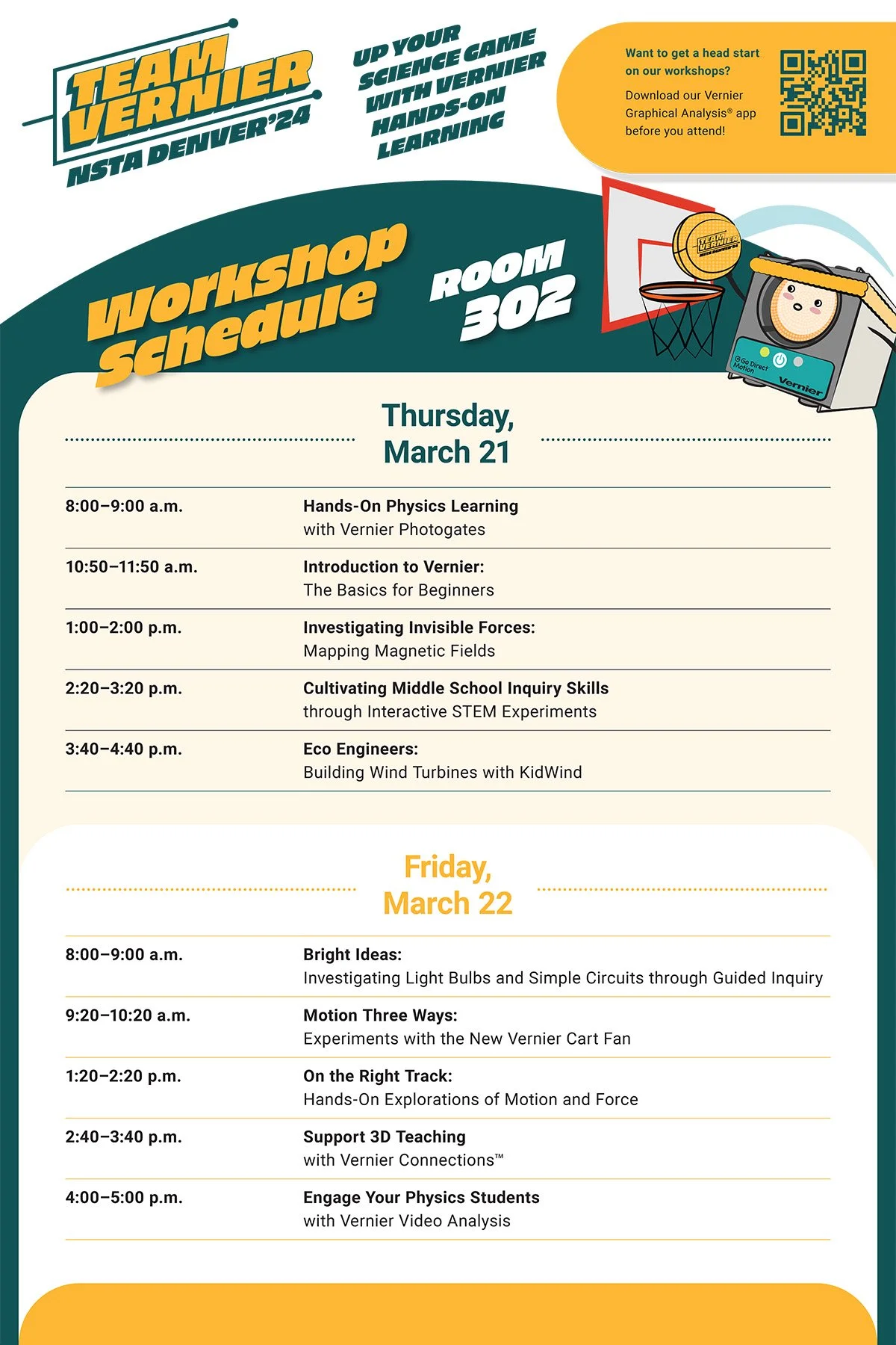
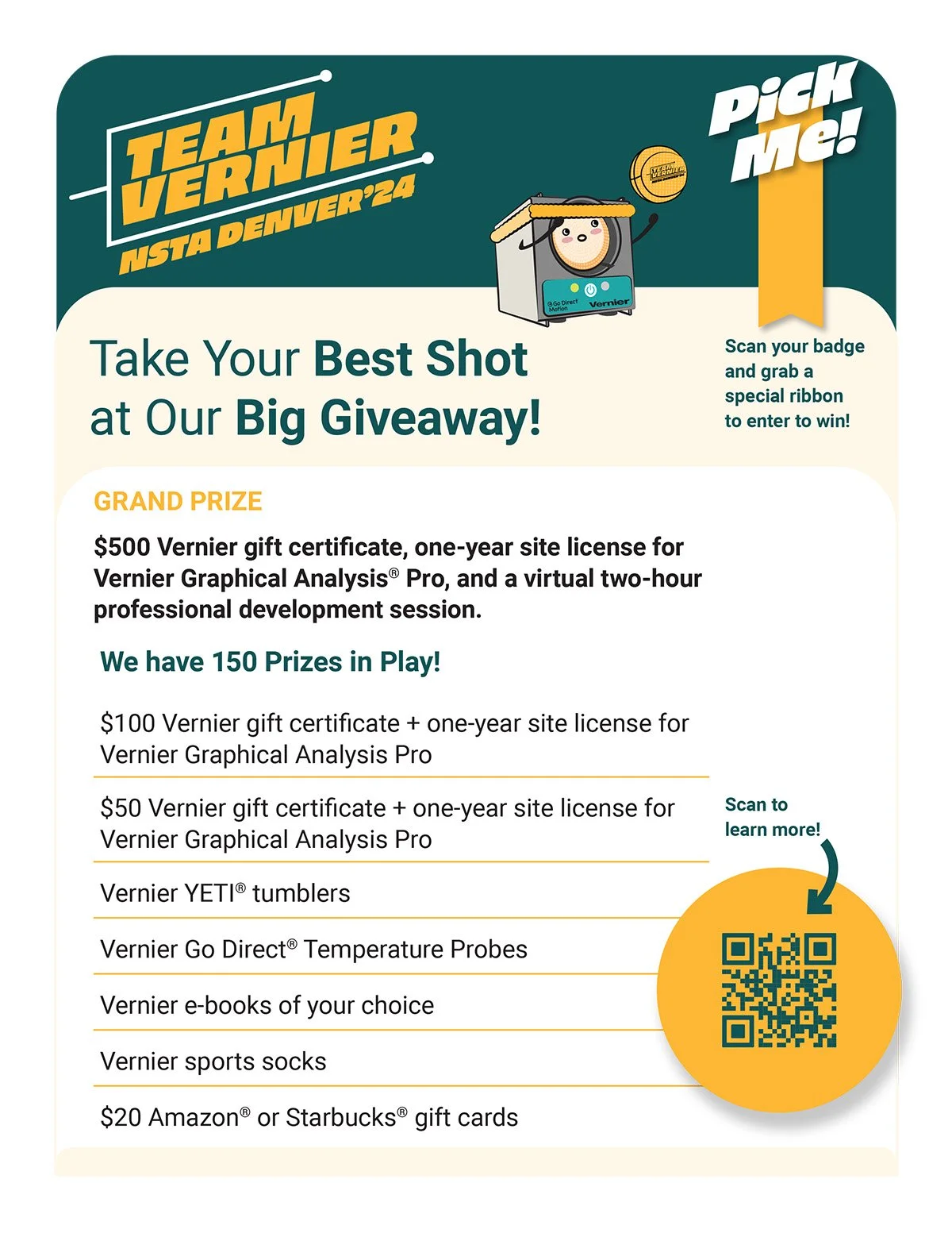
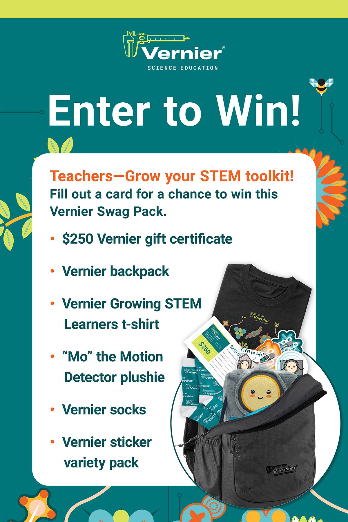
National Science Teaching AssociationThe National Science Teaching Association conference in Denver was one of the most fully realized deployments — booth signage, enter to win and giveaway signs, workshop lightbox signs, and easel workshop signs, all supported by a consistent uniform suite of t-shirts, collared shirts, and sporty jackets for the booth team.
NSTA Philadelphia 2025
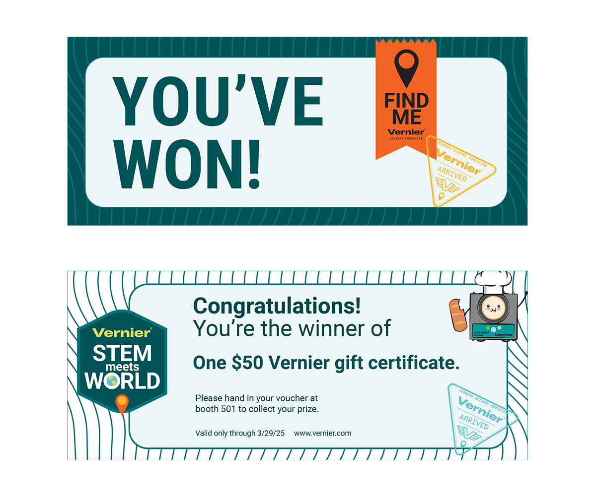
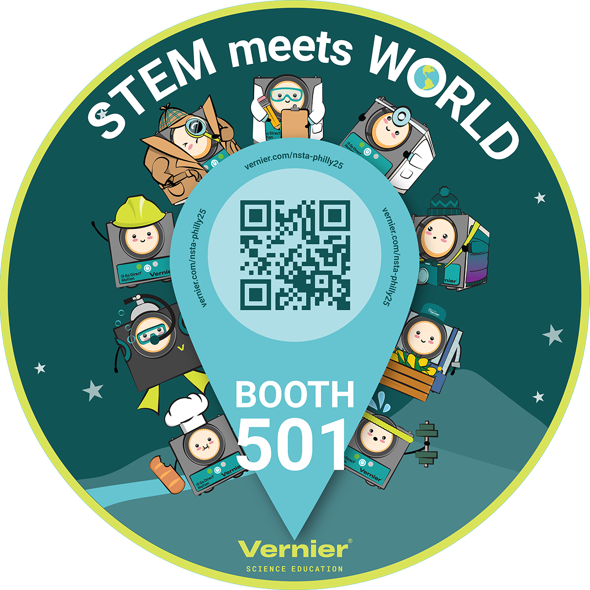
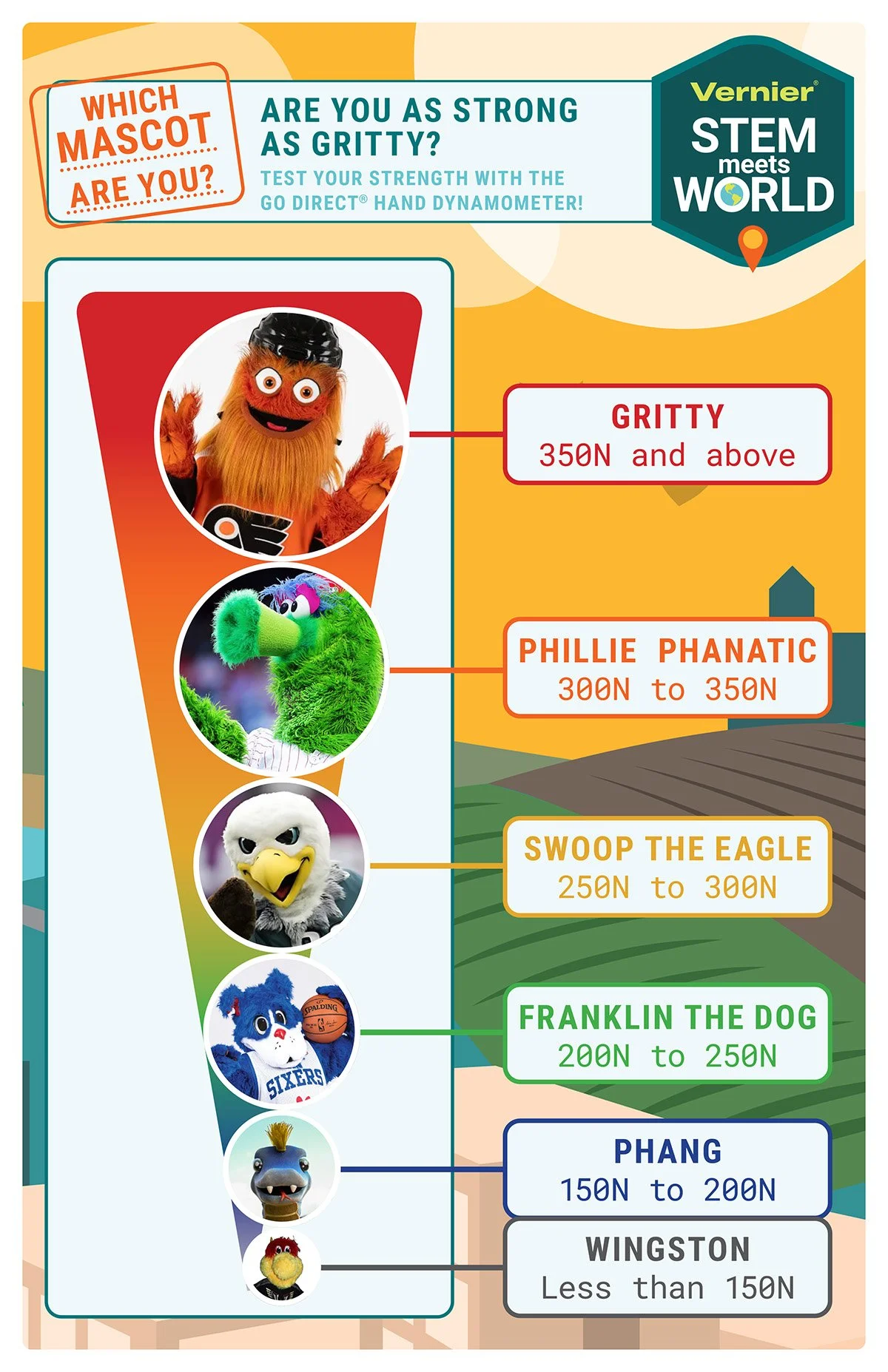
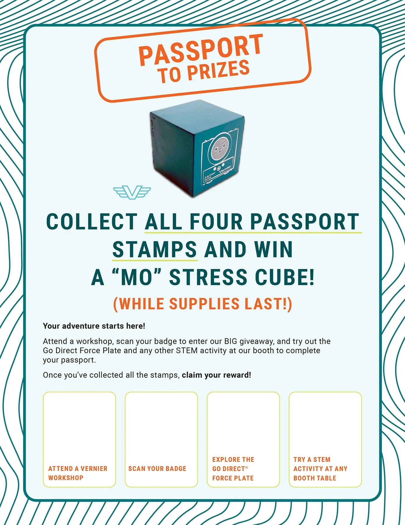
National Science Teaching AssociationThe 2025 NSTA conference in Philadelphia was the most fully equipped deployment of the three years — passport and giveaway signs, booth signage, workshop lightbox and easel signs, a mascot sign featuring Mo the Go Direct Motion Detector, a floor decal, and a giveaway voucher/coupon. The mascot sign brought Mo into the physical conference space for the first time.


GEARUP 2024 & 2025
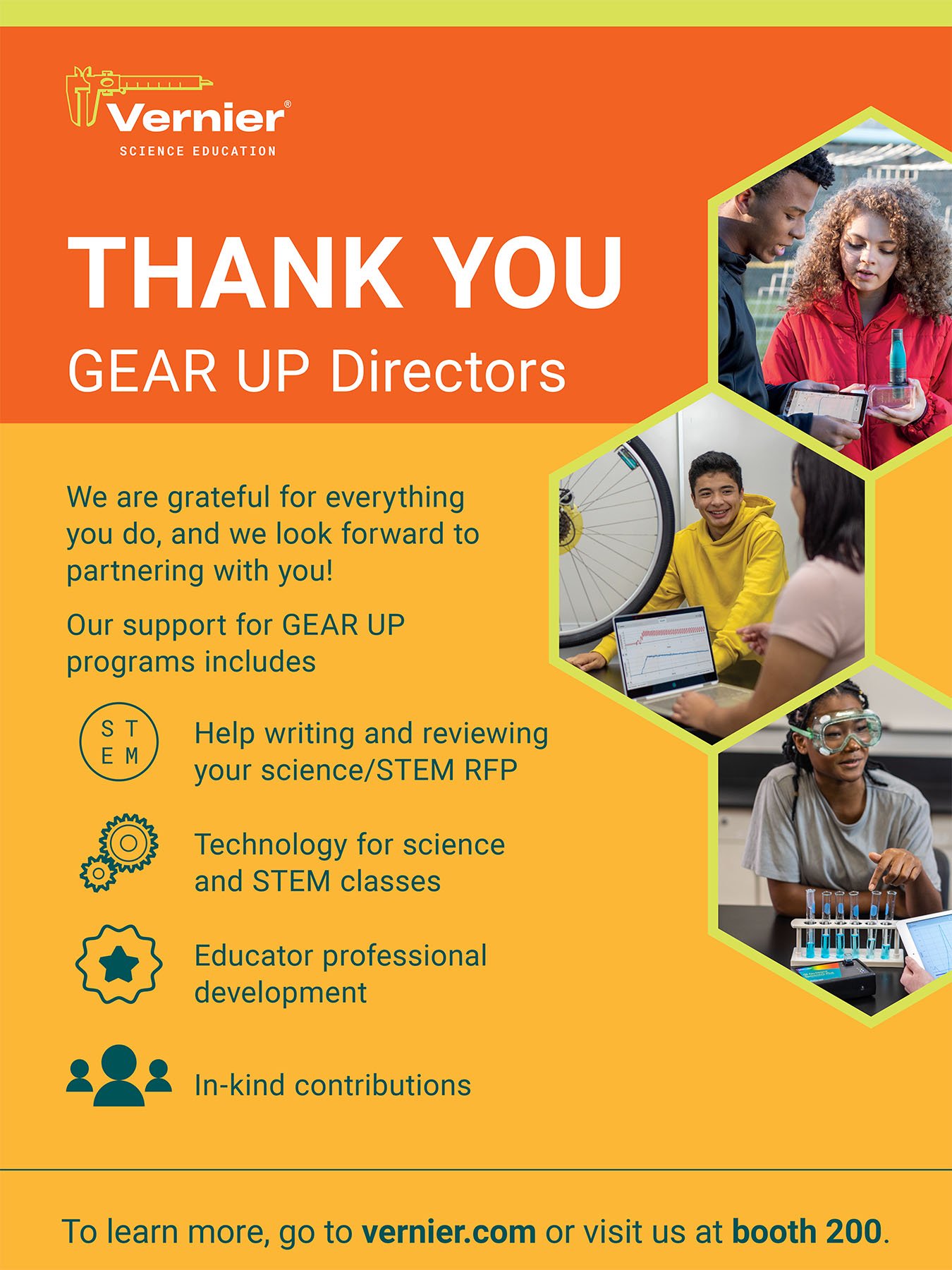
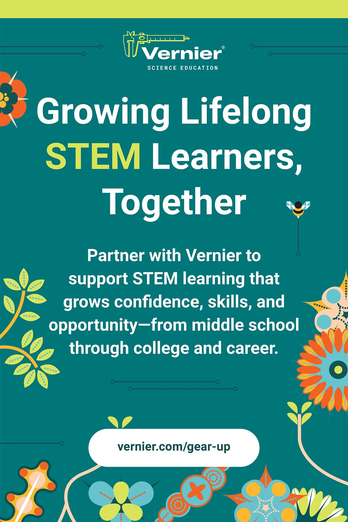
Gaining Early Awareness & Readiness for Undergraduate ProgramsTwo years of GEARUP conference presence — easel posters, enter to win and giveaway signs, and bookmarks. The 2025 conference also featured a team photo at the booth — a candid record of the people who showed up and represented Vernier in the room.
CHEM-ED, HAPS, NAOSMM & AAPT
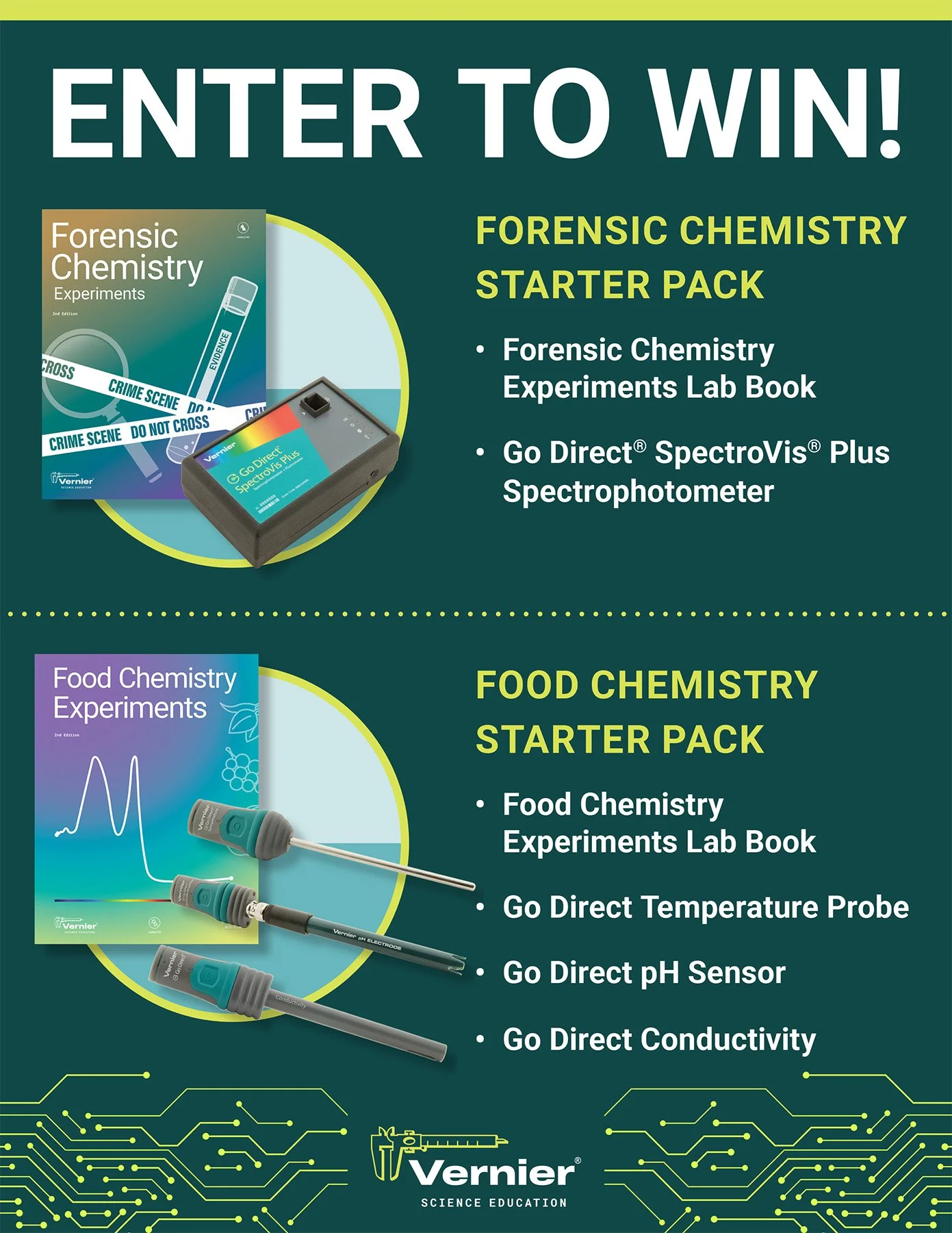
Smaller Conference DeploymentsFour additional conferences received focused deployments — CHEM-ED with a workshop sign and enter to win, and HAPS, NAOSMM, and AAPT each with enter to win signage. Smaller footprint, same brand standards.
General Swag & Apparel
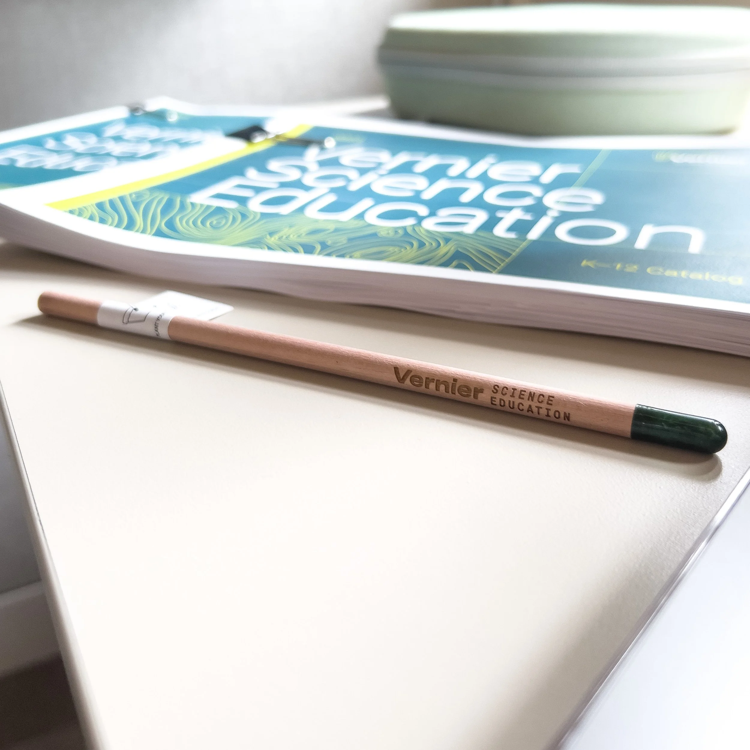
Adobe IllustratorPencils were distributed across multiple conferences — a small but consistent brand touchpoint that traveled home with educators and stayed on desks long after the event. The booth uniform suite of t-shirts, collared shirts, and sporty jackets gave the team a cohesive, professional look across all conferences.
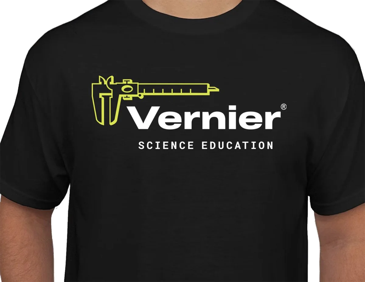
Branded clothing for the people who helped new employees feel at home.
The Mentor Committee at Vernier paired new employees with veterans — regular meetings, shared knowledge, and a genuine investment in making people feel welcome and capable. As a committee member, being part of that work was something I valued deeply. The branded clothing celebrated the committee and the people in it. It wasn't a conference deliverable or a marketing asset — it was something made for a group of colleagues who deserved to feel recognized for the care they brought to their work.
A sign for the chemistry lab — drawn with love.
In 2023, Vernier lost Elaine Nam — a beloved colleague whose presence in the chemistry lab was irreplaceable. When asked to create a sign for the lab dedicated to her memory, the approach was clear: this needed to reflect who she actually was, not just her name on a plaque. Elaine loved her cats. So I drew them — surrounded by the chemistry pattern we used consistently in Vernier's visual language, alongside beakers, test tubes, and the vessels of the lab she called her own. Her name was part of the sign holder, not the artwork itself. That felt right. The part that was mine to give was the part that was personal to her — her cats, in her world. It was a small thing made with a lot of care for someone who deserved to be remembered that way.
Three years of showing up — consistently, completely, and with care.
Three years of active conference presence across eight national and regional STEM education events — each one designed, produced, and delivered on time.
Signage, swag, apparel, print collateral, floor decals, and internal pieces — a complete physical design system that held up across every format and every venue.
From conference floors to a chemistry lab memorial — every piece was designed with the same standard of care, whether it was seen by thousands of educators or by one team who loved a colleague.
The work that lives in the world — and the work that lives in a lab.
Conference design is some of the most physically real work a designer can do. It leaves the screen and shows up in a room — on walls, on floors, on the bodies of the people representing the brand. There is something genuinely satisfying about designing something that has to survive a convention center, a booth teardown, and a flight home in a shipping case. The constraints are different from digital work, the production requirements are unforgiving, and the results are visible to hundreds or thousands of people over the course of a few days.
Three years of conference work across eight events taught me a lot about designing for physical production at scale — managing file specs, vendor relationships, and the specific demands of large-format print, apparel decoration, and promotional items simultaneously. The work also reinforced something I already believed: that brand consistency across physical and digital touchpoints is what makes a brand feel real rather than just designed.
The Mentor Committee sweatshirt and the Elaine Nam memorial sign were different from everything else in this case study. They weren't conference deliverables. They weren't marketing assets. They were pieces made for people — for colleagues who deserved to feel seen and remembered. Those are the projects that stay with you. The sign for Elaine's lab is somewhere in a building I no longer work in, and I think about it sometimes. I hope it makes people smile when they see it.
The Vernier Collection
Explore More Vernier Work
Nine case studies covering six years of in-house design work. You're viewing 8 of 9.
Brand Guide & Refresh
View Case Study →
Campaign Websites
View Case Study →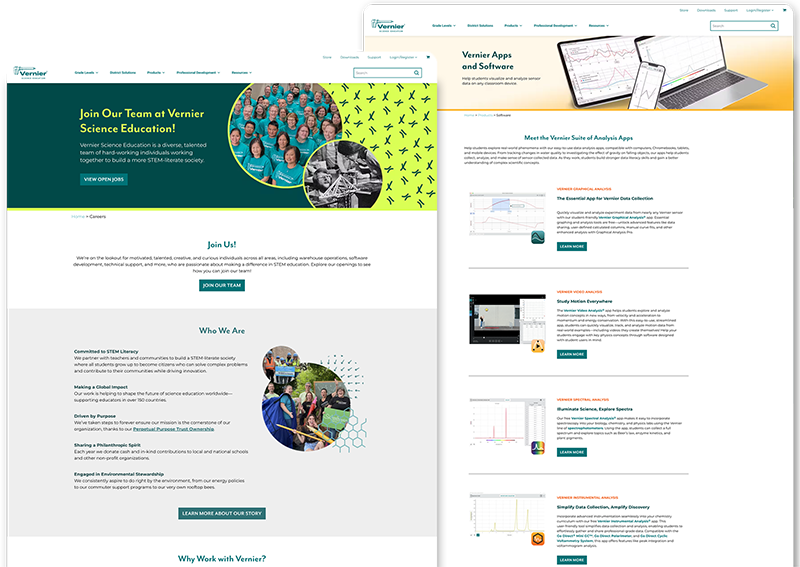
Internal Website Design
View Case Study →
Email Design & Digital Ads
View Case Study →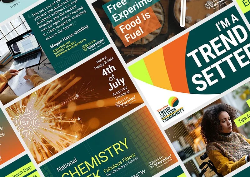
Digital & Social Media
View Case Study →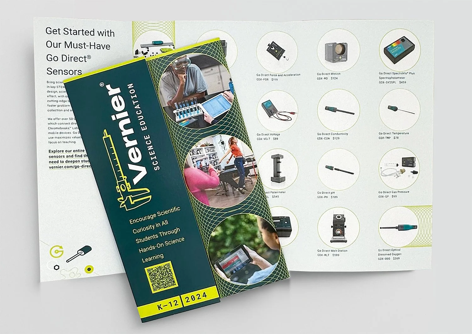
Print Brochures, Flyers & Packaging
View Case Study →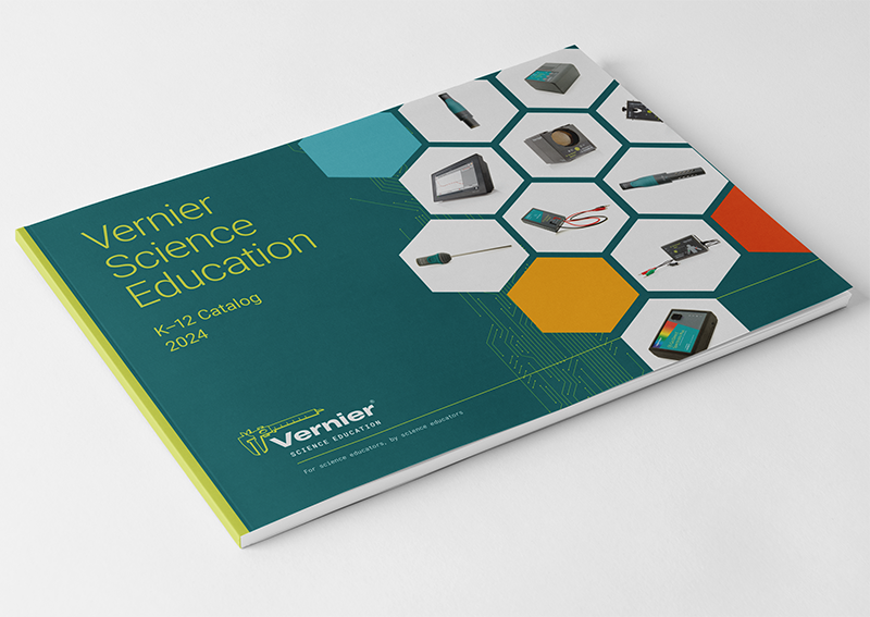
Print Catalogs, Books & Papers
View Case Study →
Seasonal Branding & Digital Art
View Case Study →