
Designing for the Long Form — Catalogs, Lab Books, and Publications for Vernier Science Education
Six years of publication and editorial design for Vernier Science Education — annual K-12 and college catalogs, lab book covers and interiors, white papers, and longer form print and digital pieces built to communicate complex science education content clearly and consistently.
Overview
Six years of long form design — built to make complex science feel clear and approachable.
Vernier's publications were some of the most technically demanding work I produced during my six years there. Annual catalogs ran dozens of pages and needed to organize hundreds of products clearly, consistently, and in a way that educators could navigate quickly. Lab books required precision — covers that set the right tone, interior pages that supported the science without getting in the way of it. White papers and longer form pieces had to balance credibility with readability, presenting research and data in a format that felt authoritative without becoming impenetrable.
Working closely with technical writers, subject matter experts, and the Art Director, I was responsible for the interior page design across these publications — managing layout, typography, hierarchy, and production from first draft through final delivery to the printer or digital platform. Every piece was built to work in print and digitally, and every piece had to feel unmistakably Vernier.
The Problem
Dense technical content. Hundreds of pages. Educators with very little time.
Vernier's publications faced the same core challenge as all of their print work — but at a much larger scale. A catalog with hundreds of products, a lab book with dozens of experiments, a white paper with pages of research data — all of it needed to be organized, readable, and consistent enough that an educator could find what they needed quickly and trust what they were reading. The design challenge wasn't just visual. It was editorial — deciding what information lived where, how hierarchy guided the eye, and how consistency across hundreds of pages kept the reader oriented without feeling repetitive.
Key Decisions
What I decided, and why.
Hierarchy does the heavy lifting
With hundreds of pages of dense technical content, visual hierarchy wasn't a stylistic choice — it was the primary navigation tool. Clear typographic levels, consistent spacing, and predictable layout patterns meant educators could scan a page and immediately understand what was most important, what was supporting detail, and where to go next. Every interior layout decision was evaluated against a single question: does this make the content easier to find and trust?
Work closely with technical writers from the start
Publications at this scale only work when design and writing are aligned from the beginning. I worked directly with Vernier's technical writers throughout each project — reviewing content as it came in, flagging layout issues early, and ensuring the design could flex to accommodate the real text rather than placeholder copy. This close collaboration meant fewer surprises in production and cleaner files delivered to the publisher or digital platform on time.
Design for both surfaces from the start
Every publication needed to work in print and as a digital PDF — and the requirements aren't always the same. Color rendering, link behavior, resolution, and legibility at screen size all required consideration alongside traditional print production specs. Building both into the workflow from the beginning rather than adapting a print file for digital at the end saved significant time and produced better results across both formats.

The Work
Six years of long form — built to inform, guide, and endure.
From annual catalogs to lab book covers and white papers, each publication type presented its own design challenges. The common thread across all of it: making dense, technical content feel clear, navigable, and worth returning to.
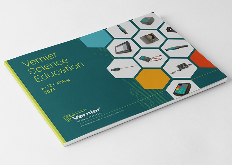
Annual Catalogs
K–12 College 2020–2025Each year I worked on both the K-12 and college editions of Vernier's annual catalog — managing interior page layout, typography, product hierarchy, and production from first draft through final delivery. The catalogs were available in both print and digital formats, requiring careful attention to how layouts translated across both surfaces. While the covers served as the public face of each edition, the interior design was the real work — organizing hundreds of products clearly enough that educators could find what they needed quickly and trust what they were reading.
Image placeholder — Catalog cover
Image placeholder — Interior spread
Image placeholder — Interior spread detail
College Disciplines Folder
Higher Education 2020The college disciplines folder was a unique piece — designed as a physical folder system organized by academic discipline rather than a traditional catalog format, allowing college educators to pull out only the sections relevant to their courses. It was a thoughtful, educator-first concept that required careful consideration of how information was structured and labeled across multiple insert pieces. Unfortunately its launch coincided with the COVID-19 lockdowns — a piece designed to be shared and handled in person arrived just as in-person everything stopped. The timing was beyond anyone's control, but the work itself was some of the most considered publication design of the catalog series.
Image placeholder — College folder exterior
Image placeholder — College folder interior inserts
Lab Books
Print Digital Cover & InteriorLab book work spanned both print and digital editions — primarily cover design, though I also assisted with interior page updates on select titles working directly with Vernier's technical writers. Each cover needed to communicate the subject matter clearly while staying within the brand system, and each interior update required careful attention to the existing layout conventions so changes felt seamless rather than patched. Files were delivered directly to the book publisher following their production specifications.

Lab Book - Print - Forensic Chemistry
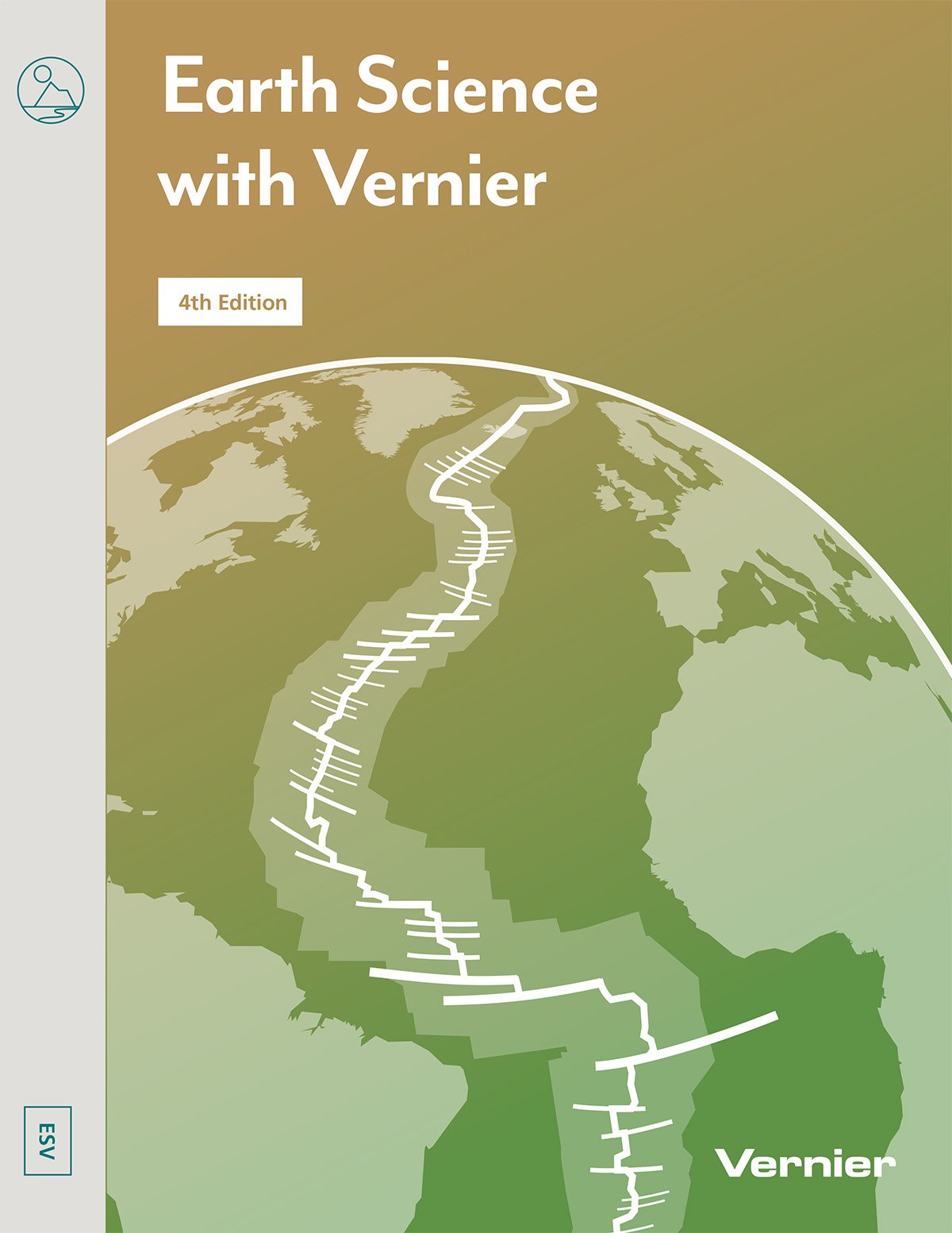
Lab Book - Print - Earth Science with Vernier
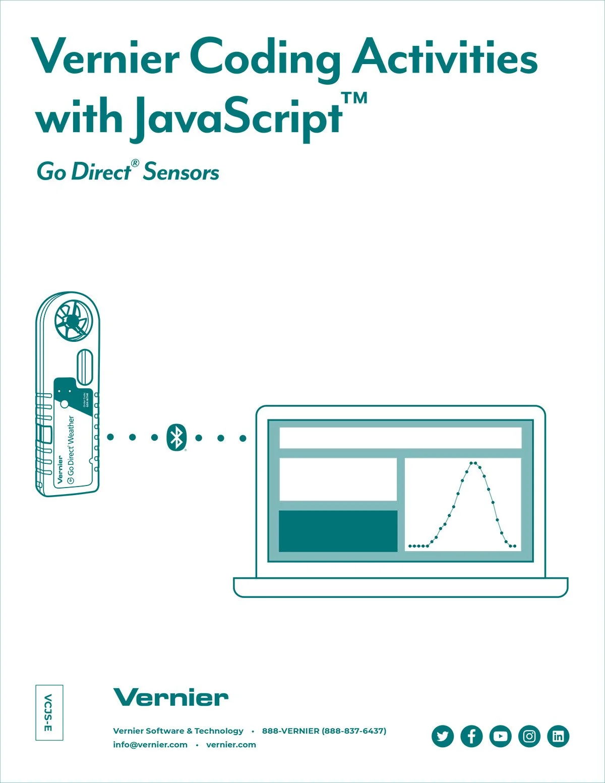
Lab Book - Digital - Javascript EBook
White Papers & Long Form
Digital Print-ReadyWhite papers and longer form pieces were designed to live primarily as digital PDFs while remaining printable when needed. These pieces carried Vernier's credibility as a science education leader — presenting research, data, and curriculum guidance in a format that felt authoritative without becoming impenetrable. Layout decisions prioritized readability at screen size, clear data presentation, and consistent branding that connected each piece back to the broader Vernier visual system.

White Paper - Exploring the Data - Cover

White Paper - Exploring the Data - Inside Spread
Outcomes
What this work delivered.
Annual K-12 and college catalogs designed and produced from 2020 through 2025 — each one organized, on-brand, and delivered on time to print and digital platforms.
Every publication was built to work in print and as a digital PDF — with layout, resolution, and production decisions made for both surfaces from the start.
K-12 catalogs, college catalogs, college disciplines folder, lab book covers and interiors, and white papers — each with its own format requirements and audience context.
Reflection
What this work taught me.
Publication design at this scale taught me that consistency is infrastructure. A catalog only works if the person reading page 87 has the same intuitive understanding of the layout as the person reading page 12 — and that only happens when the design system is solid enough to hold across hundreds of pages without intervention. Building that kind of consistency requires discipline, clear templates, and close collaboration with the writers and subject matter experts who are generating the content. The college disciplines folder was the piece I'm most proud of from this body of work — not because the timing was kind to it, but because the concept was genuinely thoughtful and the execution matched the ambition. Sometimes the best work lands at the wrong moment. That doesn't make it less worth doing.
The Vernier Collection
Explore More Vernier Work
Nine case studies covering six years of in-house design work. You're viewing 7 of 9.
Brand Guide & Refresh
View Case Study →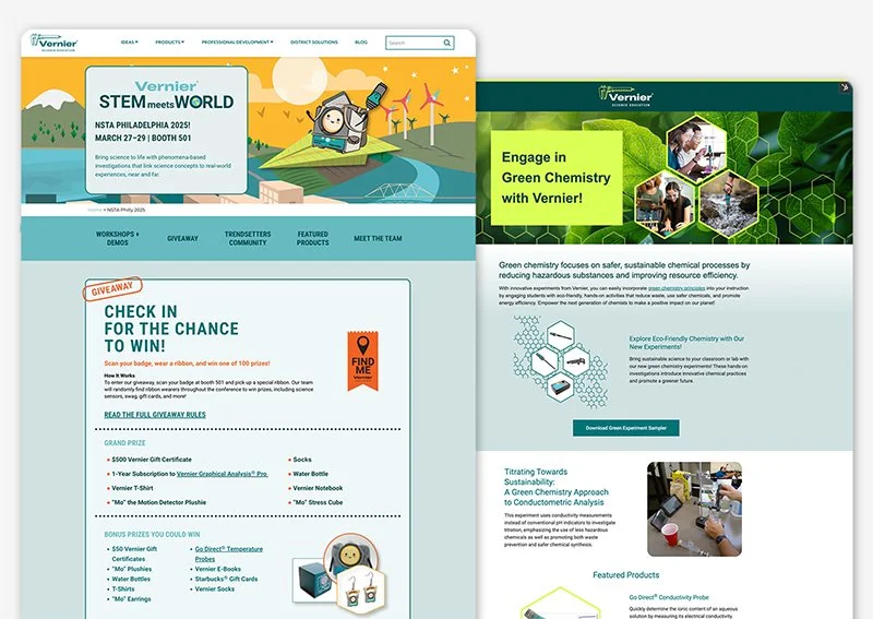
Campaign Websites
View Case Study →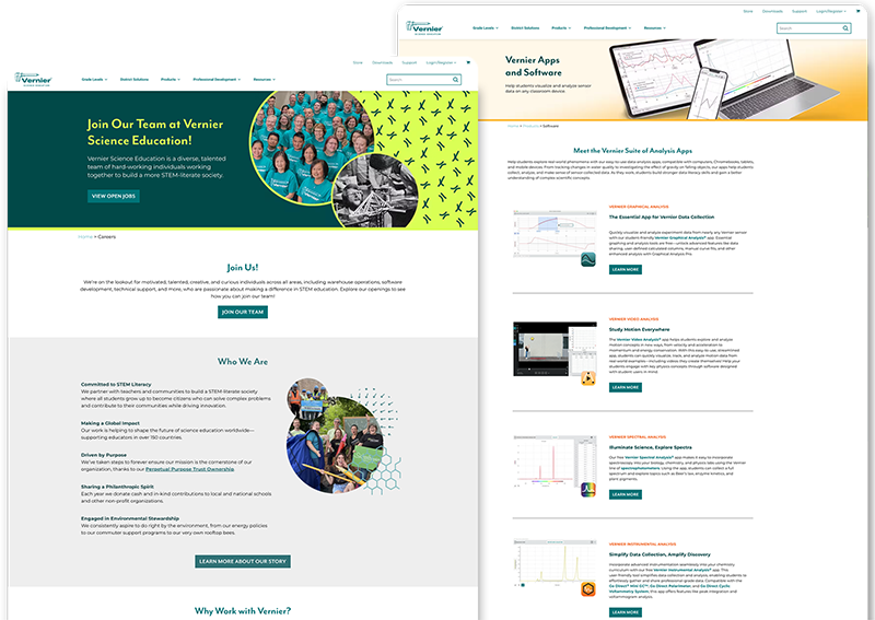
Internal Website Design
View Case Study →
Email Design & Digital Ads
View Case Study →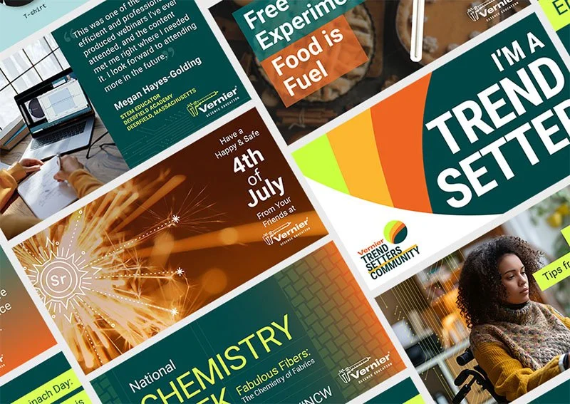
Digital & Social Media
View Case Study →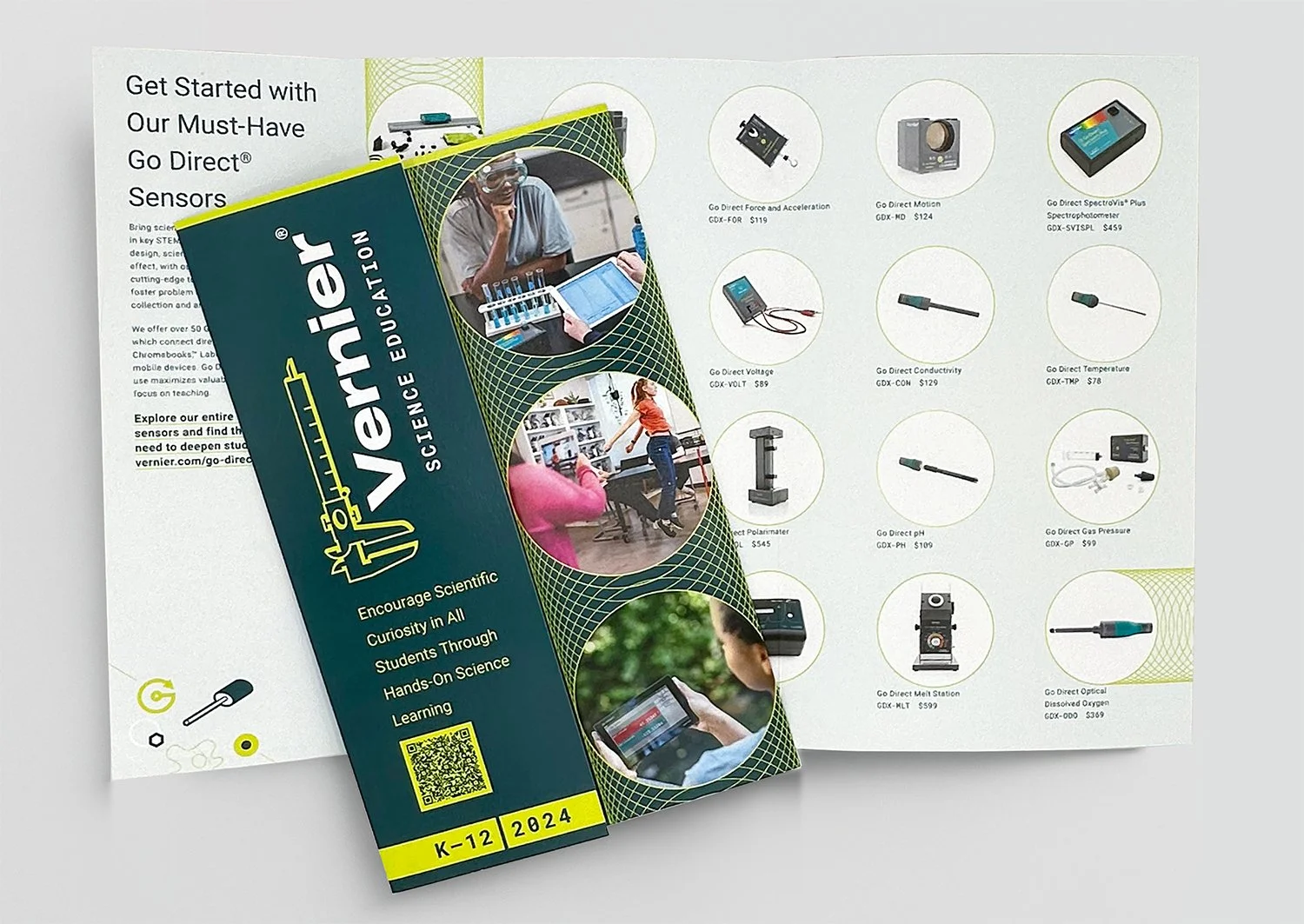
Print Brochures, Flyers & Packaging
View Case Study →
Conference Signage & Swag
View Case Study →
Seasonal Branding & Digital Art
View Case Study →