Thoughtful Print Design that Communicates and Connects
Print Design | Brochures & Catalogs | Flyers & Postcards | Packaging Design | Marketing Collateral | Typography & Layout
Print Design | 2019-2025
OVERVIEW
Vernier Science Education Print Design: Brochures, Postcards, Flyers, and Packaging
During my time at Vernier Science Education, I designed a wide range of print materials, including brochures, postcards, flyers, and product packaging such as labels and boxes. Each piece required balancing visual engagement with clear communication of technical and educational information. This work pushed me to think critically about hierarchy, layout, and imagery so designs felt approachable, purposeful, and effective for educators and students.
Collaboration was central to every project. I partnered closely with the Art Director and cross-functional team members to refine concepts, select imagery, and establish consistent visual hierarchy across both marketing and product-focused materials. Typography, structure, and graphic decisions were made to support clarity, usability, and brand consistency, whether the piece lived in a classroom, at a conference booth, or on a product shelf.
ROLE
PRINT DESIGNER
TIMELINE
2019-2025
TOOLS
ADOBE INDESIGN, ILLUSTRATOR, PHOTOSHOP, ACROBAT
MARKETING LEADERSHIP, ART DIRECTOR, COPYWRITER, PROJECT MANAGERS, SUBJECT MATTER EXPERTS, EXTERNAL VENDORS/PRINTERS
TEAM
DELIVERABLES
BROCHURES, POSTCARDS, FLYERS, SELL SHEETS, EVENT COLLATERAL, PACKAGING
How Print Supported Educators and Product Storytelling
Print played a strategic role in Vernier’s communication with educators. These materials supported audiences who value tangible resources they can review, reference, and share. Brochures, postcards, and flyers introduced new products, highlighted curriculum benefits, and helped guide educators toward the right tools for their classrooms. Many pieces served as a first point of contact at conferences or within outreach kits.
A consistent challenge across projects was translating complex scientific products into content that felt friendly, practical, and easy to understand. I focused on what educators needed to grasp first, then used hierarchy and layout to reduce friction and support quick comprehension. This approach reinforced how thoughtful design can make specialized information feel accessible.
This body of work includes materials created for product launches, seasonal promotions, educator events, curriculum support, and product packaging. Collectively, these projects strengthened my skills in hierarchy, messaging clarity, and visual storytelling, while reinforcing the value of close collaboration with subject matter experts, marketing partners, and product leads.
CREATIVE DIRECTION
Clear, approachable design that supports educators and product clarity
Each print project at Vernier started with a simple goal, help educators quickly understand what a product did and how it supported hands-on learning. Many teachers encountered these tools for the first time at conferences or through outreach kits, so the materials needed to feel inviting, accurate, and easy to scan. I helped guide early conversations around what information mattered most and how design could make that information feel practical rather than overwhelming.
THE BRIEF
“What visual approach will help educators understand complex tools in a way that feels practical, clear, and connected to their classroom needs?”
My creative direction emphasized strong hierarchy, clean typography, and imagery that showed the tools in real classroom contexts. Educators responded best to layouts that balanced technical diagrams with warm photography. This approach reinforced Vernier’s brand as both scientifically rigorous and educator focused. Consistent use of color, spacing, and iconography supported readability across brochures, flyers, postcards, and supporting print and product materials.
As the work evolved, I became more confident simplifying dense product details into visual elements teachers could understand at a glance. This often meant refining charts, creating clear callouts, and shaping content so each piece guided readers through a short learning path. These decisions helped the print materials function as reliable tools for sales teams, event staff, and educators who needed clarity quickly before exploring products in more depth.
PRODUCTION + DESIGN OVERVIEW
Bringing each piece to its final form and preparing for production
Once layouts and quantities were approved, the project moved out of exploration and into final production. At this stage, the design decisions were locked, and the focus shifted from concept to execution, accuracy, and repeatability across all pieces. I cleaned up the files, tightened the typography, looked out for widows and hyphens, checked image resolution and color mode, double checked margins and negative space, and confirmed alignment with Vernier brand standards. This step gave me the space to work with intention and precision, ensuring each piece was fully production-ready for either in-house printing or handoff to an external vendor.
Production preparation
Cleaned and organized final files
Tightened typography and spacing
Resolved widows, hyphenation, and alignment issues
Verified margins, negative space, and hierarchy
Checked image resolution, color mode, and bleed
Confirmed alignment with Vernier brand standards
Print coordination
Exported press-ready files
Partnered with the project manager and print vendor on specs for color, paper, and finishing
Reduced risk of production errors through early verification
Quality review
Reviewed printed pieces for color accuracy and trim quality
Checked consistency across the full print run
Distributed samples to contributors for reference
Reaching this stage was always rewarding. Print work has a sense of permanence, and seeing the final pieces reinforced the value of careful planning, collaboration, and attention to detail.
View the final projects below!
FINAL DESIGN | FLYERS
KidWind, Engineering, Software, and GLOBE Flyers
These four flyers supported different parts of Vernier’s STEM education story, so each one needed its own tone and structure. My goal was always the same: make the content easy to understand and create a visual system that helped educators skim quickly. I worked with our Art Director to confirm direction, then took creative ownership of the layouts, pacing, and hierarchy. I also helped modernize older materials, especially the KidWind flyer, which needed a cleaner and more inviting presentation.
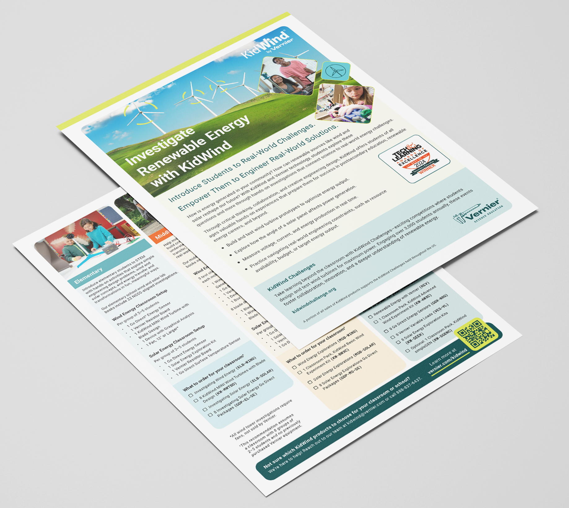
2025 KIDWIND FLYER
The KidWind flyer introduced hands-on renewable energy investigations, so the design needed to feel light and energetic. I used airy photography that highlighted student interaction with wind and solar tools. Rounded boxes helped organize sections about classroom activities and the KidWind Challenges. Replacing the older version mattered because the previous design felt heavy and dated. The new layout presented the content with clarity and gave educators a clearer sense of what students actually do during these investigations.
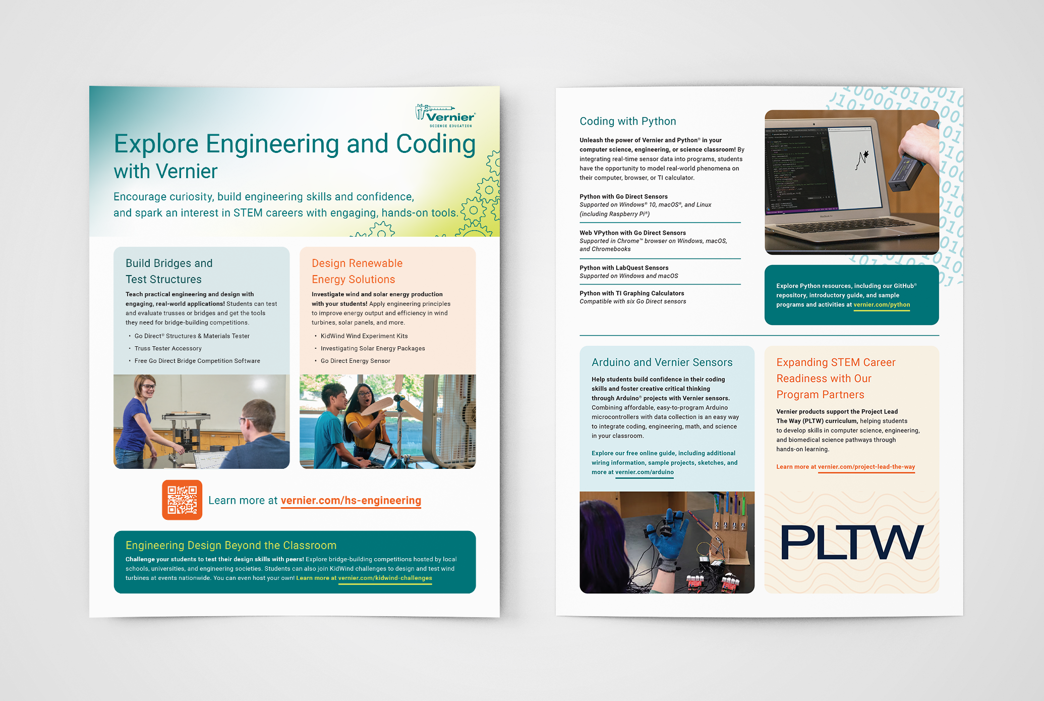
2025 ENGINEERING FLYER
The Engineering flyer carried quite a bit of information. It highlighted bridge testing, renewable energy kits, Python coding, Arduino projects, and PLTW connections in a structured way. I built a grid that supported multiple columns and callouts, then organized everything so educators could scan each section without feeling overwhelmed. Section headers, spacing, and grouped product lists made it easier to compare offerings across grade levels and topics. The action photography focused on tools in use and kept the tone practical rather than abstract.
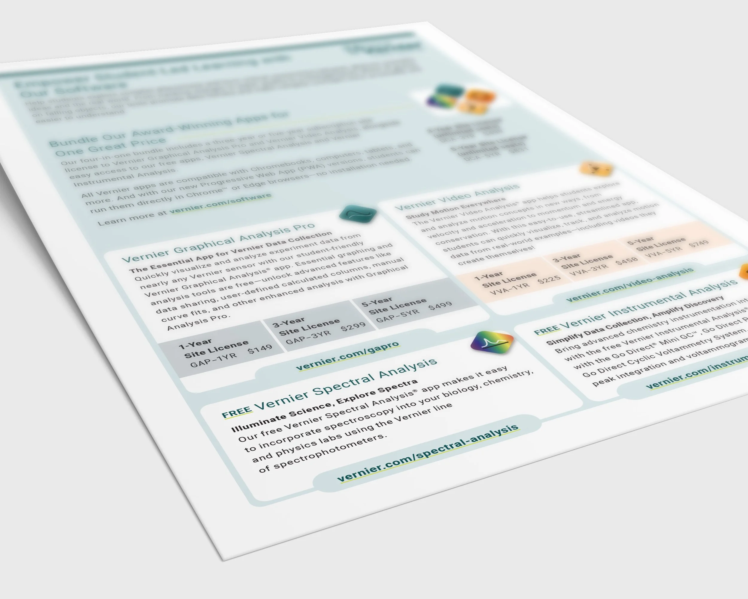
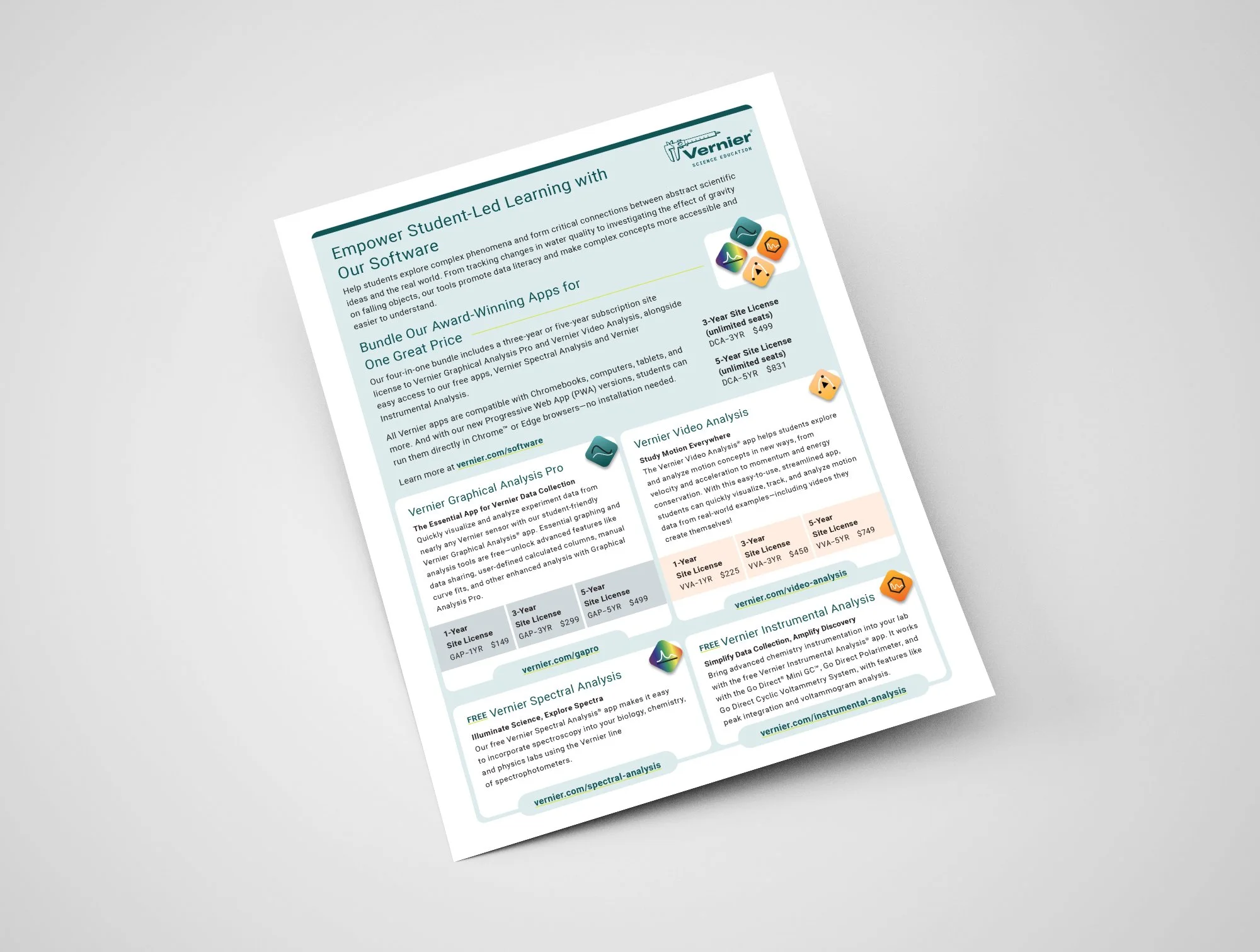
2025 SOFTWARE FLYER
The Software flyer worked differently. It relied only on text and icons and was printed in-house. Because the copy outlined four apps and a bundle offer, I kept the layout simple, centered on clean typography, consistent iconography, and equal weight across each quadrant. This approach helped the flyer serve as a quick reference for educators who wanted to understand compatibility, licensing options, and the differences between each app. The visual neutrality matched the straightforward subject matter. It was further supported by a similarly laid out software page on the Vernier website, viewable here: www.vernier.com/software
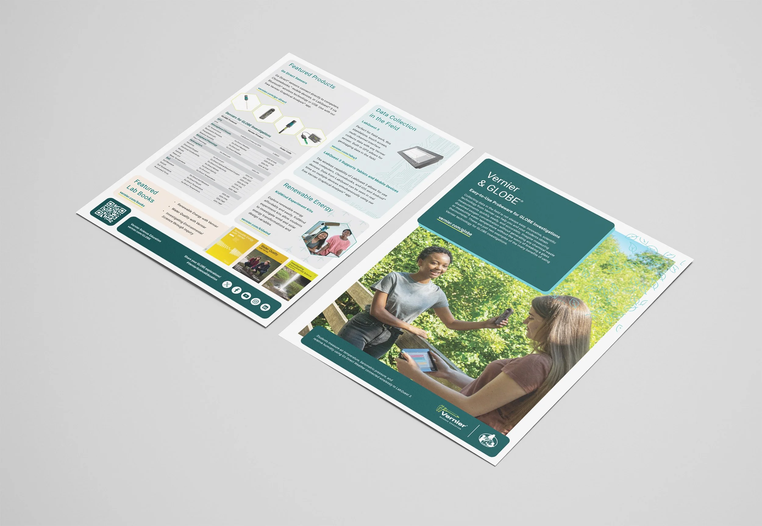
2024 VERNIER/GLOBE FLYER
The GLOBE flyer emphasized field data collection, so I built the layout around a large action photo of students using Vernier probeware outdoors. The content focused on easy, waste free measurements and durable tools like Go Direct sensors and LabQuest. A strong visual anchor supported the copy’s promise of reliable fieldwork. I used clear columns to present featured products and kept callouts minimal so educators could focus on what GLOBE investigations require.
Designing these four flyers showed me how a flexible system can support varied content. Each piece served a different audience need, but by using consistent grids, spacing, and typography, I kept them tied to the broader Vernier brand. Small decisions about imagery, structure, and pacing allowed each flyer to communicate its message clearly while staying part of a cohesive family.
FINAL DESIGN | POSTCARDS
Discovery/Let’s Talk postcards, New Product postcards, and NTSA Trendsetter postcards
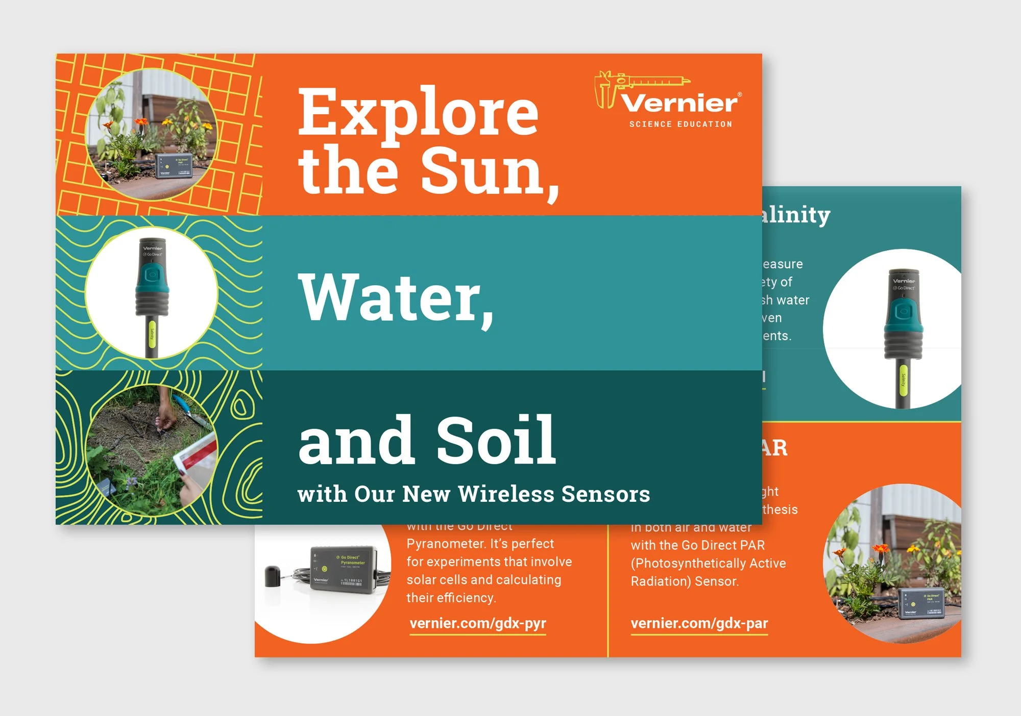
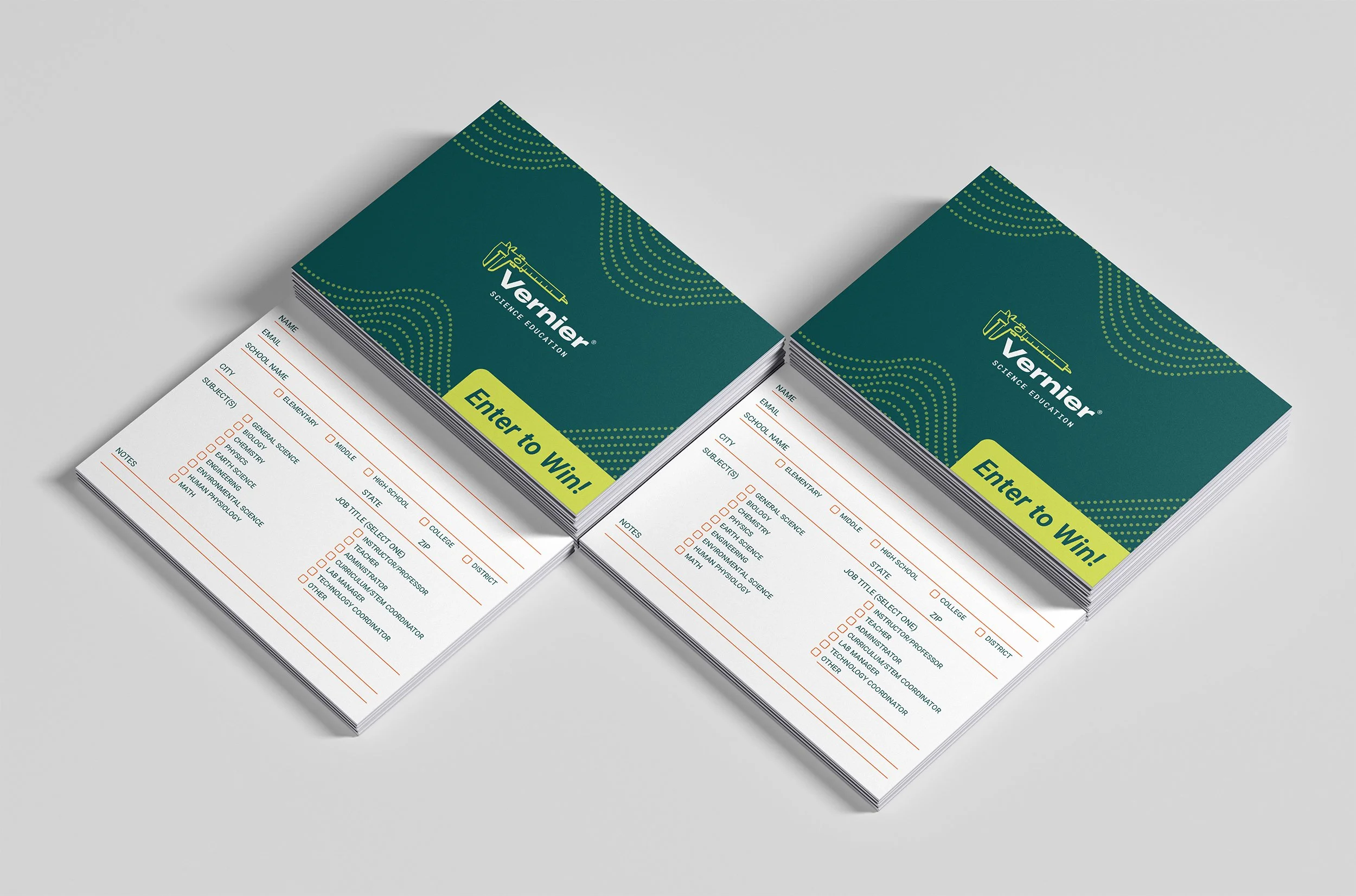
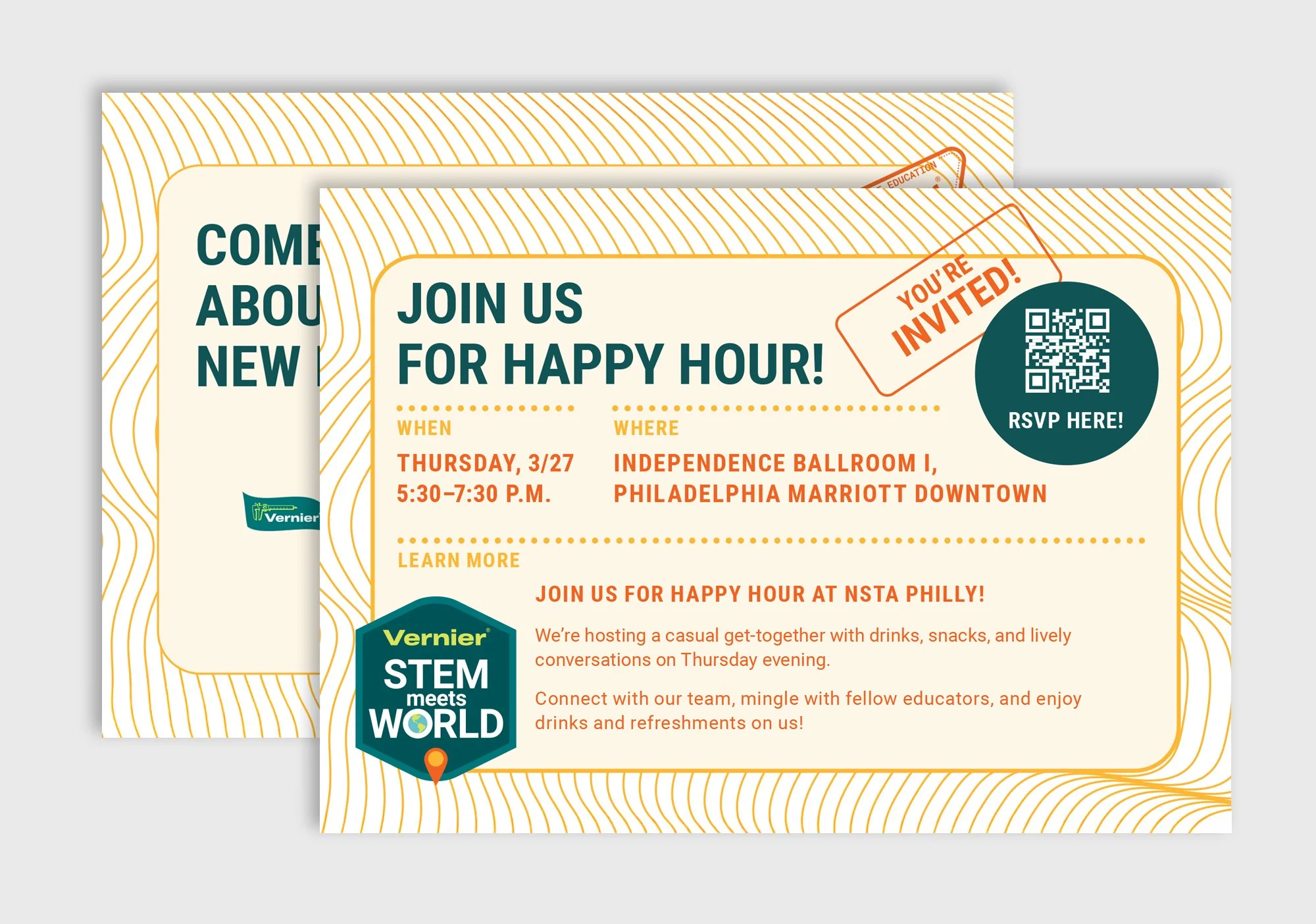
The postcards were small by nature, so every decision had to be intentional. The Discovery and Let’s Talk cards supported lead capture at conferences, the 2024 New Product postcard introduced the upcoming line, and the NTSA Trendsetter cards highlighted innovation in teaching. Each card had its own goals, but all needed to feel complete and engaging in a compact format.
I approached each card as a layout exercise in miniature. Careful type sizing, spacing, and hierarchy made the content readable in hand. Imagery, graphics, and subtle iconography were chosen to support the message without overwhelming the small surface area.
These cards had a very practical purpose, so I focused on clarity and ease of use. The front centered on the headline and form fields, with clean typography and generous spacing to make the card approachable and fast to fill out.
Subtle icons added a touch of warmth without distracting from the content. This helped balance functionality with a friendly, inviting tone that worked well at busy conference booths.
The New Product postcard needed a confident, bold, structured presence. I built a clean grid to let the product photography stand out while a concise headline directed attention immediately.
The back contained supporting copy and a call to action, arranged in a simple hierarchy for readability. Every element was carefully spaced to maintain clarity within the limited surface area.
The Trendsetter cards supported a program focused on innovation in teaching. The front highlighted the coffee hour being offered, using bright, active graphics paired with a concise headline to attract attention and clearly communicate the invitation.
The back advertised Vernier Connections powered by Penda, presenting program details and a call to action in a clean, organized layout. Tight but legible typography maintained clarity while keeping the energetic visual rhythm aligned with the NSTA booth theme.
FINAL DESIGN | BROCHURES
2024 & 2025 New Product Brochures
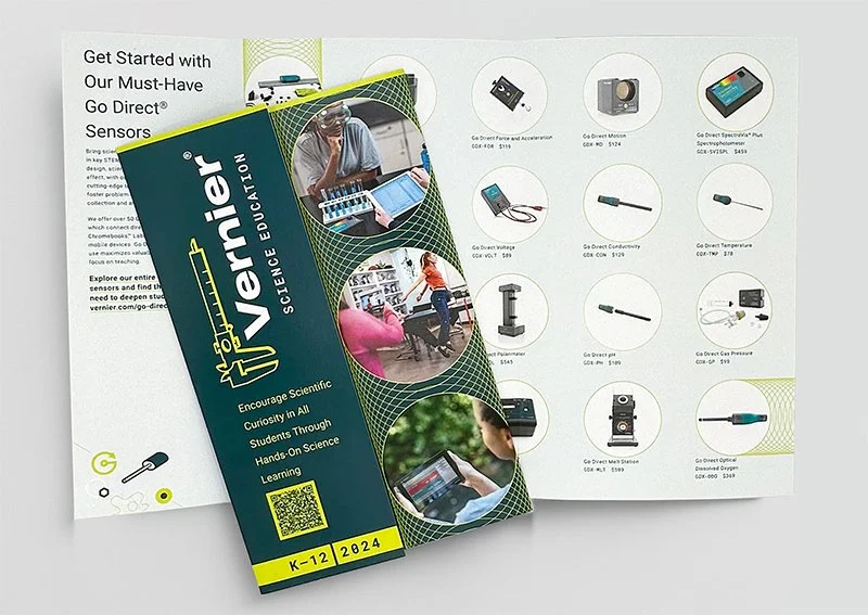
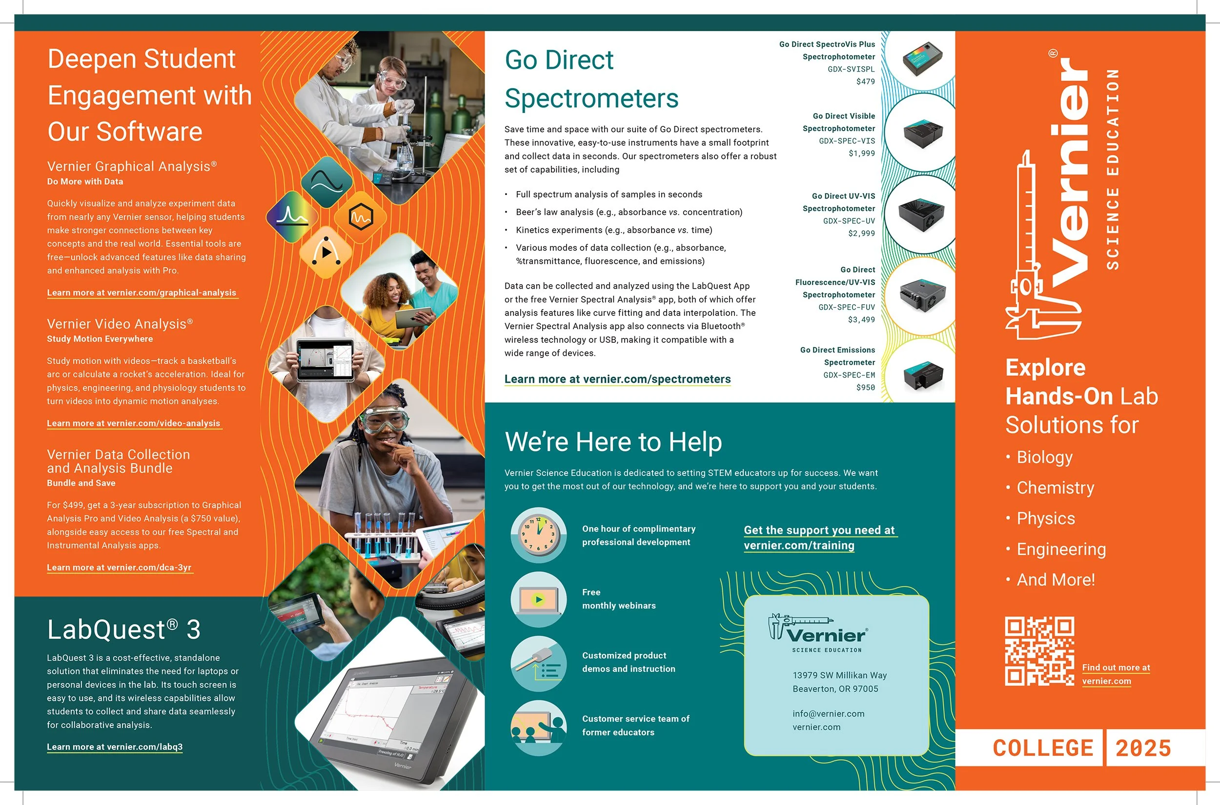
These brochures were larger, multi page pieces designed to introduce new product lines and support hands on learning. The extended format allowed for clear sequencing, strong hierarchy, and space to explain complex tools without overwhelming the reader. I focused on structure, consistency, and imagery that showed the products in real classroom use.
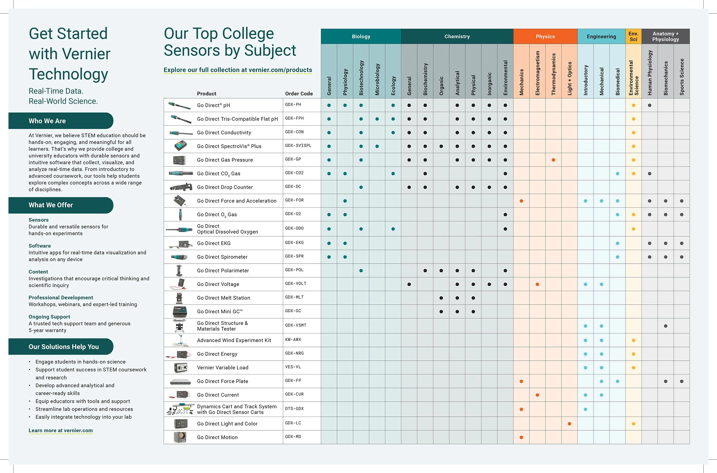
The 2024 brochure established a clean, confident foundation with prominent photography and straightforward layouts that guided educators through the lineup. The 2025 brochure built on that system with more refined graphics, subtle iconography, and updated content, including subject based product groupings and usage focused visuals.
2025 VERNIER NEW PRODUCT BROCHURE - LAYOUT SPREAD | DETAIL
2025 VERNIER NEW PRODUCT BROCHURE - LAYOUT SPREAD | INSIDE DETAIL
I treated each spread as a balance between instructional clarity and visual rhythm. Content was organized to help educators quickly understand product purpose, key features, and classroom applications while maintaining a cohesive visual flow across pages.
2025 VERNIER NEW PRODUCT BROCHURE - EXAMPLE | FOLD
Together, these brochures reinforced a unified visual identity across Vernier’s print materials while supporting the broader educational mission. This work strengthened my approach to designing long form print pieces that guide readers through complex information with clarity and intention.
FINAL DESIGN | PACKAGING + LABELS
Product Packaging and Label Design for Go Direct Scientific Sensors & Probes
Packaging and label design played a critical role in supporting Vernier’s physical products, particularly tools used in classrooms, lab kits, and outreach programs. These pieces needed to communicate essential information quickly while remaining accurate, durable, and easy to reference. The work balanced brand consistency with real world constraints such as limited surface area, material considerations, and strict print requirements.
Across products, labels and package panels were designed to clearly identify contents, usage context, and key specifications. Layout decisions prioritized hierarchy and legibility at small scales, ensuring educators could orient themselves at a glance. Typography, color, and iconography aligned with brochure and digital materials to create a cohesive product ecosystem.
FINAL DESIGN | PACKAGING + LABELS | DETAIL
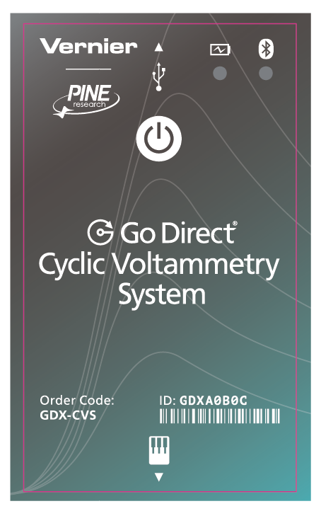
GO DIRECT CYCLIC VOLTAMMETRY SYSTEM - PRODUCT LABEL | DETAIL
The label for the Go Direct Cyclic Voltammetry System was designed to convey technical sophistication and scientific credibility. Subtle references to electrochemical data traces suggest precision and measurement, while refined line work and gradients add visual depth without overwhelming the surface. A custom icon, developed through multiple iterations, clearly communicates inputs and interactions. The overall treatment reinforces the premium nature of the instrument and its collaboration with Pine Research.
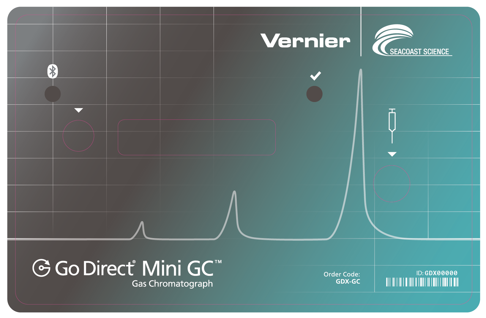
GO DIRECT MINI GC - PRODUCT LABEL DESIGN | DETAIL
For the Go Direct Mini GC, the label needed to communicate advanced analytical capability in a compact, approachable format. An early concept did not fully convey the value of the device, so I collaborated closely with the product owner to refine the direction. The final design uses restrained graphics, clear hierarchy, and refined typography to feel precise, reliable, and premium, while remaining cohesive with both the Vernier and Seacoast Science brand systems.
FINAL DESIGN | PACKAGING + LABELS | PRODUCT
GO DIRECT CYCLIC VOLTAMMETRY SYSTEM - PRODUCT LABEL
The final Go Direct Cyclic Voltammetry System label introduced strict physical constraints. The dieline needed to fit precisely within the device’s label pocket, while LED windows and button indicators required exact alignment so the button could be pressed and felt through the label. Iconography had to remain legible at a small scale and clearly communicate connection points. Alongside these requirements, the label still needed to convey cost, precision, and sophistication when viewed on the device.
GO DIRECT MINI GC - PRODUCT LABEL
For the Go Direct Mini GC, the label also needed to visually reference chromatographic data, including peaks and valleys, while aligning precisely with physical components such as buttons, syringe ports, displays, and LED indicators. Balancing visual restraint with technical accuracy was essential to ensure the label felt simple, premium, and trustworthy in real use.
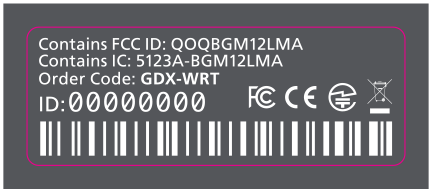
GO DIRECT WIDE RANGE TEMPERATURE PROBE - TECHNICAL PRODUCT LABEL
The Go Direct Wide Range Temperature label was applied to a small product box rather than the device itself. Accuracy and legibility were the top priorities. Required icons needed to remain visible, dimensions had to fit precisely, and barcode placement could not be altered. This piece followed a standardized Vernier technical style, prioritizing clarity, consistency, and compliance.
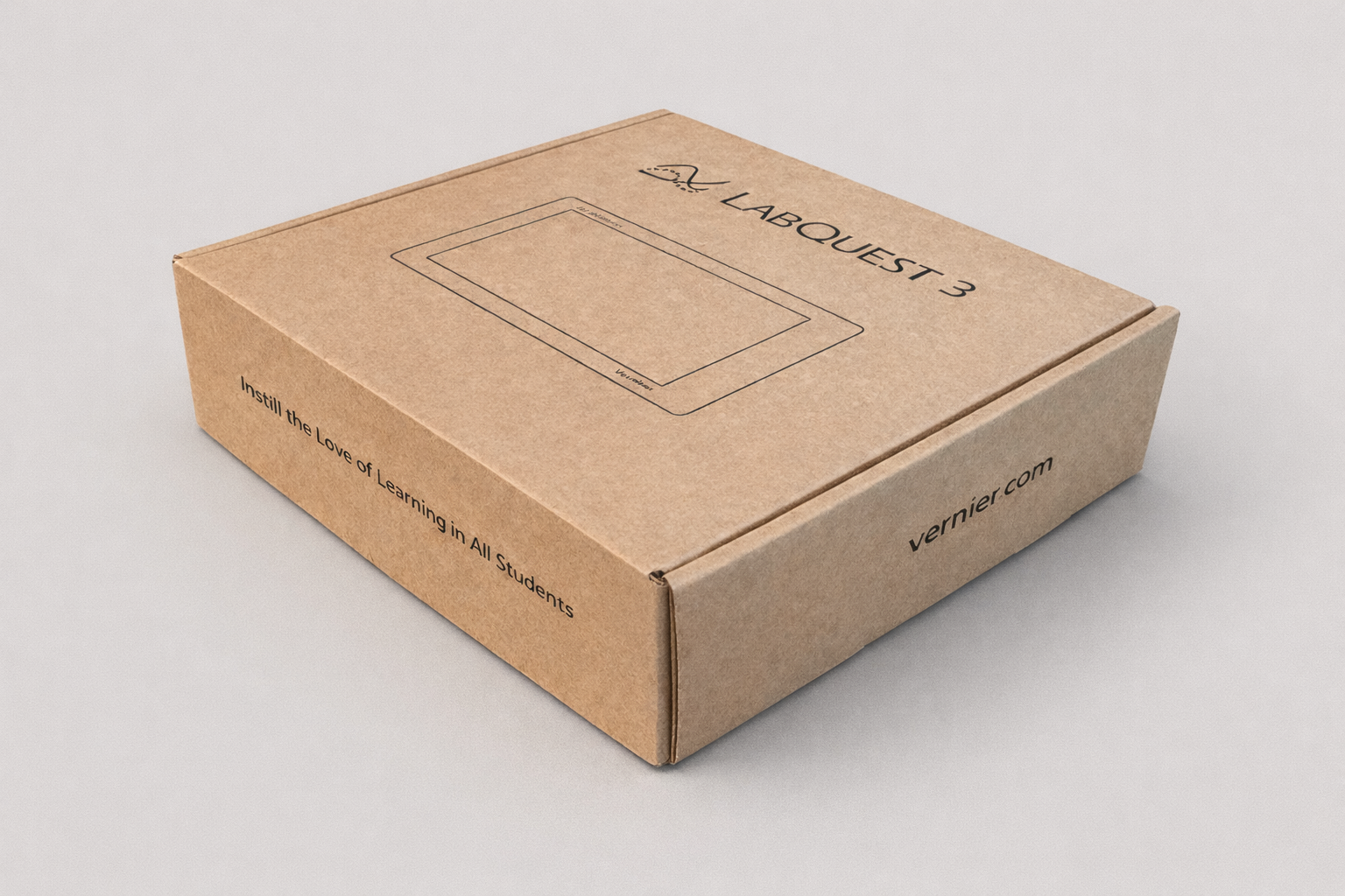
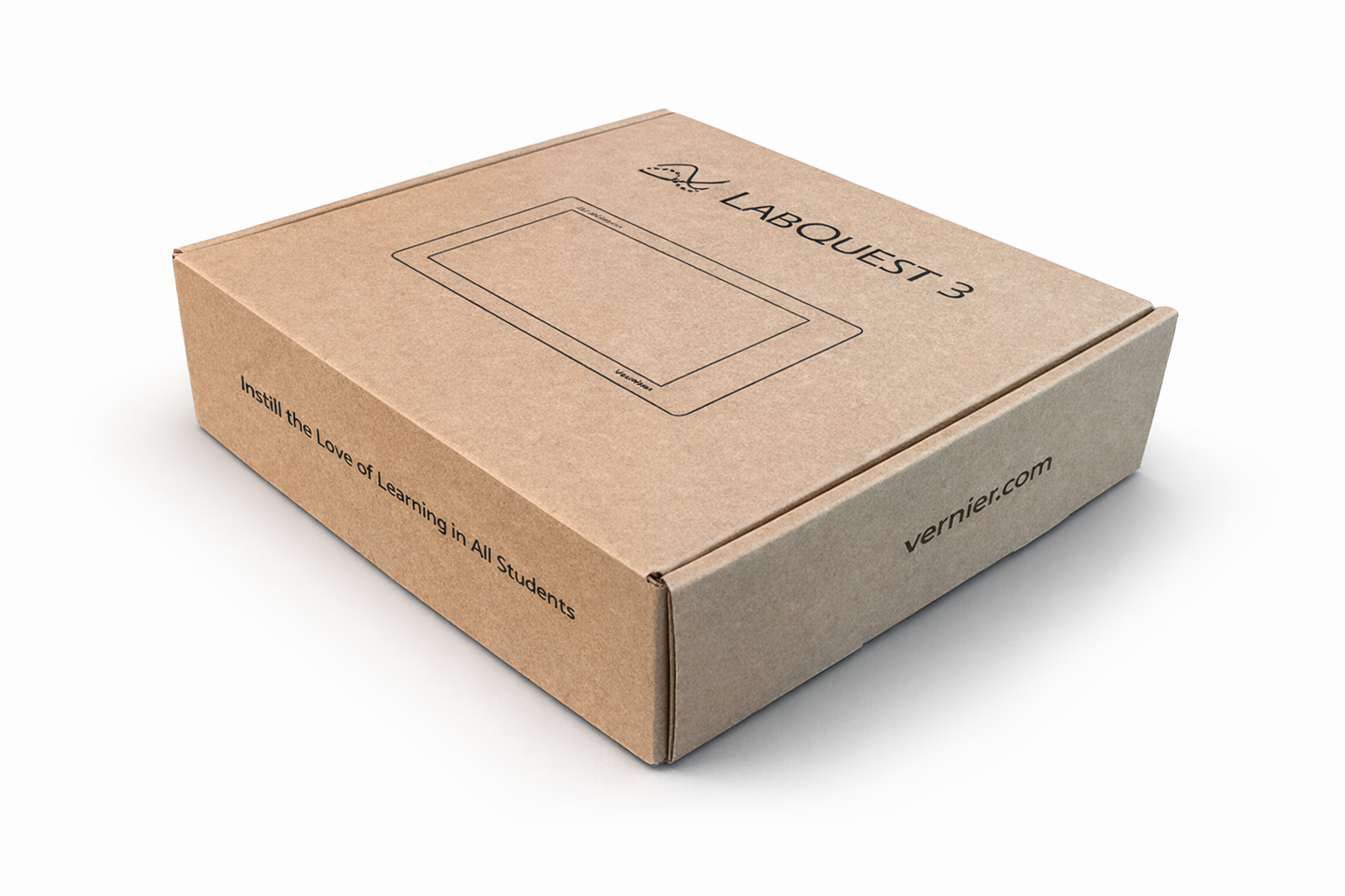
LABQUEST 3 - PACKAGING/BOX DESIGN
For the LabQuest 3 box, the packaging needed to communicate capability and trust for a flagship data collection device while remaining clean and restrained. Side panels were intentionally minimal, featuring the Vernier website and the line “Instill the love of learning in all students.” This restraint kept the focus on the product while reinforcing Vernier’s mission and brand voice. I worked closely with stakeholders to ensure the box felt premium, durable, and cohesive within the broader packaging system.
Together, these packaging and label designs extend Vernier’s visual language into physical products at the moment of interaction. The work reflects experience designing within tight technical constraints while maintaining clarity, precision, and strong brand alignment across printed materials.
OUTCOME
Print materials that supported educators and strengthened Vernier’s presence
The final brochures, flyers, postcards, and packaging supported clear communication across conferences, outreach, and classroom settings. Each piece served a distinct purpose, from sparking conversations at conference booths to introducing new products and supporting hands-on learning. Together, the materials worked as a cohesive system while respecting the unique goals, formats, and constraints of each project.
REFLECTION
Designing across print formats reinforced clarity, balance, and collaboration
Working across brochures, postcards, flyers, and packaging reinforced the importance of intentional decision making. Limited space and technical content required clear hierarchy, thoughtful layout, and restraint. These projects strengthened my ability to balance visual appeal with functional communication while maintaining consistency across formats.
Key Takeaways:
COLLABORATE EARLY AND OFTEN
Partnering closely with the Art Director, copywriters, and cross functional stakeholders from the start helped shape strong creative direction and reduced friction later in the process. Early alignment kept the work grounded in brand and messaging goals.USE IMAGERY TO TELL THE STORY
Action photography and supportive graphic elements played a critical role in communicating hands-on learning. Small choices, such as icon style or image placement, had a measurable impact on engagement and readability.SMALL FORMATS DEMAND PRECISION
Designing postcards and flyers reinforced how critical hierarchy, spacing, and typography are in tight spaces. Every element needed to earn its place to communicate clearly and quickly.
Looking back, this body of work reflects meaningful growth in managing multiple print deliverables at once. Each piece carried its own constraints, yet together they strengthened the product story and supported Vernier’s mission in the classroom. These lessons continue to shape how I approach design that requires both clarity and craft.

