
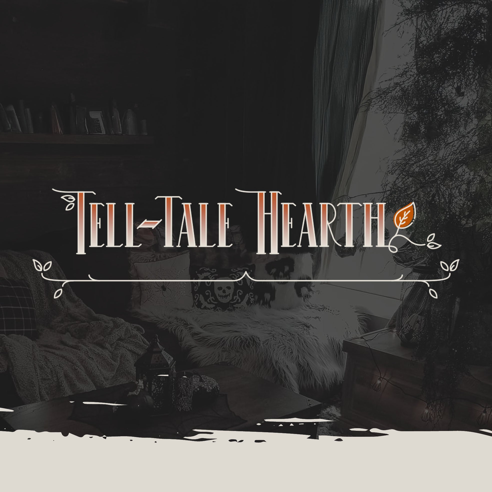
Frightfully Fun: Designing an Immersive UX/UI Experience for Tell-Tale Hearth
A concept e-commerce brand built from scratch — translating the atmosphere of a dark, Victorian-inspired boutique into a digital shopping experience that's as usable as it is beautiful. Full UX process from wireframes through prototyping and user testing.
Overview
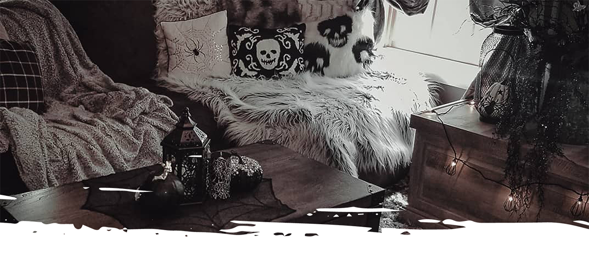
A brick-and-mortar boutique in Salem, MA needed a digital home that matched its atmosphere.
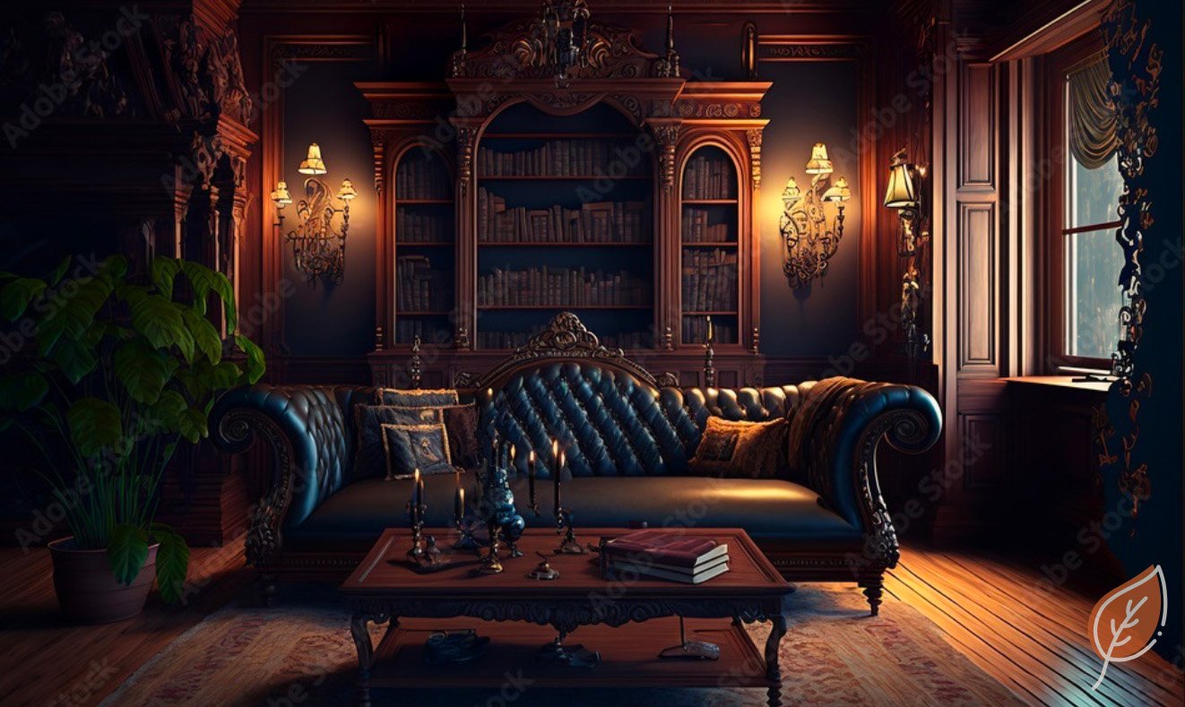
Tell-Tale Hearth is a concept brand and online shop centered on Dark Victorian, Medieval, Gothic, and Halloween decor — for customers who appreciate this aesthetic year-round, not just in October. The brand draws inspiration from a curated boutique experience in Salem, Massachusetts, where the appeal came from atmosphere as much as product selection.
The challenge was translating that sense of place into a digital environment that felt just as intentional — immersive and atmospheric, but never at the expense of usability. I led the full UX process from concept through user testing, defining the brand, designing the experience, and validating it with real users.
The Problem
Dark aesthetics and e-commerce usability are often at odds. This project proves they don't have to be.
Highly stylized retail experiences frequently sacrifice clarity for mood — navigation gets buried, product information becomes hard to scan, and checkout flows feel disconnected from the rest of the experience. The challenge was designing something that honored the brand's dark, atmospheric personality while meeting users' expectations for a familiar, trustworthy shopping experience.
Key Decisions
What I decided, and why.
Follow familiar e-commerce patterns, let the visual design carry the brand
Users shopping online have deeply ingrained expectations around navigation, product pages, and checkout. Rather than reinventing these patterns to match the brand's theatrical personality, I kept the UX structure familiar and trustworthy — then let typography, imagery, and color do the atmospheric heavy lifting.
Pair dark visuals with generous spacing and strong contrast
Dark backgrounds are a risk in e-commerce — they can make products harder to scan and text harder to read. I countered this by building in generous whitespace, high-contrast typography, and slightly lighter product page backgrounds. The result feels moody without becoming illegible or heavy.
Validate with real users before finalizing
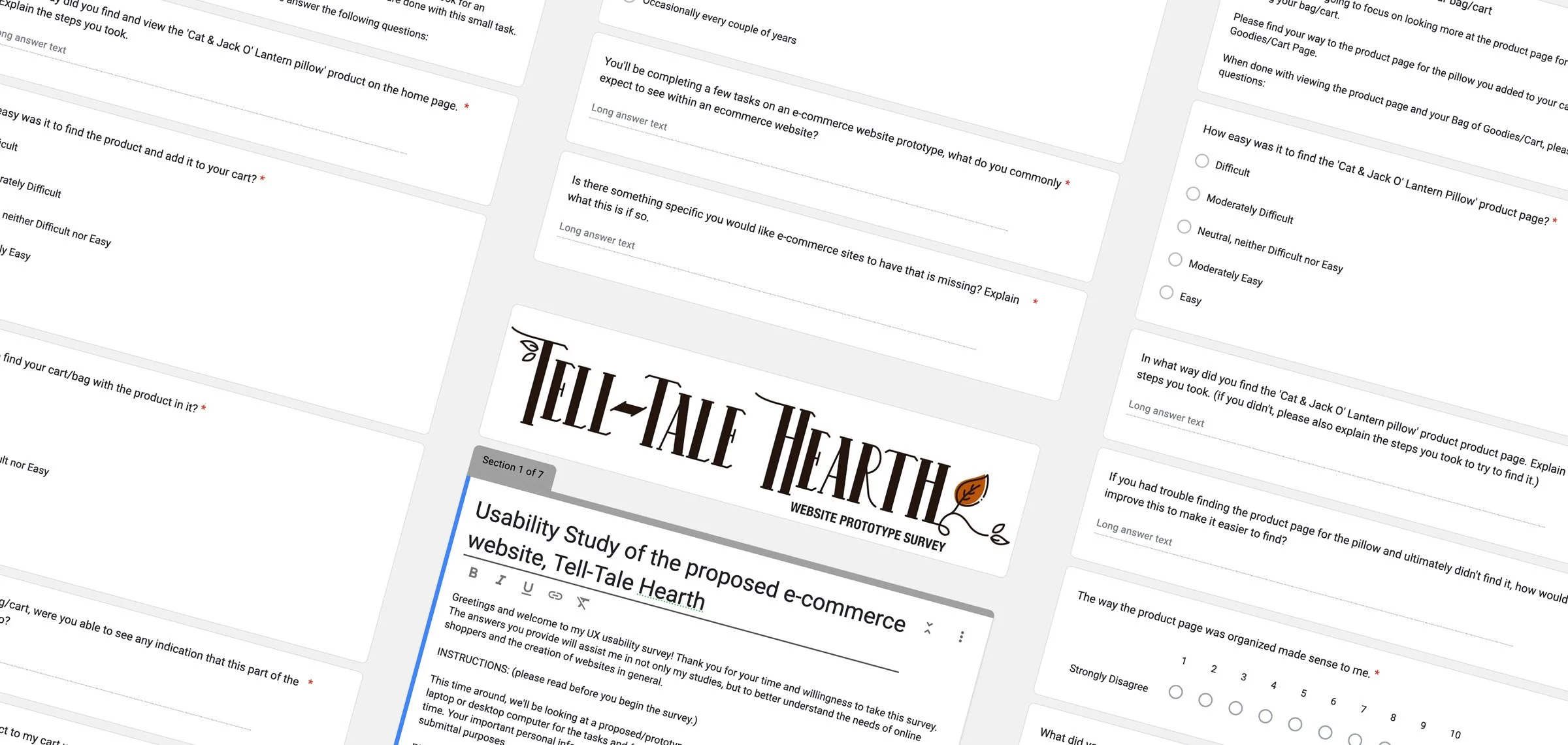
A concept brand with a strong visual identity could easily succeed aesthetically while failing functionally. I conducted a structured usability study using DECIDE methodology to test real user behavior through the full shopping flow — and iterated on the design based on what I found.
The Process
Structure before style. Wireframes before pixels.
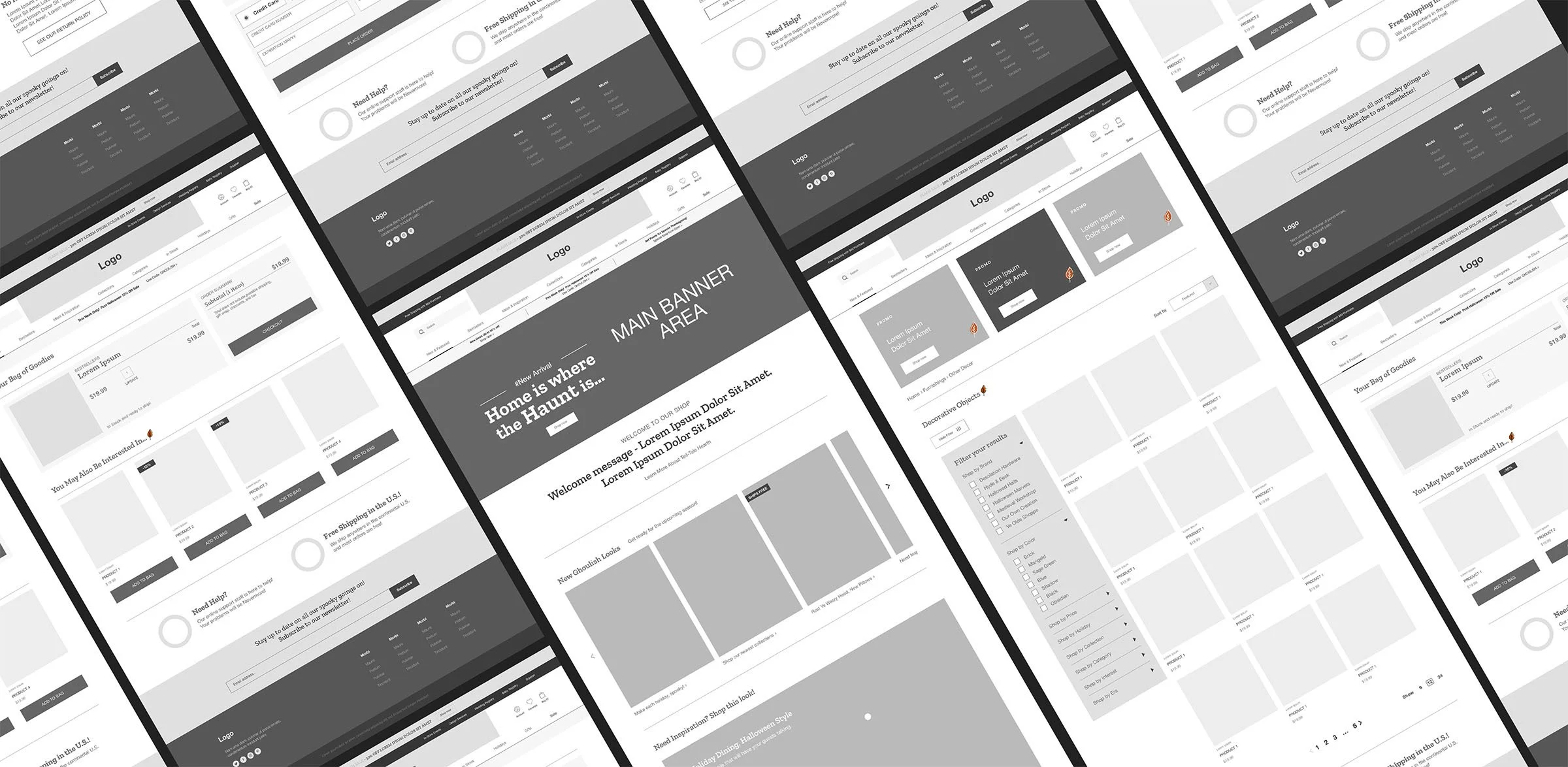
Every design decision was grounded in process. I started with wireframes to establish hierarchy and flow before introducing any visual detail — which meant problems were caught early and the high-fidelity designs could focus on refinement rather than restructuring.
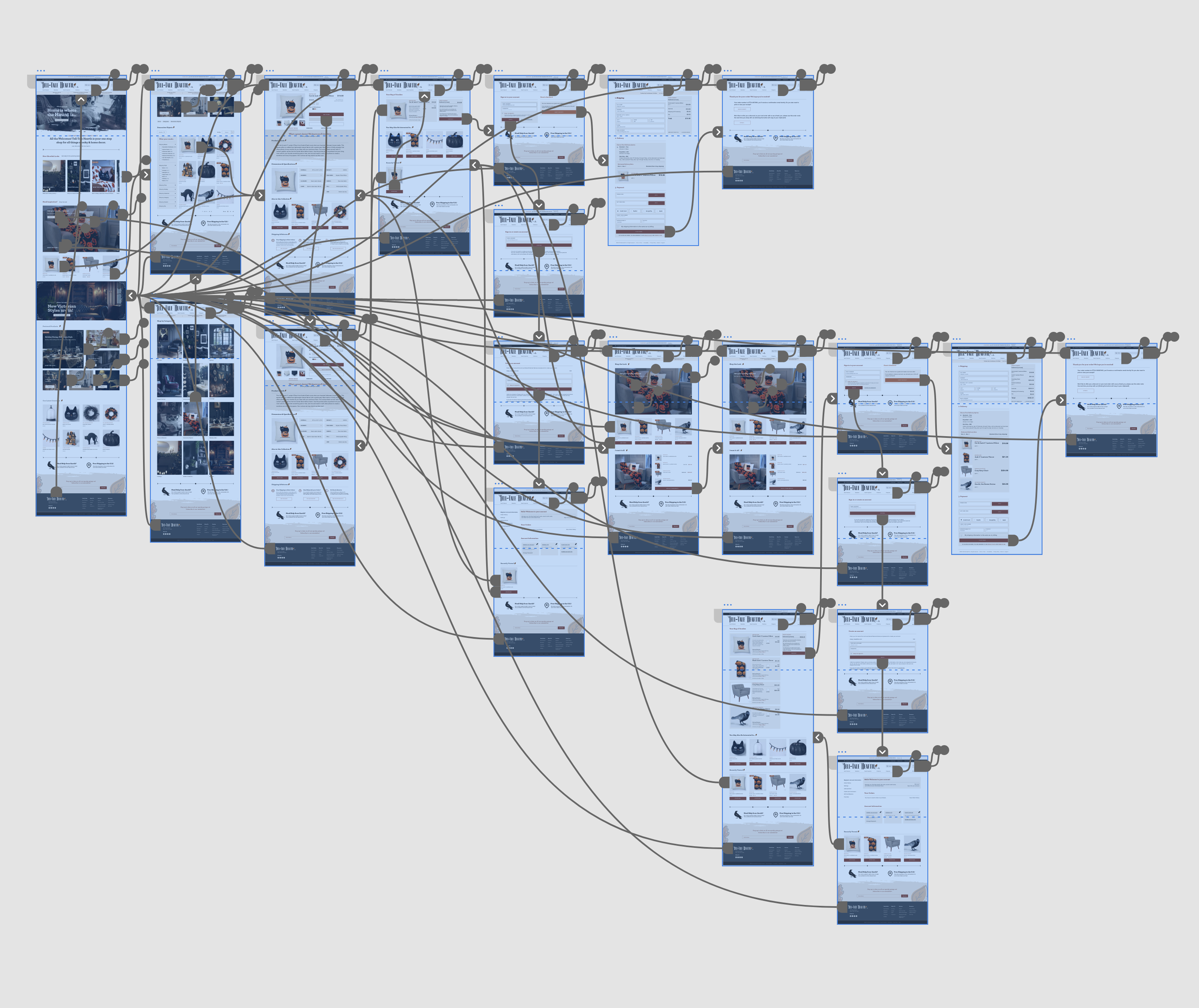
Wireframes
Adobe XDLow and mid-fidelity wireframes established page structure, navigation hierarchy, and content flow across all key page types — homepage, category, product, and checkout — before any visual design decisions were made.
Prototype
Adobe XD InteractiveA fully interactive high-fidelity prototype simulated the complete shopping experience — from homepage discovery through product exploration and checkout. This became the foundation for user testing and the primary deliverable for the project.
The Research
Testing with real users to validate the experience.
Once the prototype was complete, I conducted a structured usability study using DECIDE methodology. Participants ranged from 20 to 50 years old and included frequent online shoppers as well as people who regularly shop at home decor and craft stores. Each session ran 30–45 minutes and covered navigation, product discovery, and full checkout completion.
Recruited through Facebook groups, professional networks, and word of mouth — each offered a $5 gift card for their time.
Navigation, product discovery, cart management, and checkout completion — evaluated for clarity, flow, and friction points.
Every participant expressed genuine interest in purchasing from Tell-Tale Hearth — confirming the concept resonated both emotionally and functionally.
“I really enjoyed interacting with this site. It's thoughtfully designed. If only it were real!”
Laura D., UX Research ParticipantThe Design
Atmosphere and usability, working together.
The final design brought together everything learned from the research and iteration phases — dark, immersive visuals balanced with clear hierarchy, familiar e-commerce patterns, and a checkout flow designed to build trust at every step.
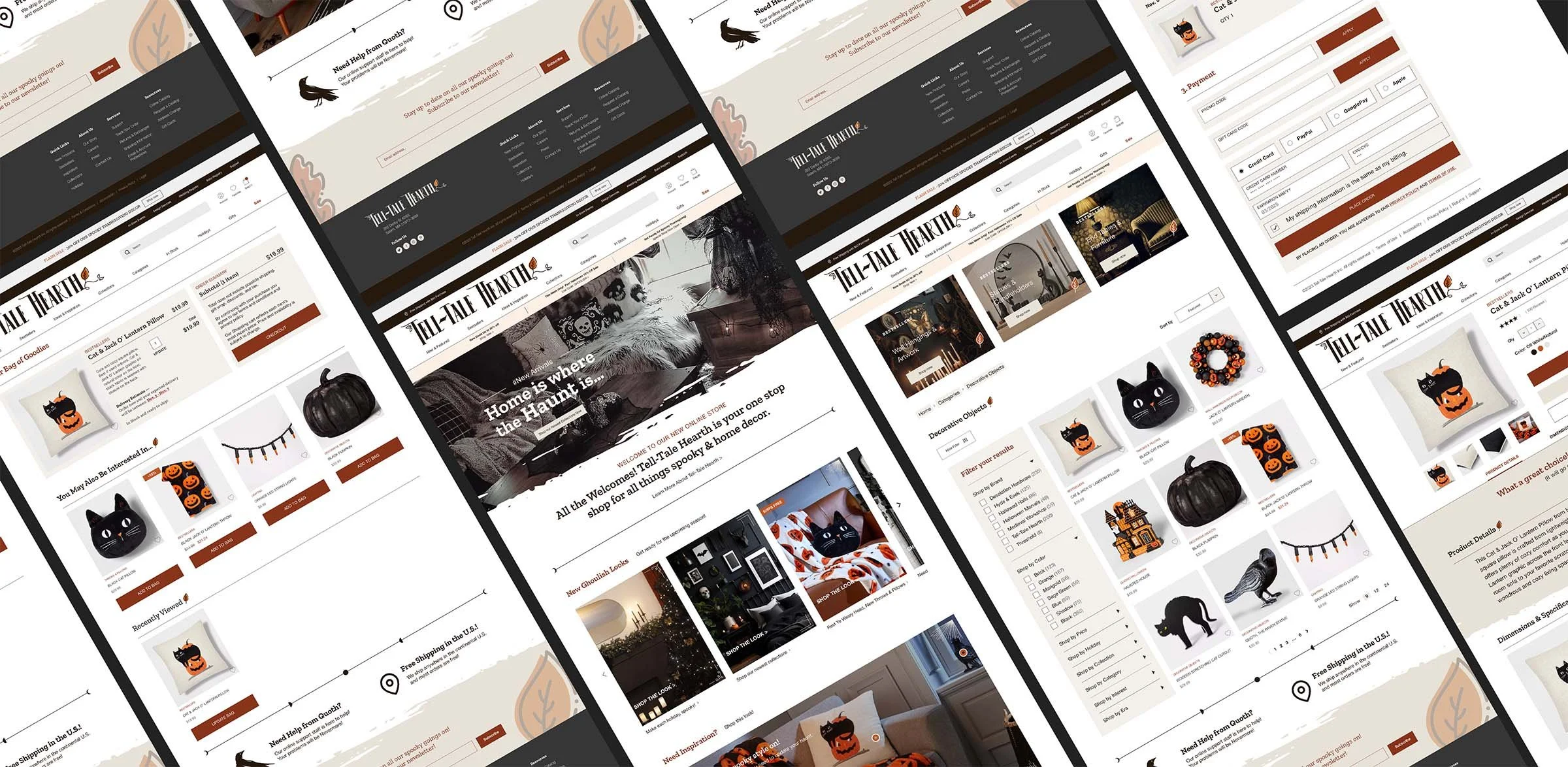
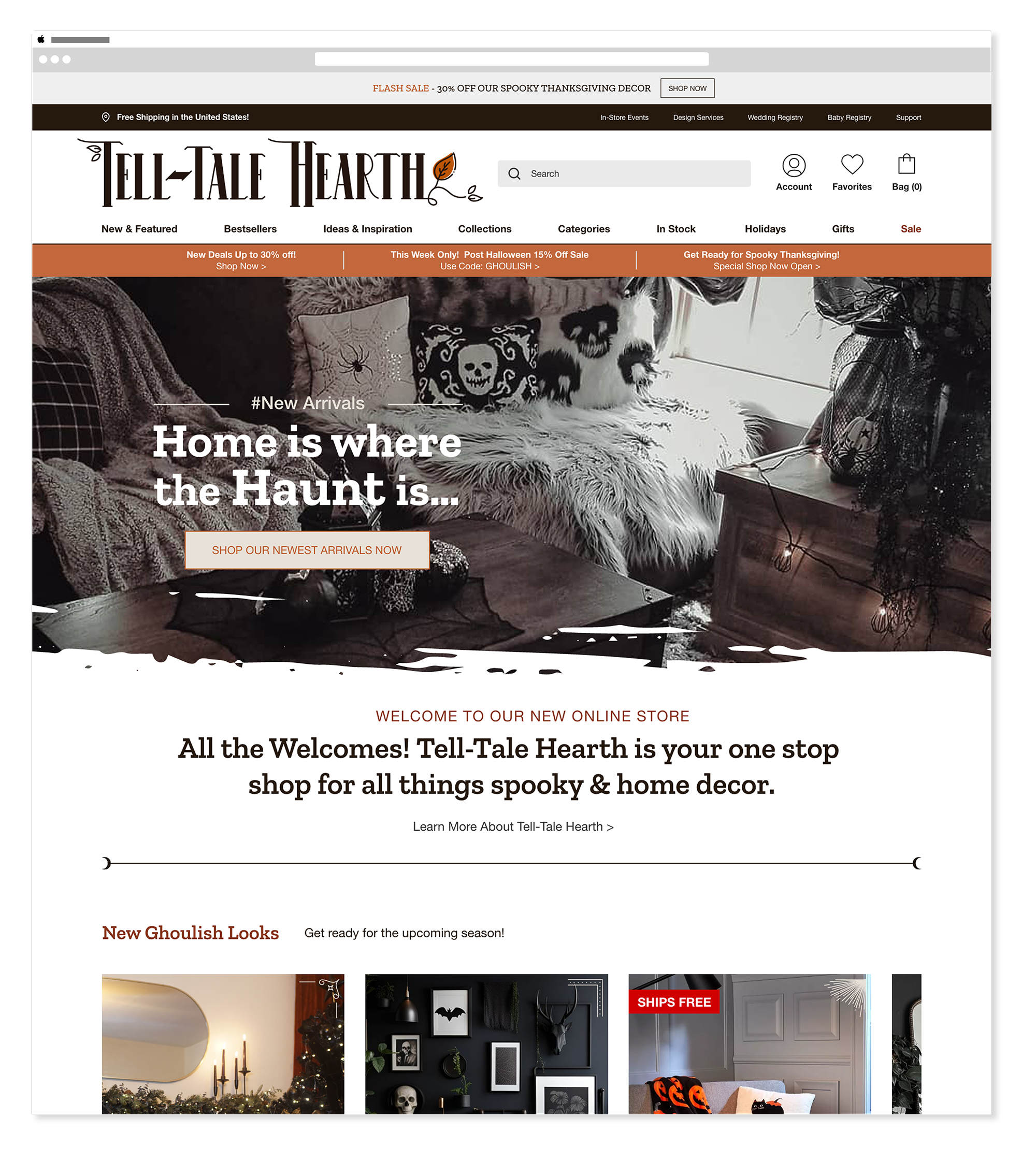
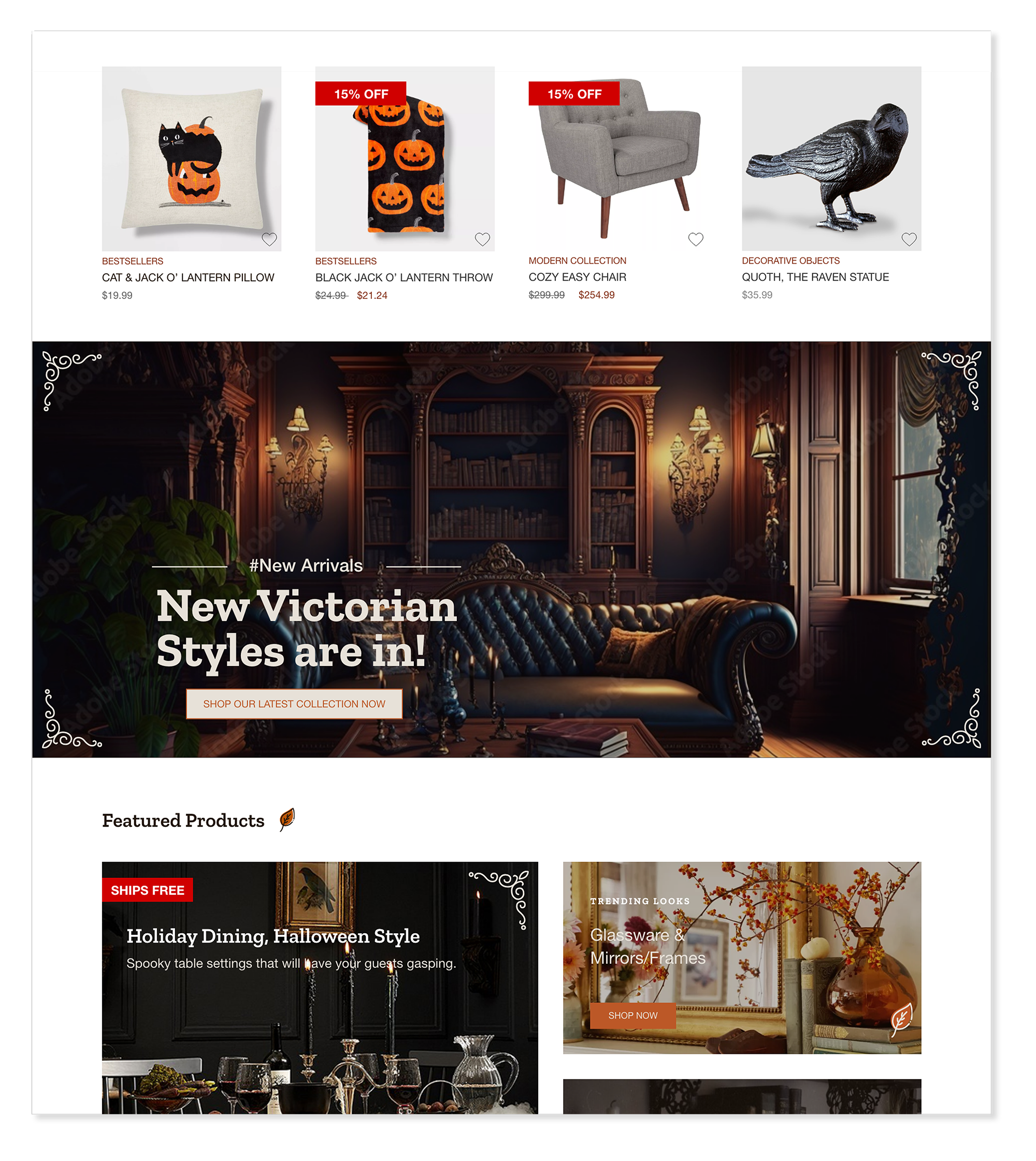
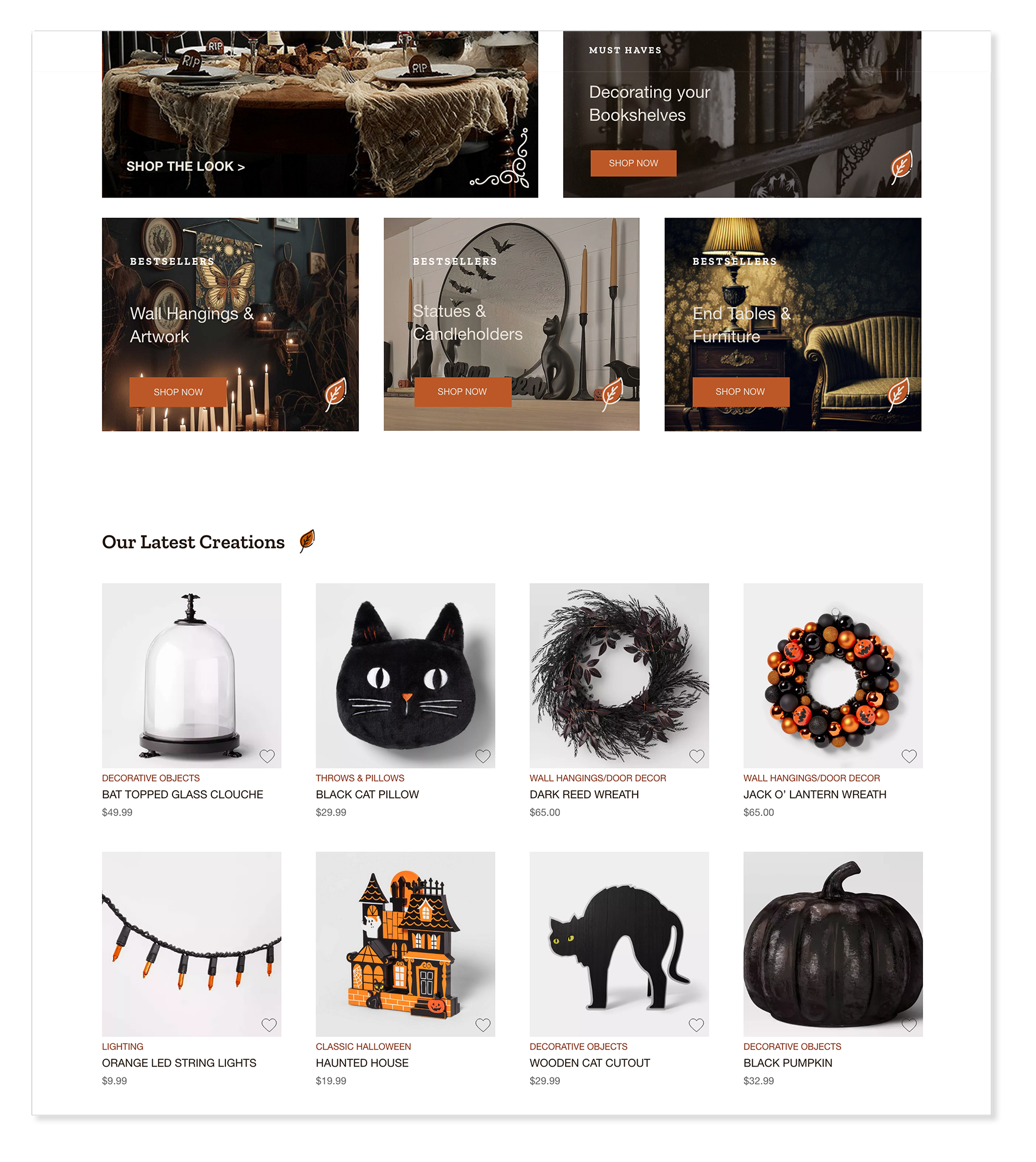
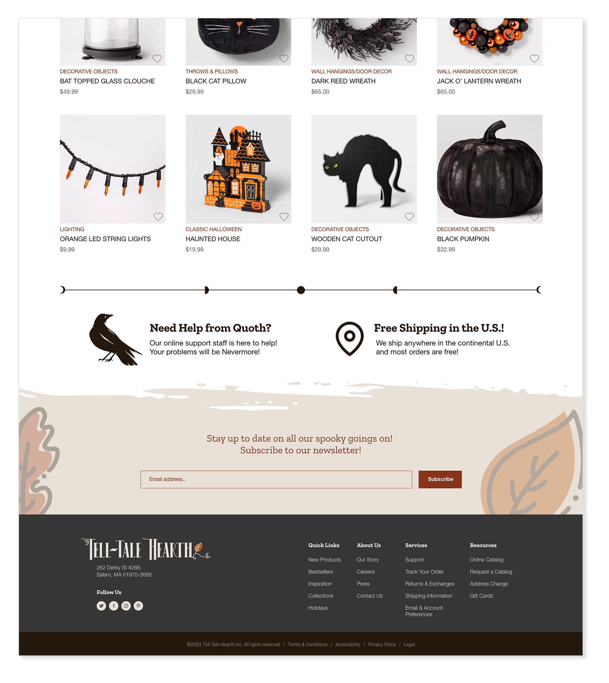
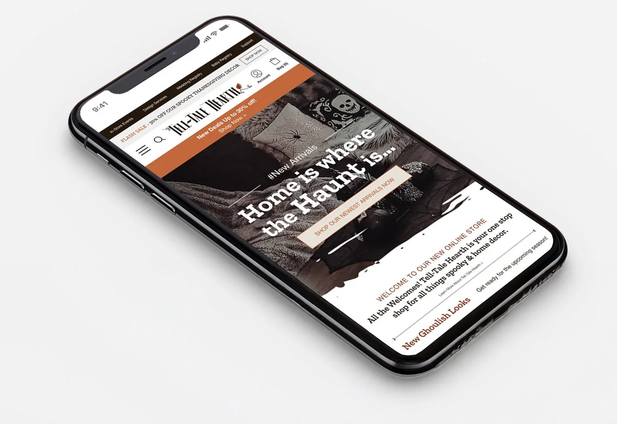
Homepage
Desktop MobileThe homepage draws users into the atmosphere immediately — featured collections, supporting imagery, and structured layout work together to establish tone without overwhelming. A clean top navigation follows familiar e-commerce conventions, keeping exploration predictable and efficient.
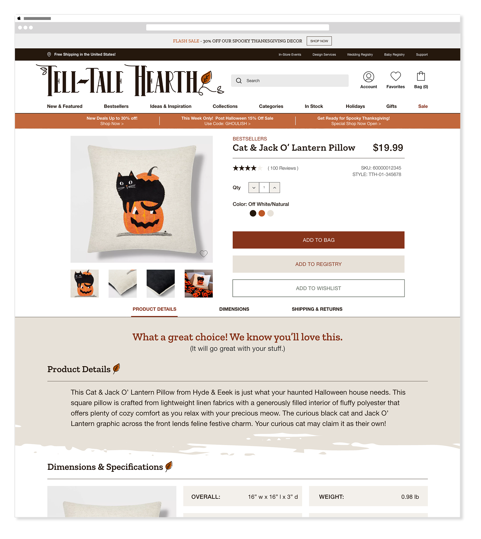
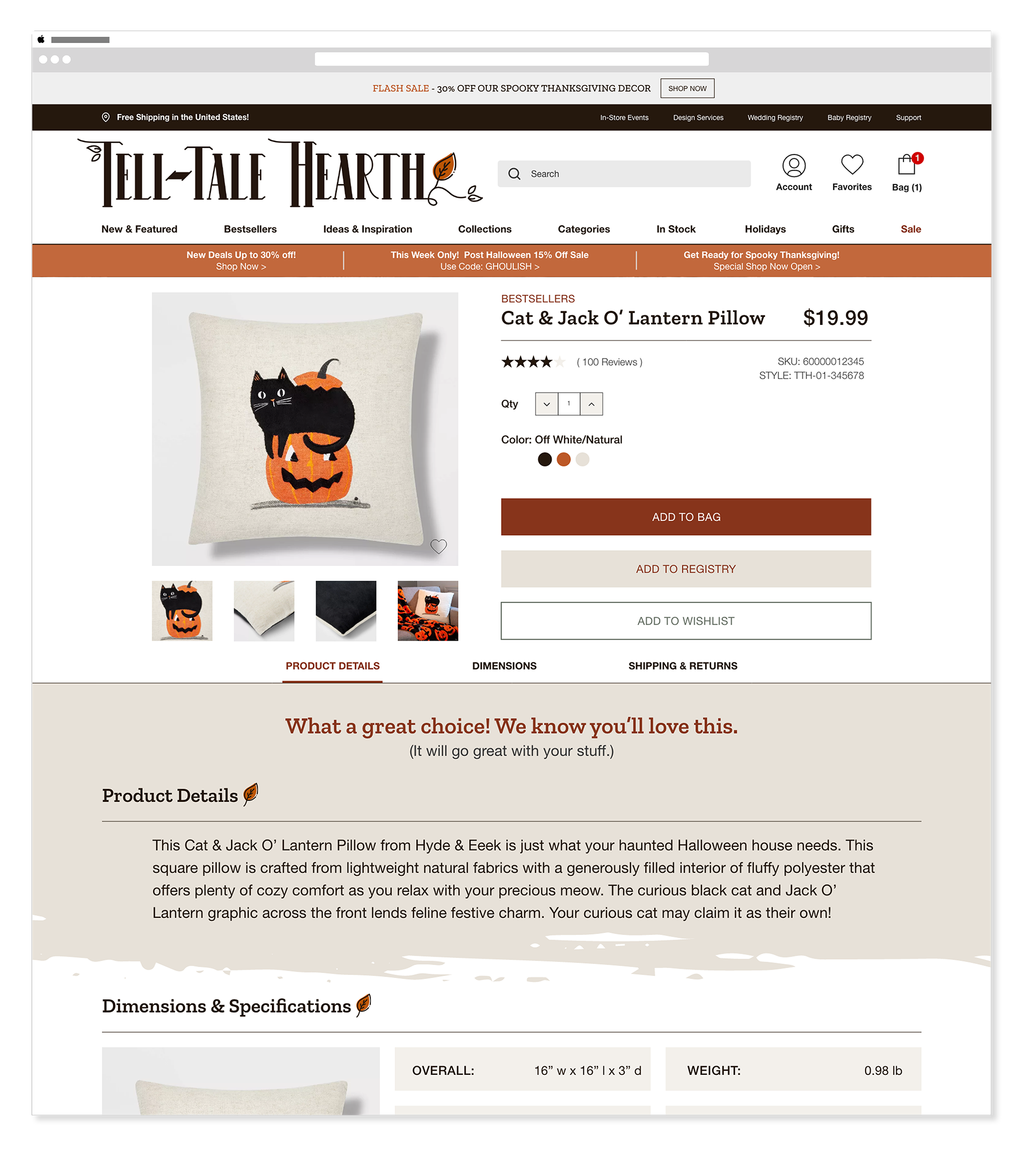
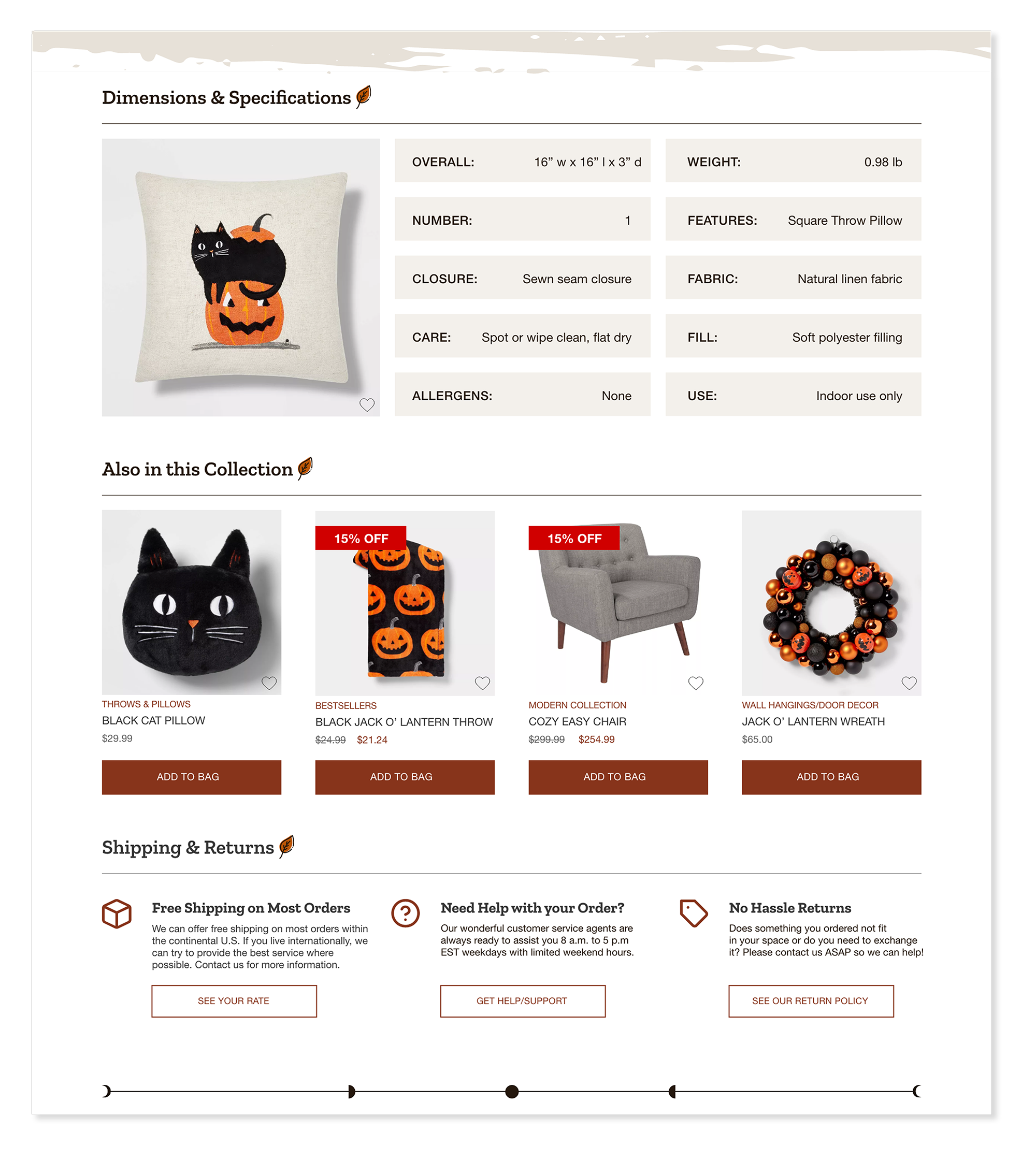
Product Pages
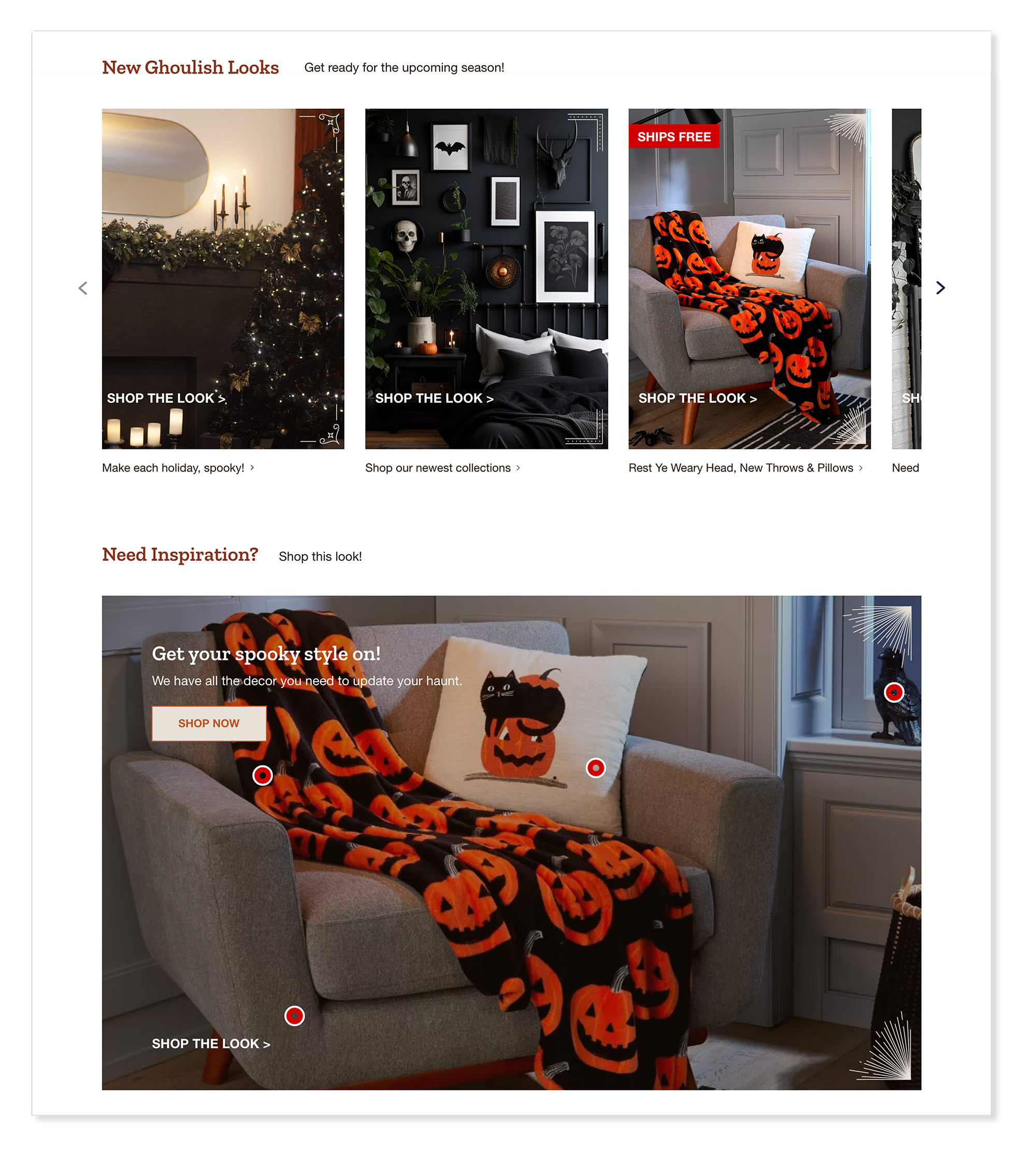
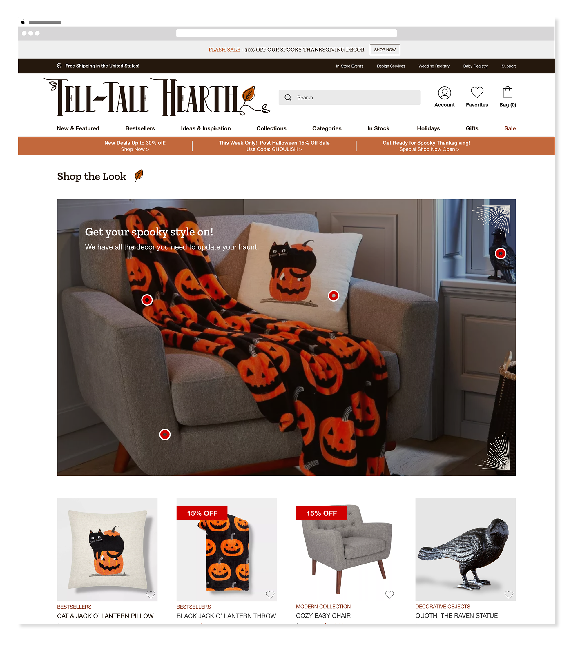
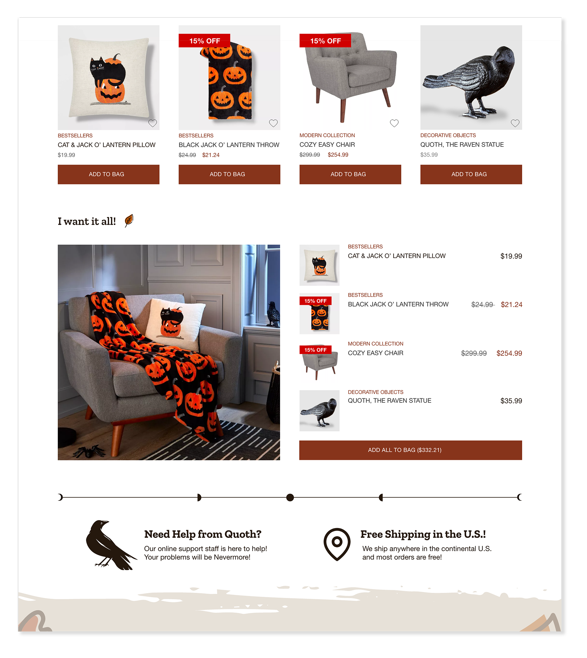
DesktopProduct pages were designed to feel like curated exhibits — each item given generous visual space and supporting details that encouraged closer inspection. The Shop the Look feature connected curated product pairings to the homepage, bridging visual storytelling with direct purchasing paths.
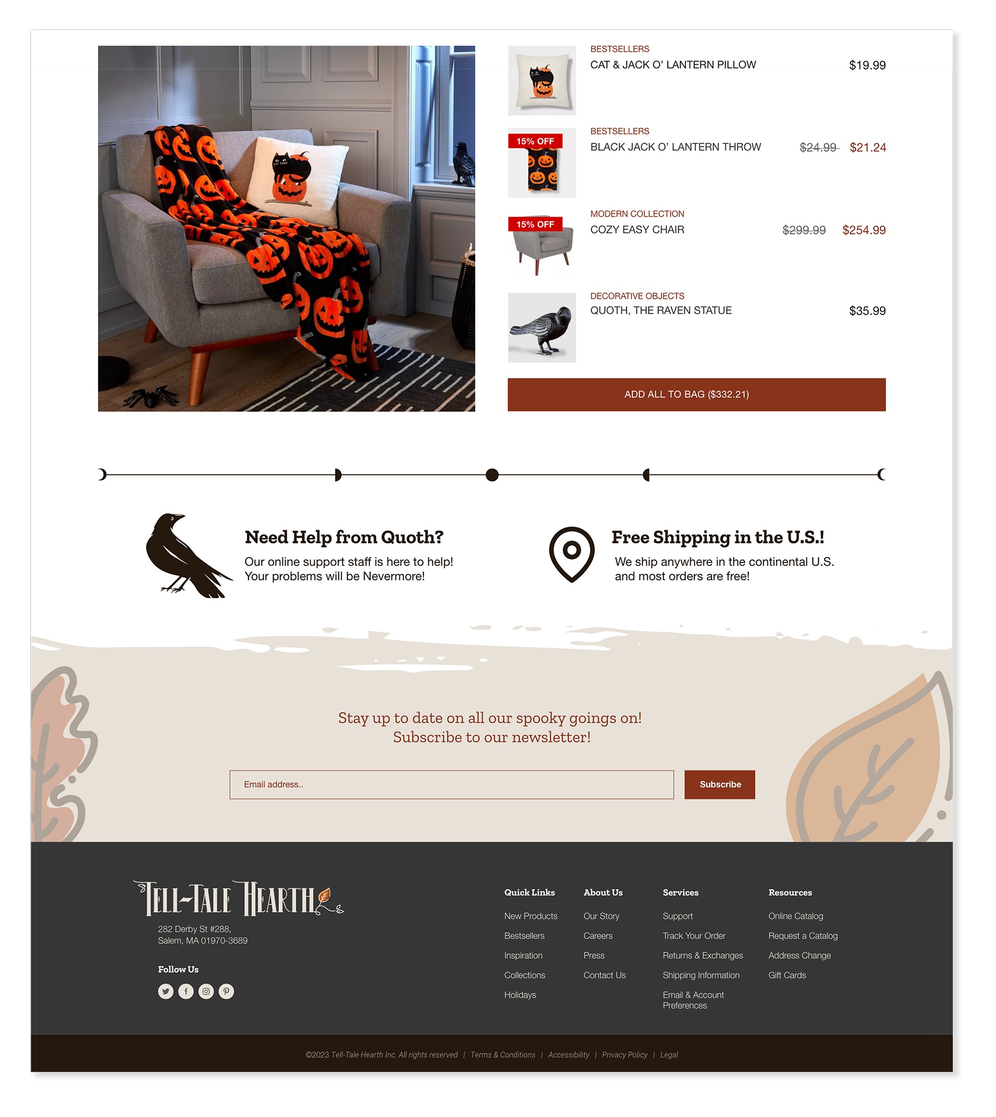
Shop the Look
DesktopThe Shop the Look pages gave visitors a curated, editorial way to discover products — grouping items into styled scenes that felt cohesive and atmospheric rather than a standard product grid. Each look carried the dark, moody aesthetic of the brand while making it easy to add multiple items to the cart at once.
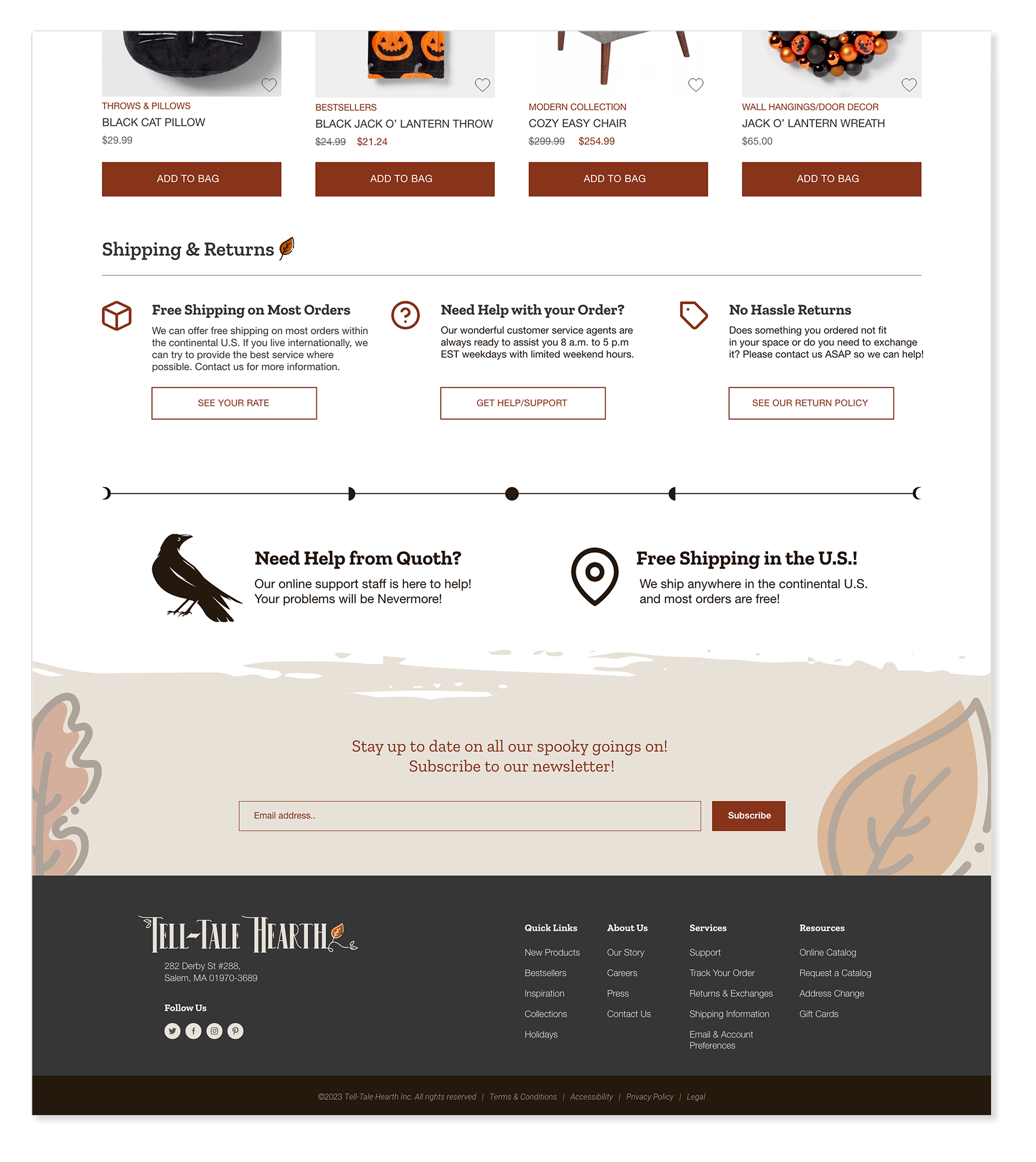
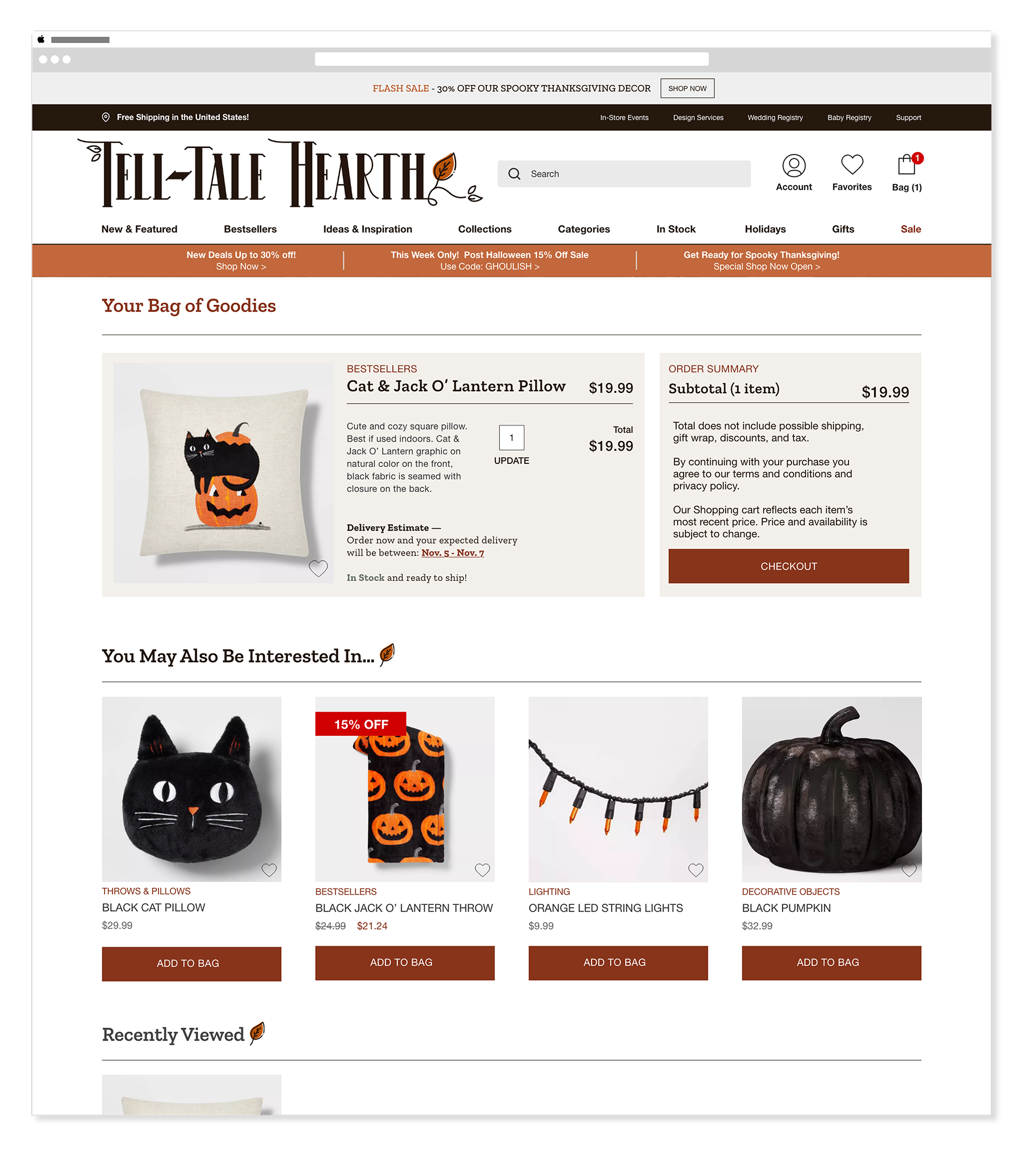
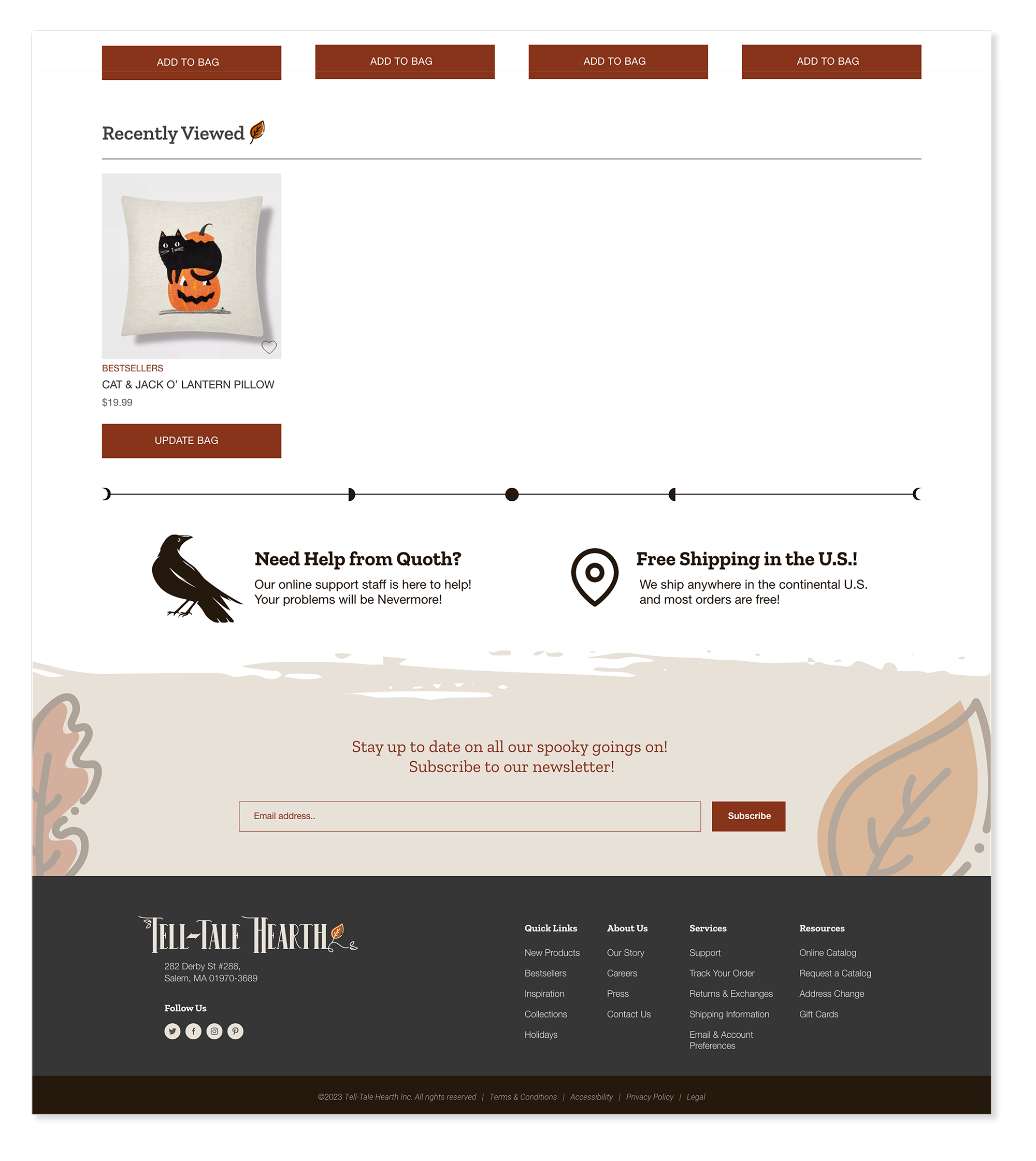
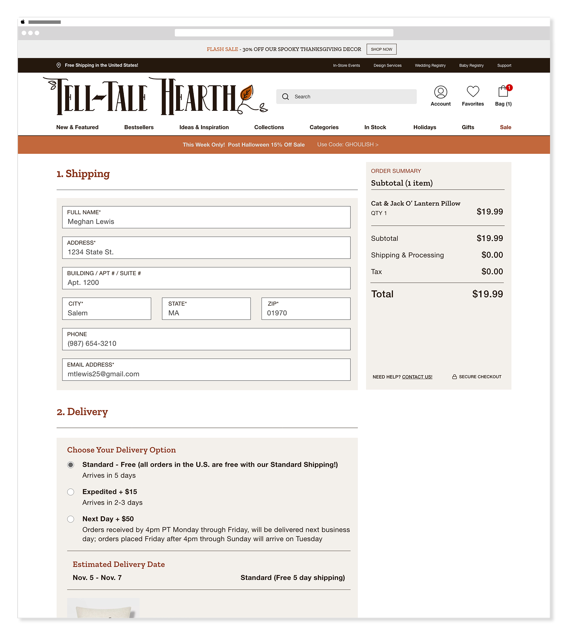
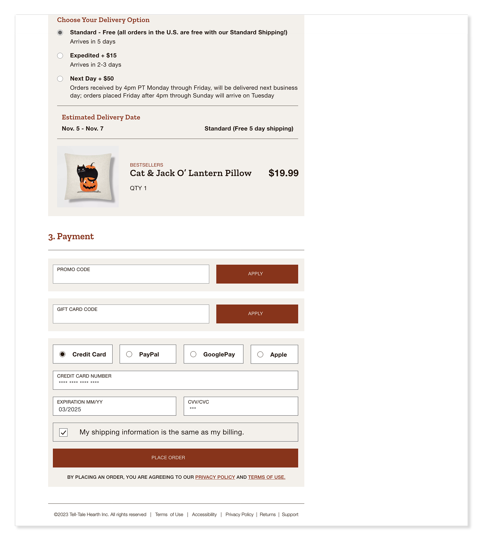
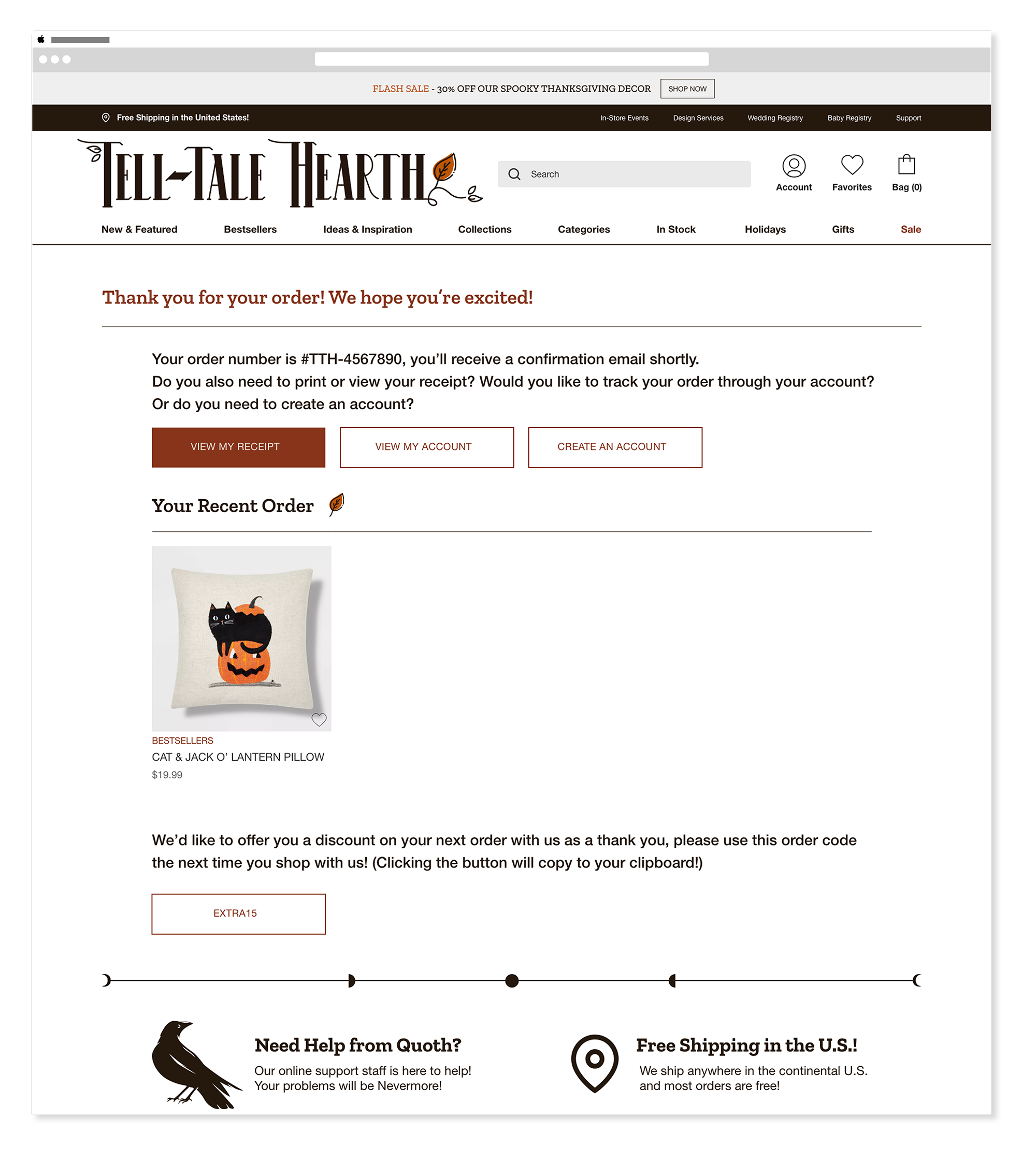
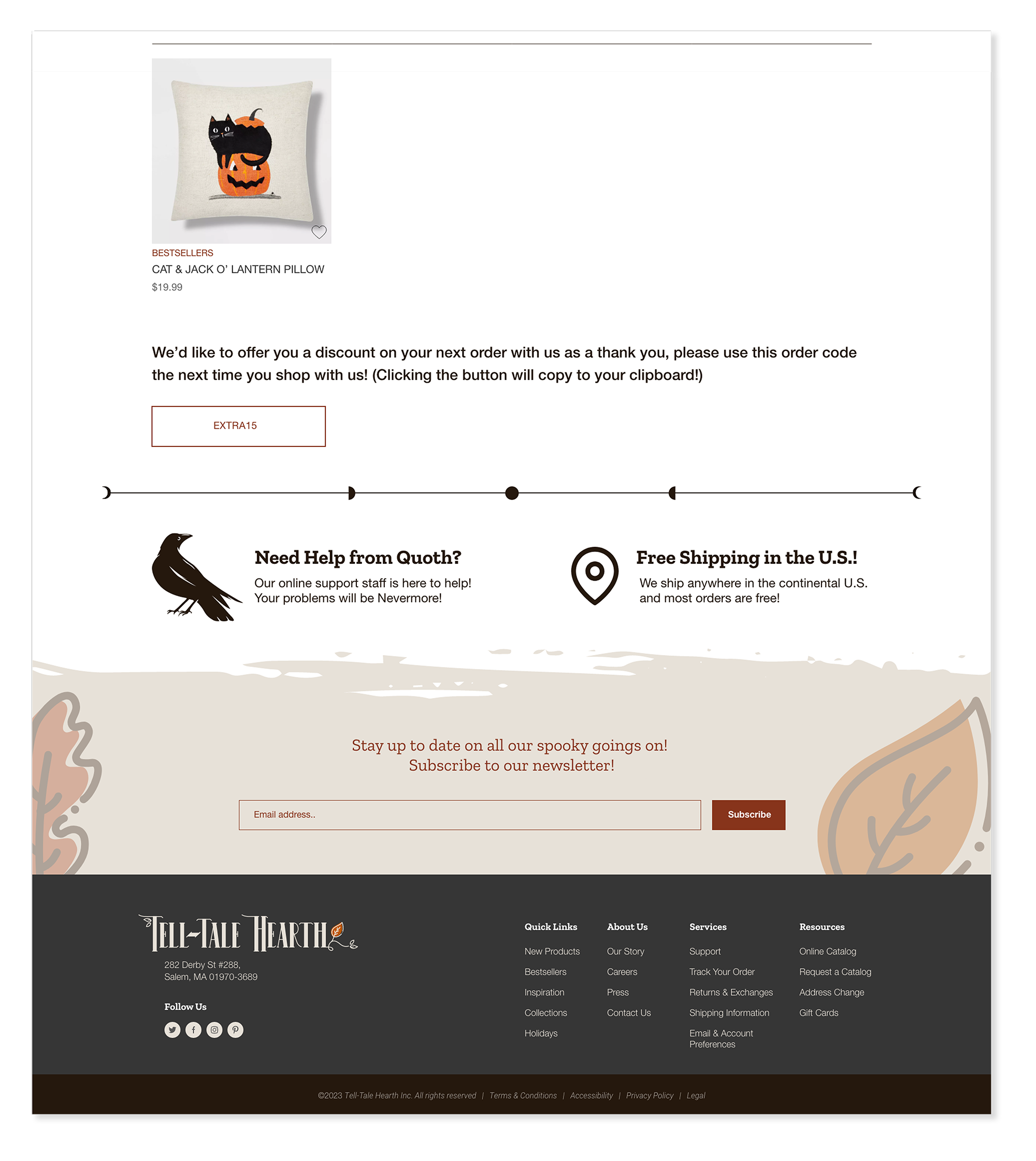
Checkout Flow
DesktopThe checkout process was designed with clarity and trust as the top priorities — progress indicators, well-defined input fields, and confirmation cues helped users feel confident at each step. The visual language of the site carried through the entire flow, so checkout never felt like a disconnected or utilitarian moment.
Shopping Bag
Shipping
Order Confirmation
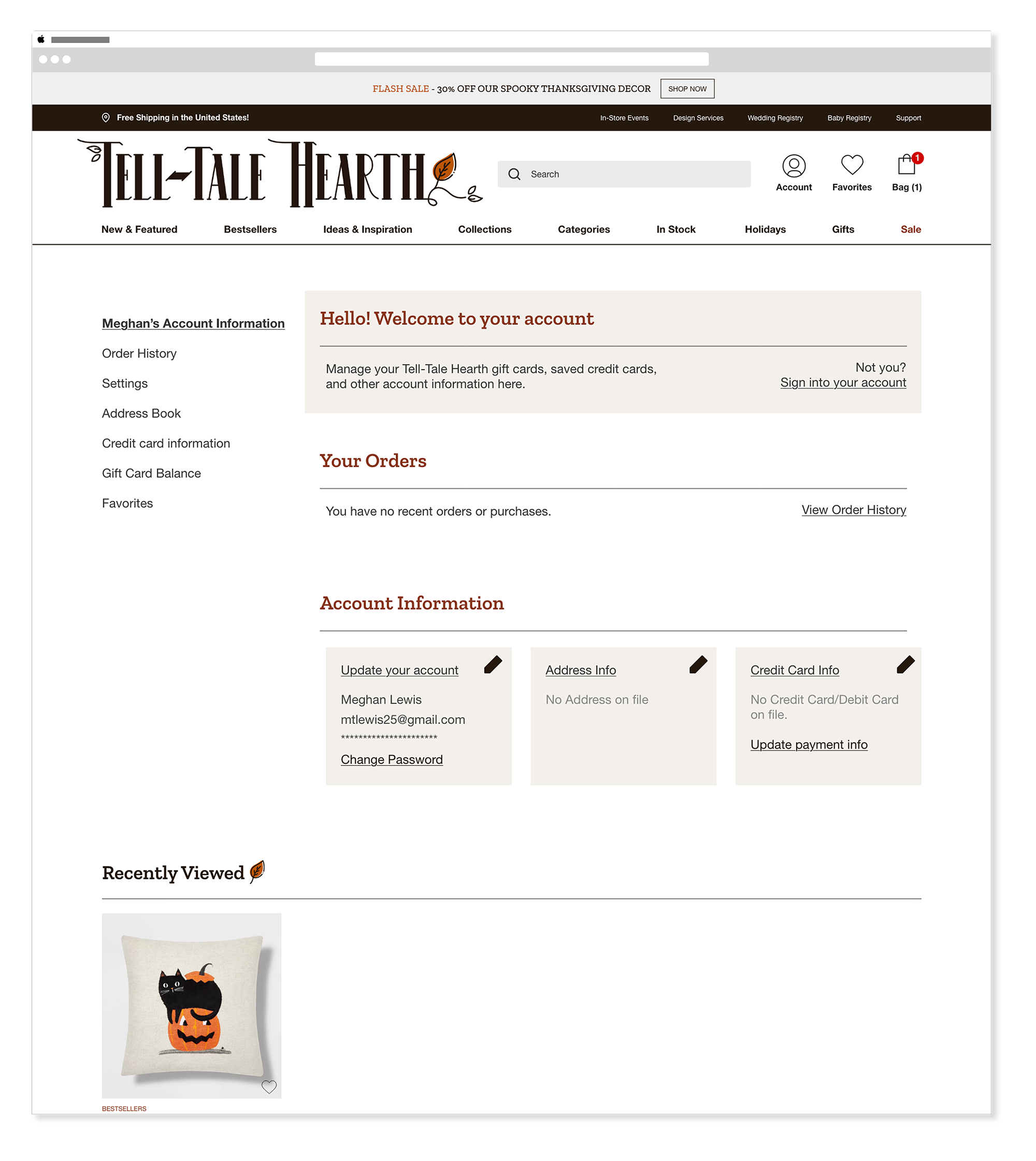
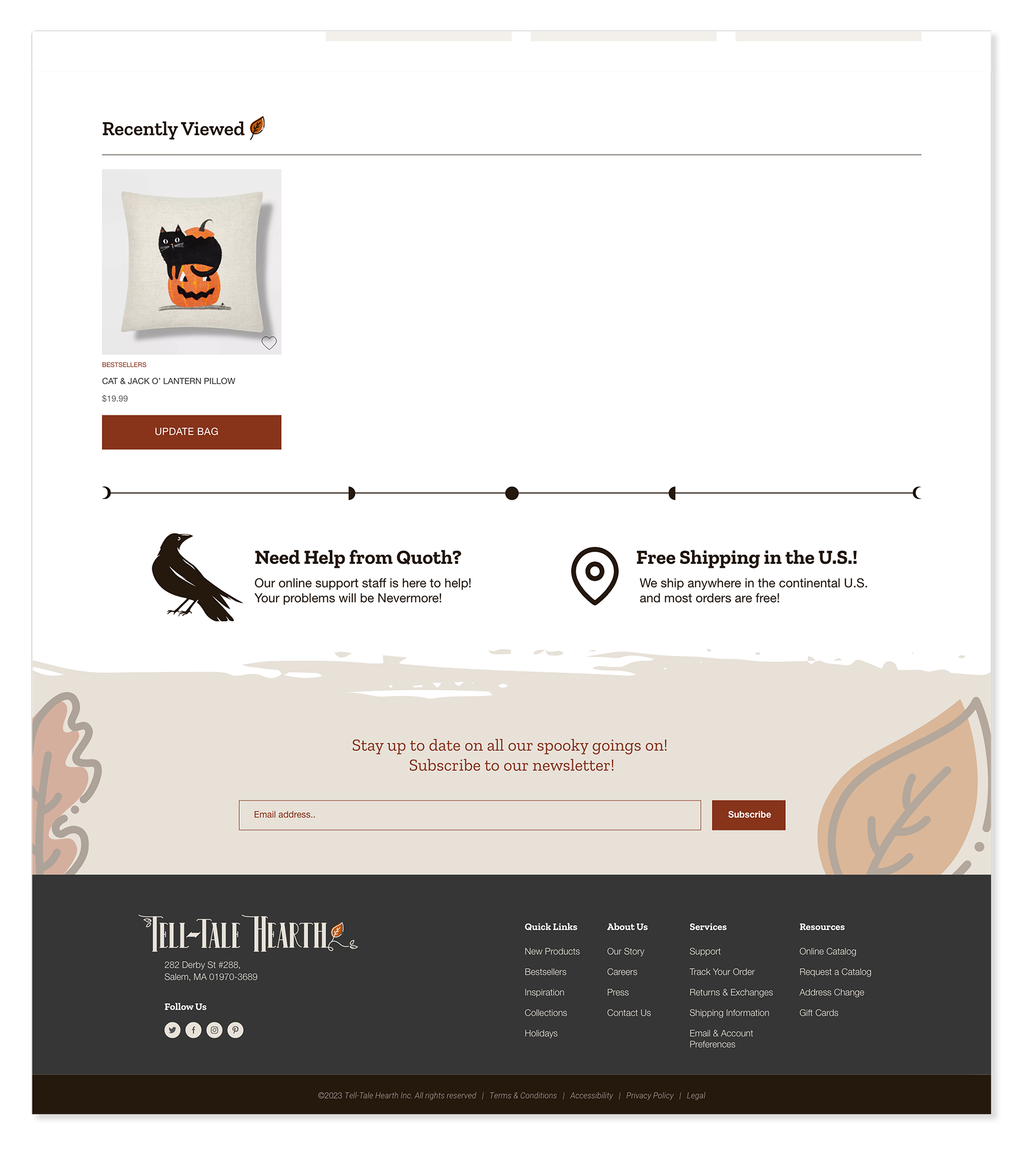
Account
Outcomes
What this work delivered.
All participants successfully completed the full shopping flow — navigation, product selection, cart, and checkout — without requiring assistance.
Homepage, category, product, Shop the Look, and checkout — each with its own layout logic, all cohesive within a single design system.
Participants stayed engaged for the full test — navigating, exploring, and completing every task without dropping off.
Reflection
What this work taught me.
Tell-Tale Hearth pushed me to think beyond visual execution and consider how structure, hierarchy, and interaction guide real behavior. The biggest lesson was one of restraint — not every moment needs to be expressive. Knowing when to simplify had a direct impact on how approachable the experience felt, and that instinct carried through the iteration phase in a way that wouldn't have been possible without grounding every decision in process and testing.