
Sharp Design for Sharp Editors: An Updated Website for Publications Professionals LLC
A full redesign and rebuild of the Publications Professionals website — modernizing a trusted editorial firm's digital presence while preserving the credibility and professionalism they'd spent decades building.
Overview
A woman-owned editorial firm with 40 years of credibility — and a website that wasn't keeping pace.
Publications Professionals LLC — known as Pubs Pros — is a veteran-owned editorial services company with a long-standing reputation for precision and professionalism. They support publishers, nonprofits, associations, and corporations with expert editing, proofreading, and production management.
I partnered with the founder to redesign and modernize the site from discovery through implementation — evaluating content structure and user flow, refining navigation, and building responsive layouts in WordPress. The goal was to translate their established credibility into a cleaner, more intuitive digital experience without losing what made the brand feel trustworthy.
The Problem
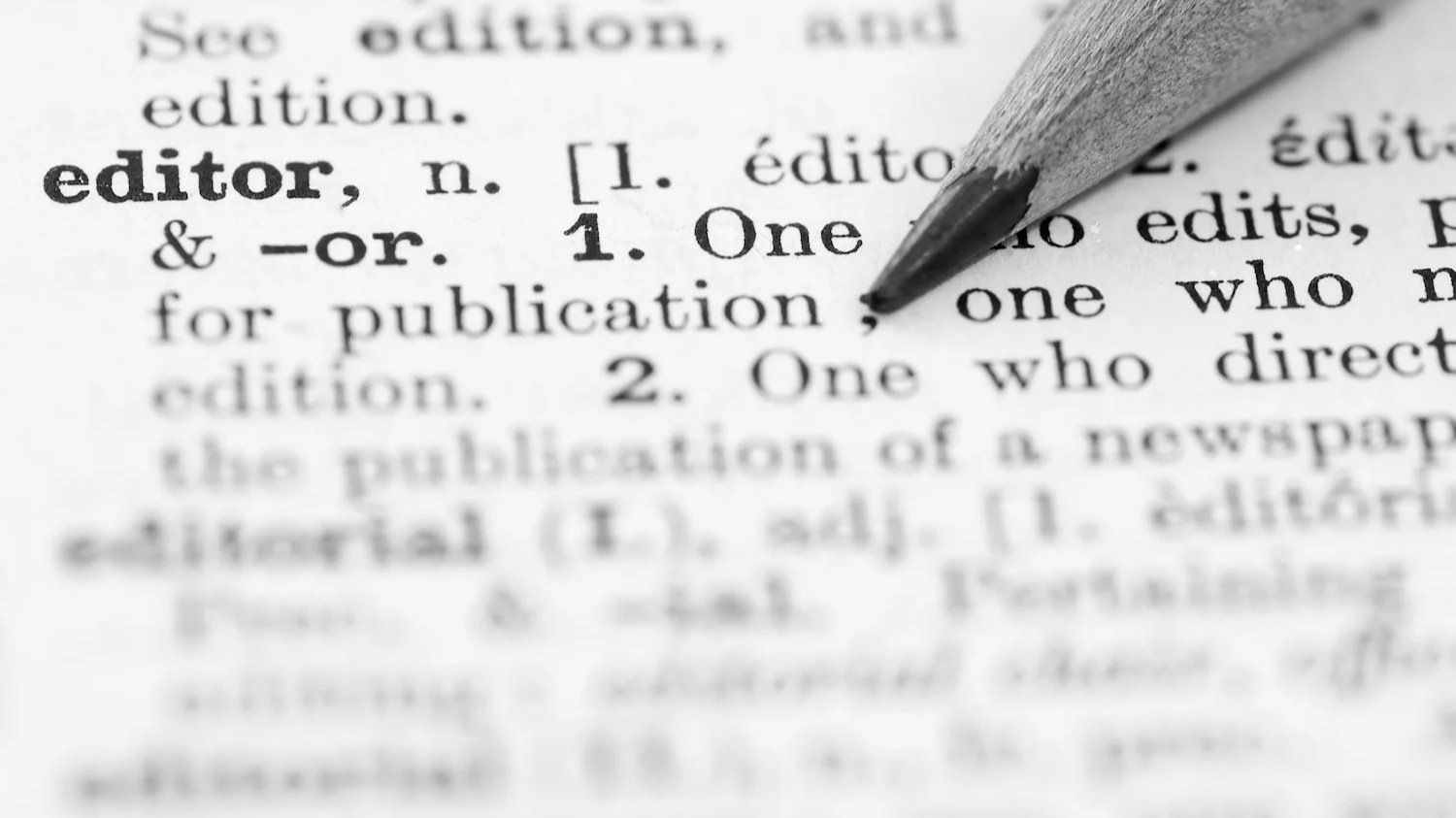
The site was undermining a company that had earned every bit of its reputation.
The existing WordPress site was experiencing hosting instability and felt outdated in both design and functionality. Navigation was cluttered, accessibility was limited, and managing content was cumbersome. These issues created friction for potential clients and didn't reflect the level of care and precision Pubs Pros brought to their own work.
Key Decisions
What I decided, and why.
Rebuild within WordPress, not around it
Rather than migrating to a new CMS, I selected a more flexible WordPress theme and rebuilt within the existing framework — ensuring the client could continue managing content independently. Constraints became an opportunity to simplify rather than add complexity.
Organize around user intent, not internal structure
Visitors wanted quick access to services, credentials, and contact information. I reorganized content around what users actually needed rather than how the company thought about itself internally — simplifying navigation and reducing reliance on dropdown menus that performed poorly on mobile.
Treat accessibility as a design foundation, not a checklist
A restrained color palette, legible typography, and generous spacing weren't just aesthetic choices — they were accessibility decisions. Touch targets were refined, contrast was validated, and every layout was tested across screen sizes before going live.

The Pages
One website. Every page considered.
Each page plays a specific role in guiding potential clients from awareness to confidence to contact. The homepage sets the tone, services builds the case, about establishes trust, and the responsive experience ensures it all works wherever someone lands.
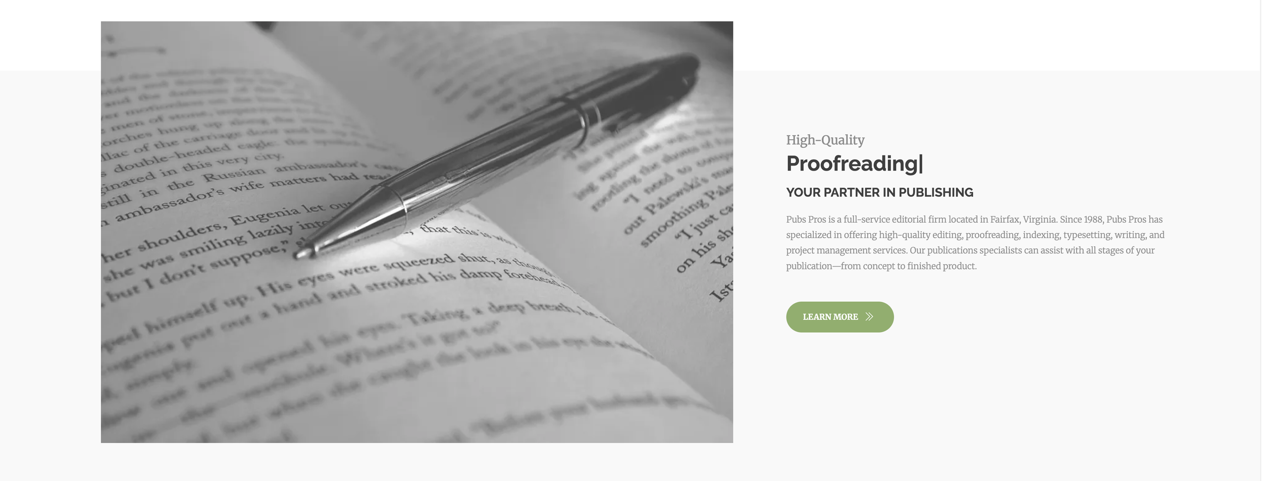
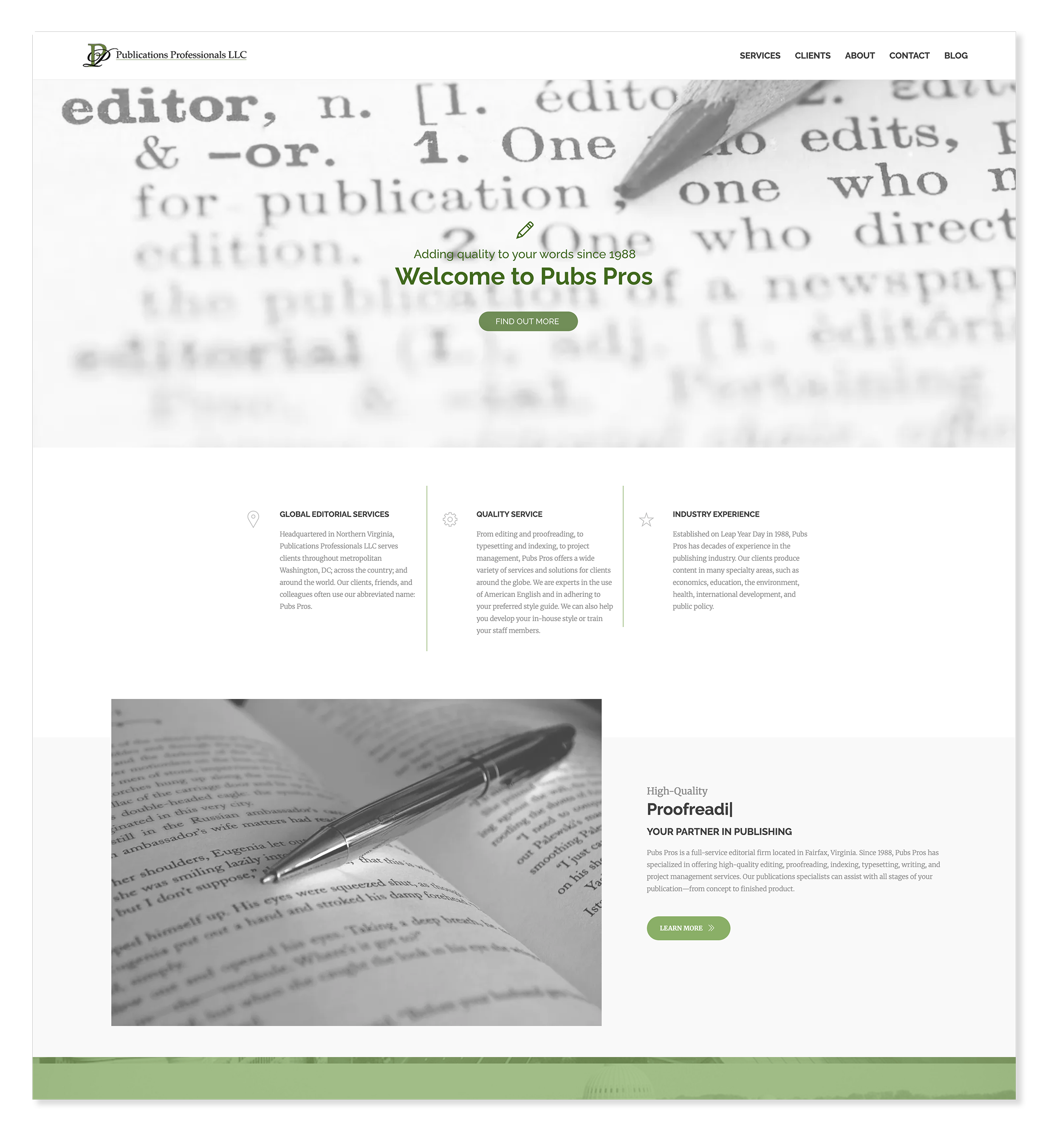
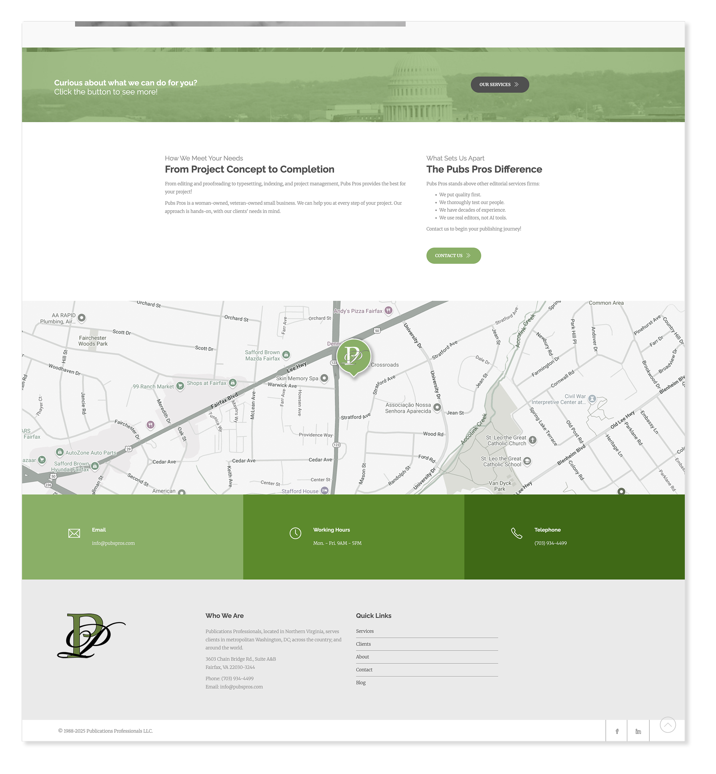
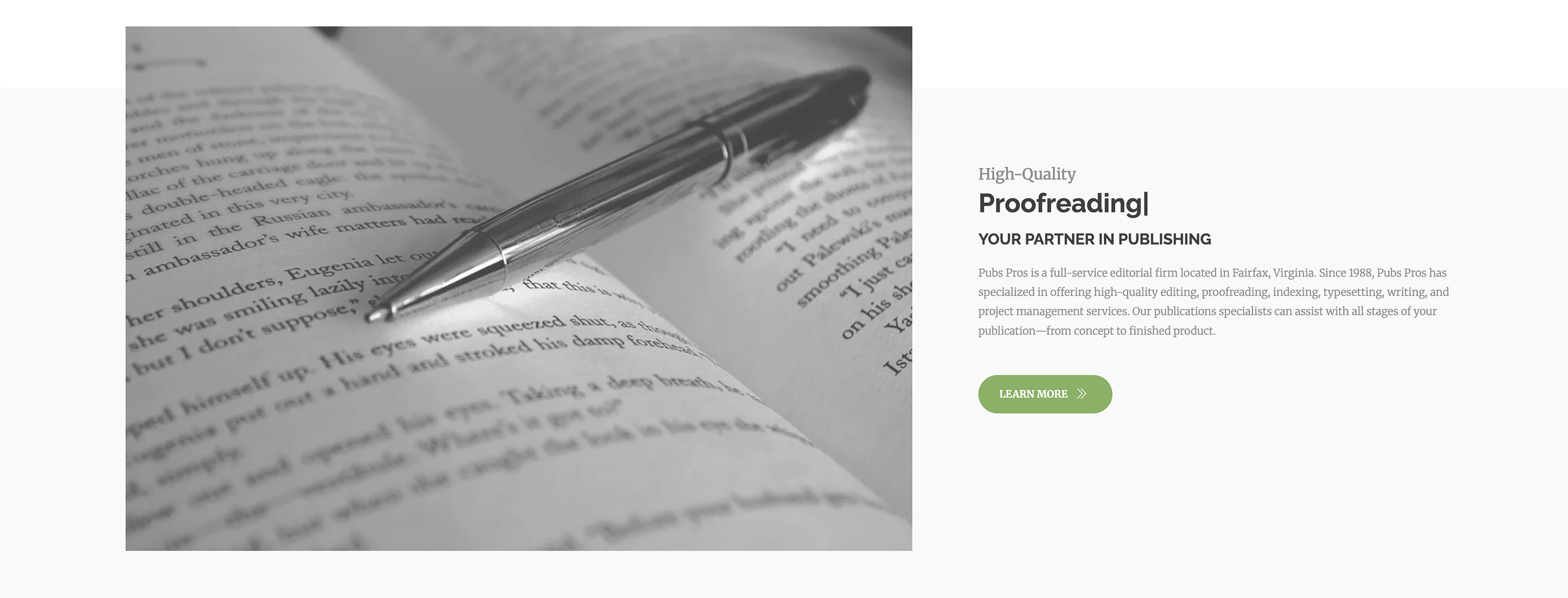
Homepage
WordPressThe homepage sets the tone for the entire site. Clear visual hierarchy, strong messaging, and a logical flow guide visitors through who Pubs Pros is, what they offer, and how to get in touch — building confidence before asking for engagement.
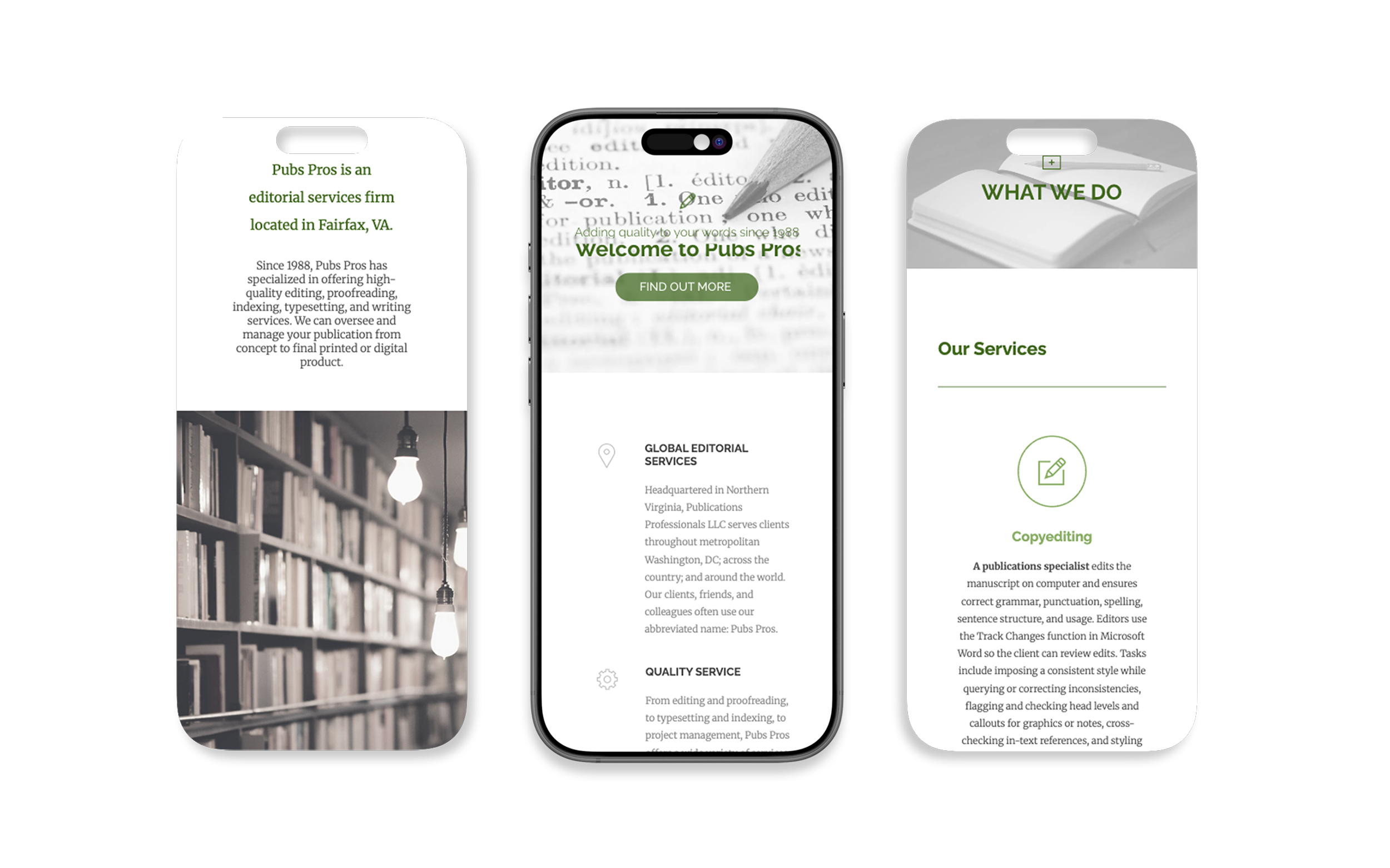
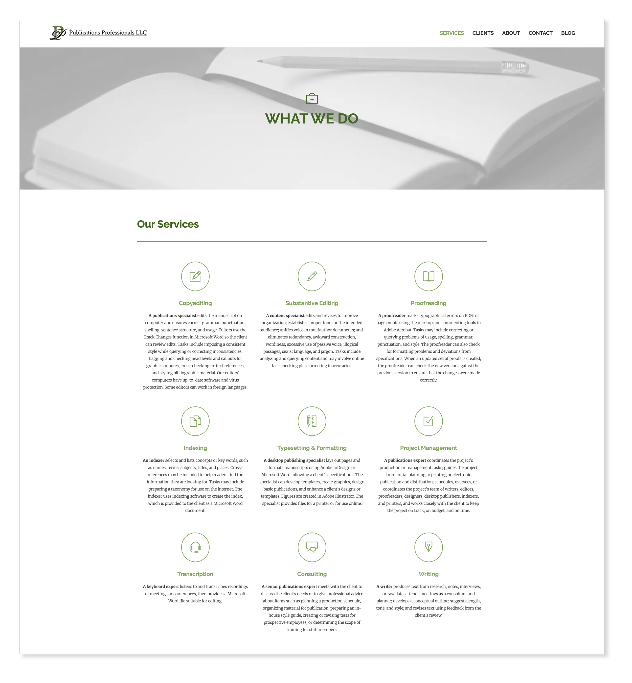
Services
WordPressThe services page needed to communicate a wide range of editorial expertise without overwhelming visitors. Clear content groupings and consistent typographic hierarchy make it easy to scan and understand what Pubs Pros offers at a glance.
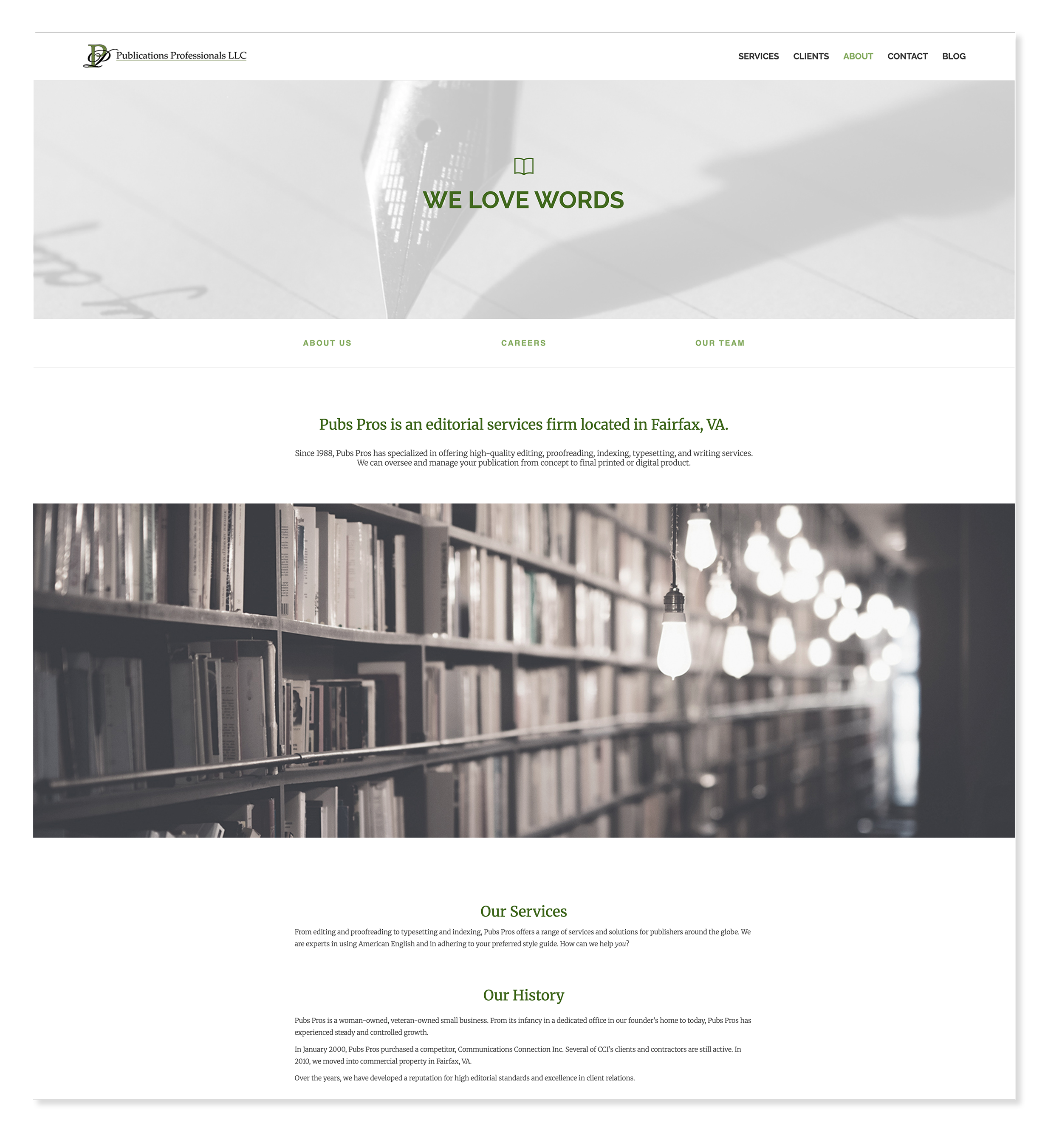
About
WordPressFor an editorial services firm, the about page is where trust is built or lost. I designed it to center the founder's voice and the team's expertise — using large imagery, clear bios, and a warm but professional tone that reinforces decades of credibility.
“Our beautifully designed website by Meghan has increased visitors and has definitely made a positive impact on our business.”
Barbara Hart, CEO & Founder, Publications Professionals LLCOutcomes
What this work delivered.
The relationship didn't end at launch — I've continued refining the site as the business evolves, reinforcing that good design is never truly finished.
The redesign strengthened the company's online presence and had a measurable positive impact on the business, confirmed directly by the founder and the company's financial statements.
Every page validated for contrast, keyboard navigation, and readability — ensuring the site works for every visitor regardless of ability or device.
Reflection
What this work taught me.
This project reinforced that successful design doesn't end at launch. Each update since has been an opportunity to strengthen usability, accessibility, and visual clarity — and close collaboration with the founder at every stage meant the site genuinely reflects the company's values, not just their services. The biggest lesson: consistency and restraint build more trust than complexity ever could.