
Most designers treat the 404 page like a utility closet — functional, forgettable, and definitely not worth decorating. I used to agree. Then I met Dr. Pete, and everything changed.
The Setup
It started as a five-minute task.
I was working through a list of things to polish on my portfolio site — the kind of low-stakes cleanup you do when you need a win. I pulled up the default Squarespace 404 page to see what visitors were actually landing on. It rendered in my site's fonts and colors, which was fine — technically on-brand — but it had no personality. No pizazz. It looked like every other Squarespace 404 page, just wearing my clothes. Honestly though, who cares about the 404 page? You land there by accident. You leave immediately. It's the utility closet of web design.
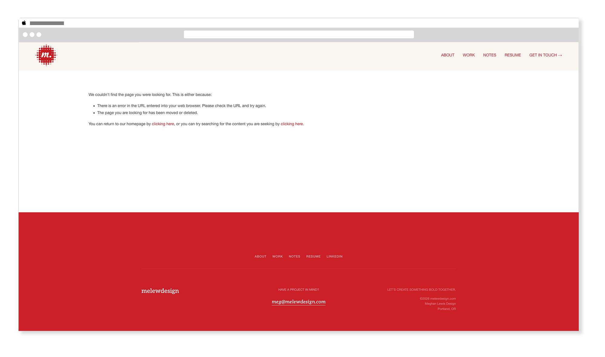
Squarespace has a default 404 state. It's fine, and it was ok enough to not think about. It's literally the 'Meh' of web pages. But every time I'd see it it would make me annoyed. It says something like "Page Not Found" in whatever your body font is, and that's about it. Functional. Completely forgettable.
The 404 page was so low on my radar, I couldn't remember if Squarespace even let you customize it. Turns out: they do. They just don't make it obvious.
I had maybe five minutes to spare. I figured I'd drop in a quick code block, write something wry, add a button back to my work page, and call it done. Thirty seconds in, I thought: what if I put a cat on it?
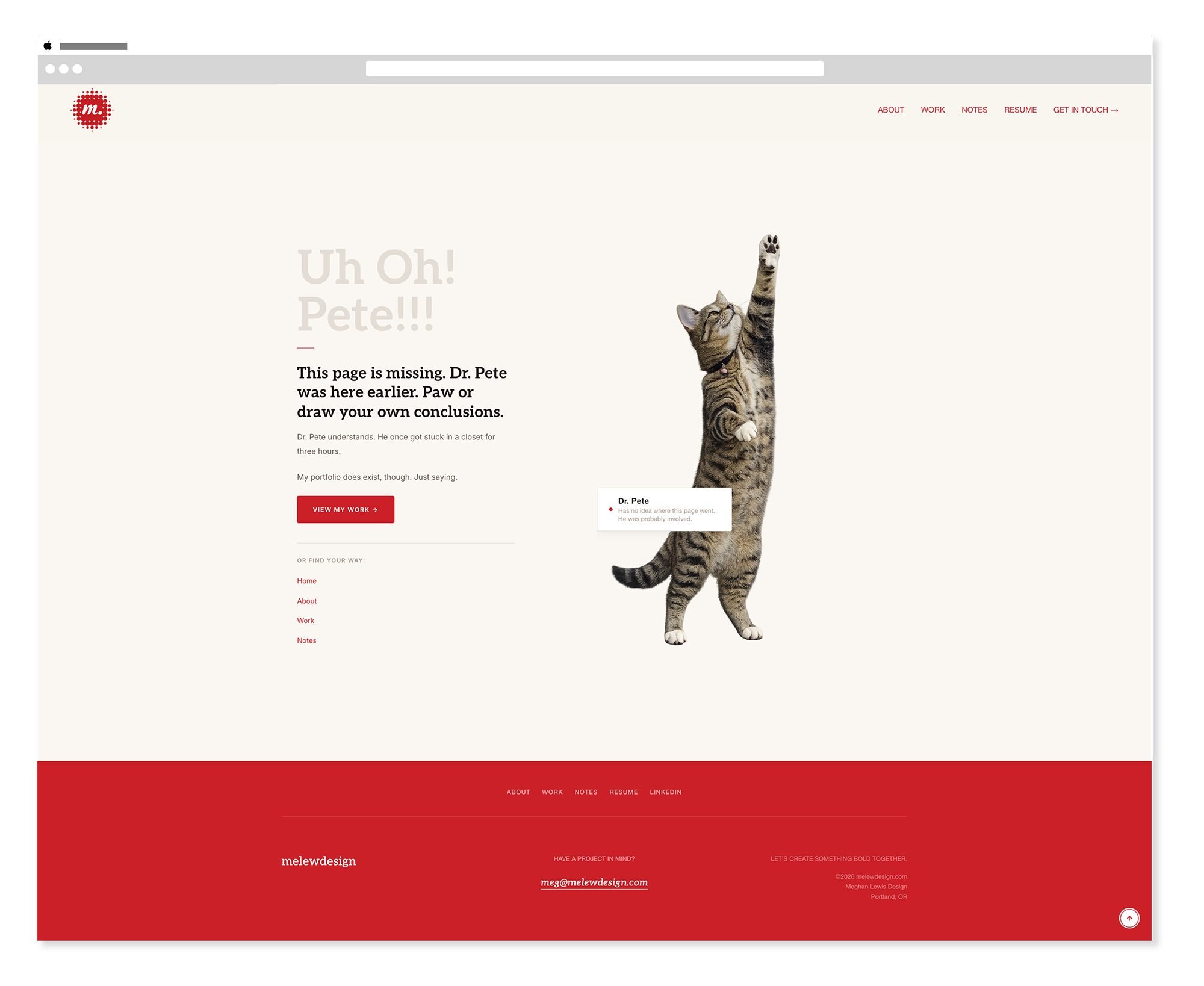
Dr. Pete is one of our cats. He is a medium-sized, confident brown tabby who approaches every situation — including situations he caused — with complete composure (or is that chaos?) He doesn't meow much. When he does, it matters. What he does instead is trill — a sound that, in our house, has come to mean one of two things: he's delighted to see you, or he's about to do something he absolutely should not do. There is no in-between. He also reaches dramatically upward toward things he will never catch. I had exactly the right photo.
The Build
How to set up a custom 404 page in Squarespace.
Here's the part nobody tells you: Squarespace 7.1 lets you fully customize the 404 page, but it's tucked away in a place most people never look. Here's how to get there and what to do with it.
Step 1 — Build your custom page
Create a brand new page in Squarespace like you would any other. Give it a title — mine is "Uh Oh! Pete!!!" which tells you everything you need to know about where this was headed. Add it to your Not Linked pages so it stays out of your navigation. This is the page you'll design from scratch and then assign as your 404 destination.
Build it however you want — sections, blocks, code, the whole thing. I set mine up as a two-column section: image block on the right for Dr. Pete, code block on the left for the text, badge, links, and CTA. Classic sections, not Fluid Engine. The image block handles the photo natively; the code block handles everything that needs to be on-brand and precise.
I set mine up as a two-column Squarespace section — image block on the right for Dr. Pete, code block on the left for the text, badge, links, and CTA. Classic sections, not Fluid Engine. The image block handles the photo natively; the code block handles everything that needs to be on-brand and precise.
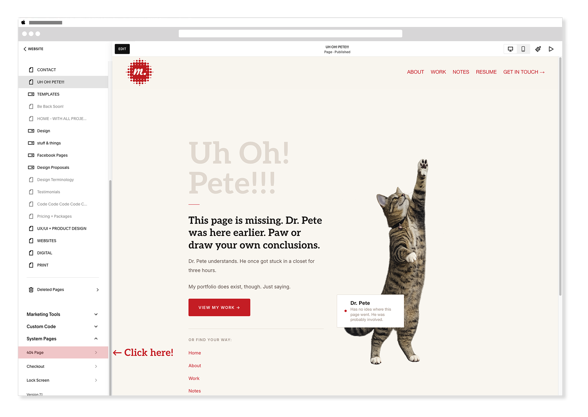
Step 2 — Assign it in System Pages
Once your page is built, scroll to the very bottom of your Pages panel. You'll find a System Pages section — click on the 404 page option. A panel will open with a dropdown menu. Select your newly built custom page from the list. Squarespace will now route all broken URLs there instead of the default. That's it.
Step 3 — Write something worth reading
This is where most custom 404 pages fall apart. Designers put in the effort to make it look good and then write "Oops! Looks like this page doesn't exist. Go home." Which is fine. But it's a missed opportunity.
Your 404 page is one of the few places on your site where someone has already done something unexpected. They're slightly disoriented. They were looking for something and didn't find it. That's actually a perfect moment to show them who you are — because whatever you put here, they're going to read it.
Mine says:
"This page is missing. Dr. Pete was here earlier. Paw or draw your own conclusions."
Below that: Dr. Pete understands. He once got stuck in a closet for three hours. And then a CTA to my work page, plus a stacked list of navigation links so nobody gets truly lost.
Step 4 — The badge
The detail that made it: a small availability badge — the same component I use on my About and Home pages — repurposed as a caption for Dr. Pete. Instead of a green dot, it has a red dot (oooooh, laser!), name, and a one-liner. On my About page it says "Available for Work — Staff roles & freelance projects." On the 404 page it says "Dr. Pete — Has no idea where this page went. He was probably involved."
Same component. Completely different energy. That kind of design consistency-with-a-wink is something I genuinely love — using a system element in an unexpected context without breaking the system.

The Thinking
What a 404 page actually says about you.
Here's the thing about error states: they're a test of your brand's personality under pressure. Anyone can look polished on a homepage. A homepage is rehearsed. But the 404 page? Nobody plans to land there. It's the moment your brand has to be itself without preparation.
A generic 404 page says: we built a website. A thoughtful 404 page says: we think about the details, even the ones nobody asks us to think about. A funny 404 page with a cat who was probably involved says: we're human, we have taste, and we don't take ourselves too seriously.
For a portfolio site specifically, the 404 page is a small but pointed argument for hiring you. It shows that you think about edge cases. That you care about the complete experience. That you understand brand voice isn't just for the homepage — it's for the utility closet where nobody looks, too.
Anyone can look polished on a homepage. A homepage is rehearsed. The 404 page is where your brand has to be itself without preparation.
The Lesson
Small missteps are design opportunities.
I almost skipped this because it isn't a page that you want visitors to land on. Honestly visitors really shouldn't see this page, at all. I didn't even think of this page to work on but would see the 404 page after I would change the slugs as I built blog posts. This annoyed me greatly. And then I did it in about thirty minutes — most of which was spent laughing at the badge copy — and ended up with one of my favorite things on my entire site.
That's the thing about the small stuff. The utility closets of your design work — the error pages, the empty states, the confirmation emails, the loading screens — they're not interruptions to the real design work. They're part of it. And they're often the places where personality has the most room to breathe, precisely because nobody's watching too closely.
Dr. Pete doesn't know he's on a 404 page. He's just reaching for something just out of his grasp, completely unbothered by whatever chaos brought you here. Somewhere in the house right now, he's probably trilling quietly to himself about it.
Honestly, same.
Want to see it live? Go to melewdesign.com/oops — or type any nonsense URL after melewdesign.com and Dr. Pete will be waiting.