
Most designers today learned on a screen. They've built beautiful things — websites, apps, interfaces — and never once held a physical proof in their hands. That's not a criticism. It's just the shape of the industry over the last decade. But the layoffs that have swept through design teams over the last few years have quietly erased something specific: the people who knew how to make things you can touch. And that knowledge is rarer than most people realize.

The Stakes
What gets lost when print expertise walks out the door.
When companies cut senior designers, they often don't realize what institutional knowledge leaves with them. A designer who's spent years in print production carries something that can't be quickly replaced: a physical understanding of the craft.
Print has a permanence that digital doesn't. A bad website can be updated overnight. A catalog that ships to 50,000 customers with a color error, a font that didn't embed, or a bleed that's off by an eighth of an inch? That's a costly reprint — or worse, a distributed mistake you just have to live with. The stakes are different. And the expertise required to avoid those mistakes is different.
I've watched teams try to spin up print production capabilities quickly after those skills have been eliminated. It doesn't go well. Not because the designers aren't talented, but because print has its own vocabulary, its own set of non-negotiable technical requirements, and its own way of failing — visibly, expensively, and at the worst possible moment.
The Craft
What print design actually is.
Let me be specific, because I think it gets misunderstood. High-level print design is not just layout. It's not "making it look nice and exporting a PDF." It's the intersection of visual craft, color management, and production engineering.
I worked as a prepress technician before I was a designer — that's the person responsible for receiving files from designers and making sure they could actually be printed correctly. I've been on both sides of that relationship. It made me a fundamentally better designer. Working in prepress teaches you to think about your files differently. You stop thinking about how something looks on screen and start thinking about how it will reproduce on paper. You learn to anticipate problems before they exist.
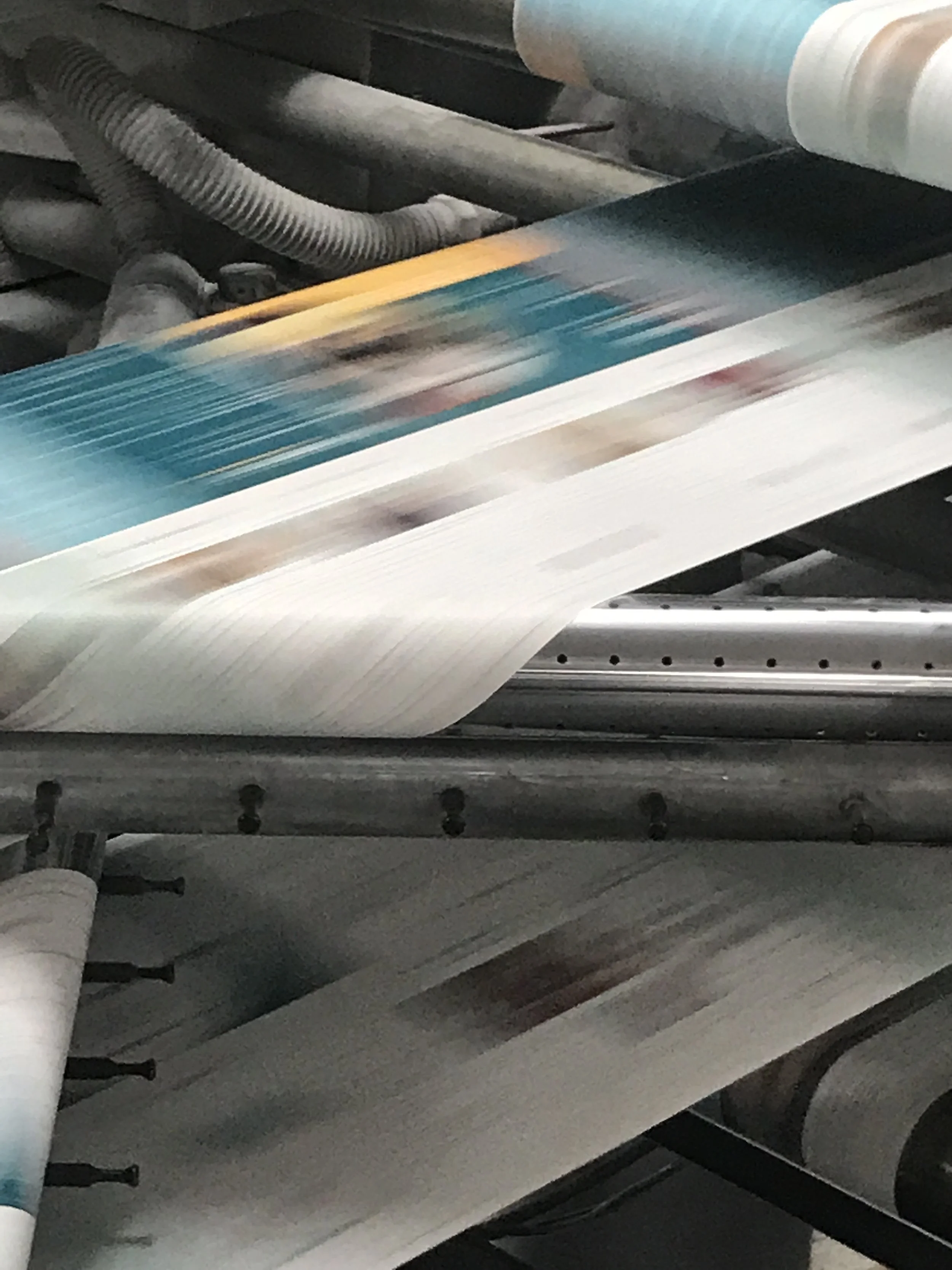
Most high-volume commercial printing is offset: ink is applied to a metal plate, transferred to a rubber blanket, and pressed onto paper. The files you prepare for offset have specific requirements around color, resolution, and file format that are entirely different from anything digital. Digital printing — high-quality inkjet or laser — has somewhat more forgiving requirements, but still demands properly prepared files. Knowing which process your job is going through shapes every technical decision you make.
High-volume commercial printing. Strictest file requirements — CMYK only, bleed, specific color profiles.
More forgiving than offset, but proper file prep still matters. Often used for shorter runs.
The Files
Making print-ready files in InDesign.
InDesign has always been my go-to for print production. It's built for it in a way Illustrator and Photoshop simply aren't — multi-page documents, master pages, robust preflight tools, and an export pipeline that gives you real control over what goes to the printer. Here's what I actually set up and check, in the order I think about it.
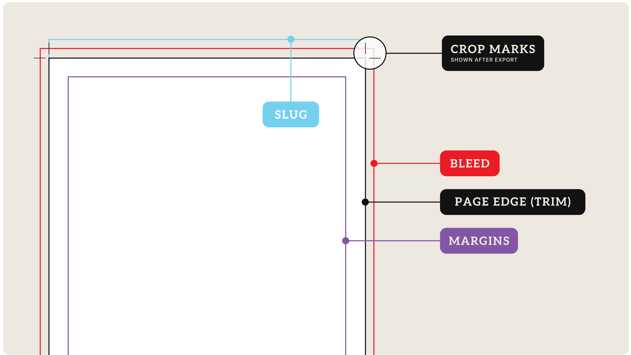
Document Setup: Bleed and Slug
Before I place a single image, I set up the document correctly. A bleed is the area beyond the trim edge where background colors and images extend to ensure no white edge appears after cutting. Standard is .125" on all sides — some printers ask for .1875" on thicker pieces. The slug is outside the bleed, used for job info: printer instructions, color bars, file names. I set one up on every job, even simple ones.
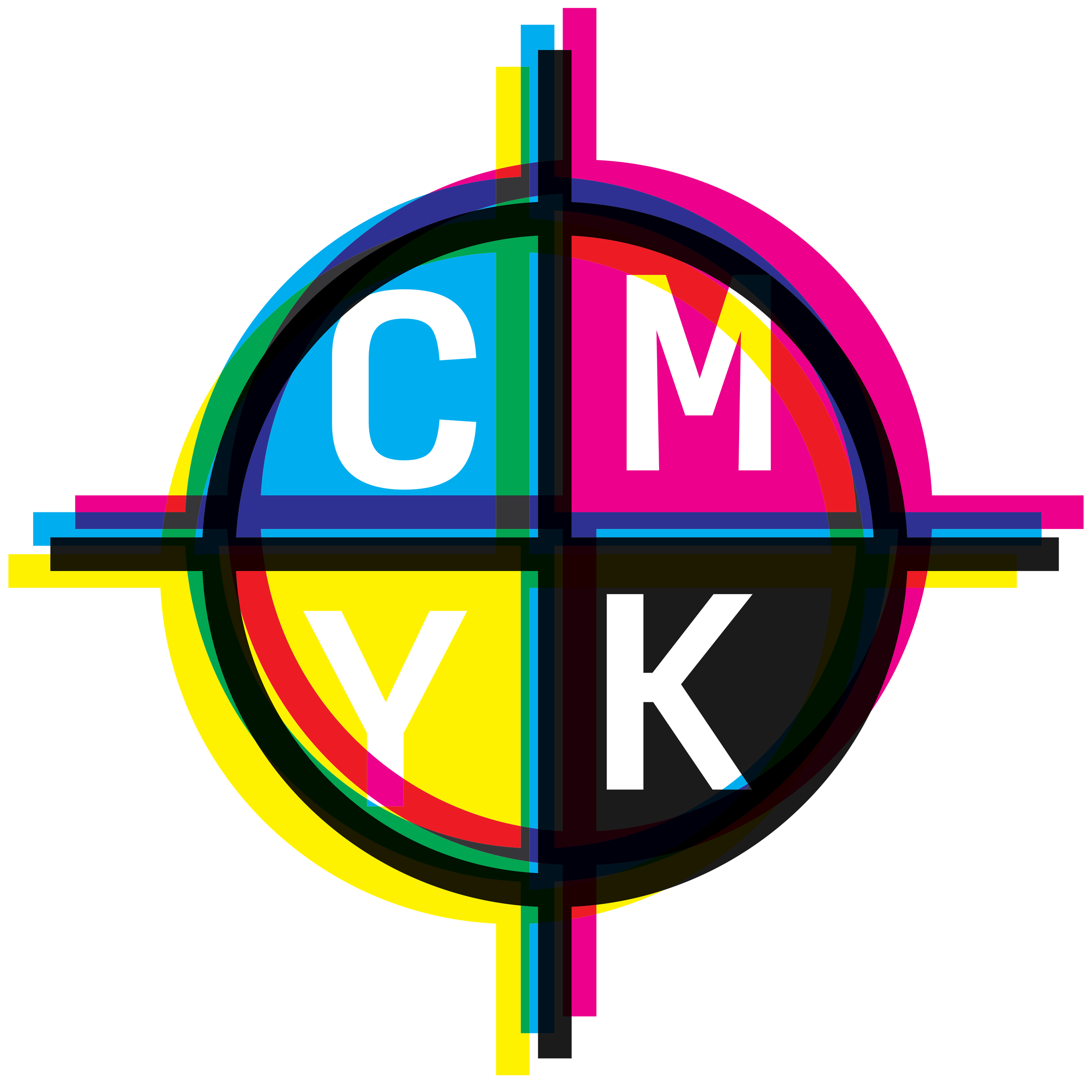
Color Mode: CMYK from the Start
One of the most common mistakes from designers who learned in digital: building files in RGB and converting at export. Don't do this. CMYK and RGB are fundamentally different color spaces. Converting at export means you're letting InDesign (or the printer's RIP) make color decisions for you — and those decisions are often not what you intended. I build print files in CMYK from document creation: images converted to CMYK in Photoshop before placing, swatches built in CMYK values, color profiles assigned to match the output condition.
The two most common U.S. offset standards are SWOP (magazine-style, web-fed offset) and GRACoL (higher-quality sheet-fed). For most of the Vernier catalog work, we used GRACoL 2006 Coated 1 — it produces richer, more accurate color on coated stocks. Confirm the standard with your printer before you start.
Image Resolution: The Real Numbers
"300 dpi for print" is correct as a baseline — but what it means in practice is effective resolution at final print size. Scale a 300 dpi image to 150% of its native size and it drops to 200 dpi. InDesign's Links panel shows effective PPI for every placed image. I check it obsessively.
| Use Case | Minimum Resolution | Notes |
|---|---|---|
| Standard print (text, full-page photos) | 300 dpi | At final print size in the layout |
| High-quality coated stock, close-up photos | 350 dpi | Especially for faces, fine detail |
| Line art, logos, bitmapped art | 1200 dpi | Crisp edges require higher resolution |
| Large format (banners, posters > 24") | 100–150 dpi | Viewed at distance — different rules |
| 1-bit black-and-white line art | 1200 dpi | No anti-aliasing to smooth edges |
Rich Black vs. Pure Black
Pure black is 0C / 0M / 0Y / 100K — appropriate for body text. Rich black combines all four inks for a deeper, warmer result; a common formula is 60C / 40M / 40Y / 100K. Rich black is great for large backgrounds, bold headlines, and full-bleed areas.
Never use rich black on small body text. The slight misregistration between CMYK plates that's normal on press becomes visible as color fringing at small sizes — it looks out of focus. Pure black only for anything under about 18pt.
And never use registration black (100C / 100M / 100Y / 100K) as a design color — it's only for crop marks and registration marks. Using it in your design means that object prints on every plate. That's a disaster.
Total Ink Coverage
Every press has a maximum total ink coverage — the combined CMYK percentage it can put on a single area without the ink failing to dry or muddying. For coated sheet-fed offset it's typically around 300%. A background that's 100C / 100M / 100Y / 100K is 400% — way over any limit.
Font Embedding, Overprint, and Transparency
Fonts need to be embedded in your exported PDF — verify in Acrobat after export via File → Properties → Fonts. Every font should show "Embedded" or "Embedded Subset." Overprinting: InDesign automatically overprints 100% black by default — don't turn it off. Transparency effects need to be flattened at export; always set Transparency Flattener to High Resolution for offset work.
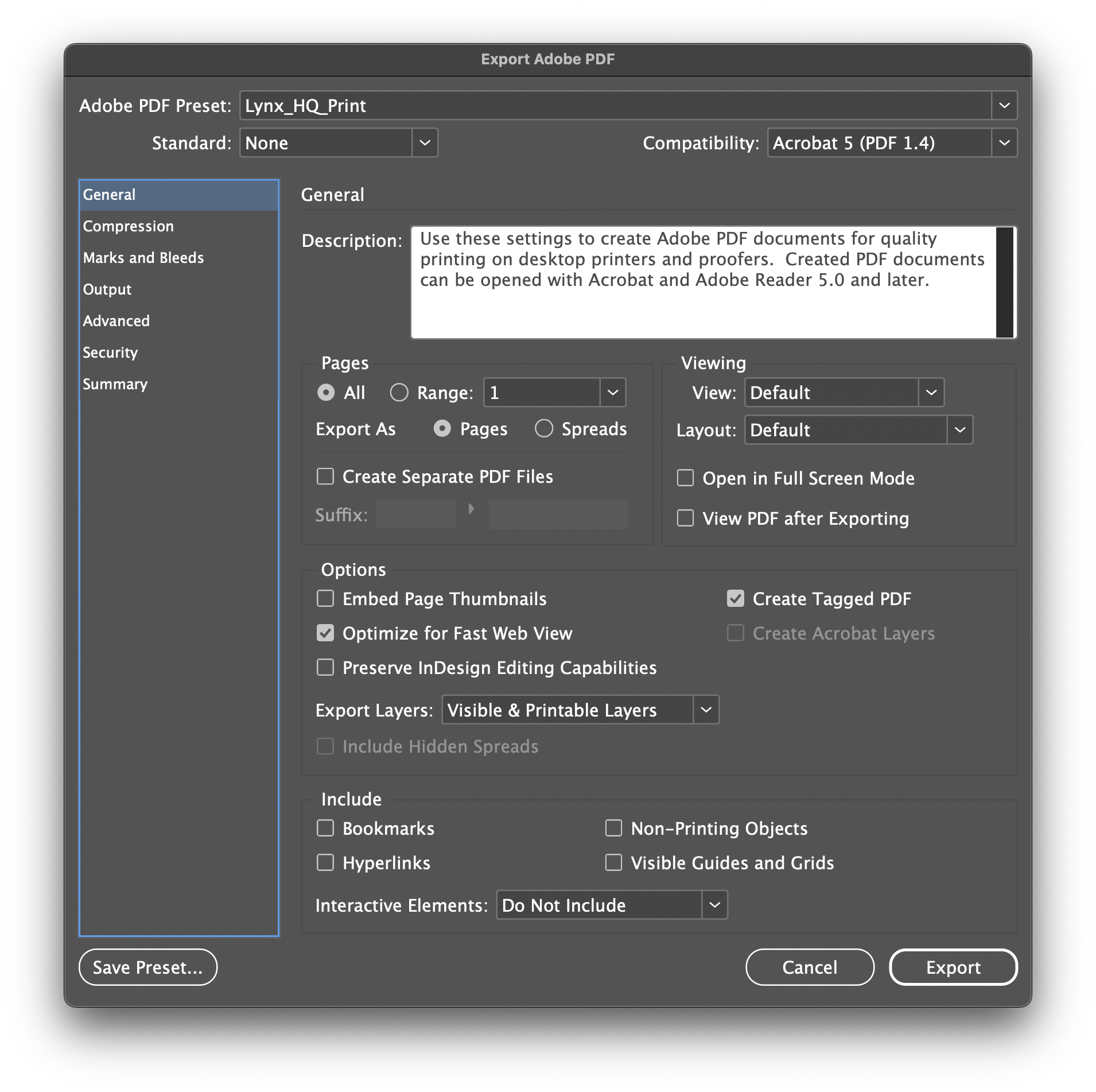
Exporting to PDF: Settings That Matter
For most commercial offset work I export PDF/X-1a — the conservative standard that flattens transparency, ensures everything is CMYK, and works with almost any print workflow. PDF/X-4 handles live transparency and is appropriate for modern digital workflows when a printer specifically requests it.
The Proof
Reading a proof before it's too late.
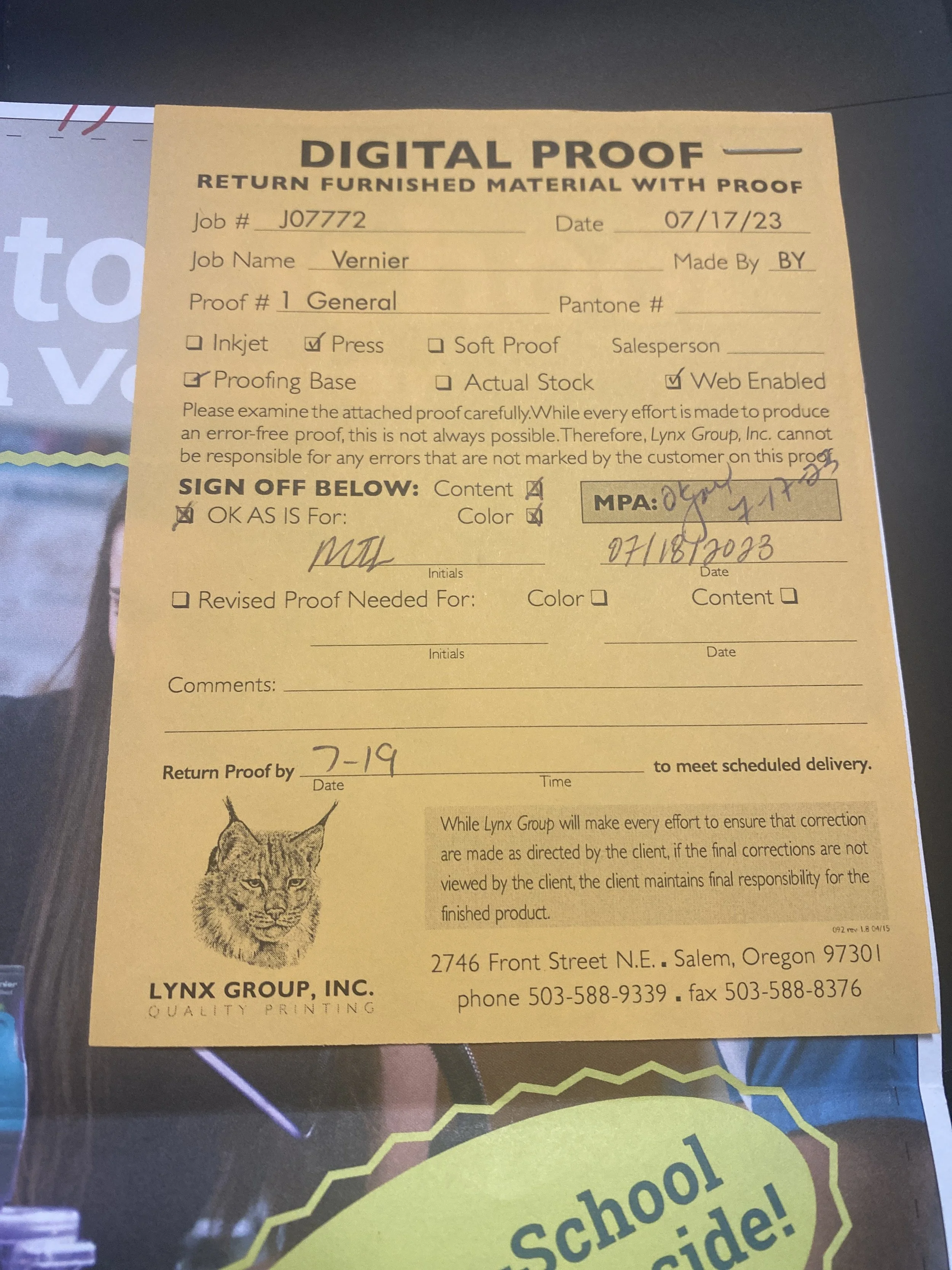
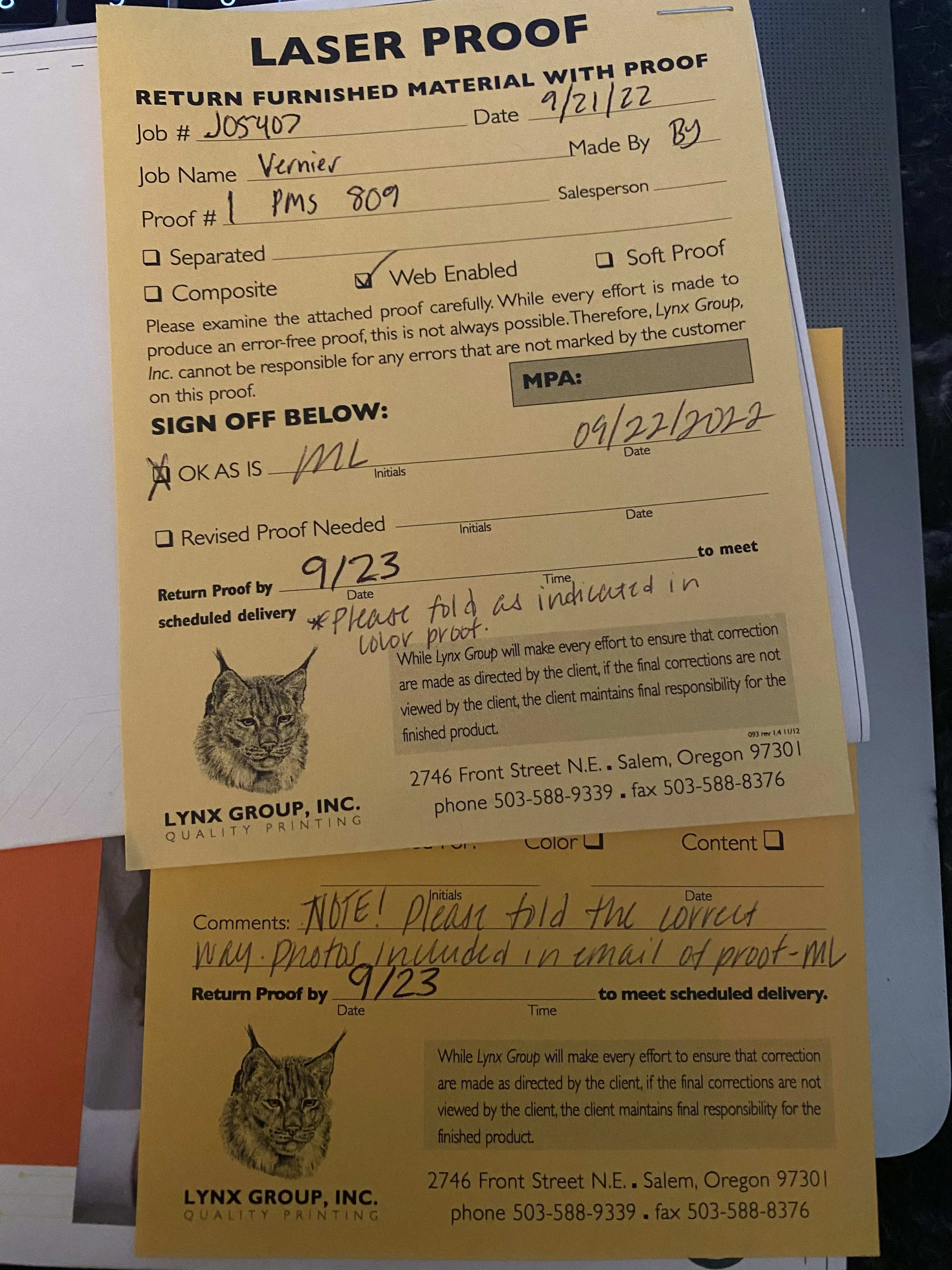
Getting a proof back from the printer is one of my favorite parts of the process — and one of the most important. A soft proof is a calibrated on-screen preview. A hard proof (or contract proof) is a physical print output meant to simulate how the final piece will look on press. For any high-stakes job, I always want a physical proof. There's no substitute for holding the actual paper in your hands.
What I Look For
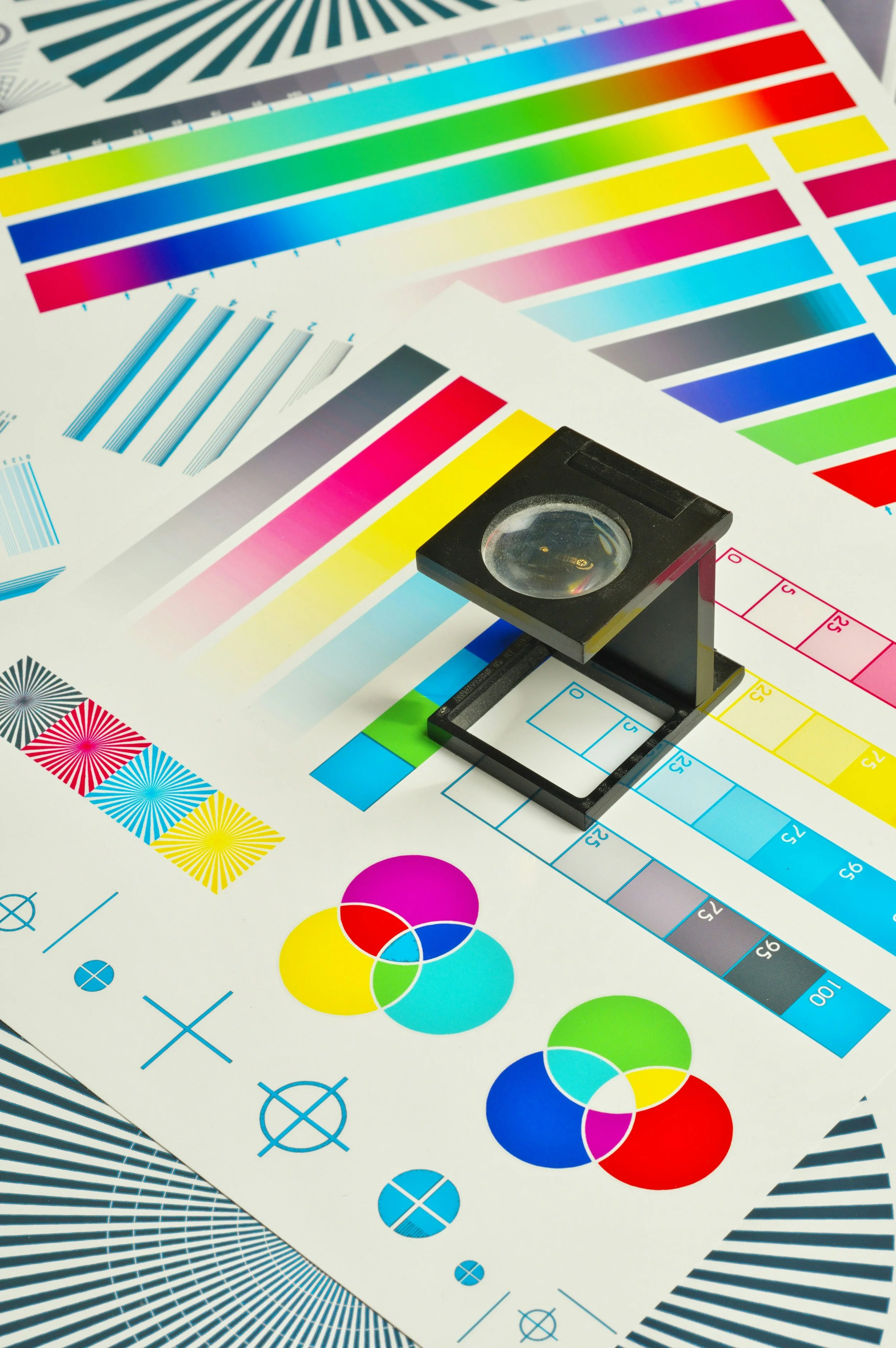
Color accuracy: The proof should come with a color bar — a strip of standardized ink patches printed alongside the job. If the color bar looks off, the proof isn't a reliable representation of the final job. Brand colors need to match. If a Pantone isn't matching on the proof, I flag it before signing off — not after the run.
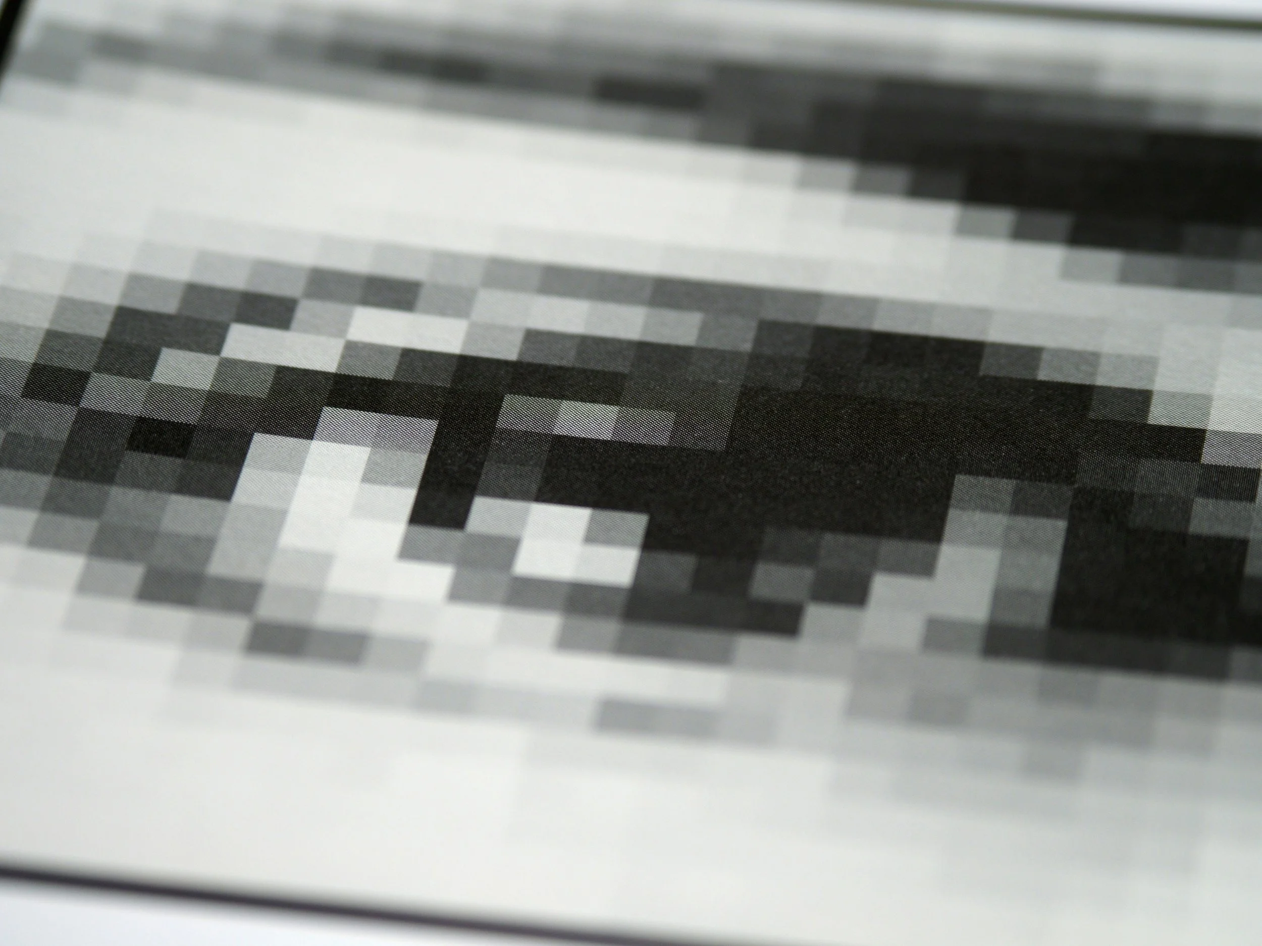
Registration: How well do the four CMYK plates align? Misregistration shows up as colored fringing around objects and soft, blurry-looking edges. I look at registration marks and at fine details like small type and thin rules. Any fringing means the press needs adjustment.
Type rendering: Small type needs to look clean and sharp. I check body copy under a loupe — particularly reverse type (white on color or black), which is the most demanding for the press. Any ink spread into the type counters reads as fuzzy or filled-in.
Bleed and trim: Is the bleed extending all the way to the edge? Are the crop marks correct? Nothing important should sit closer than .125" to the trim line.
The crosshairs outside the trim edge reveal whether the four CMYK plates are aligned on press.
Standardized ink patches that tell you whether the press was running to correct ink densities when the proof was pulled.
When It Goes Wrong
What happens after the proof is signed.
This is the part no tutorial really prepares you for. You've proofed, you've signed off, the job has gone to plate — and then something's wrong. First: stay calm and stay professional. Printers deal with problems. They are not your enemy. The relationship you have with your print rep is one of the most valuable professional relationships in this business.
If the error is discovered before printing begins, you may have the option to correct and re-plate without reprinting. Expensive — but far less expensive than a full reprint. If the job has already printed incorrectly, it's a negotiation. The factors that determine who absorbs the cost: Was the proof approved? Was the error in the approved proof or did it appear during printing? Is this a file preparation error (your responsibility) or a press error (theirs)?
I've been in the room when jobs needed reprints. It's stressful and expensive. The signed proof is your documentation — your mutual agreement on what "correct" means. Never skip it, not even on jobs that feel routine.
If the error was in your file, own it, correct it completely, and re-preflight everything before sending back. If it was on the press side, document what the problem was so you can reference it if similar issues appear in future runs.
The Work
What high-level print looks like in practice.
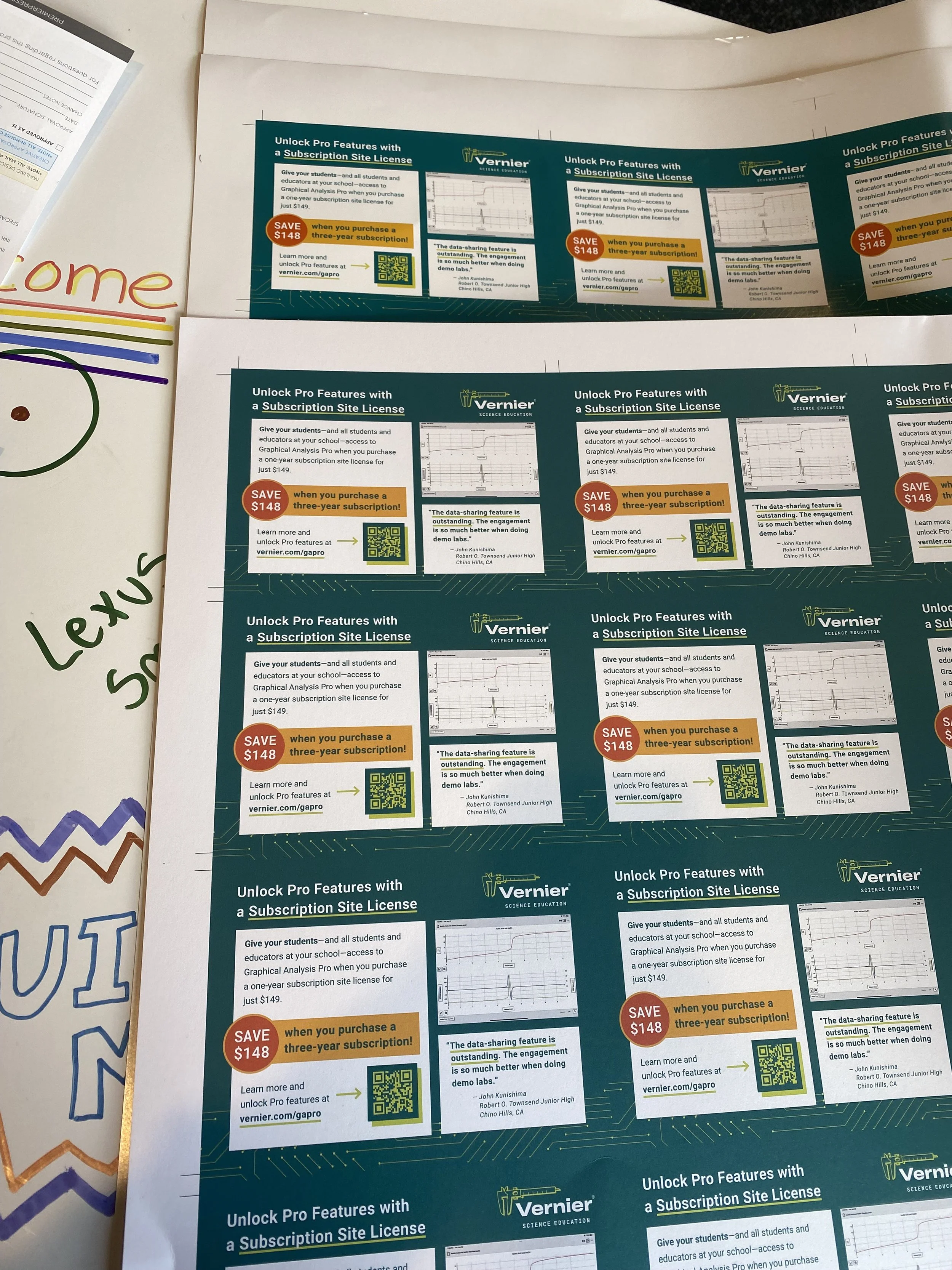
All of this technical knowledge has to produce something worth printing. Here's a look at some of the print work I produced at Vernier Science Education — not just what it looks like, but some of the decisions behind it.
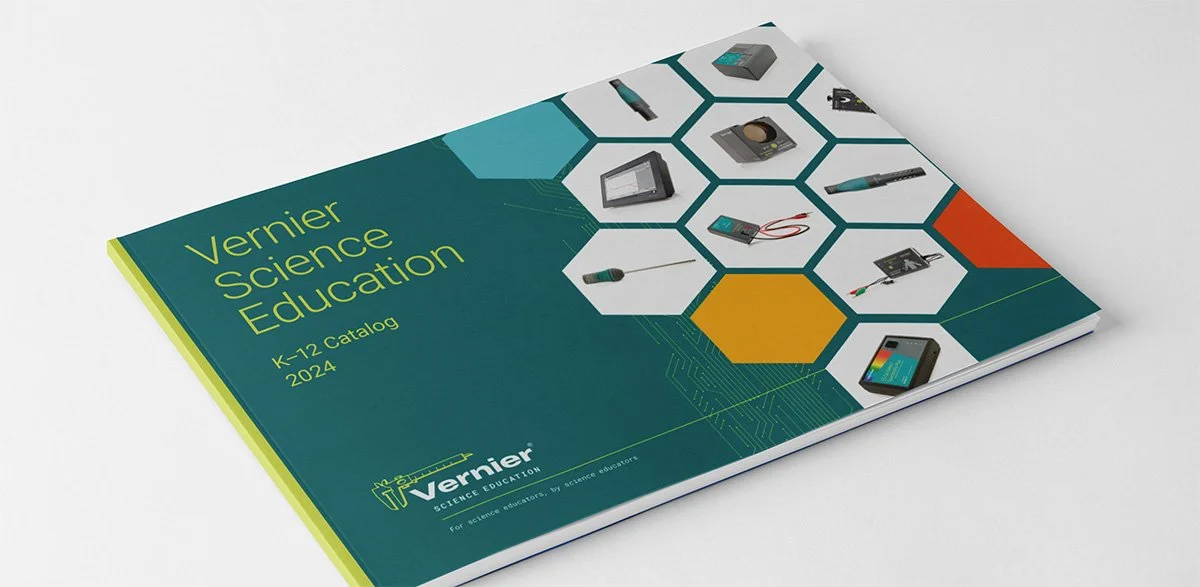 The Vernier annual catalog — hundreds of pages, consistent grid, new visual direction each year.
The annual catalog was a significant production: hundreds of pages, hundreds of products, a consistent grid, and a new visual direction each year. Managing color consistency across that many pages required disciplined use of swatches, paragraph styles, and object styles — and a thorough preflight on the full document before any file went out.
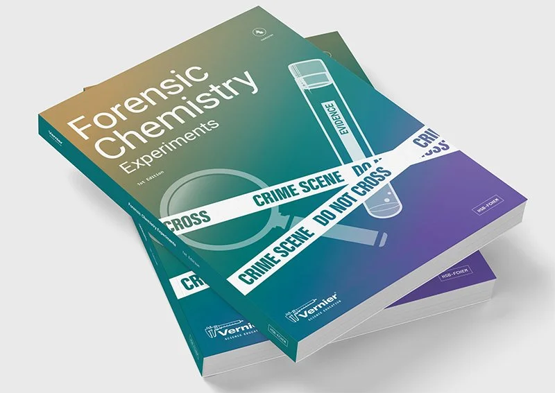
Perfect binding, specific paper stocks for marking, and cover designs that needed to read quickly on a shelf.

Strong visual hierarchy and a clear call to action — which sounds like UX work, because it is.
The Checklist
My pre-send preflight checklist.
Before any print file leaves my hands, I run through this list. Print it, save it, make it part of your workflow.
- Document bleed set to .125" (or printer-specified)All background colors and edge images extend to the bleed edge.
- All images are CMYK, minimum 300 dpi at final sizeCheck effective PPI in InDesign's Links panel for every placed image.
- No RGB images in a CMYK documentInDesign Preflight will flag these — but also spot-check the Links panel yourself.
- Color profile matches printer's requested standardGRACoL, SWOP, or custom — confirmed with your print rep before you start.
- No accidental spot colorsCheck the Swatches panel and Separations Preview. Every color should be expected process or intentional spot.
- Rich black only on large elements; pure black on body textCheck all large black areas — headlines, backgrounds — against the correct formula.
- Total ink coverage within printer's TAC limitEspecially check dark backgrounds and shadow areas.
- No text within .125" of trim edgeLive area / safe zone respected on every page.
- All fonts embedded — verify in exported PDF via AcrobatFile → Properties → Fonts — every font shows Embedded or Embedded Subset.
- No overset text, no missing links, no modified linksInDesign Preflight panel green ✓ on all three.
- PDF export preset matches printer's requirementsPDF/X-1a for most offset; X-4 if printer requests. Crop marks and bleed marks on.
- Transparency flattener set to High ResolutionAny shadows, blends, or opacity effects will flatten correctly.
- File named correctly per printer's conventionsJob name, version number, date. No spaces in file names.
Going Forward
What this means for designers and the teams that hire them.
For designers reading this: print is worth learning deeply. I know the industry pressure has been toward digital, but that's exactly why print expertise is becoming rarer and more valuable. If you can produce print-ready files, read a proof, and have an informed conversation with a print rep, you are genuinely differentiated. These skills take time to develop — the best way is to find print work and do it, ask a lot of questions, and hold your output in your hands.
For companies and hiring managers: when you need high-level print work, ask specific questions. Ask candidates to describe their file prep process. Ask if they've worked directly with a printer. Ask if they understand the difference between PDF/X-1a and X-4. The answers will tell you quickly whether this is someone who's done the work or someone who's learned the vocabulary.
Print is a craft. It rewards patience, precision, and genuine curiosity about how things get made. The layoffs will slow down — and when they do, the teams being rebuilt are going to need this expertise.