Community Cycling Center
PRESENTATION DESIGN
—
Community Cycling Center believes that all Portlanders—regardless of income or background—should have the opportunity to experience the joy, freedom, and health benefits of bicycling.
PROJECT BRIEF
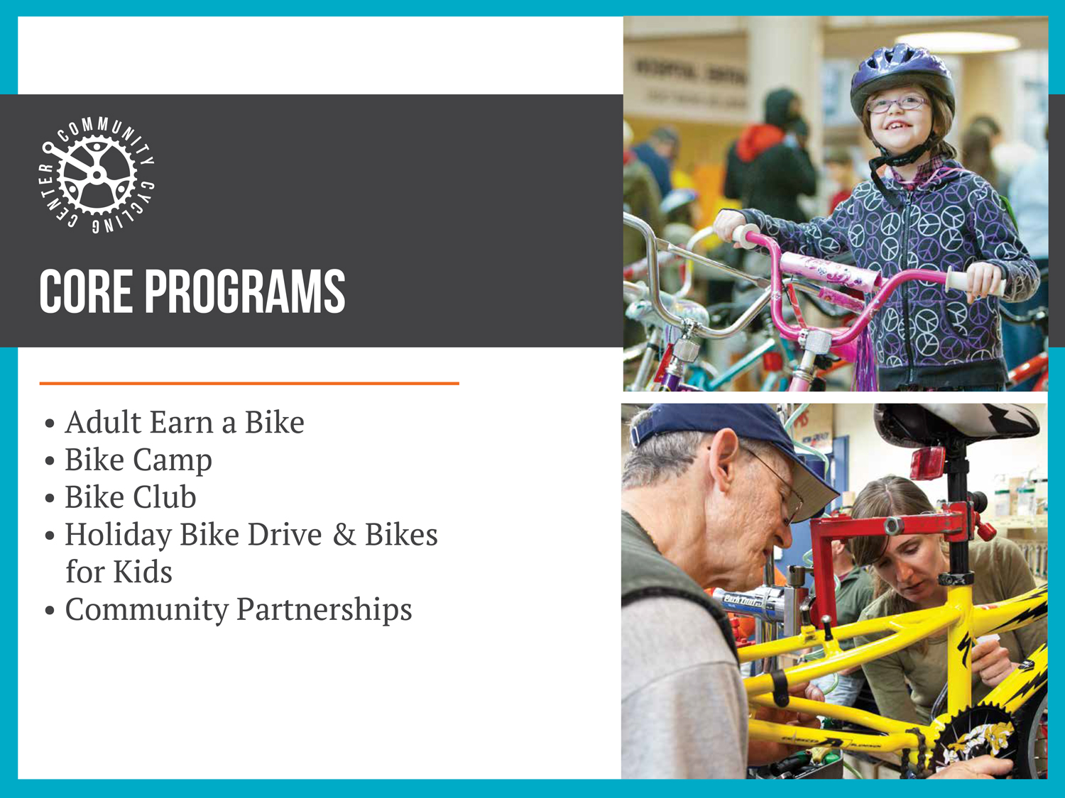
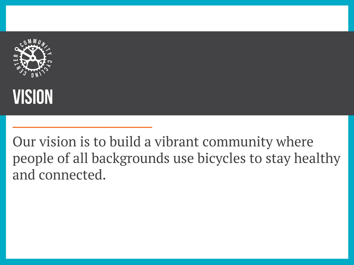
Community Cycling Center needed a new set of Powerpoint + Keynote master slides for them to use to increase their presence, have a visual presentation that is within their brand style, and also as a way to also potentially increase revenue from investors. I was tasked with creating a visually interesting and impactful set of master slides for their specific business use.
Tasking me with this project, and going through many rounds of revisions, we landed upon something that was beautiful, looks important, and professional. They are currently using these slides and continue to make an impactful change in people's lives.
FUN FACTS
Community Cycling Center is a community first bike shop located within North Portland. Their vision is to create a vibrant place where everyone can enjoy biking. Working on this project, I was able to learn more about them and how I can make a positive impact through volunteering.
THE FINE DETAILS
TIMELINE: Project began in 2016
ROLE: Presentation Designer
COLLABORATORS: Melinda Musser | Project/Marketing Manager
SCOPE: Presentation Design, Page Layout
TOOLS: Adobe Illustrator, Adobe Photoshop, Powerpoint, Keynote
ASSETS: Powerpoint & Keynote Masters, PDFs, PNGs, Placeholder Images
Volunteerism
Working with a non-profit was a wonderful experience. They were wonderful with providing feedback on my work, offered recommendations, and were very straight forward when they had constructive criticisms. It was refreshing, and it encouraged me to continue volunteering my time for good causes.
THE PROCESS
Beginning work on the slides, I began simply with the design. As is my process, I provided three different options to present the information. The direction I was given was to keep to their stylesheet but create something professional that they could use as way to garner interest and encourage donations, revenue, and business.
Some concepts were utilized later in the overall presentation design. At one point during the design phase, They became concerned with the grey photos used as placeholders. I explained these were merely placeholders and can be changed depending on the topics they were covering when building the presentations on their end. Continuing through the feedback, I provided a few different versions in color as well as in greyscale.
Finishing up + Results
All in all, working with Community Cycling Center to develop these slides was a wonderful experience. They provided fantastic feedback and we landed upon a design that is versatile, professional, and at the same time, fun and exciting.
CREDITS
Client: Community Cycling Center
Photography: Community Cycling Center
Presentation Designer: Meghan Lewis
©Community Cycling Center | www.communitycyclingcenter.org


