
Thoughtful Print Design that Communicates and Connects
Print Design | Brochures & Catalogs | Marketing Collateral | Typography & Layout
Print Design | 2019-2025

INTRODUCTION
Vernier Science Education Print Design: Brochures, Postcards, and Flyers
This collection represents several years of print work created for Vernier Science Education. I supported marketing and product teams by designing materials that helped educators understand new tools, upcoming product launches, and classroom applications. Each piece needed to feel approachable to teachers while staying aligned with Vernier's technical accuracy and brand standards. Working in print reminded me how important tactile communication can be, especially for a company rooted in hands-on learning.
I guided these projects from initial concept through final production. I worked closely with copywriters, product managers, and subject matter experts to translate complex features into clear, engaging visuals. I learned how to balance scientific precision with accessible design, and I became more confident in managing tight timelines, variable content, and evolving product details. These projects strengthened my ability to distill information into layouts that serve both educators and the business goals of the organization.
ROLE
PRINT DESIGNER
TIMELINE
2019-2025
TOOLS
ADOBE INDESIGN, ILLUSTRATOR, PHOTOSHOP, ACROBAT
MARKETING LEADERSHIP, ART DIRECTOR, COPYWRITER, PROJECT MANAGERS, SUBJECT MATTER EXPERTS, EXTERNAL VENDORS/PRINTERS
TEAM
DELIVERABLES
BROCHURES, POSTCARDS, FLYERS, SELL SHEETS, EVENT COLLATERAL
OVERVIEW
What role did print play in Vernier’s communication strategy?
Print pieces at Vernier served a clear purpose. They supported educators who preferred something they could hold, review, and share with colleagues. Brochures, postcards, and flyers helped introduce new products, highlight curriculum benefits, and guide customers toward the right tools for their classrooms. These materials often acted as a first impression at conferences or inside outreach kits.
Many of these projects involved translating technical product stories into content that felt friendly and practical for teachers. The challenge was to keep the science accurate while shaping it into layouts that communicated quickly. I spent a lot of time asking what educators needed to know first and how visuals could lower the barrier to understanding. That process helped me see how design can make specialized information feel grounded and approachable.
This body of work includes pieces created for product launches, seasonal promotions, educator events, and curriculum support. Looking back, I can see how these print projects strengthened my skills in hierarchy, messaging clarity, and visual storytelling. They also helped me build stronger relationships across teams, since each piece required close collaboration with subject matter experts, marketing partners, and product leads.
CREATIVE DIRECTION
Clear, approachable design that supports educators and product clarity
Each print project at Vernier started with a simple goal. We wanted to help educators quickly understand what a product did and how it could support hands-on learning. Many teachers were meeting these tools for the first time at conferences or through outreach kits, so the materials needed to feel inviting, accurate, and easy to scan. I learned to guide conversations around what information mattered most and how design could make that information feel friendly rather than technical.
THE BRIEF
“What visual approach will help educators understand complex tools in a way that feels practical, clear, and connected to their classroom needs?”
My early direction focused on strong hierarchy, clean typography, and imagery that showed the tools in real use. I found that educators responded well to layouts that balanced technical diagrams with warm photography. This mix reinforced Vernier’s brand identity as both scientifically rigorous and classroom centered. I leaned on consistent color, spacing, and iconography to support readability across brochures, flyers, and postcards.
As the work evolved, I became more confident simplifying dense product details into visual elements that teachers could grasp at a glance. That meant refining charts, creating straightforward callouts, and shaping content so that each piece guided readers through a small learning journey. These decisions helped the print materials serve as reliable support for sales teams, event staff, and educators who needed quick clarity before diving deeper into the product line.
DESIGN PROCESS
Laying the groundwork for adaptable campaign design
Every print assignment at Vernier began with a short brief or kickoff conversation that clarified the purpose of the piece, the audience, the timeline, and the level of product detail required. Some projects supported a new product launch, others highlighted curriculum updates or seasonal promotions. I spent time gathering context from marketing partners, product managers, and subject matter experts so I understood the story we needed to tell. This early stage always helped me feel grounded and aligned with the team before moving into design.
-
I started by reading through the draft copy and identifying the primary message, supporting details, and any callouts that needed visual weight. The clarity of the copy made it easier to decide what readers should see first and what could sit in secondary positions.
-
Sometimes the marketing partner shared past pieces or reference examples that captured the tone and focus they wanted. I studied these to understand the intended feeling and how the visuals could amplify the copy. I also checked brand guidelines to ensure typography, color, and imagery stayed consistent.
-
Before designing, I clarified who would review the piece, who approved technical details, and what the timeline looked like. These projects often involved a copywriter, a marketing partner, and a product expert. Knowing their roles helped me plan for feedback rounds and kept the workflow smooth.
Insights from early project exploration
With the content and direction in place, I spent time exploring visual approaches that supported clarity and ease of use. I looked at past Vernier materials and related STEM print pieces to see what felt effective. My goal was to create layouts that respected the copy while giving educators a clear path through the information.
-
Successful print materials used strong hierarchy, direct headlines, and clean spacing. These pieces made it easy for readers to absorb key points in a matter of seconds. This reinforced the value of building layouts around clarity and structure.
-
Some references contained heavy blocks of text or dense technical imagery that slowed down the reading experience. These examples reminded me to rely on white space, simplified callouts, and focused product photos to help teachers who were often short on time.
-
Print specifications shaped many decisions. Paper size, folding style, bleed limits, and mailing requirements influenced how much copy fit comfortably and how large images needed to be. Thinking through these details early helped me design pieces that looked polished in print and met practical constraints.
BUILD & REFINE
Moving from content to a focused visual direction
Once the copy arrived, I reviewed it to understand what needed emphasis and what information supported the main message. This helped me see the natural rhythm of the piece and where the design could lift the content.
I usually explored a single clear direction first. Print timelines at Vernier were often tight, so starting with a focused layout kept the project moving and made feedback rounds more efficient.
I began by building a clean, structural layout that supported the copy hierarchy. I mapped out where key messages would sit, placed early image blocks, and tested type sizing to ensure readability. This early layout worked like a blueprint and gave me a quick sense of how the final piece could feel in print.
Once the foundation felt solid, I added tone through color, photography, and graphic accents. I aimed for designs that felt inviting and easy to skim, because teachers looked for fast clarity. This stage was often the moment when the piece shifted from feeling like content on a page to a finished communication tool.
Early explorations centered on clarity and reader flow
My first layout passes focused on how readers would naturally move through the information and how visual cues could make that journey easier.
I built several small variations within the same direction, which allowed me to test type hierarchy, spacing, and visual weight before finalizing the design for review.
CLEAR MESSAGE HIERARCHY
I created a structure that let readers absorb key points quickly, using strong headings and supportive subheads.VISUAL EMPHASIS ON KEY CONCEPTS
I added small graphic accents, callouts, or highlighted phrases that helped teachers spot important information without feeling overwhelmed.INTUITIVE CONTENT FLOW
I arranged sections so the eye could follow a natural path, reducing friction and keeping the reading experience simple.CONFIDENT BRAND PRESENCE
I reinforced Vernier’s brand through color, imagery, and typography so the piece felt consistent with the larger family of materials.
With these decisions in place, the layout reached a balance of clarity and visual appeal that supported both the message and the reader.
REVIEWS & APPROVALS
Iteration shaped the final pieces through clear feedback and careful refinement
Once the first full layout was ready, I shared it with the project manager, the copywriter, and any subject matter experts tied to the content. Their feedback focused on clarity, accuracy, and how well the design supported the learning goals. These early reviews helped me confirm what was working and what needed adjustment before wider approval.
I usually received practical, actionable notes. Sometimes it was a request to shift emphasis in the hierarchy. Other times it involved resizing images or adjusting type to support readability. Since many of these pieces highlighted complex scientific tools or classroom applications, the SMEs often caught details that needed precision, and I appreciated how their input strengthened the final design.
After addressing the main round of edits, I refined spacing, clarified visual groupings, and cleaned up any lingering issues that could affect print quality. This stage was where the piece settled into its final form. Once the team approved the second pass, I prepared production files and confirmed everything was ready for press.
FINAL DESIGN OVERVIEW
Bringing each piece to its final form and preparing for production
Once the layouts and print quantities were approved, the project moved into the final production stage. I cleaned up the files, tightened the typography, looked out for widows and hyphens, checked image resolution and mode, double checked margins and negative space, and confirmed that everything aligned with Vernier brand standards. This step gave me space to focus on precision and make sure the piece was ready for final printing either in house or at the vendor.
After exporting press-ready files, I coordinated with our project manager and the external print vendor to confirm specifications for color, paper, and finishing. This helped the print run stay accurate and reduced the chance of production issues.
When the finished pieces arrived after the print run, we reviewed them to verify color accuracy, trim quality, and overall consistency. Each contributor received samples for their records, which made it easy to reference the piece later.
Seeing the printed work always felt rewarding. Print projects carry a sense of permanence, so reaching this point in the process was a reminder of how much thoughtful planning and collaboration went into every detail.
A. FINAL DESIGN / FLYERS
KidWind, Engineering, Software, and GLOBE Flyers
These four flyers supported different parts of Vernier’s STEM education story, so each one needed its own tone and structure. My goal was always the same: make the content easy to understand and create a visual system that helped educators skim quickly. I worked with our Art Director to confirm direction, then took creative ownership of the layouts, pacing, and hierarchy. I also helped modernize older materials, especially the KidWind flyer, which needed a cleaner and more inviting presentation.
The KidWind flyer introduced hands-on renewable energy investigations, so the design needed to feel light and energetic. I used airy photography that highlighted student interaction with wind and solar tools. Rounded boxes helped organize sections about classroom activities and the KidWind Challenges. Replacing the older version mattered because the previous design felt heavy and dated. The new layout presented the content with clarity and gave educators a clearer sense of what students actually do during these investigations.
The Engineering flyer carried the most information. It highlighted bridge testing, renewable energy kits, Python coding, Arduino projects, and PLTW connections in a structured way. I built a grid that supported multiple columns and callouts, then organized everything so educators could scan each section without feeling overwhelmed. Section headers, spacing, and grouped product lists made it easier to compare offerings across grade levels and topics. The action photography focused on tools in use and kept the tone practical rather than abstract.
The Software flyer worked differently. It relied only on text and icons and was printed in-house. Because the copy outlined four apps and a bundle offer, I kept the layout simple, centered on clean typography, consistent iconography, and equal weight across each quadrant. This approach helped the flyer serve as a quick reference for educators who wanted to understand compatibility, licensing options, and the differences between each app. The visual neutrality matched the straightforward subject matter.
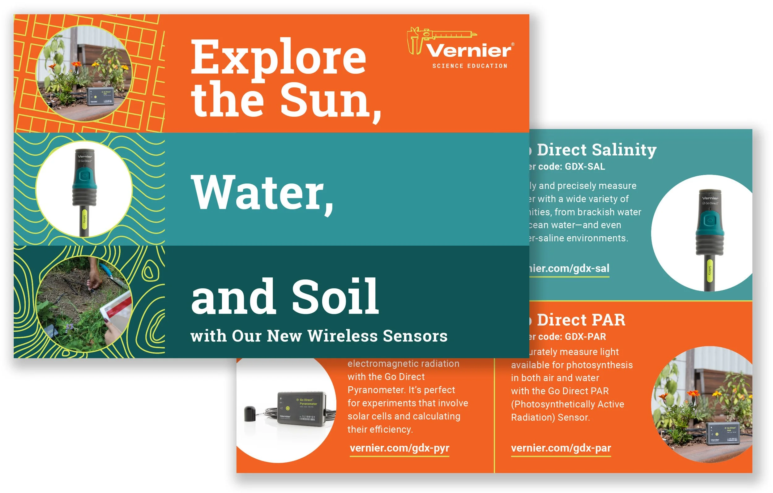
The GLOBE flyer emphasized field data collection, so I built the layout around a large action photo of students using Vernier probeware outdoors. The content focused on easy, waste free measurements and durable tools like Go Direct sensors and LabQuest. A strong visual anchor supported the copy’s promise of reliable fieldwork. I used clear columns to present featured products and kept callouts minimal so educators could focus on what GLOBE investigations require.
Designing these four flyers showed me how a flexible system can support varied content. Each piece served a different audience need, but by using consistent grids, spacing, and typography, I kept them tied to the broader Vernier brand. Small decisions about imagery, structure, and pacing allowed each flyer to communicate its message clearly while staying part of a cohesive family.
B. FINAL DESIGN / VERNIER POSTCARDS
Discovery/Let’s Talk postcards, New Product postcards, and NTSA Trendsetter postcards
The postcards were small by nature, so every decision had to be intentional. The Discovery/Let’s Talk cards supported lead capture at conferences, so the layout needed to stay clean, clear, and quick to fill out. The 2024 New Product postcard introduced the upcoming line, which meant it needed a confident structure and a strong sense of hierarchy. The NTSA Trendsetter cards supported a program that highlighted innovation in teaching, so I shaped them with a more energetic visual tone.
I approached each card as a compact layout exercise. The Discovery/Let’s Talk cards stayed minimal, using the logo, subtle iconography, and an easy to follow form. The New Product postcard relied on a bold typography and hero images with a concise headlines. The Trendsetter cards followed a similar structure but leaned into a livelier rhythm. Careful type sizing and spacing mattered on all three because the cards needed to read comfortably in someone's hand.
These cards had a very practical purpose, so I focused on clarity and ease of use. The front stayed minimal, centering attention on the form fields and the headline. I used clean typography and enough spacing to make the card feel inviting rather than crowded. Since they were used at conferences, I made sure they could be filled out quickly without sacrificing legibility.
The subtle iconography added personality without distracting from the content. It gave the card a bit of warmth, which helped balance the functional nature of the piece.
C. FINAL DESIGN / GEARUP 2025 LANDING PAGES
Showcasing Vernier as a Collaborative Partner in STEM Education
The GEARUP 2025 landing page was designed in WordPress to align with the conference’s bold, energetic visual theme while positioning Vernier as an active partner in advancing STEM learning. The design process focused on adapting the event’s visual language into a responsive digital experience that felt connected to the in-person presence.
The page was designed to echo the excitement of the in-person experience while keeping usability at the forefront. The page emphasized Vernier’s ongoing collaboration with educators and institutions. Each section was carefully structured to highlight partnership stories, shared goals, and resources that support STEM programs.
The layout was simple but effective, using large imagery, clean typography, and focused calls to action to maintain attention and guide exploration. The responsive design worked seamlessly across devices, reinforcing Vernier’s commitment to accessibility and ease of use.
This project served as a reminder of how thoughtful design choices can extend a brand’s message beyond its products, communicating values and relationships that strengthen trust with educators and partners.
OUTCOME
The final designs strengthened Vernier’s digital presence and created a more unified experience across campaigns.
Each campaign site delivered measurable improvements in engagement and visual consistency. Pages were easier to navigate, more responsive on mobile, and better aligned with Vernier’s updated brand direction. Looking back, these projects reminded me how design can bring clarity to complex initiatives and create cohesion across multiple touchpoints. They also reinforced my belief that thoughtful digital design plays a key role in connecting people to ideas, not just products.
Together, these projects strengthened Vernier’s online presence by improving consistency across platforms, elevating the visual storytelling, and creating more intentional user journeys. The work also reinforced the marketing team’s ability to adapt the brand for specific campaigns while maintaining a cohesive look and feel.
REFLECTION
Strengthening my process through collaboration and consistency
These projects reminded me how design evolves through partnership. Each one required adapting to different goals, audiences, and platforms while maintaining a unified brand experience. Balancing creative flexibility with consistency pushed me to think critically about hierarchy, accessibility, and how design choices impact the story being told.
COLLABORATION SHARPENS CLARITY
Working closely with marketing, product, and content teams taught me how clear communication early on saves time and leads to stronger creative decisions.ADAPTABILITY IS ESSENTIAL
Working closely with marketing, product, and content teams taught me how clear communication early on saves time and leads to stronger creative decisions.CONSISTENCY CREATES TRUST
Moving between HubSpot and WordPress systems required adjusting both design and technical approaches to fit each project’s structure without compromising quality.
These experiences deepened my understanding of how structure, clarity, and collaboration shape meaningful design. Each project refined how I approach complex problems and balance creativity with practicality. I came away with a stronger sense of confidence in my process and a clearer perspective on how thoughtful design can connect people with ideas that matter.
POSITION OVERVIEW
I was a graphic designer on a team of four where my daily duties span from Illustration to print collateral creation, from designing and coding websites to designing and testing marketing emails, and just about everything in between.
Each person on my team brings a great wealth of knowledge and experience. As a mid-level to senior designer, my skills and experience are utilized daily. As a very collaborative team, we come together on the work we do. Generally in this team environment, we all get the opportunity to work on a great variety of different projects and there is a lot of communication involved at every step of the project. Though we all have our strengths. I specifically enjoy designing/coding on the web and take great joy in making webpages and landing pages come to life.
FUN FACTS
I joined Vernier after a couple years as a full-time freelancer. This company has given me opportunity to grow my skills and even branch into UX/UI. I've been able to take courses in product design and UX/UI to widen my skillset.
I have also been allowed immense creative freedom, looked upon as the web design and email design expert, and work collaboratively with my team to create impactful and beautiful pieces.
THE FINE DETAILS
TIMELINE: Hired as an in-house designer in 2019
ROLE: Graphic Designer, Web Designer, UX/UI designer
SCOPE: Print Design, Webpage + Website Creation, UX/UI Design, Page layout
TOOLS: Adobe Illustrator, Adobe Photoshop, Adobe InDesign, Prototyping, Wordpress
ASSETS: InDesign Files, Illustration, Wordpress Pages & Design, PNGs
BROCHURES, FLYERS, + POSTCARDS


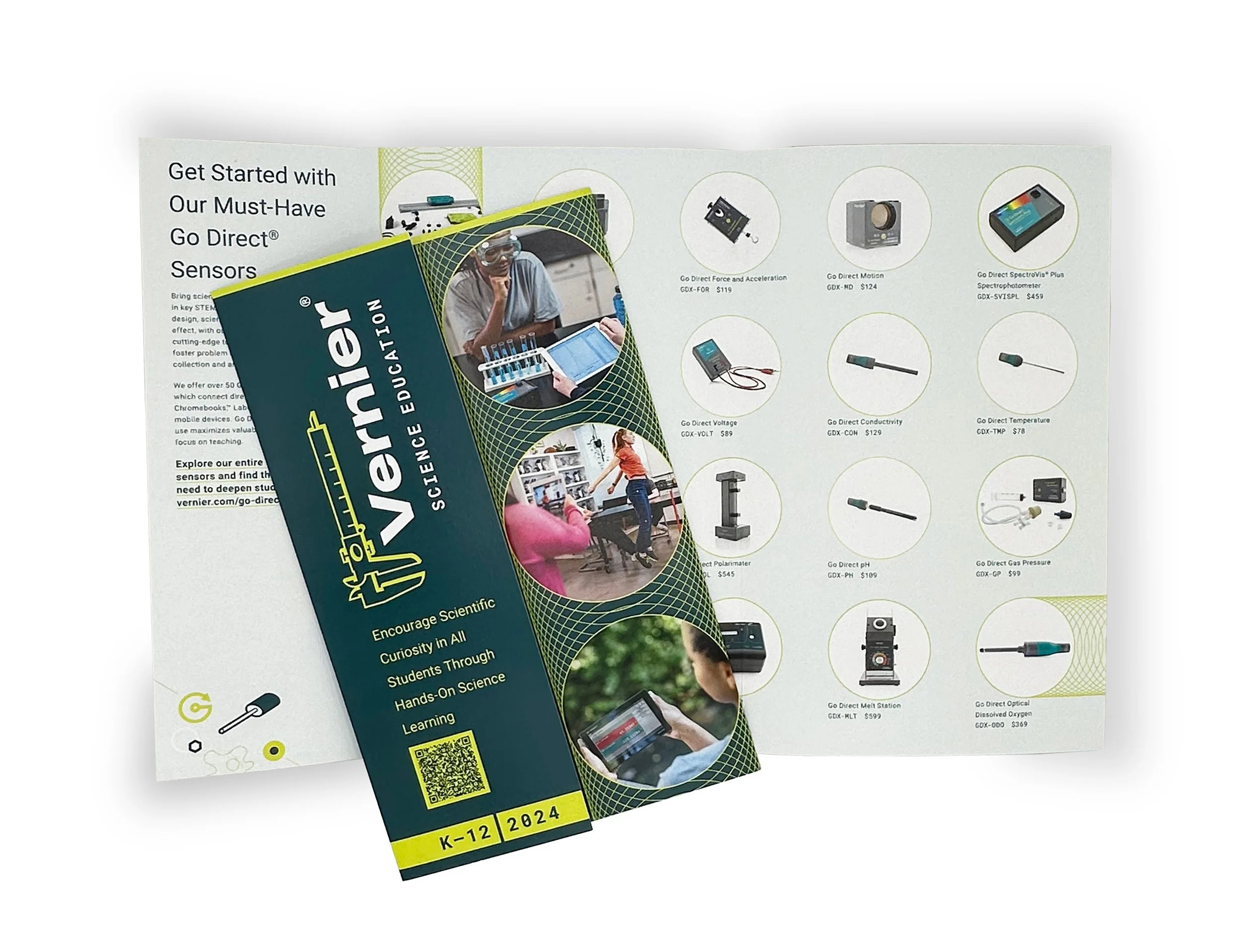
2024 New Product Brochures, K–12 and College
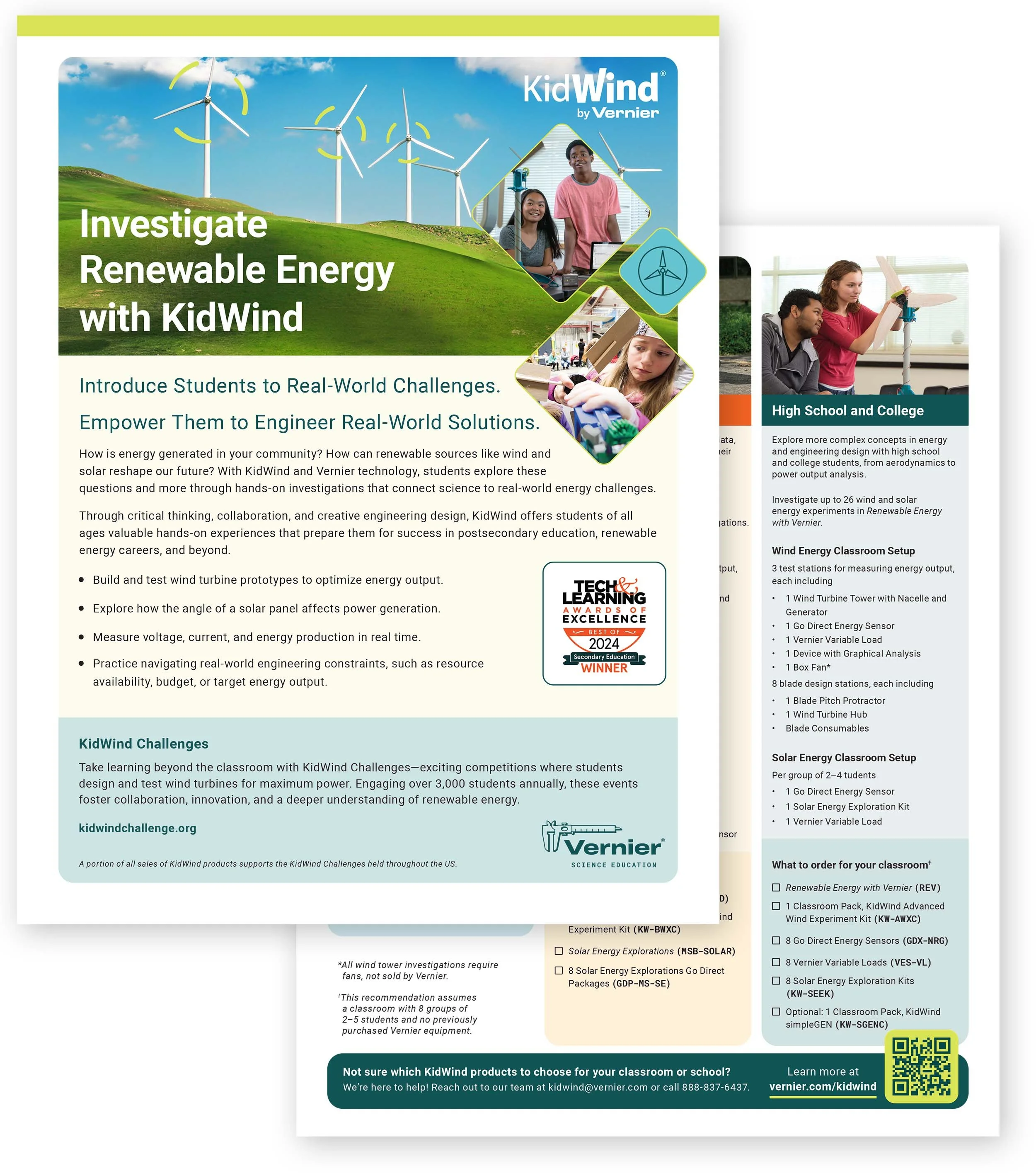
2025 KidWind Flyer

2024 Engineering Flyer

2024 GLOBE Flyer

POSTERS + ILLUSTRATIONS

Dr. Elaine Nam Chemistry Laboratory Sign

STEM Integration to Support 21st Century Skills — Infographic & Downloadable poster
CATALOG


LAB BOOK COVERS


WEBSITE, LANDING PAGES, + UX/UI
WORDPRESS PAGES + HEADERS


WEBSITE, LANDING PAGES, + UX/UI
HUBSPOT | LANDING PAGES


DIGITAL
ADVERTISING


DIGITAL
SOCIAL MEDIA


BRANDING + OTHER PROJECTS
WELLNESS CHALLENGE LOGOS
WELLNESS IS IN OUR DNA
Every year, the Health & Wellness Committee plans and organizes the Summer Wellness Challenge. This challenge is to get employees moving and tracking not only their steps, but other fun activities during an 8-week period. Each year a charity (or two) is also selected and the steps are calculated into donations.
For the past four or so years, I have been tasked with creating an engaging and fun logo/brand for the website where employees enter in their steps and track their exercise. Each year I use the overall theme to create these logos. It's a really fun project and I love participating. It is also an opportunity for me to stretch some design muscle (which includes some branding practice.)
2021 Logo
2021 Main Logo
2021 Banner Logo
2021 Web Favicon
2022 Logo

2022 Main Logo

2022 Banner Logo

2022 Web Favicon
2023 Logo

2023 Main Logo

2023 Banner Logo

2023 Web Favicon
2024 Logo

2024 Main Logo

2024 Banner Logo

2024 Web Favicon
CREDITS
Employer: Vernier Science Education
Graphic Designer: Meghan Lewis
©Vernier Science Education | www.vernier.com