
Bold Branding for a Growing Community: Visual Identity for PDXWIT
A full brand identity system for Portland Women in Technology — a nonprofit built on empowerment, connection, and inclusion. Led the creative from first sketch through final guidelines as a volunteer designer.
Overview
A nonprofit finding its visual voice after a milestone transition.
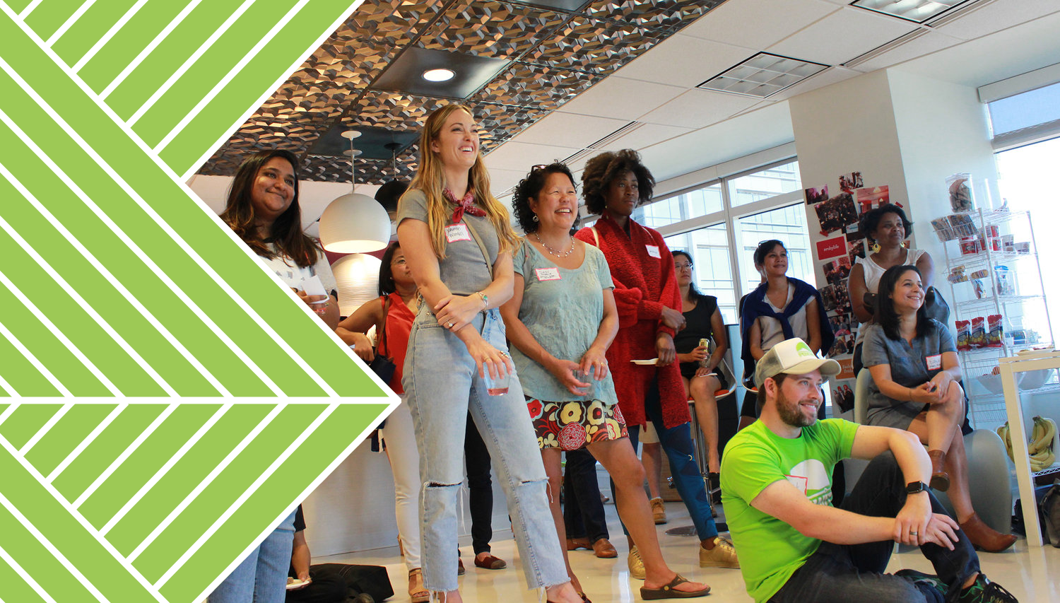
Portland Women in Technology (PDXWIT) is a nonprofit dedicated to building a community that empowers and celebrates women and underrepresented groups in tech. Following their transition to official nonprofit status in Oregon, the board wanted a visual identity that reflected this milestone while better representing the energy, diversity, and momentum of the community they'd built.
I led the creative development of the new brand identity from early concept exploration through final logo design and brand guidelines — as a volunteer. The goal was to create a system that could grow alongside the organization and adapt across print, digital, and event applications.
The Problem
The existing identity no longer reflected who PDXWIT had become.
As PDXWIT grew, its visual identity fell behind. The brand didn't communicate the vibrancy, inclusivity, or credibility the organization had earned. Leadership needed an identity that could represent the mission confidently — to long-time members, first-time attendees, corporate sponsors, and the broader tech community.
Key Decisions
What I decided, and why.
Listen before designing — discovery first
Before sketching anything, I spent time learning about PDXWIT's programs, culture, and how the organization wanted to be perceived. Conversations with leadership helped clarify what the brand needed to do, not just what it needed to look like. That grounding shaped every concept that followed.
Balance confidence with warmth
The brand needed to feel credible to corporate sponsors while remaining approachable to first-time community members. Too corporate and it would feel cold. Too casual and it would lose authority. The visual system — color, type, mark — was calibrated to hold both qualities at once.
Design for flexibility from the start
A community brand lives across dozens of applications — event signage, social graphics, name badges, sponsor decks. I designed the system with flexibility as a core requirement, not an afterthought. Clear rules meant volunteers and internal team members could create new assets without breaking the brand.
The Process
From rough sketches to a refined mark — four rounds of exploration.
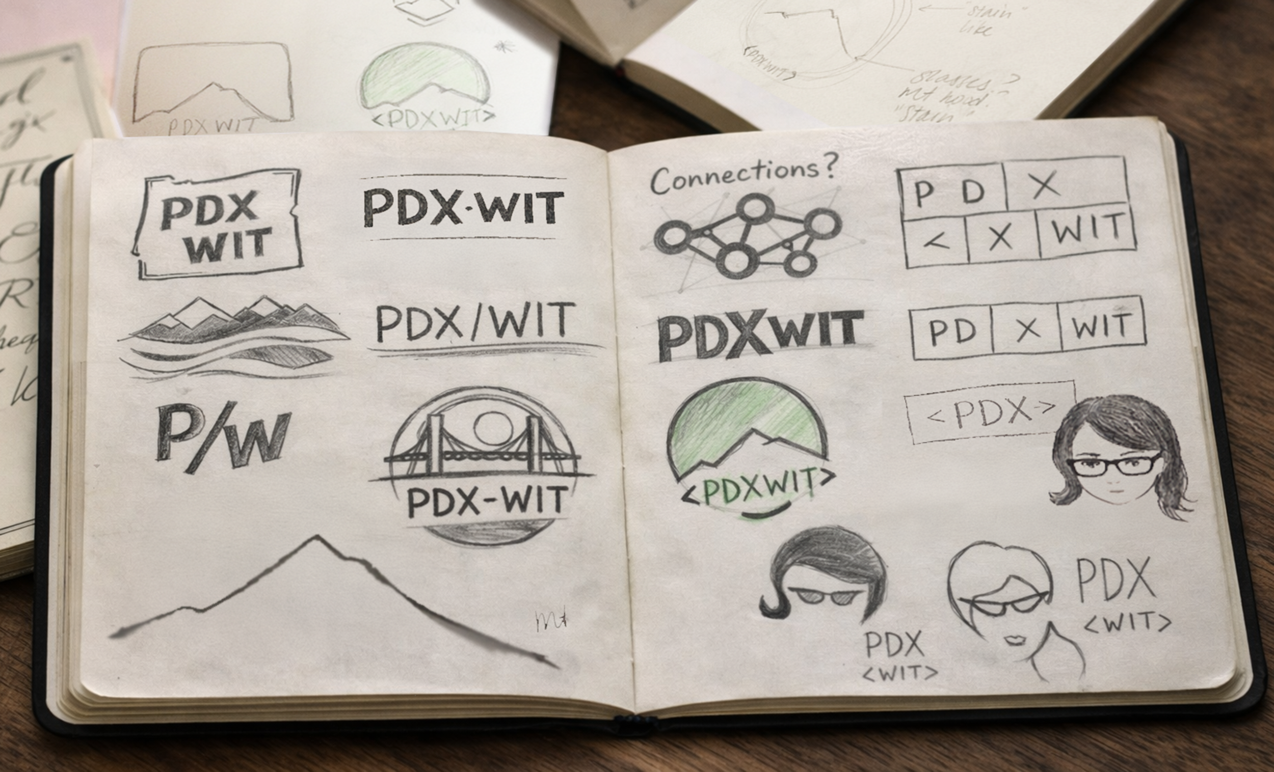
The logo went through multiple concept directions before finding its form. Each round tested different ideas of unity, progress, and connection — boxes, organic stain shapes, and ultimately mountain forms that resonated most strongly with the team.
Initial Sketches
Concept ExplorationEarly sketches to get ideas down before moving to digital — exploring typography, color, and form systems that could reflect the diversity and energy of the PDXWIT network.
Round 1 — Three Directions
Logo ExplorationFirst digital round explored three distinct concept directions — geometric boxes, organic coffee/wine stain shapes, and mountain forms. Each represented a different interpretation of community and place.
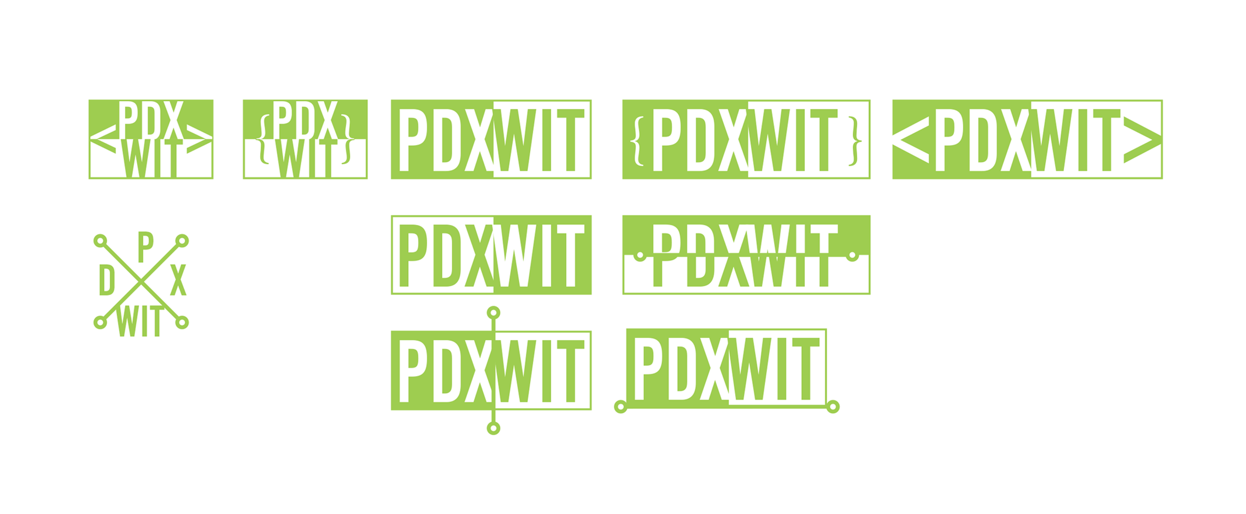
Boxes — geometric, modular
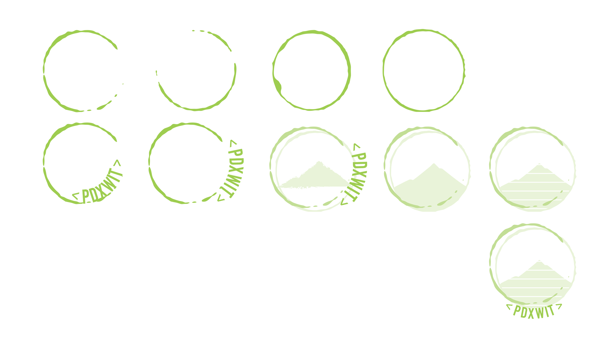
Stain — organic, informal
Mountain — grounded, rooted in place
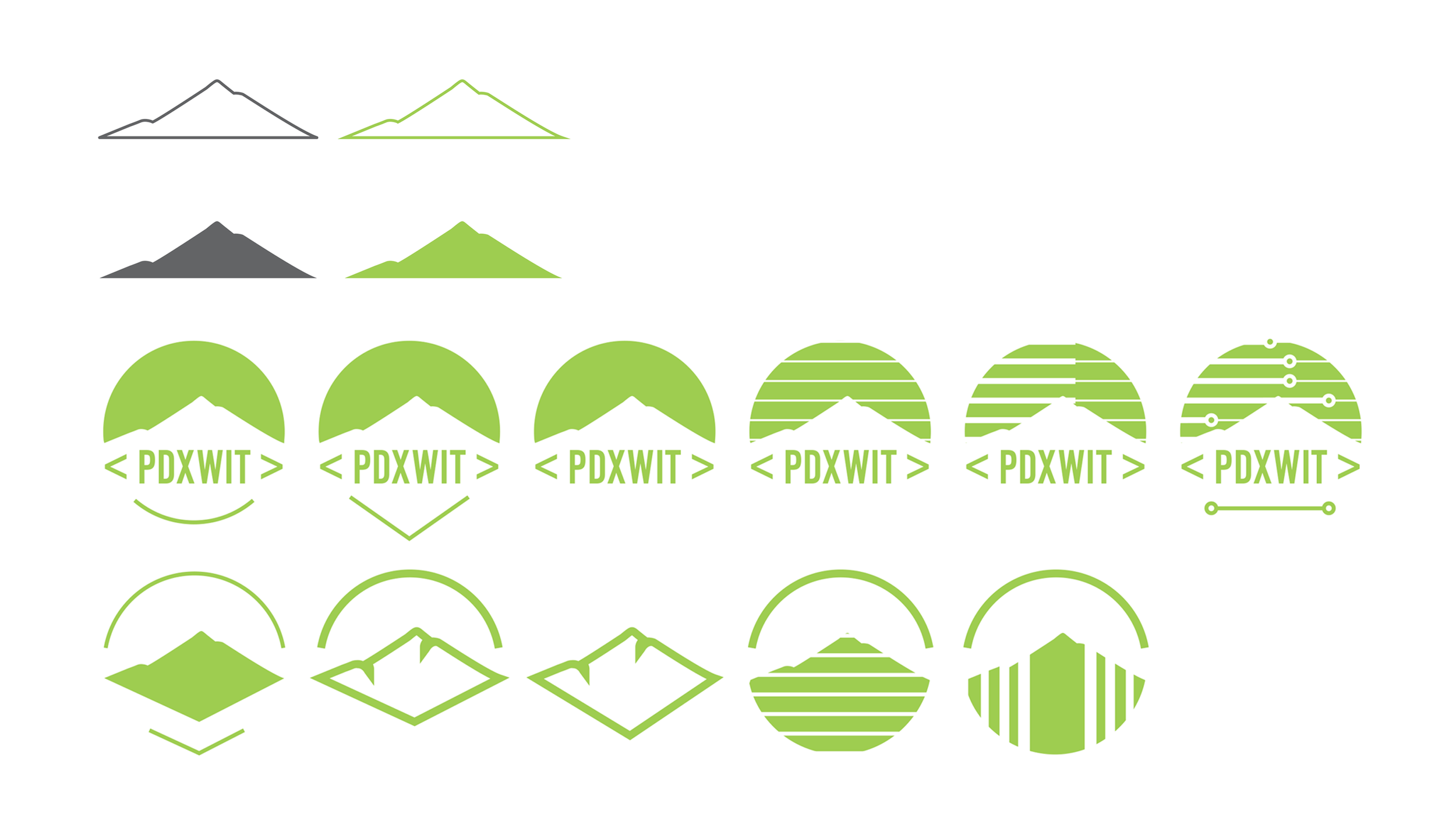
Round 2 — Refining the Mountain
Logo ExplorationThe mountain direction resonated most — grounded in the Pacific Northwest, suggesting strength and forward movement. Round 2 pushed this concept further, refining the form and testing color and typography pairings.
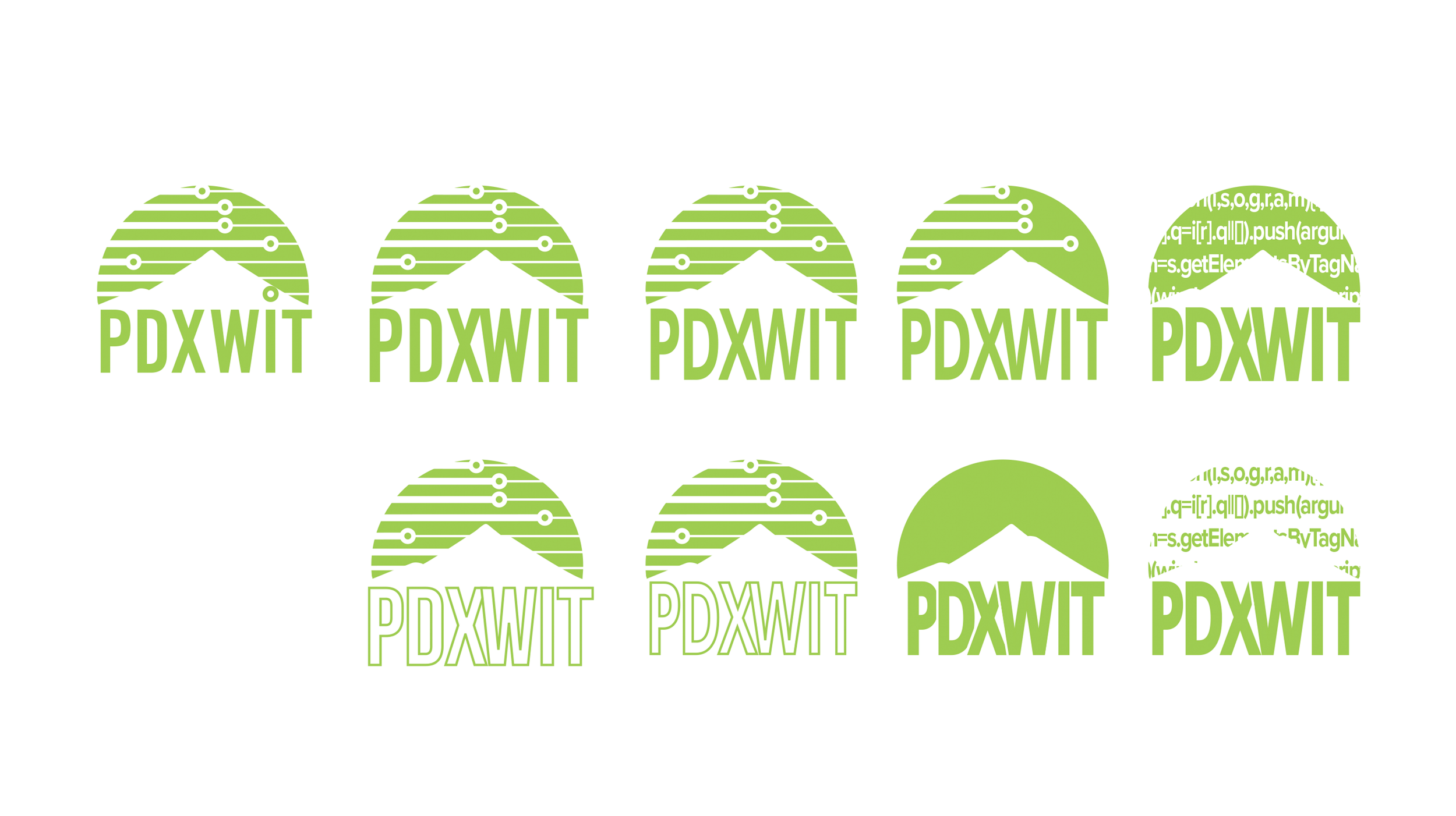
Final Round — Board Presentation
Logo Exploration Board ReviewThe final round produced two polished directions presented to the board — a primary and a secondary mountain concept. Presenting as cards allowed the board to focus on how each felt rather than getting lost in details.
Primary direction — presented to board
Secondary direction — presented to board
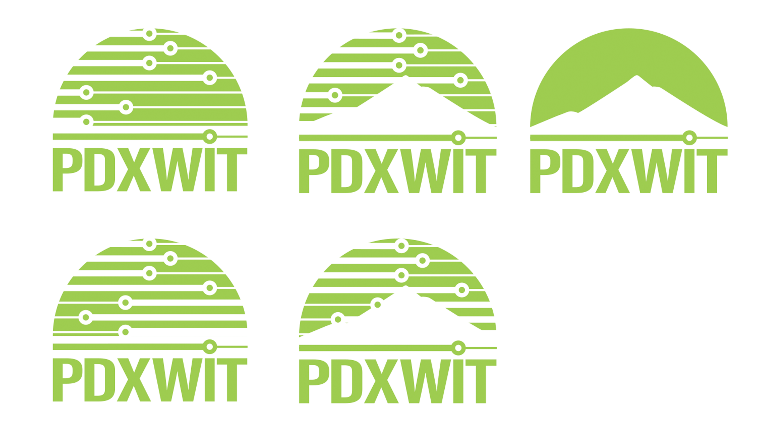
Board Review Cards
Selection ProcessTen logo options were presented to the board as individual cards — including the previous logo for reference. This format kept feedback focused on values and impact rather than minor details. A clear favorite emerged through the discussion.
"Meghan did a wonderful job illustrating the PDXWIT brand and vision in her work."
Adrienne Barnett — Senior Director of Project Management, PDXWITThe Identity
A mark that symbolizes strength, unity, and place.
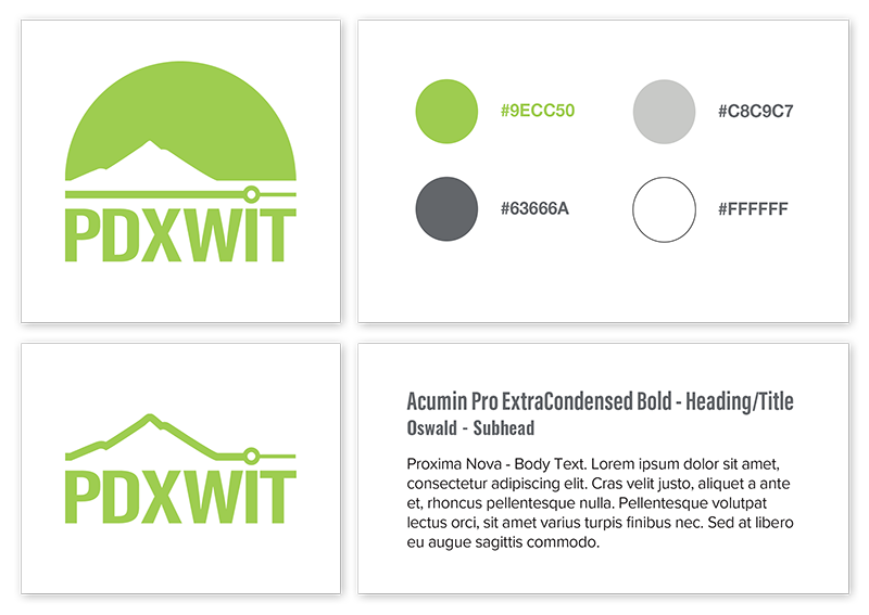
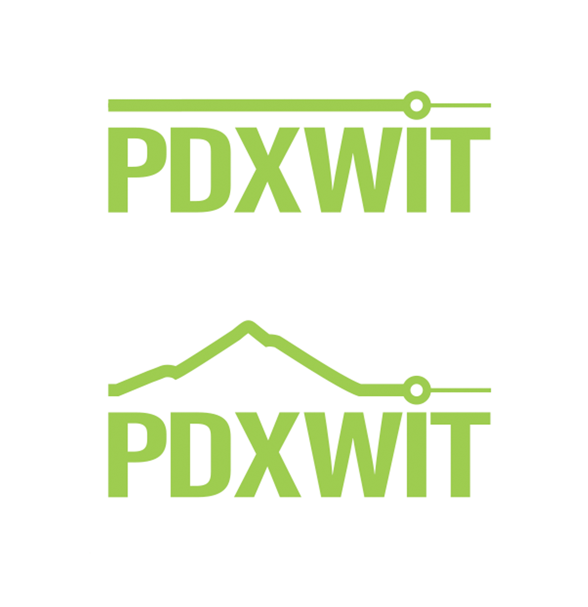
The final logo and visual system brought together everything that resonated through the exploration process — a mountain form rooted in the Pacific Northwest, a vibrant color palette inspired by diversity and optimism, and typography that balanced professionalism with warmth.
Logo System
Final DesignPrimary and secondary logo marks — designed to work independently and together across all applications.
Color & Typography
Final DesignA palette centered on deep purples with bright accent tones — modern, confident, and inclusive. Typography pairs a bold sans-serif headline face with a clean, legible body type that works across print and digital alike.

Fun Facts
Oh what fun!
Outcomes
What this work delivered.
Logo system, color palette, typography, brand guidelines, and sub-brand extensions — all as a volunteer.
Pride, Newbie, Vancouver, Podcast, and event variants — all designed within the system without breaking the primary identity.
The relationship with PDXWIT continued well beyond the project — through event photography, Slack, and a recent reconnection with new leadership to evolve the brand further.
Reflection
What this work taught me.
This project reinforced that strong brand design grows from listening, collaboration, and care. I wasn't just creating a logo — I was helping shape how an organization expressed its values and represented its people. The biggest lesson: simplicity builds confidence. Early explorations were more complex, but refining the mark to its most essential elements made the identity stronger and more adaptable. When design reflects the people behind it, it becomes a tool for trust and connection.