
From Brand to Built — WordPress Website for So Much Magic
A full WordPress website build for a Disneyland planning service — designed to convert visitors into planners through three clear product tiers, a warm brand experience, and integrations that make the business actually run.
A brand-new business needed a digital home — built fast, built right.
So Much Magic launched with a clear mission and a brand identity already in place — the next step was turning that identity into a functioning website that could actually run the business. Planning guides to sell, coaching calls to book, an app waitlist to build, and a blog to drive discovery. The site needed to handle all of it while feeling warm, trustworthy, and unmistakably on-brand from the first pixel to the last.
The process started in Figma — wireframes first, establishing the page architecture and conversion flow before anything visual was decided. Originally the plan included a full prototype phase, but a soft launch deadline of April 15th compressed the timeline. We moved from wireframes directly into the WordPress build, working in Elementor to bring the brand identity into a live, responsive site. The deadline slipped — the site launched on May 13th and 14th, 2026 — but what launched was worth the extra time.
The Problem
A new business with three products, a tight timeline, and a brand that had to translate perfectly to the web.
So Much Magic needed more than a brochure website. It needed a site that could sell digital guides, book coaching calls, capture app waitlist signups, and build an email list — all while feeling like a cohesive, trustworthy brand experience for families who were about to spend real money on a trip. The architecture had to make all three product tiers immediately clear and guide visitors toward the right path for their planning style.
The choices that shaped the build — including one we had to let go.
Starting in Figma before touching WordPress.
Even with a compressed timeline, the decision to wireframe first in Figma before opening Elementor was the right one. Wireframes established the page architecture, the conversion flow, and the hierarchy of each section before any visual decisions were made. Moving from wireframes directly into the live build — skipping the prototype phase — was a concession to the timeline, but having the structural thinking done first meant the build moved faster and with more confidence than it would have otherwise.
A beautiful concept we built — and chose not to ship.
The original homepage concept was an ambitious scrolling star chart — a visual journey that followed a visitor through a full Disneyland day, from rope drop through the afternoon to the evening fireworks. It wove through the page with specific stops along the way, combining storytelling and product discovery in a single continuous experience. We built it. It was genuinely beautiful. But it was also complex, time-consuming to maintain, and too slow to ship against the launch timeline. We held onto it — the work was too good to discard entirely — but opted for something more concise for launch: a cleaner hero with a few parallax stops that captured the same sense of movement without the production overhead.
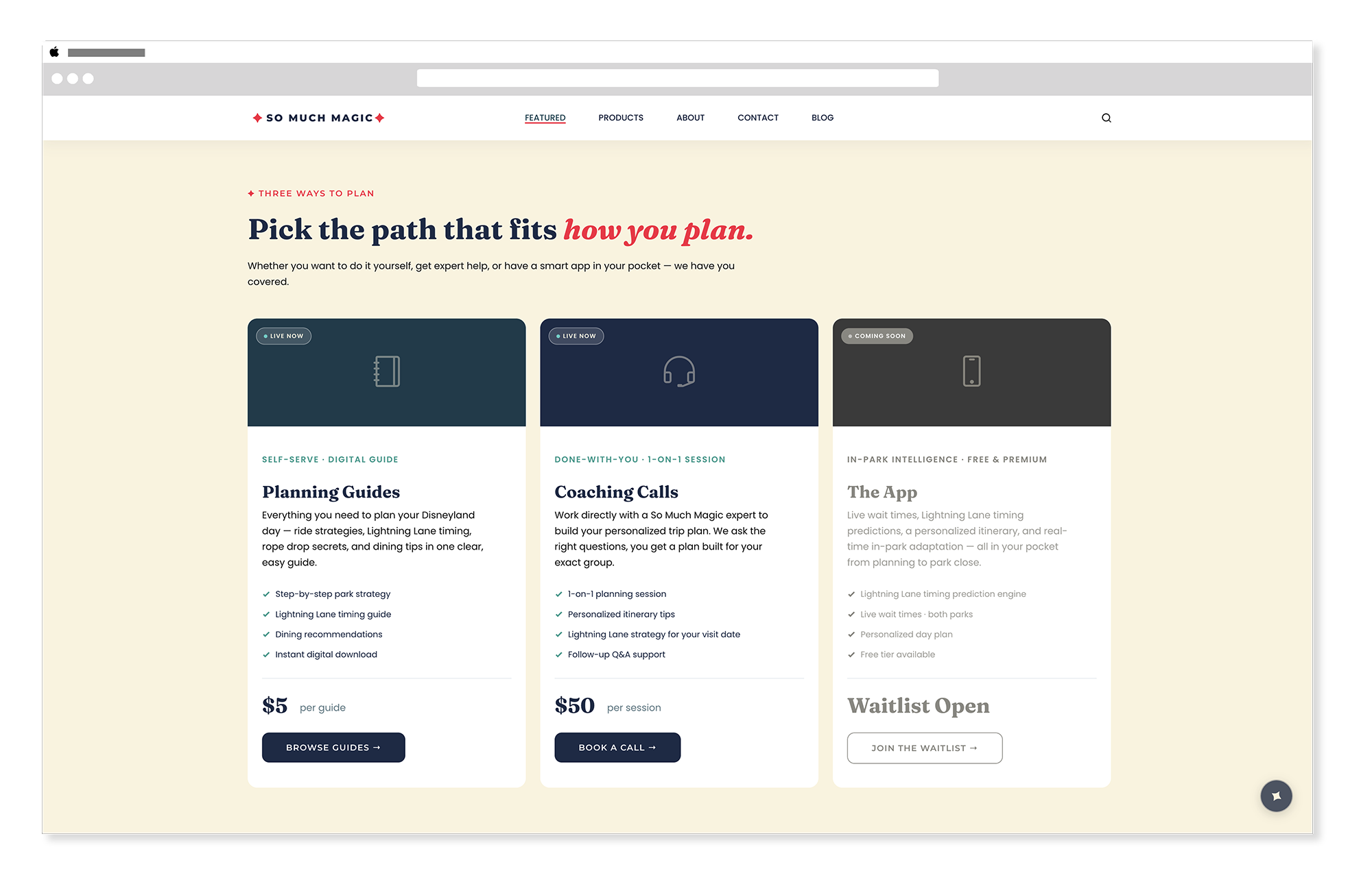
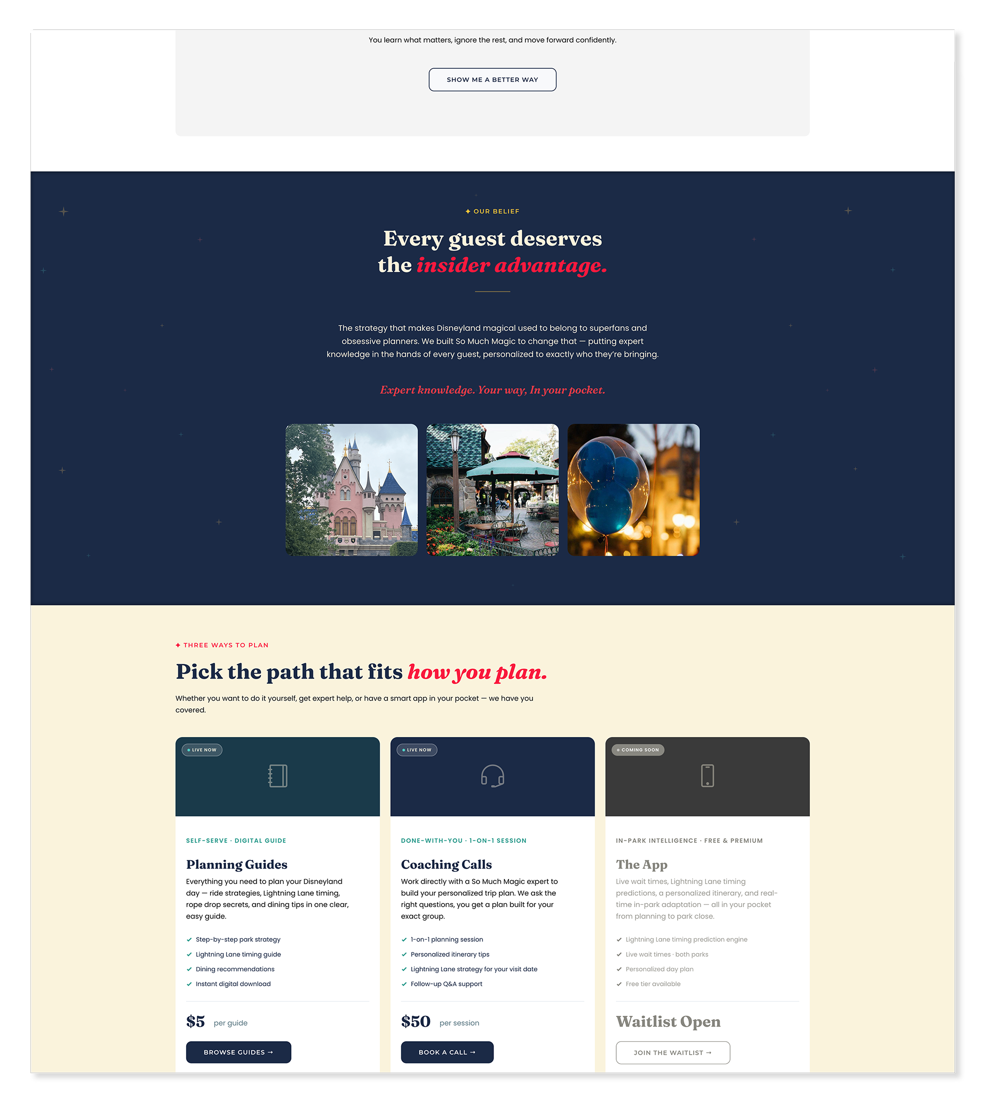
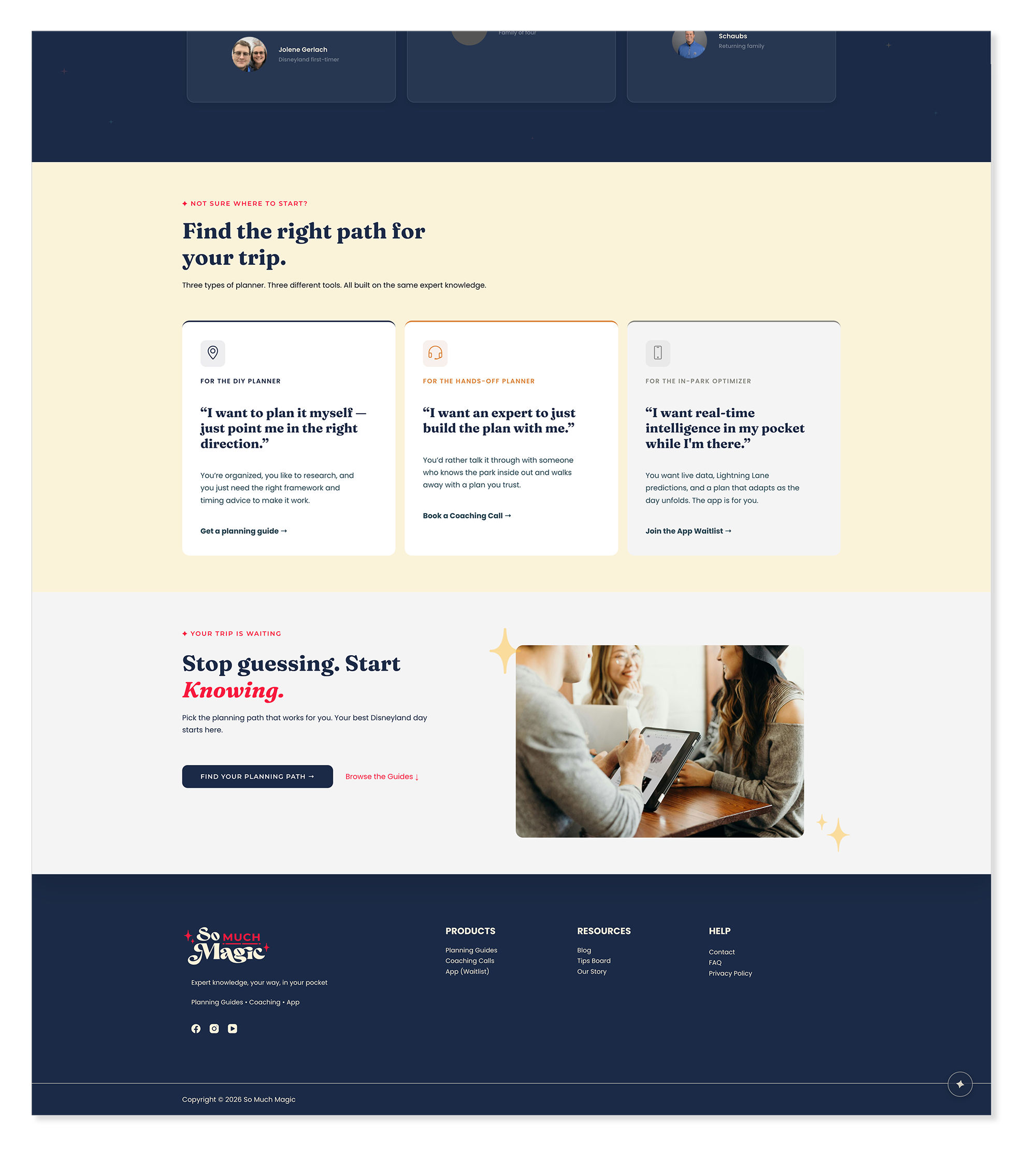
Organizing the homepage around the visitor's planning style — not the products.
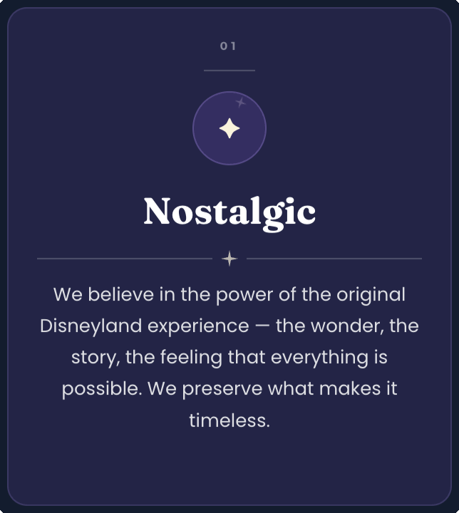
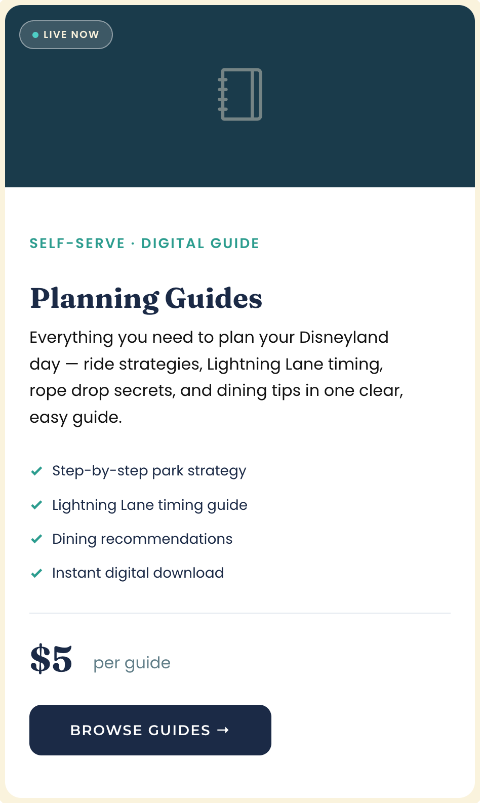
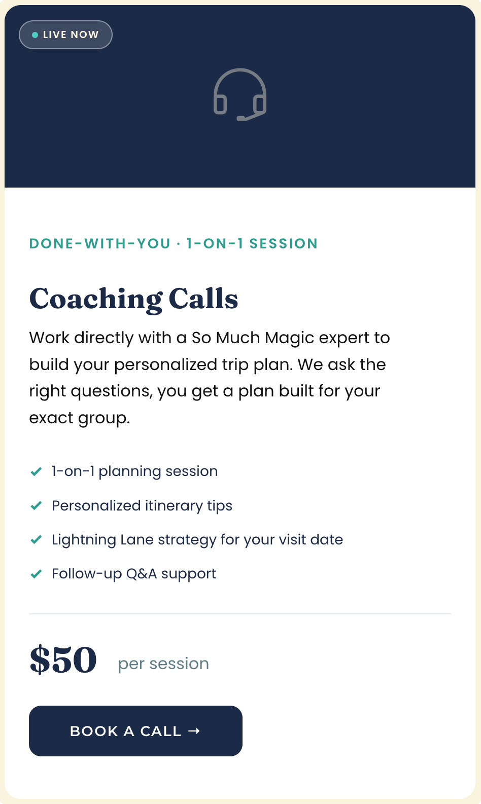
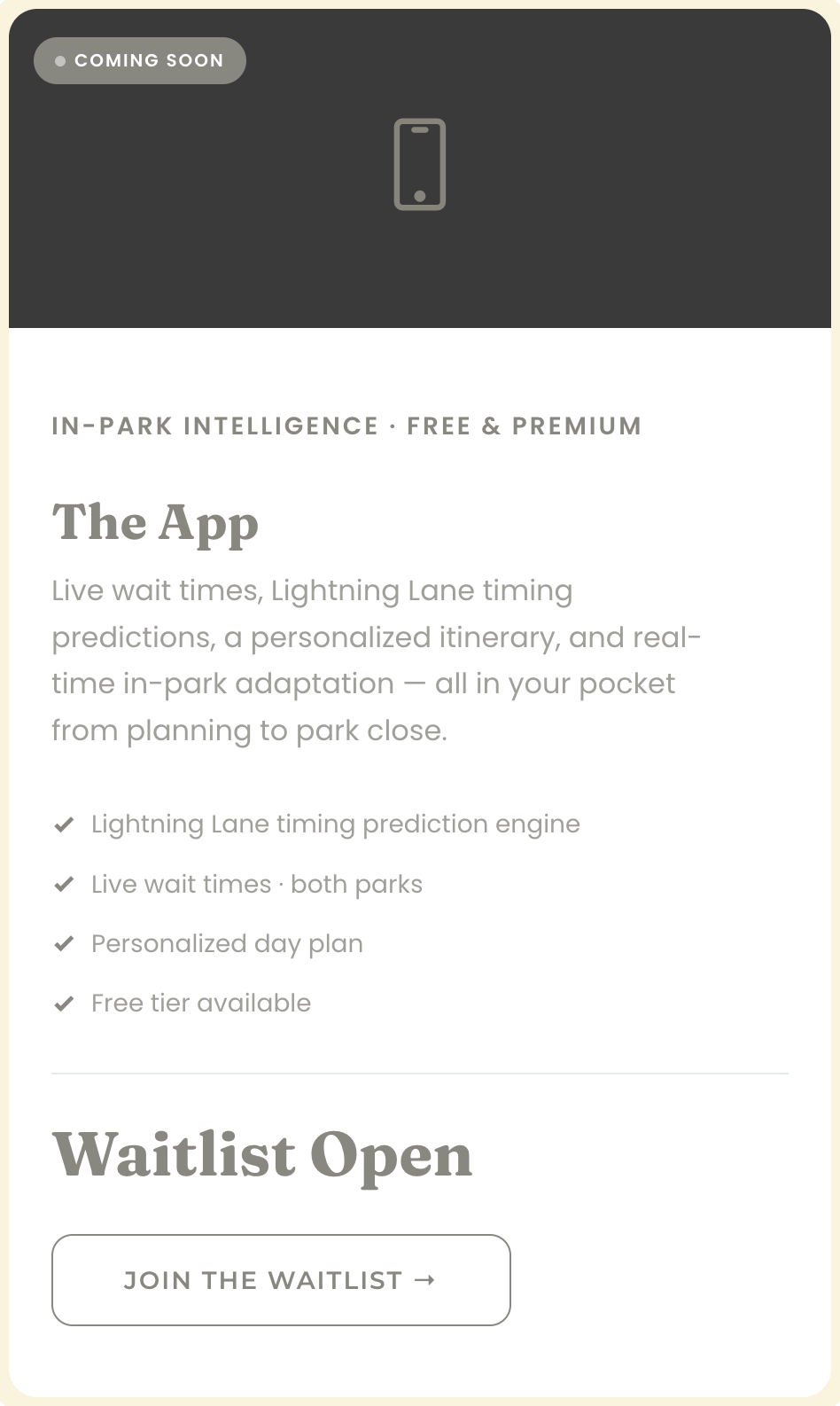
So Much Magic has three products — planning guides, coaching calls, and an app waitlist. The temptation was to lead with the products. The better decision was to lead with the visitor's planning style and let the product follow naturally from that. The DIY planner, the hands-off planner, and the in-park optimizer each have a distinct mindset and a distinct need. Framing the product tiers around those mindsets rather than the features made the conversion path feel like a recommendation rather than a sales pitch.
Treating the website as a direct extension of the brand identity.
The branding work came first — and the website had to honor it completely. Every color, every type decision, every spacing choice was evaluated against the brand guidelines established in the identity phase. Midnight Blue hero sections, Cream background sections, Golden Yellow and Magic Pink as accent energy, Fraunces for headings and Poppins for body. The star and sparkle motifs from the brand identity appear throughout the site as supporting elements. The result is a site that feels like the brand — not a site that was built and then branded afterward.
Building a site that could actually run the business from day one.
A beautiful site that can't process a transaction or capture an email address is just a brochure. The integration architecture — Square for guide sales, Kit for coaching calls and email capture, Substack for the blog — was planned from the wireframe phase to ensure every product tier had a working backend from launch day. The app waitlist feeds directly into Kit as well, building the list for the eventual app launch. Every visitor action has somewhere to go.
From Figma wireframes to a live, conversion-ready WordPress site.
The build moved from Figma wireframes directly into Elementor — a compressed process that required every decision to be made with confidence. The brand identity was already established, the architecture was already mapped, and the integrations were already planned. What remained was building something that honored all of it and launched ready to work.
Wireframes
FigmaWireframes established the homepage architecture, the product tier hierarchy, the conversion flow, and the page structure before any visual decisions were made in Elementor. The Figma file also includes inspiration screenshots that captured the visual direction before the build began — after the homepage wireframe was complete, we moved directly into WordPress rather than prototyping the full site. Working in Figma first gave the build a clear blueprint even without a full prototype phase.
Brand Foundation
Adobe Illustrator Adobe PhotoshopThe website build didn't start from scratch visually — it started from a complete brand identity that was already fully realized. The logo system, color palette, and type system established in the branding phase became the design system for every decision made in Elementor. Midnight Blue and Deep Teal for hero and feature sections, Cream for content sections, Magic Pink and Golden Yellow as accent energy throughout, Fraunces for headings, Poppins for body, and Montserrat for interactive elements. The brand guided every pixel. For the full story on how the identity was built, see the So Much Magic Branding case study →
Midnight Blue
#1b2a46
Deep Teal
#194755
Golden Yellow
#ffc438
Magic Pink
#f9183e
Cream
#fbf2da
The Star Chart — A Concept Worth Keeping
Elementor Adobe IllustratorThe original homepage concept was a scrolling star chart — a visual journey that followed a visitor through a full Disneyland day from rope drop to evening fireworks, weaving through the page with specific stops along the way. It was ambitious, beautiful, and genuinely exciting to build. It was also too complex to ship against the launch timeline. The concept is preserved — the right version of it may yet find its way into the site as it grows.
So Much Magic — Star Chart
So Much Magic — Star Chart - detail
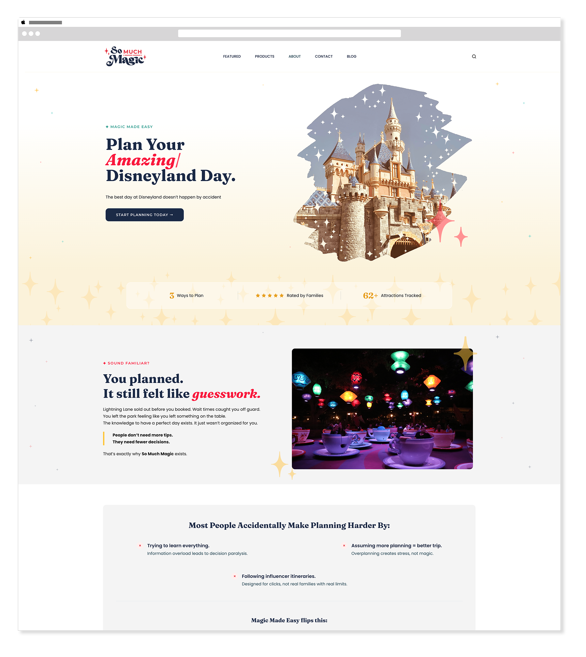
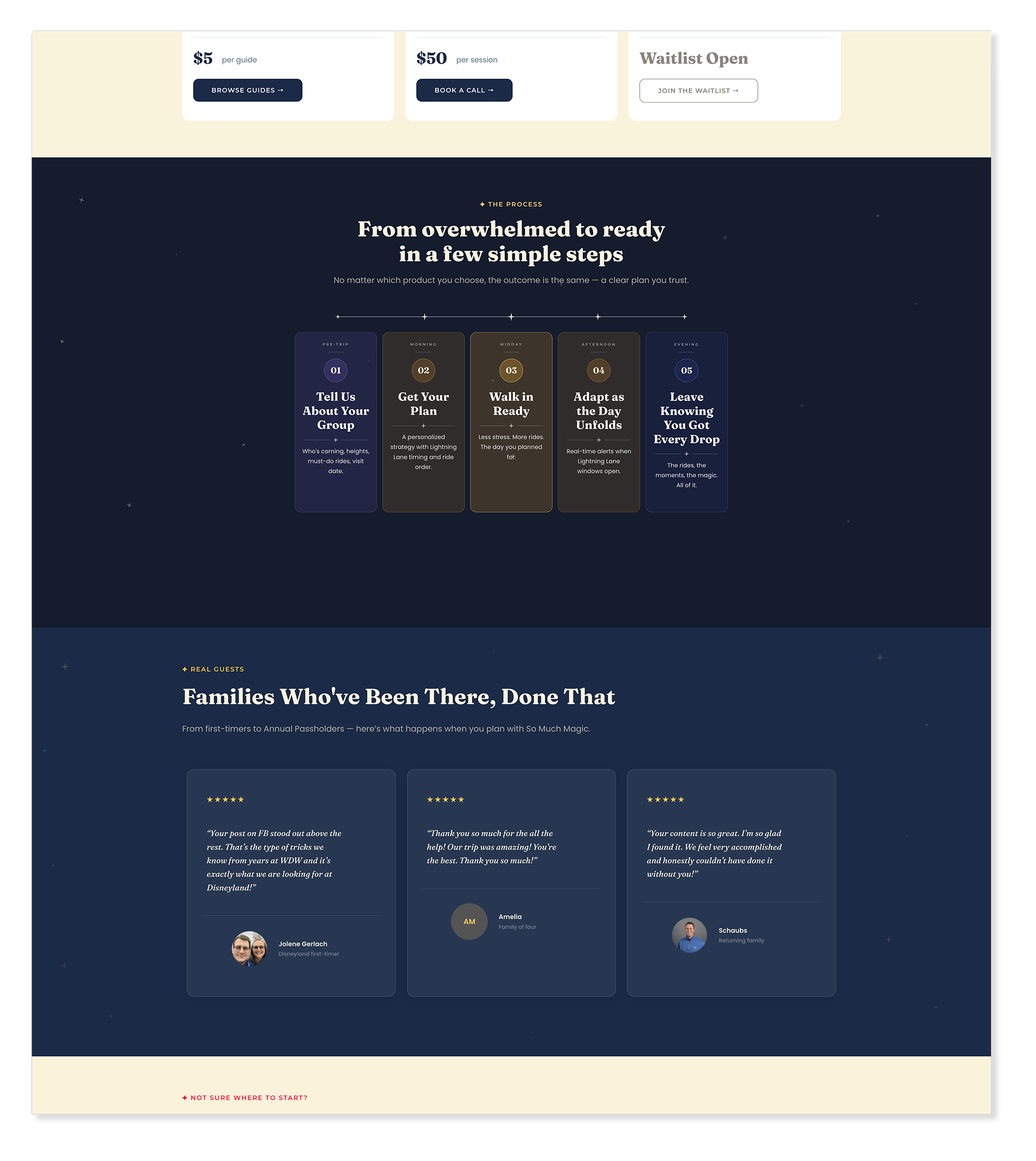
Homepage
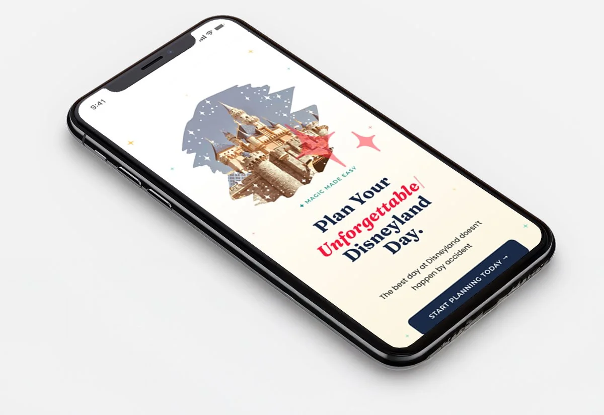
WordPress ElementorThe homepage leads with a clear value proposition — the best day at Disneyland doesn't happen by accident — and moves visitors quickly toward the three planning paths. A warm Midnight Blue hero, parallax stops that create a sense of movement and journey, and a clean product tier section that frames each option around the visitor's planning style rather than the product's features.
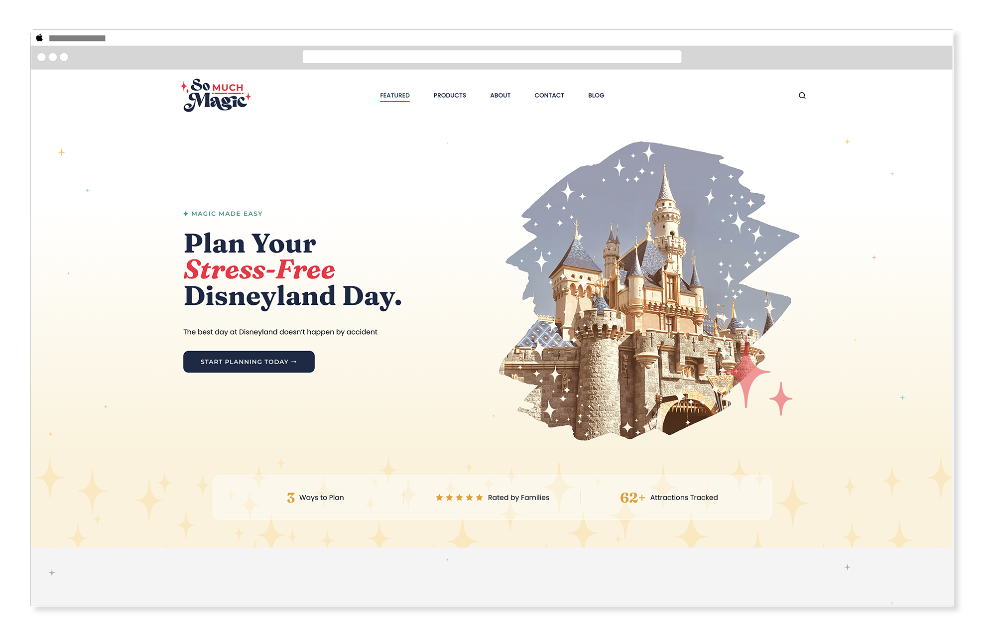
So Much Magic — Homepage
So Much Magic — Homepage Product Cards
Interior Pages
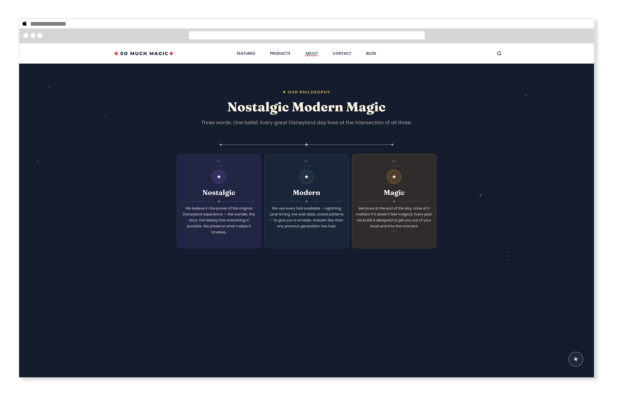
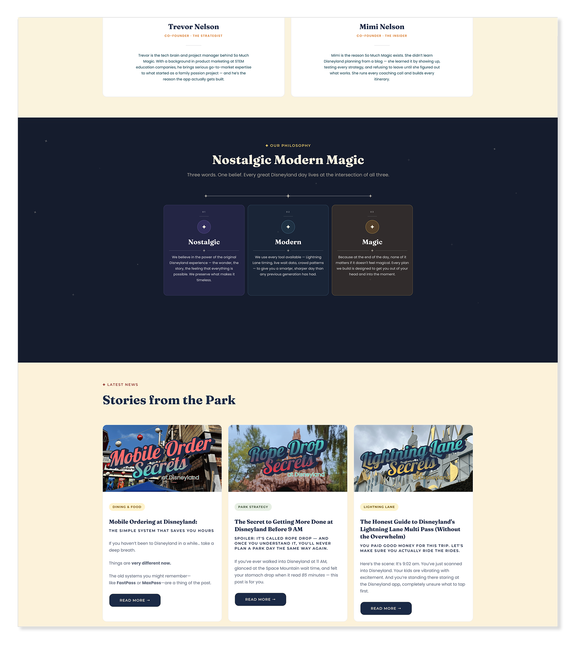
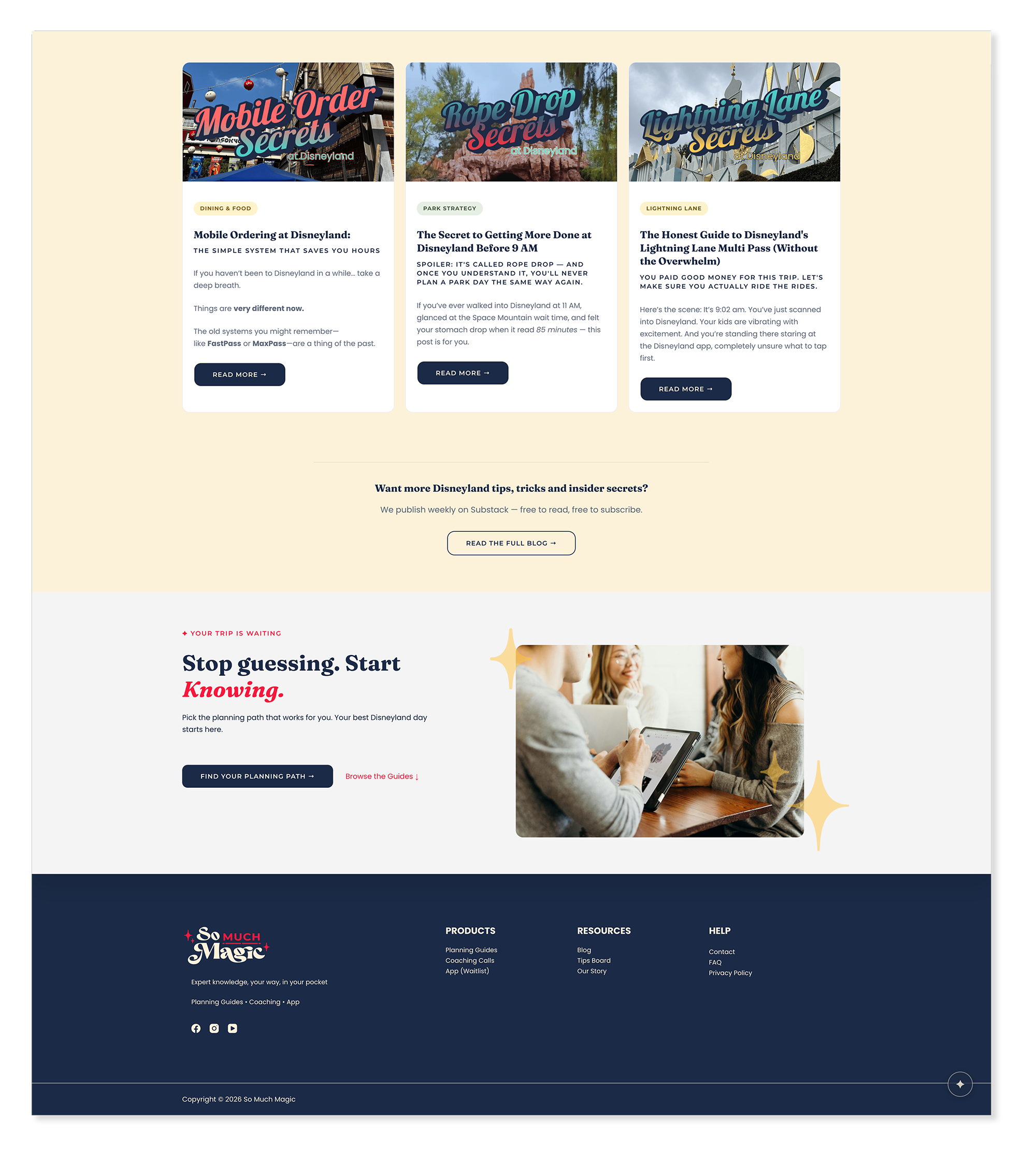
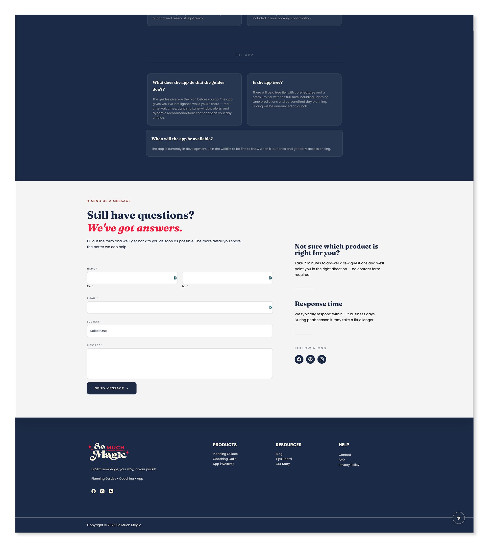
WordPress ElementorHome, About, and Contact pages carry the same brand consistency as the homepage — warm, clear, and conversion-aware throughout. The blog routes to Substack for the full reading experience while keeping the brand presence strong on the listing page.
So Much Magic — Homepage
So Much Magic — About
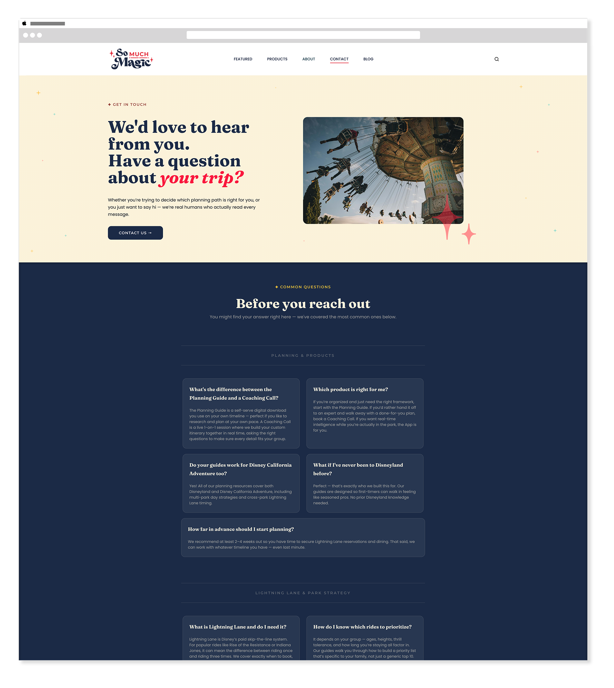
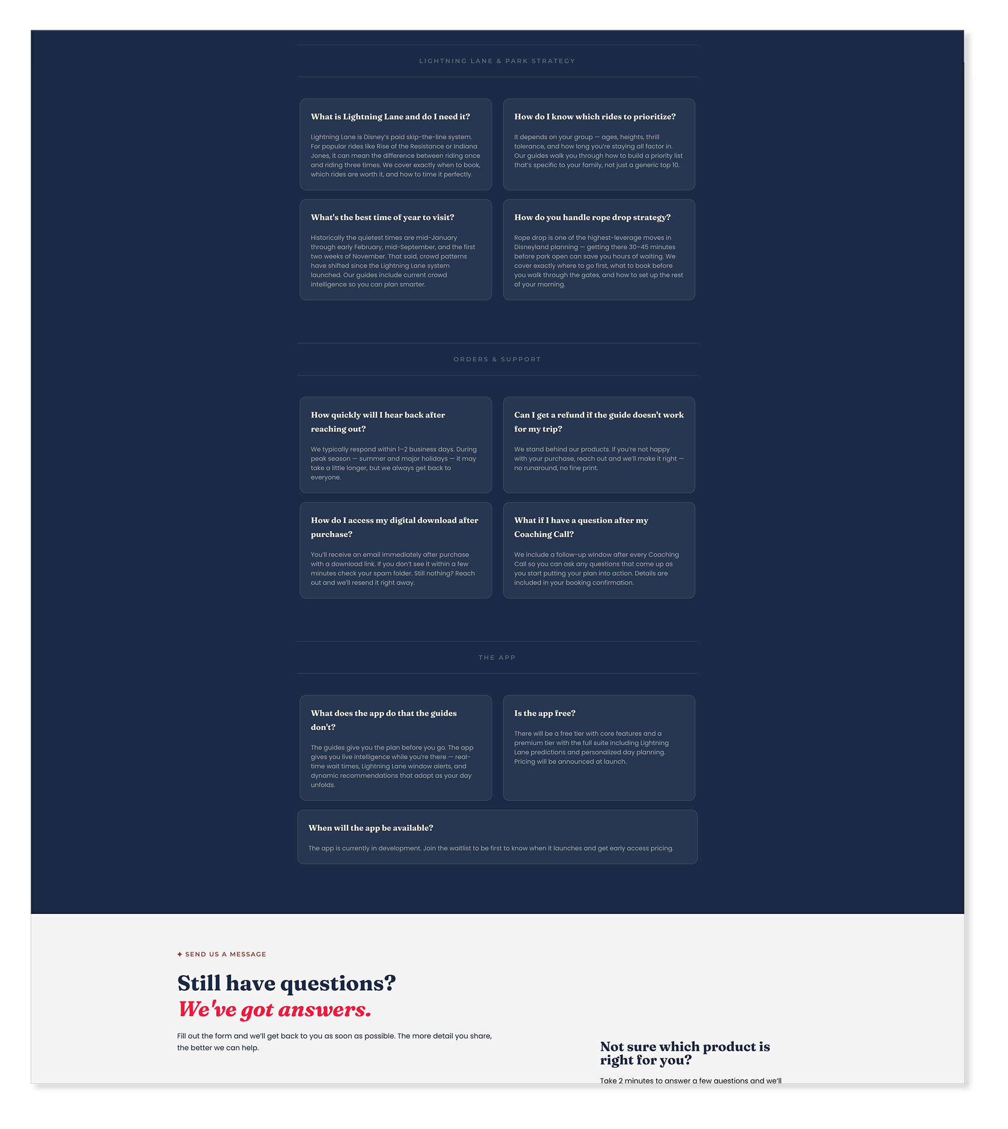
So Much Magic — FAQ + Contact Us
Integrations
Square Kit SubstackThree integrations make the business run — Square handles guide sales, Kit manages coaching call bookings, email capture, and app waitlist signups, and Substack powers the blog. Every visitor action has a destination, and every product tier has a functioning backend from day one.
"Meghan's work reminded me of something we all know but don’t always practice: The best outcomes happen when you collaborate with experts."
Trevor Nelson — Founder, So Much MagicDark, rich, and unmistakably magical — four moments worth looking at closely.
The So Much Magic site leans into deep, rich color — Midnight Blue, Deep Teal, and Rich Black anchor the most impactful sections. The challenge was making those dark tones feel warm, whimsical, and inviting rather than cold or heavy. The answer was in the details: star motifs, warm accent colors, editorial typography, and photography that radiates the joy of being in the park.
Homepage Parallax — The Journey Begins
ElementorThe homepage parallax section creates a sense of forward motion — a visual cue that visiting Disneyland is a journey, not just a transaction. Park photography moves at a different speed than the foreground content as the visitor scrolls, giving the section depth and energy. Golden Yellow star motifs float through the dark background, carrying the brand's sense of wonder without competing with the content.
So Much Magic — Updated Homepage Parallax
So Much Magic — Updated Homepage Parallax - detail
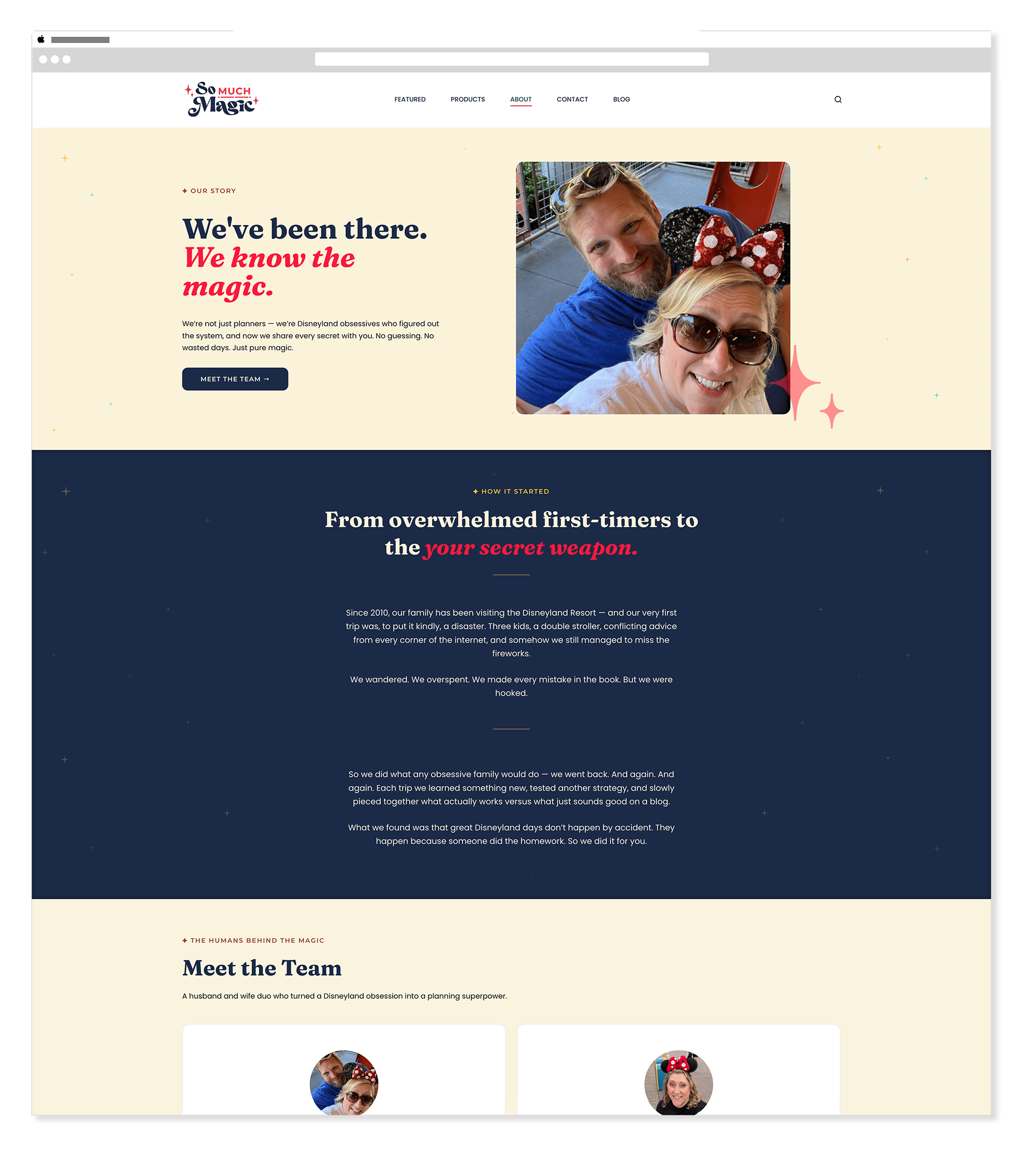
About Page Parallax — The Story Behind the Magic
ElementorThe about page uses parallax differently — slower, more personal, and anchored in the human story behind So Much Magic. Where the homepage parallax creates momentum and excitement, the about page parallax creates intimacy. Same technique, completely different emotional register. The dark background lets Trevor and Mimi's story breathe without distraction.
So Much Magic — About Page Parallax
So Much Magic — About Page Parallax - detail
Product Cards — Dark but Inviting
ElementorThe three product cards sit in one of the most important sections on the site — the moment a visitor decides which planning path is right for them. A dark background anchors the section with weight and importance, while Magic Pink and Golden Yellow accents give each card its own energy. Fraunces headings and clear pricing make the decision feel easy rather than pressured. The cards feel premium without feeling cold.
So Much Magic — Homepage Product Cards
So Much Magic — Planning Card - detail
So Much Magic — Coaching Card - detail
So Much Magic — Waitlist Card - detail
Testimonials — Real Families, Real Magic
ElementorThe testimonials section is one of the warmest moments on the site — real words from real families who had better days at the park because of So Much Magic. A cream background softens the section after the intensity of the product cards, and the typography gives each quote the space to breathe and land. Trust is built in moments like these, and the design needed to get out of the way and let the words do the work.
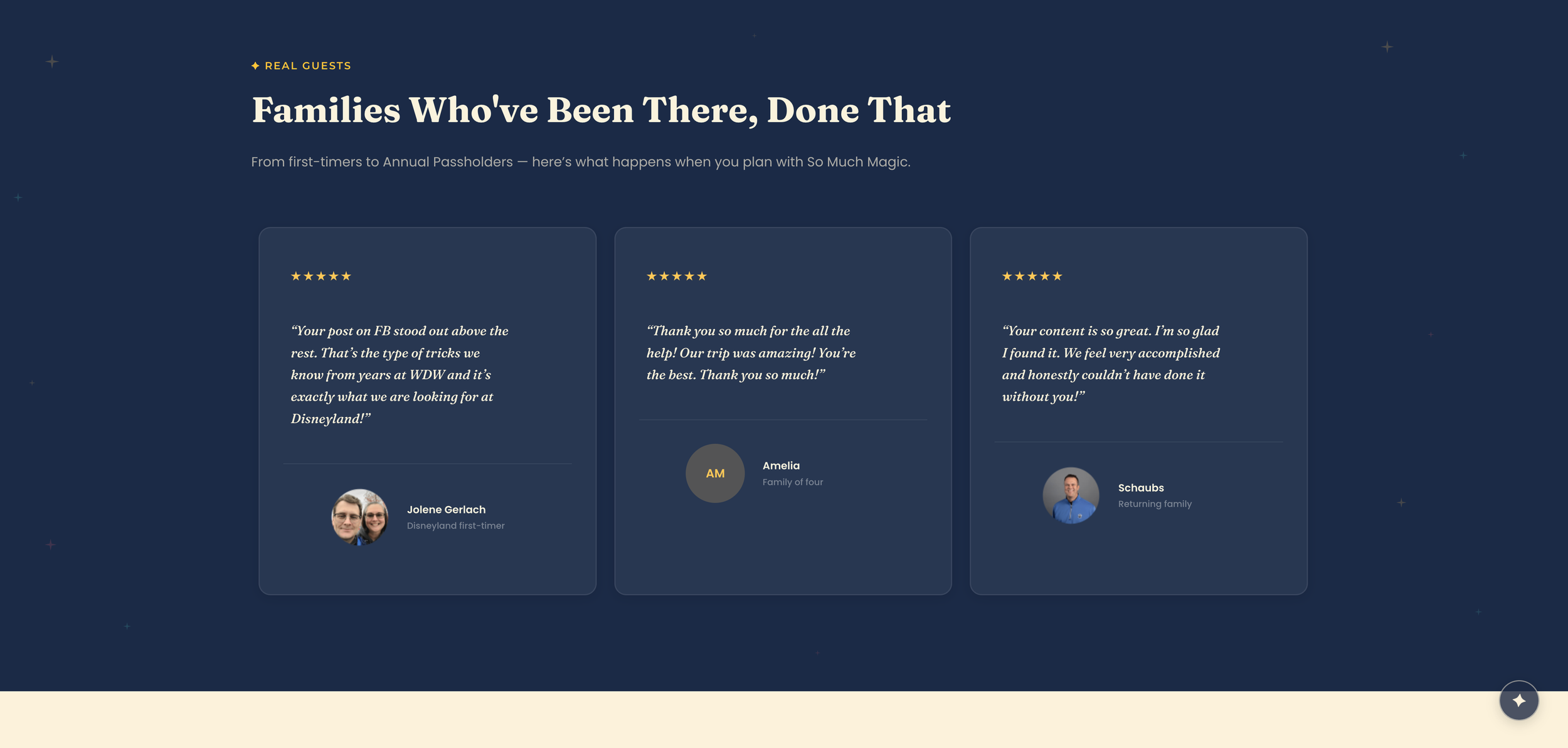
So Much Magic — Testimonials
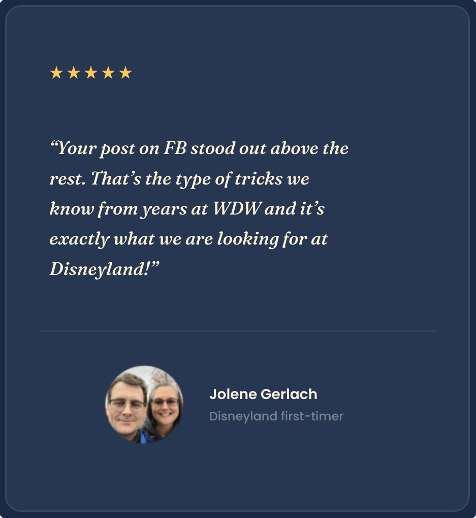
So Much Magic — Testimonials - detail
Three pages, fully realized — desktop and mobile.
Every page was designed to serve a specific role in the visitor's journey — from discovery and conversion on the homepage, to story and trust on the about page, to action on the contact page. Each one holds up at every screen size.
The homepage in full — hero to footer. Every section serves a specific conversion purpose while staying warm, whimsical, and on-brand throughout. The full scroll view shows how the dark and light sections alternate to create rhythm and visual breathing room across the page.
The about page tells Trevor and Mimi's story — why they built So Much Magic, what makes them qualified to guide families through the park, and why the best day at Disneyland starts with the right plan. The parallax section anchors the emotional core of the page, and the warm Cream sections give the personal content room to breathe.
The contact page keeps the brand energy high while giving visitors a clear, frictionless way to reach Trevor and Mimi. Simple, direct, and on-brand — everything a contact page should be.
Responsive Design
Mobile ElementorEvery page was designed mobile-first — the majority of visitors planning a Disneyland trip will be doing it from their phone. The brand's warmth, the product tier clarity, and the conversion flow all hold up at every screen size.

Launched, live, and ready to grow.
Homepage, About, and Contact — each designed to serve a specific role in the visitor's journey from discovery to conversion.
Square for guide sales, Kit for coaching calls and email capture, and Substack for the blog — every product tier functional from day one.
The site was built to scale — WooCommerce integration planned as the shop grows, and the app launch on the horizon as the next chapter of the So Much Magic story.
A compressed timeline, a scrapped concept, and a launch worth celebrating.
So Much Magic was one of the most genuinely exciting projects I've worked on in a long time. Trevor and Mimi came in with a clear vision, real enthusiasm, and the kind of collaborative energy that makes the work feel like a shared project rather than a client engagement. From the branding work through the wireframes and into the build, every phase felt like we were building something that mattered — because it does. Families are going to have better days at Disneyland because of this.
The star chart concept was a genuine creative highlight — ambitious, beautiful, and worth the time we put into it even though it didn't make the launch. Knowing when to set something aside rather than delay a launch is a real skill, and the decision to ship something clean and considered instead of something complex and unfinished was the right one. The star chart isn't gone. It's waiting for the right moment.
The soft deadline of April 15th slipped to May 13th and 14th — but what launched was worth the extra time. The site is live, the integrations are working, and the business is open. That's what a launch is supposed to feel like. The app is next, and when that case study gets written, this one will be the foundation it builds on.