
Does This App Make Wellness Feel Human? A Usability Study of the Ryse Health App
A structured usability study of Ryse — a community-focused fitness app — exploring how first-time users navigate the onboarding experience, where friction occurs, and what design changes could make wellness feel more connected and less clinical.

Overview
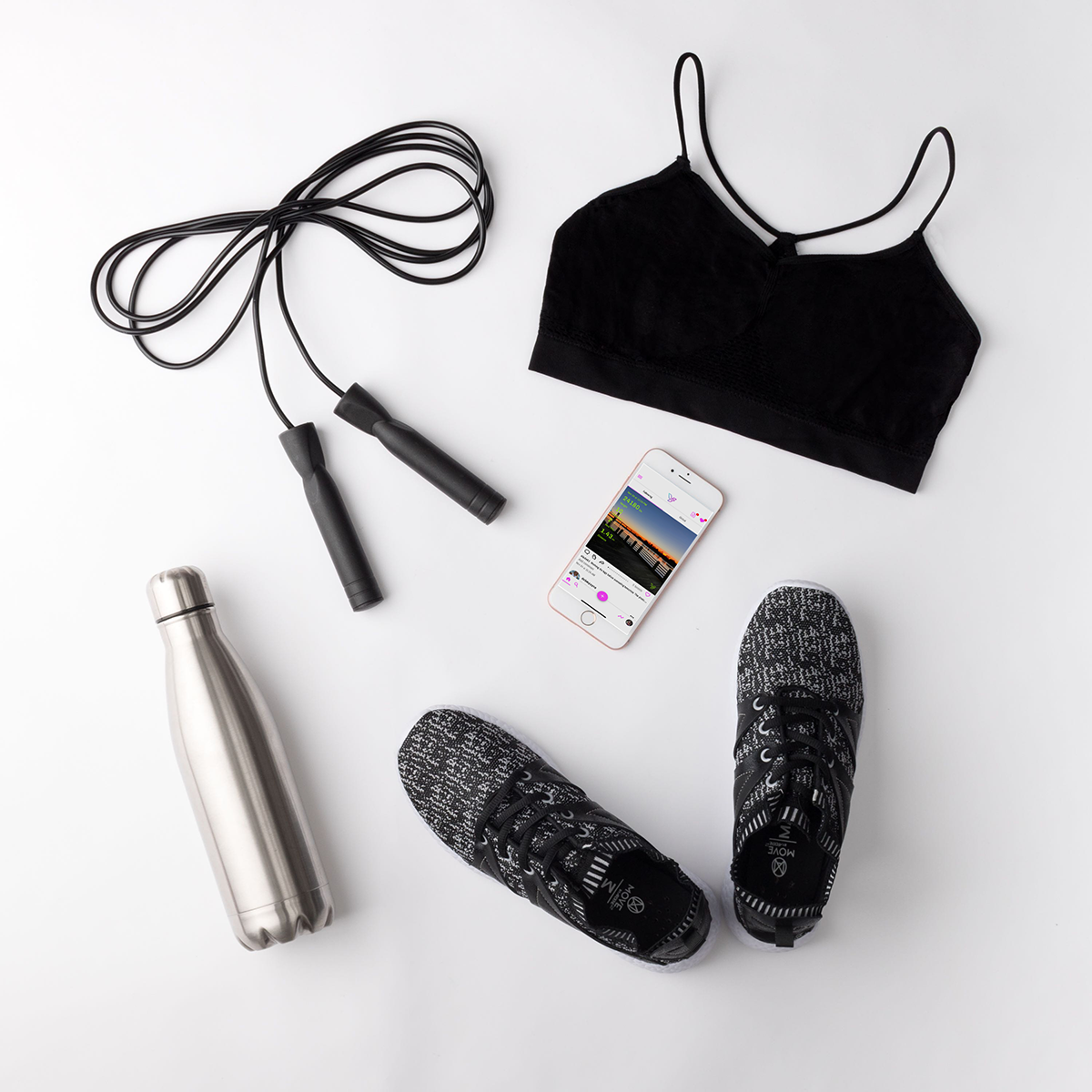
A fitness app built for connection — but were new users actually feeling it?
Ryse is a community-based health app with a simple but ambitious idea: wellness is better when it's shared. Unlike most fitness apps that lead with metrics, streaks, and paywalls, Ryse wanted to build genuine connection between users — shared goals, mutual encouragement, and a sense of belonging.
When the Ryse team noticed early users disengaging, they needed to understand why. I conducted a structured usability study — 12 to 15 participants, 8 to 10 timed tasks, surveys, and follow-up interviews — to identify where friction occurred and what changes would help the app live up to its community-first promise.

The Problem
Most fitness apps track you. Ryse wanted to connect you. New users weren't feeling the difference.
The fitness app landscape is saturated with metric-driven tools that gamify progress and lock features behind paywalls. Ryse's community-first approach was its biggest differentiator — but early data suggested new users were dropping off before they ever experienced that value. Something in the onboarding and early interaction was breaking the promise.
Key Decisions
What I decided, and why.
Recruit from real fitness communities, not a generic panel
Rather than recruiting through a general user testing pool, I sourced participants from Facebook groups, Slack channels, and personal networks of active fitness app users. This ensured participants had real-world context for the tasks — they already had opinions about wellness apps, which made their feedback more meaningful and their frustrations more instructive.
Timed specific tasks over open exploration
I chose structured timed tasks over open-ended exploration to generate comparable, measurable data across participants. Tasks were designed to mirror real daily scenarios — logging a meal during a busy day, adjusting a fitness goal, finding the community features — so that hesitation and confusion surfaced naturally rather than through artificial pressure.
Pair usability testing with competitive analysis
To give the Ryse team context beyond their own app, I conducted a competitive analysis of MyFitnessPal and LoseIt alongside the usability study. This revealed industry-wide patterns — heavy gamification, paywall friction, weak community features — that helped frame Ryse's differentiation opportunity and made the recommendations more strategic.
The Research
Watching real people use the app — and listening to what they didn't say.
The study combined timed task testing with qualitative follow-up interviews to capture both behavioral data and emotional context. Each task was designed to feel natural — the kind of thing a user would actually do on their first day with the app — so that friction surfaced organically.
Active fitness app users ages 20–50, recruited from fitness communities and personal networks.
Structured scenarios covering onboarding, meal logging, goal setting, and social feature discovery.
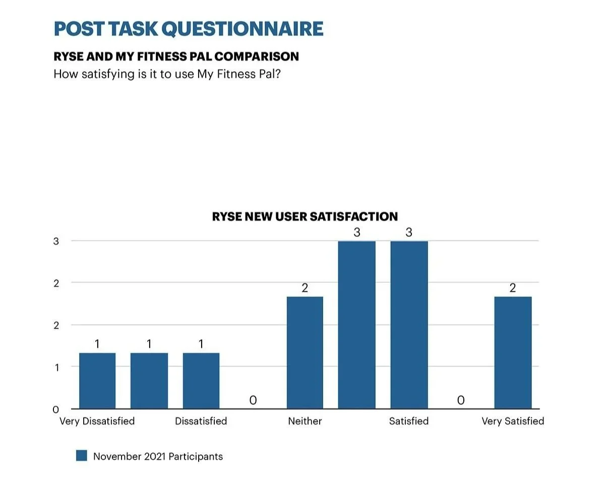
Average across all tasks — with notable drop-off on social features and terminology-heavy flows.
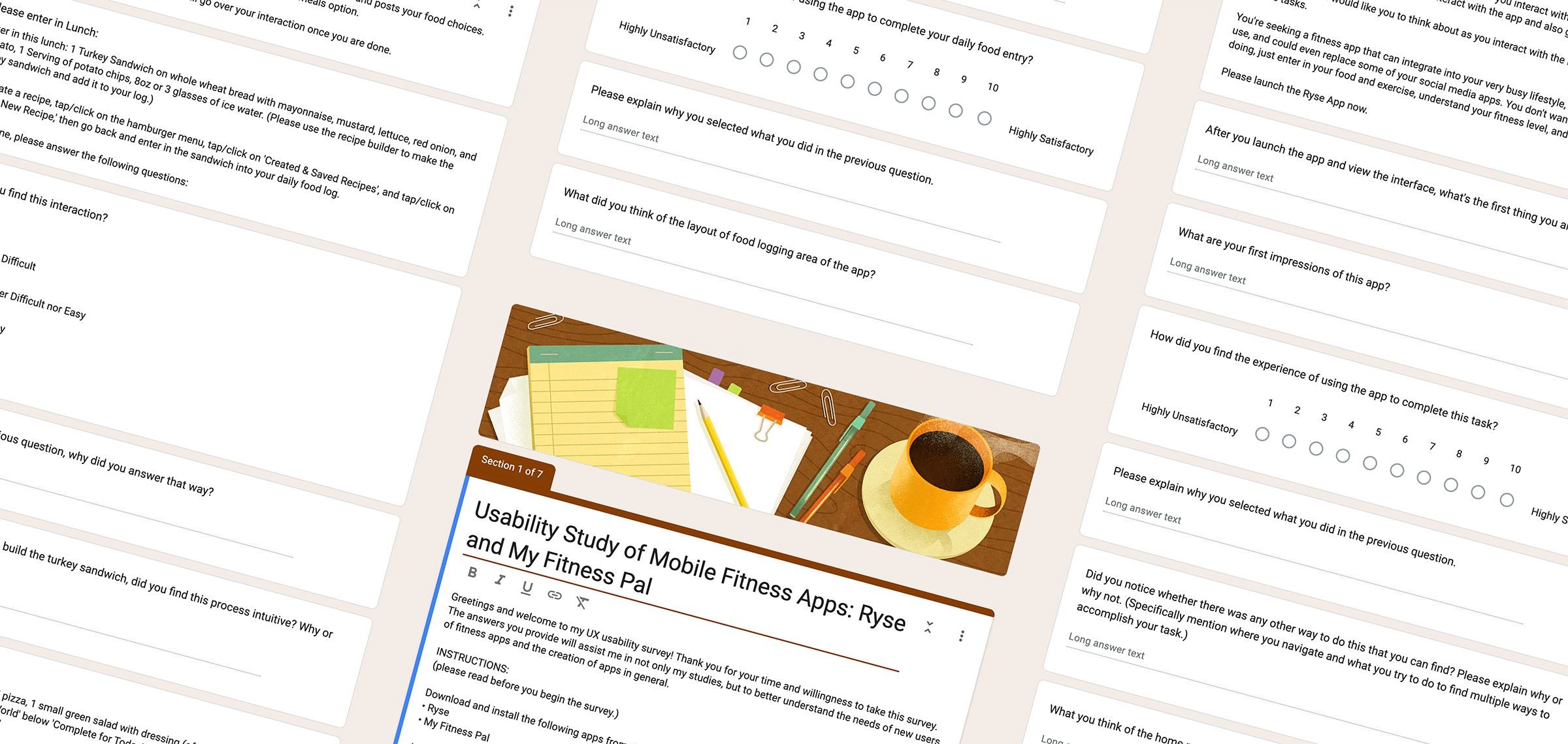
Survey & Task Design
Google FormsEach task was framed as a real-world scenario to surface authentic friction. Quantitative metrics — task success rate, time on task, error count — were paired with self-reported satisfaction scores to capture both what users did and how they felt about it.

Competitive Analysis
MyFitnessPal LoseIt NoomI examined leading fitness platforms to understand how they handled tracking, social interaction, and onboarding. Most relied on gamification and premium paywalls — reinforcing Ryse's community-first approach as a genuine differentiator, not just a positioning statement.
The Findings
Three patterns that kept getting in the way.
Across tasks and interviews, three recurring issues emerged that undermined the community-first experience Ryse was aiming for. None were catastrophic on their own — but together they created enough friction to disengage users before they reached the app's most meaningful features.
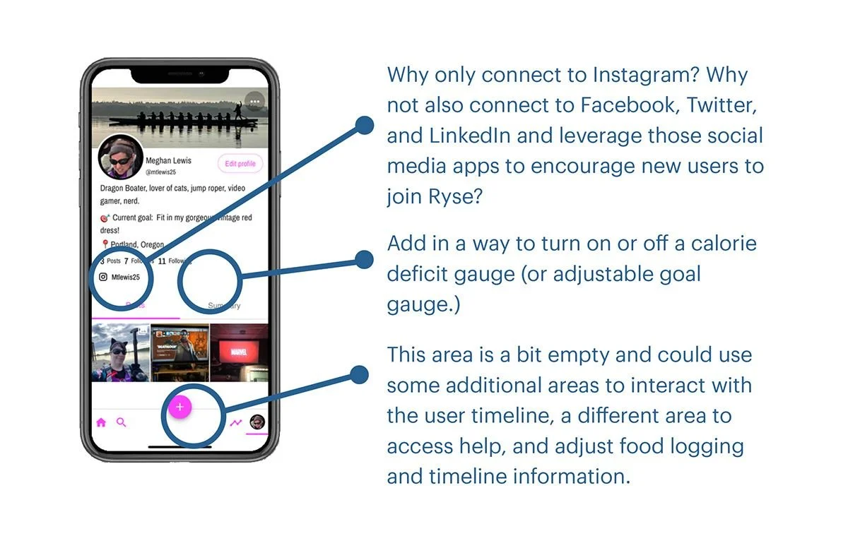
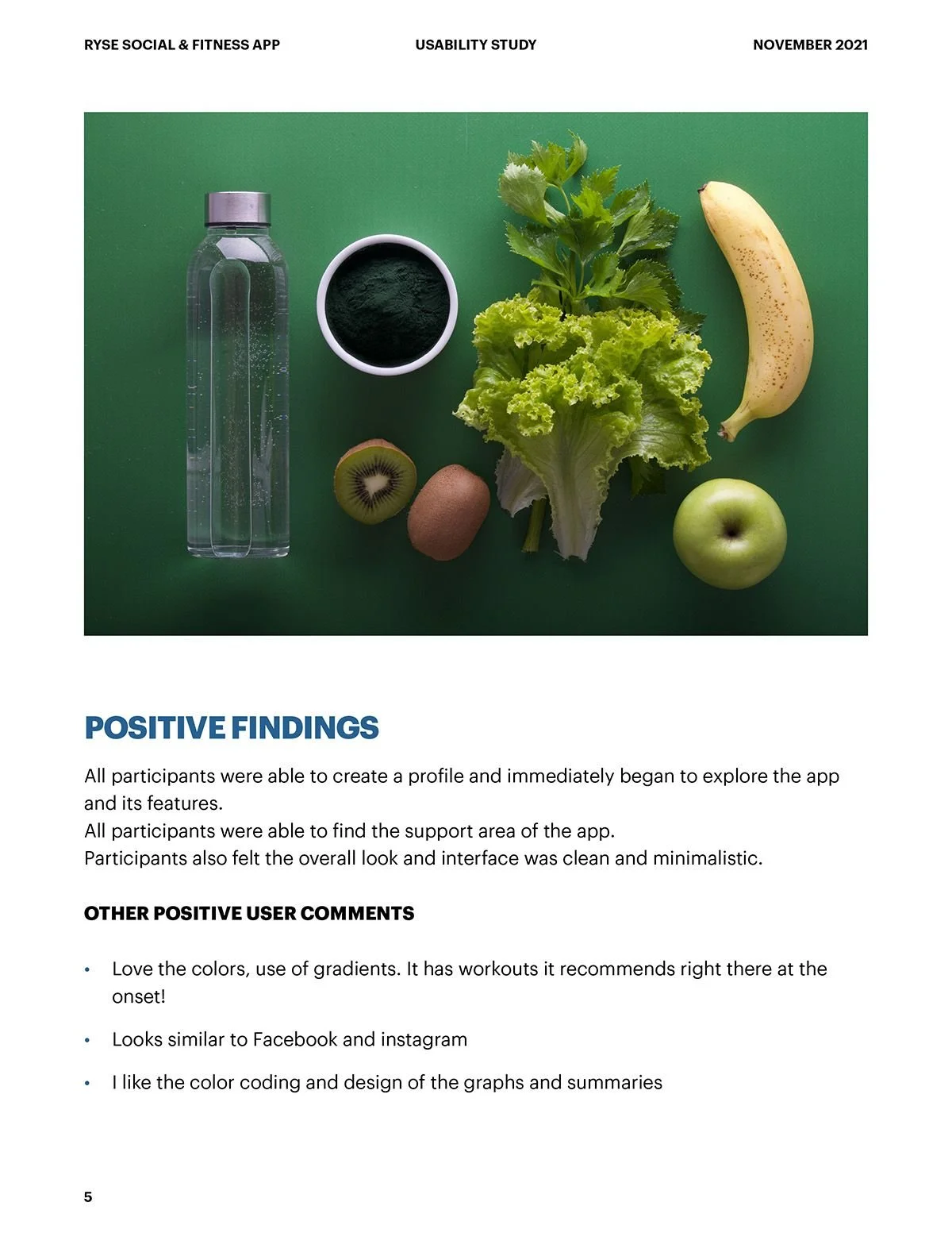
1. Navigation & Feature Discovery
Multiple participants struggled to locate core features — adding meals, adjusting goals, accessing settings. Several described the app as "overly complicated." The gap between the app's clean visual design and its underlying structure created confusion that felt counterintuitive for a wellness product built around ease and connection.
2. Terminology & Content Clarity
In-app terminology — particularly "Recovery" — confused participants who interpreted it differently from its intended meaning. When language creates friction, users lose confidence. For a health app asking users to be vulnerable about their goals and habits, unclear terminology had an outsized impact on trust.

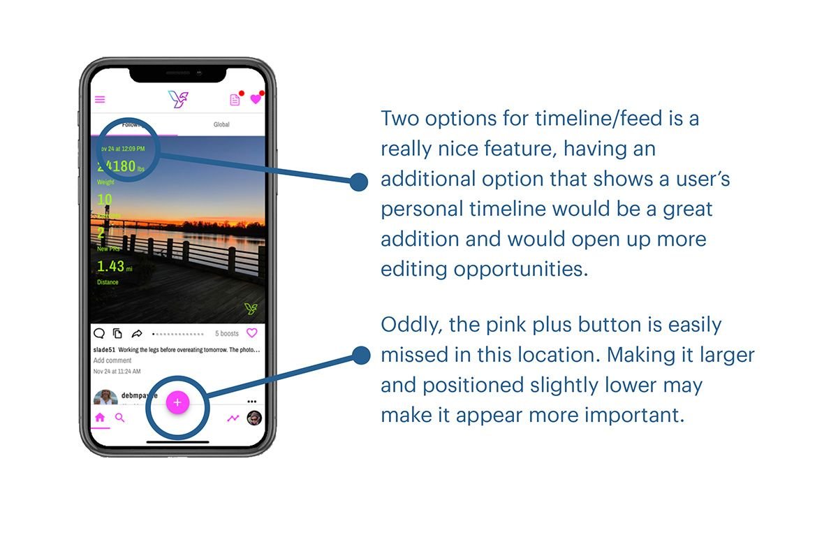
3. Community Feature Visibility
The social and community features — Ryse's core differentiator — were consistently discovered late or not at all during testing. Users who never found the community elements had no way to experience what made Ryse different. The app's most valuable content was buried behind a navigation structure that didn't lead users there naturally.
“Even small usability issues can affect trust — and in a health app, trust is everything.”
Meghan Lewis, UX ResearcherAnalysis & Recommendations
What the data said — and what we recommended the team do about it.
With all feedback organized, the report became a roadmap for refining the user experience — balancing usability improvements with the social energy that made Ryse stand out. Every recommendation was grounded in direct user evidence, not assumptions.
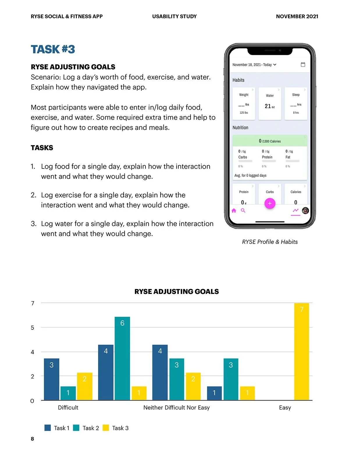
Navigation & Visual Hierarchy
Many participants struggled to find features or complete simple tasks like adding meals or accessing settings — describing the app as "overly complicated." Several requested dark mode and noted the interface felt visually cluttered. Recommendations focused on simplifying navigation structure, reducing visual noise, and establishing a clearer hierarchy that surfaces core actions without requiring users to hunt for them.
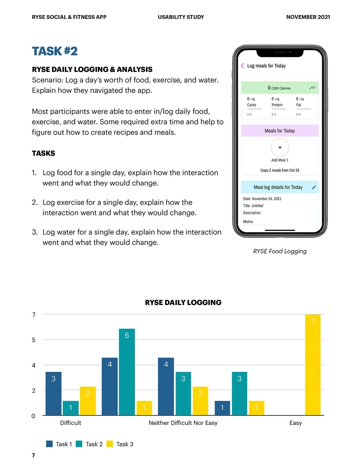
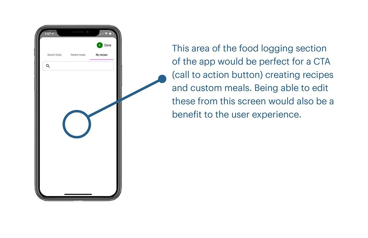
Food Logging & Recipe Creation
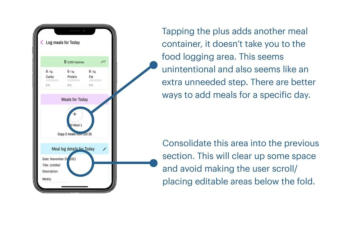
Food logging was a consistent source of frustration — default entries felt arbitrary and disconnected from how people think about real meals. Recipe creation was even harder, with several users unable to locate the feature at all. Recommendations included more intuitive labeling, clearer prompts, and a streamlined workflow that meets users where they are rather than requiring them to adapt to the app's internal logic.
Support & Social Experience
Users appreciated the social feed and community interaction but struggled to find help when they needed it. Support options felt limited and routed through external platforms, leaving users feeling isolated when issues arose. Recommendations focused on building in-app guidance, improving onboarding support, and making the community features more discoverable — leaning into the social energy that participants consistently identified as Ryse's greatest strength.
User Study Execution
Turning research findings into actionable insights.
After compiling and organizing all survey data, I built a detailed UX report that documented each pain point and proposed design recommendations. Using spreadsheets, heat maps, and visual flow diagrams, I grouped feedback by feature type and user goal. The comparison between Ryse and MyFitnessPal added context, revealing that users valued simplicity, clarity, and predictability above all else. Every recommendation was grounded in real user evidence reviewed from task recordings and interviews.
Research Scope & Focus Areas
30–45 Min SessionsEach session evaluated onboarding, core interactions, in-app navigation, pain points, reasons for use, and competitive comparison. Study methods included timed online tasks and surveys, followed up with 1-to-1 phone or in-person interviews with up to 5 selected participants.
Participant Profiles
Ages 20–50 Active Fitness App UsersParticipants ranged from 20 to 50 years old and included both new and experienced fitness app users — people already using MyFitnessPal, LoseIt, or Noom, as well as users who had never tracked fitness digitally before. All participants were interested in losing or maintaining weight, excluding pro-athletes who might skew results. Participants were recruited through Facebook fitness groups, professional Slack channels, Discord servers, and personal networks — each receiving a $5 Starbucks gift card for their time.

Test Scenarios & Tasks
5 Task Areas Competitive AnalysisParticipants were asked to imagine they were seeking a fitness app that could integrate into a busy lifestyle — effortless, easy to use, and rewarding to interact with. Tasks were designed to mirror real daily use and covered five areas: initial app setup and profile creation, food logging and exercise tracking, adjusting goals and caloric intake, finding in-app help and support, and a direct competitive comparison with MyFitnessPal. Participants used their own devices, downloading both Ryse and MyFitnessPal from the App Store or Google Play.
Compiling the Report
After organizing the methodology details and raw data, I drafted a UX Usability Report that compiled all findings into one structured document — graphs, written summaries, and direct user quotes — so patterns were easy to identify. Consistent issues surfaced clearly: difficulty adding food, confusion around recipe creation, and trouble locating support options. Recommendations were tied directly to the tasks participants completed, and participant comparisons between Ryse and MyFitnessPal helped clarify where Ryse felt unfamiliar or overly complex. These insights guided the next steps in refining user flows and identifying which features needed stronger clarity or more intuitive paths.
Final Report
A clear direction came into focus as the design evolved.
Once the study was complete, I gathered every insight, task outcome, and user quote into one cohesive report. My goal was to create a document that developers and stakeholders could read quickly without losing the nuance of what users experienced — presenting data in a way that highlighted both the immediate usability challenges and the moments where the app resonated with participants.
The report included distilled pain points, charts that illustrated user behavior, and recommendations tied directly to each task. I also created a clear hierarchy within the report so readers could move from high level themes to detailed observations without feeling lost — making it easy to understand where users struggled most, such as recipe creation or food logging, and where they felt more confident, like creating posts and engaging with the social feed.
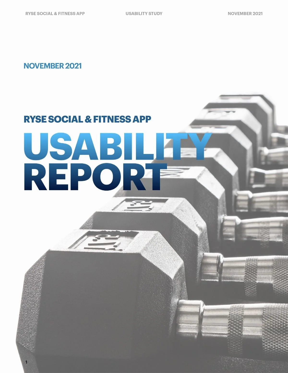
Report Preview
November 2021 Apple PagesThe final report compiled all findings into one structured document — test objectives, participant profiles, task results, competitive analysis, and prioritized recommendations — grounded entirely in real user feedback.
Outcomes
What this work delivered.
Across 8–10 timed tasks covering onboarding, logging, goal setting, and social feature discovery.
Navigation complexity, terminology confusion, and buried community features — each with specific, actionable recommendations.
A full research report with findings, data visualizations, competitive analysis, and prioritized design recommendations.
Reflection
What this work taught me.
This project reinforced something I believe deeply about UX research: the most important findings are often emotional, not functional. Participants could usually complete the tasks — but their confidence, trust, and enthusiasm were eroded by small friction points that accumulated over time. In a health app asking users to be honest about their habits and goals, that erosion matters enormously. Designing for connection requires more than good intentions — it requires every interaction to feel as human as the mission behind it.