
Designing a Clear, Motivating App for Health and Habit Tracking
UX/UI Design | Mobile App Design | Interaction Design | Visual Systems | Health & Wellness | Case Study
UX/UI & Mobile App Design | 2020

INTRODUCTION
Designing for Real Life Health Habits
This project began with a simple question I kept returning to while using health and fitness apps myself. Why does tracking habits, nutrition, and progress across multiple tools still feel fragmented and frustrating? I set out to explore how a single, thoughtfully designed experience could bring these pieces together. The concept expands on the foundation of Apple’s Health app and reimagines it as a more robust, all in one platform similar to MyFitnessPal, but with a stronger focus on clarity, customization, and daily usability.
I approached this project as an opportunity to design a more supportive and responsive health experience. The goal was to help users manage food, workouts, and health data in one place while reducing manual input and cognitive load. I focused heavily on how different health goals and conditions could shape the experience, from calorie tracking and intermittent fasting to carb awareness for diabetic users. Throughout the process, I prioritized intuitive flows, meaningful feedback, and a visual system that felt motivating rather than overwhelming, especially for users navigating long term weight loss or habit building journeys.
ROLE
UX/UI DESIGNER, UX RESEARCHER
TIMELINE
2020: 8 WEEK PROJECT
TOOLS
ADOBE XD, PHOTOSHOP, ILLUSTRATOR
SOLO DESIGNER, INSTRUCTOR INPUT
TEAM
DELIVERABLES
USER FLOWS, USER PERSONAS, WIREFRAMES, HIGH FIDELITY MOBILE APP SCREENS, VISUAL DESIGN SYSTEM, INTERACTION CONCEPTS, DESIGN CONCEPTS
OVERVIEW
What does this app do?
This app was designed to address the common frustrations of tracking health and wellness across multiple disconnected tools. Users often struggle with entering data, monitoring progress, and adjusting routines in a way that feels intuitive and supportive. My goal was to create a single platform that brings together nutrition, workouts, and health metrics while reducing repetitive input and cognitive load.
The concept expands on the foundation of Apple’s Health app, imagining a more flexible and personalized experience similar to MyFitnessPal. By collecting user health information upfront, the app can tailor guidance and feedback, whether the user is focused on calorie tracking, intermittent fasting, carb management, or other dietary goals. It also allows users to mark favorite foods and workouts, adjust their routines, and sync external devices for a seamless experience.
I designed this app with real users in mind—people on weight loss journeys or habit building goals who want clarity, flexibility, and encouragement rather than rigid rules. Features like personalized alerts, scalable progress tracking, and adaptable visual cues were all intended to make daily use feel manageable, motivating, and supportive. This project became a way to explore how thoughtful UX and visual design can transform health tracking from a chore into a helpful, human-centered experience.
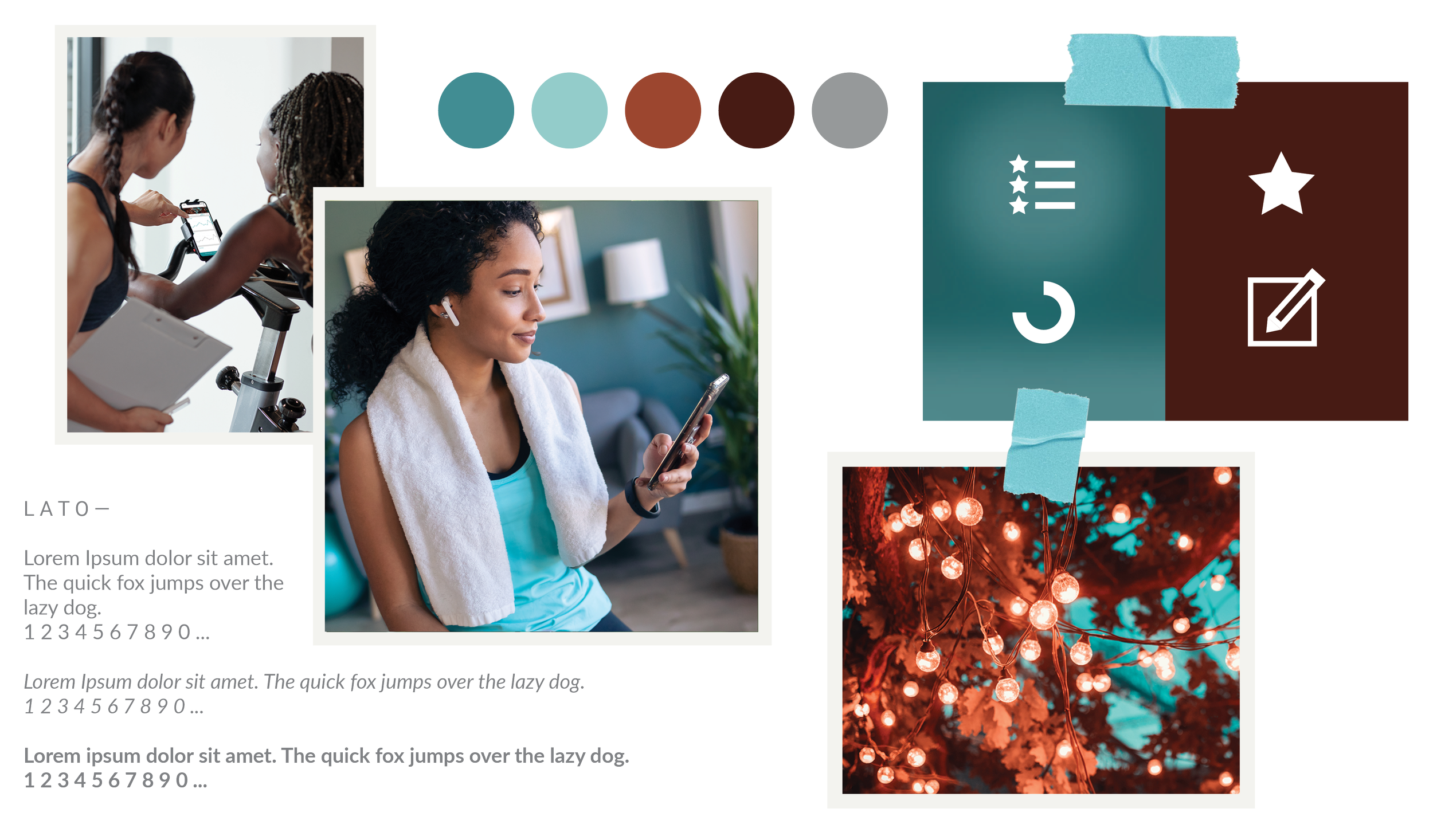
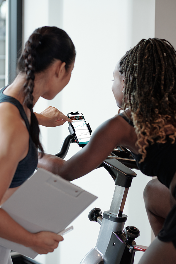
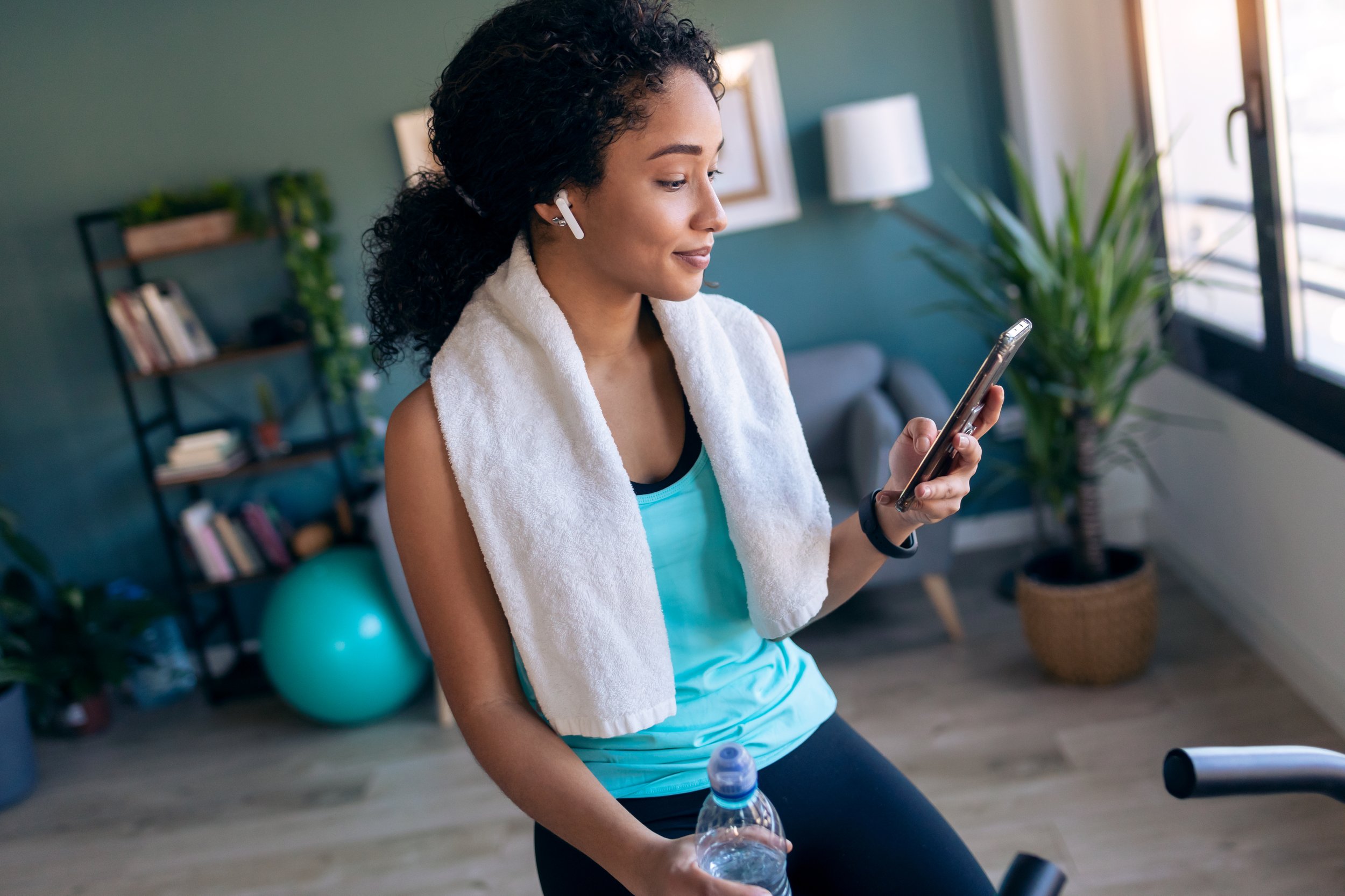
HEALTH APP MOODBOARD
PROBLEM
Health apps often fail to make tracking simple, seamless, or personalized
Many health apps promise to help users manage nutrition, exercise, and wellness, yet the experience can feel fragmented and frustrating. Data often lives across multiple apps, editing entries can be unintuitive, and customizing goals or routines can create unnecessary friction. Users are forced to spend time inputting and correcting data instead of focusing on their actual health goals. This project set out to explore ways to address these gaps and create a more intuitive, supportive experience.
THE BRIEF
“What would a single, user-centered app look like if it made tracking health, workouts, and nutrition seamless, intuitive, and motivating?”
Hypothesis: If users have a single app that adapts to their personal goals, integrates health data, and reduces repetitive input, they will be more likely to engage consistently and make meaningful progress toward their wellness objectives.
I believe that by creating an app that anticipates user needs, provides clear feedback, and allows flexible customization, we can transform health tracking from a frustrating chore into an empowering, daily habit that supports long-term wellness.
DISCOVER & DEFINE
Setting preliminary research goals
To begin, I wanted to deeply understand the frustrations and habits of health-conscious users. The goal was to identify where current apps create friction and uncover opportunities to design a more seamless, personalized experience. I focused on three main research goals to guide the early phase of the project.
-
Conduct interviews and observational research to explore how users track nutrition, workouts, and health metrics, identifying points of friction and confusion.
-
Perform a feature analysis of popular health and fitness apps to identify effective interactions, visual patterns, and opportunities for improvement.
-
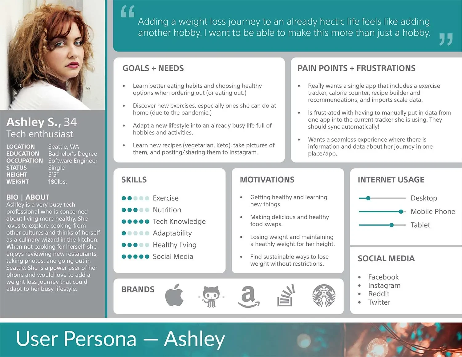
Build initial user personas and scenarios to understand diverse goals, dietary needs, and tracking habits, ensuring the app would serve real-world behaviors.
Insights from competitive and contextual research
I conducted a competitive analysis and reviewed research on health tracking apps to discover what works well and where gaps exist. While no app fully addressed the holistic tracking experience I envisioned, there were plenty of useful features and visual strategies worth adapting.
-
Several apps employed interactive dashboards, gamified progress tracking, and clear visual cues. These patterns informed the way I designed visual hierarchies, feedback loops, and interactions in the prototype.
-
Many interfaces required manual, repetitive input or complicated navigation, making it difficult for users to track their health consistently. This insight emphasized the need for intuitive flows and automated data integration where possible.
-
I identified opportunities to consolidate data from multiple sources, personalize notifications and feedback, and allow flexible goal management to support a variety of health journeys.

DESIGN & PROTOTYPING
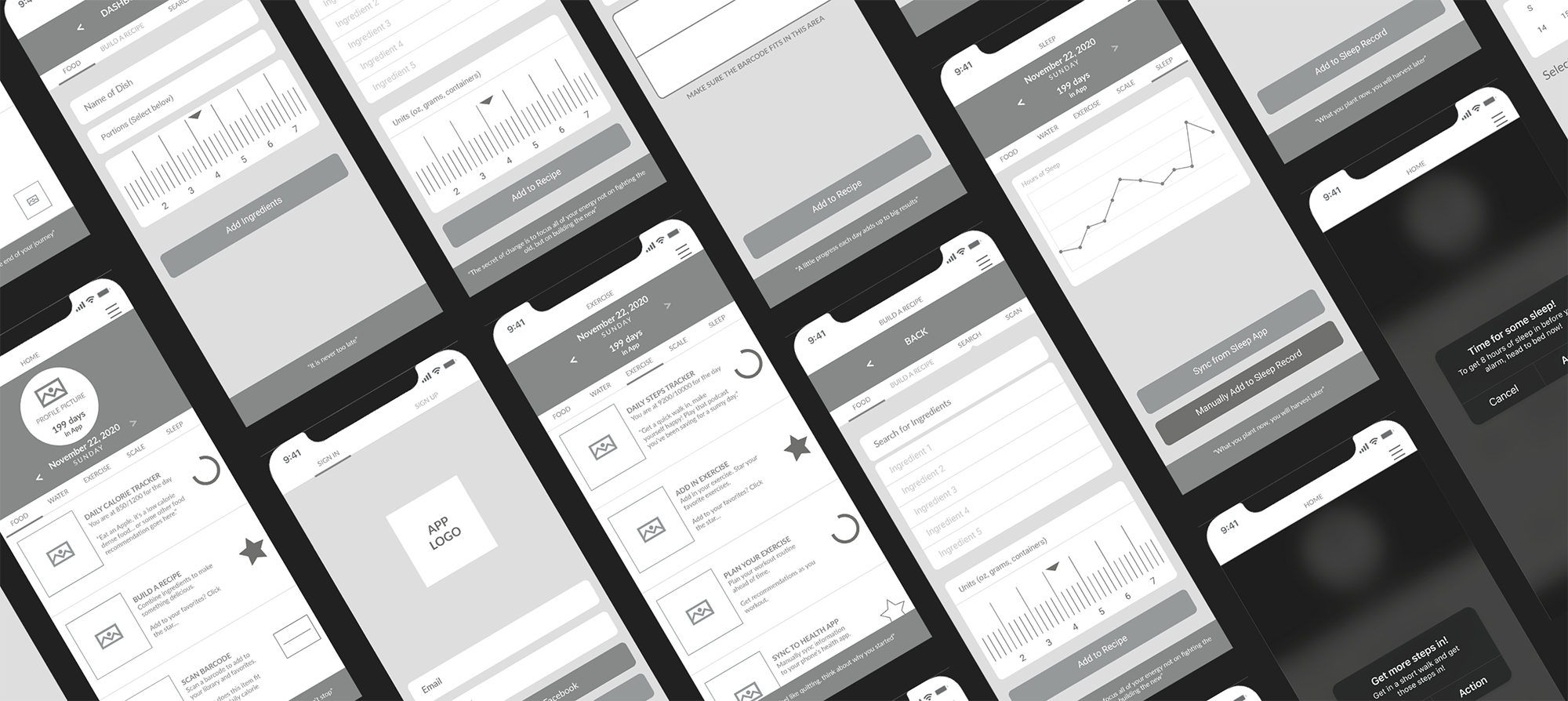
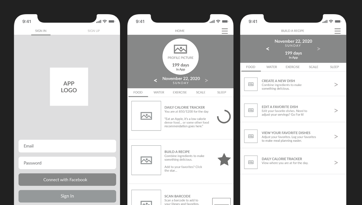
Exploring the structure of a seamless health experience
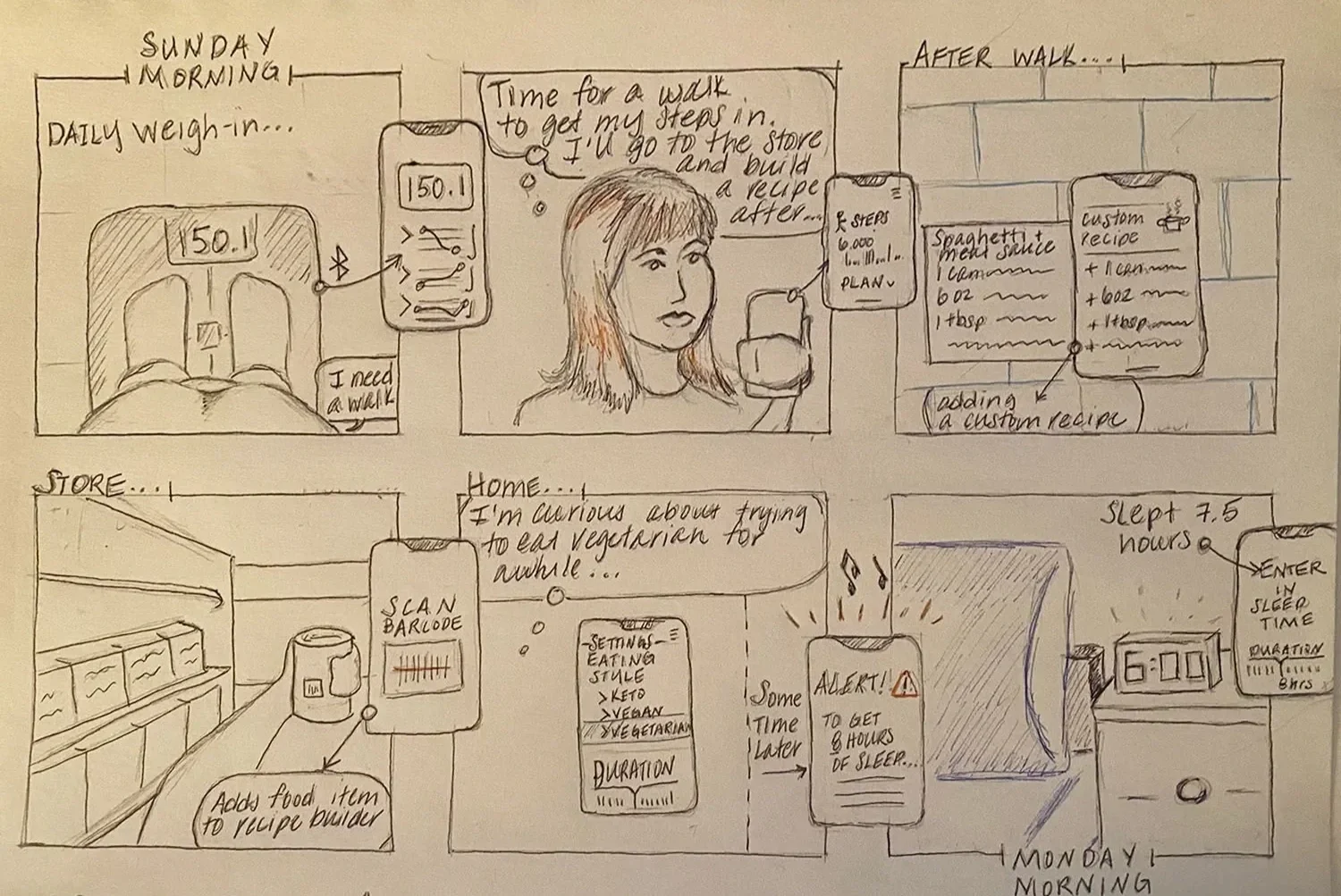
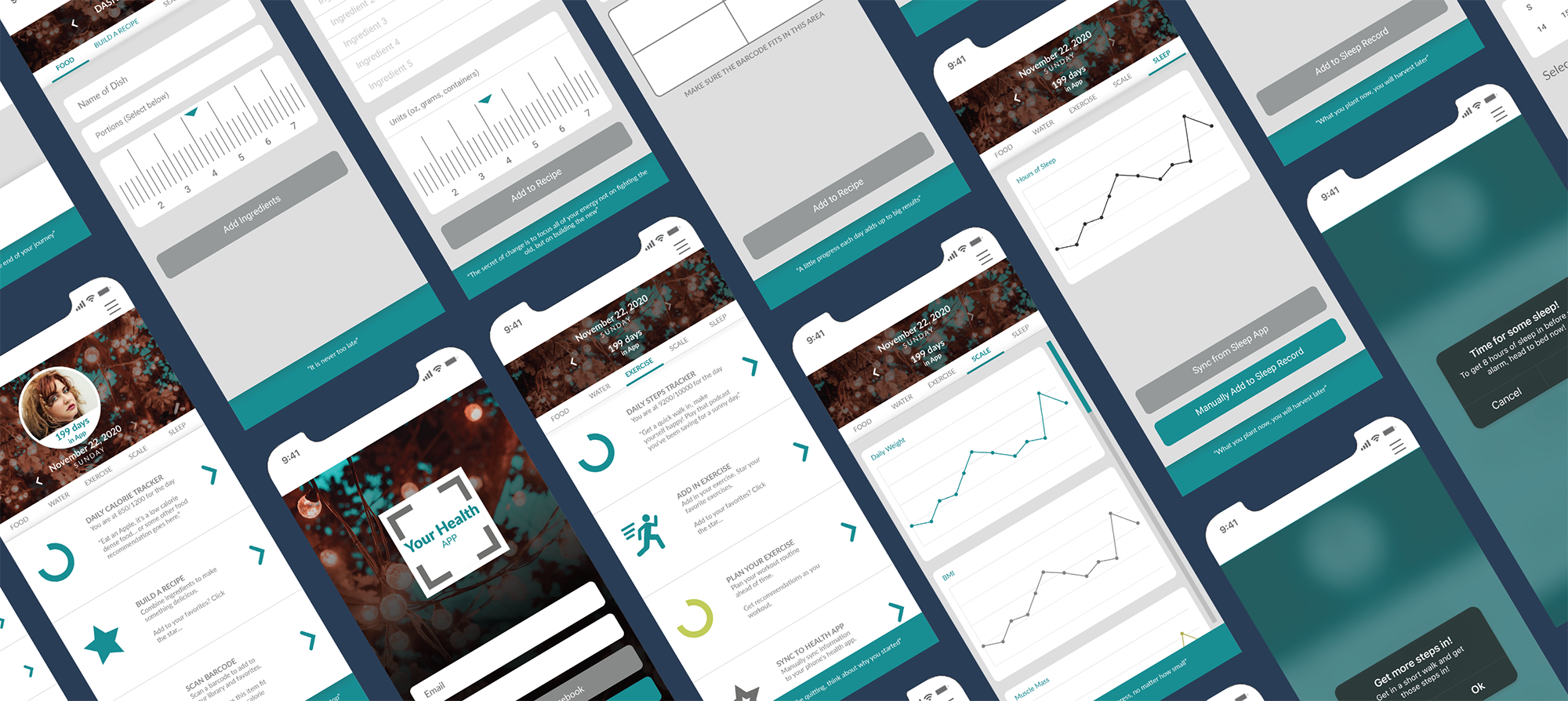
After defining the core user pain points and opportunities, I began visualizing the app through wireframes. The goal was to translate research insights into screens that felt intuitive, engaging, and aligned with real user behaviors.
I explored multiple approaches for presenting the app’s functionality, focusing on layouts that supported easy navigation, clear feedback, and flexible tracking. Each wireframe aimed to balance usability with a motivating visual hierarchy.
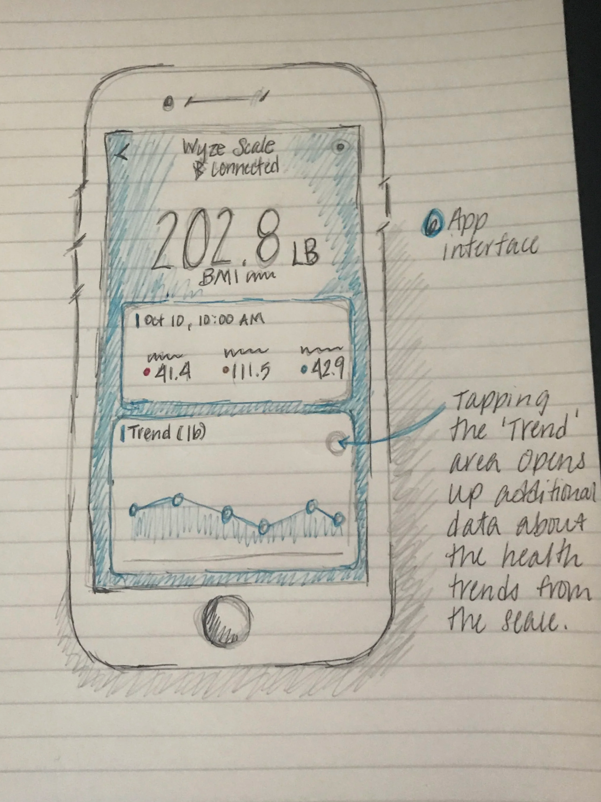
I started with a straightforward linear workflow to map the essential user journeys: logging meals, tracking workouts, syncing devices, and reviewing progress. This allowed me to experiment with layout, information grouping, and visual hierarchy while staying focused on usability.
Wireframes provided a clear blueprint for interactions, including favoriting foods and workouts, adjusting dietary preferences, and tracking different eating styles. They made it easier to identify areas of friction and refine the flows before moving into higher fidelity design.
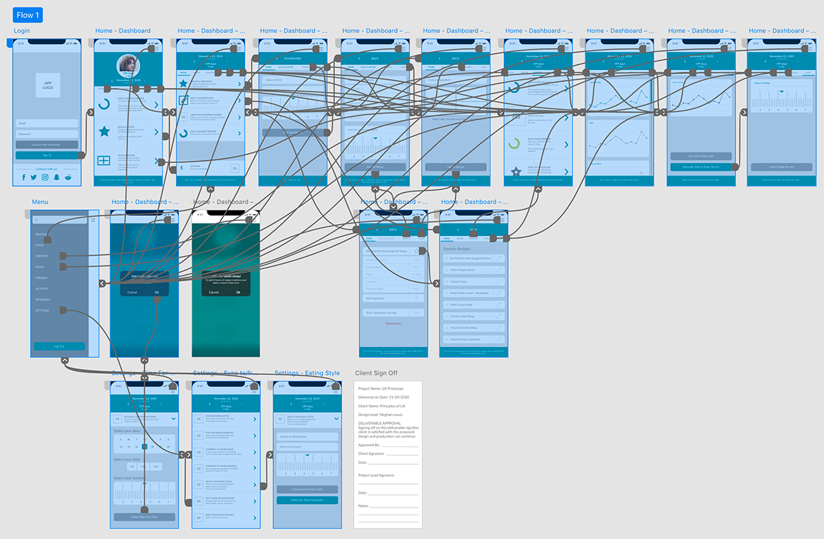
Prototyping interactions and visual refinement
Next, I transformed the wireframes into a clickable prototype to test navigation, screen transitions, and feedback loops.
This prototype allowed me to experiment with interactive elements, menus, and progress tracking screens, providing a tangible sense of the app’s behavior and flow.
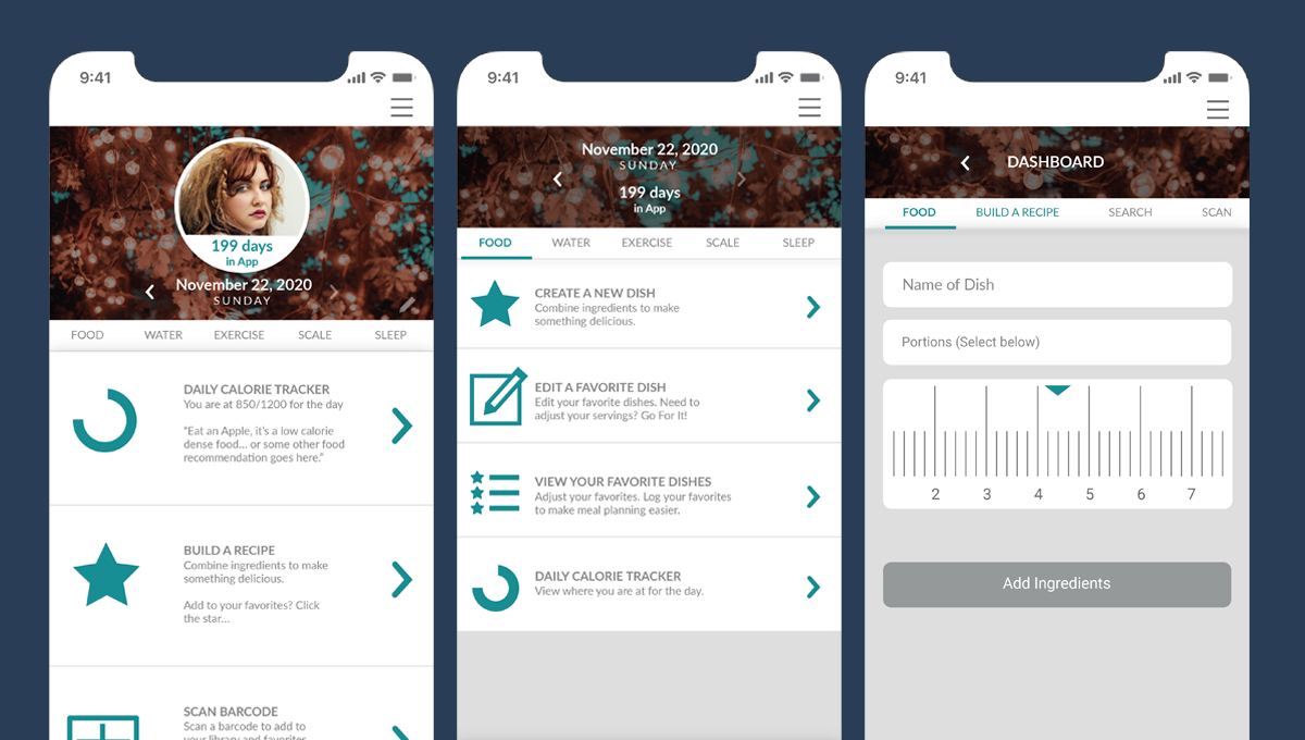
PERSONALIZED NUTRITION TRACKING
Users can log meals, track calories, and favorite recipes, all tailored to their dietary preferences and goals.INTEGRATED WORKOUT LOGGING
Workouts can be tracked manually or synced from external devices, allowing users to see their efforts reflected in progress metrics.FLEXIBLE GOAL MANAGEMENT
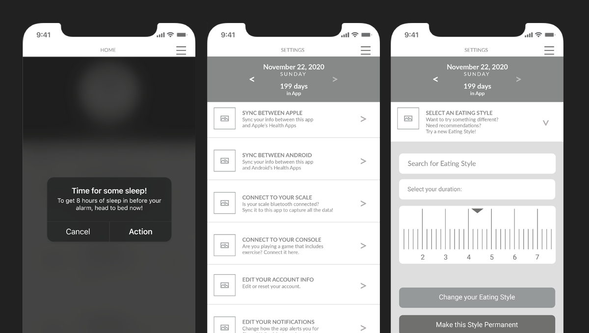
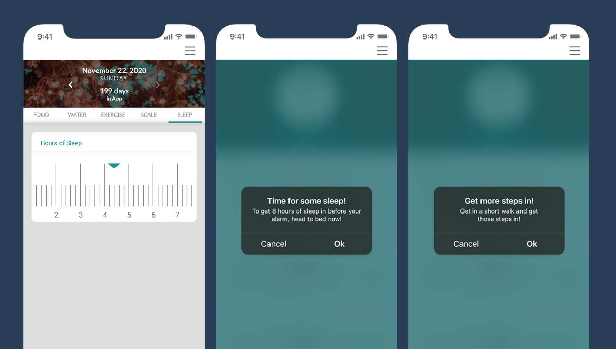
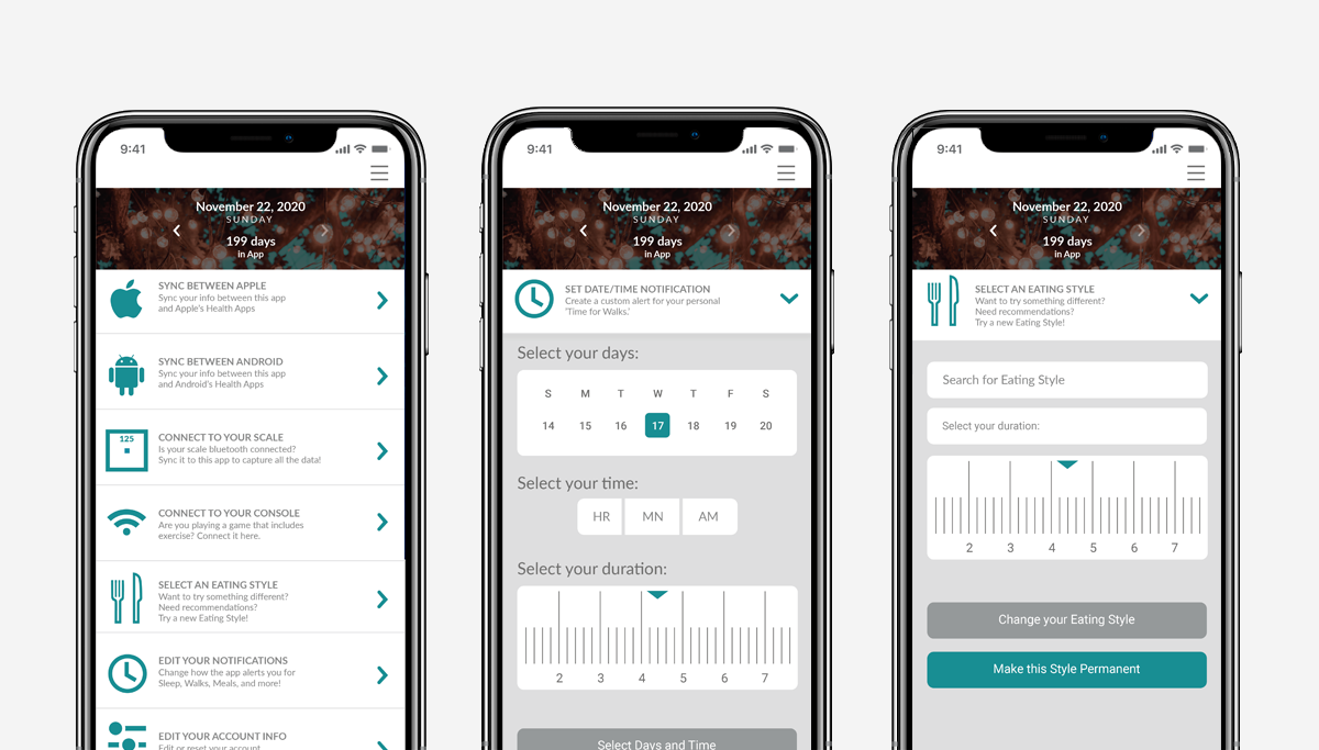
Users can switch between different eating styles, set custom targets, and receive timely notifications to support habits.PROGRESS VISUALIZATION
Clear dashboards provide an overview of calories, workouts, and weight trends to help users stay motivated and informed.
BUILD & REFINE
Translating research insights into a polished, usable app
After completing user research and compiling survey feedback, I began refining the app’s screens, interactions, and visual language. The insights highlighted areas where users felt frustrated, confused, or slowed down while tracking their health and habits.
With this feedback in mind, I iterated on the layouts, updated imagery, finalized color palettes, and adjusted copy to make the experience as clear and motivating as possible. Each change was informed by user needs and aimed to reduce friction while keeping the interface approachable.
-
Users noted that entering meals, workouts, and metrics repeatedly across multiple apps was time consuming. I addressed this by consolidating key flows and creating defaults and shortcuts for frequent entries.
-
Survey feedback revealed users struggled to locate settings, progress dashboards, and nutrition data. I reorganized the toolbar and screen layouts to separate core functions and make all key actions easily accessible.
-
sers had different needs, such as tracking intermittent fasting, keto, or carb management. I added flexible options, clear labels, and customizable alerts to accommodate a variety of goals and habits.
Simplifying interactions for a single, cohesive experience
I redesigned the layout into a single-screen view that consolidates all key functions into an intuitive, feature-rich interface. Each component is now clearly separated by function, and the core interaction flows naturally from a single entry point, allowing users to log meals, workouts, and metrics with minimal friction.
With these refinements in place, the concept reached a balance between simplicity, usability, and personalization, creating an experience that empowers users to track health habits confidently and consistently.
ITERATION
Refining the experience through feedback and testing
After building the initial prototype and compiling feedback from early user testing, I focused on refining interactions, layouts, and visual elements. Observing users navigate the app highlighted friction points, areas of confusion, and opportunities to make tasks more intuitive. Each round of iteration helped me better understand how real users would interact with the app and what adjustments were necessary to make the experience seamless.
Feedback revealed that users wanted quicker access to frequent actions, clearer visual cues for progress, and easier ways to switch between dietary preferences and workout types. I implemented changes such as consolidating toolbars, improving iconography, and making interactive elements more prominent.
Each iteration was informed by observation and direct input, allowing me to continually refine the app until it balanced usability, motivation, and personalization. This process ensured that the final prototype reflected real user behaviors and provided a more satisfying, engaging health tracking experience.
FINAL DESIGN
Bringing the health app to a polished, user-centered experience
After multiple rounds of testing and careful iteration, the app evolved into a cohesive, intuitive platform that supports users in tracking their health and habits. I focused on refining layouts, visual hierarchy, and interactive elements to make logging meals, workouts, and metrics seamless and engaging.
The final design balances flexibility and clarity, allowing users to easily switch between dietary preferences, monitor their progress, and access frequently used actions without friction. Each design choice was informed by user feedback and guided by the goal of creating a supportive, motivating experience.
The interface now provides a single-screen view that consolidates core features, with clear separation between functions and consistent visual cues for guidance. Users can personalize tracking options, see progress at a glance, and engage with interactive elements that make the experience feel dynamic rather than static.
This final design reflects the insights gained throughout the project, from wireframing to iteration, ensuring that the app not only meets functional needs but also supports sustainable wellness habits through an accessible and thoughtful interface.
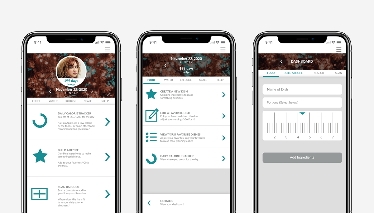
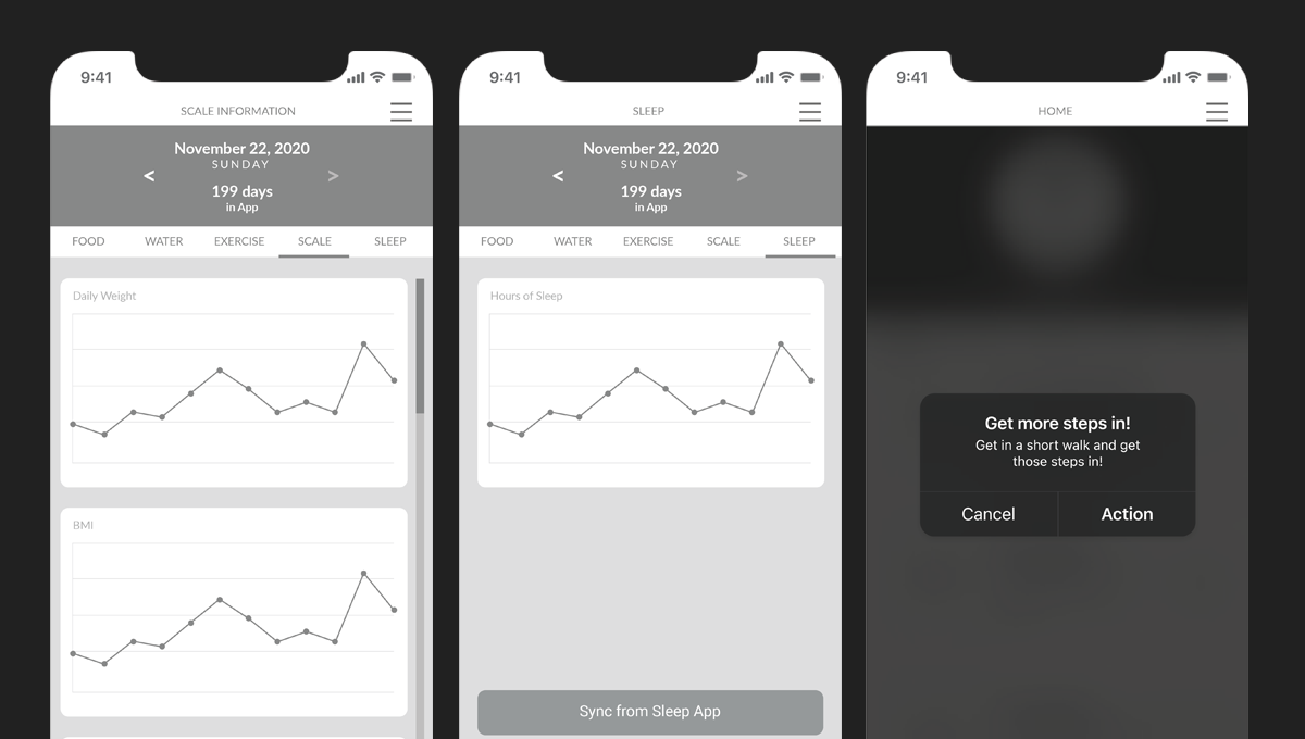
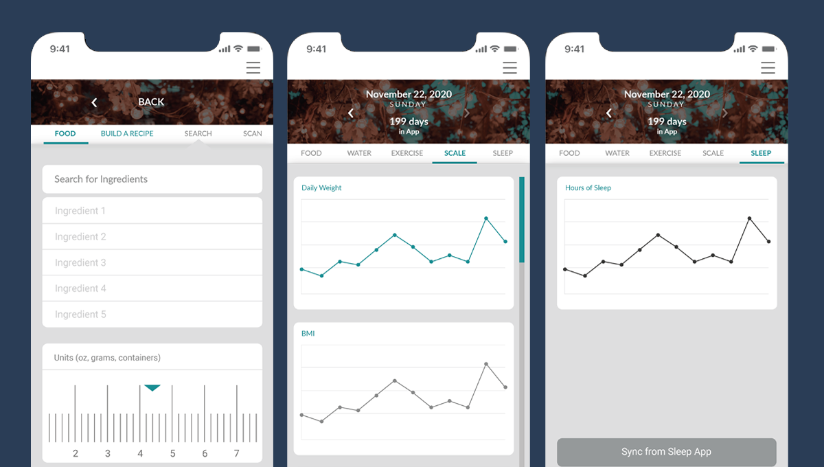
A. FINAL DESIGN / DASHBOARD & PROGRESS TRACKING
Centralized insights to motivate daily habits
The dashboard was designed to be the heart of the app, providing users with a quick overview of their daily activity, calorie intake, and progress toward health goals. I focused on visual hierarchy and clear information architecture so that users could understand their status at a glance.
Interactive progress bars, charts, and color-coded feedback were incorporated to make the experience more engaging and actionable. The goal was to balance motivation and information without overwhelming the user.
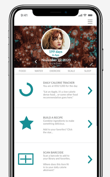
Users can drill into specific metrics, such as steps taken or meals logged, without leaving the dashboard. This keeps the experience seamless and reduces the friction of switching screens.
By presenting information in a visually digestible and interactive format, the dashboard encourages consistent engagement and provides immediate feedback to support healthy habits.
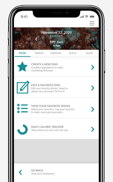
B. FINAL DESIGN / MEAL & RECIPE LOGGING
Simplifying food tracking with intuitive input
The meal logging feature allows users to quickly add foods, scan ingredients, and save favorite recipes. I designed a clear input flow with predictive text and visual cues to make tracking effortless.
Users can switch dietary preferences on the fly, enabling the app to adjust recommended meals and highlight alternatives. This personalization helps support a variety of eating styles such as keto, CICO, or intermittent fasting.
Favorite foods and recipes can be pinned for faster entry, reducing repetitive tasks and creating a more seamless experience.
The combination of flexibility, visual clarity, and predictive interactions ensures that logging meals becomes a supportive, motivating part of the user’s routine rather than a chore.
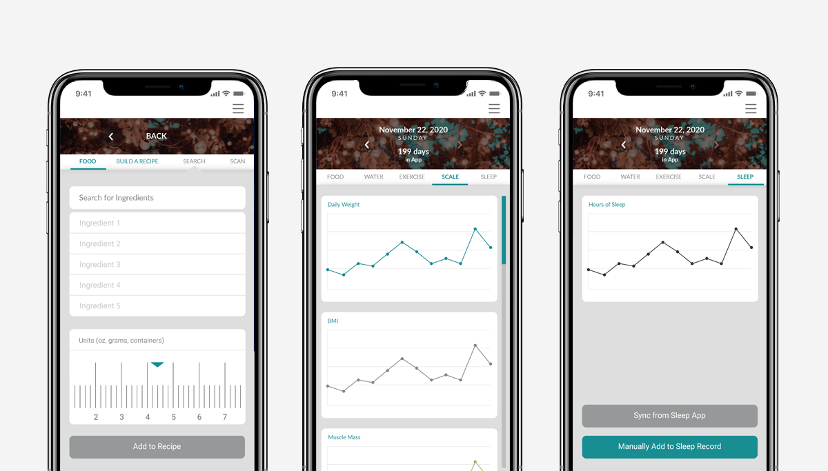
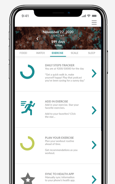
C. FINAL DESIGN / WORKOUT & ACTIVITY TRACKING
Integrated tracking for a complete health picture
The workout and activity feature consolidates steps, exercise routines, and video game-based fitness into a single view. I designed it to be visually consistent with the dashboard while highlighting completion and progress metrics.
Users can add workouts manually or sync data from compatible devices, ensuring that the app captures all activity in one place. Interactive graphs and daily summaries help users reflect on trends and stay motivated.
Key interactions, such as adding or editing workouts, were optimized for minimal taps and intuitive gestures, making the process faster and more enjoyable.
By combining a clear visual structure with interactive feedback, this feature encourages consistent use and helps users maintain a holistic view of their fitness and health journey.
OUTCOME
The final designs delivered a cohesive and engaging experience for health-conscious users, and the concept continues to inform approaches to app-based wellness solutions.
Each iteration was informed by observation and direct input, allowing me to continually refine the app until it balanced usability, motivation, and personalization. This process ensured that the final prototype reflected real user behaviors and provided a more satisfying, engaging health tracking experience.
REFLECTION
Reflecting on a concept brought to life from scratch
Building this app from a concept to a working prototype pushed me to balance speed with thoughtfulness. Each stage taught me the importance of planning, iteration, and staying flexible. By the end, the design felt cohesive, usable, and aligned with the needs I had identified for health-conscious users.
EMBRACE ADAPTABILITY
I learned that conceptual projects demand flexibility. Some ideas evolved or shifted entirely, and staying open allowed me to pivot quickly without losing sight of the core user experience.COLLABORATION IS KEY
Early conversations with developers, even in a concept phase, helped clarify technical possibilities and limitations. These discussions ensured the designs were both ambitious and achievable.INVEST IN RESEARCH
The most valuable time was spent understanding user behaviors and pain points. This foundation guided every design decision, ensuring the app addressed real challenges and not just assumptions.
Looking back, this project reinforced my confidence in leading a concept from ideation to a polished prototype. While the app was built in Adobe XD, I see great opportunity to refine and rebuild it in Figma, making it even more dynamic and scalable. The lessons learned here will continue to shape my approach to creating user-centered, engaging, and intuitive digital products.