
Twelve Years Apart — A Photography Website, Built Twice
A hand-coded HTML and CSS photography website originally built as a PCC final project in 2013 — and fully rebuilt, rebranded, and relaunched in 2025. Two versions, twelve years of growth, and the same subject.
The same project, twelve years apart — and everything had changed.
In 2013, John Hart Photography was one of my first projects at PCC — a hand-coded HTML and CSS website built for a Beginning Dreamweaver course final. No templates, no CMS, no shortcuts. Just code, a photographer's portfolio, and the early stages of a skill set I was still developing. The site showcased John's eye for composition and his passion for photography, but it was a product of its time — not responsive, not polished by today's standards, but genuinely built from scratch and genuinely mine.
In 2025, I came back to it. The rebuild started as a personal project — a way to revisit hand-coded work and push my current skills against a familiar brief. It wasn't until about halfway through the build that I realized I had done something almost identical twelve years earlier. That moment of recognition made the project feel like something more than a portfolio exercise. It became a way to measure distance traveled.
The Problem
A site that told the right story — but couldn't hold up in the modern web.
The 2013 version was built before responsive design was standard practice. It looked right on a desktop, but fell apart everywhere else. Twelve years of web evolution had left it behind — not just technically, but visually. The 2025 rebuild wasn't about fixing what was broken. It was about doing the same thing properly, with everything learned in between.
The choices that shaped both versions.
Choosing a real person over a fictional subject.
In 2013, the course final allowed any subject. Choosing John Hart — a real photographer with a real body of work — raised the stakes in the right way. Designing for actual photography rather than placeholder images forced every layout decision to be made in context. It also produced something portfolio-worthy rather than a classroom exercise that would be forgotten immediately after submission.
Staying in hand-coded HTML and CSS for the 2025 rebuild.
The 2025 rebuild could have used any number of modern tools — WordPress, Squarespace, a static site generator. The decision to stay in hand-coded HTML and CSS was deliberate. It kept the project honest, forced a deeper engagement with the fundamentals, and made the comparison between 2013 and 2025 meaningful. The constraint was the point.
Building mobile-first in 2025 where the 2013 version had none.
The original site was desktop-only — that was the standard of the time and the scope of the course. The 2025 rebuild made responsiveness a core requirement from the first line of CSS. Every layout decision was made with mobile in mind, and media queries were used throughout to ensure the photography held up at every screen size.
Updating the visual identity alongside the technical rebuild.
The 2025 version wasn't just a technical upgrade — it was a full visual refresh. The typography, color palette, and overall aesthetic were reconsidered from the ground up, keeping what made the original feel like John's work while bringing it into alignment with where web design had gone in the intervening twelve years.
Two versions, twelve years apart — the same photographer, a very different web.
The 2013 version was built in Dreamweaver, hand-coded from scratch, and designed to showcase John's photography across gallery pages, a travel section, and an about page. The 2025 rebuild took everything learned in the intervening years and applied it to the same brief — responsive, refined, and built with a clarity of intent that only comes from experience.
2013 — Original Site
HTML & CSS Adobe DreamweaverThe original site was built entirely by hand in Dreamweaver — no templates, no frameworks, no shortcuts. Navigation, gallery layouts, and image presentation all coded from scratch. It was a desktop-only experience, but it was real and it was mine.
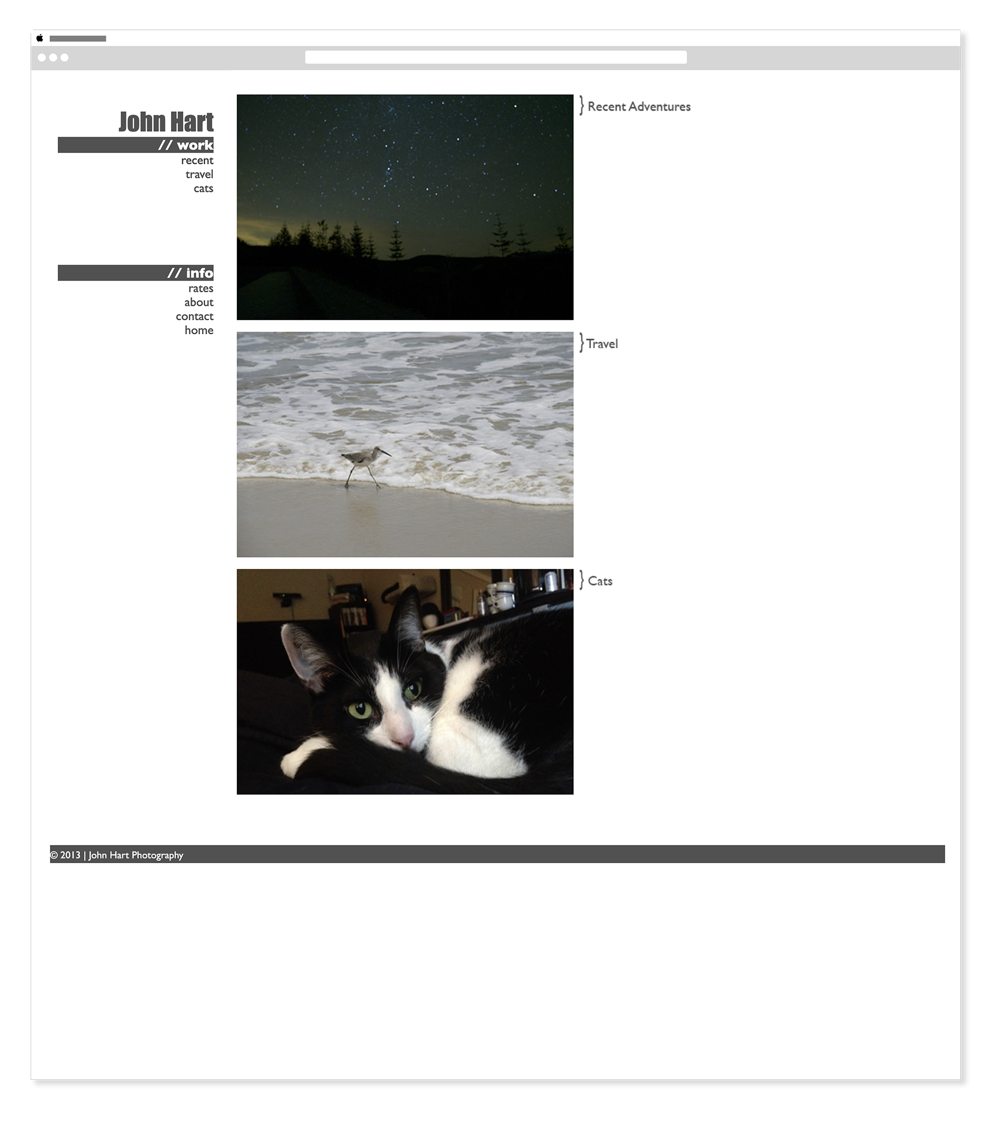
2013 — John Hart Photography - Homepage
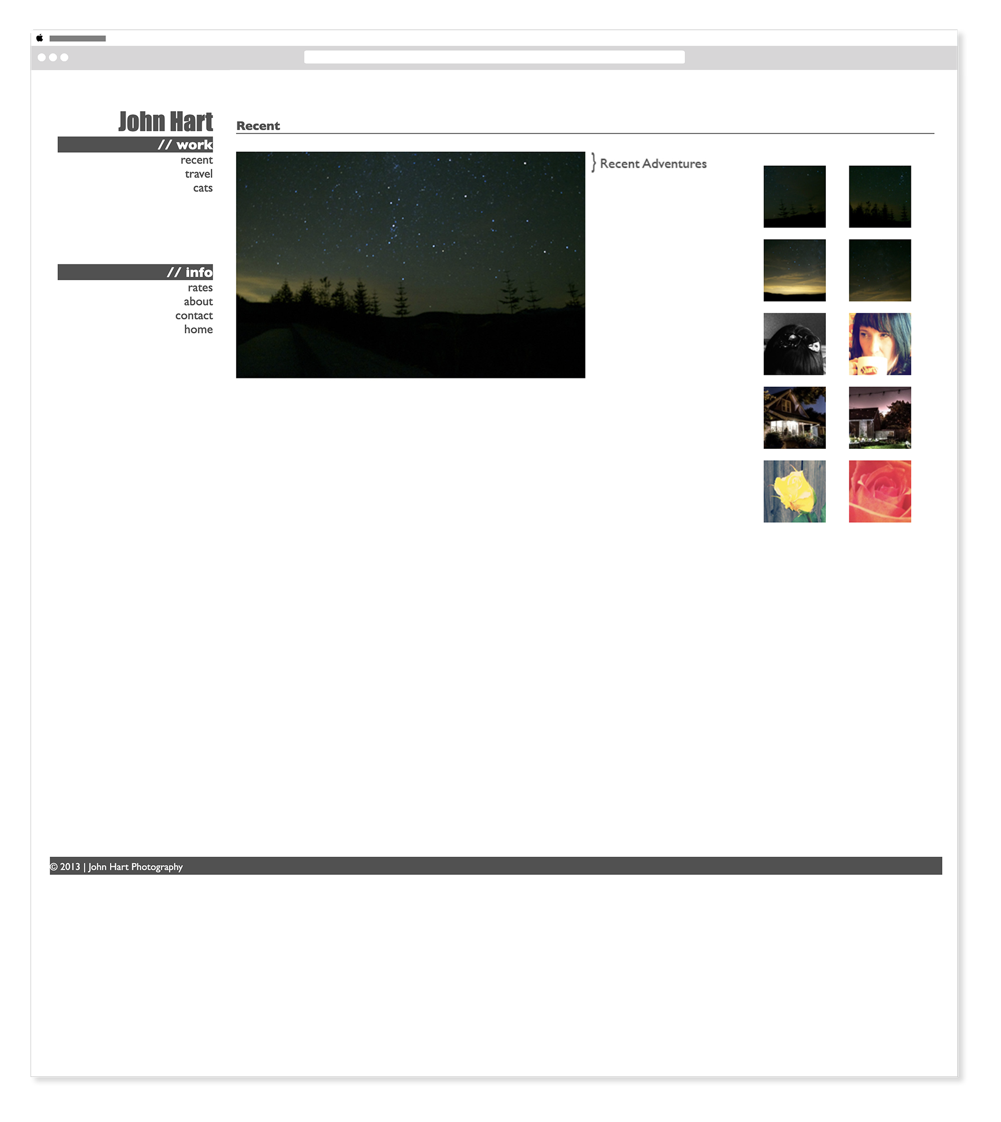
2013 — John Hart Photography - Recent
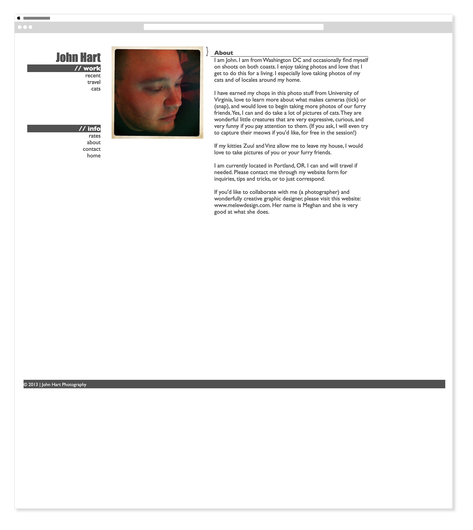
2013 — John Hart Photography - About
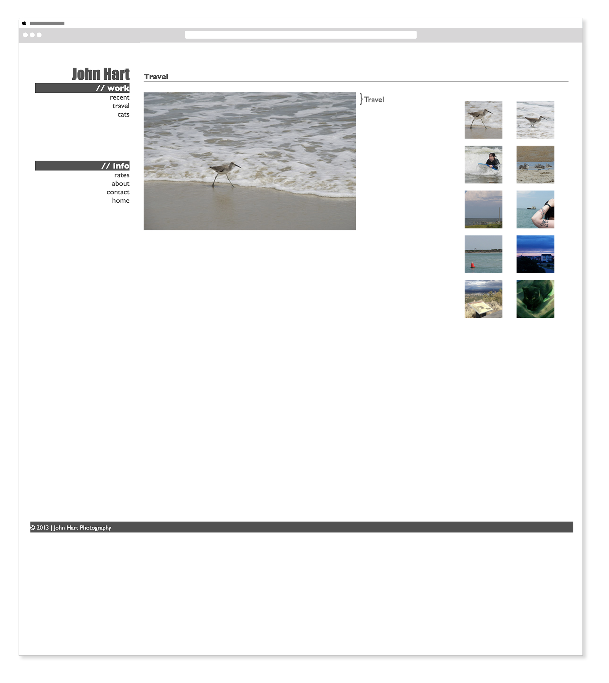
2013 — John Hart Photography - Travel
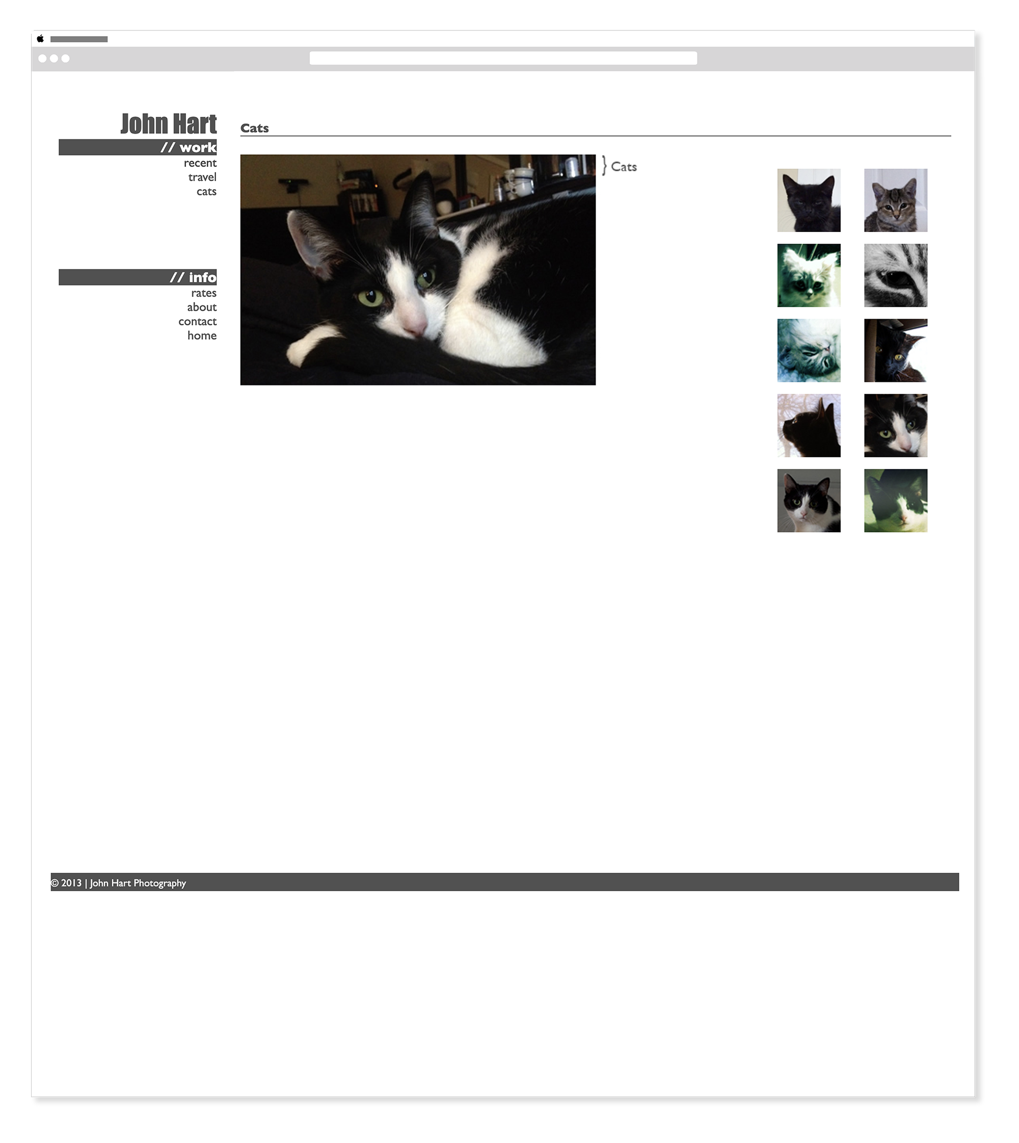
2013 — John Hart Photography - Cats Gallery
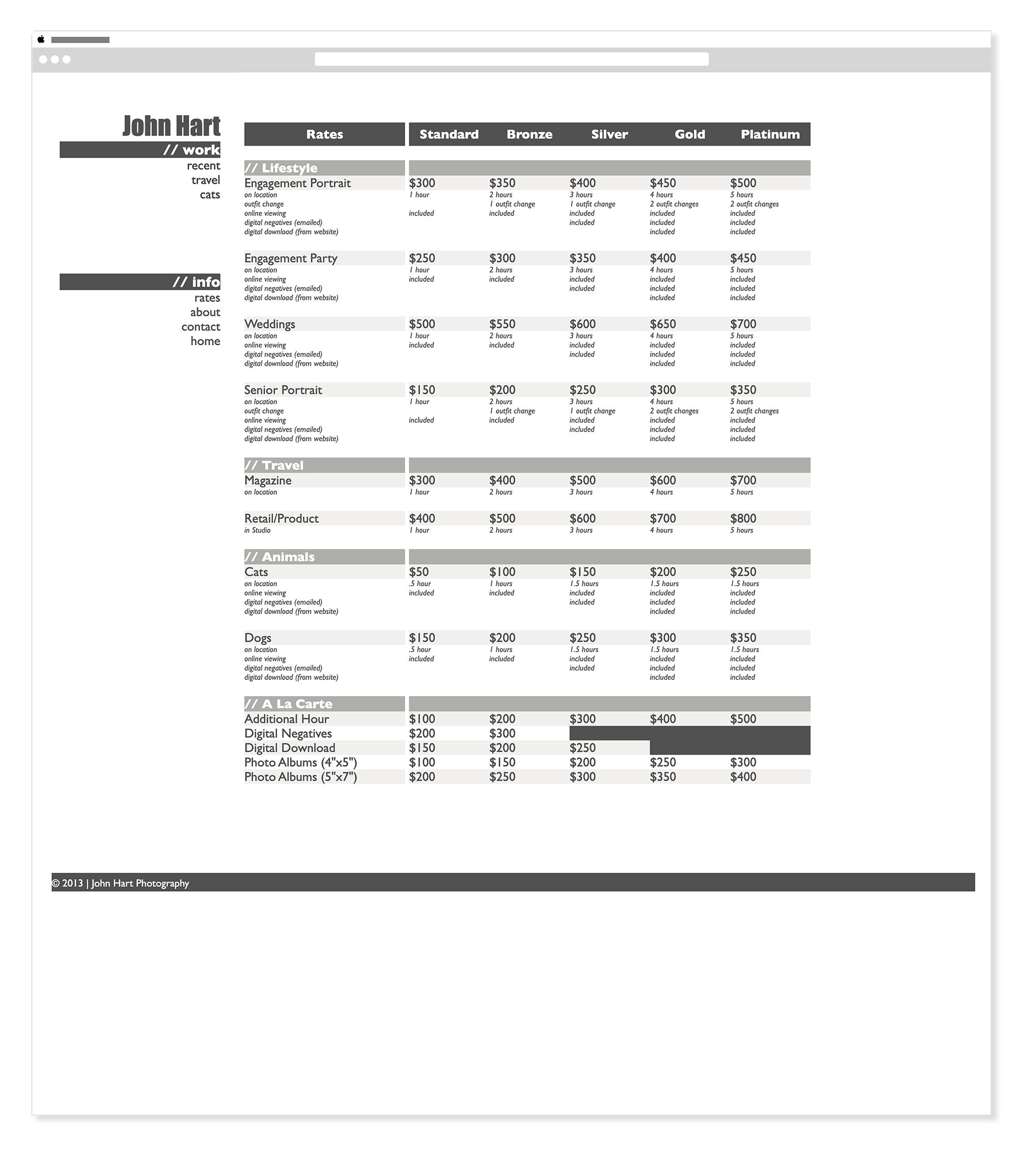
2013 — John Hart Photography - Rates
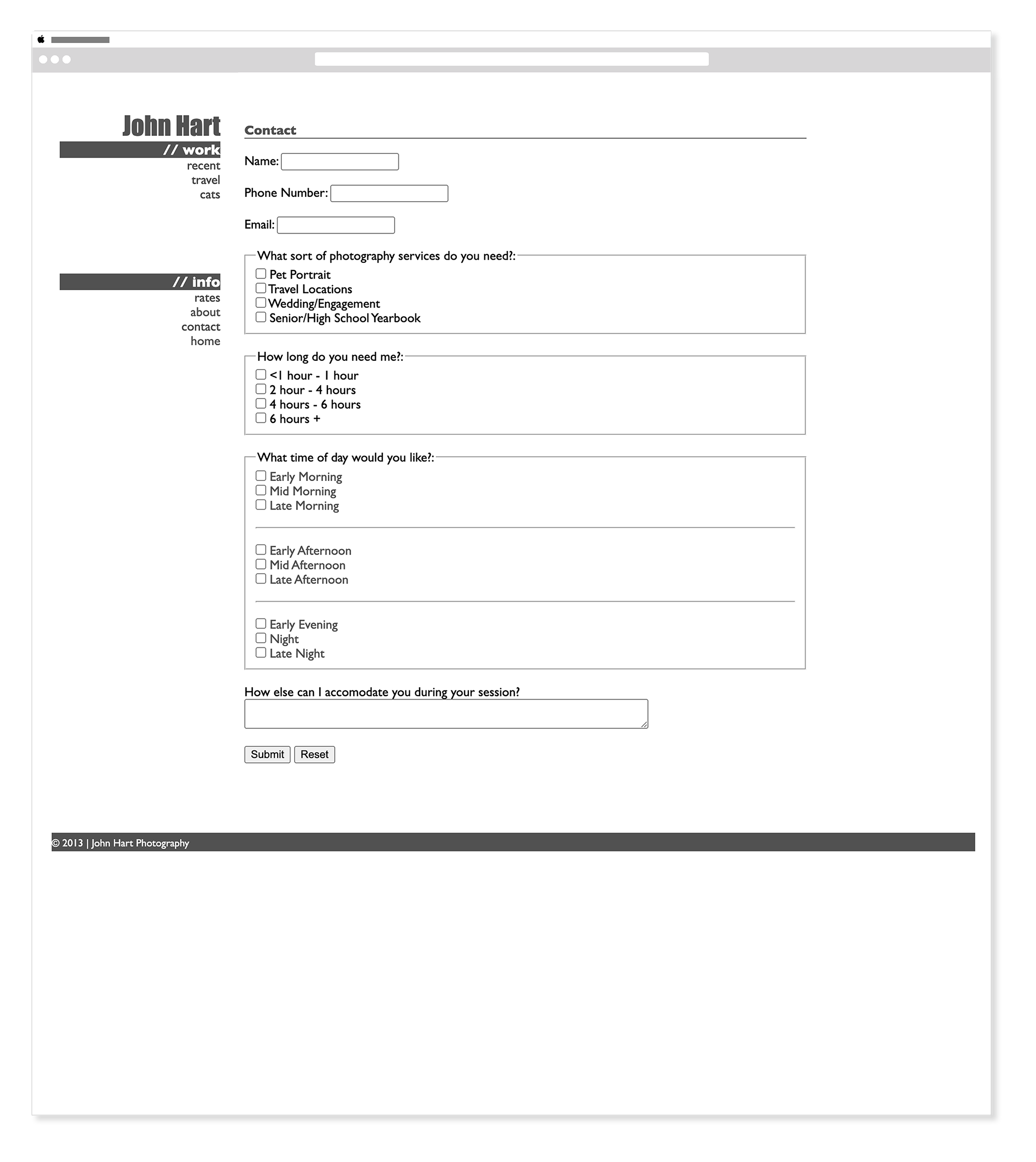
2013 — John Hart Photography - Contact Form
Wireframes — 2025 Rebuild
FigmaBefore a single line of code was written, the 2025 rebuild started with wireframes — mapping out the homepage and gallery page architecture for both desktop and mobile. Working through the structure first meant every layout decision in the build phase was grounded in intentional thinking rather than improvisation.
Homepage
Galleries
2025 — Rebuilt & Refreshed
HTML & CSS Adobe PhotoshopThe 2025 rebuild brought full responsiveness, a refreshed brand identity, and a modern visual language to the same brief. Every layout was reconsidered, every design decision made with twelve more years of experience behind it.
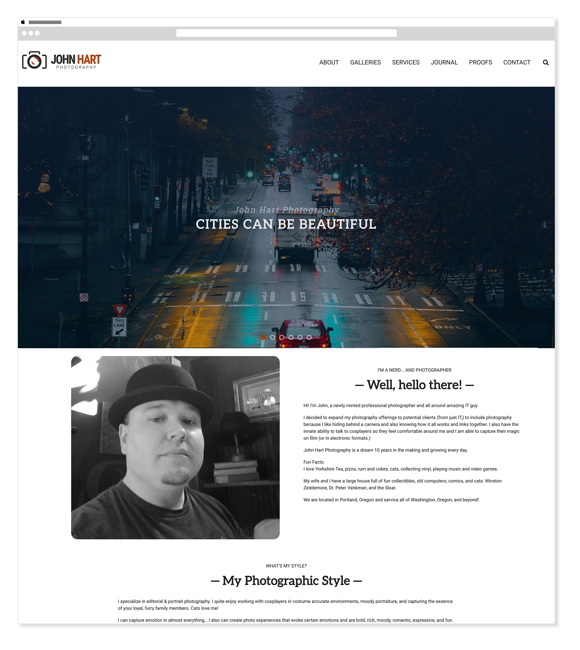
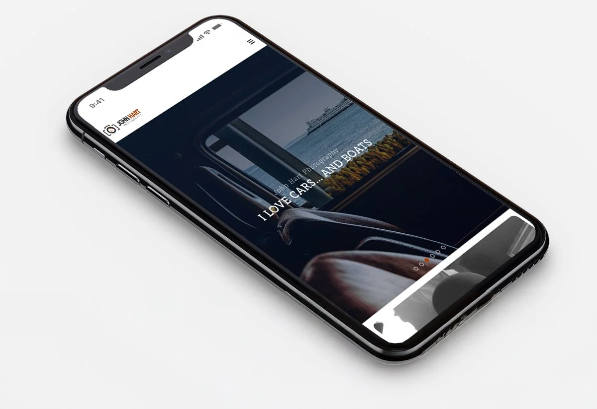
2025 — John Hart Photography - Homepage
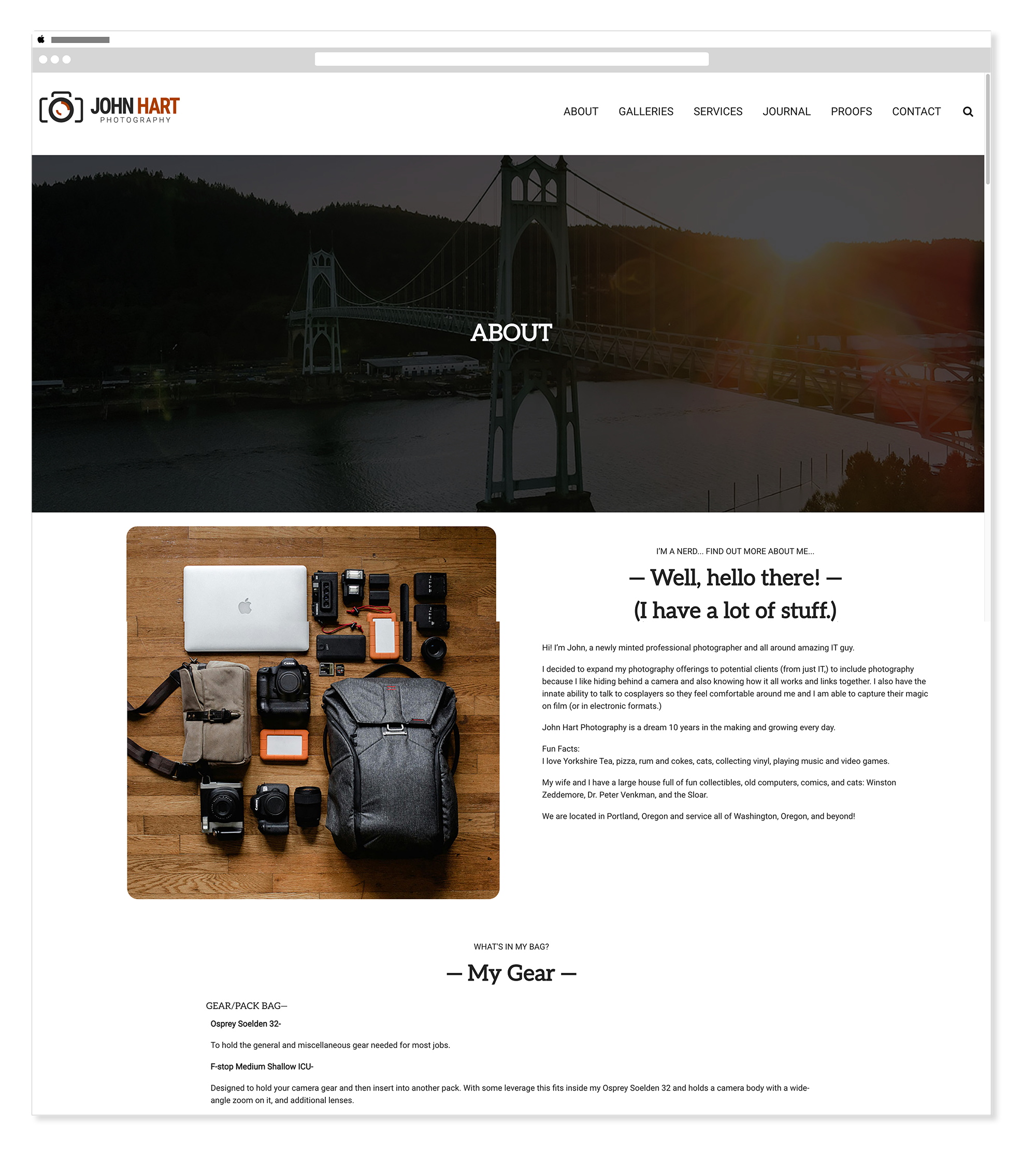
2025 — John Hart Photography - About
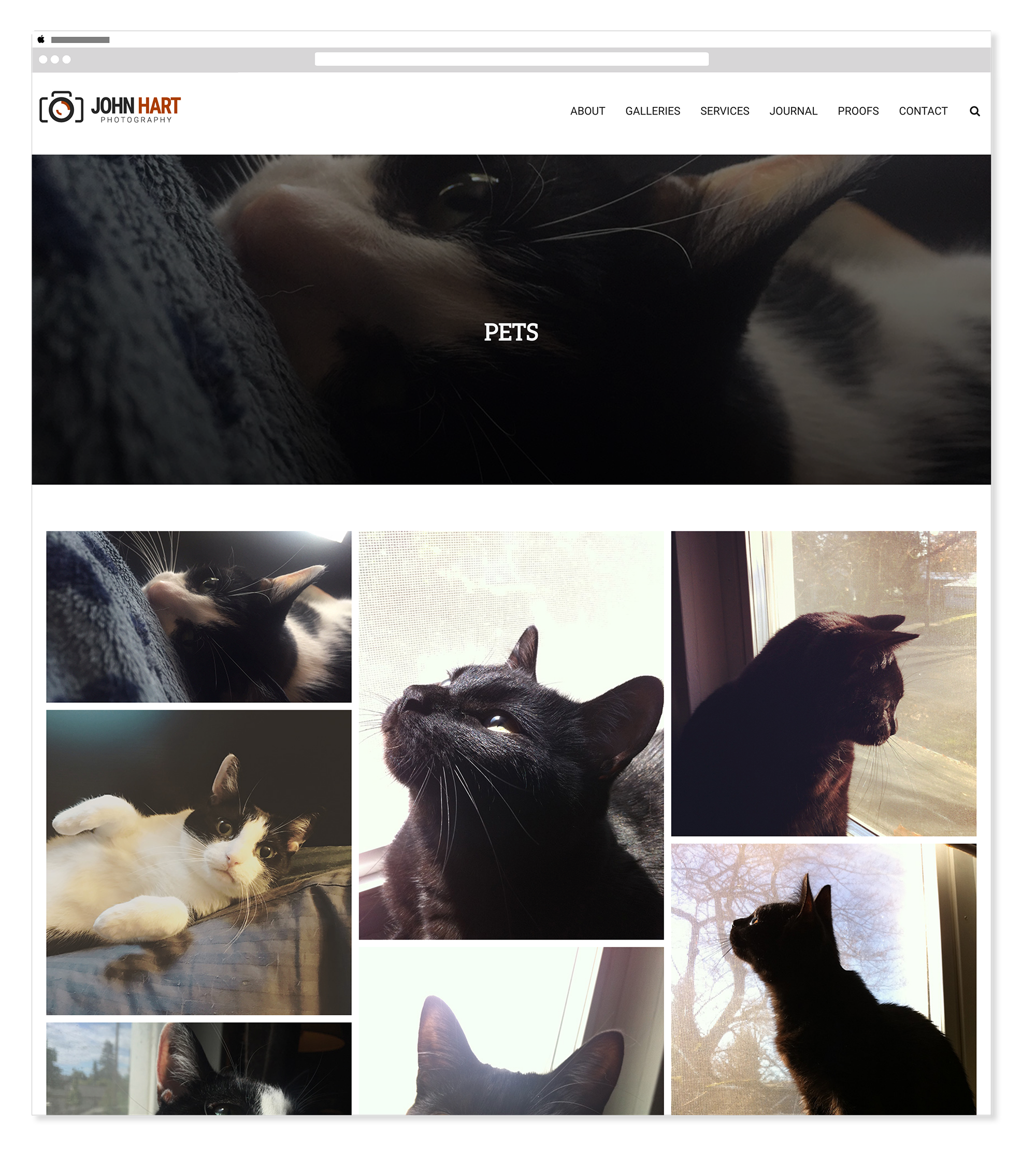
2025 — John Hart Photography - Pets Gallery
2025 — John Hart Photography - Mobile
Before & After
Twelve years of growth, side by side — the same photographer, the same brief, and a very different result.
2013 — original hand-coded site
2025 — updated hand-coded site
A visual identity updated to match twelve years of growth.
The 2025 rebuild wasn't just a technical upgrade — it came with a considered visual refresh. The typography, color palette, and logo were all reconsidered from the ground up, keeping what felt authentic to John's work while bringing the identity into alignment with where web design and visual culture had gone in the intervening twelve years. The system is intentionally restrained — a photographer's brand should never compete with the photography itself.
Logo
Adobe IllustratorThe updated logo gives John Hart Photography a clean, confident mark — simple enough to sit quietly alongside strong photography without competing for attention, distinctive enough to feel intentional and ownable.
Color & Typography
Adobe IllustratorThe color palette is deliberately limited — a warm amber, two neutrals, and white — tones that complement photography rather than distract from it. The typography pairs Aleo for headings with Roboto for body copy, a combination that feels editorial and readable without ever competing with the images themselves.
Color Palette
Amber
#AB3F01
Near Black
#282828
Mid Grey
#515151
White
#FFFFFF
Typography
Aleo
Headings & Display
Aa Bb Cc Dd Ee Ff — 0 1 2 3 4 5 6 7 8 9
Aa Bb Cc Dd Ee Ff — 0 1 2 3 4 5 6 7 8 9
Roboto
Body & UI — Light · Regular · Medium
Aa Bb Cc Dd Ee Ff — 0 1 2 3 4 5 6 7 8 9
Aa Bb Cc Dd Ee Ff — 0 1 2 3 4 5 6 7 8 9
“Updating a website without knowing it was getting an update.”
Meghan Lewis, Senior Visual DesignerTwo versions, one clear measure of growth.
A desktop-only HTML and CSS photography portfolio built from scratch in Dreamweaver — a real deliverable from one of the first web design courses at PCC.
A fully responsive, rebranded, and visually refreshed rebuild — same brief, same photographer, twelve years of additional skill applied to every decision.
The gap between the two builds is the most honest measure of growth — not a resume line, but a before and after that shows exactly how far the craft has come.
I didn't remember building it the first time — until I was halfway through building it again.
The 2025 rebuild started as a personal project — a way to stay sharp with hand-coded work and push against a familiar brief. It wasn't until I was about halfway through that something clicked and I realized I had done almost exactly this before. Finding the 2013 version in the archive confirmed it. That moment of recognition changed the project. It stopped being a portfolio exercise and became something more useful — a genuine measure of how much had changed in twelve years of practice.
The 2013 version was built in a classroom, by someone still learning what HTML was. The 2025 version was built by someone who has spent years pushing CSS to its limits, building design systems inside CMSs, and writing code that other people have to maintain. Staying in hand-coded HTML and CSS for both versions wasn't nostalgia — it was the only way to make the comparison honest. Same constraint, same subject, same intent. Everything else had changed.
The Beginning Dreamweaver course at PCC was one of the first web design classes taken after returning to school. It was online only — which felt comfortable, even then. The class confirmed something already suspected: working inside code felt natural, and building things from scratch was more satisfying than filling in templates.