
Designing a Clear, Motivating App for Health and Habit Tracking
A self-directed UX/UI concept exploring how a single, thoughtfully designed app could bring nutrition tracking, workout logging, and health metrics together — reducing friction and making daily wellness feel manageable rather than overwhelming.

Overview
One app to replace the chaos of tracking everything everywhere.
Health and fitness apps have a problem — there are too many of them, and none of them talk to each other. Nutrition lives in one app, workouts in another, sleep in a third. The result is a fragmented, repetitive experience that creates more friction than motivation. This project set out to explore what a single, unified health tracking app could look like if it was designed around how people actually live — not just how they ideally should.
The concept expands on the foundation of Apple's Health app and reimagines it as a more robust, all-in-one platform — similar to MyFitnessPal but with a stronger focus on clarity, personalization, and daily usability. From calorie tracking and intermittent fasting to carb management for diabetic users, the app was designed to adapt to a wide range of real-world health goals without feeling rigid or overwhelming.
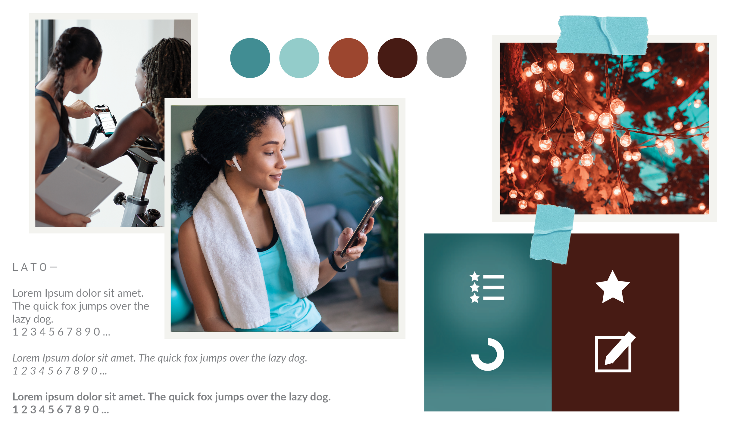
HEALTH APP MOODBOARD
Key Decisions
What I decided, and why.
Start with real frustrations, not assumptions
Rather than designing around what I thought users wanted, I began with competitive analysis and contextual research to understand where existing apps actually failed. This surfaced three consistent themes — fragmented data, repetitive manual input, and inflexible goal management — that became the foundation for every design decision that followed.
Collect context upfront to reduce friction throughout
One of the key decisions was to collect health information during onboarding — goals, dietary preferences, eating styles, conditions — so the app could tailor guidance and feedback from day one. This meant users didn't have to reconfigure the app every time their needs shifted, and the experience felt responsive rather than generic.
Make the interface motivating, not clinical
Health apps often default to sterile, data-heavy interfaces that feel more like spreadsheets than support systems. I deliberately chose a warmer visual direction — approachable typography, clear progress visualizations, and encouraging feedback — to make daily use feel rewarding rather than obligatory. The goal was an interface that users actually wanted to open.
Research & Discovery
Understanding where health apps lose people — before designing anything.
Before sketching a single screen, I set out to understand the real frustrations behind health tracking. I focused on three research goals: understanding user pain points through interviews and observation, analyzing existing apps for effective patterns and gaps, and building personas that reflected the diverse goals and habits of real users.
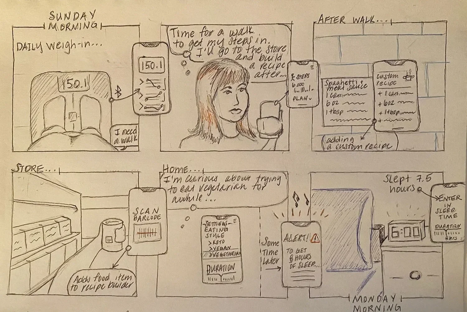
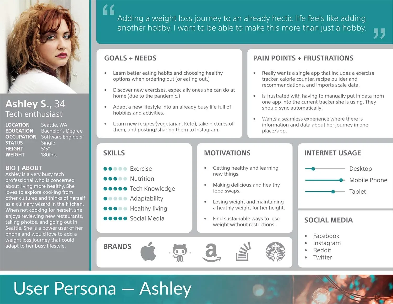
User Personas & Storyboards
Adobe XD User ResearchI developed user personas and storyboards to ground the design in real behaviors and motivations. These artifacts helped me stay focused on the people using the app — not just the features — and ensured every design decision traced back to a genuine user need.
Competitive Analysis
MyFitnessPal Apple HealthI reviewed popular health and fitness apps to identify effective interaction patterns and surface gaps. The research revealed three consistent themes: apps that used interactive dashboards and visual progress cues kept users more engaged; most interfaces required manual, repetitive input that created friction; and no existing app fully consolidated nutrition, workouts, and health metrics in a flexible, personalized way — leaving a clear opportunity to design something better.
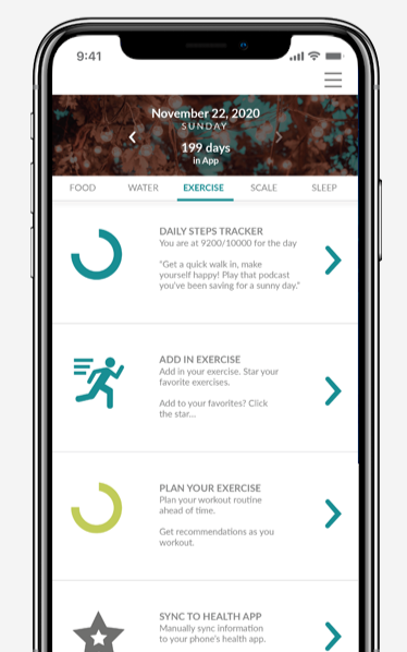
Design & Prototype
From research insights to screens — building the structure of a seamless health experience.
With user pain points clearly defined, I moved into wireframing — translating research into layouts that felt intuitive, engaging, and aligned with real user behaviors. I started with a straightforward linear workflow to map the essential user journeys: logging meals, tracking workouts, syncing devices, and reviewing progress. Each wireframe aimed to balance usability with a motivating visual hierarchy.
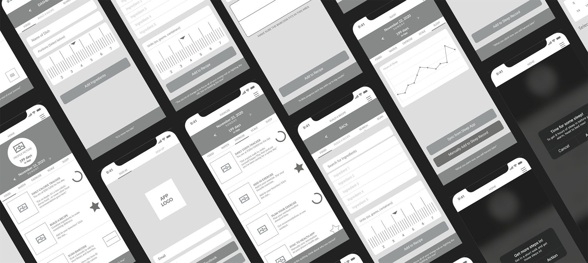
Wireframes
Adobe XD Low FidelityWireframes provided a clear blueprint for interactions — favoriting foods and workouts, adjusting dietary preferences, and tracking different eating styles. They made it easier to identify areas of friction and refine the flows before moving into higher fidelity design. Multiple layout approaches were explored to find the right balance between information density and ease of navigation.
Prototype
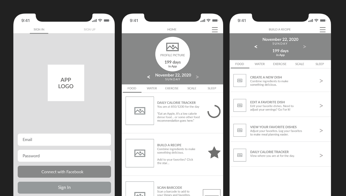
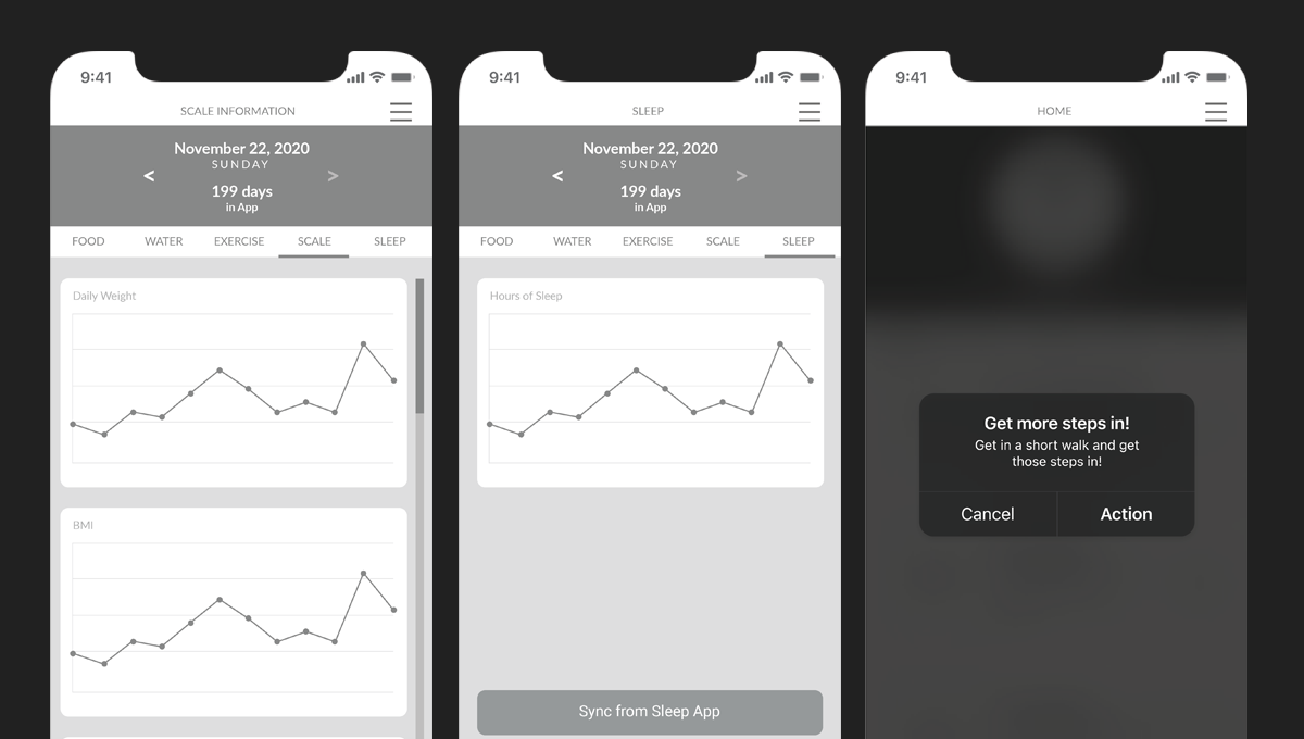
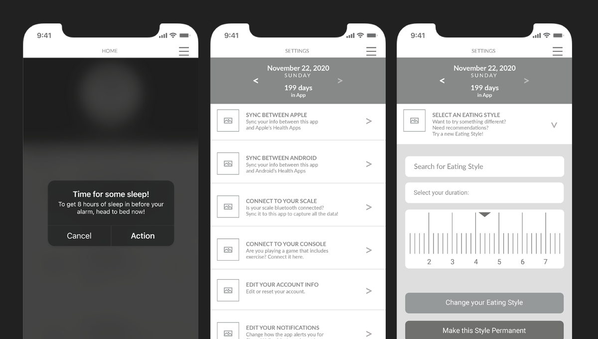
Adobe XD Clickable PrototypeThe wireframes were transformed into a clickable prototype to test navigation, screen transitions, and feedback loops. Four core features were prototyped and validated: personalized nutrition tracking with meal logging and favorites, integrated workout logging with device sync, flexible goal management with custom targets and alerts, and progress visualization dashboards showing calories, workouts, and weight trends.
View the Prototype →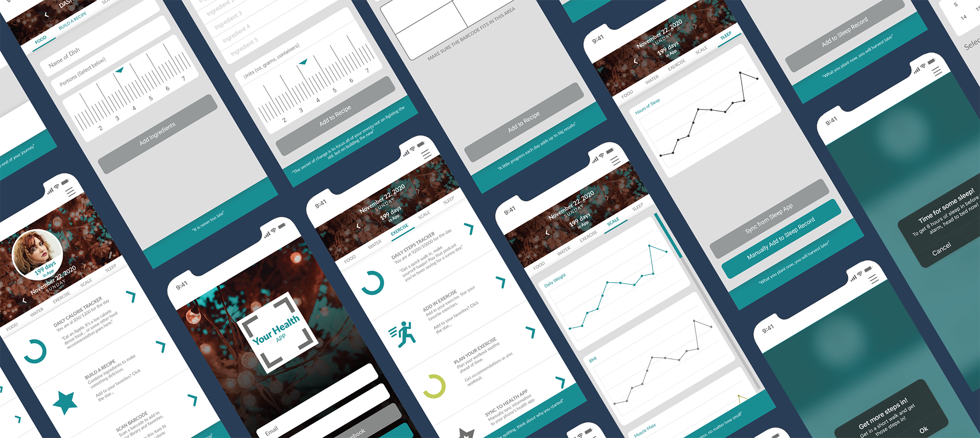
Build & Refine
Translating research insights into a polished, usable app.
After completing user research and compiling feedback, I began refining the app's screens, interactions, and visual language. The insights highlighted areas where users felt frustrated, confused, or slowed down while tracking their health and habits. With this feedback in mind, I iterated on layouts, updated imagery, finalized color palettes, and adjusted copy to make the experience as clear and motivating as possible.
Key Iterations
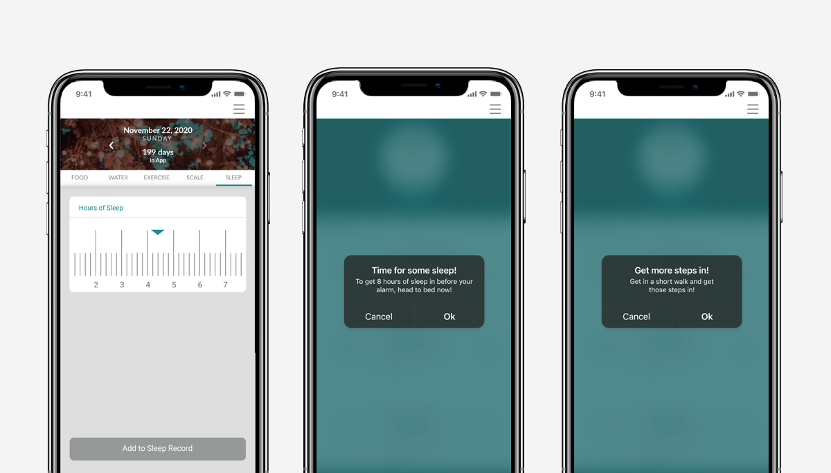
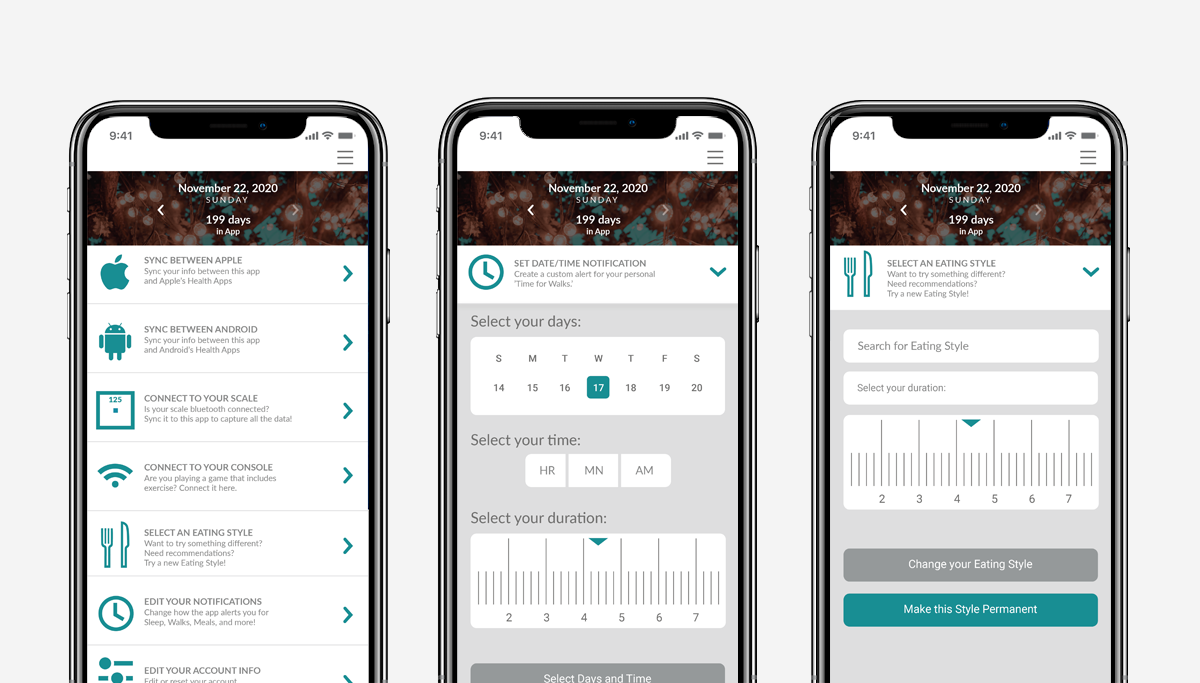
Adobe XD High FidelityThree areas drove the most significant refinements. First, repeated input frustrations — users noted that entering meals, workouts, and metrics across multiple apps was time consuming, so I consolidated key flows and created defaults and shortcuts for frequent entries. Second, navigation clarity — feedback revealed users struggled to locate settings, progress dashboards, and nutrition data, so I reorganized the toolbar and screen layouts to separate core functions and make key actions easily accessible. Third, diverse user preferences — users needed support for intermittent fasting, keto, carb management, and more, so I added flexible options, clear labels, and customizable alerts to accommodate a wide range of goals.
Final Design
A unified health tracking experience built around how people actually live.
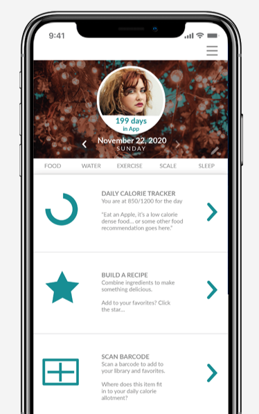
The final high fidelity screens brought together everything learned through research, wireframing, and iteration — a visual system that felt warm and motivating, navigation that kept core actions within reach, and flexible tracking that adapted to each user's goals rather than forcing them into a rigid structure.
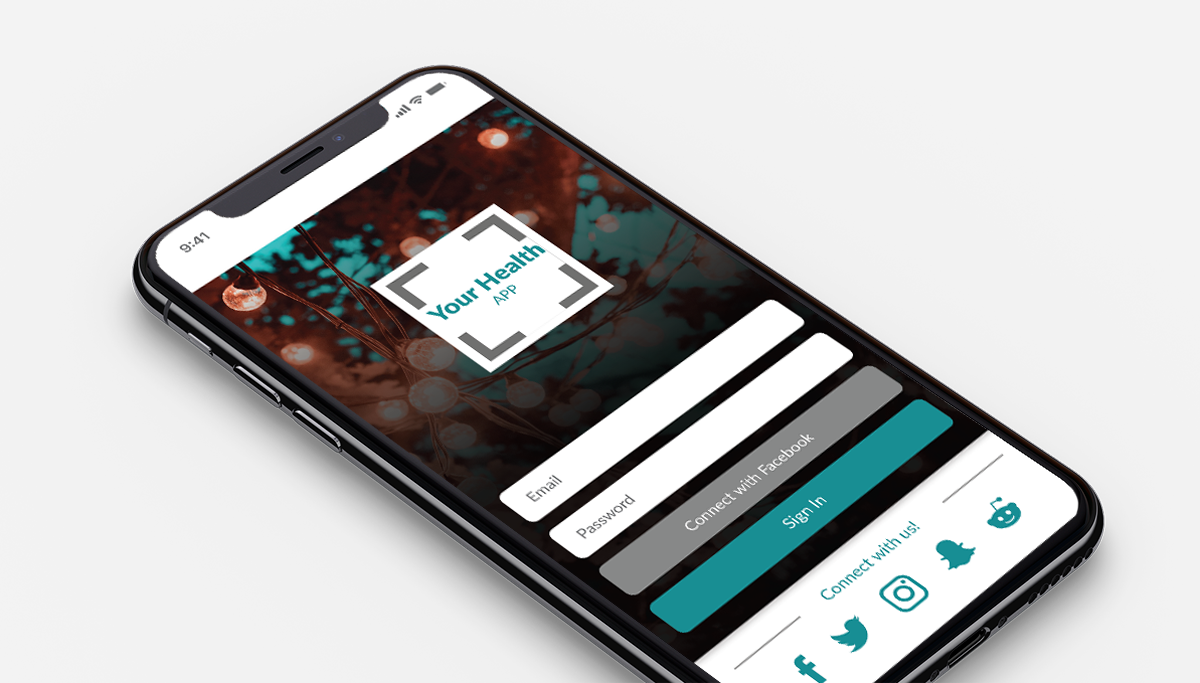
App in Context
High Fidelity Adobe XDThe final mockup shows the app in a real device context — bringing the visual system to life and demonstrating how the interface feels in hand.
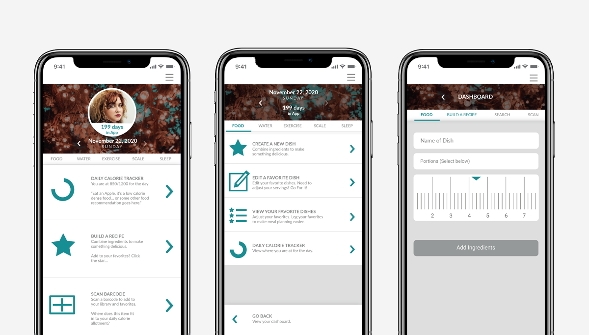
Screen Flow
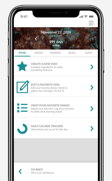
4 ScreensThe screen flow shows the core user journey through the app — from the dashboard overview through nutrition tracking, workout logging, and progress visualization.
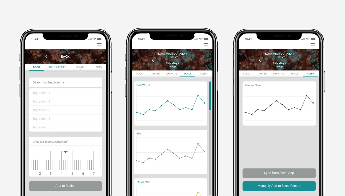
Screen Details
Visual SystemIndividual screen details highlight the visual design system — typography, color, iconography, and layout working together to create an experience that feels clear, motivating, and distinctly human.
Outcomes
What this project delivered.
A full UX/UI process completed in 8 weeks — from initial research and personas through wireframes, iterations, and a clickable high fidelity prototype.
User flows, personas, storyboards, wireframes, high fidelity screens, a visual design system, and a clickable Adobe XD prototype.
A single app concept that consolidated nutrition tracking, workout logging, and health metrics — reducing the fragmentation and friction of managing multiple tools.
Reflection
What this project taught me.
This project was an early exploration of what a full UX/UI process could look like from research through prototype — and it taught me a lot about the value of starting with real frustrations rather than assumed solutions. The competitive analysis was particularly eye-opening: the gaps in existing health apps weren't mysterious, they were just consistently ignored. Users wanted flexibility, consolidation, and encouragement — and most apps gave them data entry forms instead. Designing around those needs rather than around features made every decision feel more grounded and purposeful. If I returned to this project today, I'd push the personalization further and invest more time in usability testing to validate the flows before finalizing the visual design.