
Designing a Space to Stream — Twitch & YouTube UI for Meg the Artist
A cohesive personal brand built across two streaming platforms — custom illustrations of four cats, animated emojis, panel artwork, channel banners, and video editing all working together to create a space that feels like home.
A personal brand built for two platforms — and four very opinionated cats.
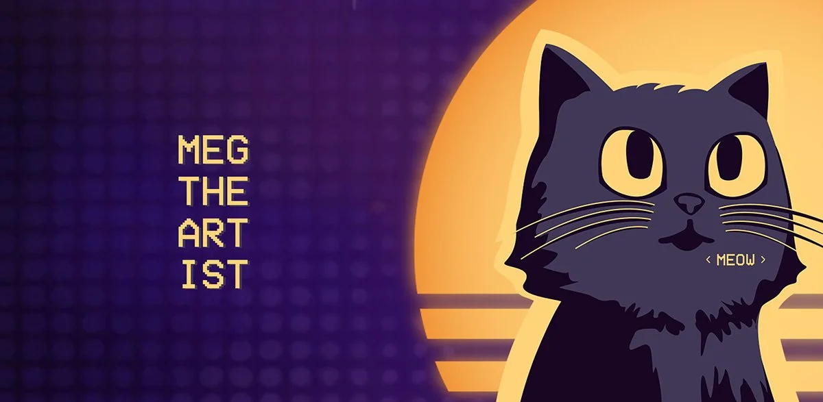
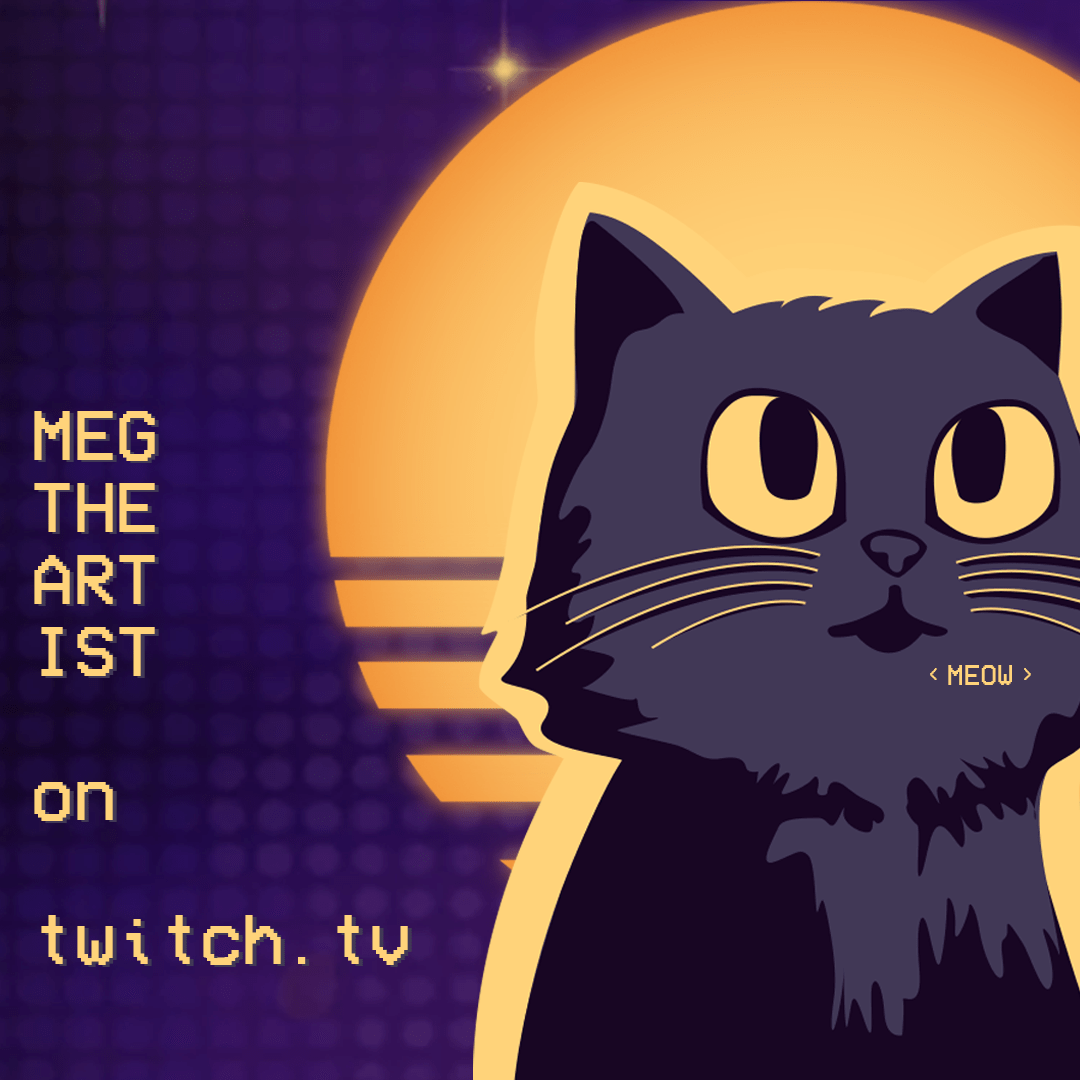
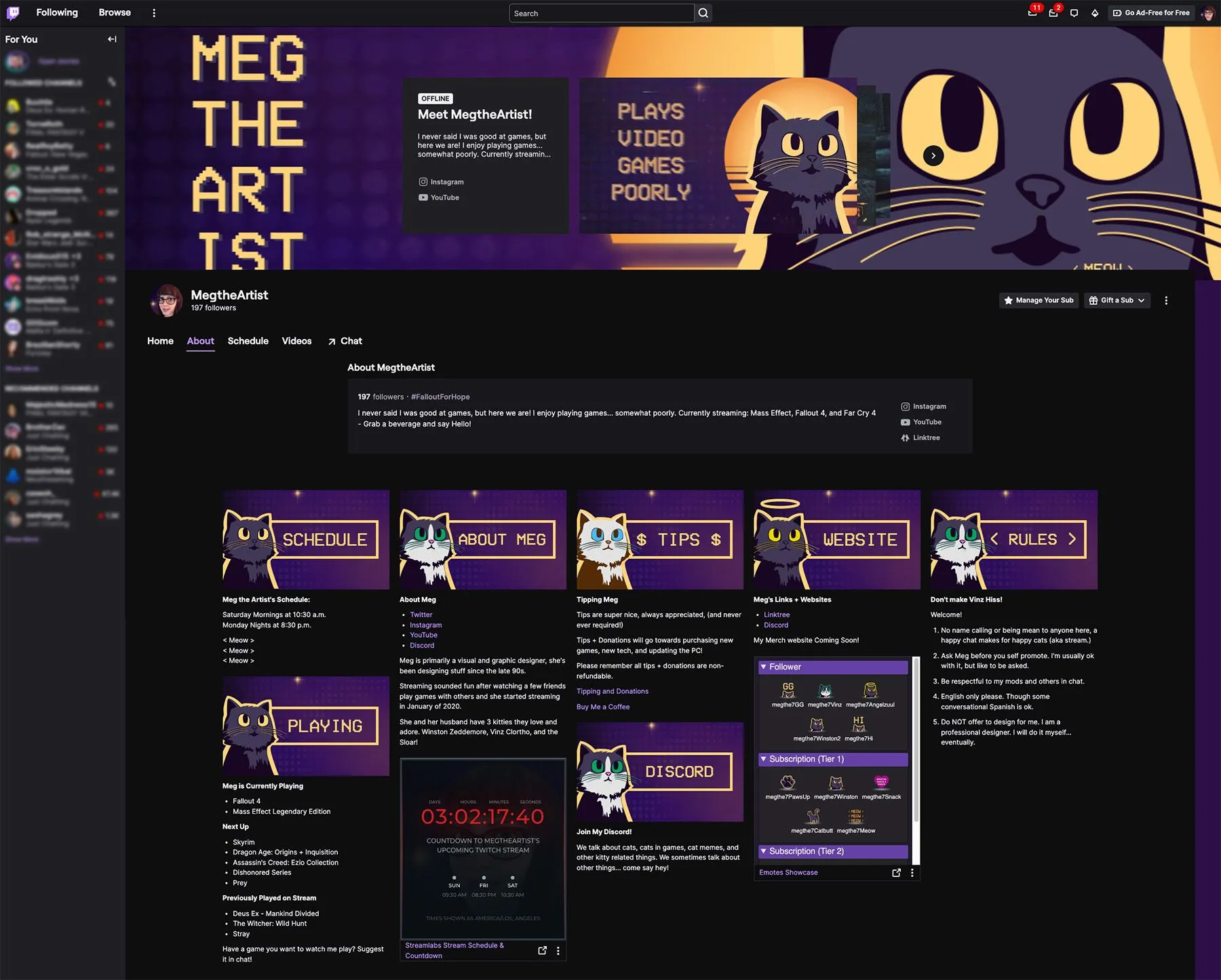
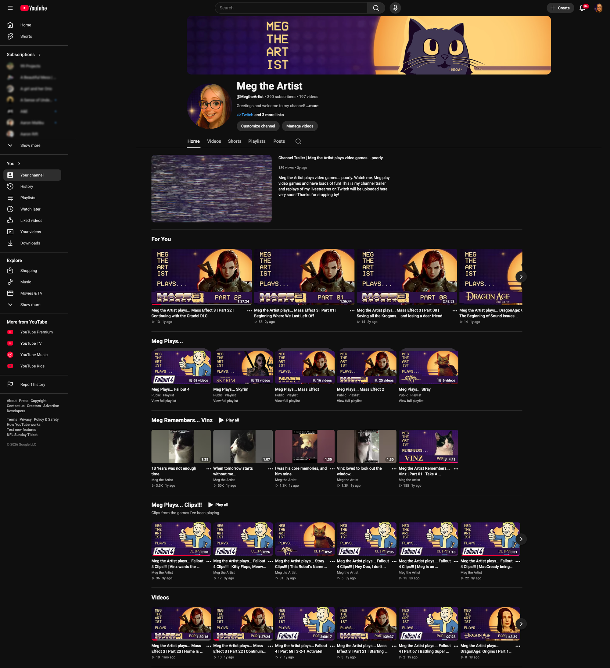
Meg the Artist started as a Twitch streaming channel and grew into a fully realized personal brand spanning two platforms. The goal was simple in concept but specific in execution: create a cohesive, on-brand space that felt personal and inviting — somewhere visitors would want to stay, follow, and come back to. Twitch gives streamers a defined structure to work within, but leaves plenty of room for personality within that structure. The brand started with illustration — specifically, custom artwork of Winston, Vinz, Zuul, and Sloar, the four cats who make regular appearances in the streams — and grew outward from there into panel headers, animated emojis, channel banners, and eventually video editing for YouTube. Every piece of it was designed to feel cohesive, whimsical, and unmistakably mine.
The Problem
A blank channel page and a platform full of constraints — and an opportunity to make it feel like home.
Twitch gives every streamer the same starting point — a generic page with predefined areas for panels, banners, and artwork. The challenge isn't the platform's flexibility, it's the opposite: working creatively within fixed dimensions and guidelines while still producing something that feels distinctive and personal. Panels are capped at 320 pixels wide. Emojis have to work at tiny sizes. Everything has to read clearly on both desktop and mobile. And it all has to feel cohesive across two very different platforms.
The choices that shaped the brand.
Starting with the cats.
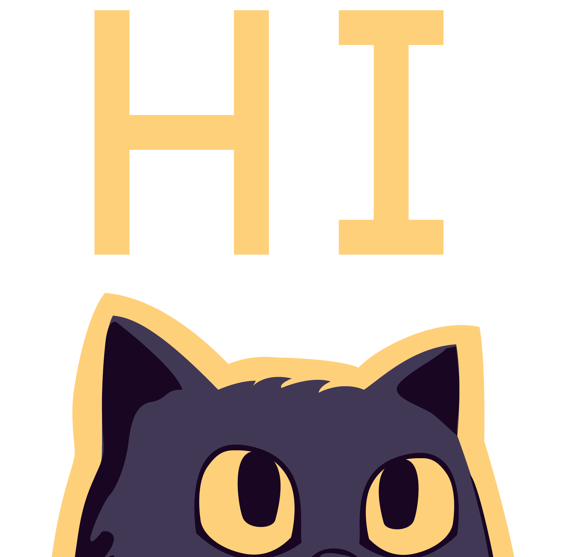
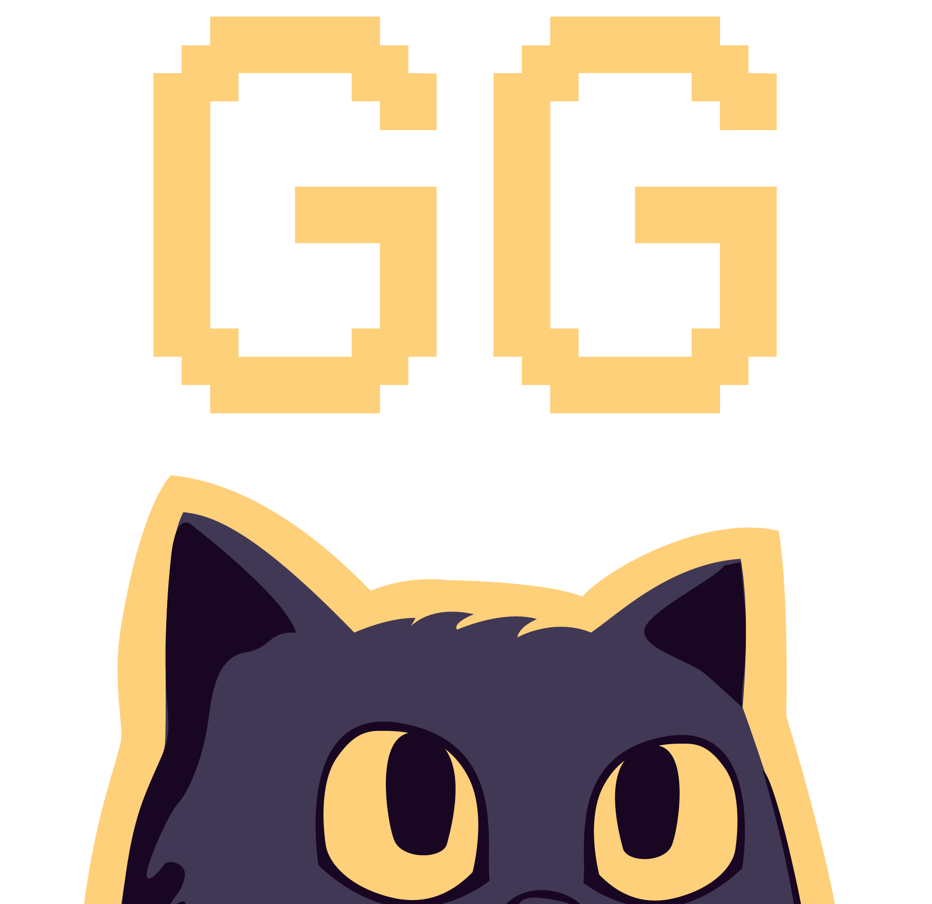
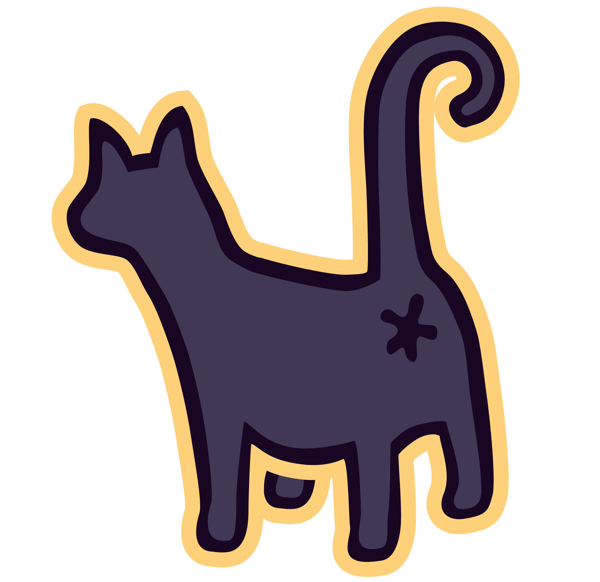
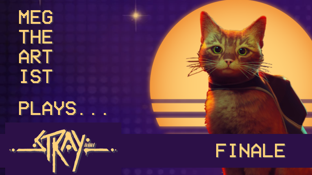
The first creative decision was to anchor the brand in illustration — specifically, custom artwork of Winston, Vinz, Zuul, and Sloar. The cats are a real and constant presence in the streams, so making them the visual centerpiece of the brand wasn't a gimmick — it was honest. It gave the channel an immediately recognizable identity that was personal, warm, and impossible to replicate. Everything else in the brand system flowed outward from those four characters.
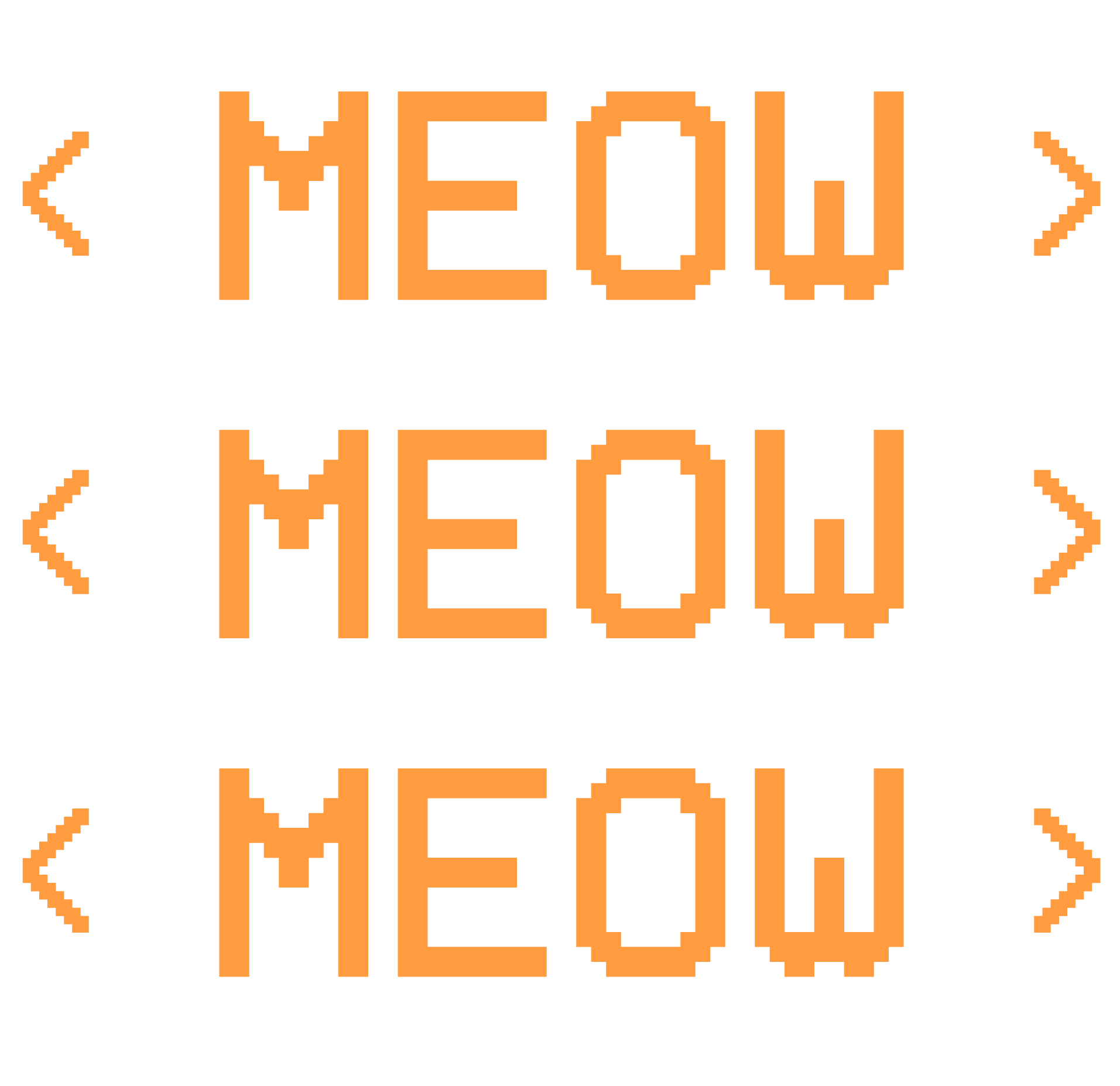
Designing artwork that works at tiny sizes and encourages engagement.
Twitch emojis are small — they have to be readable and expressive at sizes where detail disappears. Each emoji was designed with that constraint in mind, keeping shapes bold and silhouettes clear. The first set stayed tightly on brand — cat-themed, whimsical, and immediately connectable to the channel. Emojis are also a subtle marketing tool: when visitors use them in other streamers' chats, they carry the brand with them.
Extending to YouTube to preserve the streams beyond Twitch's erasure window.
Twitch deletes VODs after a set period — which means streams disappear unless they're saved elsewhere. The decision to edit and upload to YouTube wasn't just about preservation — it was about building a second audience and extending the brand's reach beyond the live streaming context. The YouTube channel carries the same visual identity as Twitch, keeping the brand cohesive for viewers who discover the content through either platform.
Treating both channels as one brand, not two separate projects.
It would have been easy to treat the Twitch and YouTube channels as independent design problems. Instead, every visual decision was made with both platforms in mind — color palette, illustration style, typography, and tone all consistent across both. That cohesion is what makes the brand feel established rather than cobbled together, and it makes adding new elements to either channel straightforward because the system already exists.
A brand built piece by piece — illustrations, panels, emojis, and beyond.
Every element of the Meg the Artist brand was designed and built from scratch — starting with the cat illustrations that anchor the identity and expanding outward into every touchpoint a visitor encounters on either platform.
Channel Art & Banners
Adobe Illustrator Adobe PhotoshopThe channel banners set the visual tone for both platforms — on-brand, immediately personal, and designed to communicate personality before a single stream has been watched.
Cat Illustrations
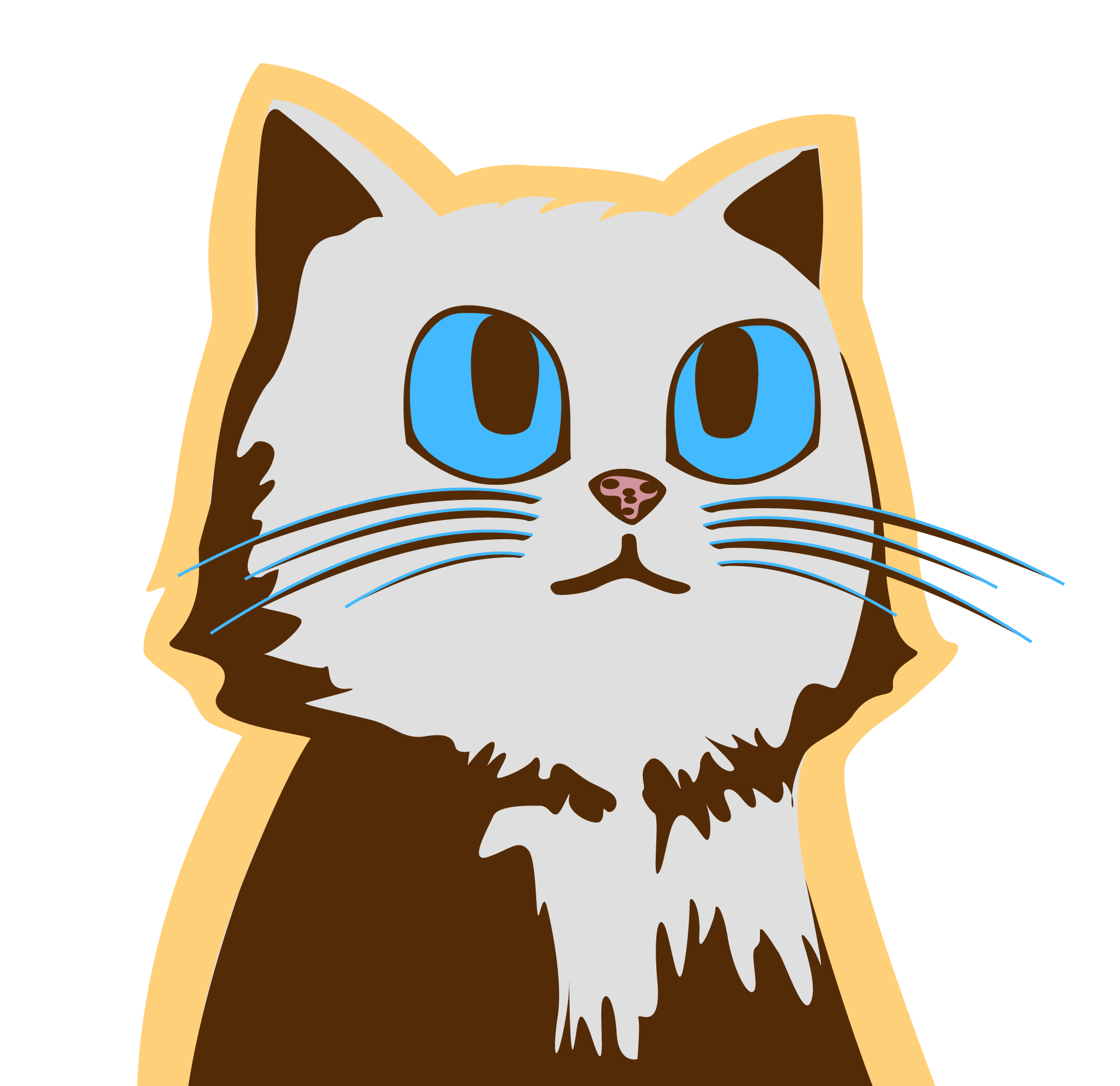
Adobe IllustratorWinston, Vinz, Zuul, and Sloar — the four cats who anchor the brand. Each illustration was designed to be bold, expressive, and versatile enough to work across panels, emojis, and channel art at any size.
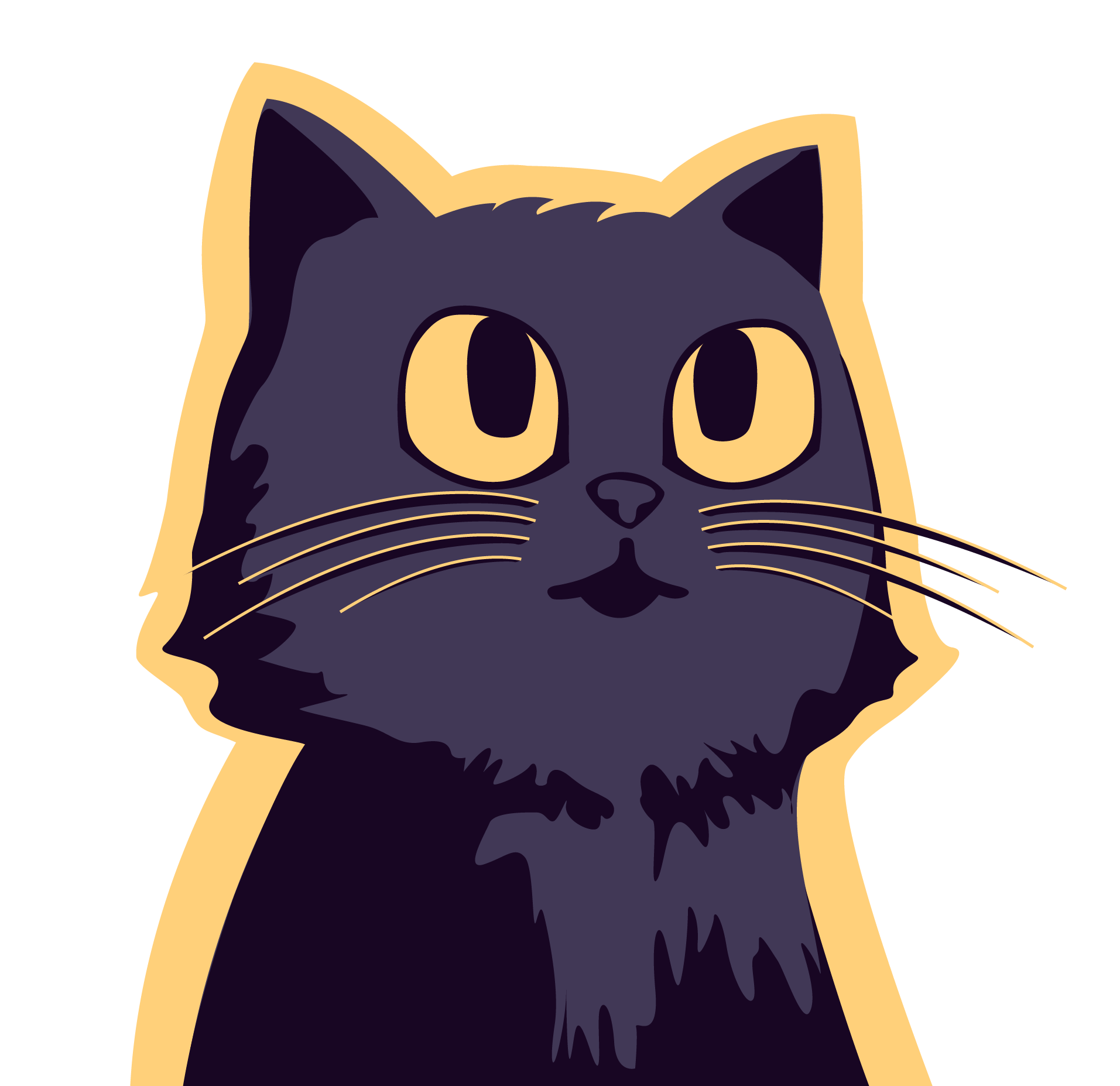
Meg the Artist — Winston Illustration
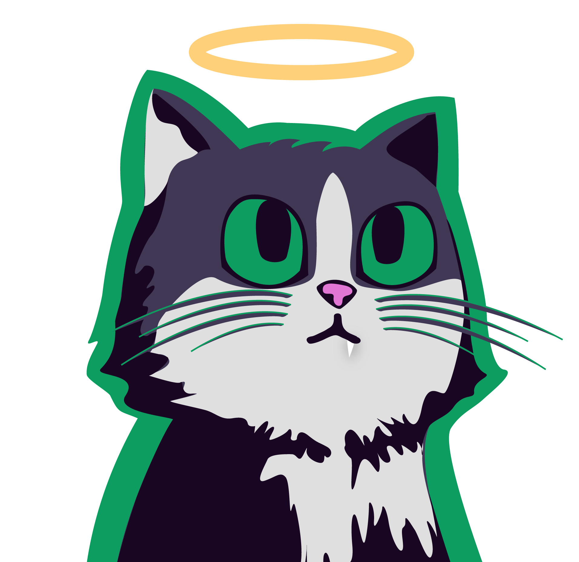
Meg the Artist — Angel Vinz Illustration
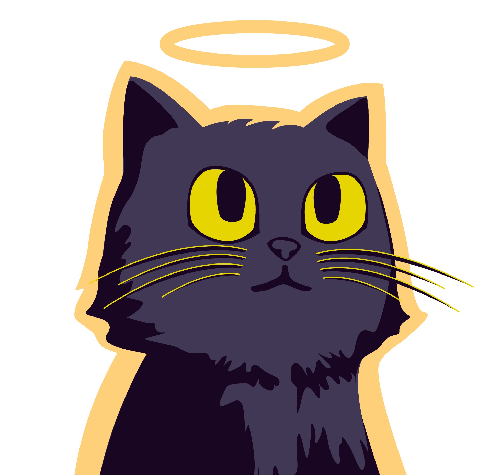
Meg the Artist — Angel Zuul Illustration
Meg the Artist — Sloar Illustration
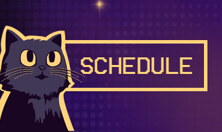
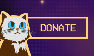
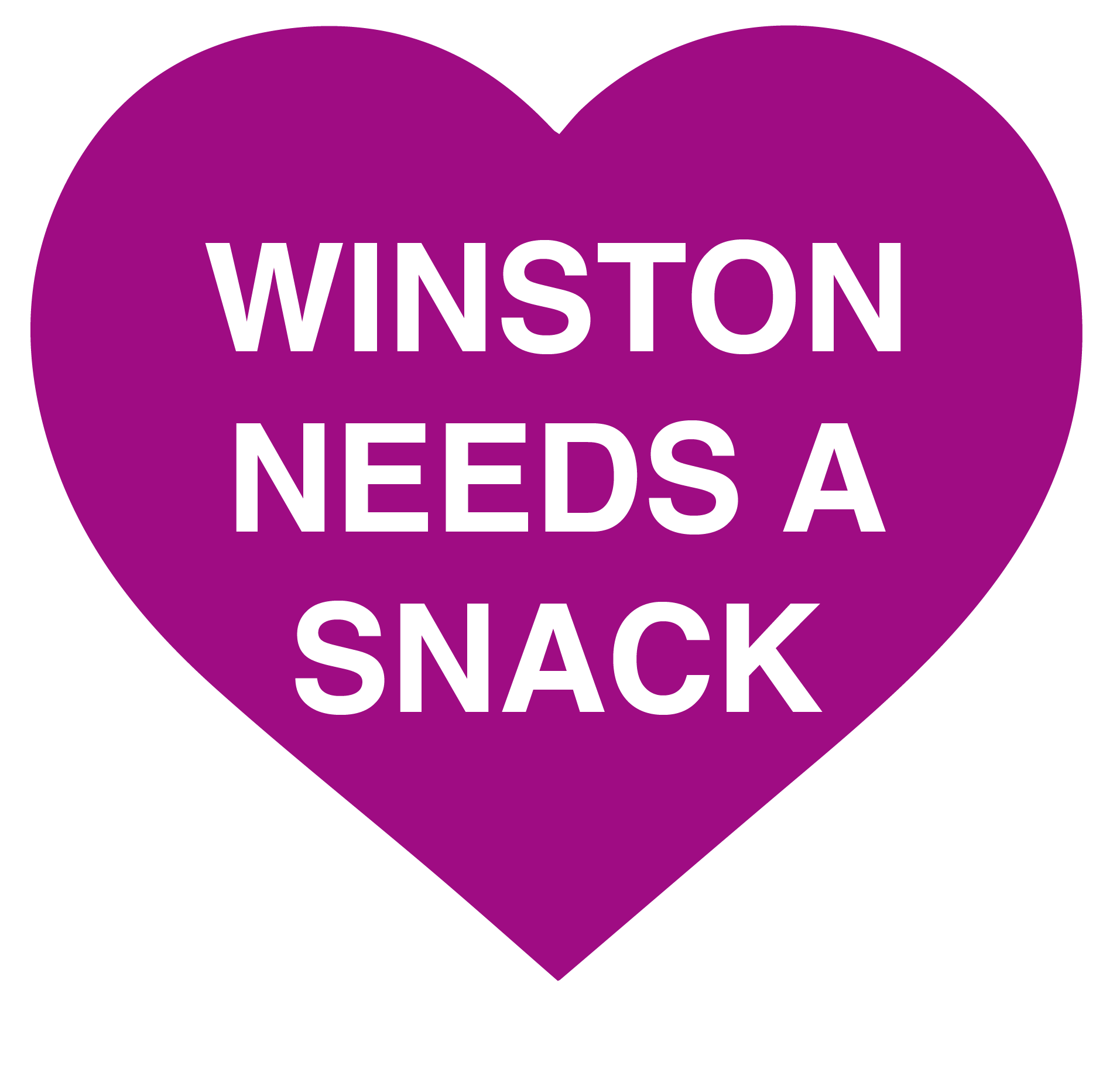
Panel Headers
Adobe IllustratorEach panel header was designed to be concise, whimsical, and on-brand — constrained to 320px wide per Twitch's guidelines, with information that was clear at a glance and personality that made visitors want to read further.

Emojis for User Interaction
Adobe IllustratorThe first set of custom emojis was designed to work at tiny sizes while staying on brand — bold shapes, clear silhouettes, and cat-themed personality throughout. Visitors can use these in any Twitch chat, carrying the brand with them wherever they go.

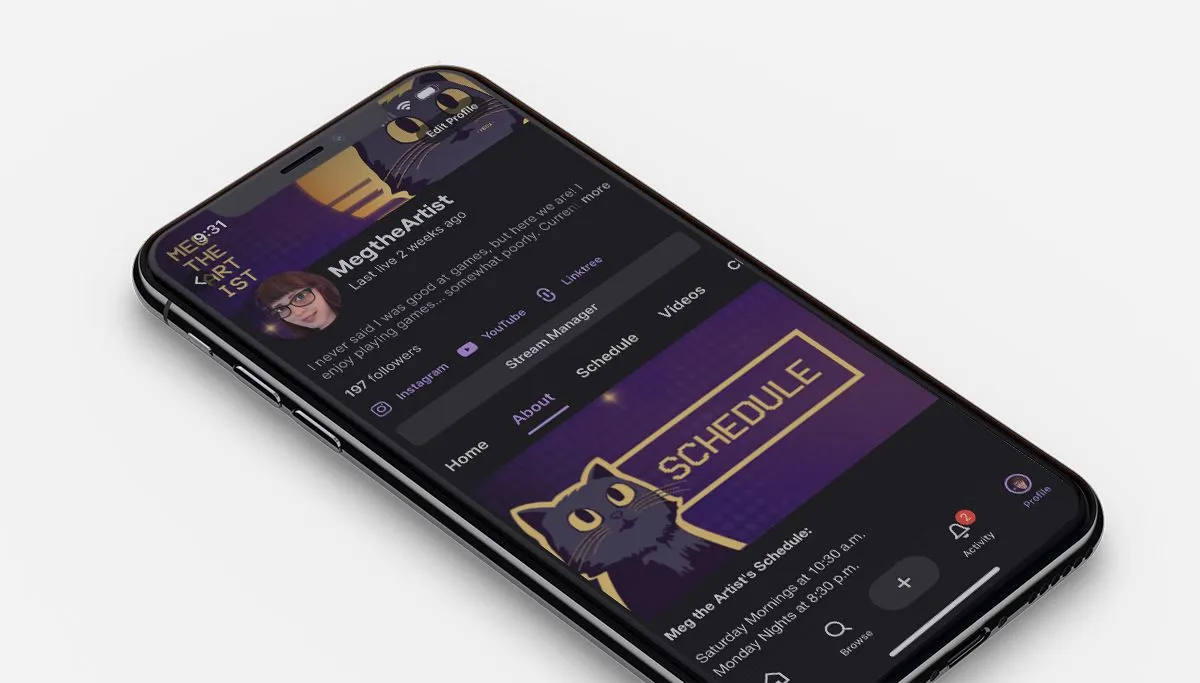
The full channel page as it appears to visitors — all the brand elements working together in context, on both desktop and mobile.
The YouTube channel extends the brand beyond Twitch — edited VODs uploaded for viewers who missed the livestream or discovered the content through YouTube. The same visual identity carries across both platforms.
“By day, brand systems and style guides. By night, pixel art and chat commands. Same brain, different mode.”
Meghan Lewis, Twitch StreamerA personal brand that grew an audience — and kept growing.
The cohesive brand and custom artwork increased participation and followers across both Twitch and YouTube — visitors who arrived because of the content stayed because of the experience.
A single cohesive brand now lives across two platforms — Twitch for live content and YouTube for edited VODs — giving the channel a presence that extends well beyond the live streaming window.
The brand continues to grow — new emojis, new content, and new design elements added as the channel expands. A strong visual system makes every addition feel like a natural extension rather than an afterthought.
Designing for yourself is a different kind of challenge — and a useful one.
Personal projects have a way of being both the easiest and the hardest design work. There's no client to answer to, no brief to interpret, and no approval process — but that freedom comes with its own pressure. Every decision is yours, which means every mistake is too. Building the Meg the Artist brand has been a genuine creative exercise in applying professional discipline to a personal project — establishing a system, staying within it, and resisting the temptation to keep changing direction every time something new feels interesting.
The cats were the right choice. Winston, Vinz, Zuul, and Sloar are genuinely part of the streams — they show up, they have opinions, and viewers have responded to them warmly. Starting the brand with illustration rather than typography or color meant building from personality outward, which gave the whole system a warmth that would have been harder to achieve any other way. The emojis flying through chat during a livestream remain one of the most satisfying design moments I've had — small, functional, and completely mine.