
Sound as a Foundation — Logo & Website for Portland Media Partners
A logo and WordPress landing site for a full-service media group — built around the visual language of sound waves and launched ahead of schedule.

A brand and website built on a single unifying concept.
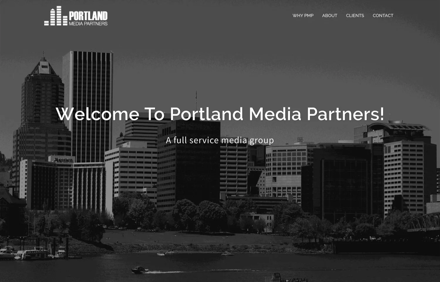
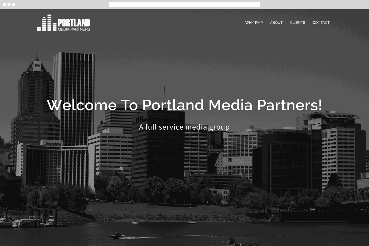
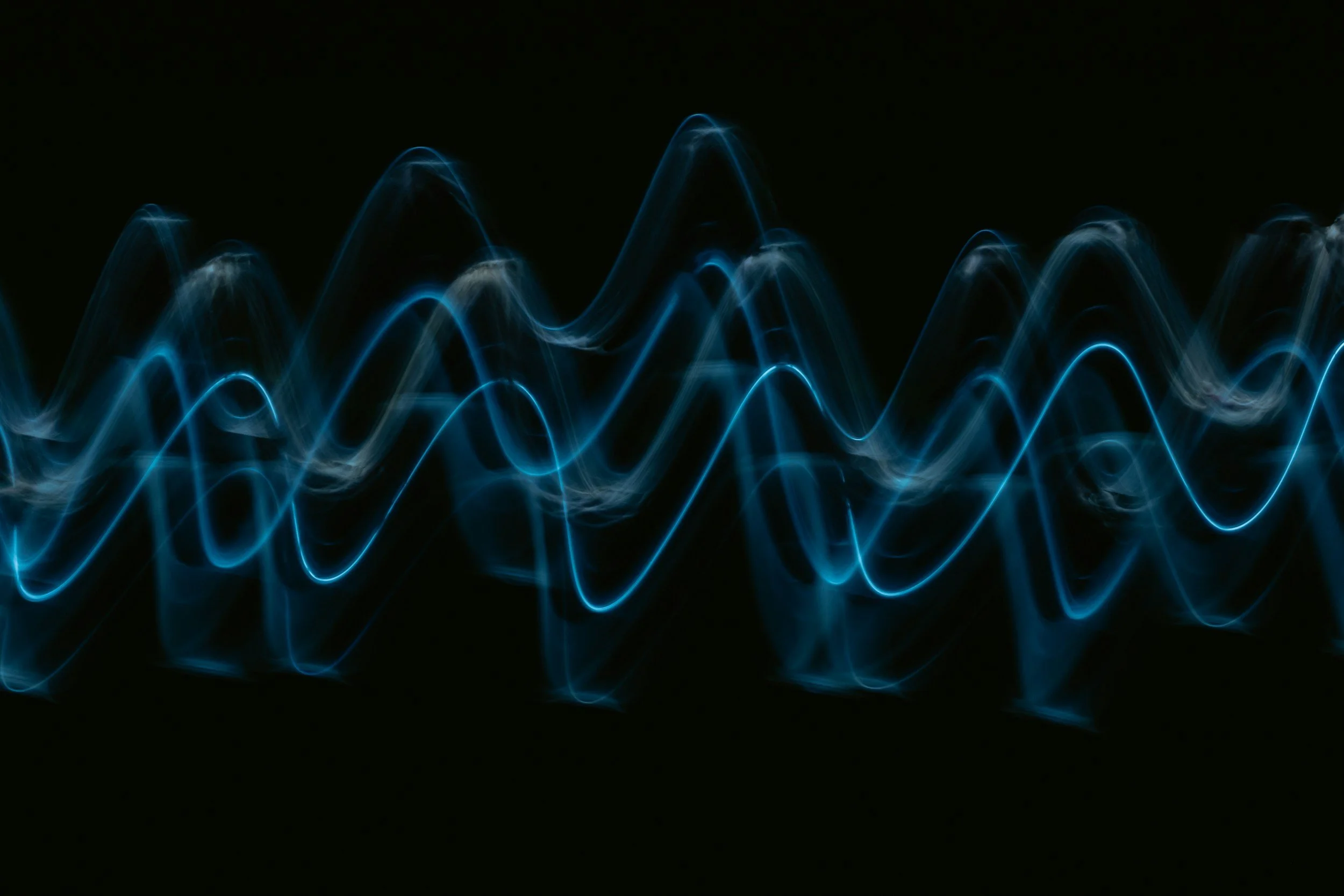
Portland Media Partners needed a logo and landing page that conveyed professionalism for a burgeoning full-service media group. The concept came together quickly: sound waves — drawn from the client's deep roots in radio and television — became the visual foundation for both the logo and the site. Portland's skyline, reimagined as rising sound forms, gave the mark a local identity that landed immediately.
The Problem
Logo, brand, and a live site — in under two weeks.
Portland Media Partners needed a professional identity from the ground up — logo, brand, and a live website — with a fast turnaround and a clear vision.
From mockup to live site — designed and built solo.
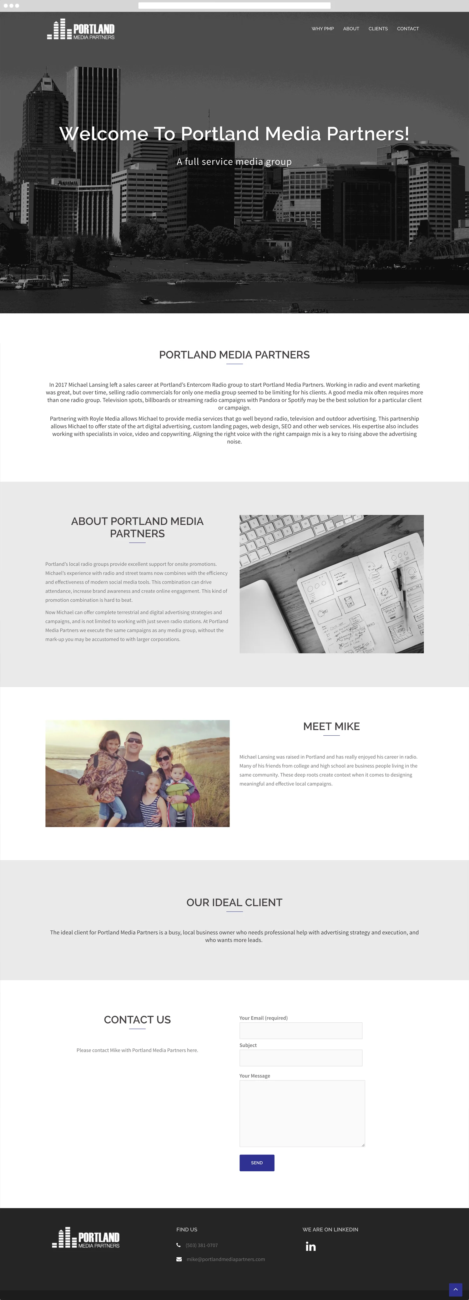
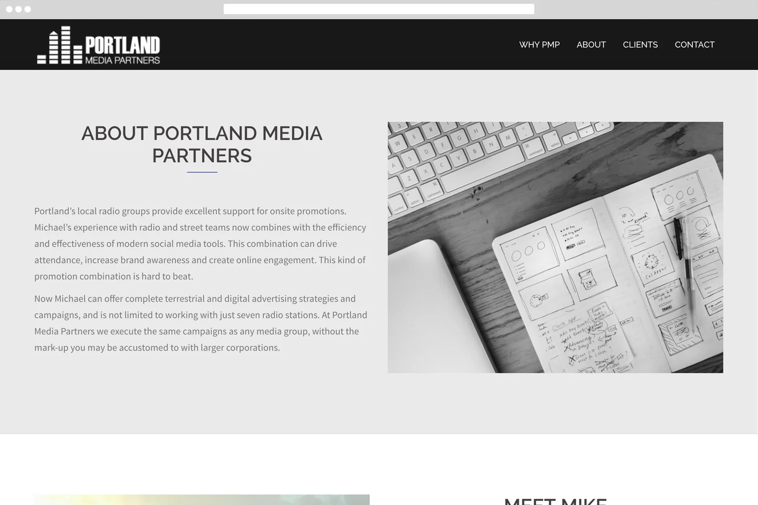
The sound wave concept unified every design decision — color, layout, and typography all flowed from the logo outward. The site was built as a single long-scroll page with anchor navigation. Custom code handled the page jumps cleanly without breaking the back-to-top button.
Logo & Brand Identity
Adobe IllustratorThe concept started with sound — specifically the waveform you'd see on a mixing board or audio visualizer. Mike's background was deep in radio and television, so using that visual language as the foundation felt immediately right. The challenge was making it feel like more than just a generic audio reference. The breakthrough came from looking at the Portland skyline and realizing the peaks and valleys of a sound wave could double as a cityscape. By stylizing the waveform so the tallest peaks echoed the silhouette of Portland's buildings, the logo became two things at once — a nod to the media industry and a clear statement of place. The result was a mark that felt specific to Portland Media Partners rather than interchangeable with any other media brand.
Website Design
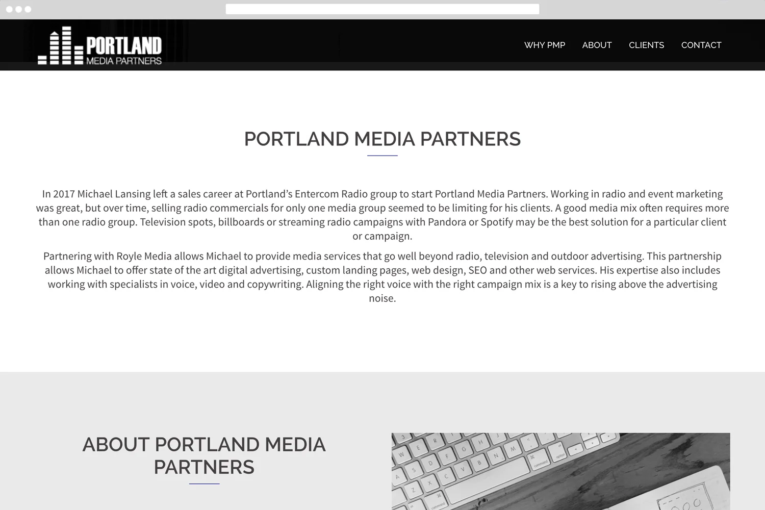
WordPress HTML & CSSA single long-scroll page with anchor navigation, built to feel clean and professional. Images were sourced and manipulated to fit the brand palette — only a few iterations before the client signed off.
A strong concept, a fast turnaround, and a happy client.
This project was a good reminder that a single unifying concept can carry a brand a long way. Starting with the sound wave form and letting it inform everything — the logo, the layout, the color — kept the work cohesive without overcomplicating it. Delivering a polished logo and live site in under two weeks, with only a few rounds of feedback, is something I'm proud of. The client was thrilled with the result.