
Some projects find you. Others you find yourself coming back to — not because you have to, but because the work mattered enough the first time that walking away from the second chapter wasn't really an option. PDXWIT is that project for me.
The First Chapter
Building an identity from scratch.
Portland Women in Technology was founded in 2012 by Megan Bigelow and Kasey Tonsfeldt — born out of a simple frustration: why should you have to travel to a national conference just to be surrounded by women in tech? What started as informal happy hours grew into one of Portland's most active community organizations, eventually hosting four to six events a month, pairing over 1,200 aspiring tech workers with mentors, and building a membership of more than 8,000 people.
[ Historical details sourced from Wikipedia — PDX Women in Technology. ]I was part of that community. As a member, volunteer, and event attendee, I showed up for PDXWIT wherever I could. And at some point, I became the person who built its visual identity.
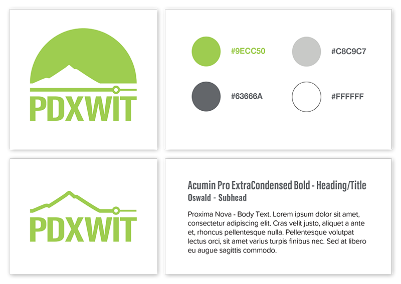
The brand I created — the mountain mark, the node and line, the color system — was designed to reflect what the org stood for: grounded in Portland, connected by community, and always moving upward. The mountain represented both the city and the ambition. The node and the connecting line represented the network — the whole reason PDXWIT existed.

The logo that existed before the rebrand — the starting point for all the exploration that followed.
The identity I built as a volunteer — the mountain mark, node and line, and color system that carried PDXWIT for years.
That identity carried PDXWIT through years of growth. In April 2024, the org dissolved, citing the loss of corporate sponsorship funding. It was an ending that felt abrupt to a lot of people who had given a lot to the community. I was one of them.
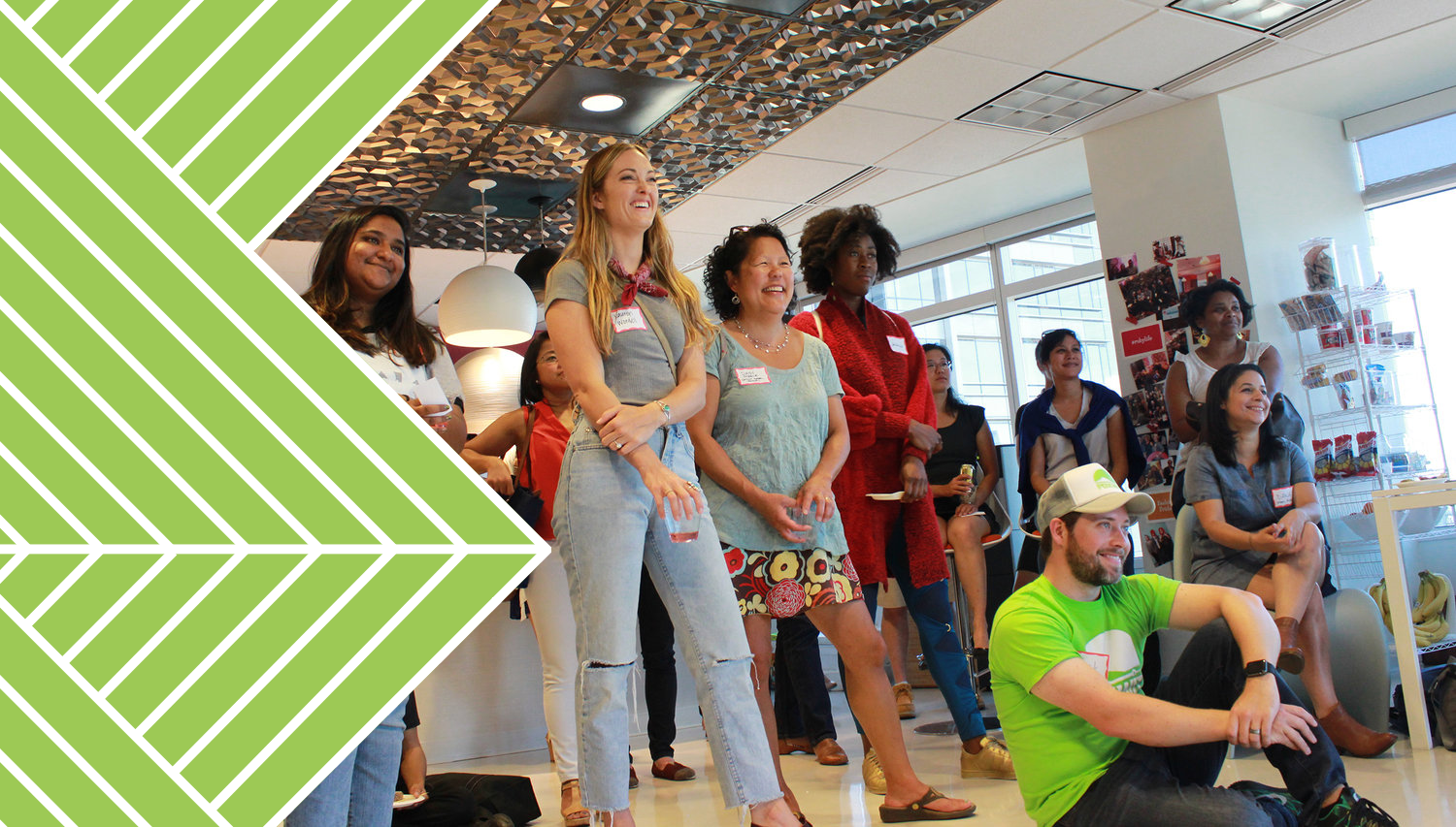 The PDXWIT community — the reason the identity needed to mean something.
The Call
I didn't wait to be asked.
When I heard there was going to be a resurgence, I reached out directly to Kellyn Pot'Vin-Gorman, the person leading the rebuild. I introduced myself, shared my history with the org, and offered my help. I wanted to be part of it again — but this time on clearer terms, with a better foundation.
What followed has been one of the better working relationships I've had. Kellyn leads with clarity and generosity. She's a mentor in the truest sense — the kind of person who makes the people around her better without making them feel small. The contrast with some of my earlier experiences with the org was significant, and it reminded me that the same work can feel completely different depending on who you're doing it alongside.
The Rebrand
Honor what came before. Move it forward.
The brief was clear: keep the mountain, keep the colors, keep the node and the line. Kellyn also wanted to introduce stars into the identity — a deliberate nod to PDXWIT's embrace of AI and emerging technology. It wasn't a decorative choice. It was an intentional one, signaling that this version of the community is oriented toward what's coming, not just what has been.
The main design decision we worked through together was the wordmark. The original typeface had character, but for this iteration we wanted something with more weight — something that felt more established and more confident. The challenge was finding a face strong enough to hold its own next to the mountain mark without competing with it. We workshopped it together, which is not always how these decisions get made. The result is better for it.
What came out the other side is an identity that feels continuous with the original while standing clearly on its own. Same roots. Stronger footing. New chapter.
Color & Typography for Web
The original earthy palette was refined and extended with digital-safe values — ensuring every color meets accessibility contrast standards on screen. Typography was updated to web-optimized Google Fonts equivalents that preserved the character of the original system while improving load performance.
Color System — 2026 Refresh
Lime Green
#9DCC4F
Forest Green
#316E40
Orange
#B86947
Rich Black
#121212
Cream
#FCF2DA
Light Grey
#EDEDED
Dark Forest
#0F2211
Typography
DM Serif Display
Headings & Display
Aa Bb Cc Dd Ee Ff — 0 1 2 3 4 5 6 7 8 9
Aa Bb Cc Dd Ee Ff — 0 1 2 3 4 5 6 7 8 9
Inter
Body & UI — Regular · Medium · Semi-Bold
Aa Bb Cc Dd Ee Ff — 0 1 2 3 4 5 6 7 8 9
Aa Bb Cc Dd Ee Ff — 0 1 2 3 4 5 6 7 8 9
The Website
A digital home built to last.
The rebrand fed directly into a full WordPress build — a new site for a relaunching community that needed to go live quickly, handle real needs from day one, and be maintainable by a small volunteer team. Events first, everything else in service of discovery and connection.
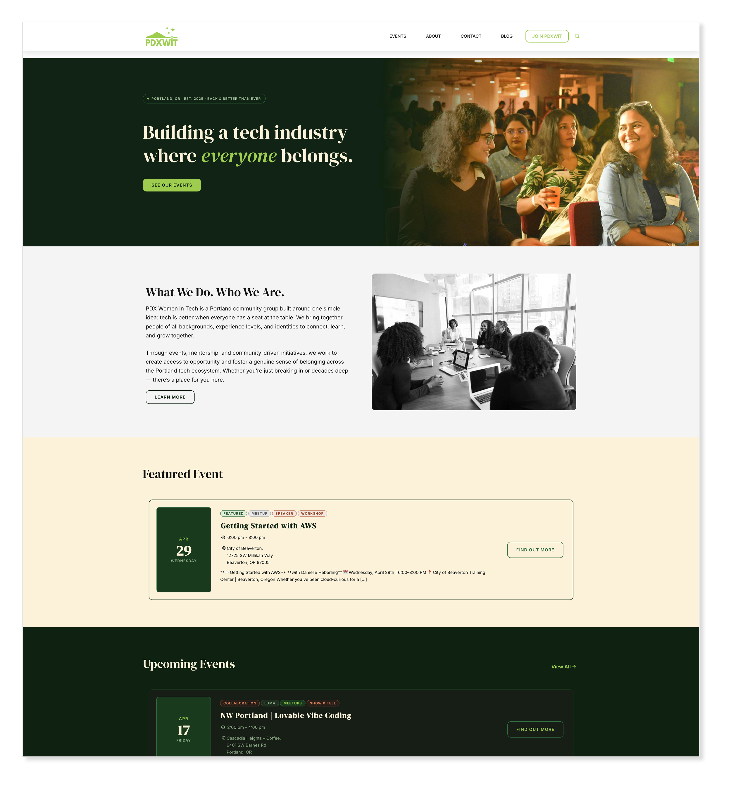 The new PDXWIT homepage — mission up front, events immediately accessible.
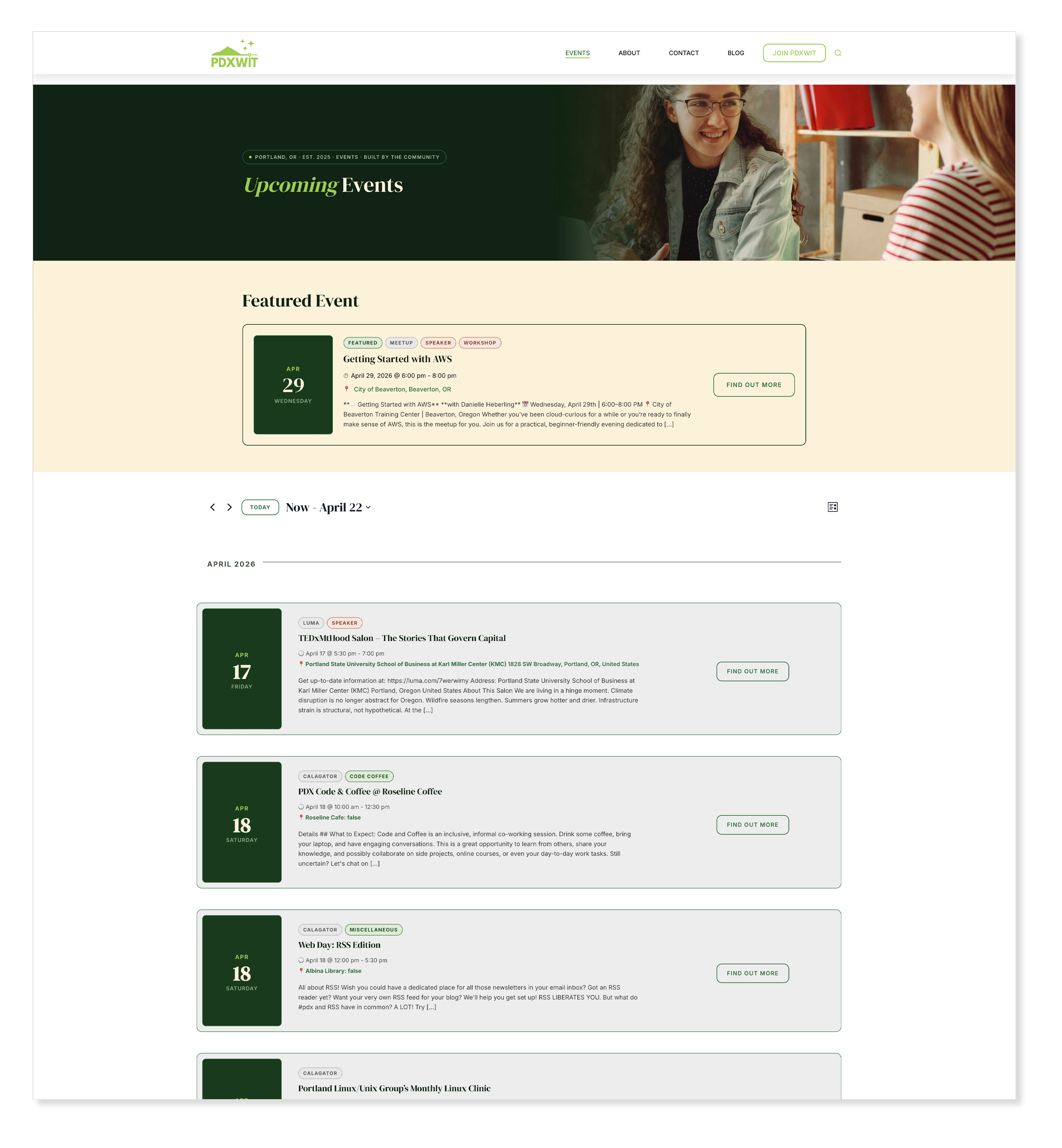
Events are the heart of PDXWIT — the listing page was designed to surface them immediately with minimal friction.
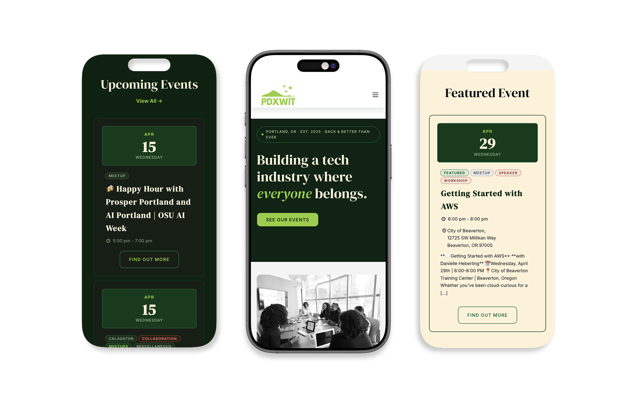
Fully responsive — the community experience holds up on every device.
What I Took From It
The same work, twice, means more.
Designing for a community you're part of is a different kind of work. The stakes feel higher because they are. You're not just solving a visual problem — you're representing something people care about, something they show up for, something that has meant something to them personally.
Doing it twice, with everything that came between, made it mean more. Not less.
I'm proud of the original PDXWIT identity. I'm proud of this one too. And I'm grateful to Kellyn for the chance to be part of the story again — and for showing me what good leadership in a community organization actually looks like.
The work is live at pdxwit.net. The community is back. And so am I.
References
Sources & Further Reading
Historical information about PDXWIT's founding and growth was drawn from the following sources: