
Frightfully Fun Branding — Visual Identity for a Story-Driven Gothic Retail Experience
A complete brand identity for Tell-Tale Hearth — a year-round gothic, Victorian, and Halloween-inspired retail concept rooted in story, atmosphere, and craft. This case study covers the branding work that laid the foundation for an accompanying e-commerce experience.
Overview
A brand built to feel like a destination — not a season.
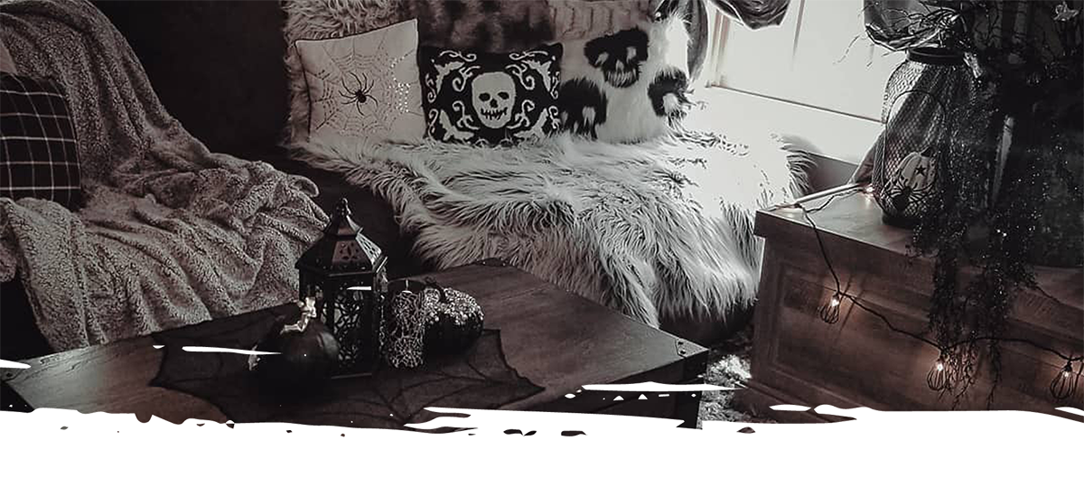
Tell-Tale Hearth started with a question I kept coming back to: why does gothic, Victorian, and Halloween-inspired decor only get to exist for two months out of the year? The concept imagines a brick-and-mortar destination in Salem, Massachusetts — a year-round retail experience for people who embrace this aesthetic as a way of life, not just a seasonal occasion.
The branding work came first, establishing the visual foundation that everything else would grow from. Logo, color, typography, patterns, and brand guidelines — all designed to feel immersive and atmospheric without tipping into novelty or theatricality. This case study covers that identity work. The e-commerce and UX/UI concept that followed lives in a separate case study →
The Problem
Gothic retail has a seasonality problem — and a branding problem.
Most retailers that engage with gothic, Victorian, or Halloween-inspired aesthetics do so seasonally — showing up in October and disappearing by November. The result is a market full of novelty items and temporary displays rather than considered, elevated product experiences. Tell-Tale Hearth needed a brand identity that felt year-round, intentional, and rooted in something deeper than spooky season tropes.
Key Decisions
What I decided, and why.
Restraint over theatricality
The easiest version of this brand would have leaned hard into skulls, cobwebs, and dripping candles. I deliberately avoided that direction. Tell-Tale Hearth needed to feel like a place people returned to year-round — and novelty wears off quickly. Instead I focused on atmosphere: deep color, considered typography, and symbolism rooted in home, flame, and storytelling. The result feels gothic without feeling costume-y.
Design for flexibility from the start
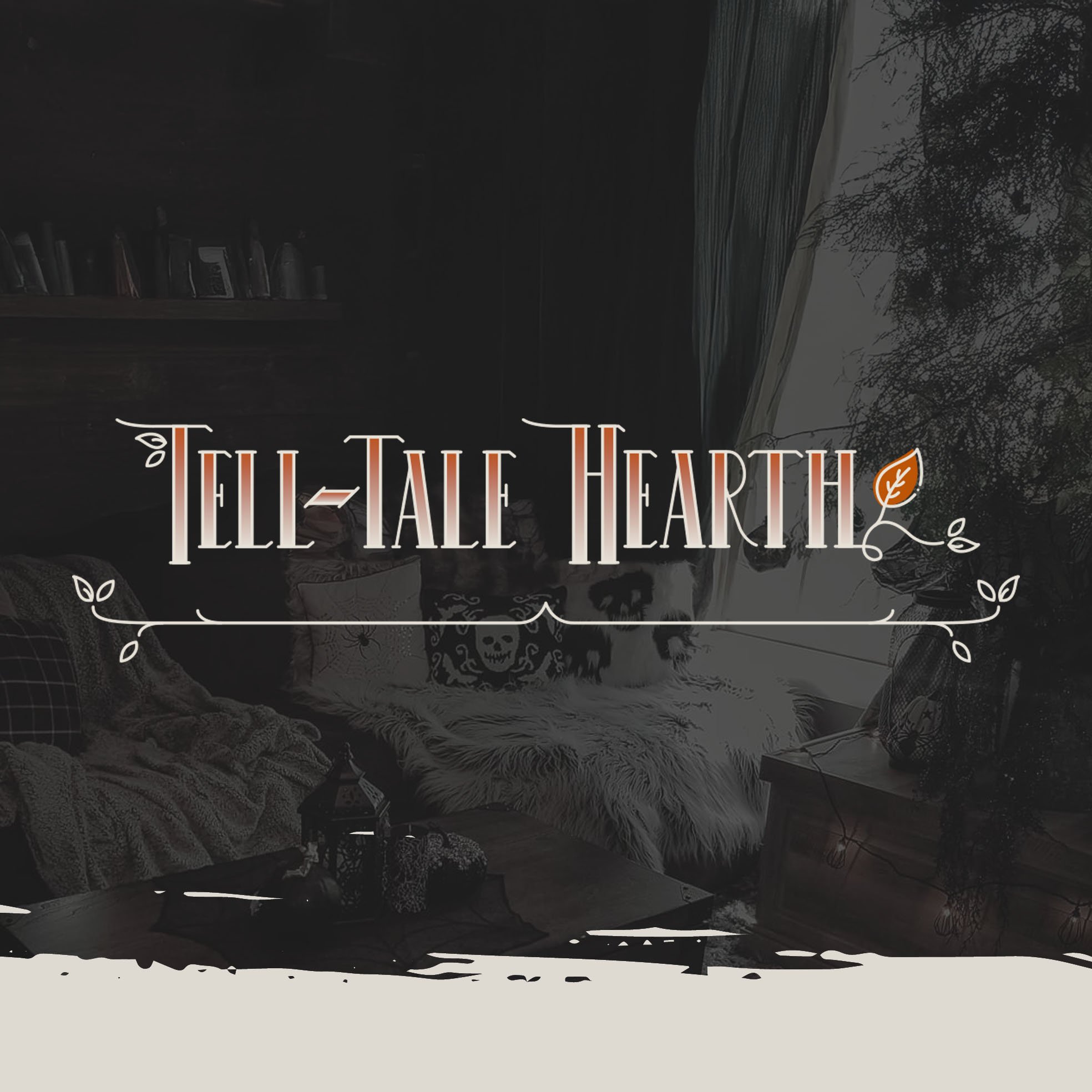
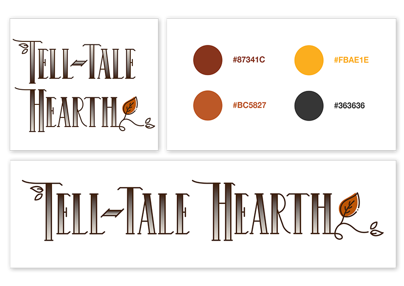
The logo came together quickly once the creative direction was clear — but rather than stopping there, I pushed into a full logo system. A primary mark, alternate variations, and a simplified version for small-scale applications like packaging labels and swag. A subtle gradient was introduced to add depth and warmth, reinforcing the brand's atmospheric tone without overcomplicating the mark. Each variation had clear use cases so the brand stayed consistent even at the edges.
Build a system, not just assets
From the start the goal was a cohesive brand system rather than a collection of isolated pieces. Color, typography, patterns, and guidelines were all designed to work together and scale — from in-store signage and packaging to future digital and e-commerce applications. Every element was evaluated against the same question: does this still feel like Tell-Tale Hearth when it's applied somewhere unexpected?
The Work
Building an identity rooted in atmosphere, restraint, and story.
Every element of the Tell-Tale Hearth identity was designed to work as part of a cohesive system — logo, color, typography, and patterns all reinforcing the same atmospheric tone without competing for attention.
Logo System
Adobe Illustrator 3 VariationsThe logo emerged quickly once the creative direction was established — a mark built around the symbolism of home, flame, and storytelling. A subtle gradient adds depth and warmth without overcomplicating the form. Three variations were developed for different contexts: the primary mark for flagship use, an alternate variation for size-constrained applications, and a simplified mark for small-scale uses like packaging and labels.
Image placeholder — Primary logo
Image placeholder — Alternate logo
Image placeholder — Simplified mark
Color & Typography
Moody Palette Story-Driven TypeThe color palette pairs deep, atmospheric tones with warm neutrals — creating contrast and depth that feels intentional and year-round rather than seasonal. Seasonal alternate palettes allow the brand to shift subtly with the calendar while staying rooted in the same visual language. Typography was selected to complement the mood without overpowering it, balancing character and readability across print and digital applications.
Main — Brand Colors
Burnt Sienna
#87341C
Ember
#BC5827
Candlelight
#FBAE1E
Slate Teal
#447384
Sage Shadow
#667065
Main — Neutrals
Dark Hearth
#412410
Charcoal
#363636
Midnight Brown
#25180D
Parchment
#E7E1D8
Warm Sand
#F1B67D
Seasonal Alts — Winter
Blood Red
#D00000
Evergreen
#205827
Mulled Wine
#702529
Midnight
#0A293B
Seasonal Alts — Spring & Summer
Dusty Rose
#C1877B
Charcoal
#363636
Antique Rose
#B86A77
Sage
#A2AE96
Typography
Zilla Slab
Primary — Headings & Display
Aa Bb Cc Dd Ee Ff — 0 1 2 3 4 5 6 7 8 9
Aa Bb Cc Dd Ee Ff — 0 1 2 3 4 5 6 7 8 9
Aa Bb Cc Dd Ee Ff — 0 1 2 3 4 5 6 7 8 9
Helvetica Neue
Secondary — Body & UI
Aa Bb Cc Dd Ee Ff — 0 1 2 3 4 5 6 7 8 9
Aa Bb Cc Dd Ee Ff — 0 1 2 3 4 5 6 7 8 9
Aa Bb Cc Dd Ee Ff — 0 1 2 3 4 5 6 7 8 9
Patterns & Visual Elements
Supporting Graphics TexturePattern and texture explorations were designed to complement the logo rather than compete with it. Subtle motifs added visual interest and atmosphere when needed, while remaining flexible enough to recede in content-heavy layouts. These supporting elements helped create a cohesive system that could scale across physical and digital touchpoints without losing the brand's sense of quiet intrigue.
Image placeholder — Pattern
Image placeholder — Visual elements
Brand Guidelines
Logo Usage Color TypographyOnce the visual identity was finalized I assembled a comprehensive brand guidelines document — defining logo usage, color relationships, typography standards, and guidance around imagery and tone. Rather than prescribing rigid rules, the guidelines were designed to balance structure with flexibility, providing a clear reference for maintaining cohesion as the brand grows into new contexts and applications.
Image placeholder — Brand guidelines page 1
Image placeholder — Brand guidelines page 2
Image placeholder — Brand guidelines spread
Outcomes
What this work delivered.
Logo system, color palette, typography, patterns, and brand guidelines — all designed to work together and scale across retail, packaging, and digital touchpoints.
Primary mark, alternate variation, and simplified mark — each with clear use cases so the brand stays consistent from flagship signage to small-scale packaging.
Main palette plus Winter and Spring/Summer alternates — allowing the brand to shift subtly with the calendar while staying rooted in the same visual language.
Reflection
What this project taught me.
Tell-Tale Hearth taught me that atmosphere is a functional design decision, not just an aesthetic one. The hardest part of this project wasn't creating something visually interesting — it was maintaining restraint. Every time I was tempted to add another ornamental detail or push the palette darker, I had to ask whether it served the brand's long-term story or just my own impulse toward drama. The answer was usually restraint. What I'm most proud of is the seasonal color system — the idea that a brand can shift with the calendar without losing its identity felt like a genuinely interesting design problem, and solving it in a way that felt cohesive rather than scattered was satisfying. The branding work laid a foundation I was excited to build on in the accompanying UX/UI and e-commerce concept.