
Portland Media Partners
Branding + Wordpress Development
Client: Portland Media Partners/Royle Media
Role: Web + Graphic Designer
Assets Delivered: Illustrator files, PDFs, PNGs
Tools: Adobe Illustrator, Adobe Photoshop, Wordpress
Year: 2017
—
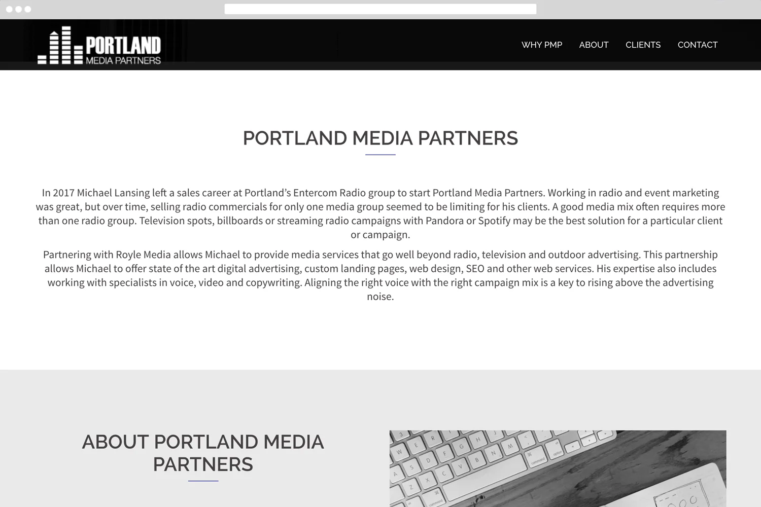
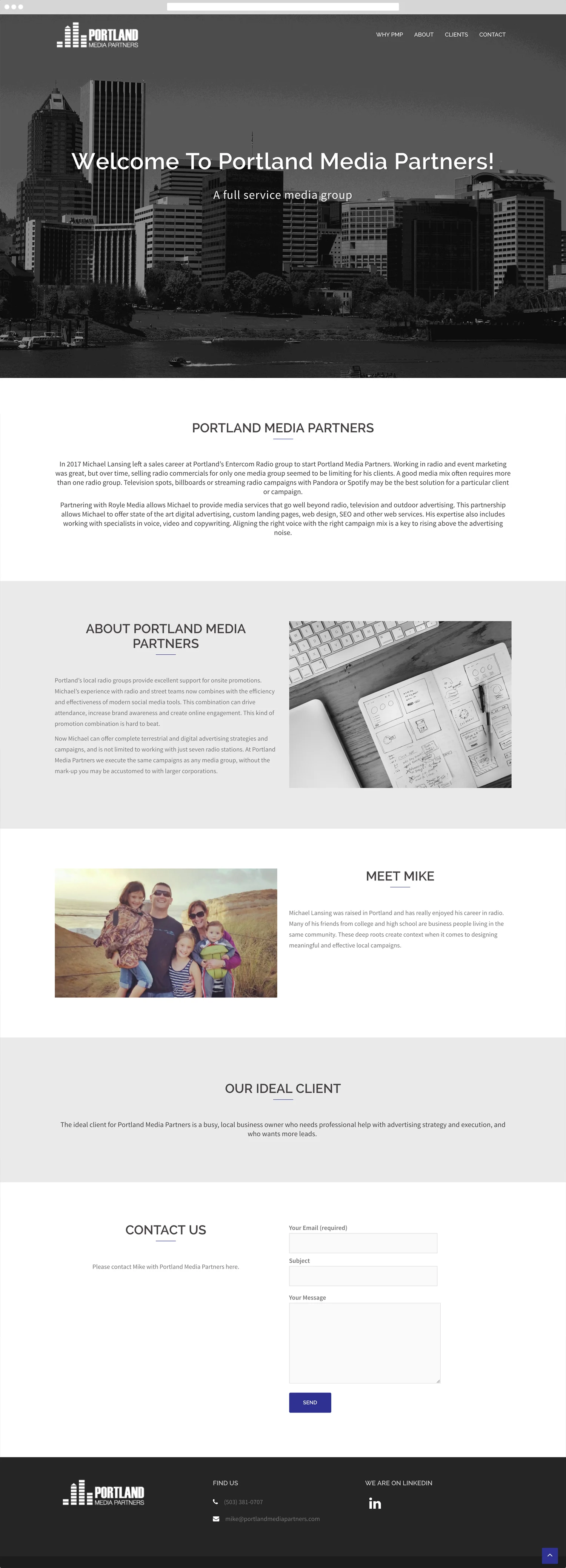
Connecting with Royle Media, I was tasked with creating a logo and landing website for burgeoning full service media group. Using the logo as a step to creating a well rounded landing page, I was able to create something that looks professional, using limited resources and only a few iterations of changes. The client ultimately was extremely impressed and thrilled with the work.
Sound as inspiration...
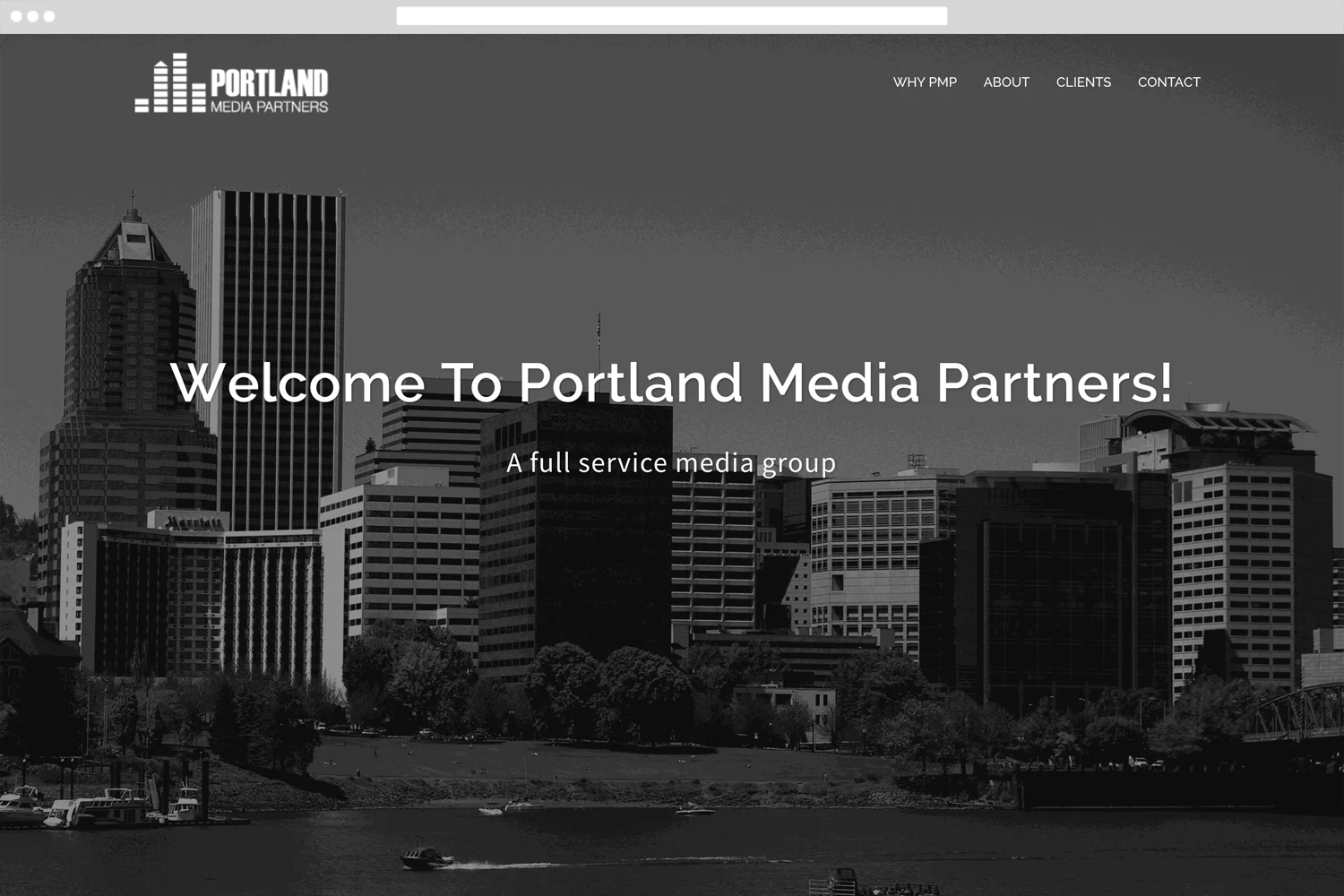
Beginning work on Portland Media Partners' site, we came together on a singular concept, using the sound form as a unifying concept. We emphasized his experience in the industry and wanted to be sure to show how he is able to enhance his clients' digital footprint. Using sound waves as inspiration, we kept things simple as possible basing a lot of the color and layout on the logo. Mike had years of experience in radio, so we used that as a source of inspiration as well. Instead of working against the theme, we embraced it and used it to our advantage. Using custom code where needed as well.
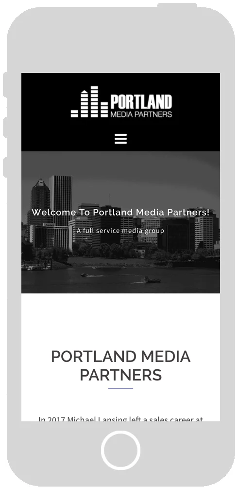
Due to the nature of the page itself, I was able to quickly implement page jumps from the navigation menu into the page itself. The transition between the pages is smooth and doesn't interrupt the back to top button at all.
The process...
Spending only a couple days putting together all the assets, we were able to launch the site within only 2 weeks. Working collaboratively with the project manager at Royle Media, I found and manipulated the images to fit within the new brand and template color choice. Using a development server, we only iterated the design a few times and was able to launch well ahead of schedule.
Logo + Branding Design
Beginning work on Portland Media Partners' logo and branding, we used the sound wave form from a sound board as a unifying concept. Mike had years of experience in radio and television, so we used that as a source of inspiration as well. He also wanted to use Portland as a source of inspiration and using the buildings built from the sound was extremely well received.
Credits
Creative + Art Director: Stephen Cahill
Web & Graphic Designer: Meghan Lewis
Fun Facts
This was my first project with Royle Media. Bringing me on as a contractor to gauge my creative process and abilities. I certainly wowed them with my branding techniques and quick assessment of what works and doesn't work within Wordpress.