
Celebrating Community — Event Graphics & Podcast Branding for PDXWIT
Event infographics, a podcast logo and ad system, and a tote bag for pad printing — all rooted in the brand identity I built for PDXWIT and designed to celebrate the community it serves.

An ongoing creative relationship built on community and brand consistency.
After establishing the PDXWIT brand identity and logo system, I continued as the organization's Graphic Design Lead — creating event infographics, a podcast identity, and branded merchandise that all stayed true to the visual language we had built together. The work spanned several years and grew in scope over time, eventually bringing in two additional designers who I art directed on collaborative pieces. Every deliverable had to work within the brand, reflect the spirit of the event or campaign it was created for, and hold up at any scale — from a Meetup event listing to a tote bag handed out at the door.
The Problem
A growing organization that needed design to keep pace with its ambitions.
PDXWIT was hosting four to six events a month, launching a podcast, and producing branded merchandise — all while maintaining a consistent visual identity across every touchpoint. Each new deliverable had to feel connected to the brand without being repetitive, and celebrate the specific event or campaign it was created for.
Three years of graphics that kept a community connected.
Each campaign had its own design challenge — the podcast logo needed to work at tiny sizes, the event infographics needed to celebrate specific themes while staying on brand, and the tote bag required learning an entirely new production process. All of it had to feel like PDXWIT.
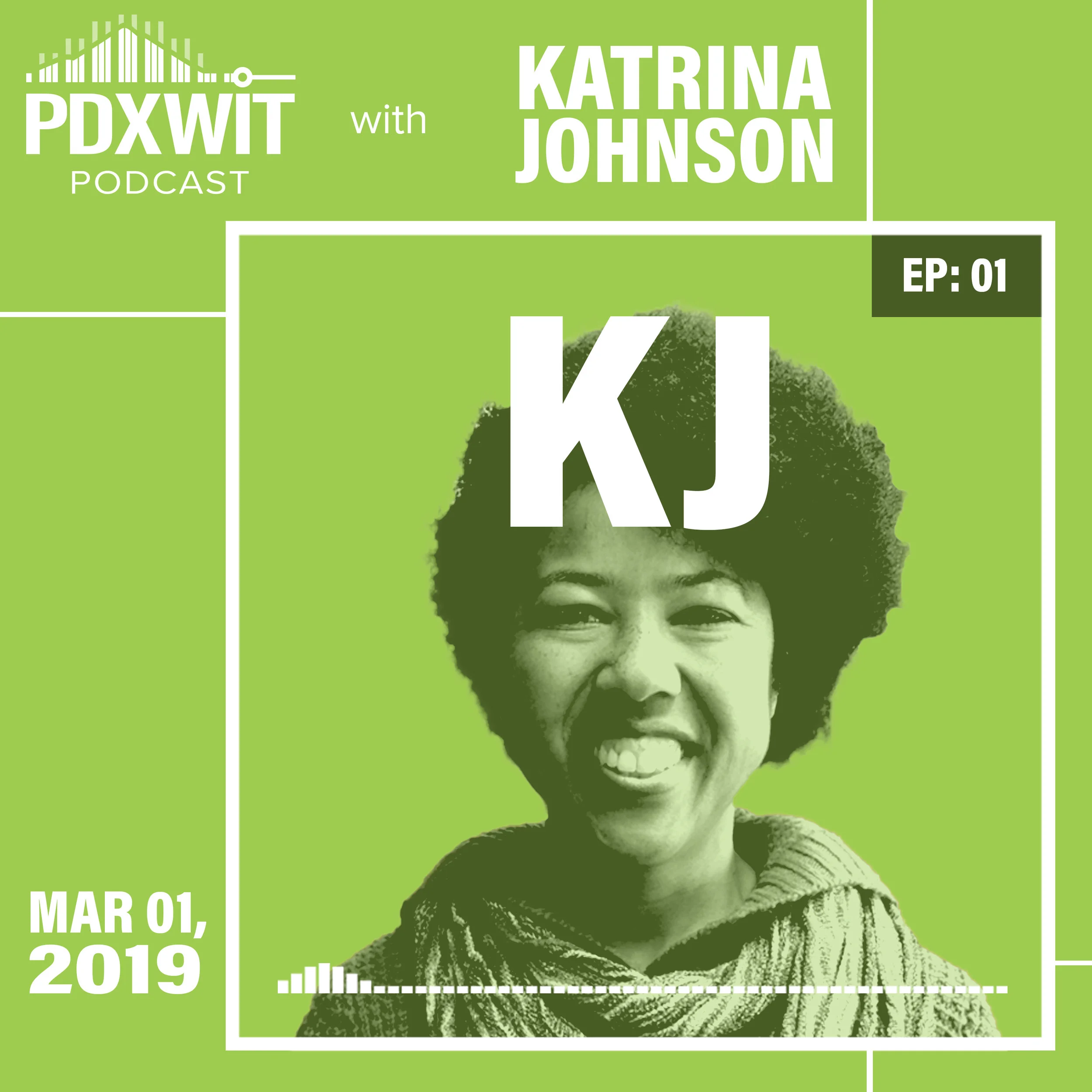
Podcast Logo & Ad System
Adobe Illustrator Adobe PhotoshopThe podcast logo went through significant simplification — an early version was too intricate to hold up at small sizes. The final mark and ad system used layered Photoshop adjustment layers to make episode graphics fast to produce and easy to update. The project also led to the addition of two new brand colors — blue and brick red — to expand the palette for digital use.

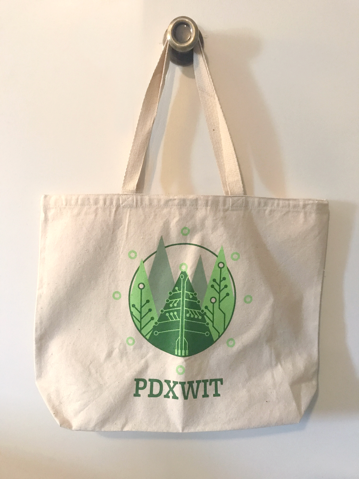
2018 Holiday Party & Tote Bag
Adobe Illustrator Adobe InDesignThe holiday infographic fed directly into a tote bag graphic for pad printing — a production process that required learning new file preparation techniques and working through several iterations with the printer to land on the right color combination. The tote bags ran out almost immediately at the event.


2018 Summer Soiree
Adobe Illustrator Adobe PhotoshopA collaborative infographic where I provided art direction and concept to the designers on staff. The ice cream treat vector artwork was created by Nikki Rodriguez and Adrienne Pass — I brought it all together into the final piece.


Years of work for a community I believed in — and learned a lot from.
Being the Design Lead for PDXWIT over several years was one of the most rewarding ongoing creative relationships I've had. Every deliverable was a chance to push the brand into new territory while keeping it grounded in what made it recognizable. The podcast work taught me a lot about designing for small-scale reproduction. The tote bag introduced me to pad printing — a production process I hadn't worked with before and one that required real back-and-forth with the printer to get right. Art directing Nikki and Adrienne on the Summer Soiree was a different kind of challenge — translating a concept clearly enough that others could execute it and then bringing it all together. Watching the tote bags disappear at the holiday party almost immediately was one of those moments that reminds you why the craft matters.